The Art Career of Denise Wyllie

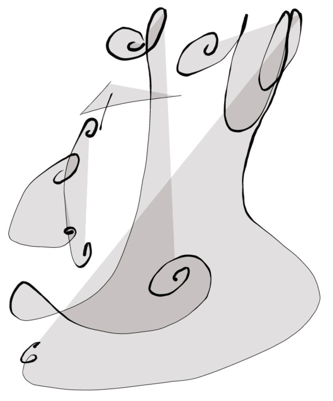
‘Being Together’ Estandos Juntos Series by Denise Wyllie, Woodcut, 63 x 45cm.

I like to select artists for this blog whom uniquely represent the art world.

‘Being Together’ shown above is a woodcut from the Estandos Juntos Series [the Spanish translation of the artwork] by Denise Wyllie which featured at “The Master’s” exhibition, hosted by the Royal Society of Painter-Printmakers in November 2019 at The Bankside in London.

Denise Wyllie’s artworks appeal to the fine art and interior design markets alike.

Her ‘Estandos Juntos Series’ of gender inspired prints explores the relationship between men and women.  Closeness, disparity, fear, acceptance, race, dominance, reluctance, submission et al.  At least that’s how I see this Series of works.

There is no doubting a feminine style to Denise Wyllie’s floral works.  Her literary commentary is itself ‘a cat among the misogynistic pigeons’.  At this moment I can picture every female reader cheering Denise on.  Men too, as without thorns how does one protect the rose?

Are female artists under-represented in museums?  Is this something you would agree is true?

Primarily through the latter 19th century we see international art establishments readily accepting women into the upper echelon of art.  Often from well-to-do connected backgrounds.

My own past blog articles featuring female artists include: [please click their names to visit the links]

Sonia Mehra Chawla

Tamara de Lempicka

Louisa Beresford, Marchioness of Waterford

Mary Stevenson Cassatt

Élisabeth Louise Vigée Le Brun

Artemisia Gentileschi

Anna Hyatt Huntington

Aelita Andre

Käthe Kollwitz

Berthe Morisot

Thankfully the 21st century is creating new working opportunities for women regardless of class, background, beliefs/non-belief, race or origin.  Technology is the ethical driving force within art, through increased marketing accessibility and popular cultural movements supporting equality.

Let’s take a good look at Denise Wyllie’s floral landscape and treescape works:

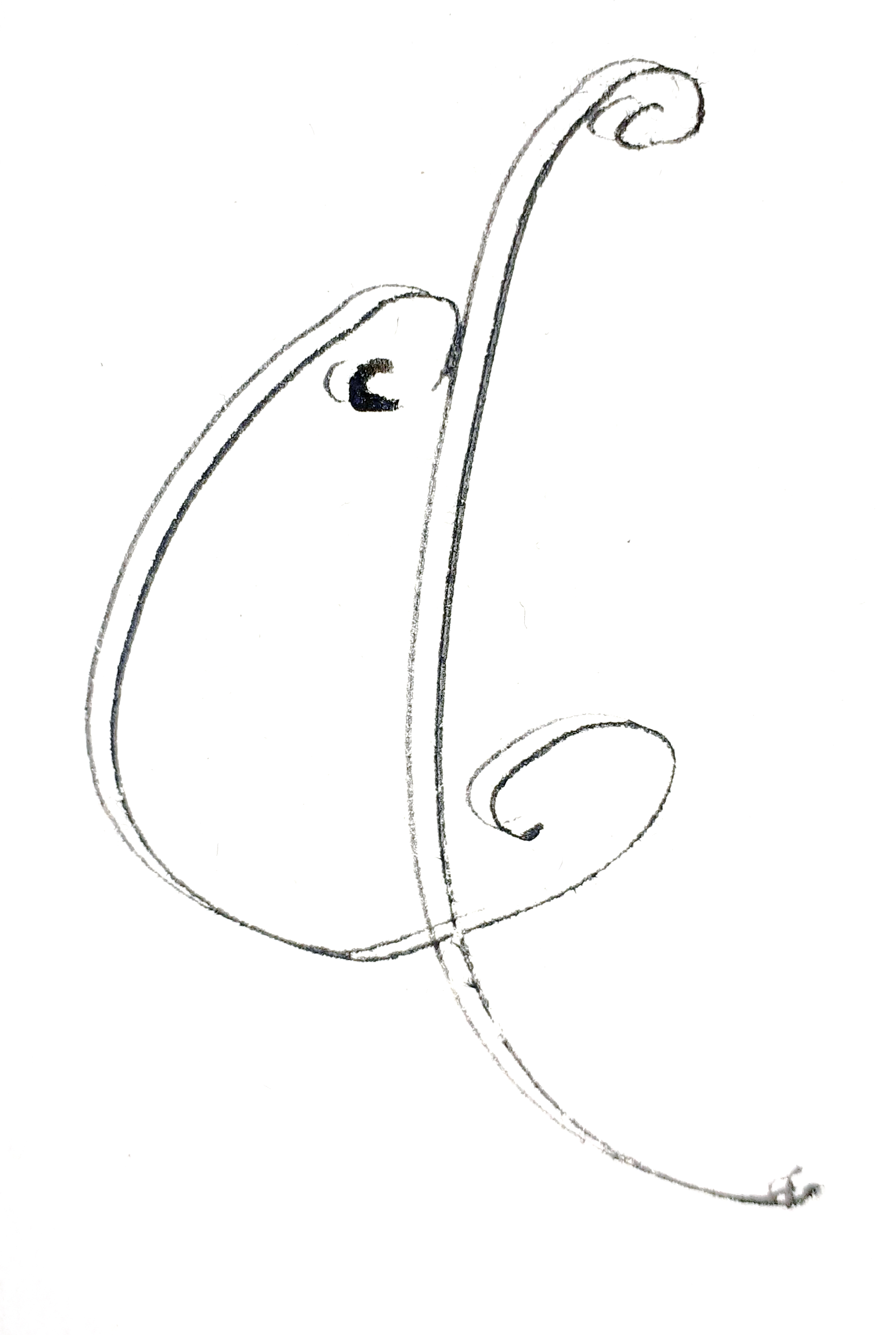
‘Into The Renaissance Rose Garden’ by Denise Wyllie, Screenprint, 50 by 70 cm, Edition number 10.

Denise has immersed herself within the David Austin Rose Gardens in Shropshire and blossom trees of Kyoto, Japan over the years.  Artists have an innate desire to draw near to their subject matters to disentangle meaning, grasp new definitions and disseminate thoughts.

‘Into The Renaissance Rose Garden’ by Denise Wyllie is a pretty play on perspectives.  It’s one of those artworks made specifically to bring joy.  Reminding us of springtime blossom whilst fairy flowers wistfully dance the breeze.  Children are probably running around making blissful noises getting caked in mud.

‘Into The Renaissance Rose Garden’ is a stunning composition.

For some years now I’ve recorded birds tweeting at my local nature reserve.  There is a wealth of natural beauty to discover and realise.  Listen as twilight water birds make soft conversational sounds to one another.

Kyoto: Travelling in the snow original Wyllie's screenprint Find Art, Buy Art, Museum Art Gallery, Royal Academy Of Arts, Contemporary Artwork, Abstract Expressionism, Kyoto, Printmaking

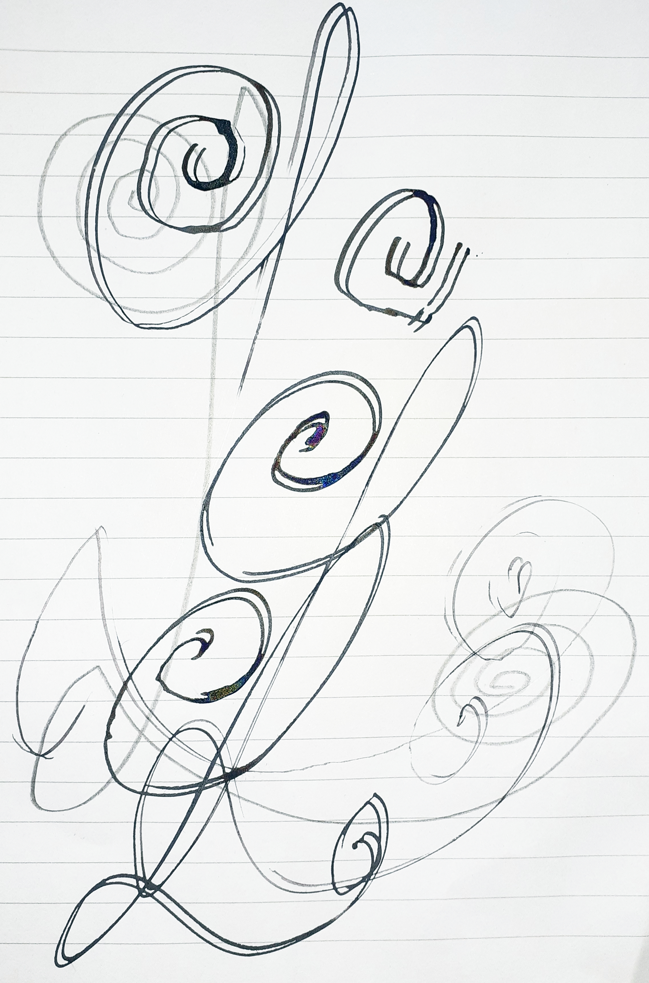
‘Kyoto: Travelling in the snow original’ by Denise Wyllie, Screenprint.

If you have ever seen timeless Japanese artworks such as ‘Magpies and Hare’ by Cui Bai [please click the link to view], you will appreciate Denise captures the absolute essence of Japanese silkscreen printing in her works.

‘Kyoto: Travelling in the snow original’ by Denise Wyllie is the apotheosis of the Japanese style.  Sinewy curving branches, hints of delicate leaves, windswept movement.  Bring a colour contrast to the mix and this wintry landscape comes alive with clever outer-edge and far-ground detailing.

A carefully constructed artwork like this cannot be fully visualised without first displaying the piece upon your wall.

‘Tree Spirits 3’ by Denise Wyllie, signed Giclee Fine Art print on Hahnemuhle 310gsm paper.

And then just as you thought there would be no darkness to Denise Wyllie’s work, we have ‘Tree Spirits 3’.

Eerily beautiful isn’t it?

Her career experience, ability and crafted brilliance is magnified throughout her art making.  Complex layers excite our visual senses.. eyes and mind.

Please kindly view the artworks for sale here at: Denise Wyllie & Clare O Hagan to find your own favourite art pieces from their vast inventory.

Standard

HYPER JAPAN – Online Exhibition

#

HYPER JAPAN Announces a Series of Online Workshops

HYPER JAPAN hosts the UK’s largest exhibition of Japanese Pop Culture, gathering together the country’s many Japan fans to share their enthusiasm.

Created by Cross Media Ltd.’s President and Representative Director Mr. Kazuhiro Marumo in 2010, HYPER JAPAN has been working hard to develop a community around their event and provide visitors with access to all kinds of exciting content from Japan. Despite the challenges of 2020, HYPER JAPAN remains determined to stay at the forefront of the UK’s Japanese scene, mapping out a series of online events to bring the energy of the exhibition online.


Tsurushi-Bina (Hanging Dolls) Workshop

Led by Jessica Corlett of Flapjac Fashion-craft Events, in this online event participants will create their own Tsurushi-Bina, decorations which are displayed at Hina Matsuri, Japan’s annual Doll Festival. Flapjac Fashion-craft have been a regular at HYPER JAPAN events, bringing a cute new twist to traditional Japanese textile arts.

This will be a paid event and materials will not be provided, but just as original Tsurushi-Bina were made from leftover kimono silk this workshop is a great chance to be reuse old materials and get artistic and Jessica leads you through three unique designs.


Date: 12th September 2020
Time: 14:00-16:00
@ZOOM online

Apply for Tickets here

Tsurushi_bina_2_1_480x480 377404f381dc75d56f188ddddf66ac9c_480x480


Shodo (Japanese Calligraphy) Workshop

With such a complicated writing system, calligraphy of Japanese is both impressive and beautiful. Professionals who train to create Japanese characters as an art form will go through extensive training, and the best way to be introduced to the ancient disciple is by a master.

That opportunity is being offered in an online workshop run by Akemi Lucas, who works under the name of ‘Koshu’ and has been learning the art of calligraphy since she was eight. Her artworks have appeared in campaigns for the 2019 Rugby World Cup and advertising by the 2020 British Olympic team’s main sponsor.

In a two hour lesson Akemi Lucas will explain more about the Japanese writing system, help applicants to draw the characters for Ambition & Eternity (大志&永) and host a Q&A session.


Date: 19th September 2020
Time: 10:30-12:30
@ZOOM online

Apply for Tickets here

Akemi-profile2 image_1_2048x2048


Sumi-e painting (Japanese ink painting) online workshop  

HYPER JAPAN is delighted to announce that Akemi Lucas will also be joining us for an online session where you can learn all about Sumi-e, the Japanese art of ink painting. An introduction on the background of Sumi-e will be followed by a chance to get active and create your own ink depiction of an orchid as Akemi talks you through the process.


Date: 17th October 2020
Time: 10:30-12:30
@ZOOM online

Apply for Tickets here

image_Orchid_PRonly_600x akemi_lesson_480x480


Origami Workshops with Alice Stern from Sushi Art 

Origami is one of Japan’s most well-known art forms and HYPER JAPAN is looking forward to collaborating with Alice Stern for two separate workshops which will get focus on the fun of folding. After inspiration from time spent living in Japan, Alice set up Sushi Art more than five years ago and has been sharing her experience and craftwork across the UK.

In the first workshop Alice will be showing applicants how to create three designs, a Lotus Flower, Crane & Samurai Helmet. With talks on the history and tradition of origami included, this workshop promises to be instructive and productive!


Date: 10th October 2020
Time: 14:00-16:00
@ZOOM online

Apply for Tickets here

IMG-20200818-WA0000_480x480 IMG-20200817-WA0041_2048x2048

The second origami workshop Alice will be hosting on November 7th centres on the more advanced Kusudama flower ball, a design comprised of 60 pieces of origami paper. As Alice takes you step by step through the process, she’ll also be explaining a little more about how this piece was displayed.


Date: 7th November 2020
Time: 14:00-16:00
@ZOOM online

IMG-20200817-WA0027_2048x2048 IMG-20200818-WA0019_480x480

Keep the energy going!

With some great online activities lined up, let’s hope that we can keep the HYPER JAPAN spirit as vibrant as ever and make sure nothing gets in the way of enjoying Japanese culture together!

Event courtesy of HYPER JAPAN.
# # # #
Standard

‘a4 LY equation [digital sketch #1]’

‘a4 LY equation [digital sketch #1]’ [28th August 2020] by Matt The Unfathomable Artist, freehand digital sketch using desktop computer software with mouse, original image is 1396 pixels [w] x 1679 pixels [h].

From start to finish this freehand digital sketch took me approximately 44 minutes to produce.

The hours to refine the calligraphy was done over the foregoing days, with iron gall ink and carbon pencil practice upon A3/notepad paper respectively.

After historical handwriting research focusing upon ‘a’, ‘4’, ‘L’, ‘Y’ paper studies and freehand practice I had a good idea of the scrolling style I wished to create.

The best way to offer insight into my work is by providing actual photographs of my ink work practice:

‘yj’ [August 2020 – calligraphy] sketch practice, iron gall ink dip nib pen on notepad paper.

The ‘y’ was quite difficult as calligraphy goes.  Scrolling ‘y’ letters were already highly represented in handwritten texts I studied.  I wanted something with my style – simplifying and complicating my design as necessary to ensure it exemplifies Art.

The adjacent line similar to a ‘j’ [immediately above] is my practice at finding the downward stroke for the ‘y’.  With all the characters for this work I filled quite a few scrap paper sheets.

‘Perfect a’ [August 2020 – calligraphy] sketch practice, iron gall ink dip nib pen on A3 paper.

This ‘a’ I produced, photograph shown immediately above, is just about as perfect as I made throughout tens of illustrations with same.  My digitally sketched ‘a’ has provided complimentary movement to the other characters.  A sense of quirkiness.

There is a feeling of jazz music, bass playing and dancing in the above digital work, in my own opinion.

What did you think viewing this piece?

‘Scrolling L’ [August 2020 – calligraphy] sketch practice, iron gall ink dip nib pen on notepad paper.

The looped ‘L’ on the down stroke really excited me.  At that instance of artistic experiment I knew the L was, shall I modestly seek to say, successful.

The question was, ‘how much scrolliness is required?’

Digital sketching software enables us to add or remove lines and re-try without starting a whole new piece of paper.  Even my digital sketch with the mouse, top photograph, needed tens of practice letters and number 4’s on the computer screen.

I re-tried between twenty to thirty times for this digital artwork.  After the ‘a’ and ‘L’ had been digitally sketched I kept working at the ‘Y’ for the quality in this piece I wanted.  The number ‘4’ is my own version of 17th Century numerical handwriting.

Joyful working satisfaction through practice.

Standard

‘Butterfly with Seismic Waves’

‘Butterfly with Seismic Waves’ [June 2020] by Matt The Unfathomable Artist, iron gall ink sketch on lined notebook paper [80gsm].

Sketch practice entitled ‘Butterfly with Seismic Waves‘ [June 2020] merely shows my experimentation with a metallic dip nib pen whilst also ensuring a good even flow of the ink in readiness for larger Artist’s-paper seismic works through June of 2020.

Inadvertently the whole butterfly flaps its wings chaos theory has been turned into an unintended conceptual visualization.  On paper at least.  The sound waves intensify the butterfly’s meaning since the seismic ink lines form part of its strongly defined wings.

The butterfly is with us in this artistic message.

Standard

Pop Art Unfathomable

‘Pop Art Unfathomable’ [7th May 2019] by Matt The Unfathomable Artist, digital Pop Art produced for Silkscreen Print Editions. Created through the triple digital blending of ‘If Entirely Fathomable, Wouldn’t Be Unfathomable’ Aquamarine, Red Ochre and Sap Green hand painted versions on Artist’s paper. Original image is 2600 pixels [w] by 2228 pixels [h], 300 DPI.

With silkscreen printing proliferating Pop Art culture I want to create pieces that are my own representation within this art genre.  In fact, wherever any art genre exists, art collectors and fans can be sure I’m looking for new ways to produce works ticking all of those cubist boxes.

Pop Art Unfathomable‘ [7th May 2019] by Matt The Unfathomable Artist is produced using digital images of ‘If Entirely Fathomable, Wouldn’t Be Unfathomable‘, itself originally created in three separate versions – Aquamarine, Red Ochre and Sap Green pigment paint brushed onto Artist’s paper.

The former received the pop art treatment through triple photographic blending, please see above.  Using desktop computer software each image was positionally overlaid with varying degrees of transparency.

Effectively multiplying the words, providing a 3D-like quality and playfully obsfucating the saying in harmony with the original message concept.

How can something unfathomable be made fathomable if there is over-complication?

You will appreciate, as with my work generally, this series of artworks has a profusion of intellectual reasonings.  Combined cognitive abilities in art produces works explaining our world-view absorption and outpouring of communication.

At the heart of this saying is an emphasis on creating solutions to problems we feel are unassailable.

Standard

type: The Unfathomable… Artist – Electronic Version

‘type: The Unfathomable… Artist – Electronic Version’ [18th August 2020] – by Matt The Unfathomable Artist, dip nib pen using original iron gall ink recipe on A3 [180 gsm] Artist’s paper.

type: The Unfathomable… Artist – Electronic Version‘ is Basquiat inspired.

I would like to quote my own personal commentary regarding this new iron gall ink piece:

“Intellectually i’m really happy with this artwork. Only after did i think, ‘that’s why i put the jagged lines in‘ This is my first Basquiat style piece and i can honestly write i had no prior notions to make it a Basquiat in style until it happened 🎨❤” [bold italics added for emphasis].

The jagged lines top and bottom were added on the 14th August 2020 after I’d finished the central/vertical calligraphy.  Initially without the ‘black block ink and multiple lines’ you can see in the artwork photograph above – completed through impromptu ink work.

I literally didn’t know how to proceed with this artwork from thereon.  Actually thinking I might leave it as it was, adrift of any further inspiration or ideas.

After drying the piece for a few days I began spontaneously researching electronic circuit board diagrams with avid interest.  I’m familiar, decades past, with circuit diagrams through my Dad’s former occupation as a photocopier engineer and his [second generation] electronics expertise.

Electronic magazines featuring television and Hi-Fi circuitry, repair and assembly scattered all over the house.  Diagrams with capacitors, LED’s, transistors, LCD’s, transformers etc.  Viewing circuit diagrams is always a memorable and pleasant experience to me.  I laughed when I saw a multimeter photograph yesterday.  My Dad carried one of those around with him quite often.

For me, this artwork is a connection to the ancient and modern past, encapsulated with new hope for the future.

I’d like to share with you the electronic circuit diagram symbols used in my artwork including their relative placements:

fuse [rectangular box with zigzag lines – begins diagonally underneath the word ‘type’];

Anode/Cathode Solar cell Photodiode [line into circle with inner triangle-vertical-line and two ascending diagonally right-to-left down-pointing arrows – underneath the grammatical colon and letter ‘T’];

battery multi-cell [horizontal line with vertical line, vertical single dash line, vertical single dash line longer, vertical line with horizontal line – underneath the space between the words ‘The’ and ‘Unfathomable’];

dome light [horizontally represented domed light bulb with heart light element – underneath letters ‘n, f, a, t, h’];

tri-phase protective and neutral conductor [single line with ‘triple diagonal line’ ‘diagonal line with T line’ and ‘diagonal line with black dotted circle’ intersections – underneath letters ‘m, a, b, l, e . .];

solder bridge [two adjacent lines above-below with two split circles representing the solders – underneath the word ‘type’];

balanced terminals [two adjacent lines with two open circles – underneath and between the words ‘type’ and ‘The’];

electromagnetic shielding [large rectangle, shaped by line dashes – surrounding the word Artist];

constant current source or general transformer or obscured oscillator [line with filled black circle] and also [line with black circle with imperfect unfilled circle overlapping directly below – underneath letters ‘l, e’ ] – please note this latter symbol also has an unknown electronic meaning.

Reasoning is viewer-dependent, wherever conceptual plurality applies to positive and negative space.

Standard

Seismic Sound Wave Masterpieces

‘Twenty One Particular Seismic Waves’ [12th August 2020] by Matt The Unfathomable Artist, dip nib pen using original iron gall ink recipe on A3 [180 gsm] Artist’s paper.

Without your physically seeing these artworks it’s not easy for me to explain the quality I feel I’ve produced through my iron gall ink pieces.  I’m immensely delighted whenever I view these works myself.

Dip nib pen calligraphy with its magnificent arty fine lines is providing me with pUrE ArT HaPpINeSs.

Twenty One Particular Seismic Waves‘ [12th August 2020] is inspired by Andy Warhol’s iconic screenprinting Pop Art brand works.

Twenty one individual vertical seismic waves each with their own flavour of uniqueness, see above.

‘Five Vertical Three Horizontal Sound Waves #1’ [12th August 2020] by Matt The Unfathomable Artist, dip nib pen using original iron gall ink recipe on A3 [180 gsm] Artist’s paper.

A spirally kind of perfection in ‘Five Vertical Three Horizontal Sound Waves #1’ shown above.  The fifth vertical [from the left] is actually the first, as I worked the paper from right to left.  The lowest placed soundwave is first of the horizontal waves.  Varying pressure regularly upon the paper to create focal points of interest.

Speed of nib pen movement is fairly consistent throughout all eight of these soundwaves.

For this piece I made the lines especially wavy to replicate a green monochrome electronic oscillator display I’d seen my Dad working with decades ago.  He kept this overtly under the stairs for sometime.  I remember thinking many times it was such a cool piece of equipment.

I switched the confounded thing on every now and again purely for the joy of its perplexing display.  There are famous movies, books and television series having fed my incredible boyhood imagination regarding the potential pretend-play of this oscillator.

‘Triple Seismic Waves #5’ [May 2020] by Matt The Unfathomable Artist, dip nib pen using original iron gall ink recipe on A3 [180 gsm] Artist’s paper.

I produced ‘Triple Seismic Waves #5‘ a few months ago in May 2020.  Due to storing this to dry, I didn’t sign it at the time, whilst working on other pieces.  Going through my archive of artworks, upon its rediscovery I promptly signed it for its beauty this day of the 12th August 2020.

I love the noticeably rhythmic changes in seismic wavelengths across this piece.  In reproductive simile of seismographic lines I generally work the ink quite rapidly.  There is a pleasure all of its own for every artist working specific movements.

Standard

Detail part two of my study ‘a4 LY’ equation artwork

‘a4 LY’ equation detail nine.

The thinking behind your first glance visuals with my ‘a4 LY’ equation artwork is to challenge your personal perception of beauty.

‘a4 LY’ is not likely immediately ‘beautiful’ to all viewers.  We could ask the question, ‘Does this really matter with art?’.

The answer, I suppose, depends entirely upon the subject material.

Most people want to see ‘beautiful art’ as this is what we’re naturally attracted to with visuals.  My intention with these two part blog series of visuals is to analyse the ‘beauty’ from within my artwork to find interesting and attractive features.

[For ‘Detail part one’ please click here]

‘a4 LY’ detail seven.

Squiggles above ^^ in detail seven.

‘a4 LY’ detail eight.

With ‘a4 LY’ detail eight, shown immediately above, I found myself enthralled by the majuscule lettering (capitals) found in ancient books.  Majuscule lettering could include the first letter of a new page chapter becoming illuminated with grand artistry.

For this very reason the ‘a4 LY’ detail eight photograph along with the LY within my complete artwork are my own happy scientific replications of the artistic majuscule theme.

‘a4 LY’ detail 5_a close-up.

‘The tree, branches, leaves, bark, wood grain, molecules and atoms’ of Art.

Signed, Matt.

Standard

Detail part one of my study ‘a4 LY’ equation artwork

‘a4 LY’ detail two.

Following on from my last post ‘If Entirely Fathomable, Wouldn’t Be Unfathomable’ I believe this article dignified a detailed look at my ‘a4 LY‘ equation artwork.

Hopefully the macro images on this page will help viewers enjoy the ultra-fine hair line details iron gall ink produces upon good paper.

‘a4 LY’ detail one.

This artwork is purely another experimentation piece, whilst honing specific art ideas.  Having perused the ‘Vivaldi script’, I might try this font next.

‘a4 LY’ detail four.

Mid-English numerals from the early 16th Century, mostly, did not include Roman numerals in popular documents.  Secretary-hand, postal correspondence or formal representation to my best knowledge.

‘j’ denoted number 1 and ‘iiij’ denoted the number 4 [resource: The National Archives – Paleography UK].

Whilst standardised word spelling and usage of the modern letter j was not widely prevalent through [early] 16th century English writing.  Handwriting styles regarding formation of letters could vary quite significantly.

The numerals ‘iiij’ to denote the equation number ‘4‘ is stylised by myself from handwriting research prior to producing this particular work.

‘a4 LY’ detail six.

My artworks can involve natural random elements.  The seismographic-like lines within this artwork convey a sense of electricity, waves, sound, oscillation, current, weight and potential resistance.

‘a4 LY’ detail three.

In detail three, above, two lines converge at the centre [of this image], reminiscent at least to me of a famous chapel painting.  With the conceptual placement of this artwork historically between the 16th century into modern times, I love artistic comparisons.

‘a4 LY’ detail five.

Signed, Matt.

Standard

‘If Entirely Fathomable, Wouldn’t Be Unfathomable’ the a4 LY version

‘If Entirely Fathomable, Wouldn’t Be Unfathomable’ [5th August 2020] by Matt The Unfathomable Artist, dip nib pen using original iron gall ink recipe on A3 [180 gsm] Artist’s paper.

This version of ‘If Entirely Fathomable, Wouldn’t Be Unfathomable‘ has been made using an original iron gall ink recipe dating to c1540 A.D.

The metallic nib of the wooden handled pen required repeated dipping into the bluish-black fluidic iron gall ink to produce legible lines onto the paper.

I have formulated a ‘typeface’ of alphabetical characters within this artwork.  The letters a, E, h, I, m, n, u and w are the most distinctive in style.

Viewing this artwork you will clearly see my equation as follows:

The ‘a4 LYequation [6th August 2020] by Matt The Unfathomable Artist, digital version.

I think this is magnanimously intriguing, do not you?

Study #1 ‘a4 LY’ equation [6th August 2020] by Matt The Unfathomable Artist, dip nib pen using iron gall ink on A3 Artist’s paper.

With this first study of my ‘a4 LY’ equation I’ve incorporated ferrous waves into modern alphabetical lettering with 16th century numerals.

I love my new equation, it’s supercool.

Standard