The ‘Me Want, We Want’ poem

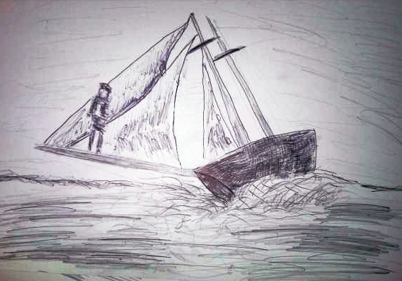
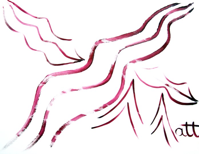
‘Me Want, We Want’ [4th/7th June 2019, version two] by Matt The Unfathomable Artist, blue ink pen on A3 light textured paper.

Poem by Matt The Unfathomable Artist entitled ‘Me Want, We Want’:

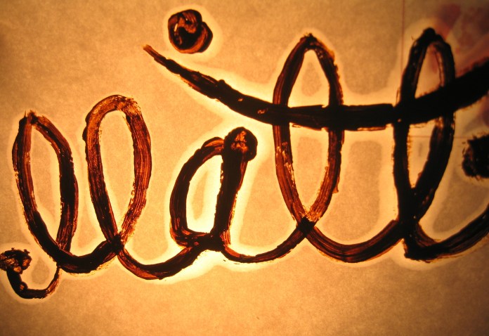
‘Me Want, We Want’ [19th March 2020, digital version in Elephant font] by Matt The Unfathomable Artist.

______________________________________________


‘Me Want, We Want’ [4th/7th June 2019, version one] by Matt The Unfathomable Artist, blue ink pen on A3 light textured paper.

Inspired by a safari photo taken of wildebeest in the Masai Mara by a friend who lives in South Africa.  The photograph was published online 4th June 2019.

Upon viewing the photo I created the first draft of my new original poem.  Completing the poem’s compositional structure within the first of two versions we now see here on the 7th June 2019.

In version two I feel I’ve encapsulated the idea of conservationist urgency.  A free flowing style of writing.

‘Me Want, We Want’ is intended pragmatically.  Decorum.  Constructive.  My interest particularly is to represent the voice of children, younger people, in writing form.  To appeal to children through my poem in sharing ecological ideas in a way that is easily readable to young art enthusiasts.

To speak about the Earth.  How the animals feel.  How we feel regarding habitat destruction, negative climate change and environmental pollution.

Clearly children and younger people generally feel strongly about what is happening with climate change in this world they’re growing up within.

It’s their world too.

Their now and their future.

Inspiring younger people positively is one of the greatest gifts in making art.

Standard

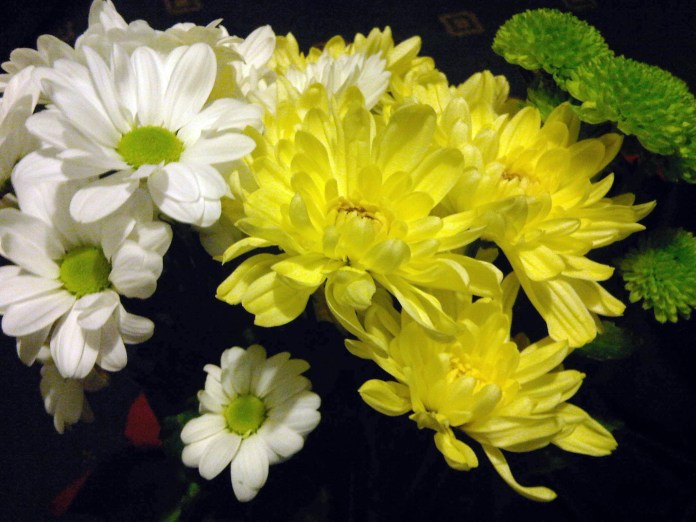
The Daisies [photograph 2013]

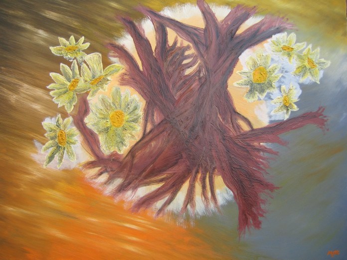
The Daisies [photograph 2013] providing inspiration for ‘Roots and Daisies’ [2013, Oil on canvas, 40ins x 30ins] by Matt The Unfathomable Artist.


‘Roots and Daisies’ [2013] by Matt The Unfathomable Artist, Oil on canvas, 40ins x 30ins.


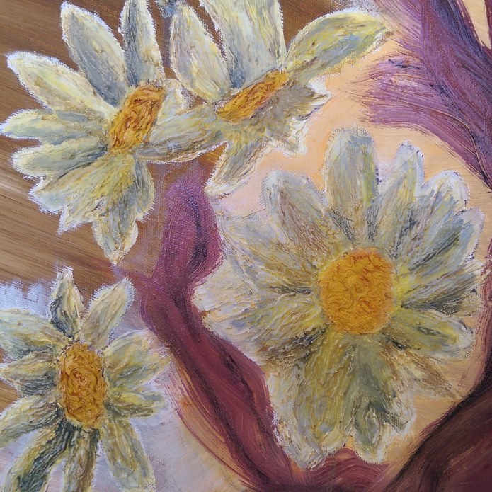
‘Roots and Daisies’ [2013] by Matt The Unfathomable Artist, detail of four Daisies with one Root amidst.


Standard

‘Creative Mind’ – oil on canvas

‘Creative Mind’ [completed Summer/Autumn 2012] by Matt The Unfathomable Artist, Oil on canvas, 36ins x 28ins.  Please note the lower right artist’s signature is not shown in this photograph.

Detailed photography [01] of ‘Creative Mind’ [completed Summer/Autumn 2012] by Matt The Unfathomable Artist, Oil on canvas, 36ins x 28ins.

Detailed photography [02] of ‘Creative Mind’ [completed Summer/Autumn 2012] by Matt The Unfathomable Artist, Oil on canvas, 36ins x 28ins.

Detailed photography [03] of ‘Creative Mind’ [completed Summer/Autumn 2012] by Matt The Unfathomable Artist, Oil on canvas, 36ins x 28ins.

Detailed photography [04] of ‘Creative Mind’ [completed Summer/Autumn 2012] by Matt The Unfathomable Artist, Oil on canvas, 36ins x 28ins.

Detailed photography [05] of ‘Creative Mind’ [completed Summer/Autumn 2012] by Matt The Unfathomable Artist, Oil on canvas, 36ins x 28ins.

I hope you love my oil painting artwork ‘Creative Mind’.

Thank you

Matt The Unfathomable Artist

Standard

Impassioned Kisses – Pop Art Oil Painting

‘Impassioned Kisses’ [completed August 2013] by Matt The Unfathomable Artist,
Oil on canvas, 36 inches x 28 inches.

Pop Art oil painting entitled ‘Impassioned Kisses’ completed August 2013.

‘Beautiful art lines are discovered and re-discovered like sand dunes and swan necks.’

by Matt The Unfathomable Artist

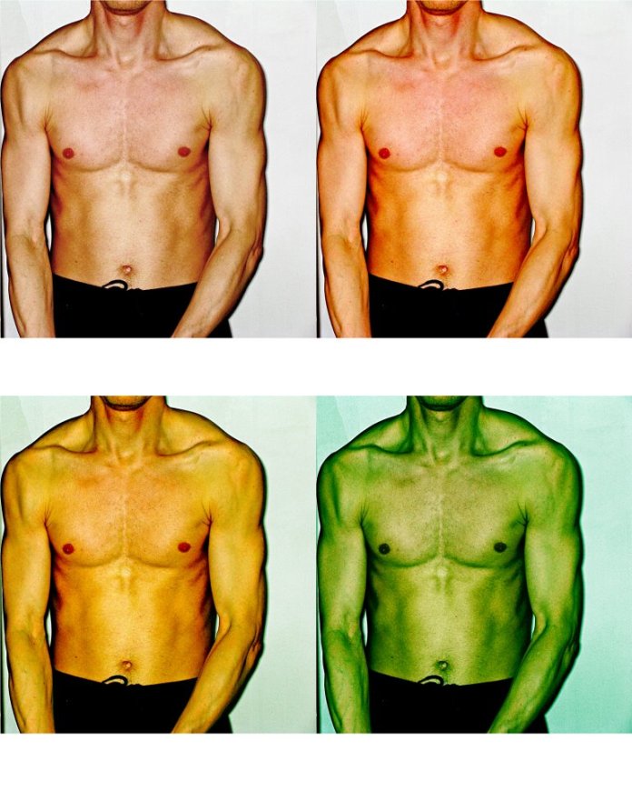
[Digitally edited photograph]

Standard

MeUI – brand logo expressed as digital identity

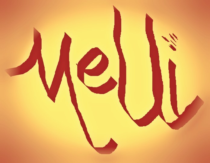
‘MeUI’ [2018] by Matt The Unfathomable Artist, Digitally designed brand logo graphic.

‘MeUI’ is a digital brand logo graphic expressing through abstract linguistic art the idea of unique personality, individual DNA and feeling.

Standard

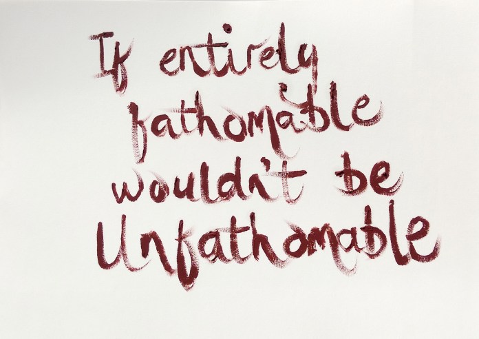
‘If Entirely Fathomable, Wouldn’t Be Unfathomable’

I have produced a series of Pop Art oil pieces on A3 light textured paper entitled ‘If Entirely Fathomable, Wouldn’t Be Unfathomable’.

Here is the Aquamarine version:

Pop Art ‘If Entirely Fathomable, Wouldn’t Be Unfathomable’ [Aquamarine, 25th April 2019] by Matt The Unfathomable Artist, Aquamarine oil paint writing on A3 light textured paper, signed ‘Matt’ on reverse. Digitally edited photograph. Original Saying created December 2018.

This is the Red Ochre #1 version:

Pop Art ‘If Entirely Fathomable, Wouldn’t Be Unfathomable’ [Red Ochre, 26th April 2019] by Matt The Unfathomable Artist, Red Ochre oil paint writing on A3 light textured paper, signed ‘Matt’ on reverse. Digitally edited photograph. Original Saying created December 2018.

.. and here is the Sap Green version:

Pop Art ‘If Entirely Fathomable, Wouldn’t Be Unfathomable’ [Sap Green, 26th April 2019] by Matt The Unfathomable Artist, Sap Green oil paint writing on A3 light textured paper, signed ‘Matt’ on reverse. Digitally edited photograph. Original Saying created December 2018.

The phantasmagorical concept emanating from this Pop Art ensemble is to mix artistic persona with fluent ecological conservation.  To help inspire the need for cultural, societal, economical and environmental change linked to our beautiful Earth planet.

I like the idea ‘If Entirely Fathomable, Wouldn’t Be Unfathomable’ carries within various layers of meaning.  For instance if someone says, we can’t solve this, it’s too difficult, it cannot be done, then we quizzically reply, ‘If Entirely Fathomable, Wouldn’t Be Unfathomable’.

To drive true change we need new behaviour to accomplish whatever is necessary, environmentally speaking.  Art can motivate, encourage, nurture, grow, develop and achieve unimaginably positive solutions we just didn’t think possible.

‘If Entirely Fathomable, Wouldn’t Be Unfathomable’.

Some have wondered at the random placing of words onto the A3 paper with regards to the use of ‘canvas’ space.  Aquamarine naturally aligned centrally.  Red Ochre (#1 of #2) shifted right, whilst Sap Green ascended higher textually than the preceding colour oil works.

Perhaps this is the result of pure chance, coincidence.  Or possibly preposterously we can read formulaic thinking into the letters.  After I completed the art pieces, super happily viewing them drying late evening, I couldn’t help notice the positioning of certain letters:

Y over O in ‘Aquamarine’,

Y intersects B in ‘Red Ochre #1’,

Y is a constant over MA in ‘Sap Green’.

T required calculation.

Likely astronomers, engineers and mathematicians can help explain the correlation to us.

Thank you for reading.

I hope you enjoy my Pop Art works.


Standard