Nāvigantis Explōrātiō

“Nāvigantis Explōrātiō” [10th ~2256hrs/ 11th ~0449hrs November 2024] by Matt The Unfathomable Artist, abstract acrylic painting on 100% pure cotton triple-gesso primed canvas board, 10 in x 12 in (25.4cm x 30.5cm), 4000 x 3340 pixels.

Before you read the background commentary for “Nāvigantis Explōrātiō” at the feet of this article I wanted to give further insight into the piece beyond details already published.

The Statue of Liberty is to New York, USA as the Eiffel Tower is to Paris, France.

Perspective changes things.

Once I brought the Magenta, Monochrome, Turquoise, Dark Blue, Yellow and original Red together..

.. I began to see imagery for the Statue of Liberty!

Had you noticed this in “Nāvigantis Explōrātiō” yourself?

If not, neither did I until making the collage.

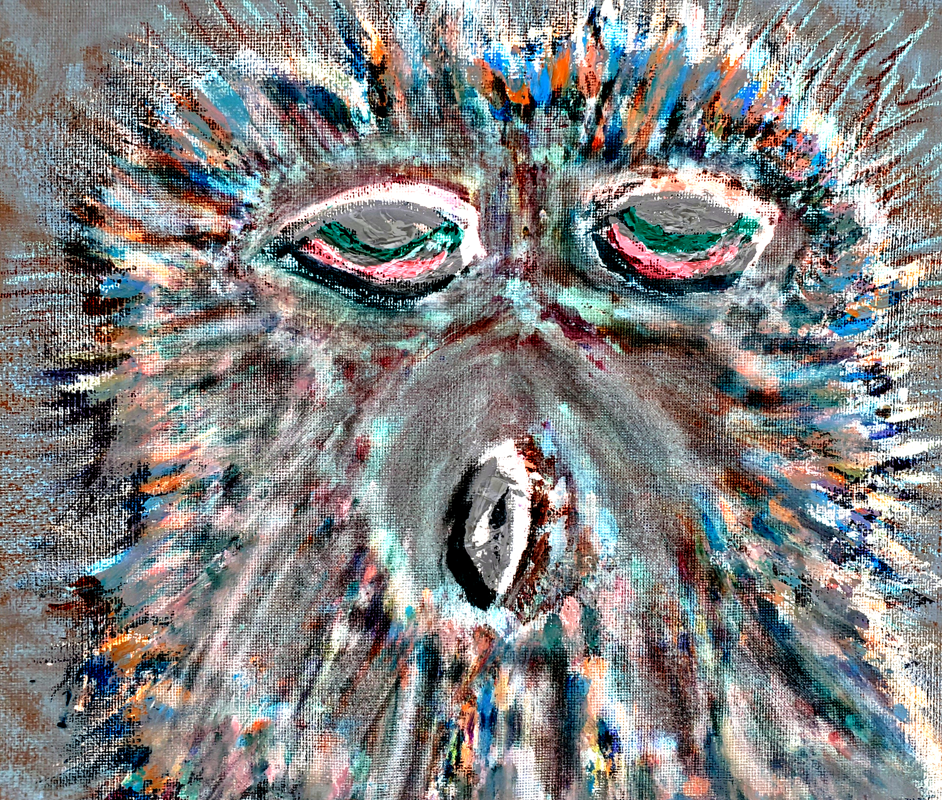
Unless I’m specifically making a portrait or wholescale unified piece I often focus on finite square inches of a canvas. Precisely where the brush or palette tool is being worked.

For me this artwork exemplifies my vivid exploration in textures and shapes.

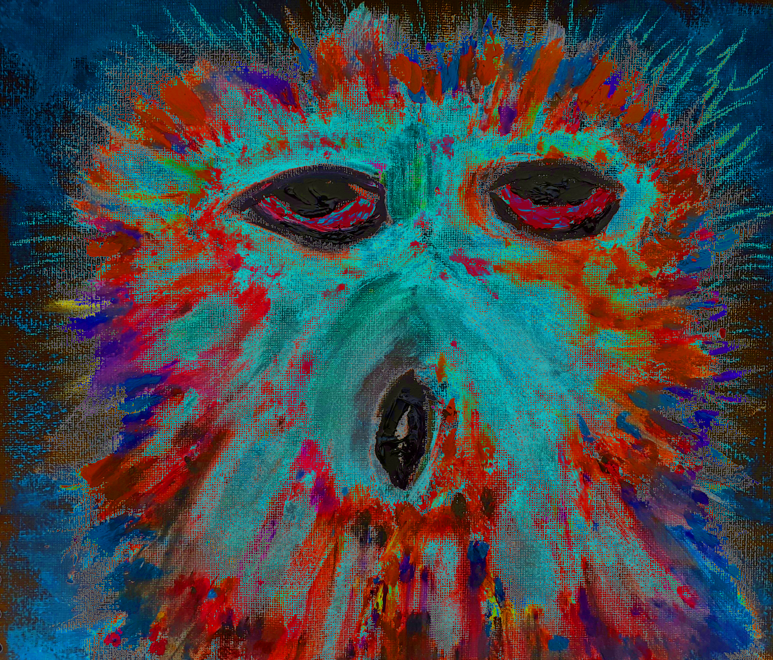
From the original acrylic I then made five differing tones and produced a pleasing 3×2 Collage from these digital pieces.

Here is the collage in pop art Andy Warhol style:

“Nāvigantis Explōrātiō – 3×2 Collage” [Digital Artwork, 12th November 2024] by Matt The Unfathomable Artist, Digital Artwork derived from abstract acrylic painting on 100% pure cotton triple-gesso primed canvas board, 10 in x 12 in (25.4cm x 30.5cm), 12000 x 6680 pixels.

“Nāvigantis Explōrātiō – 3×2 Collage” = AWESOME <heart eyes emoji> !

For beauty purposes let’s publish the individual digital colour/monochromatic works with my first thoughts describing each piece:

“Nāvigantis Explōrātiō – Magenta” [Digital Artwork, 12th November 2024] by Matt The Unfathomable Artist, 4000 x 3340 pixels.

“Nāvigantis Explōrātiō – Magenta” – Sensual, sensitive.

“Nāvigantis Explōrātiō – Monochrome” [Digital Artwork, 12th November 2024] by Matt The Unfathomable Artist, 4000 x 3340 pixels.

“Nāvigantis Explōrātiō – Monochrome” – Arctic, Antarctican cool.

“Nāvigantis Explōrātiō – Turquoise” [Digital Artwork, 12th November 2024] by Matt The Unfathomable Artist, 4000 x 3340 pixels.

“Nāvigantis Explōrātiō – Turquoise” – Turtles crawling to the sea.

“Nāvigantis Explōrātiō – Dark Blue” [Digital Artwork, 12th November 2024] by Matt The Unfathomable Artist, 4000 x 3340 pixels.

“Nāvigantis Explōrātiō – Dark Blue” – Power.

“Nāvigantis Explōrātiō – Yellow” [Digital Artwork, 12th November 2024] by Matt The Unfathomable Artist, 4000 x 3340 pixels.

“Nāvigantis Explōrātiō – Yellow” – Submarines and seals.

“Nāvigantis Explōrātiō – original Red” [Digital Artwork, 12th November 2024] by Matt The Unfathomable Artist, 4000 x 3340 pixels.

“Nāvigantis Explōrātiō – original Red” – Rockets ascending into space.

Quotation from social media published on 12th November 2024:

[ I made “Nāvigantis Explōrātiō” on the 10th November within about an hour just prior to 2256hrs. Then a quick finishing draft just prior to 0449hrs of 11th November – reason being I needed to overpaint the top left area of the canvas with the acrylic now being drier to do so.

I kept wondering afterwards why I shaped the abstract the way I did.

Anyway, later that day of the 11th November at 1809hrs (UK) I read an article online about NASA’s Voyager 2 including ‘an artist’s depiction’ of the flyby.

My painting appears somehow representative of this in an abstract style with Picasso canvas ideas to mind at the time. Of course, I had not yet seen this particular NASA imagery in the news article!

This is why I decided to title the artwork “Nāvigantis Explōrātiō” in honour of the coincidence.

What I had seen though is a photograph of a reusable space rocket in dazzling light with its umbilical structures whilst viewing social media sometime on the 10th.

The central area of the canvas is, in my opinion, a subconscious artistic symbolisation of the rocket, albeit in green. ]

Here is the wet paint photograph at 2256hrs on 10th November for you to enjoy textures:

“first draft wet paint – Nāvigantis Explōrātiō” [10th November 2024 at 2256hrs] by Matt The Unfathomable Artist, abstract acrylic painting on 100% pure cotton triple-gesso primed canvas board, 10 in x 12 in (25.4cm x 30.5cm), 5000 x 4155 pixels.

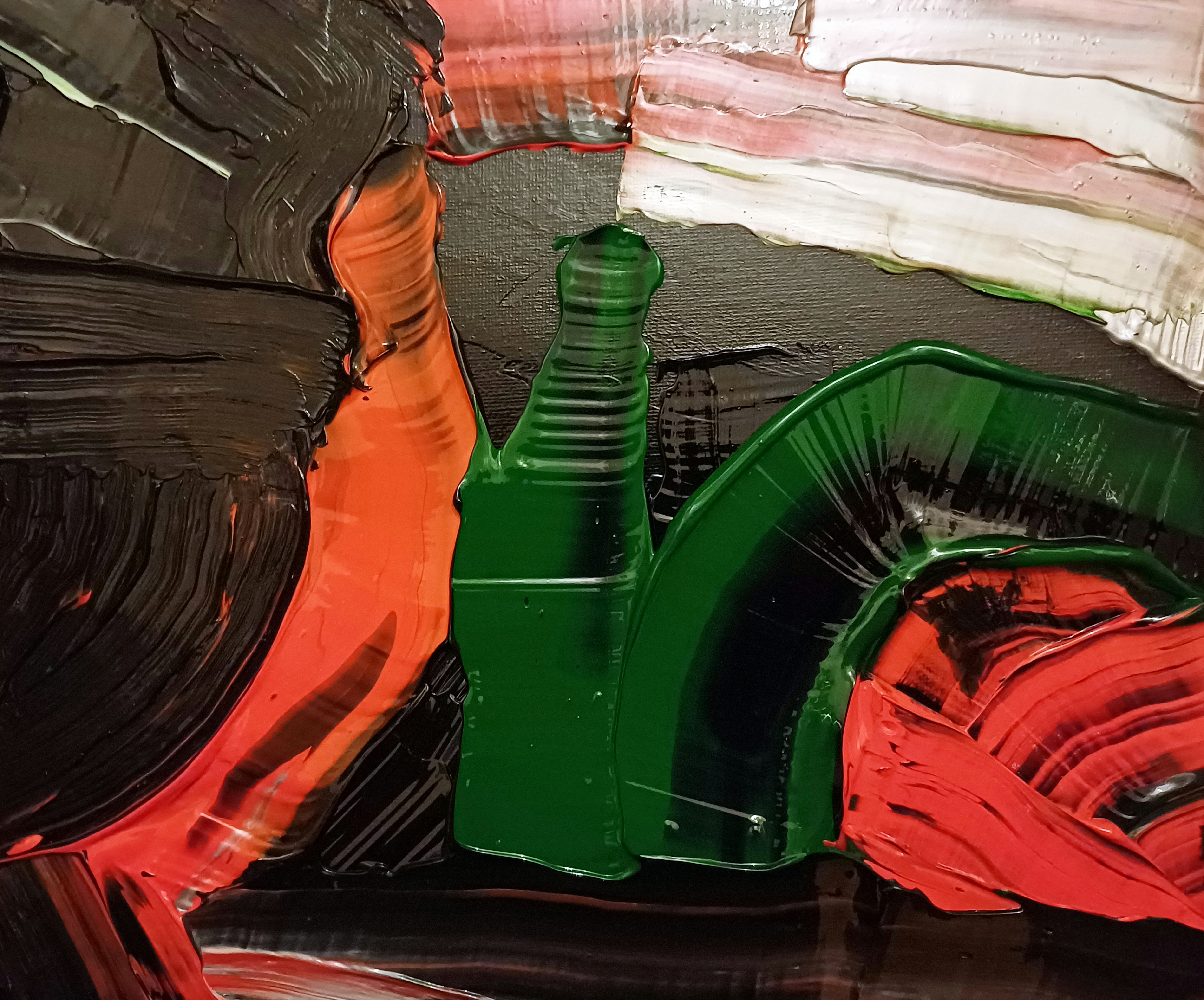
Please note colour balancing might vary upon your screen due to differing light conditions and wet paint at the time of photography. You can note the textured Mars Black overpainting I introduced at the top-left by comparing this 2256hrs wet paint photograph with the finissimo piece at the top of this article.

Very much Picasso influenced working style to my painting.

My singular linear palette motions add to the visual excitement.

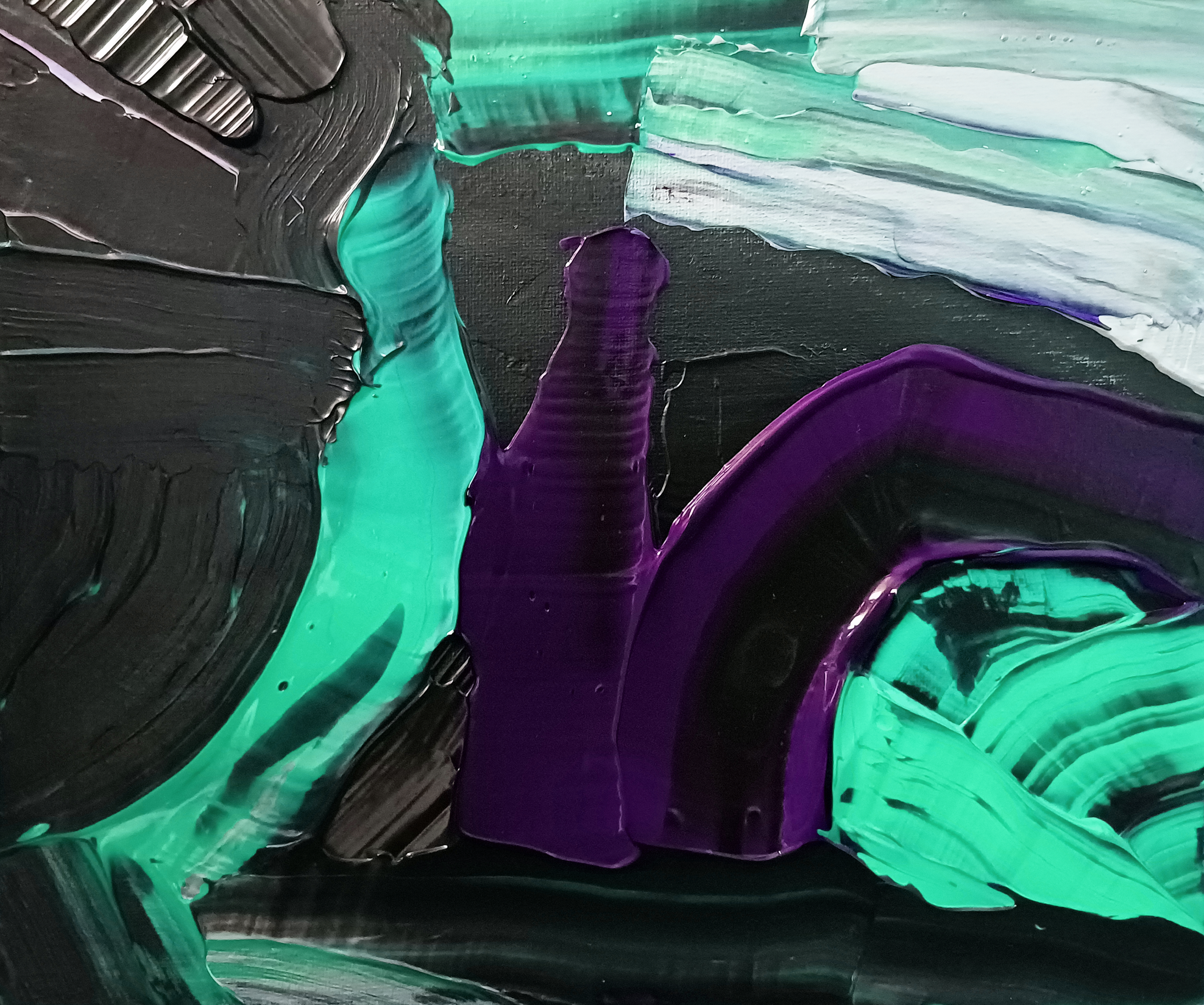
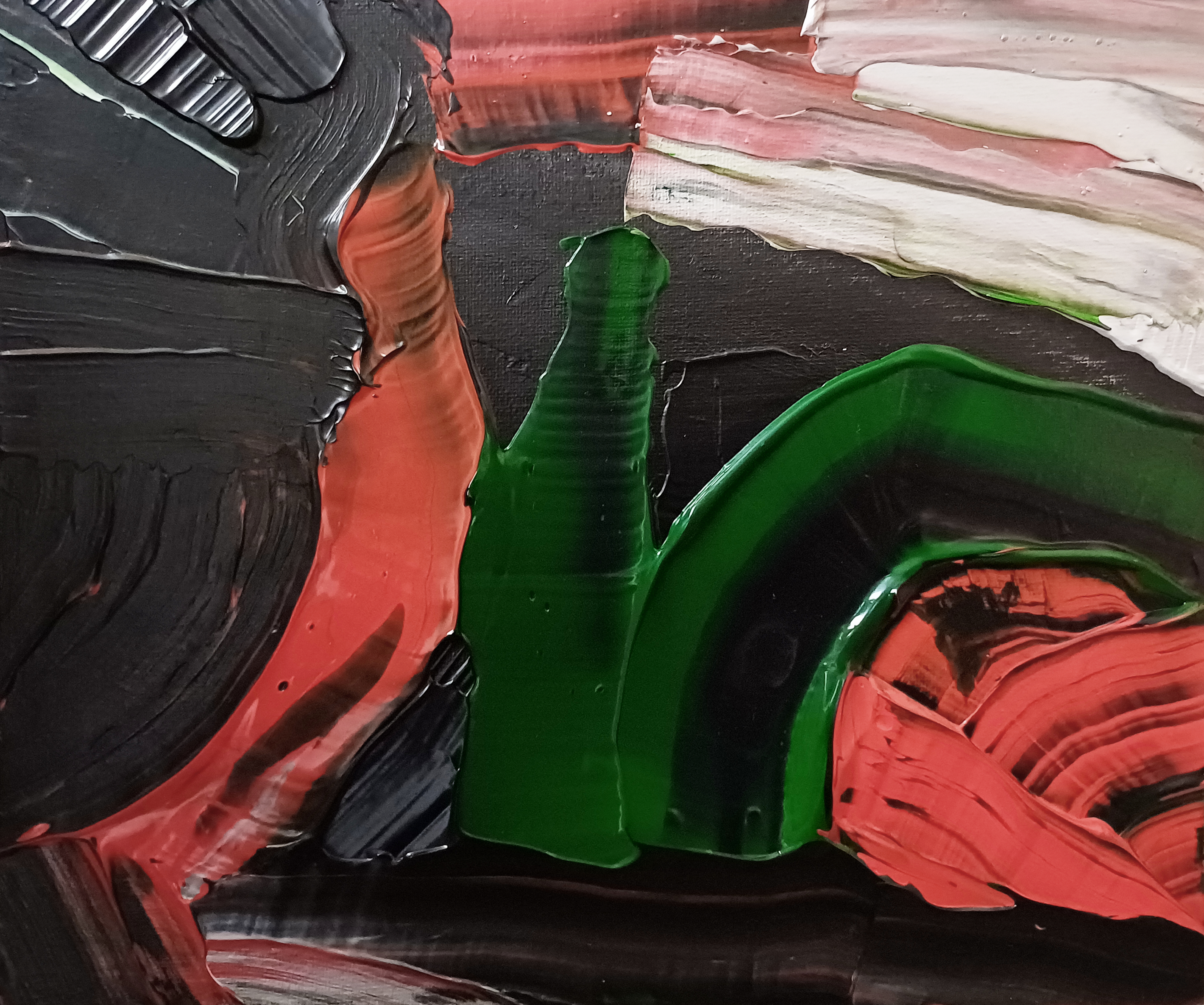
For fans of my art a bonus piece I love equal to the Turquoise version:

“Nāvigantis Explōrātiō – Lime Green” [Digital Artwork, 12th November 2024] by Matt The Unfathomable Artist, 4000 x 3340 pixels.

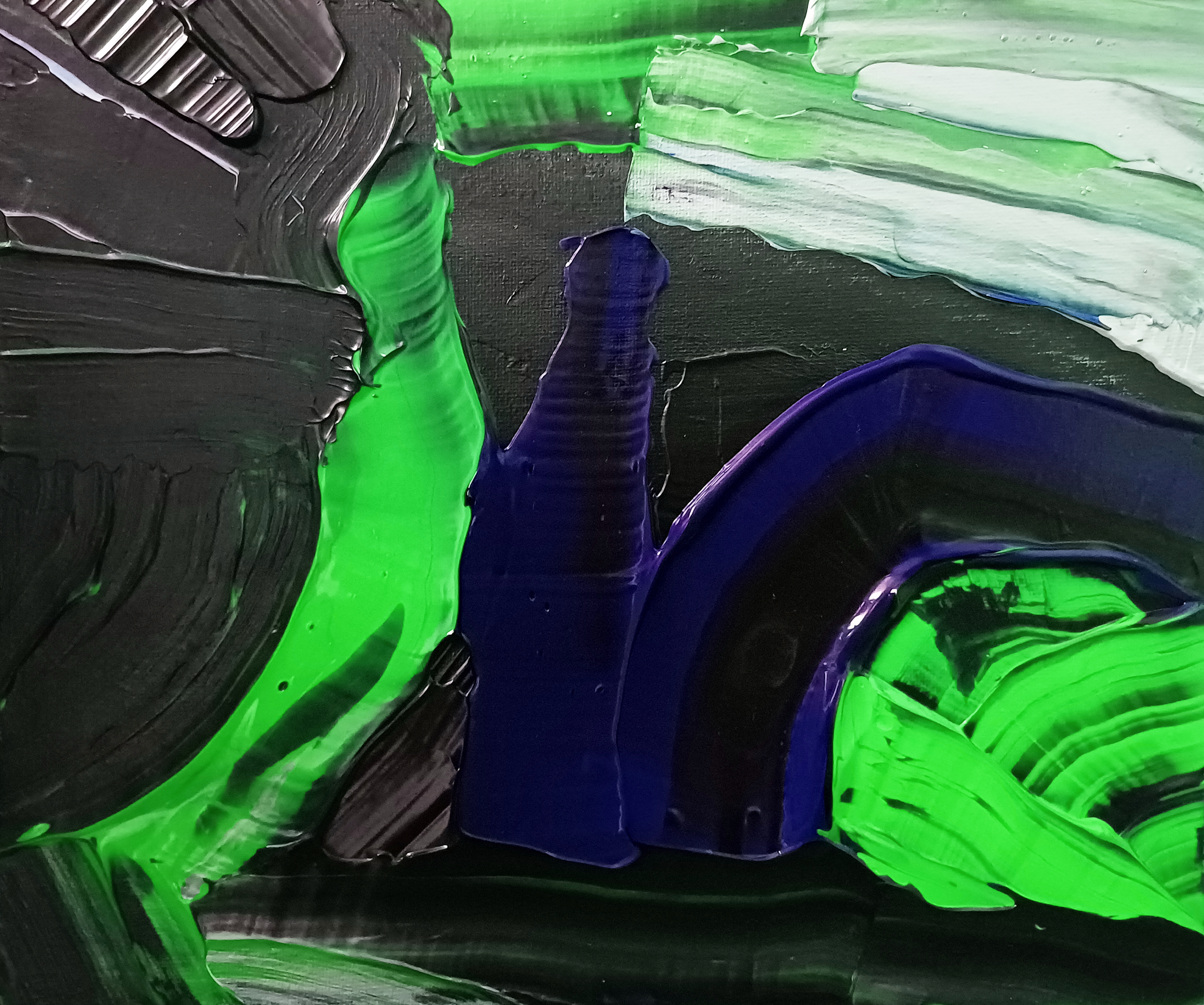
With the central-‘original Red’-grass-green, now aptly named rocket columns at the lower-right of my 3×2 Collage, Lime Green wanted to join its compatriots as a separate Digital Artwork.

Hope you have enjoyed my plethora of artistic ideas, some conscious, some subconscious.
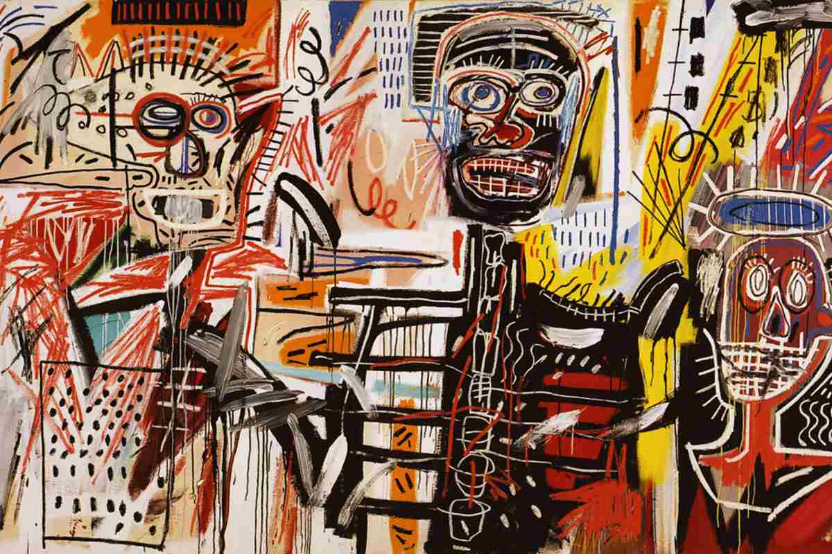
Standard

Robert C. Jackson

Robert C. Jackson
DON’T EVEN THINK ABOUT IT, 2023
Oil on Linen
40 x 30 in.
101.6 x 76.2 cm.

In my introducing to you the artist Robert C. Jackson I would like to say firstly that for further information about his career I provide a link at the end of this article. Please do take a look at his commissioned art process on the Robert C. Jackson website, linked below, as this is superbly interesting.

Here though I wish to talk about his art.

So let us begin.

DON’T EVEN THINK ABOUT IT” [2023] shown above is so funny. Hahaha, I love this. I want this piece to be honest!

It makes me laugh. Humour has featured in paintings overt and sophisticated, such as Jean-Honoré Fragonard’s “The Swing” of 1767, for millennia.

Robert C. Jackson is a Realist painter. Fine details are everything to Robert.

The yellow soda crates immediately provide focal interest. An indifferent expression on the toy gorilla adds intensity. The bananas look delicious, stacked for display. Marketing words hint at the whole title theme concept. Whilst I’m now also notably aware of writing in the pithy manner of Fleming.

Short sentences. Can draw. Attention.

The cooper-like barrel metalwork at the outer edge of the boxes speaks strength, creates definition. The gorilla shadow is prominent. Light to darkness casts along the floor, foreground to aft. Fonts are accurate, finite. BIG BOY BEVERAGES is turned upside down. It could have a meaning. Then again this is a feature Robert uses to make random, fun or juxtaposed interest within compositions.

Next artwork shown immediately below we have toy animals in parallel opposition, perhaps:

Robert C. Jackson
CATS AND DOGS, 2023
Oil on Linen
30 x 40 in.
76.2 x 101.6 cm.

I feel “CATS AND DOGS” is representing much more than cute toy pets. There is perhaps subtle messaging going on. Advice or words to live a good life? Childhood imagery of an age when play is the only thing to occupy our time? Dissipation? Mediation? The precipice of something?

You decide ultimately as the viewer. Everyone has their own opinion. Sometimes we agree, sometimes we agree to disagree. 

As with all pieces by Robert it is beautifully painted. The toys have real life. I often say my own drawings and paintings have life of their own once I’m happy to sign them. 

What packaging boxes, soda crates and items would you include in a Robert C. Jackson work?

Yes, lots going on intellectually with these works. The toys have personalities.

Boys and girls, ladies and gentlemen please sing with me the song of cats and dogs:

“Cat.. m-eow.

Dog.. t-ongue.

Eyes.. w-ide.

Raised.. cl-aaaaw.”

Haha. That made me laugh too. I’m sitting here loving the idea readers are cheerily singing away.

On that note we have the next artwork to talk about:

Robert C. Jackson
PEACEABLE KINGDOM, 2023
Oil on Linen
30 x 40 in.
76.2 x 101.6 cm.

PEACEABLE KINGDOM, 2023.. Dr. Nut hahahaha. Come on, is it my sense of humour or is this messaging absolutely hilarious. The lion is funny. The tiger is funny. Winnie the Pooh is always and forever funny.

I want this piece too! If I’m writing about an artist you can already know I greatly appreciate their work to that very extent. 

Technicalities, compositions, style, individual pieces and their personableness.

The mannequin here in the piece immediately above looks like C3PO of Stars Wars fame. ORANGE SQUEEZE. A-TREAT BEVERAGES. A sheep looking to camera. Fun. Fun. Fun.

We can enjoy viewing a multitude of impressive artists online through social media. I first got to see Robert’s work through his gallery representation at Gallery Henoch in New York [link to Robert C. Jackson artworks here: Gallery Henoch – Robert C. Jackson works.

Robert C. Jackson
GOOD COMPANY, 2023
Oil on Linen
28 x 72 in.
71.1 x 182.9 cm.

Balloon dogs were of course made famous by Jeff Koons. Earlier to this Andy Warhol created an art installation which featured air + helium filled Silver Clouds made as pillows in a room, floating above viewers near the ceiling.

The idea of balloon dogs and inflatables communicates the sense of fun and playfulness. Robert’s balloon dogs in GOOD COMPANY shown above are having a ball! Partying, eating, having a good ole chat reminiscing about ‘when they were a kid‘.

I did wheelies on my bike, played tig in torrential rain, got my string-connected mittens soaking wet throwing snow balls, knee deep. Climbed trees, all.. the.. honest to goodness time. Played everyone for themself one-v-one soccer. Rolled on the Malvern Hills. Rode a horse in the Welsh valleys. Threw exploding giant mushrooms. Read so many books I could not count. Watched Glen A. Larson shows on tele. 

Life is the starling that calls out for the grub.”

As promised here is the link to the website for you to enjoy of Robert C. Jackson.

Standard

“Angry Owl – #2”

“Angry Owl #2 – Original” by Matt The Unfathomable Artist, pastels, charcoal and acrylic on 10in x 12in canvas pad.

“Angry Owl #2 – Original” is probably a selfie on his smartphone.

“Angry Owl #2 – Digitised” [4th July 2023] by Matt The Unfathomable Artist, digital artwork.

“Angry Owl #2 – Digitised” found himself in computer circuitry.

“Angry Owl #2 – Black & White” [4th July 2023] by Matt The Unfathomable Artist, digital artwork.

“Angry Owl #2 – Black & White” walked onto the set of a 1920’s silent movie. Quickly he assumed this cunning mask to conceal his distinctive looks.

“Angry Owl #2 – Pixelated” [4th July 2023] by Matt The Unfathomable Artist, digital artwork.

Caught up by mistaken identity “Angry Owl #2 – Pixelated” found himself in a Police line-up. ‘Pixelated’ was his disguise so you wouldn’t recognise him.

“Angry Owl #2 – Solarised” [4th July 2023] by Matt The Unfathomable Artist, digital artwork.

As you can clearly see “Angry Owl #2 – Solarised” turned his face to the Sun. He wasn’t even on holiday at the time.

“Angry Owl #2 – Tracing Paper” [4th July 2023] by Matt The Unfathomable Artist, digital artwork.

A keen student of H.G. Wells The Invisible Man, “Angry Owl #2 – Tracing Paper” went to art class in high school to perfect blending into any surrounding. I think by now you would all agree he is quite brilliant at camouflage.

“Angry Owl #2 – Montage” [4th July 2023] by Matt The Unfathomable Artist, digital artwork.

“Angry Owl #2 – Montage” was released by secret services in order for the public to formally identify him, amidst all his aliases. We do not know where “Angry Owl #1” is either. Last information we have is that “Angry Owl #1” was placed into a refuse bin for no reason whatsoever.

To help identify “Angry Owl #1” here is the last known photograph:

“Angry Owl #1” [August 2010] by Matt The Unfathomable Artist, pastels on board.

Please do not attempt to approach “Angry Owl #1” or “Angry Owl #2” as they are able to horizontally rotate their necks at extreme angles. Also, they are absolutely lethal to harvest mice.

Special skills: Ability to listen to you under one foot of snow.. whilst hovering airborne!

If you find “Angry Owl #1” please contact Matt The Unfathomable Artist as he is willing to trade one of his best currently available sketches for the safe return of “Angry Owl #1”.

Thank you for your kind assistance.

Standard

Seismic Sound Wave Masterpieces

‘Twenty One Particular Seismic Waves’ [12th August 2020] by Matt The Unfathomable Artist, dip nib pen using original iron gall ink recipe on A3 [180 gsm] Artist’s paper.

Without your physically seeing these artworks it’s not easy for me to explain the quality I feel I’ve produced through my iron gall ink pieces.  I’m immensely delighted whenever I view these works myself.

Dip nib pen calligraphy with its magnificent arty fine lines is providing me with pUrE ArT HaPpINeSs.

Twenty One Particular Seismic Waves‘ [12th August 2020] is inspired by Andy Warhol’s iconic screenprinting Pop Art brand works.

Twenty one individual vertical seismic waves each with their own flavour of uniqueness, see above.

‘Five Vertical Three Horizontal Sound Waves #1’ [12th August 2020] by Matt The Unfathomable Artist, dip nib pen using original iron gall ink recipe on A3 [180 gsm] Artist’s paper.

A spirally kind of perfection in ‘Five Vertical Three Horizontal Sound Waves #1’ shown above.  The fifth vertical [from the left] is actually the first, as I worked the paper from right to left.  The lowest placed soundwave is first of the horizontal waves.  Varying pressure regularly upon the paper to create focal points of interest.

Speed of nib pen movement is fairly consistent throughout all eight of these soundwaves.

For this piece I made the lines especially wavy to replicate a green monochrome electronic oscillator display I’d seen my Dad working with decades ago.  He kept this overtly under the stairs for sometime.  I remember thinking many times it was such a cool piece of equipment.

I switched the confounded thing on every now and again purely for the joy of its perplexing display.  There are famous movies, books and television series having fed my incredible boyhood imagination regarding the potential pretend-play of this oscillator.

‘Triple Seismic Waves #5’ [May 2020] by Matt The Unfathomable Artist, dip nib pen using original iron gall ink recipe on A3 [180 gsm] Artist’s paper.

I produced ‘Triple Seismic Waves #5‘ a few months ago in May 2020.  Due to storing this to dry, I didn’t sign it at the time, whilst working on other pieces.  Going through my archive of artworks, upon its rediscovery I promptly signed it for its beauty this day of the 12th August 2020.

I love the noticeably rhythmic changes in seismic wavelengths across this piece.  In reproductive simile of seismographic lines I generally work the ink quite rapidly.  There is a pleasure all of its own for every artist working specific movements.

Standard

Andy Warhol Highlights Conservation.. TODAY.

‘Siberian Tiger from Endangered Species’ [1983] by Andy Warhol, Screenprint on Lenox Museum Board, 38″ x 38″.

Thirty four years ago as a distance of Earth time can be viewed quite differently depending upon your perspective.

In the universal scheme of things it’s a blip of light.  The prehistoric warming of our life-supporting planet helped our atmosphere to form.

Cup your hands together, place your hands over your mouth and breathe outwards.

A gaseous dome slowly appeared as a refractive curvature around the cooled Earth crust.  Physically speaking Time represents a slingshot, as far as one can understand its concept.

Whilst quantifying vast universal distances we are technically measuring things with a supermassive curved ruler.  If you threw measuring tape across a room to gauge its length you would land at a reasonable estimate.

Throw measuring tape to the outer universe and even with the best will in the world, very strange things are going to happen as regards Time and Relative Dimensions in Space.

Think of our sea with its known pathways and currents throughout its depths.

Then imagine the Universe with all its contained masses conveyed at varying speeds according to their ebb and flow.

Linearity becomes a distinct calculative problem.

‘Pine Barrens Tree Frog from Endangered Species’ [1983] by Andy Warhol, Screenprint on Lenox Museum Board, 38″ x 38″.

Amphibians are amongst the coolest of animals, particularly growing up, myself, as a child of learning.  Just as otters, honey badgers and dolphins are natural comedians.

Amphibians look kind of extraterrestrial in a mostly pleasant way.

Andy Warhol’s conservation screenprints, four of ten shown here, should be recognised as an artistic yardstick to amplify progress.

Propensity and discombobulation.

The ‘Pine Barrens Tree Frog from Endangered Species’ clings on, above.

‘African Elephant from Endangered Species’ [1983] by Andy Warhol, Screenprint on Lenox Museum Board, 38″ x 38″.

There can be no doubting that Andy Warhol is the King of Pop Art.

Shown above, ‘African Elephant from Endangered Species’ cleverly depicts a reduced landscape to emphasize scale.

‘San Francisco Silverspot from Endangered Species’ [1983] by Andy Warhol, Screenprint on Lenox Museum Board, 38″ x 38″.

Would not all things appear too monochromatic without the ‘San Francisco Silverspot from Endangered Species’ by the popular artist?

We can make art in order to transport us toward positive change and to affect.

“They Always Say Time Changes Things.  But You Have To Actually Change Them Yourself.” – Andy Warhol.

http://warholfoundation.org/

I think this article highlights that the power of truly heartfelt emotive art should never die.

Standard

John Singer Sargent – Portrait Art’s Everything

‘Carnation, Lily, Lily, Rose’ [1885] by John Singer Sargent, Oil on canvas, 68.5 in × 60.5 in

The title for the above painting by John Singer Sargent ‘Carnation, Lily, Lily, Rose’ is from the song called ‘The Wreath‘ by eighteenth-century operatic composer Joseph Mazzinghi.

The two girls are the daughters of Frederick Barnard an illustrator by profession.

Dolly aged eleven is to our left and Polly aged seven is standing in front of her to our right.  Sargent found inspiration to include Chinese lanterns whilst sighting them during an earlier boating expedition on the Thames with American artist Edwin Austin Abbey.

This en plein air technique literally influenced by Monet to John Singer Sargent was completed over countless sessions whilst visiting Broadway, Worcestershire, England – The Cotswolds.

I promise you would find a visit to the Cotswolds oh so very pretty just like these two adorable girls painted herewith.  Therewith or herewith – its almost like going back in time.

The house of these very gardens was then owned by yet another friend of Sargent’s – American painter, writer and sculptor Frank Millet.  Sadly he died in the sinking of the RMS Titanic in 1912.

A 2016 auction of the beautiful “Poppies – A Study Of Poppies for ‘Carnation, Lily, Lily, Rose'” sold for £6,858,000 USD at Sotheby’s.

The history, its painted subjects, the luminous mastery and intricate technical derivation would make the original ‘Carnation, Lily, Lily, Rose’ a grand prize for any serious Art Collector.

What do you like most yourself about this painting?

The trodden grasses?  The girls’ concentrated facial expressions?

Warm Chinese lanterns incandescently glowing amidst arty white lillies?

I particularly love that Barnard’s daughters are thoroughly engaged, individually, in an unspeaking togetherness.  A shared purpose to delight each other and themselves equally.

John Singer Sargent gifts us with this painting for the ages.

‘Robert Louis Stevenson and His Wife’ [August 1885] by John Singer Sargent, Oil on canvas, 20 1/2 x 24 1/2 in

Rock and roll baby!

I thought of The Beatles when I first saw the painting ‘Robert Louis Stevenson and His Wife’.  Sgt Pepper’s Lonely Hearts Club Band and more specifically George Harrison.

Stylistic lyrical geniuses.

Robert Louis Stevenson is super cool.  Sargent captures Robert’s inherent quirkiness, his restlessness of thought.  Creatives can, at times, exhibit this characterisation without being aware of their indifferent juxtaposition.

Art takes over the mind.  It becomes the working of the hands.  The pacing of the feet by sheer conscious will.

Interestingly his wife appears almost ghostly and distant in this full-bodied reddened portrait.  Stevenson looks as if he wants to ‘get away’ to his writing even as Sargent’s brush strokes are being formed.

The opened door and positioning of our protaganist might seem incidental.  However, would you have chosen this composition over all other possible scenic angulations?

We have to say ‘Eureka!’

John Singer Sargent is a true portrait artisan.  The Rubens of his generation.  Sargent is as accomplished at Impressionist works as he is portrait Realism.

‘The talk of the town’..  Sargent probably knew someone’s ‘ears were burning’.

‘Miss Elsie Palmer’ [1889-90] by John Singer Sargent, Oil on canvas, 75 1/8 x 45 1/8 in

I found the pose of ‘Miss Elsie Palmer’ quaint and disciplined.  A pragmatic solution to posing for great lengths of time.  Her hair natural and the clothing fabrics a multitude of folding criss-crossing layers.

Miss Elsie Palmer’s eyes look rather mournful here.  This is a professional portrait revealing a practically perfect young lady in every way.  Modest and likeable.  Sargent’s use of light and dark is exemplary as expected.  Mood is, as Warhol commented in his own way, where Sargent’s genius shines.

Looking through his vast body of work is hugely pleasurable for any art lover.  Blending of interactive foreground and background details.  His unique artistic quality incorporated from canvas to canvas.

Quite remarkable.

‘Lawrence Alexander “Peter” Harrison’ [c1905] by John Singer Sargent, Watercolor on paper, 50.16 x 33.02 cm

Immediately above is a relaxed Impressionist portrait of the artist ‘Lawrence Alexander “Peter” Harrison’ by his close friend John Singer Sargent.

Immediately pictured below please take a look at Sargent’s fellow artist Giovanni Boldini‘s (1845 -1931) likewise expert rendition ‘Portrait of the Artist Lawrence Alexander “Peter” Harrison’:

‘Portrait of Lawrence Alexander “Peter” Harrison’ [1902] by Giovanni Boldini,
Oil on canvas, 49 5/8 by 39 3/4 in

Boldini’s portrait is regal and dignifying in its own exquisite artistic right.

Whilst Sargent’s portrait clearly demonstrates his extreme skill at Impressionism.  The sense of body and movement in both artworks is outstanding.  Please remember that Sargent is strongly regarded as the epitome of classical high society portraiture.  True it is too.

Yet he is also very brave artistically with his career.

Impressionist works.  Perfected landscapes.  Architectural masterclasses.  Ordinary peoples, time-indefinitely painted during his various travels.

John Singer Sargent – Art at Everything.

Standard

Kieron After Claude

“Cattle Walking At St Benet’s” [2015] by Kieron Williamson, Oil on canvas, 16ins x 22ins.

Having viewed John David Ratajkowski’s beautifully charming ‘Cow Tuesday’ art pieces online I thought it would be interesting for me to include “Cattle Walking At St Benet’s” by prodigious child artist Kieron Williamson.

Artists incorporate a unique personality and stylistic signature to their artworks.  Art experts know a John Ratajkowski artwork from a Kieron Williamson, a Basquiat from an Andy Warhol.

All masterful artists in their own right.

Where do I begin writing about an artist whom at six years of age was already exciting prospective buyers into making sealed bids for his artwork?

His lifetime earnings have exceeded £2.5 million.. and Kieron is still only 14 years old!

‘I guess’, said the movie veteran, that when you make a child genius we should always appreciate that their early talents have also likely been nurtured from a very young age.  Even so, they are undoubtedly born this way.

Like Justin Bieber musically.. and beyond.

“Cattle Walking At St Benet’s” is glorious.  Cows have that remarkable quality of looking at us pensively.  They’re immensely trusting.  Chewing the cud they couldn’t care less what was going on in another field, sheep grazing by their side.

Kieron’s artwork above captures the layperson’s idea of cows.  Aloof, awkwardly thoughtful and at great efforts in movement at everything until perhaps the Farmer calls.  That’s how I see it.

Then again, I breathe art every single day of my life.  Kieron and John too.

“Dramatic Sunset” [2009] by Kieron Williamson, Pastel from his 2nd Exhibition, 14 ins x 10 ins.

Immediately above is an astoundingly mature artwork by Kieron Williamson when he was just seven years old.  I encourage you to look online to see his people-in-rural-landscapes work.

This sunset pastel is one of my favourite sky scene artworks, ever.  I’m trying to bring forward words to describe here what I’m seeing.  Artists study artists and none more so than lifelong famed British artist David Hockney.

Therefore I can say that this sunset pastel has become ‘pools and portraits’ to the art world in my opinion.  KRW Esq, if you will.

“Distant Cattle” [2014] by Kieron Williamson, Oil on board, 10 ins x 14 ins.

The above artwork “Distant Cattle” contains intense drama.  The wind could be roaring any moment soon.  Those approaching clouds might loom as a thunderous downpour.  This painting is about our relationship with the environment.  How it makes us feel.

‘Urgency mixed with the oils of imperturbability’. 

Thanks Kieron, I’ve hyphenated this new saying as it sounded, dare I say of classic landscape art, inspirationally cool.

JMW Turner’s are cool.  And Hockney too.

Imperturbability, he said.  Oh how this most unusual word somehow reminds me of Roald Dahl and all his wonderful children’s books.

“London Monotone Figure” [2013] by Kieron Williamson, Oil on board, 10 ins x 14 ins.

I continued to sit back in my chair whilst I first viewed “London Monotone Figure” on Kieron’s website:

http://www.kieronwilliamson.com

Anyone familiar with my photography will probably understand why for interconnective reasons:

“The Snow Walker” [photographed 6th January 2010, 1635hrs] by Matt The Unfathomable Artist,.  Unknown man walking near and to my hometown local lake.

Interconnective reasons of Imagination and Reality.

You see, at around 9 years of age I was by my own personal request gifted with a children’s book about spycraft.  It was for Christmas that year I think.

Can I please imagine that the solitary figure in Kieron’s painting is a spy vanishing into London’s misty void? Okay, he might be an old man.. in disguise?  Or a blind man tapping his way along the murky pathway?  Kieron’s painting allows artistic licence for our imagination.

Which brings me to my next interconnective thought..

..The 1927 film ‘Metropolis’ by Fritz Lang was my Dad’s favourite movie.  He owned the complete film on video.

The full movie is itself a work of art, inspirational even to this day.  I’ve no doubt my Dad saw a simile of his own mother and father in the film.  Yes a good likeness of character, a simile of my Gran and Grandad.  I’m absolutely certain of this.

M and the spy movie genre began to find its place in film art history.

“London Monotone Figure” is also a superior artwork.  Its simplicity and complexity.  A bluish-grey gun metal palette.  Mysterious, Spooky, Ghostly.  Absolutely charming, characterful and inventive of Kieron’s design.

Kieron Williamson is producing masterpieces in a consistent manner with the dexterity of past greats such as Carlos de Haes.

Here’s to a superb “Family Gathering” as we check the “View From A Window” at “Day’s End, Norfolk” just wishing for the “Blakeney Sunrise” to arrive.

Standard

Sound Waves Art

My Wild Big Cat Sound Wave Vocalisation & Artwork number 1 drawn on A4 paper using blue ink pen - June 7th 2016 by Matt The Unfathomable Artist
“My Wild Big Cat Sound Wave Vocalisation & Artwork [number 1]” drawn on A4 paper using blue ink pen – June 7th 2016 by Matt The Unfathomable Artist

‘My Wild Big Cat Sound Wave Vocalisation; Artwork [number 1]’ drawn on A4 paper using blue ink pen – June 7th 2016 by Matt The Unfathomable Artist

You may already know I love writing song lyrics and composing melodies. Yes, even singing too.

So it should be no surprise really that I enjoy any art form that might be musically inclusive. Whilst producing my ‘Seismic Waves’ series of artworks I wondered how I might represent sound waves. In order to replicate sound waves in digital on-screen format I changed the point accentuations jaggedly.

Which.. (or is that wice?) nicely brings me to seeing a curious bird that went calling in all directions on the treetop at my local lake. Literally chirping at 90 degrees (not like Joe 90 of the television series) and swiftly shifting its petite form clockwise then chirping again quite loudly. Four times it did this through 360 degrees and repeated the process all again.

I’m quite sure that this proud little bird would make a very beautiful sound wave artwork. The artwork shown immediately below was a pure contrivance. No doubt this sound wave would make a good noise of sorts if processed through digital software.

Soundwaves number 1 on A4 paper using blue ink pen - June 6th 2016 by Matt The Unfathomable Artist
“Soundwaves [number 1]” on A4 paper using blue ink pen – June 6th 2016 by Matt The Unfathomable Artist.

‘Soundwaves [number 1]’ on A4 paper using blue ink pen – June 6th 2016 by Matt The Unfathomable Artist.

Following on from ‘Soundwaves [number 1] and ‘Seismic Waves’ I thought to myself that it would be exciting to record a soundwave then replicate the visual representation of vocals with an artistic impression.

I chose to create a wild big cat vocal as this has many ideas behind the concept of my first sound/drawn choice. Yes, I appreciate I could have chosen ‘Hello, my name is Matt.’ However the former vocal would be interesting both audibly and visually with its change of tone and pitch peaks. It required some practice. So I personally vocalised for about 5 minutes, making various wild cat sounds before recording.

Here is the recording:

https://drive.google.com/file/d/0B_1g4lrULQoBcXJzN1A1RTdRUEU/view?usp=drivesdk

I strongly recommend Low Hertz Bass Capable Headphones whilst listening to this recording.

Probably not so useful if you’re watching the film ‘On Her Majesty’s Secret Service’ (1969).

"My Wild Big Cat Sound Wave Vocalisation & Artwork [number 1]" drawn on A4 paper using blue ink pen - June 7th 2016 by Matt The Unfathomable Artist
“My Wild Big Cat Sound Wave Vocalisation & Artwork [number 1]” drawn on A4 paper using blue ink pen – June 7th 2016 by Matt The Unfathomable Artist

A closer look at my ‘wild cat vocal’ ink on A4 paper artwork is shown here:

‘My Wild Big Cat Sound Wave Vocalisation & Artwork [number 1]’ on A4 paper using blue ink pen – June 7th 2016 by Matt The Unfathomable Artist

Perhaps some fine art collectors will raise their eyebrows. Perhaps not. I respectfully appreciate their professional opinion. Basquiat and Warhol is obviously fine art.

It’s definitely worth noting, oops no mistaking the wordplay there, that this sketch artwork immediately above was replicated on the first attempt whilst actually looking at the sound wave.

That said, are the seemingly crazed sounds of a man impersonating wild cats and producing drawings from his vocals fine art? I don’t think it will take 50 years to know the answer. Everyone has their own opinion – I respectfully appreciate this too.

Dali, Picasso, Frida Kahlo and even Jackson Pollock were and are all considered eccentric. Basquiat often listened to music as he felt this helped his artistic ingenuity. Normal behaviour mixed with their extraordinary creativity.

Warhol worked with extreme efficiency of artistic method. Some fashion photographers prefer the freedom of taking hundreds of photographs during a shoot. Some limit themselves to no more than 50 shots or less.

Different working methods. New and reinvigorated ways to create art. Art that inspires people for generations.

I would like to produce a ‘Seismic Wave’ artwork in oil paint on canvas from an actual earthquake (see previous blog article for further details). I also wish to create further ‘Sound Wave’ art impressions from real life recordings.

It got me to thinking. Can you imagine how beautiful…

That’s one small step for [a] man, one giant leap for mankind.’
… would look like in a sound wave artwork? If anyone knows of such an ink or oil painted artwork please do let me know.

INCREDIBLE.

Standard

Banksy Is The Street Art Master.

'Keep Off Our Worms' - Banksy original graffiti artwork

‘Keep Off Our Worms’ (2014) – Banksy original spray paint artwork

In 2014 this original artwork, pictured above, appeared on a wall in Clacton-On-Sea, Essex, England one week prior to a UK Parliamentary by-election.

I see five grey looking pigeons and a bright-looking bird suspended upon a single ‘tight-rope’ perch.

What do you see?


'Laugh Now But One Day We'll Be in Charge' (2002) by Banksy - spray paint on canvas - 12in x 12in

‘Laugh Now, But One Day We’ll Be in Charge’ (2002) by Banksy – spray paint on canvas – 12in x 12in

I see a definitive quotation.  A statement referenced with a placard or a pinafore.

Is ‘Laugh Now, But One Day We’ll Be In Charge’, above, explaining animalistic human traits?  The fight for resources?  Or greed?

Should we imagine that brute force will gain authority over intellect?  Perhaps it touches upon equality, working conditions and slave labour?  How about the evolving cycle of Man vs Woman?  I’m not trying to provide a dominant argument here.

The beauty of a great artwork is personal opinion.  Provocation for thought and emotion.

The most recognisable street artist of our generation, Banksy, certainly makes international headlines time and again!  The exclamation felt quite natural to include.  ‘Read all about it, read all about it – Banksy has sprayed our walls and doors!’

People show strong appreciation when they know they are being loved.  Ideas challenged.  Behaviour scrutinised.

I personally chose the artwork images to display in this blog article.  Each original artwork has already been represented with worldwide coverage throughout the popular press.  Banksy creates street art that speaks influence and popularity.


'This'll Look Nice When It's Framed' by Banksy (2010, San Francisco)

‘This’ll Look Nice When It’s Framed’ by Banksy (2010, San Francisco, USA)

The above artwork – all photographs taken from the Banksy Website – appeared in the Mission District at Valencia and 20th Street, San Francisco, California, USA.

The artwork pensively references the historical viewpoint of ‘on-the-wall’ art pieces.


'Mobile Lovers' (2014) by Banksy

‘Mobile Lovers’ (2014) by Banksy

This depiction of a warm embrace, as pictured above, appeared on a doorway next to the Broad Plain Working With Young People club in April 2014.  It first sold for £403,000, which is a staggering price for any living artist to achieve.

With ‘Mobile Lovers’ Banksy is highlighting the disconcerting divide caused by our growing technological dependence offset against personable human interactions.  If unchecked this is a serious pandemic that is ‘sneaking up behind’ the human race in a multitude of ways.

It’s not difficult to observe people engrossed in their social media pages during get-togethers.  How can connecting be disconnecting at the same time?  What are the long-term effects?

Banksy uses his art and global appeal to help address this problem with a beautiful message.  Satirical and empathic, especially the choice of location – a youth centre.  A new technologically adept generation coming through.

Can modern relationships survive this technological minefield?

Much more than that, great artworks reverberate.  Their intrinsic value increases monetarily and intellectually from generation to generation.

Banksy is inspiring visionaries, a new stream of artists and The Public with his own carefully crafted style.  Challenging hard-line views with humour, stark remonstrations and perfectly executed art concepts.

Banksy is the ‘street art’ cool Andy Warhol of the people.

And we all know that there “Ain’t nobody cooler than that.” an artist said.

Standard

Empathic Depictions by Jean-Michel Basquiat

Untitled known as 'Two Heads on Gold', 1982. Acrylic and oil paintstick on canvas [80 × 125 in 203.2 × 317.5 cm]

Untitled ‘Two Heads on Gold’, 1982 by Jean-Michel Basquiat
Acrylic and oil paintstick on canvas
80 × 125 in- 203.2 × 317.5 cm

Today I finished watching the latter half of a docu-movie entitled Jean-Michel Basquiat: The Radiant Child.

Let me please ramp up some intellectual thoughts for your consideration.  Ok, well up until several weeks ago I didn’t know that Charles Bird King’s father was killed by a native American.  This would not be poignantly significant except that Charles Bird King is almost singularly remembered as one of the greatest historical portrait artists of native American culture in a truly positive light.  Dignifying the perspective of native Americans in his day and beyond to our time.

The question to ask from this docu-movie in my opinion is – How did Basquiat die at 27 years of age?  Obviously his lifestyle choice was conducive to this.  He was sucked up into a decadent torrent, seemingly casting himself off in an instant.

Can anyone here expect to cast a pebble into the sea only to find that same pebble rise to the surface of the waters and roll back towards you?  What you actually do is skim the pebble upon the surface many times to see it skipping along the smoothness of waves.

I’m deeply moved by this film because I see almost precisely the same sensitivity and fragility that Van Gogh no doubt possessed during his own lifetime.  37 years and 27 years is merely glancing at the surface of what life has to offer.

At this point I would mention that perhaps watching Pina (preferably in 3D) by Wim Wenders is also a strongly emotive film experience.  That is, if you would like to tap into your deep inner sensibilities for an hour or two.  Personally speaking I do sincerely become immersed in a range of emotions during these arty indulgences.

Back on track to Jean-Michel Basquiat.  Firstly a superior artist to any reference of what we might consider good or acceptable art in quality.  His drawing in a child-like manner explains how he felt as a person in this highly competitive commercial world.  Cartoonistic, raw and excitable in style.  Abrupt, often complex and bold.  Stark and beautifully complimentary.  Largely attractive colour contrasted arrangements.

Philistines – 1982. Acrylic, crayon on canvas, 183 x 312.5cm.

Philistines – 1982 by Jean-Michel Basquiat
Acrylic, crayon on canvas, 183 x 312.5cm

Is Jean-Michel Basquiat explaining some of his own life experiences in his painting above?  I would strongly accept this hypothesis.

Bird on Money, 1981 by Jean-Michel Basquiat. Acrylic, crayon on canvas - 167.5 x 228.5cm

Bird on Money, 1981 by Jean-Michel Basquiat.
Acrylic, crayon on canvas – 167.5 x 228.5cm

Come on surely we would all like to own a Basquiat?  Colourful and interesting doesn’t even begin to describe a Basquiat.  His influence in artists like Banksy is almost a given.  Basquiat clearly dignifies many artists within his paintings so I think its posthumous reward his art is still living and breathing today.  Speaking street and high brow intellectualism as one.

Del Monte, c1984-1985 by Jean-Michel Basquiat and Andy Warhol. Synthetic polymer paint & silkscreen ink on canvas. 76 x 88 in. (193 x 223.5 cm)

Del Monte, c1984-1985 by Jean-Michel Basquiat and Andy Warhol
Synthetic polymer paint & silkscreen ink on canvas
76 x 88 in. (193 x 223.5 cm)

I’ve included this latter painting above to add controversy to the whole art valuation debate.  What is a piece of art worth?  This painting sold for $1,082,500.  Unusually Jean-Michel Basquiat chose not to use visible words or letters in this artwork.  The branding work is synonymous with Andy Warhol’s style.  An art collector would pay this sum purely based on the strong friendship that Andy Warhol and Jean-Michel Basquiat had or perhaps because JMB is a genius for unspoken commentary?

Art is each their own personal feeling.  But I tell you something, when I saw the slave ship briefly referenced in one of Jean-Michel Basquiat’s paintings during the docu-movie aforementioned, well, sometimes it takes time to see what an artist is saying or feeling on many levels.

Personally I think this is Basquiat referencing his savvy worldly acumen and woefully addictive tendencies with honest sentimentality.  I would be surprised if the brilliance of his style does not find influence in my own future artworks ‘through a new mind’ in some way.  I certainly hope so because I loved the man himself.  A great pity he is no longer with us as a person and masterful artist.

Standard