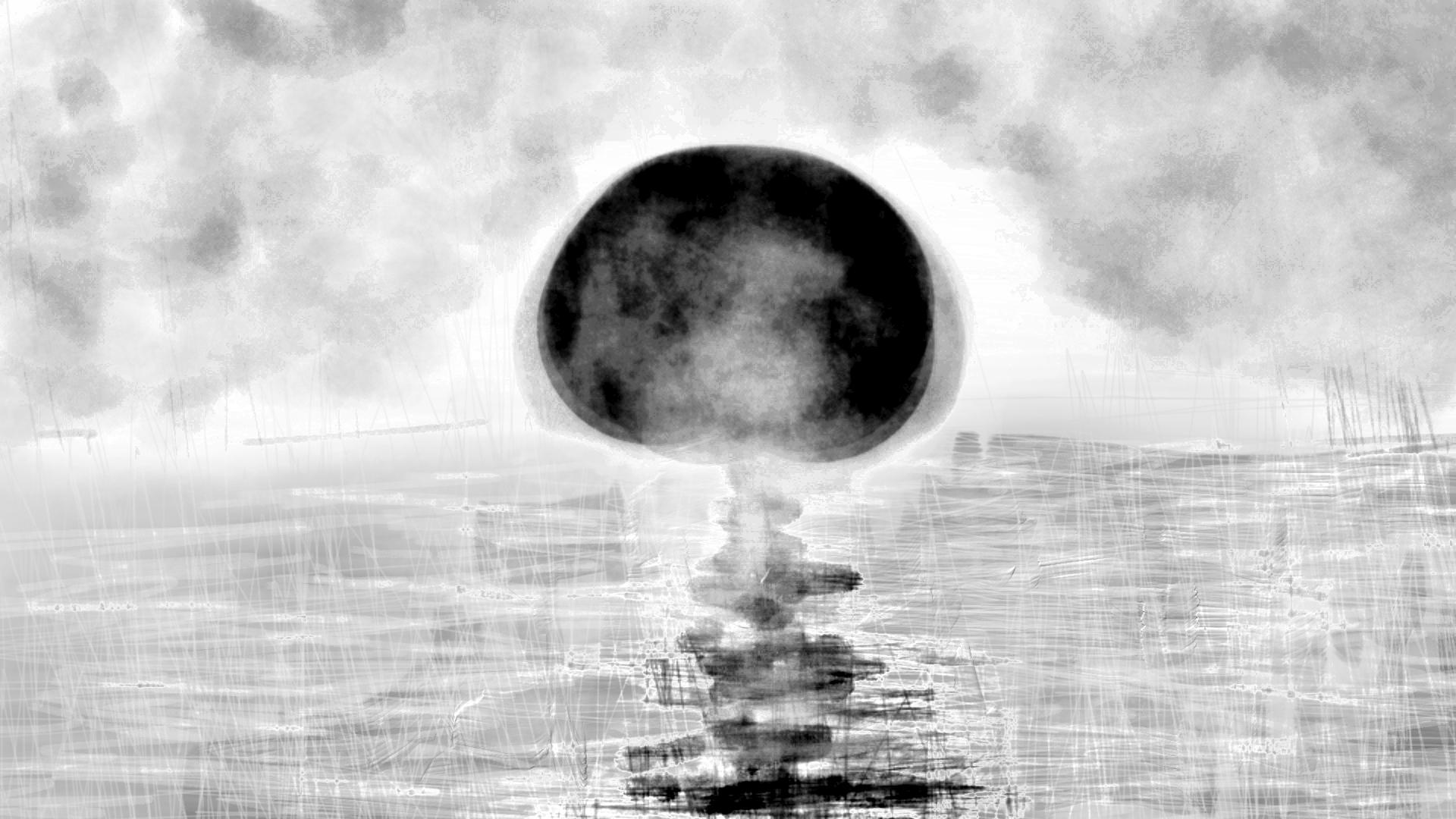
“Drip Paintings #1 Original Wet Digital Edition” [27th February 2024] by Matt The Unfathomable Artist, acrylic drip painting with minimal white brushstrokes on A3 250g mixed media paper, digitally balanced 3000 x 2129 pixels image.
This highly original drip painting artwork, shown immediately above, took me less than an hour before eating my quiche at teatime. I made three digital versions including this original piece.
As I write this blog article the painting is still very wet as can be seen from the photography for the canvas. It is made on canvas paper with leftover paint scrawlings from making an earlier artwork.
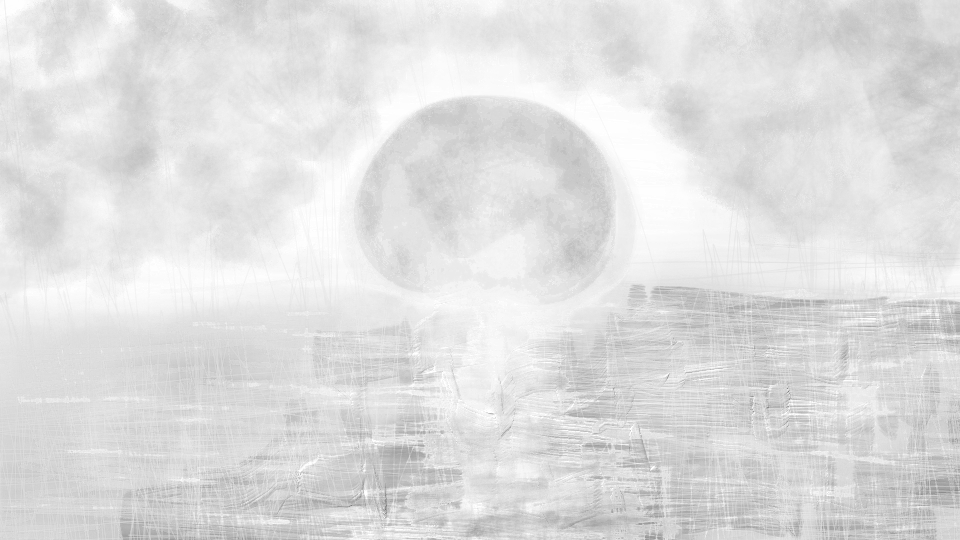
“Drip Paintings #1 Monochrome Wet Edition” [27th February 2024] by Matt The Unfathomable Artist, acrylic drip painting with minimal brushstrokes on A3 250g mixed media paper, digitally balanced 3000 x 2129 pixels image.
Black and white, noir, monochrome.. always cool.
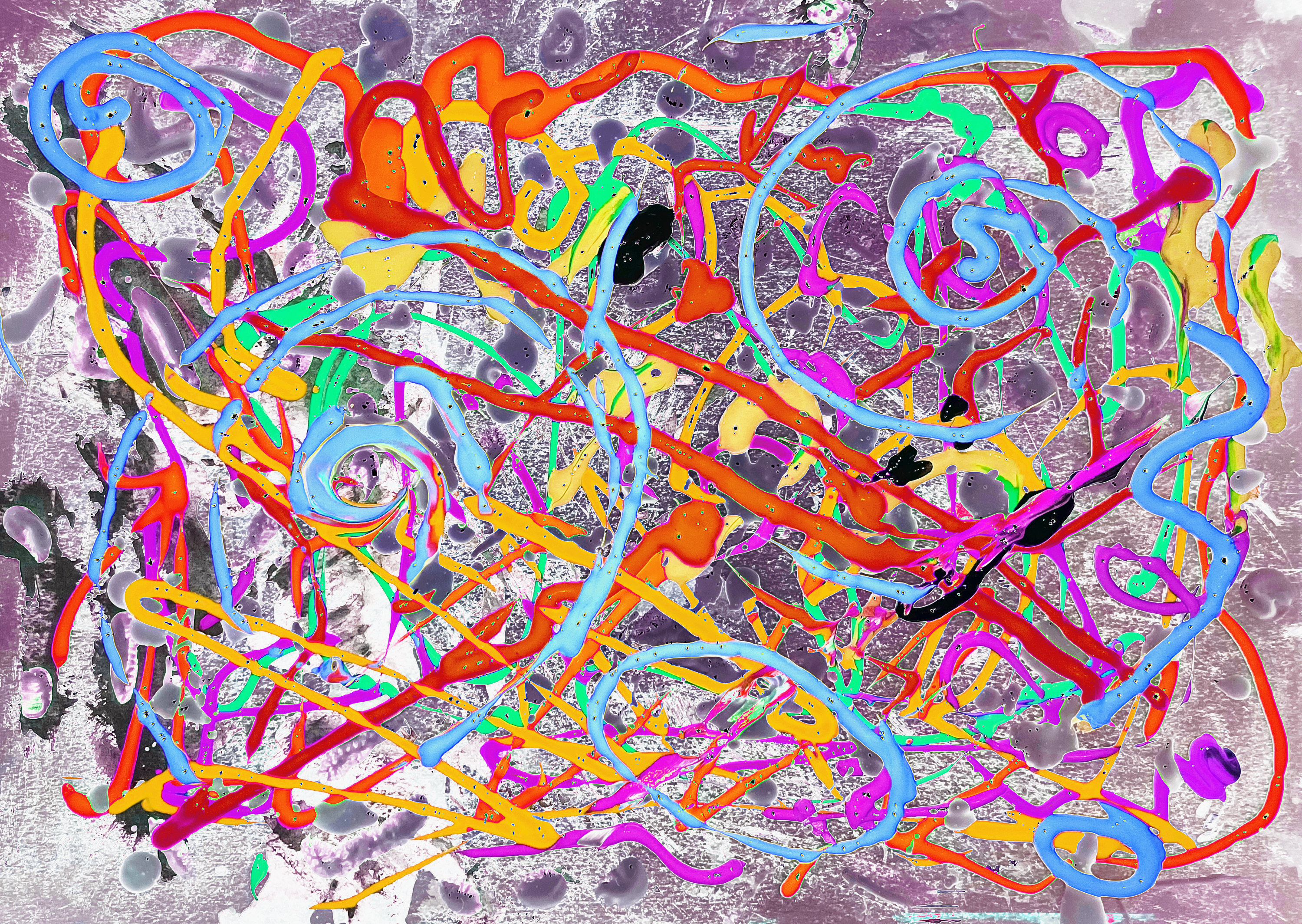
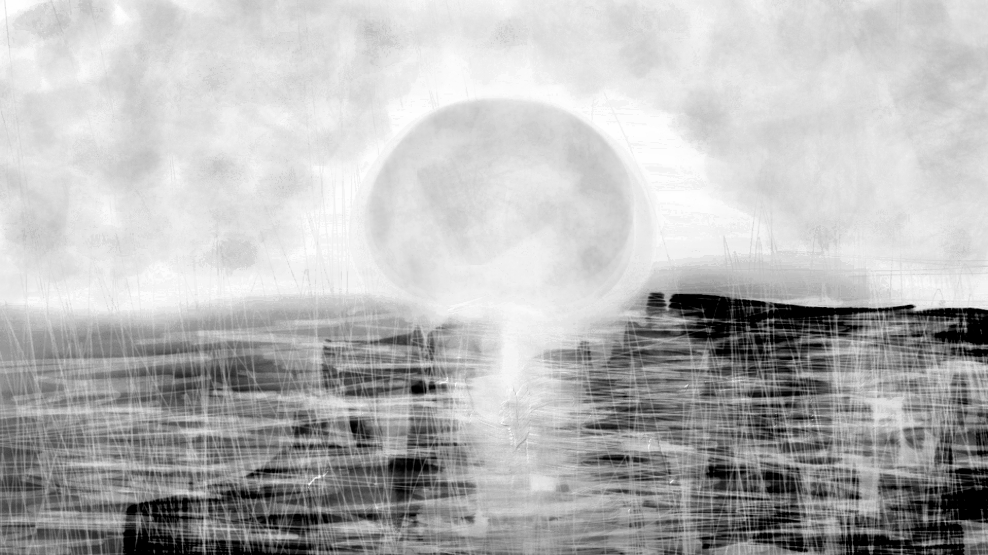
“Drip Paintings #1 Jazz Hip-Hop Edition” [27th February 2024] by Matt The Unfathomable Artist, acrylic drip painting with minimal white brushstrokes on A3 250g mixed media paper, digitally balanced 3000 x 2129 pixels image.
I named this one Jazz Hip-Hop Edition (immediately above) purely since a music reviewer liked paintings on my WordPress. It has a whole freestyle vibe going for it. Candy delicious.
The acrylic paints recently purchased for me are perfect for drip paintings :]
Here is the now dry Original canvas below:
[Please note this portion of the article is written two days later on 1st March from the wet versions first published on 27th February]
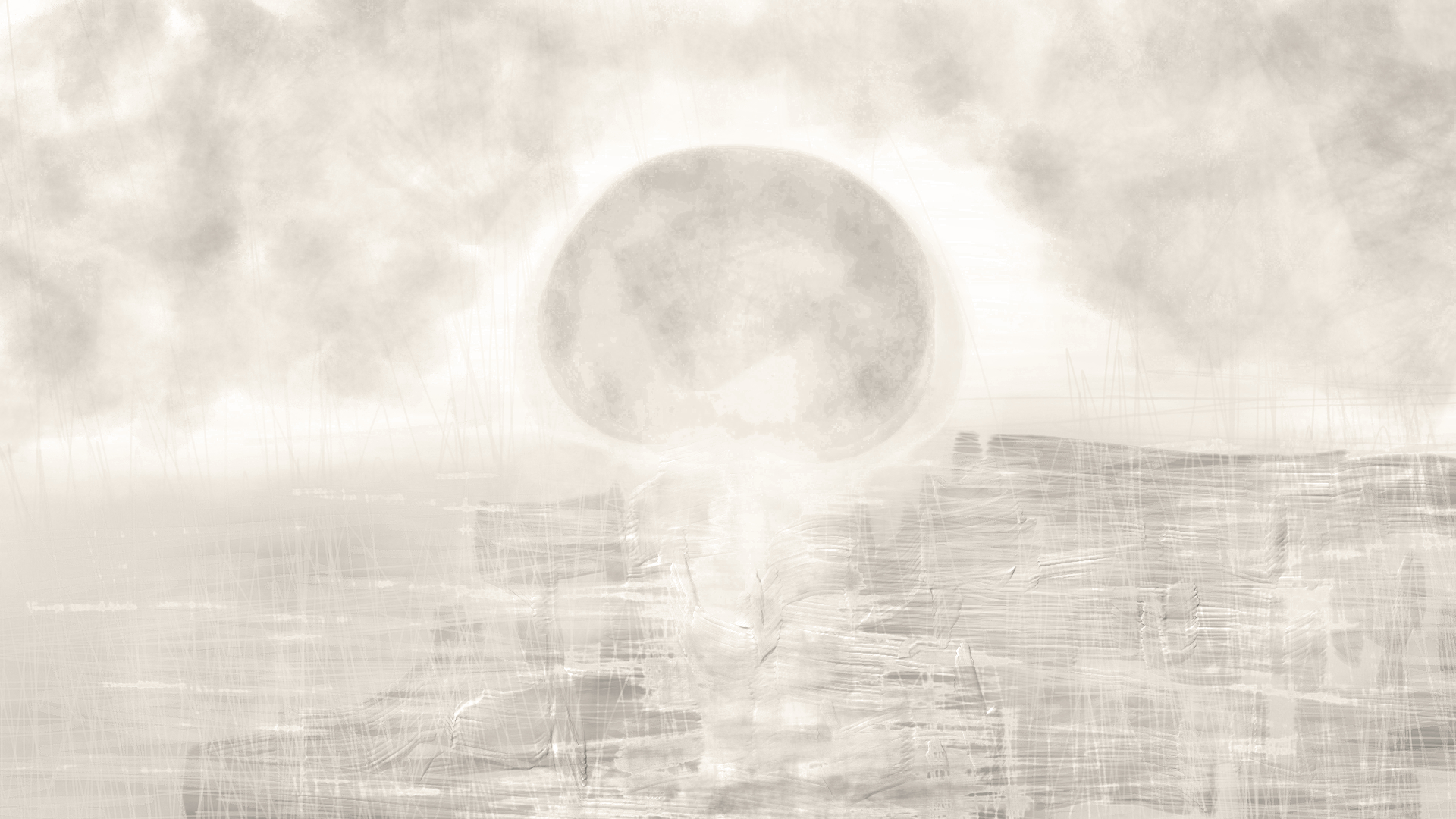
“Drip Paintings #1 Original Dry Edition in Sunlight” [1st March 2024] by Matt The Unfathomable Artist, acrylic drip painting with minimal white brushstrokes on A3 250g mixed media paper, digitally balanced 3000 x 2129 pixels image.
“Drip Paintings #1 Original Dry Edition” required genuine expert level photographic editing to balance the ultrafine tonal contrasts. This is the quality I seek in my work, whether a digital piece or an image representing the physical artwork in digital form.
We have a visibly dynamic timeline effect between the two images of Wet and Dry editions over a few days. The dry edition is noticeably flatter with gravity causing a near pastel smoothness. Whereas the two Wet digital versions show greater depth in the paint drips and light bouncing off the reflective surfaces.
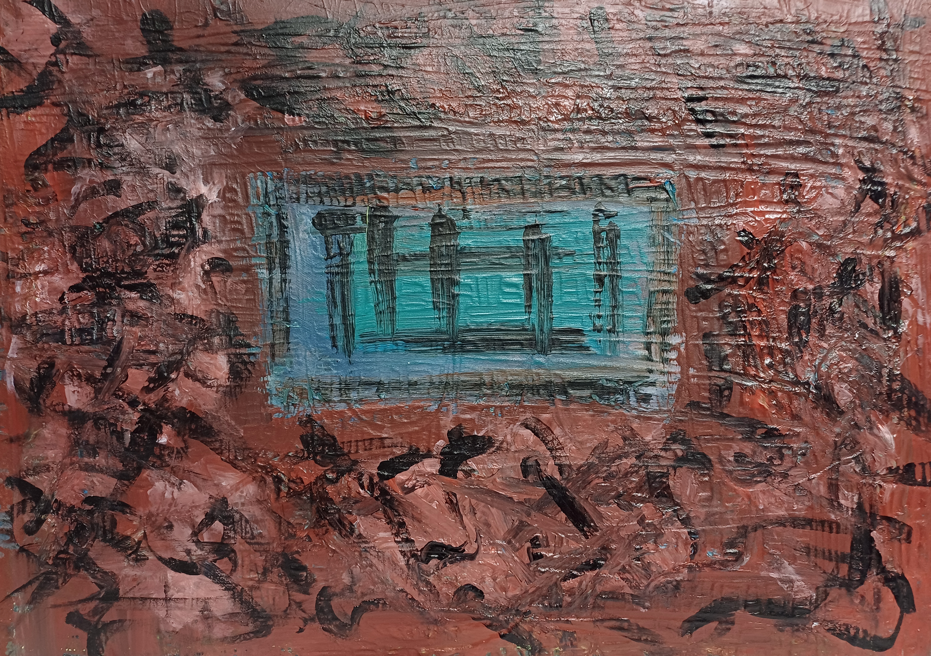
“Abstract – i don’t know [original]” [25th February 2024] by Matt The Unfathomable Artist, acrylic painting on A3 250g mixed media paper with cardboard.
“Abstract – i don’t know [original]” is the product of multiple painting sessions, goodness knows how many hours.
Firstly this is not a political artwork. I wish to make this clear. I am a humanitarian, impartially. Yellow and blue is a colour scheme I use often in my works, see earlier sketches with sun yellow and sky blue.
Red/yellow, green/blue – these are natural hues I enjoy.
I chose yellow/blue to brighten the canvas. Simple as that.
Van Gogh referenced his own perceived art failures. Even Monet mentioned problems with his canvases, in terms of technical elements he disliked with some works in progress.
Aside from Malevolence upon Trees [click to view] I cannot think of an artwork causing so much difficulty! Sacré bleu. Yet, can you imagine the beauty now of “Malevolence upon Trees” in a silkscreen print? The grass alone is amongst the greatest I ever drew! I made it to appear as Shakespeare writing to you.
Purely for documenting my work I would like to note the paint in “Abstract – i don’t know [original]” was not acquired by myself personally. A non-artist very kindly bought paint on my behalf. Yes, I did pay for the paint. I was just happy to have new paint to work with lol.
Anyway whether this is successful as an artwork, i don’t know. Hence the title. Since I put so much effort in to the canvas I decided to do some digital versions.
I just hope you enjoy something, anything from the hours upon hours and days I put into this canvas:
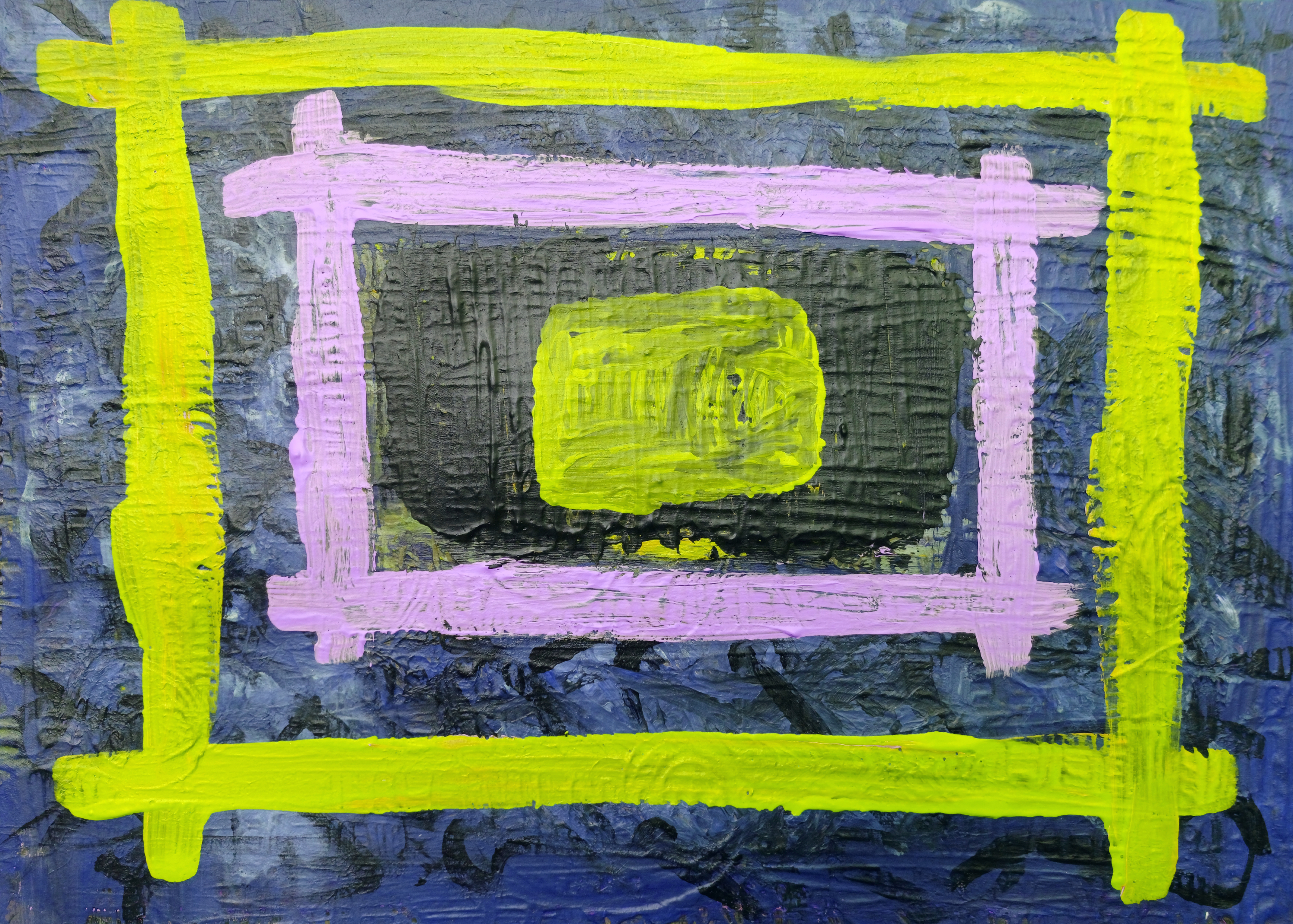
“Abstract – i don’t know [white lines, black background]” [26th February 2024] by Matt The Unfathomable Artist, acrylic painting on A3 250g mixed media paper with cardboard.
Nice, I like it.
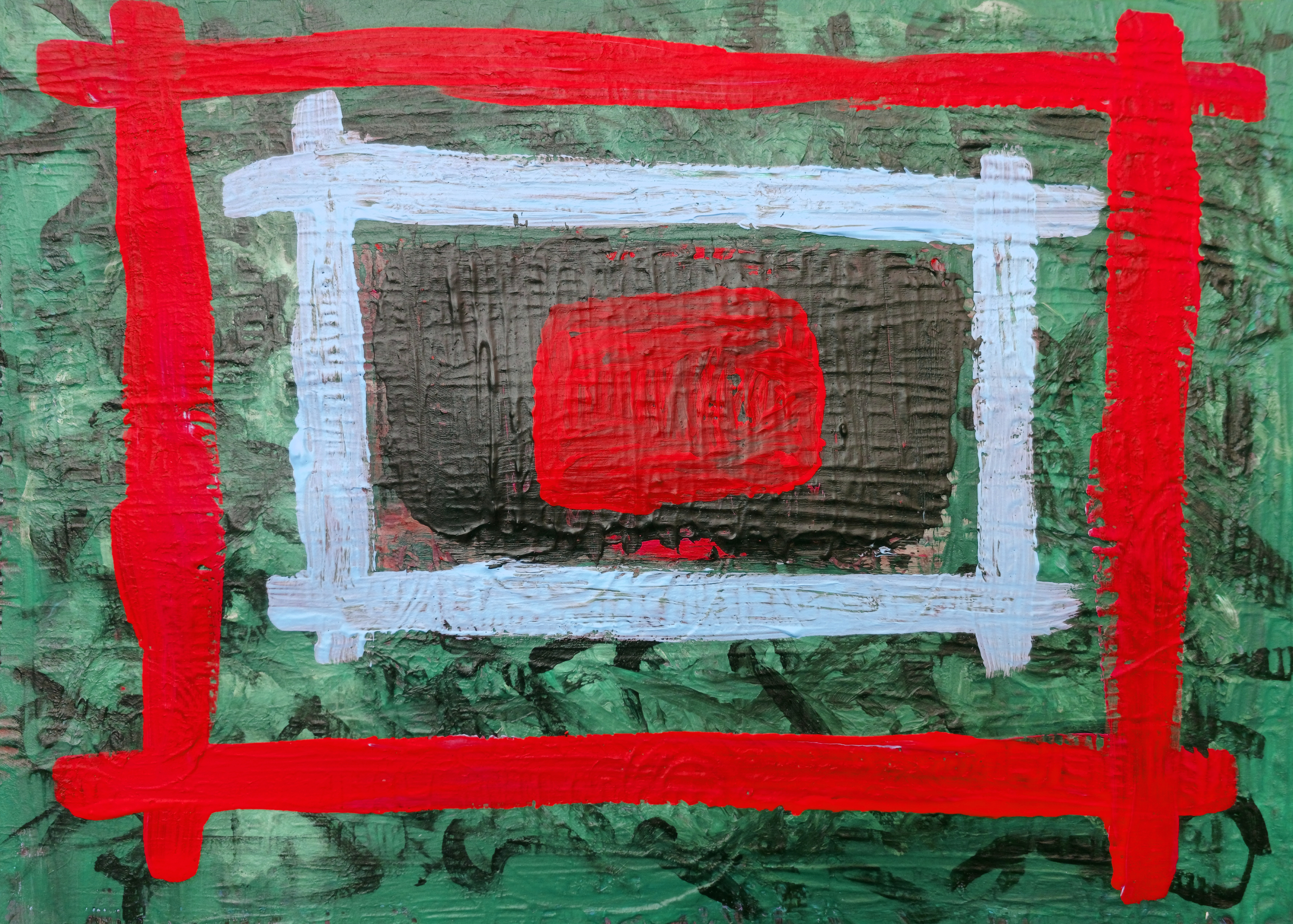
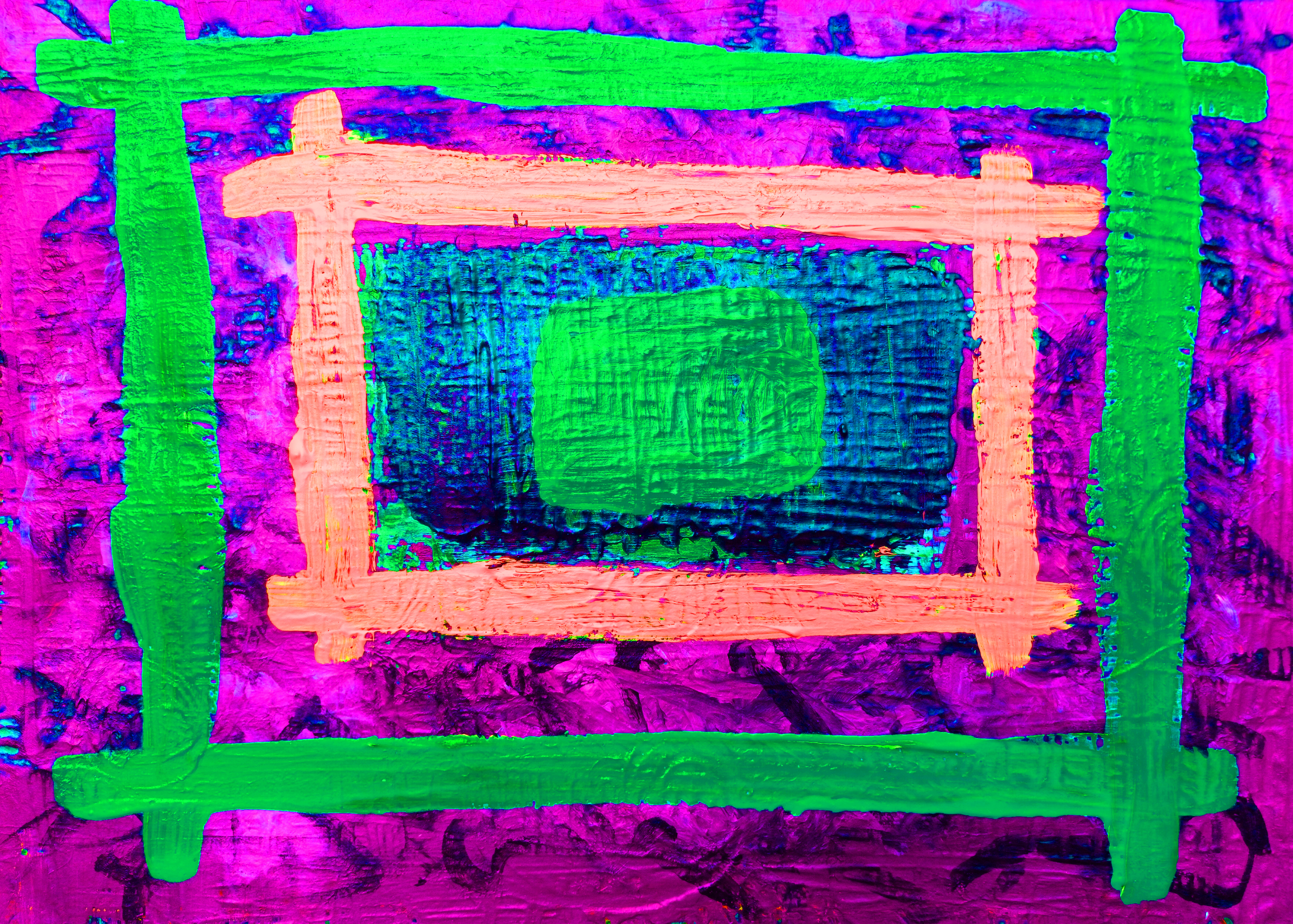
“Abstract – i don’t know [red lines, green background]” [26th February 2024] by Matt The Unfathomable Artist, acrylic painting on A3 250g mixed media paper with cardboard.
Vibrant, oriental.
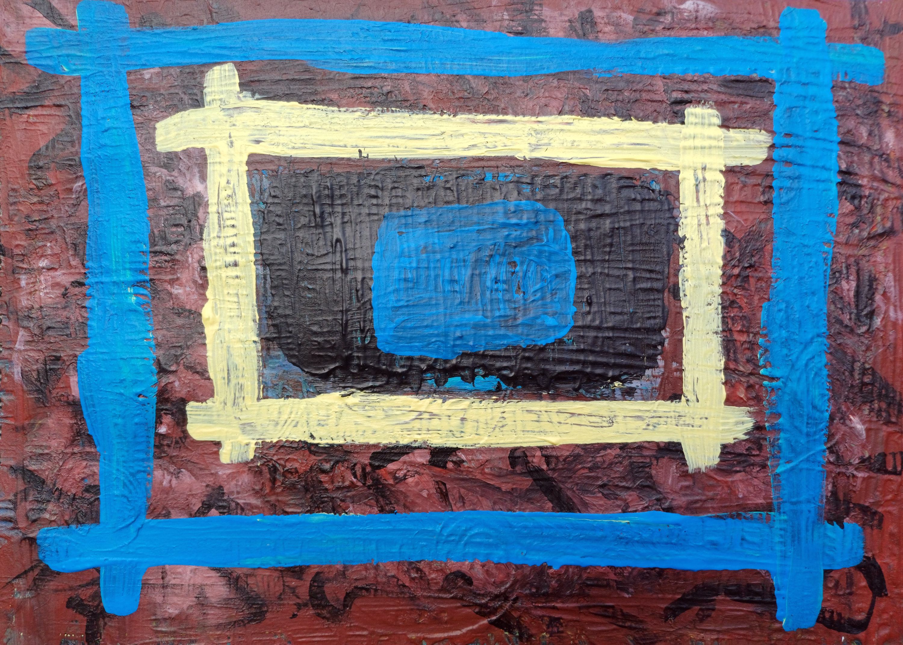
“Abstract – i don’t know [lime yellow lines, blue background]” [26th February 2024] by Matt The Unfathomable Artist, acrylic painting on A3 250g mixed media paper with cardboard.
Perspectives.
“Abstract – i don’t know [black lines, white background]” [26th February 2024] by Matt The Unfathomable Artist, acrylic painting on A3 250g mixed media paper with cardboard.
Mirror.
“Abstract – i don’t know [pink magenta lines, green background]” [26th February 2024] by Matt The Unfathomable Artist, acrylic painting on A3 250g mixed media paper with cardboard.
Pretty jolly.
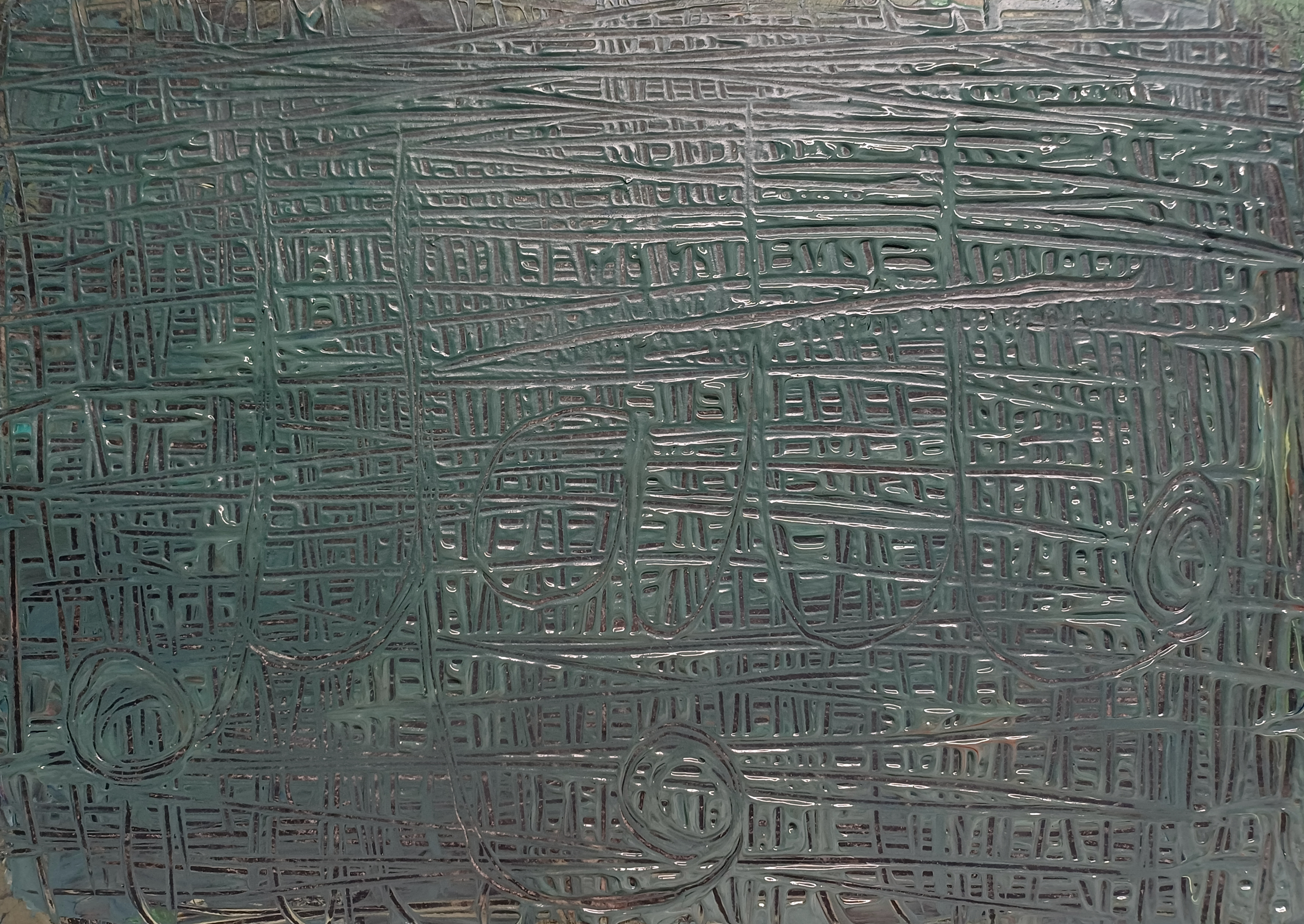
“Abstract – i don’t know [silk green lines, magenta background]” [26th February 2024] by Matt The Unfathomable Artist, acrylic painting on A3 250g mixed media paper with cardboard.
Funky.
“Abstract – i don’t know FIRST DRAFT [Tiles signed Matt in green]” [23rd February 2024] by Matt The Unfathomable Artist, acrylic painting on A3 250g mixed media paper with cardboard.
First draft of the artwork, immediately above.
“Abstract – i don’t know SECOND DRAFT [Oriental style, reddish background]” [24th February 2024] by Matt The Unfathomable Artist, acrylic painting on A3 250g mixed media paper with cardboard.
Second draft of the artwork prior to adding yellow, blue and black, immediately above.
By the way the canvas paper got so wet it melded into the cardboard of the pad, this being the last page.
The ISBN on the reverse is now part of the artwork :]
I cheekily included the tag ‘NOT fine art’ for this article 🙊<speak no evilmonkey> emoji.
“HAHAHA! – Yumminess” [digital Pop Art, 30th August 2023] by Matt The Unfathomable Artist, 100% digital artwork, 1080 x 1920 pixels.
spricket spracket™ :]
I doodled digitally for less than an hour in August 2023 to create the Original ‘HAHAHA! – Yumminess’ shown above. From this Pop Art digital piece I produced three similar works including ‘Comic Book’, “Auto Focus“, “Wendy House” and a “Collage of Four“.
These pieces were specifically made for a younger audience whom art interconnected to modern electronic technology in their everyday lives.
“HAHAHA! – Auto Focus” [digital Pop Art, 30th August 2023] by Matt The Unfathomable Artist, 100% digital artwork, 1080 x 1920 pixels.
kewl №1&2 :]
“HAHAHA! – Wendy House” [digital Pop Art, 30th August 2023] by Matt The Unfathomable Artist, 100% digital artwork, 1080 x 1920 pixels.
Yeah yeah〄 :]
“HAHAHA! – Comic Book” [digital Pop Art, 30th August 2023] by Matt The Unfathomable Artist, 100% digital artwork, 1080 x 1920 pixels.
manga㋡✌️
“HAHAHA! – Collage of Four” [digital Pop Art, 30th August 2023] by Matt The Unfathomable Artist, 100% digital artwork, 1080 x 1920 pixels.
“Microscopic Doodle with Squares – Original” [digital Pop Art, 29th August 2023] by Matt The Unfathomable Artist, 100% digital artwork, 1920 x 1080 pixels.
In August 2023 I continued with 1950’s abstract ideas. This is an entirely Original artwork which includes a whimsical imaginary microscopic organism detail at the centre.
Why? I just thought this was a supercool idea.
Tardigrades!
Please click on the image above to see its tiny authentic beauty. Hoping you art genuinely impressed. The concept is aged. Drawings on thimbles, postage stamps and even at the atomic level et al. This is my digital take on that whole genre of artmaking.
I promise this was exceptionally intricate to produce. Requiring magnification of the digital canvas to create a believable organism. Who knows, it probably really does exist.
If I had use of a stylus instead of a computer mouse I could likely produce even more fantastical microscopic creatures. I can and could buy a stylus, I just haven’t decided to do so as yet. Primarily since I enjoy physical artmaking with pencils and paints.
My relationship with NFTs needs honing. This subject is another discussion for another time.
I made a Collage (image immediately below) and animation from the Original.
“Microscopic Doodle with Squares – Circles Collage” [digital Pop Art, 29th August 2023] by Matt The Unfathomable Artist, 100% digital artwork, 3264 x 3264 pixels.
Is “Microscopic Doodle with Squares – Circles Collage” as mind-bogglingly Pop Art wonderment as I feel it is?
The answer is yes. Hey, I need to love my own work. The thing is I do, I do, I do [said in a silly voice].
So, I have a mind-bogglingly gorge Collage artwork, what do I do next with it?
This.. is.. what.. you.. do.. with.. it.. [pause after each word with emphasis]:
“Microscopic Doodle with Squares – GIF animation” [digital Pop Art, 29th August 2023] by Matt The Unfathomable Artist, 100% digital artwork, 1200 x 1200 pixels [original GIF].
All thanks, praise and accolades are welcome for “Microscopic Doodle with Squares – GIF animation”.
I so freakishly love this it makes me go ooh, aah and woo. Modestly, obv.
Laughing, as I cheekily included ‘present masters‘ in my WordPress search tags.
“Kakemono 掛物 – Natural” [digital Nihonga style, 3rd/4th September 2023] by Matt The Unfathomable Artist, 100% digital artwork, 1920 x 1080 pixels.
Inspired by Japanese Nihonga works I made Naturalshown above from a blank digital canvas within one hour in September 2023 using professional digital painting techniques and software applications.
Over the next hour I made five complimentary new versions from the original with distinct or subtle grades of contrasting.
I worked to immensely fine tones, often to 1/100th of a tonal value to balance each artwork perfectly!
I see my Nihonga works beautifully produced through digital media using technological methods onto giclee and silkscreen print.
Each unique digital piece is an artwork containing its own profound qualities.
Here are the five harmonious pieces:
“Kakemono 掛物 – SolarScape Pastel” [digital Nihonga style, 3rd/4th September 2023] by Matt The Unfathomable Artist, 100% digital artwork, 1920 x 1080 pixels.
I had the opportunity to ‘brighten’ SolarScape Pastel. Yet, I believed the artwork exuded greater depth for its glimpse of yellow pastel light.
“Kakemono 掛物 – Oriental” [digital Nihonga style, 3rd/4th September 2023] by Matt The Unfathomable Artist, 100% digital artwork, 1920 x 1080 pixels.
Goodness, Oriental. I love this.
“Kakemono 掛物 – Rising Luminescence” [digital Nihonga style, 3rd/4th September 2023] by Matt The Unfathomable Artist, 100% digital artwork, 1920 x 1080 pixels.
Rising Luminescence – subtle for its beauty and intense shine.
“Kakemono 掛物 – Polar Constellation” [digital Nihonga style, 3rd/4th September 2023] by Matt The Unfathomable Artist, 100% digital artwork, 1920 x 1080 pixels.
Polar Constellation – the sea holds the attention here. Intended for its title.
“Kakemono 掛物 – Sepia” [digital Nihonga style, 3rd/4th September 2023] by Matt The Unfathomable Artist, 100% digital artwork, 1920 x 1080 pixels.
Sepia – warm, soft and luxurious.
By the way, I made the water as I would with physical oil based paints. Incredibly it has taken five months to publish these onto my WordPress.
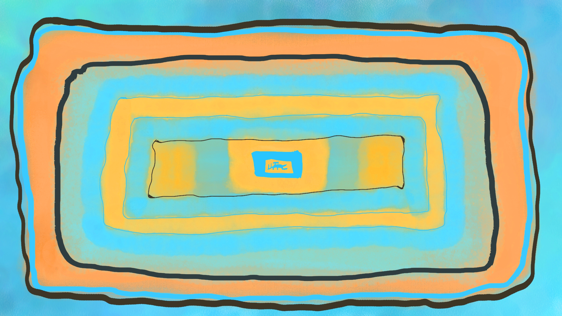
“Abstracted Paints #1” [11th February 2024] by Matt The Unfathomable Artist, gouache abstract painting on A3 250g mixed media paper, 3000 x 2162 pixels image.
Whilst making ‘Bluish Grey Sky with Tea’ I used a whole A3 canvas to make paint checks to test brush textures or remove excess paint. I looked at these random paint strokes as an artistic opportunity.
“Abstracted Paints #1” (image shown above) and “Abstracted Paints #1 DIGITAL” (shown below) are two works I made using those paint marks upon that physical A3 canvas. I succinctly added paint to turn the canvas into an abstract artwork. As I write it’s still wet so I will sign the canvas in due time.
It was a quickly produced piece. A mix between Kandinsky and Pollock, in my opinion. Unintended at the time of producing. If anyone draws similar comparison in style then I would most definitely be delighted.
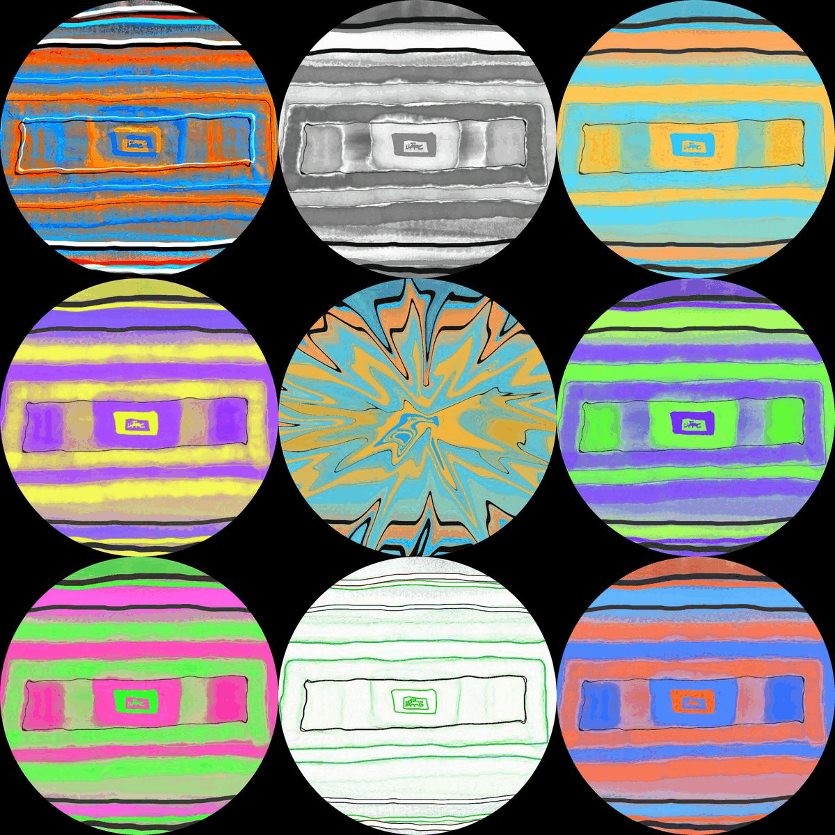
Here is the digital version in monochrome:
“Abstracted Paints #1 DIGITAL” [11th February 2024] by Matt The Unfathomable Artist, digitally created from my original gouache abstract painting, image is 3000 x 2162 pixels.
I invite you to click on the images for “Abstracted Paints #1 & DIGITAL” to get a sense of how beautifully intricate the pieces are. As a high quality large-scale giclee print these would look phenomenal!
I balanced colours very carefully to bring the most out from the digitally produced monochrome tones in the latter artwork whilst utilising professional photographic editing software.
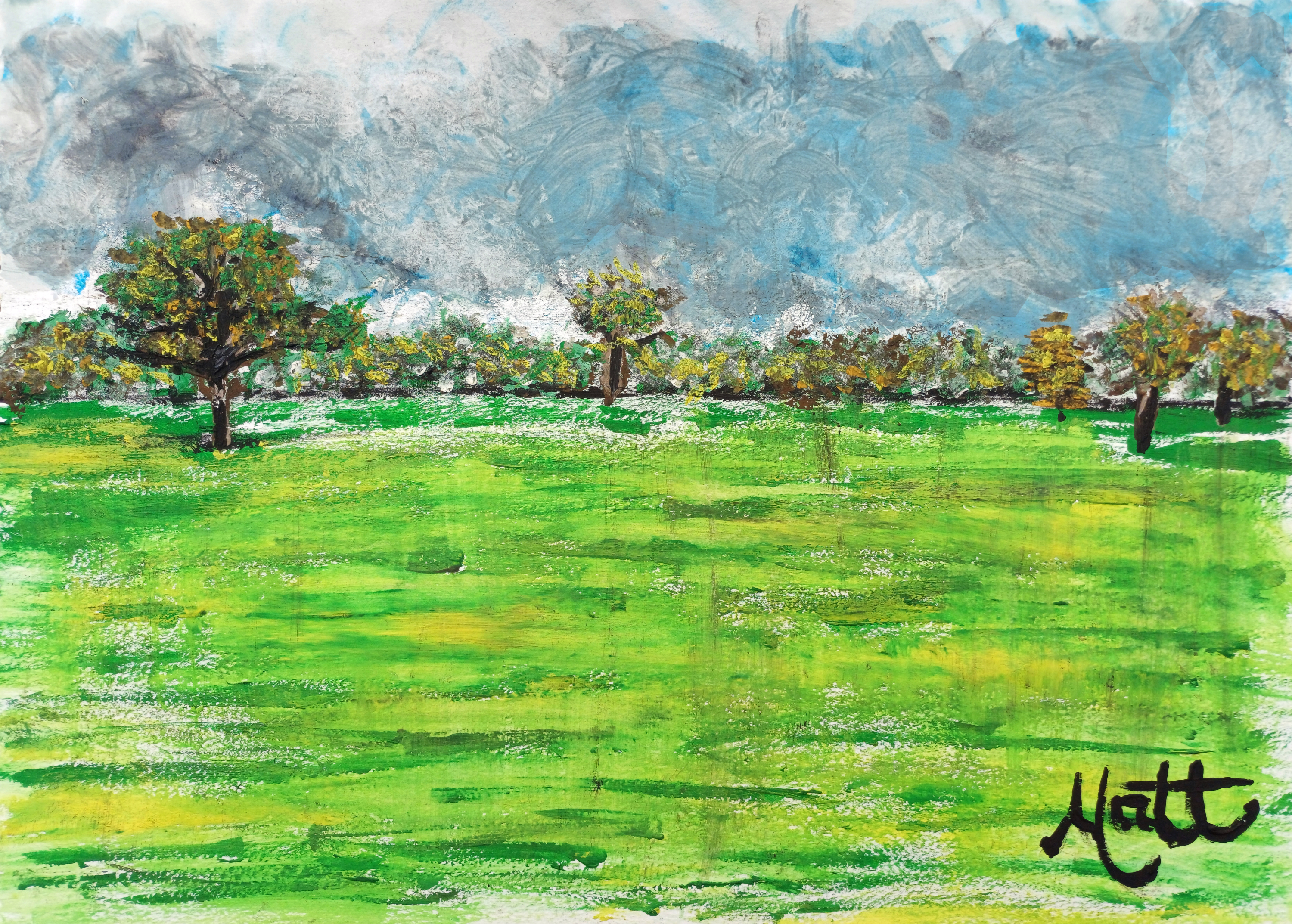
“Bluish Grey Sky with Tea” [8th February 2024] by Matt The Unfathomable Artist, gouache painting signed in black gouache paint on A3 250g mixed media paper, digitally balanced 3000 x 2164 pixels image.
This is an original gouache landscape painting made from a blank canvas in just 56 minutes 9 seconds on A3 artists paper excluding signing.
The first draft took 33 minutes 29 seconds, followed by a cup of tea then second draft at 22 minutes 39 seconds. I used some tea in the painting, then happily signed with my signature brush. I have used this same brush to sign paintings for approximately ten years.
In all eight brushes were used for painting with speed. Eight individual paints were mixed – black, white, burnt sienna, cerulean blue, lemon yellow, burnt umber, ochre yellow and sap green.
Inspiration arrived whilst I enjoyed a phenomenally delicious cup of tea and carefully considered how next to continue my painting.
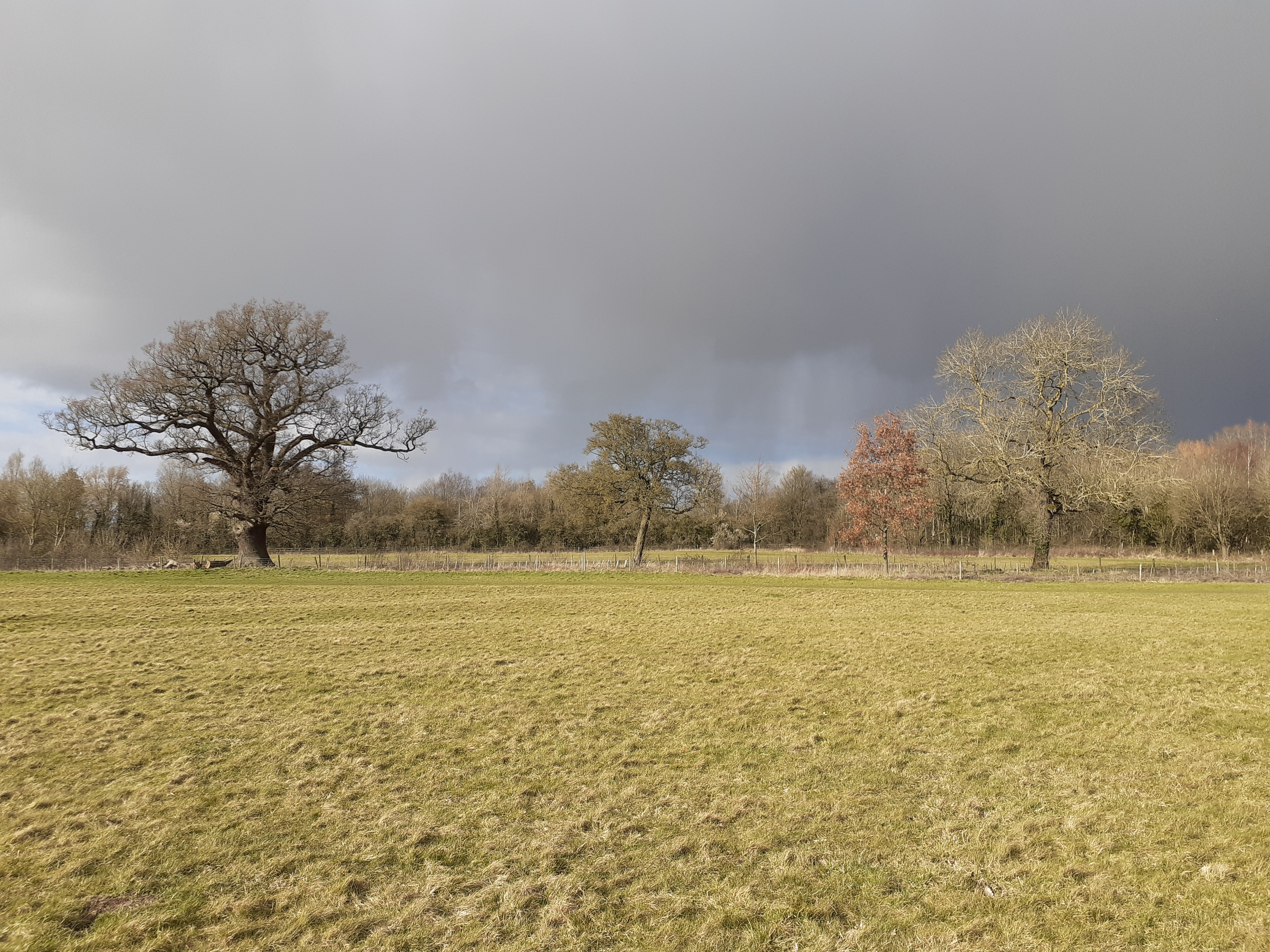
It was an early evening. Curtains drawn. No natural light to make use of. Working from a photograph dated 13th March 2021 taken at 1522hrs (see below). It was one of several compositions standing in the field, others shot in varying directions. I even kept some of the blue sky poking out to the centre-left for authenticity.
On the evening of the artwork creation I was yet to see the painting myself in natural sunlight. The texture is certainly handsome with artistic movement and feeling.
It was dark outside whilst painting in the early evening indoors. Raining through the night.
I love the sound of rain!
Here is the photograph:
“Bluish Grey Sky – photograph” [13th March 2021, 1522hrs] by Matt The Unfathomable Artist.
The photo is uncropped since the composition from my camera is perfect through good framing of the landscape. My canvas image is quite difficult to colour adjust and required highly complex photographic editing. It is now the closest representation of the artwork having edited same meticulously for publishing purposes. This was entirely necessary to capture the grey tones in the clouds and meter the overpowering blue hues in the original unedited canvas photograph.
The bluish grey tones art everything for this piece.
Furthermore the trees are naturally overcast by the atmospheric clouds in the original photograph. Again, this is a mood I wished to ensure fairly equitable in my artwork.
Obviously my painting is a quickly produced (56m9s) Impressionist piece, especially if you can appreciate A3 sized canvas paper to cover with paint. For this I had just 12ml tubes of fine artists’ gouache since my usual working oils are currently in storage. One of the reasons I sketched in pencils since approximately February 2021. Iron gall ink works dominated 2020, with poetry and sayings consistent through 2019 to 2021.
In 2019 I did do one or two sketches too, notably “Young Pegasus [sketch #2]”.
Oils, particularly the impasto style I prefer take considerable time to dry.. months. Whereas gouache is more so days. Besides I have loved creating sketches of my local nature reserve, and also digitally derived artworks using professional painters software applications.
In this I hope you’re as satisfied as I am with my speedily resulted landscape artwork comparable to the originating composition. The King James VI & I Oak of 1612shown foremost left is contrasted by the theme of a rather beautiful bluish grey sky.
Please do click on the canvas image for a detailed look at all those wonderfully delicious textures! Goodness gracious it made me so happy.
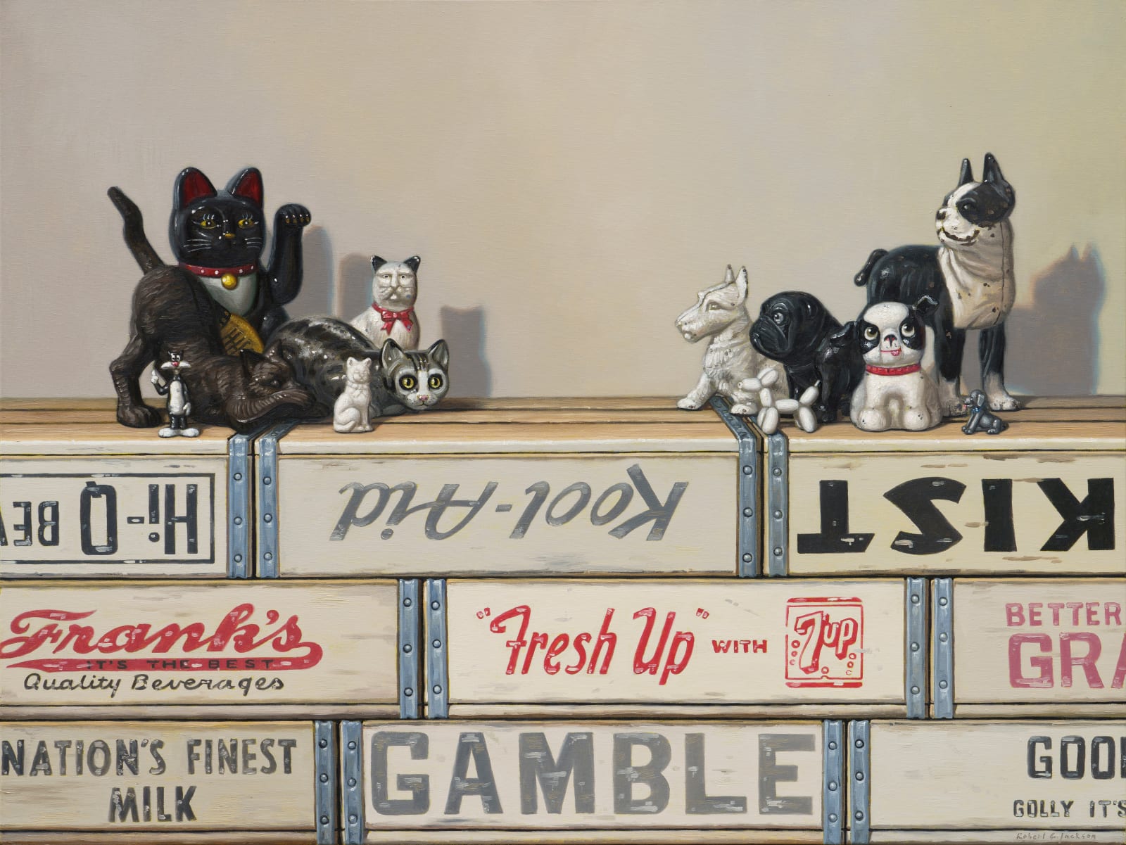
Robert C. Jackson DON’T EVEN THINK ABOUT IT, 2023 Oil on Linen 40 x 30 in. 101.6 x 76.2 cm.
In my introducing to you the artist Robert C. Jackson I would like to say firstly that for further information about his career I provide a link at the end of this article. Please do take a look at his commissioned art process on the Robert C. Jackson website, linked below, as this is superbly interesting.
Here though I wish to talk about his art.
So let us begin.
“DON’T EVEN THINK ABOUT IT” [2023] shown above is so funny. Hahaha, I love this. I want this piece to be honest!
It makes me laugh. Humour has featured in paintings overt and sophisticated, such as Jean-Honoré Fragonard’s “The Swing” of 1767, for millennia.
Robert C. Jackson is a Realist painter. Fine details are everything to Robert.
The yellow soda crates immediately provide focal interest. An indifferent expression on the toy gorilla adds intensity. The bananas look delicious, stacked for display. Marketing words hint at the whole title theme concept. Whilst I’m now also notably aware of writing in the pithy manner of Fleming.
Short sentences. Can draw. Attention.
The cooper-like barrel metalwork at the outer edge of the boxes speaks strength, creates definition. The gorilla shadow is prominent. Light to darkness casts along the floor, foreground to aft. Fonts are accurate, finite. BIG BOY BEVERAGES is turned upside down. It could have a meaning. Then again this is a feature Robert uses to make random, fun or juxtaposed interest within compositions.
Next artwork shown immediately below we have toy animals in parallel opposition, perhaps:
Robert C. Jackson CATS AND DOGS, 2023 Oil on Linen 30 x 40 in. 76.2 x 101.6 cm.
I feel “CATS AND DOGS” is representing much more than cute toy pets. There is perhaps subtle messaging going on. Advice or words to live a good life? Childhood imagery of an age when play is the only thing to occupy our time? Dissipation? Mediation? The precipice of something?
You decide ultimately as the viewer. Everyone has their own opinion. Sometimes we agree, sometimes we agree to disagree.
As with all pieces by Robert it is beautifully painted. The toys have real life. I often say my own drawings and paintings have life of their own once I’m happy to sign them.
What packaging boxes, soda crates and items would you include in a Robert C. Jackson work?
Yes, lots going on intellectually with these works. The toys have personalities.
Boys and girls, ladies and gentlemen please sing with me the song of cats and dogs:
“Cat.. m-eow.
Dog.. t-ongue.
Eyes.. w-ide.
Raised.. cl-aaaaw.”
Haha. That made me laugh too. I’m sitting here loving the idea readers are cheerily singing away.
On that note we have the next artwork to talk about:
Robert C. Jackson PEACEABLE KINGDOM, 2023 Oil on Linen 30 x 40 in. 76.2 x 101.6 cm.
PEACEABLE KINGDOM, 2023.. Dr. Nut hahahaha. Come on, is it my sense of humour or is this messaging absolutely hilarious. The lion is funny. The tiger is funny. Winnie the Pooh is always and forever funny.
I want this piece too! If I’m writing about an artist you can already know I greatly appreciate their work to that very extent.
Technicalities, compositions, style, individual pieces and their personableness.
The mannequin here in the piece immediately above looks like C3PO of Stars Wars fame. ORANGE SQUEEZE. A-TREAT BEVERAGES. A sheep looking to camera. Fun. Fun. Fun.
We can enjoy viewing a multitude of impressive artists online through social media. I first got to see Robert’s work through his gallery representation at Gallery Henoch in New York [link to Robert C. Jackson artworks here: Gallery Henoch – Robert C. Jackson works.
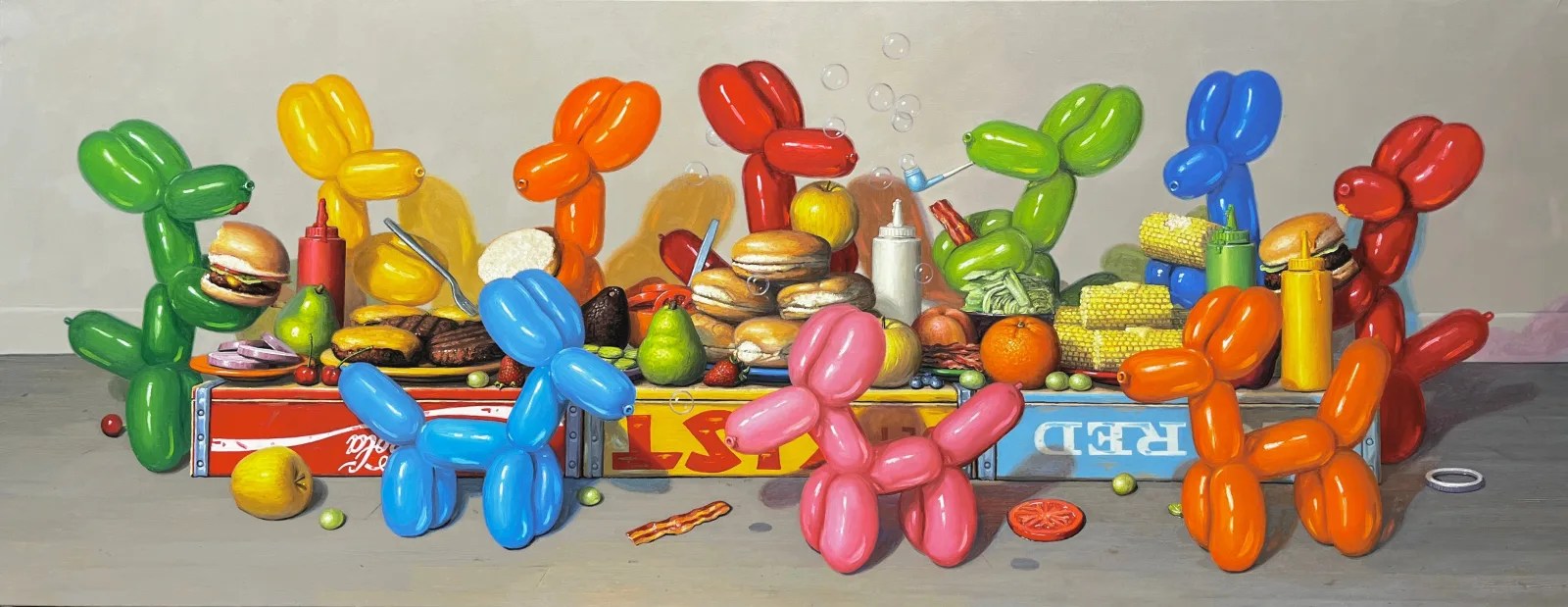
Robert C. Jackson GOOD COMPANY, 2023 Oil on Linen 28 x 72 in. 71.1 x 182.9 cm.
Balloon dogs were of course made famous by Jeff Koons. Earlier to this Andy Warhol created an art installation which featured air + helium filled Silver Clouds made as pillows in a room, floating above viewers near the ceiling.
The idea of balloon dogs and inflatables communicates the sense of fun and playfulness. Robert’s balloon dogs in GOOD COMPANY shown above are having a ball! Partying, eating, having a good ole chat reminiscing about ‘when they were a kid‘.
I did wheelies on my bike, played tig in torrential rain, got my string-connected mittens soaking wet throwing snow balls, knee deep. Climbed trees, all.. the.. honest to goodness time. Played everyone for themself one-v-one soccer. Rolled on the Malvern Hills. Rode a horse in the Welsh valleys. Threw exploding giant mushrooms. Read so many books I could not count. Watched Glen A. Larson shows on tele.
“Life is the starling that calls out for the grub.”
As promised here is the link to the website for you to enjoy of Robert C. Jackson.
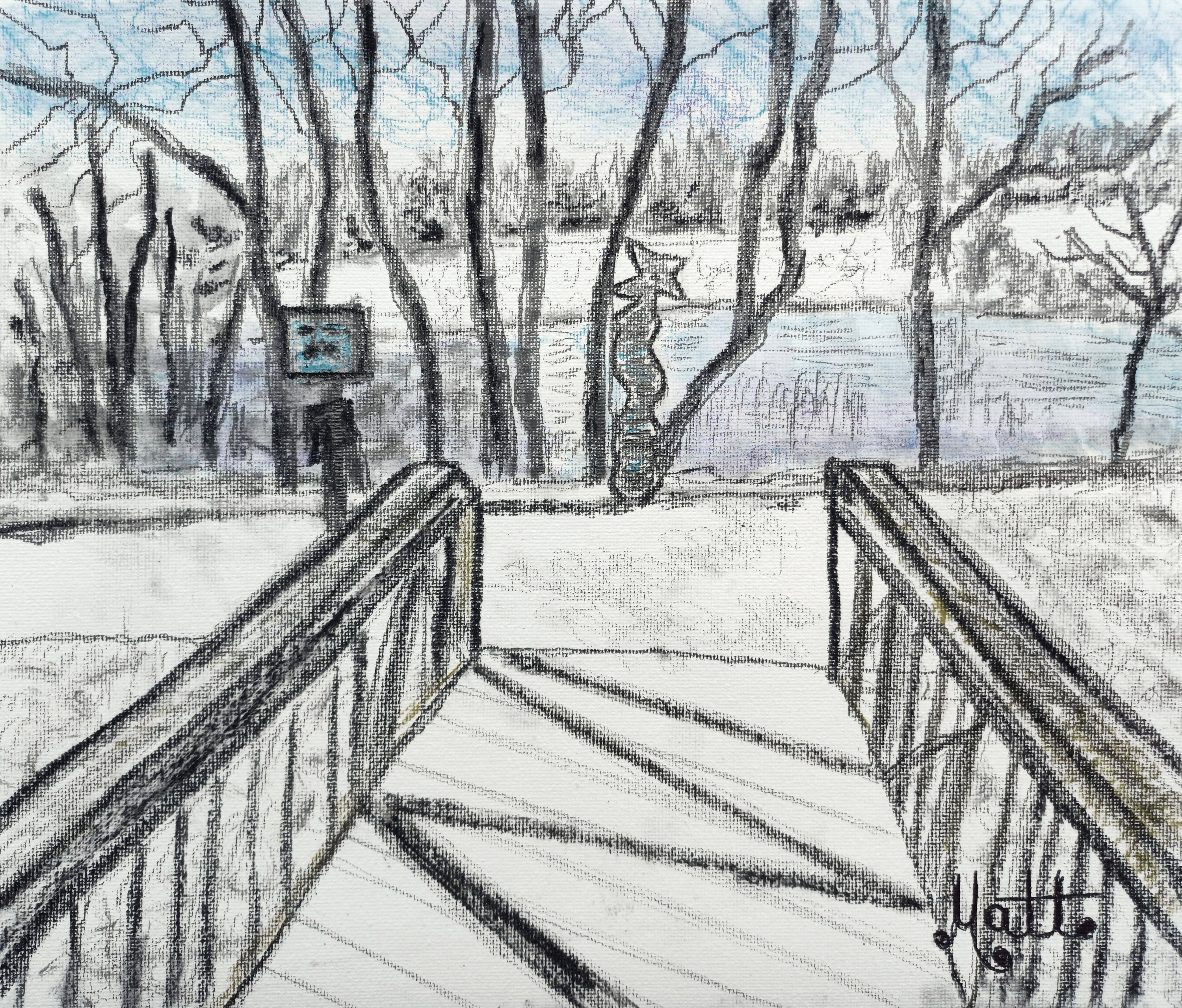
“The Runners Totem“ [6th February 2024] by Matt The Unfathomable Artist, sketch with B, HB, 2B, 5B, 6B, charcoal, charcoal stick, blue, yellow & purple colour pencils on 280gsm 250mm x 300mm gesso primed canvas pad, online Instagram image 3000 x 2559 pixels.
“The Runners Totem“ was sketched in just under 57 minutes including signing over two drafts. 51m17s first draft; 5m39s for the second/final draft including signing. I enjoyed a quick cup of tea in between the two drafts.
The original photograph taken by me on 27th January 2024 is a late afternoon composition at the ‘totem pole’ where I have started and finished my lake runs for about fourteen years. This is (at least) the second totem pole in this exact place since the former pole was replaced some years ago.
My favourite feature of this sketch is the shadow on the metal bridge walkway. It reads as an ‘M’.
Interestingly the totem pole clearly has a notable singular ‘M’ displayed upon this. Possibly this is purely a chance occurrence. I didn’t include the totem pole M as this was too far away in the photograph. Besides, my sketch is impressionistic in style and drawn quite quickly.
I like to believe there is a man’s face in the “CYCLE LANE“.. “LOOK BOTH WAYS” blue sign to the mid-centre-left of my artwork. My artistic idea in this depiction is regarding impartiality over partiality in a hiearchical sense. A topic of conversation I have discussed recently with regards to human beings and an inherent tribal mentality.
Even the titling of my artwork has definitive meaning too, to me personally.
In my opinion (considering past, present or future) dystopia does not need to be restricted to technological adversity in living conditions upon Earth. Dystopia could also include societal, economic, spiritual, cultural, lawful-unlawful or geographically misaligned sensibilities.
Individually, collectively and/or across certain hierarchy.
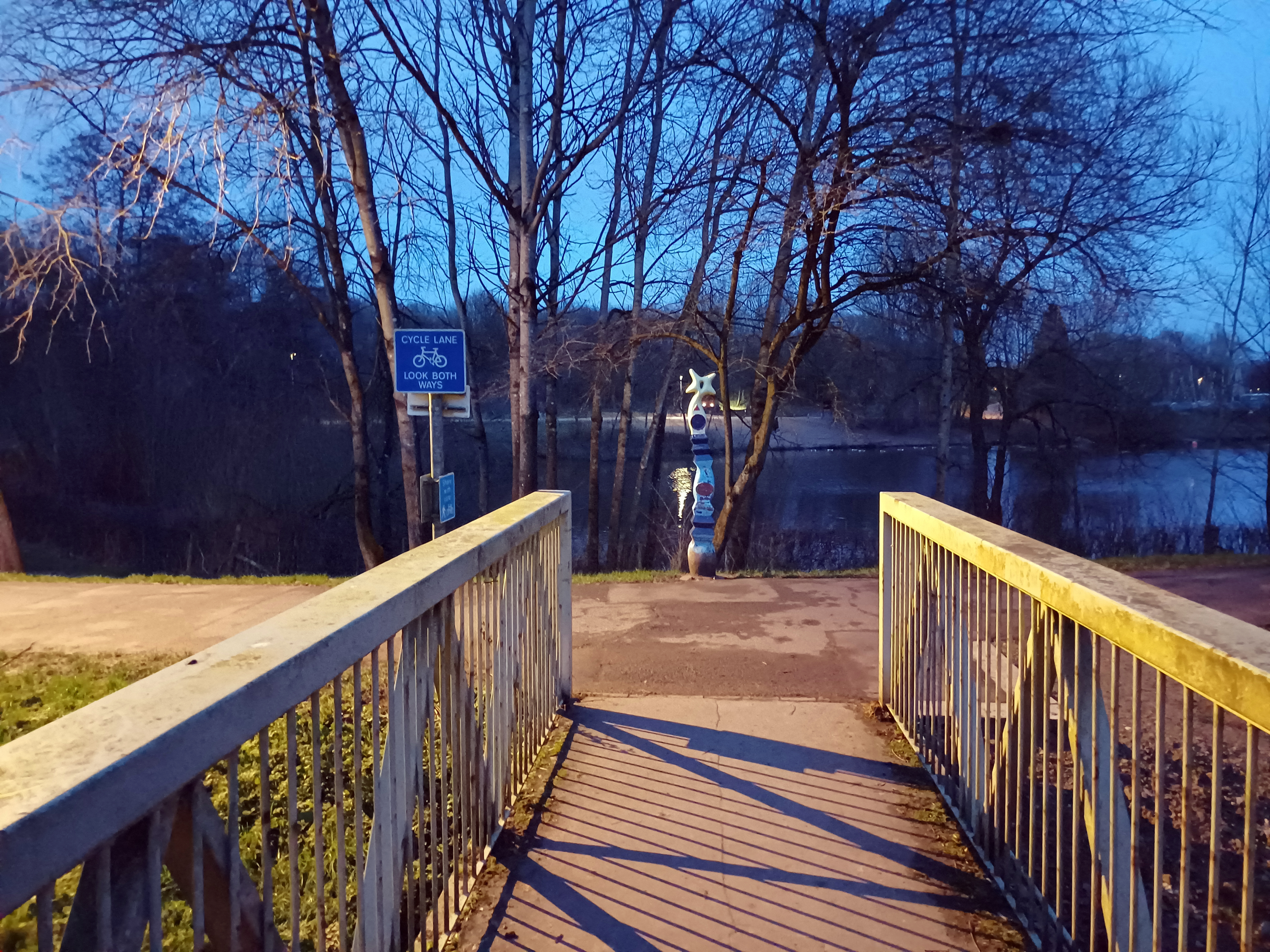
Here is my photograph:
“The Runners Totem – photograph“ [27th January 2024 at 1718hrs] by Matt The Unfathomable Artist.
Obviously there are things I would change or add detail to with further sketching time. I wanted to make this sketch in under one hour. Less than 57 minutes sufficed.
Again it is genuinely baffling to me why this might take near an hour. What I appreciated is the placement and general composition proportions needed to be as reasonably represented as possible.
I did a very quick Collage too, just for fun:
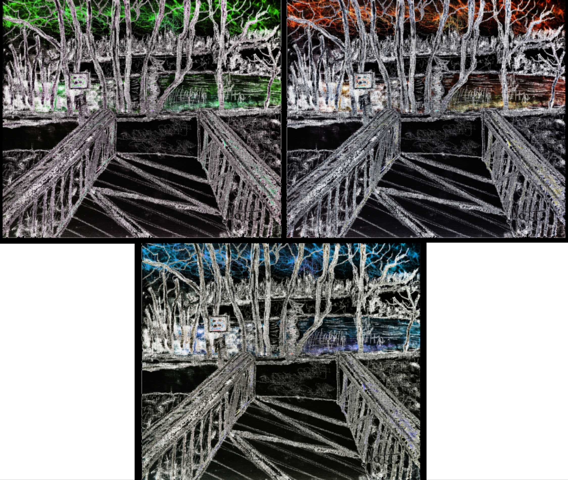
“The Runners Totem – Collage of Three“ [Digital Artwork, 6th February 2024] by Matt The Unfathomable Artist.
I feel my Collage of Three plays on visual perspectives.
Finally I made yet another collage with four complimentary colours:
“The Runners Totem – Collage of Four“ [Digital Artwork, 6th February 2024] by Matt The Unfathomable Artist.
With “The Runners Totem – Collage of Four“ I thought an Andy Warhol style Pop Art piece would be supercool.
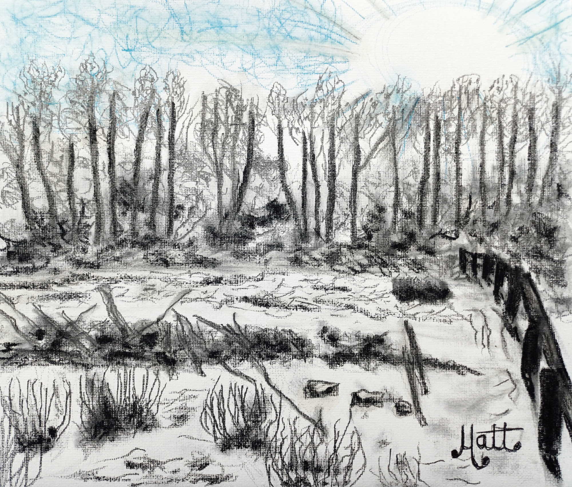
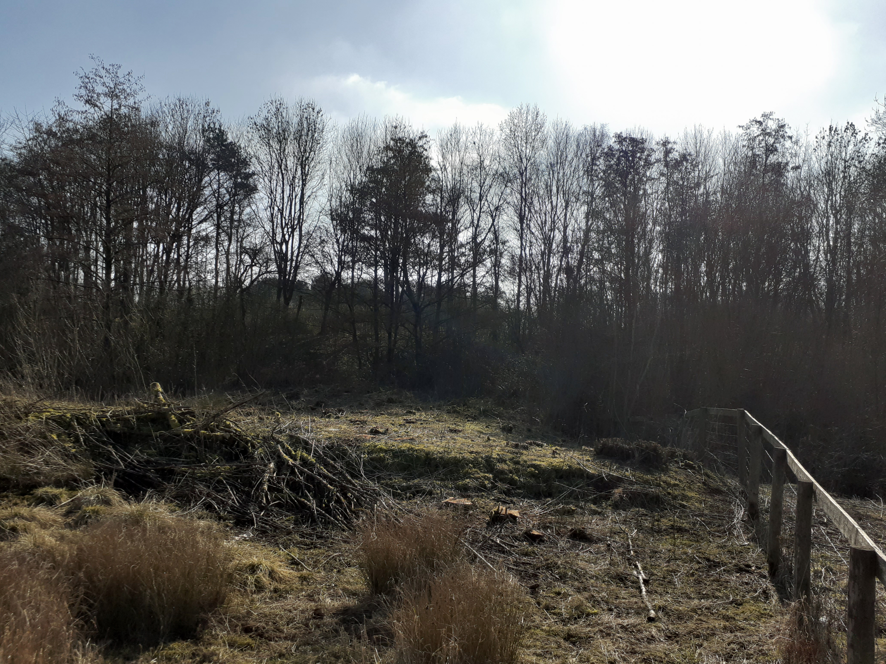
“Ridge Willow Corner“ [4th February 2024] by Matt The Unfathomable Artist, sketch with B, HB, 2B, 5B, 6B, charcoal, charcoal stick and blue/yellow colour pencils on 280gsm 250mm x 300mm gesso primed canvas pad, online Instagram image 2000 x 1702 pixels.
“Ridge Willow Corner“ was sketched in just under 56 minutes including signing over two drafts.
42 minutes 44 seconds for the first draft then 12 minutes 44 seconds for the second/final draft. My original photograph is taken on 28th February 2021 facing south, with Ridge Willow in the middle of the composition, logs piled and strewn.
Afterwards I viewed everything satisfactorily except the wooden posts to the right. Only though for technical reasons as compared to my photograph (see below). That said, the strong contrast of the wooden posts in charcoal is a noteworthy feature of the whole quickly sketched piece.
The idea is to be fast and impressionistic. In this I can honestly say the picture was a very difficult composition with much detail and angular perspectives to consider artistically. Likely its one of those vistas that requires a study to evaluate professionally prior to the perfected artwork.
Interestingly Van Gogh is noted for calling some of his finest masterpieces ‘failures’.
Now, as I look at this piece I see possible influence from Vincent Van Gogh in the despondent looking wooden posts heavily featuring charcoal. As if they are persons carrying a burden of hardship and toil. Complete chance although I have viewed Van Gogh and Picasso works this past week.
By the way I blunted several pencils during this work. One 6B pencil broke like the axe that near-splices a log all the way through, possibly whilst sharpening!
“Are the obstacles lines in the sand that can be moved?”
Let’s take a look at the photograph composition:
“Ridge Willow Corner – photograph“ [28th February 2021 at 1313hrs] by Matt The Unfathomable Artist.
With the photograph you can see why I chose to make the sunshine so bright. Actually this is careful use of the white canvas space. I did add yellow pencil at the outer edges (of the sun) to highlight this dazzling effect.
It’s baffling to me as I view my sketch for real as to why it took me so long haha! Then I remind myself that the time flew like a falcon. Glancing periodically at the stopwatch ‘clock’ à la rabbit of Alice in Wonderland fame.