Most of the time I share the finished pieces, the ideas and the process. Today I want to be honest about the practical side: keeping the studio running takes real resources and I can’t do that on inspiration alone.
I’m an independent artist. I work solid hours, I research, do all my own administration, draft, paint and keep going until the piece is ready. That part is the privilege. The really hard part is that every new work has a cost attached to it.
The gold acrylics, heavier surfaces, panels, varnishes, the technology that keeps the workflow stable, even the cost of keeping this site online so I can keep sharing work with you. It all adds up.
So I’m making a straightforward ask.
How You Can Help
A lot of you have followed my work for a long time. People often ask if there’s a way to support the studio beyond buying an original artwork.
If the work brings you something, if you enjoy the fusion of science, nature and subconscious that I share here, please consider contributing to the Studio Fund.
What Your Support Does
This support keeps the studio moving.
It helps me buy the materials that make the work possible
Covers the running costs of sharing the work publicly
Supports me whilst I’m working on drafts or busily researching pieces
If you can only give the price of a coffee, every donation helps. If you can’t give at all, you’re still welcome here. Reading, sharing, commenting, being present: that support is real too.
To Corporate and Science Readers
If you represent a research body, organisation or business and you see value in supporting research-focused art, I’m happy to receive donations or formal sponsorships to aligned projects. If you want to chat, please reach out directly via email.
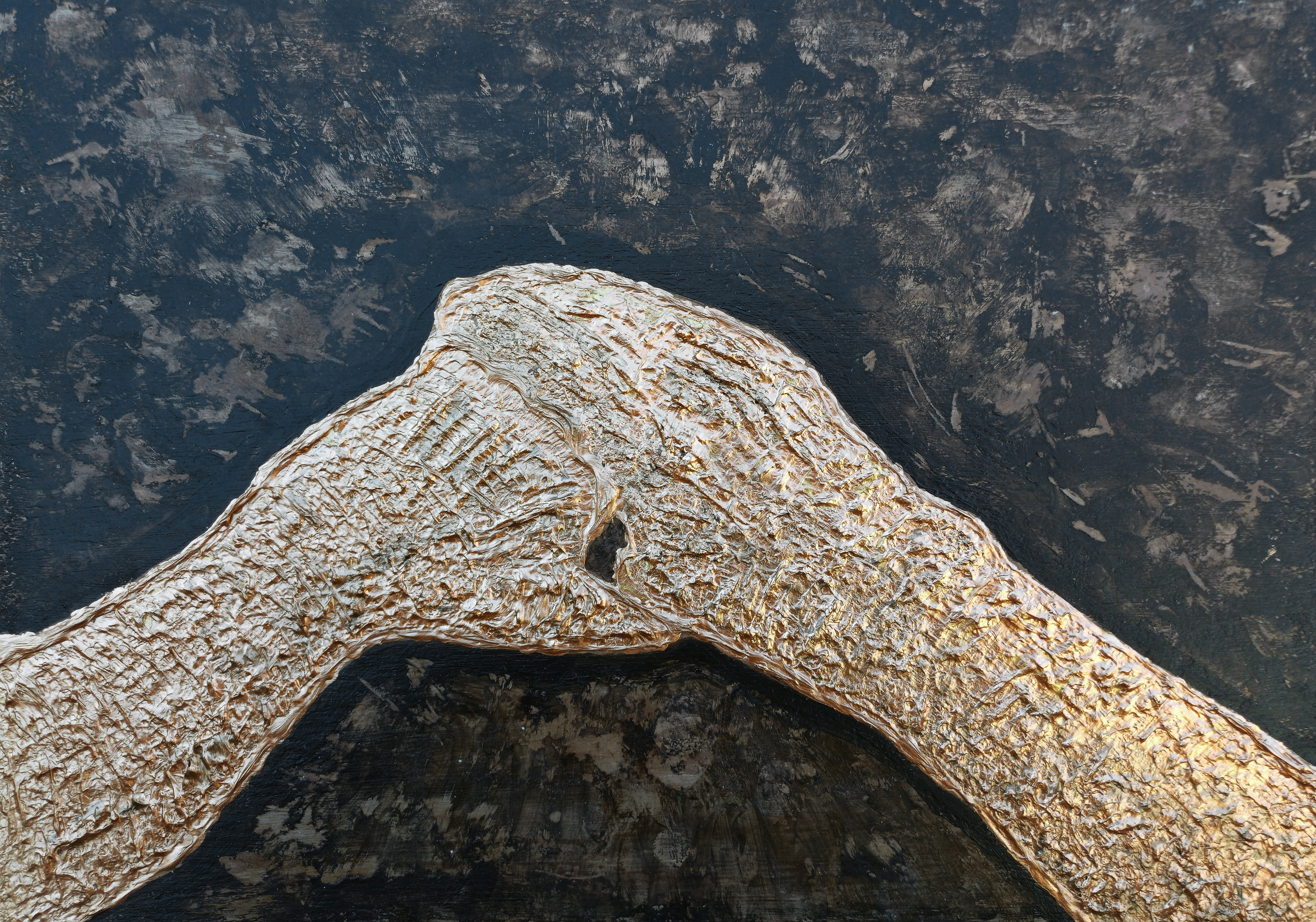
“My Hands” [4th to 10th April 2025] by Matt The Unfathomable Artist, acrylic on A3 (42cm x 30cm) 2mm primed wood board, 7138 x 5000 pixels.
From social media:
“I photographed my hands in the composition you see in the painting at 1454hrs 4th April. By 1525hrs I made the hands first draft consisting of the paint drawing outline and newly filled bronze.
I worked a mars black and egg yolk ground prior to this. Highlighting raw artwork to hint at an aged wooden panel origin.
Each day I meticulously added further sculptural details to attribute elements specifically inspired by da Vinci.
“My Hands” is made in twelve drafts with finite adjustments to finissimo.”
The Iterative Object — “My Hands”
This analysis sets out the work’s core understanding.
Palette & Surface Substrate
A deliberate study in contrast and textural hierarchy:
Ground: Egg tempera. An archival, near-classical substrate that provides a stable, absorbent foundation.
Field: Mars Black. Delivering maximum chromatic counterpoint and visual field bringing the central relief into legibility. The black-umber defines the sculptural presence of the hands.
Positive Form: Bronze and gold acrylics laid in heavy impasto. The texture appears as code. Ridges and channels register the act of making, turning the hands into sculptural form.
Process: The 12-Draft Iteration
The piece is a meticulous, thought-expressive gesture.
Twelve discrete drafts to the final form. A programme of finite, meticulous adjustments. Each draft refining the silhouette, texture, and balancing the gold-bronze relief against the dimensional void.
Composition & Visual Reading
The central form — “My Hands” — reads as a singular sign, almost a sigil.
The joined hands create a stable platform. Gesture suggests warmth, empathy. An aperture between the thumbs form a focal point — a deliberate contemplation within the metallic formation.
Lifelike gold-bronze construction, architectural drawing, sculpture, layers of artistic formulation.
Can you envisage this work as a Bronze sculptural piece?
“Turquoise Green Bronze Waters” [23rd April 2025] by Matt The Unfathomable Artist, acrylic mixed with liquid fixative and clear acrylic medium on A4 250gsm Artist’s mixed media paper mounted onto A3 (42cm x 30cm) primed-bronze painted 5mm wooden board, 5000 x 3725 pixels.
“Turquoise Green Bronze Waters” is made with specific movie inspiration, having rented the film the evening prior on the 22nd April. I painted “Alvis Dede Wimsey III” immediately after “Turquoise Green Bronze Waters” too.
Then on 26th May I produced six variations to create a 3×2 Collage, plus a silver 3D-Movie version. The latter silver version yet to be published.
Turquoise Green Bronze Waters
At first glance, your attention is drawn into an oceanic expanse of turquoise depth, layered with strokes of emerald green, coral pinkish-salmon, burnished bronze, and subtle golden highlights. The textures ripple across the surface like tidal currents, suggesting a convergence of water, mineral and energy.
This piece is alive with impressive swirls:
Fluid yet grounded – The swirling gestures evoke the untamed motion of water, while the underlying turquoise base steadies the composition.
Calm whilst intense – Soft pastel undertones create moments of serenity, balanced against sharper bronze and emerald accents to bring dramatic tension.
Elements interacting with water – A recurring theme in art, bridging natural contrasts through layered abstraction.
Essentially I would like to reveal this painting represents the most joyous scene in the movie, to me. The ebb and flow of emotion carried within each curve-play of..
.. discovery, perfect friendship, adventure, understanding and selfless uncompromising protection.
“Turquoise Green Bronze Waters – 3×2 Collage” [Digital Artwork, 26th May 2025] by Matt The Unfathomable Artist, produced from the original A3 acrylic painting, 5000 x 2483 pixels.
The Colour Transformation: Six Dimensions of the Same Tide
Accompanying the original piece is a six-panel digital collage, a study in chromatic reinterpretation. Each transformation recontextualises the original features into alternate emotional registers, revealing the adaptive soul of abstraction.
1. Violet Surge (Top Left)
A lush, almost botanical transformation, where shades of lavender and green fuse into an ethereal dance. The strokes become vine-like—suggesting organic life entangling beneath the surface.
Have you guessed the movie yet?
2. Graphite Echoes (Top Centre)
Stripped of colour, the monochrome rendition exposes the raw anatomy of movement. Without hues to guide the eye, we are drawn purely to form, discovering unexpected structures hidden within the fluidity.
3. Crimson Drift (Top Right)
A heated translation where deep reds and muted aquas meet. This version feels elemental, as if fire has collided with water—suggesting passion, turbulence and heat.
4. Verdant Flux (Lower Left)
A vivid green inversion that evokes reforestation, renewal and nature’s resurgence. It reimagines the composition as an aerial landscape—a terrain seen from above, multicoloured rivers weaving through new growth.
5. Magenta Pulse (Lower Centre)
Possibly the most vibrant reinterpretation, where magenta dominates in a surge of emotional energy. This palette brings out the artwork’s inner velocity, the textures vibrating with urgency.
6. Yellow Golden Horizon (Lower Right)
Finally, the yellow-golden translation lifts the piece into radiance and warmth. The once-aquatic composition transforms into something sunlit, reminiscent of desert mirages or a chameleon catching the glimmer of daylight.
Here, on 11th September 2025 I see for the first time a face at the centre of the Yellow Golden Horizon!
How did I not see the face in my own artwork before 🙈?
Themes and Intent
Across the primary work and its chromatic studies, recurring motifs emerge:
Fluidity and resistance – The tension between soft washes and defined, almost calligraphic lines mirror nature’s duality.
Transformation through perception – By shifting palette alone, the emotional narrative of the artwork changes entirely.
Time and memory – The layered gestures evoke geological sediment, wave ascensions and the intimations of thought—a sense that the watery surface is the playful act of emotive friendship.
You are invited to spiritually immerse yourself—to discover how colour redefines meaning once reimagined across multiple dimensions.
A Reflection on Process
My original painting, here, reflects textural layering technique, where pigment and medium interweave to create depth you can almost feel under your fingertips. The carefully curated six-panel digital collage demonstrates a digital-meets-physical dialogue, amplifying the tactile qualities of paint through chromatic reinterpretation.
This convergence of traditional artistry with modern experimentation positions the work within a broader conversation: how abstraction evolves in an era where colour appears infinite, yet visual touch remains irreplaceable.
Hope you enjoyed viewing and reading this article.
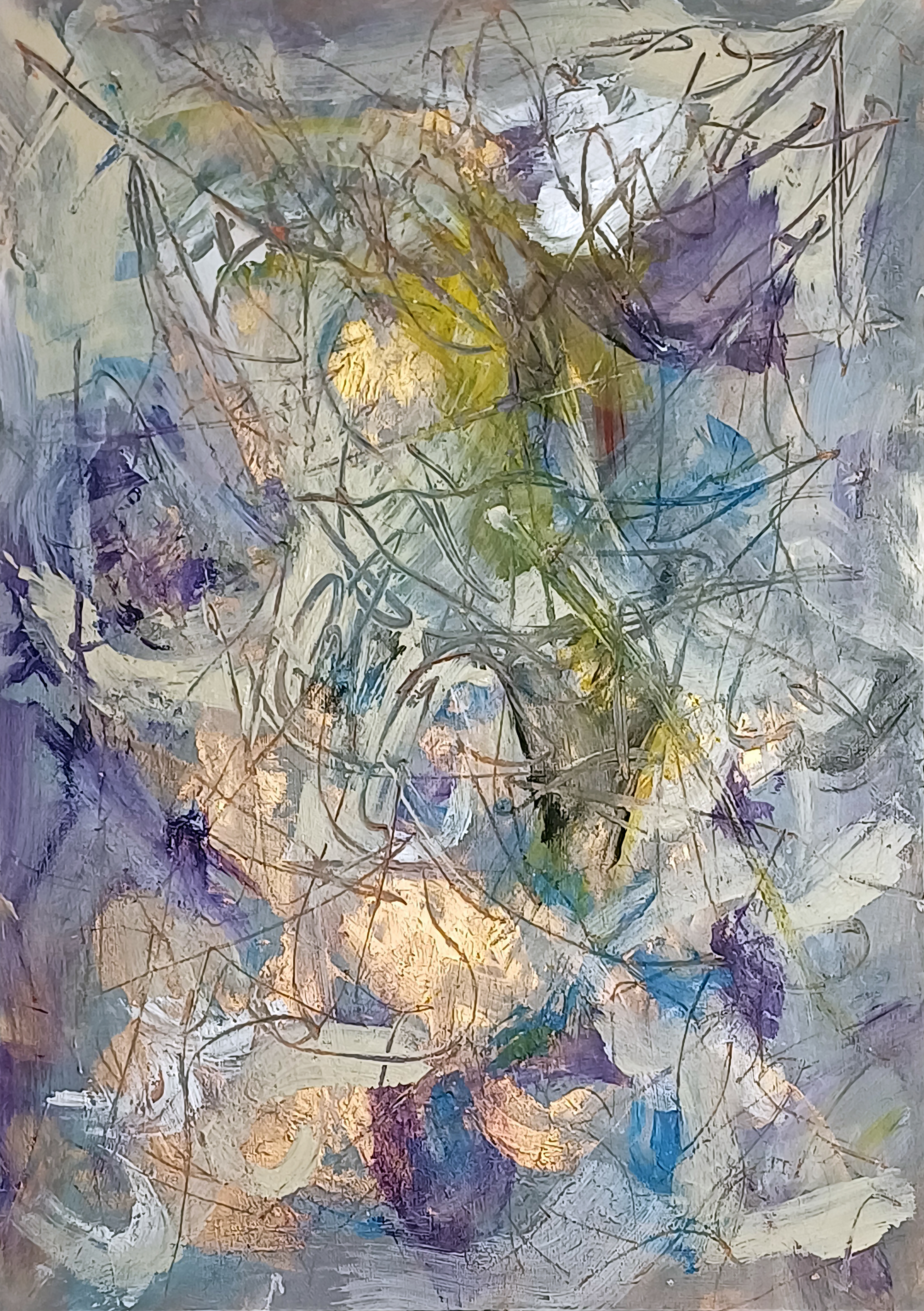
“Surfaces #1” [14th/15th March 2025] by Matt The Unfathomable Artist, acrylic & pastels on A3 (42cm x 30cm) 2mm gesso primed wooden board, 5000 x 7096 pixels.
Social Media Commentary:
[ I made “Surfaces #1” simultaneously with another wooded panel. “Surfaces #1” retained all the necessary requirements I look for in my pieces..
.. quality, balance, originality, artistic expression and personality in style.
“Surfaces #2” I overpainted into “y intersects b”, a Pop Art piece. ] – 17th March 2025.
My abstract composition Surfaces #1 unfolds as a layered field of energy, where colour, texture and line converge into dynamic interplay. Wisps of lavender, azure and deep violet co-operate with creamy whites, orchestrated by flashes of golden light that seem to radiate from within the work.
Sweeping translucent markings weave across the surface, creating a web-like structure reminiscent of organic growth.
There is a sense of depth achieved through the overlay of calligraphic pastel lines atop areas of cloth wiped impasto, with firm textures revealing glimpses of earlier layers. The visual repertoire is one of oscillation—between translucence, opacity, stillness and movement. The atmospheric palette, coupled with the fluid, improvisational paintmaking, imbues the piece with a sense of natural phenomena: light through foliage, reflections in water, or even shifting cloud formations.
In its essence, the work invites contemplative empathy, where the viewing reveals subtle chromatic interaction. It’s a meditation of surface technique—equally a meditation on the hidden strata beneath.
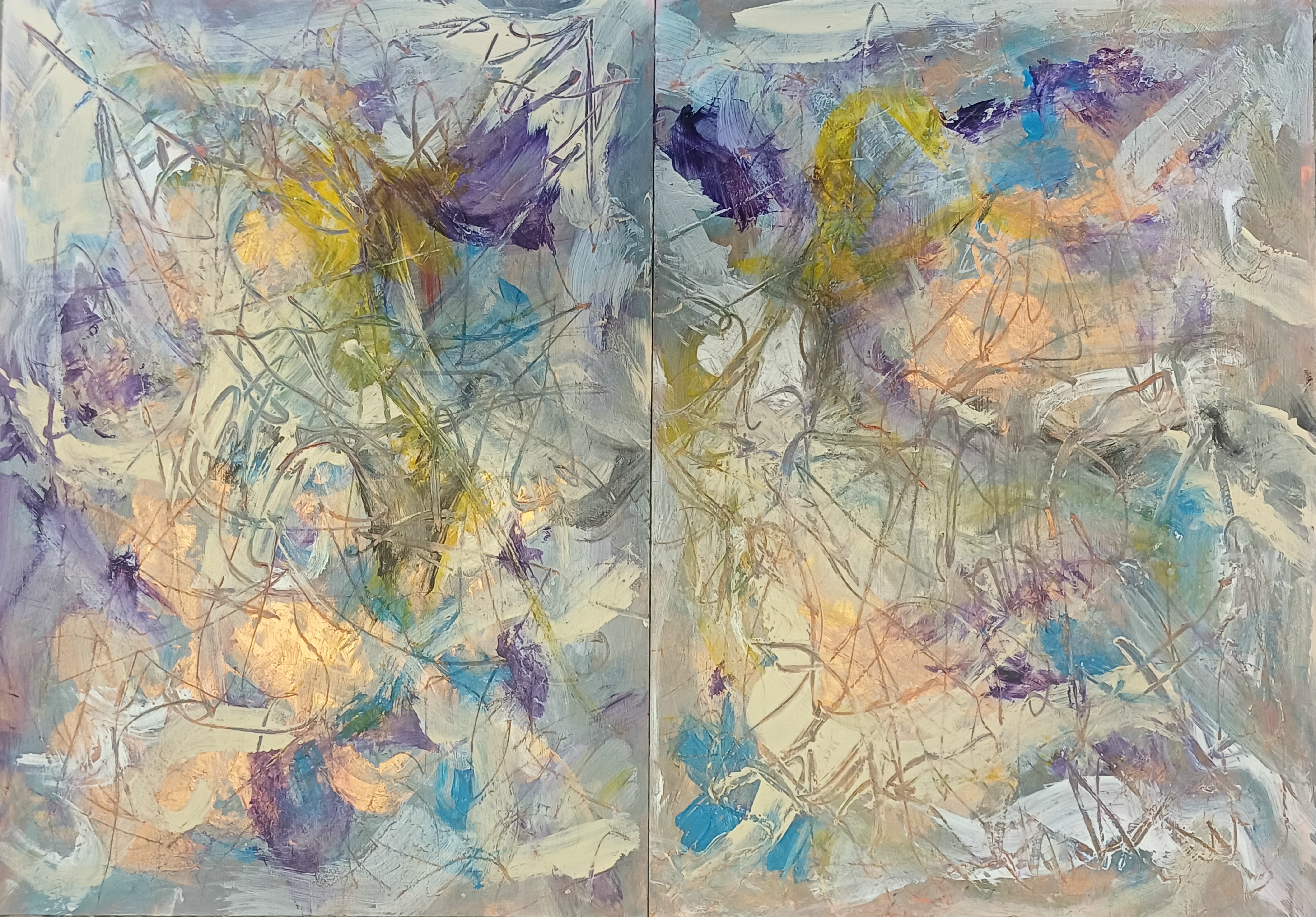
Here is the original diptych:
Diptych of “Surfaces #1 & Surfaces #2”
I retained Surfaces #1 (seen on the left), whereas being unhappy with Surfaces #2 I took the decision to overpaint same to make “y intersects b” [14th – 17th March 2025]:
You can see a small area of the underpainting for Surfaces #2 in the a4LY writing of “y intersects b”.
“Gold Sun Paint Play” [circa 25th April 2025] by Matt The Unfathomable Artist, acrylic on opened cardboard box (approximate 11in x 8in (28cm x 21cm), 5000 x 3882 pixels shown upon cropped gesso canvas for publishing purposes.
Gold Sun Paint Play
“Gold Sun Paint Play” invites the viewer to step outside the strictures of formality to embrace a visual world ruled by spontaneity, flowing movement and bright colour. Painted on a horizontally ‘columned’ piece of torn card, this work speaks not just to the enjoyable act of painting—it appeals to childlike silliness, the process of play as a serious artistic method.
I had immense concentrated fun assembling colour blocks in the form of an abstracted landscape. Crimson-orange embraces violet. Dashes of green and cream separate the palette intensity. All the while metallic gold frames the Sun, a discernible reference point for this vista.
This play is a theatre of chance. Urgent brushstrokes overlap in gestures of compositional resolve and competition. The torn edges of the substrate remain visible, lending a documentary quality to the work—evidence of the surface history and complexity.
A visible ‘tag’ of cardboard remnant at the bottom-right corner grounds the piece in some perceivable mechanical form.
Instantly I’m reminded of words I published to my blog in November 2019:
‘I was greatly interested in Gravity, so I wrote about this. I was greatly interested in soundwaves and the sonic boom, so I wrote about this. Some weeks ago “i saw a buzzard flying overhead, near over my house. It made its call. Eureka. I saw its wingtips and from this i determined soundwaves could be changed by engineering the surface ⚡”.
With “Gold Sun Paint Play” a notable constructive rhythm to the composition: vertical and horizontal divisions allude to maps or symbols, whilst the colour interplay attracts.
I laughed when I made a sort of giraffe face, top-right. The moment a young child tells you an abstract shape, to you, is definitely a giraffe is a wonderful point of self determination.
For those drawn to raw texture, unpredictability, and the visible trace of an artist’s mind, “Gold Sun Paint Play” is my version of how children love to paint.
“Brushworks #1 – Original” [21st September 2024] by Matt The Unfathomable Artist, acrylic paint on 250gsm A4 mixed media art paper (upon a 250gsm paper), 6000 x 4271 pixels.
Brushworks and Palette Works
For this article featuring a multitude of paper works, the text shown in italics is replicated from my Instagram social media. I’ve included these words since my earlier Instagram posts give much insight into each work.
“Brushworks #1 – Original” began (unintentionally) as paint markings whilst producing “DELINEATI0N #000000” (artwork shown at the end of this article). Afterwards I started to have fun with brush motions on this paper to (now) intentionally produce random arty brush workings.
Palette knife and brushes each bring different qualities to paintings.
Following the brushwork I used a solid palette knife to press the second sheet of paper underneath this 250gsm piece for structure. This produced pressed leaf, some flattening effects of the paint and virtually imperceptible yet purposed knife edge indentations into the paper.
The brushwork is interesting hence the reason for naming the piece as “Brushworks #1”. There is no palette knife working upon the painting itself.
A beautiful SolarScape from “Brushworks #1 – Original” is shown here:
“Brushworks #1 – SolarScape” [23rd September 2024] by Matt The Unfathomable Artist, digital artwork from original acrylic painting, 6000 x 4271 pixels.
Please do click on the image for “Brushworks #1 – SolarScape”.
Beautiful, expressive brushwork imagery.
“Brushworks #4” [5th December 2024] by Matt The Unfathomable Artist, acrylic painting on A3 250gsm mixed media paper, 5000 x 3621 pixels.
Having worked upon “Alienalis Mantis” I immediately utilised spare paint to make “Brushworks #4”.
There is no object or idea represented merely fun with the paintbrush.
I LOVE the paint colour gold. Oh my goodness, dear gold, how can I not paint your brilliance?
From approximately March 2024 to-date I have found myself in a ‘Gold Phase’.
Like some/most artists I focus on specific working themes or styles through spans of time. The fourth quarter of 2023, for instance, strongly represented 100% digitally produced painting works.
Through 2019 to July 2023 I produced multiple pencil drawings and sketches along with much intellectual poetry workings too.
“Brushworks Ultramarine Gold #1” [10th January 2025] by Matt The Unfathomable Artist, acrylic painting on A4 250gsm mixed media paper, 5000 x 3601 pixels.
Purchasing ultramarine, gold, sap green and sand (cream colour) on the day I made “Brushworks Ultramarine Gold #1” to carefully contrast lights and darks in terms of canvas visualisation.
I feel this is classically abstract.
“Brushworks Ultramarine Green #1” [14th January 2025] by Matt The Unfathomable Artist, acrylic painting on A4 250gsm mixed media paper, 5000 x 3580 pixels.
“Brushworks Ultramarine Green #1” is made intuitively and quickly within approximately fifteen minutes. Sometimes I create works incredibly fast with the high artistry I need to produce.
I painted this with two brushes (wide, flat) with the orange paint orientated to the top right. I perceived a ‘Caesar’ image, canvas reversed 180 degrees, 100% chance.
Here is the image upside-down for you to see the ‘Caesar’, on the left-half of the upside-down photograph in red with a gold crown:
“UPSIDE DOWN Brushworks Ultramarine Green #1” [14th January 2025] by Matt The Unfathomable Artist, acrylic painting on A4 250gsm mixed media paper, 5000 x 3580 pixels.
An arty ‘Caesar’ portrait, random chance, yet very much subconscious thought.
“Brush & Palette Works #1” [6th January 2025] by Matt The Unfathomable Artist, acrylic painting on A4 250gsm mixed media paper, 5000 x 3695 pixels.
The A4 paper for “Brush & Palette Works #1” was utilised with another [fragmentary] piece from the underside of an as yet unfinished mixed materials work (“Conker Lots“).
Earlier overpainted (random underpaint) areas were complimentary-palette-scraged with copper and green. I then added cadmium-red, sand (delightedly) and violet with a brush.
The primary red area to the right is cloth work.
Seeing an abstract opportunity, I made a Rothko style flurry to the lower-left in appreciation.
I make these pieces spontaneously and quickly although I did two definitive drafts to perfect the visual.
“Brush & Palette Works #2” [6th/7th January 2025] by Matt The Unfathomable Artist, acrylic painting on fragmentary A4 250gsm mixed media paper, 6000 x 5232 pixels.
The roughly ¾ A4 paper for “Brush & Palette Works #2” was utilised from the underside of an as yet unfinished mixed materials work (“Conker Lots”).
Underpainted areas were palette-scraged with copper and cadmium-red. I also added violet and sand colour paint with a brush.
I made this piece spontaneously and quickly, evaluating prior to a second draft in a finite area to perfect the visual. The second draft on the 7th.
The background helps to view the piece uniformly due to partial fragmentation of the paper.
I would like “Brush & Palette Works #1″ & “Brush & Palette Works #2” to be sold together. I perceive a three-dimensional element to the display installation.
The partial paper piece was purposely torn from the underside of “Conker Lots” sometime earlier. I needed to mount “Conker Lots” to an A3 wood panel for structural integrity.
This is the otherside of “Brush & Palette Works #2” (taken from some A4 papers stuck to the underside whilst making “Conker Lots”):
“Black White Robot” [7th January 2025] by Matt The Unfathomable Artist, acrylic painting on fragmentary A4 250gsm mixed media paper, 8000 x 8000 pixels with border for social media presentation.
I made “Black White Robot” whilst wiping paint from a brush in vertical and horizontal motions. Produced entirely with the torn part at the top. Afterwards I discovered a ‘robot’ or ‘android’ looking face.
Interested in this unique composition I decided to make a second version the next day:
“White Black Robot” [8th January 2025] by Matt The Unfathomable Artist, acrylic painting on A4 250gsm mixed media paper, 8000 x 8000 pixels with border for social media presentation.
“White Black Robot” differed only in the ground, whereby I painted titanium white to add a level of contrast to this formal piece. Formal in that I planned to make the robot composition, emulating lines from the original brushwork paint play the day prior.
As promised here is “DELINEATI0N #000000” (shown immediately below) from which I utilised to make “Brushworks #1 – Original”.
The colours corresponding precisely between the two works:
“DELINEATI0N #000000” [20th/21st September 2024] by Matt The Unfathomable Artist, charcoal pencil & acrylic paint on 250gsm A4 mixed media art paper, 6000 x 8484 pixels.
“DELINEATI0N #000000” started as a study to develop ideas for a pop or poster art piece. I realised the work becoming exceptionally unique as words arrived to mind in stylistic calligraphy.
As I document this artwork I understand some subconscious specific concepts found their way into “DELINEATI0N #000000”.
National geographic borders, music, opportunity for all and plenty of complex thoughts I am happy for people to enjoy deciphering according to their own interpretation.
“DELINEATI0N #000000” is inspired from Elijah solo, you can listen to their beautiful music by clicking the link.
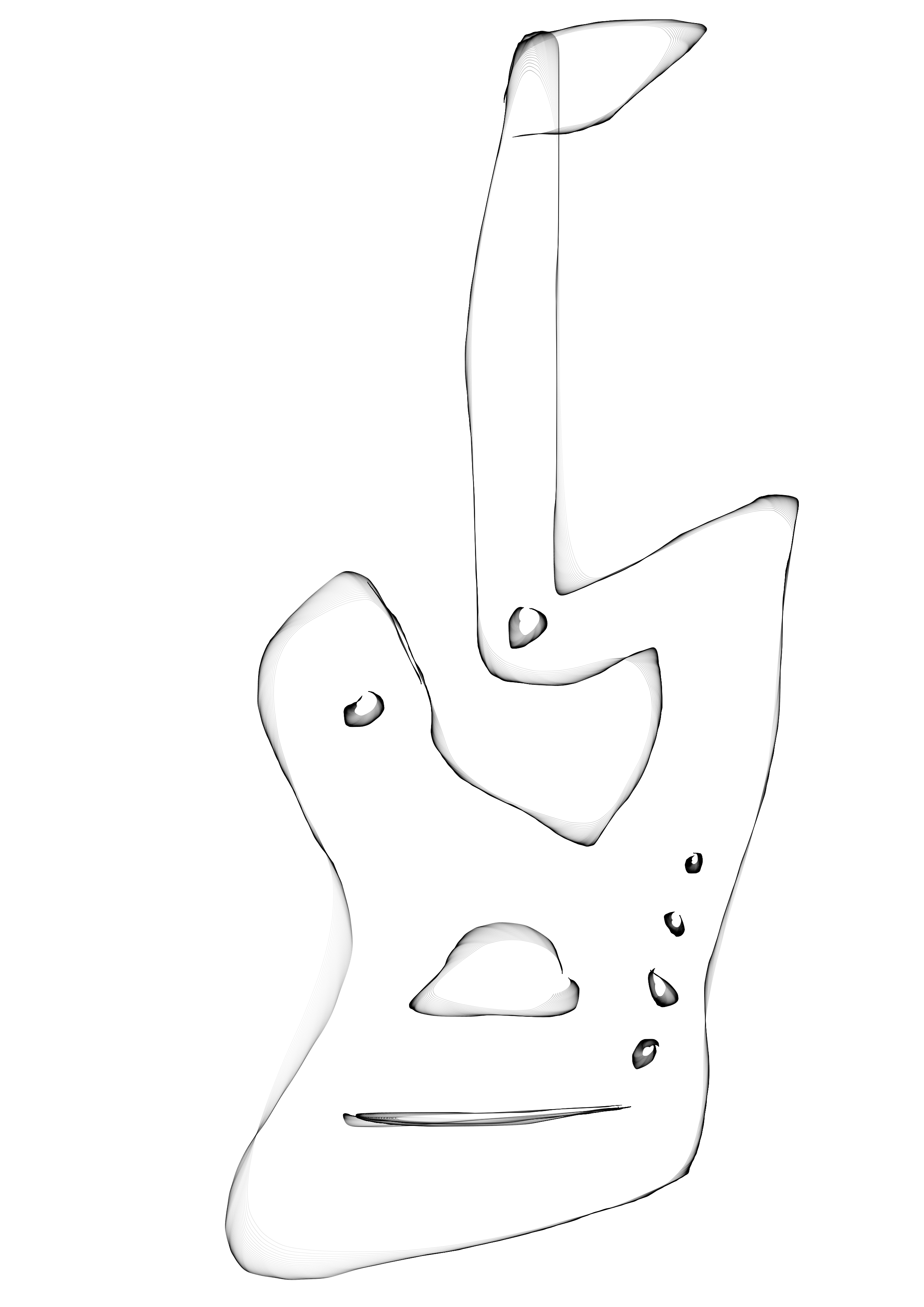
“Guitar Design One A” [Digital Art, 1st December 2024] by Matt The Unfathomable Artist, Digital Artwork, 5000 x 7073 pixels.
Let’s ascend into my process of production for these works. “Guitar Design One A” is made in ten minutes from “Guitar Design One” (foot of this article) using freehand digital drawing software.
The shading you see automatically follows the lines I made, see my blog article and works ‘a4 LY equation [digital sketch #1]’ for academic artistic reference.
Inspired by the beauty within “Guitar Design One A” I decided to make an acrylic replication of sorts on mixed media paper.
Artistic brand signage gave me the idea to produce a visually colourful piece in Alienalis Mantis, shown immediately below:
“Alienalis Mantis” [4th/5th December 2024] by Matt The Unfathomable Artist, acrylic fine art painting on A3 250gsm mixed media paper with four 250gsm backing papers, 5000 x 3617 pixels.
Impressed by the accurate brushwork of signage artists, think shop windows for barbers and barge boats, I thought this would make for an excellent amalgamation of styles.
Abstract and Signage.
My drawing lines in “Guitar Design One A” were so perplexing I found these a maze for my brushwork! Therefore I improvised with certain areas on the paper, quickly finding the landscape orientation the best for the acrylic visual.
I made the gold head for the (unintended) Mantis with textures similar to the preserved outer wrapping of an ancient Egyptian mummy.
It’s exciting for me to appreciate this acrylic is derived from guitar designs. The violet is blueberries to the orange. Everything seems to have motion. Life.
Here is the third computer design, a new work made in eight minutes:
“Guitar Design B” [Digital Art, 1st December 2024] by Matt The Unfathomable Artist, Digital Artwork, 5000 x 7073 pixels.
Haha, isn’t “Guitar Design B” wonderful?
To be a comfortable guitar I might need to round out its seated-position shape.
Finally we have the first design, “Guitar Design One”:
“Guitar Design One” [Digital Art, 1st December 2024] by Matt The Unfathomable Artist, Digital Artwork, 5000 x 7073 pixels.
“Guitar Design One” is more mandolin than guitar. Yet, this design provided the inspiration for guitar Design B.
Here is pre-published social media commentary for the digital pieces and acrylic painting in bold and italics:
[ The three computer drawn guitar designs I made are as follows:
‘Guitar Design One’ prior to 1720hrs on the 1st December 2024, produced in minutes for fun. Seen at the centre of this work.
‘Guitar Design One A’ a professional artwork produced from design one within ten minutes to 1730hrs. The design I incorporate into “Alienalis Mantis”, and the verily design represented here.
Then finally ‘Guitar Design B’, produced within eight minutes to find artistic lines for the possibility of a professional guitar body and neck.
“Rosé Wine Flowers” [24th November 2024] by Matt The Unfathomable Artist, abstract acrylic painting on A3 250gsm mixed media paper, 4000 x 2914 pixels.
For readers who haven’t seen my pre-published social media here is a commentary for the artwork above in bold and italics:
“Rosé Wine Flowers” began with splatting a fan brush all over the canvas. Much fun to be honest. I then brushed in abstract shapes impasto style. The copper creates a wonderful contrast to the canvas which I have included in the photography for you to enjoy.
I have seen a ‘soldier’, ‘Beethoven’ or perhaps a ‘scientific genius’ in the abstract shapes. 100% pure chance. The vermilion hue red I added to harmonise the painting whilst also experimenting with compositional ideas.
From this lattermost freestyling I derived the working title “Rosé Wine Flowers” since afterwards it immediately reminded me of an artist’s work I viewed in a gallery some time ago in 2008.
An artist style I could recollect some sixteen years or so later. Her expertise is floral depictions. I felt my cadmium-red brush lines inadvertently emulated her floating, dreamy canvas quality.
Cadmium-red overpainting transformed this painting, providing definition with structure. A place for your eyes to wander.
‘The Beethoven’ as I shall call the mid-lower chance portrait is purely a bonus.
“Breathing Manuscript” [13th November 2024] by Matt The Unfathomable Artist, abstract acrylic painting on A3 250gsm mixed media paper, 4000 x 2983 pixels.
I have a passion for ancient subjects, cultures, and civilizations. Ancient Egypt particularly intrigues me, for decades.
Presently I’m informally studying the silent movie era with a focus on Hollywood stars of times past. Collating information for depth of understanding and artistic inspiration.
Silent movie levels of acting, directing and production professionalism are truly ingenious. I could talk to you about this subject for hours.
At the top left of “Breathing Manuscript” I perceived a Pharoah-like portrait. I wanted this artwork to look ancient, aged. A lost find, perhaps writings.
In my animation immediately below we can imagine viewing this piece in a cave with a fire-lit torch:
“Breathing Manuscript – Animation” [13th November 2024] by Matt The Unfathomable Artist, abstract acrylic painting in three photographs produced into a 1920 x 1424 pixels GIF animated file.
This artwork is a seed, to grow. An experimentation.
To develop potential further, classical art in new works.
“Breathing Manuscript” is contextual to “Malevolence upon Trees”. Not in theme or idea. In horror, gruesome sentiment to both pieces. Without intention.
My ‘m’ grass (as I called this) in “Malevolence upon Trees” intended to appear like writing, specifically ‘ye olde’ Shakespearean. A work taking much time and effort.
“Breathing Manuscript” is a paint play.
A final piece in this colour scheme will be produced on clay stone, preferably sculpted too. Oh goodness a kiln-fired clay sculpture. I still have the last pottery work I made in 1987.
Sometimes I make art and ask, does this need to be beautiful for people to enjoy? Being ultra-critical if it lacks beauty. Then I ask, why? Answering with.. beautiful art is popular.
Honestly though, this is my first effort in acrylic at emulating antiquity. All I know is that whenever I view this piece it has something.
“Copper Sunshine Face – RED” [3rd/4th & 9th November 2024] by Matt The Unfathomable Artist, acrylic painting on 100% pure cotton triple-gesso primed canvas board, 10 in x 12 in (25.4cm x 30.5cm), produced into Digital Artwork with a red border, 3000 x 3000 pixels.
From my social media in bold and italics:
[ I made the original acrylic painting freestyle over two days. Tube piping the paint in heavy impasto. The style is a continuance of my exploring the very essence of Picasso.
The artwork questions racism with the use of colour, occupation, history and emotion to challenge prejudice and hatred.
I produced eight digital versions in addition to the acrylic artwork which features in the centre. Originally the real neck ties were secured top and bottom to flatten the canvas board temporarily whilst the heavy paint work is still drying.
To my delight I immediately realised I had inadvertently made installation art from my painting with powerful meaning!
Six digital versions are background colours GREEN, MAGENTA, RED (shown here), ORANGE, UMBER and CYAN. A 3×2 Collage (the eighth version) is produced in the colour order listed here. The seventh MONOCHROME version is included in this blog article.
The title is purely a reference to the copper paint piped to make some of the facial features. The outer area of the face refers to rays of the sun. The artwork canvas began as a beautifully sophisticated abstract in yellow and green.
After evaluation I decided to freestyle the portrait you see here. ]
For reference into a physical mounting of the piece the RED is #fe0000 / rgba 254,0,0,255.
Next we have the beautiful six grid Collage:
“Copper Sunshine Face – 3×2 Collage” [Digital Artwork, 9th November 2024] by Matt The Unfathomable Artist, 9000 x 6000 pixels.
As an Andy Warhol fan my 3×2 Collage provides the opportunity to enjoy colour to its fullest.
“Copper Sunshine Face” is a cultural look at historical society particularly from America, where music converged through classical, jazz, blues, soul, country, rockabilly, rock n’roll, pop, disco, hip-hop, rap and electronic music.
– “Matt, what is your inspiration behind Copper Sunshine Face?”
‘Purity of human being where racial origin has no division. This is why I chose to paint the face yellow, to signify the Sun. The headdress style is 1950’s America following my love of listening to The Collins Kids especially “Shortnin’ Bread Rock” . As described already, the choice of adding ties to the piece is unintended subconcious chance.’
– “The ties are now integral to the piece then?”
‘I like the idea the funeral tie is part of Copper Sunshine Face since this has personal meaning. However I’d like the buyer to add their own personal item as the uppermost headdress for the duration of ownership. Continuing in this manner for any future resale of the piece in keeping with its original purpose.‘
– “Sounds cool! Why then did you make MONOCHROME if the face is yellow for the Sun?”
‘To me the pieces are founded upon singing in the harvest fields. I felt the subject material needed to appreciate history, hardship and equality for all.‘
Links courtesy of Wikipedia and Heppest of the Hep YouTube channel. Music publishing owned by any existing label copyrights.
Here is MONOCHROME:
“Copper Sunshine Face – MONOCHROME” [Digital Artwork, 9th November 2024] by Matt The Unfathomable Artist, 3000 x 3000 pixels.
“Copper Sunshine Face – MONOCHROME” reminds me of old black and white movies.
Whilst making the original acrylic painting I thought I’d picked out burnt umber, having bought same in both gouache and acrylic earlier. Halfway through I realised as the wet metallic paint gleamed I’d chosen copper instead. The tones do look similar on the tube packaging. This is the reason I included a BURNT UMBER version in the 3×2 Collage.
The textural detailing of the yellow face is made by softly wiping kitchen tissue paper on “Copper Sunshine Face”.
I wish the artworks to represent progress and oneness for the human race.