“Cosmic Mouth” [6th/7th & 10th September 2024] by Matt The Unfathomable Artist, acrylic paint on premium 115gsm medium textured cotton primed to 240gsm over 12in x 16in (30cm x 40cm) wood-fibre board (4mm), 7018 x 5167 pixels.
“Cosmic Mouth” is literally painted over a female mouth acrylic painting (produced 1st & 2nd September with much effort and innumerable drafts). I then worked on the newer Cosmic overpainting you see here for the next two days.
On the 10th September I varnished the centre. I did retain a photograph of the underpainting even though it wasn’t successful to my eyes. You can see hints of the underpainted mouth along the middle of the canvas.
The female mouth I’m determined to paint successfully is physical perfection.
Thankfully the overpainted “Cosmic Mouth” is the perfection I sought for.
Writing of perfection..
“Artist Seduces Artist” [13th September 2024] by Matt The Unfathomable Artist, acrylic paint on premium 115gsm medium textured cotton primed to 240gsm over 12in x 16in (30cm x 40cm) wood-fibre board (4mm), 6000 x 4525 pixels.
..I made “Artist Seduces Artist” in around an hour to an hour and a half, freestyling, in heavy impasto acrylic.
Please do click these images for an even better viewing.
“Artist Seduces Artist” would look incredible hung at the centre of the darkest black large fabric square or rectangular-like tapestry, 6ft by 6ft at the very minimum. it is 100% Picasso inspired 🎨
I made a very finite finishing touch with two paintbrushes to the completed artwork with burnt umber on 17th September due to my perfecting standards.
For the primary working I utilised three painting techniques: palette knife, paintbrush motions using approximately four brushes, and constant-direct tube paint applications onto the canvas for the grass-green and turquoise surrounds.
Originally I intended to use burnt umber, gold, and mid-yellow colour. Prior to canvas working I included silver, copper and bronze into the palette. I have time and again tried to make ‘the beautiful simple style’, yet invariably add complexity!
After thorough happiness with the predetermined colours I then felt the canvas needed the delicious cadmium red, interesting turquoise, balancing titanium white and then finally the defining grass-green to make everything come alive.
It was at this point I added the mid-yellow even though this was an intended colour to use from the outset. I flattened the profile of the turquoise surrounds for visual interest with a flat-paintbrush. The grass-green received an area of purposed flattening due to the paint settling on the canvas.
Please note the inspiration for this canvas derives from the book “Life with Picasso” by Françoise Gilot and Carlton Lake with my own interpreted Picasso style. I was at page 38 to that point prior to making this artwork.
“Artist Seduces Artist” is a mixture of textures, layers, partially recognisable or obscured pictorial elements and humour with a composition intended to please the eyes in visual interest.
The essence of Picasso himself interpreted in an inspired style by myself.
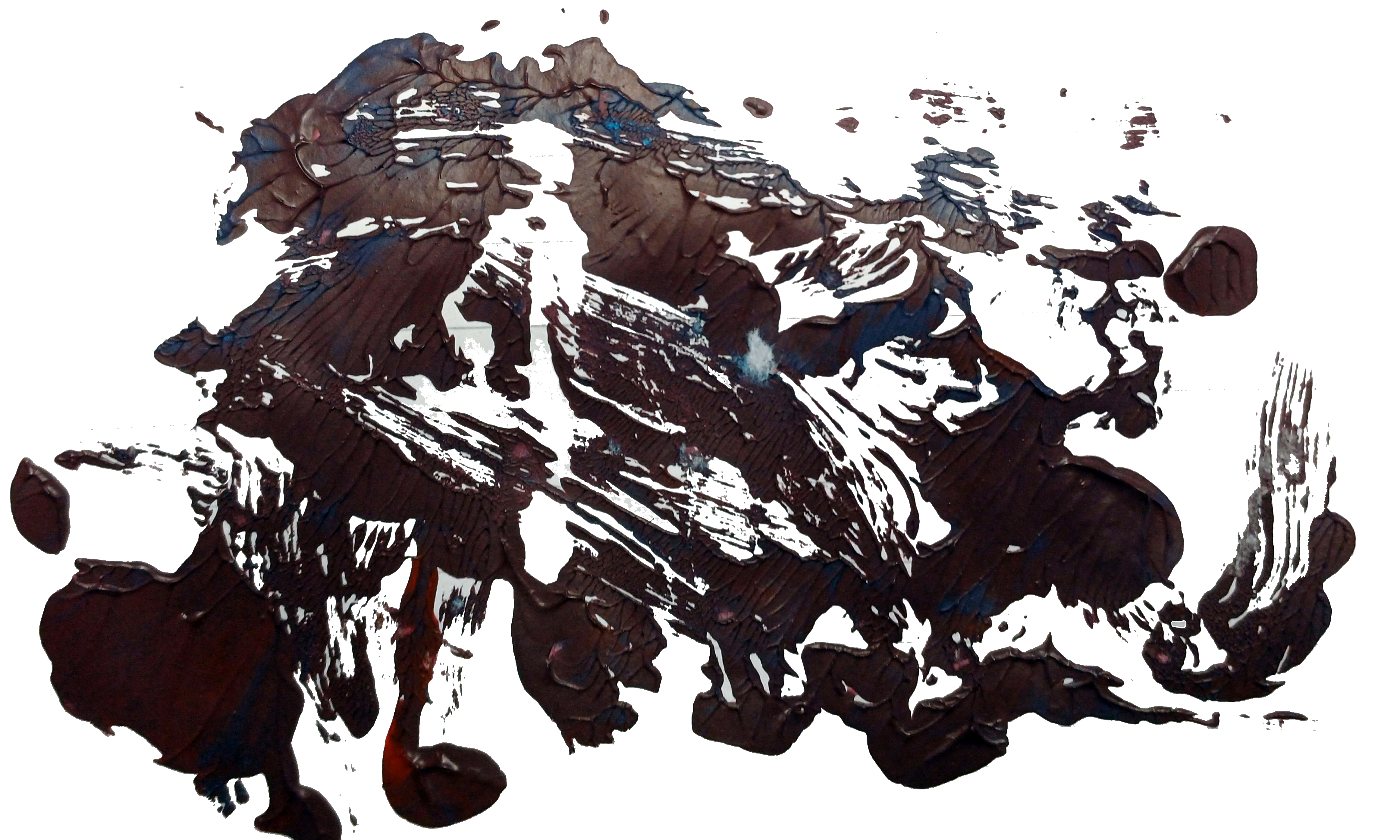
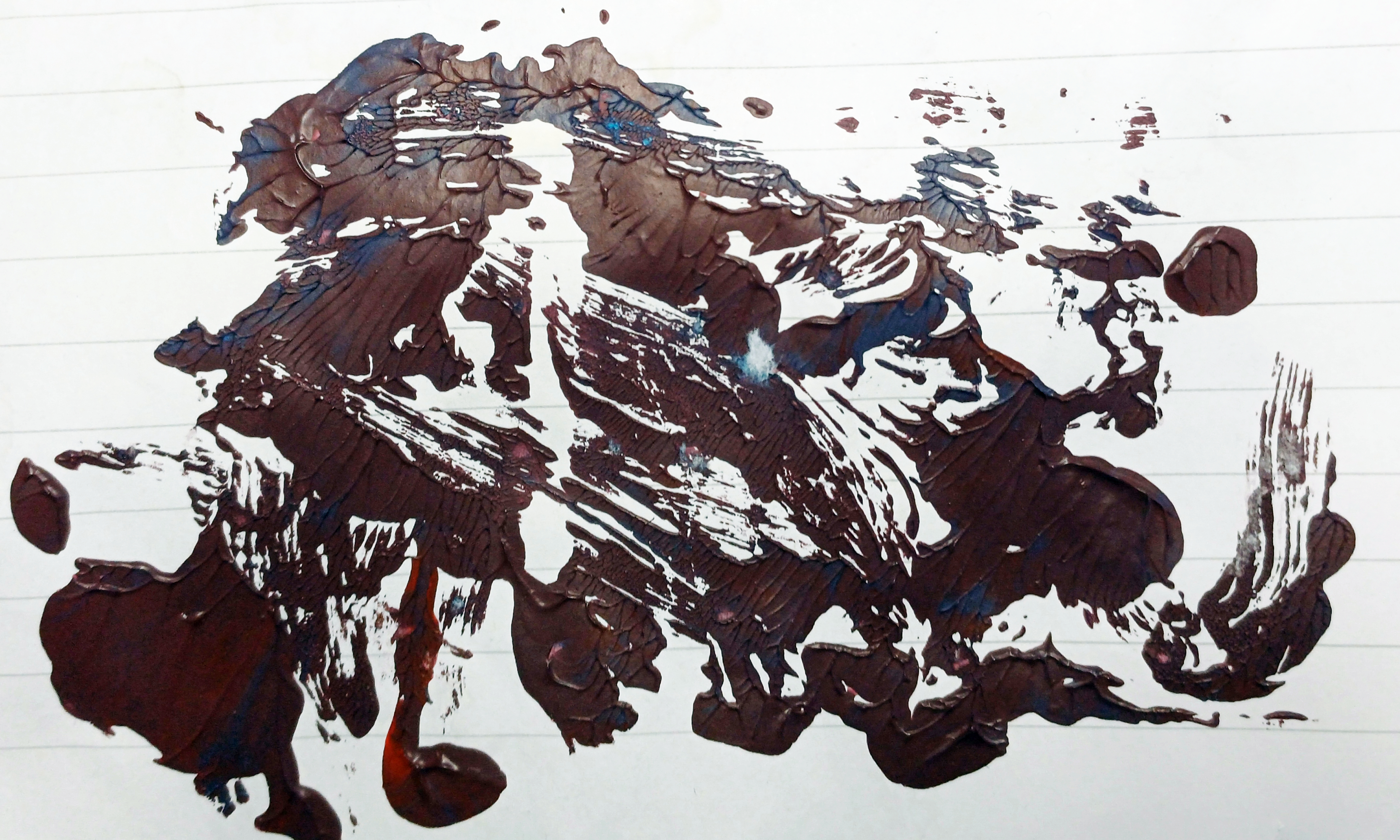
“UN noise dash dot” [6th to 9th September 2024] by Matt The Unfathomable Artist, charcoal, pastels & acrylic paint on premium 115gsm medium textured cotton primed to 240gsm over 12in x 16in (30cm x 40cm) wood-fibre board (4mm), 6936 x 5160 pixels.
Matt The Unfathomable Artist fans please be ready for draft by draft overload.
Having wrote detailed information I thought ‘Fans do need to see these drafts to appreciate how UN noise dash dot progressed’.
“UN noise dash dot” is made in approximately four drafts as follows.
6th September prior to 2111hrs:
First draft: beautiful red canvas coverage and canvas scratches (palette knife) including scratched words. I cannot explain how invigorating this first draft was.
Photograph immediately below.
“UN noise dash dot – first draft”
It’s cool fans get to see early drafts, my artmaking process and developing ideas.
Late 6th into early hours of 7th September prior to 0011hrs:
Second draft:
charcoal lines added
charcoaled SCREEN_. [to read, ‘dash dot’] PLAY, 314, ART LIFE, tree, UN, stylised sigma symbol [ Σ ] left of ART LIFE, M and box shapes
‘claw’ added to the top of a rectangular robot-like or building shape
soft pastels around some boxes for definition
The ‘claw’ could possibly be subconsciously inspired by “The Giant Claw” [movie, 1957] and/or Robby the Robot from “Forbidden Planet” [movie, 1956]. The latter is one of my all-time favourite films. I did enjoy “The Giant Claw” recently, due to the acting performances by the cast.
un in capitals means ‘the opposite of’ or ‘contrary to’ although I’m happy with any reasonable interpretation for this lettering.
I did also think of the un in unfathomable whilst writing this and also the United Nations. I didn’t and haven’t defined an exact meaning for ‘un’. I enjoy viewers deciding for themselves, personally.
Photograph immediately below.
“UN noise dash dot – second draft”
7th September prior to 1445hrs:
Third draft:
yellow paint added around boxes,
yellow highlights around some words,
pseudo-purple paint (first batch) around boxes,
green paint around 314, ART LIFE, UN,
letter [ i ] symbolically added in green to the right of the letter M.
You can see the wet purple and yellow on the UN noise dash dot canvas (image immediately below) that featured in ‘Sandpapered Green..”:
“UN noise dash dot – third draft”
8th September 2024 – artwork drying, photographed once for artistic evaluation:
no drafts, I photographed “UN noise dash dot” now dry from the day before and the still drying heavy impasto canvas of “Cosmic Mouth” – the ‘astronomy‘ art work (not the female mouth canvas working as this was extensively done on the 1st & 2nd September 2024, subsequently overpainted).
9th September early afternoon prior to 1334hrs:
Fourth draft:
green highlights around boxes and dash dot symbols added in green to balance the canvas visuals.
heavier overpaint to the existing UN green box for definition.
second batch of mixed red/blue-to-pseudo-purple paint added around smaller boxes and underneath the overpainted green dash dots below ‘UN‘. I called this latter area ‘the seated dash dots‘ as some days afterwards this is how I myself interpreted this. Please do see “Mapped Random Satellite {Day} #1” as I believe this is my subconscious finding its way into UN noise dash dot. Interestingly the seated shape of these dash dots is pure chance to fill negative canvas space!
see [*2] further below for details of the second batch of pseudo-purple paint I mixed on Notepad paper to randomly become “Upper – Original” with “Unfathomable Apocalypse Rider in Six-Grid Collage”.
“UN noise dash dot – WET PAINT” [6th to 9th September 2024] by Matt The Unfathomable Artist, acrylic paint on premium 115gsm medium textured cotton primed to 240gsm over 12in x 16in (30cm x 40cm) wood-fibre board (4mm), 6624 x 4914 pixels.
In terms of subject matter I feel “UN noise dash dot” is my usual pop art complexity. Not in any order of importance or competing artistic thought:
movies, classical films (produced by studios like RKO Pictures)
spurious Morse Code without any meaning in ‘dash dot’
my digital artworks with bright neon-like highlights as a purely visual reference to the neon-like acrylic highlights within “UN noise dash dot” please see:
Here is further information whilst making “UN noise dash dot” with regards to the two pseudo-purple paint batches I mixed on the 7th and 9th September respectively:
[*1] 7th September prior to 1445hrs:
Whilst mixing the first batch of red/blue paint for the purple I made a (then unknown to me) random artwork on sandpaper that would become “Sandpapered Green with Dark Purple & Yellow”.
I folded one P400 sandpaper piece in the middle from the leftover purple paint to make two paint prints on the same P400 paper piece. I then pressed one of these to a third sandpaper rectangle (folded P400 piece), now making three individual rectangular acrylic ‘prints’ across two pieces of P400 sandpaper.
[*2} 9th September early afternoon prior to 1334hrs.
Whilst mixing a second batch of red/blue paint for the purple I made a (then unknown to me) random artwork on lined Notepad paper. This would become first two acrylic pieces then their digital artwork derivations through “Upper – Original” and “Unfathomable Apocalypse Rider – Original” (both physical pieces and the digital derivations are included in the same blog article and link).
Just a quick thought on ‘then unknown to me‘. To me as an artist, mixed or mixing paint is made purely for the purpose of the canvas I’m working on, nothing more. When working on oils I have art-deco teacup saucers I use to mix the paint. These are cleaned after each oil painting session.
Making art from mixed acrylic paint leftovers is therefore quite new to me. Every now and then I like the look of the random paint I’ve mixed, please see “Pure Chance Portrait #2 in Portrait” for instance. Interestingly, I have some iron gall ink practice works I turned into art pieces some years ago. I’ve not published or formally documented any of those as yet.
“UN noise dash dot” is unusual in that I had two batches of mixed acrylic paint workings I liked and decided to do something with.
“Unfathomable Apocalypse Rider in Six-Grid Collage” [digital artwork, 9th/10th September 2024] by Matt The Unfathomable Artist, random acrylic red/blue to purple mixed paint on lined notepad into six-grid collage, 6480 x 5853 pixels.
From social media in bold and italics:
Quotation:
“.. I’m very eager for art writers to see a digital artwork I have just made. Having randomly mixed red and blue to make purple for a Pop Art piece [UN noise dash dot] on lined notepad paper yesterday.
It’s quite honestly a most unfathomable coincidence, beyond the planned construction of the six-grid collage itself from the photographed paper in my hand just now this afternoon.
After mixing purple and using the paint on the aforementioned Pop Art piece (yesterday) I viewed the sheet of paper, kind of liking the shapes I had pressed together, yet thinking none more to it..
.. saying to myself, ‘I shall try to make something of it. I would like to show people art can be made from seemingly nothing’. Yesterday I viewed photographic images of the [Indian] Gaur online.
I did this both some day before and after the purple mixing yesterday. Immediately after making the six-grid digital piece I realised inspired thought is somehow finding its way into my work.
The thing is I simply motioned my brush to mix paint, nothing more! When I pressed the wet leftover purple paint paper together at the middle, all I did was touch my finger at one non-painted side a number of times to cause a difference in the paint separation. Without any defined idea or concept.
I really cannot wait for art writers to see this work in its entirety, as I haven’t even photographed the upper-half of the pressed paper to-date. It’s absolutely ridiculous! I’m going to do so this afternoon or later.
It is a most random inspired work in my opinion.” – written by Matt The Unfathomable Artist, 1506hrs on 10th September 2024.
Here is the digital artwork image for the “Unfathomable Apocalypse Rider”:
“Unfathomable Apocalypse Rider – Digital” [digital artwork, 9th/10th September 2024] by Matt The Unfathomable Artist, random acrylic red/blue to purple mixed paint on lined notepad, 4646 x 2788 pixels.
Pictured immediately below is the actual physical random paintbrush pressing on the notepad:
“Unfathomable Apocalypse Rider – Original” [original image held in my hand photographed 10th September 1310hrs, pressing 9th September 2024] by Matt The Unfathomable Artist, random acrylic red/blue to purple mixed paint impressioned-pressed onto lined notepad, 4646 x 2788 pixels.
Imagine the plain paper of the as yet “Unfathomable Apocalypse Rider” folded on top being pressed into the (Upper or bison) random acrylic mixed paint half of the notepad paper.
This is how the Upper bison half of the brushwork pressed together on the 9th September 2024 came to look as you see here:
“Upper – Original” [photographed held in my hand 11th September 2024 at 1414hrs, paint brushwork and pressing 9th September 2024] by Matt The Unfathomable Artist, random acrylic red/blue to purple mixed paint, pressed in half on lined notepad, 4646 x 2788 pixels.
[differences in notepad paper and paint colours due to indoor lighting conditions and the photographic editing between the two images]
Just take a close look at the beautiful striations in “Upper – Original”. Everything the product of complete random pressing from randomly mixed pseudo-purple paint on the 9th September 2024!
I didn’t even realise the randomness of “Upper” represented any visual form or idea until two days later.
– “How Matt could you not see a bison?! Or North America for that matter?!”
‘I was looking at the <random> paint you see in “Upper” upside down at first. When I turned the paper the other way around what would become “Unfathomable Apocalypse Rider – Original” became my initial artistic focus of interest. Primarily since I could quickly see a human-like form in ‘Rider’.
Whereas “Upper” now upside down* as we see it in the image didn’t immediately bring anything to mind visually or in any objective form. Likely since I macro viewed the intricate striations. In fact I was so amazed about the ‘Rider’ for its randomness I even wrote exclusively about this the next day at 1506hrs on the 10th September.Not realising “Upper” would turn out to be as artistically unusual as “Unfathomable Apocalypse Rider – Original”!
*upside down at the top as regards the notepad paper. This is why I called it “Upper” at the time since I didn’t have any other specific title idea for this. In fact, I believe I mixed the (Upper) paint ‘upside down’ at the foot of the paper to how you see it above. Entire notepad image shown at the end of this article for reference [see # below]
Quotation from social media in bold and italics:
“If I told you the perceivable landmass you see is 100% completely random paint mixing would you believe me? The beautiful leaf-like striations occurred through my pressing this Upper half against the folded Notepad paper at the centre.
You can see where I held the paper as I made the pressing in both my hands.
After some days I began to envisage this random paintwork looked like North America. On the 12th September or thereabouts I noticed the unusual placement of ‘Florida’. On the 14th September (five days from its random production) I could then see the entire piece looked like a Bison! ‘Florida’ had therefore became its tail, completely by chance.
Extraordinary.” – personally written quotation published on 18th September 2024 to social media.
From “Upper – Original” I made the following digital artworks:
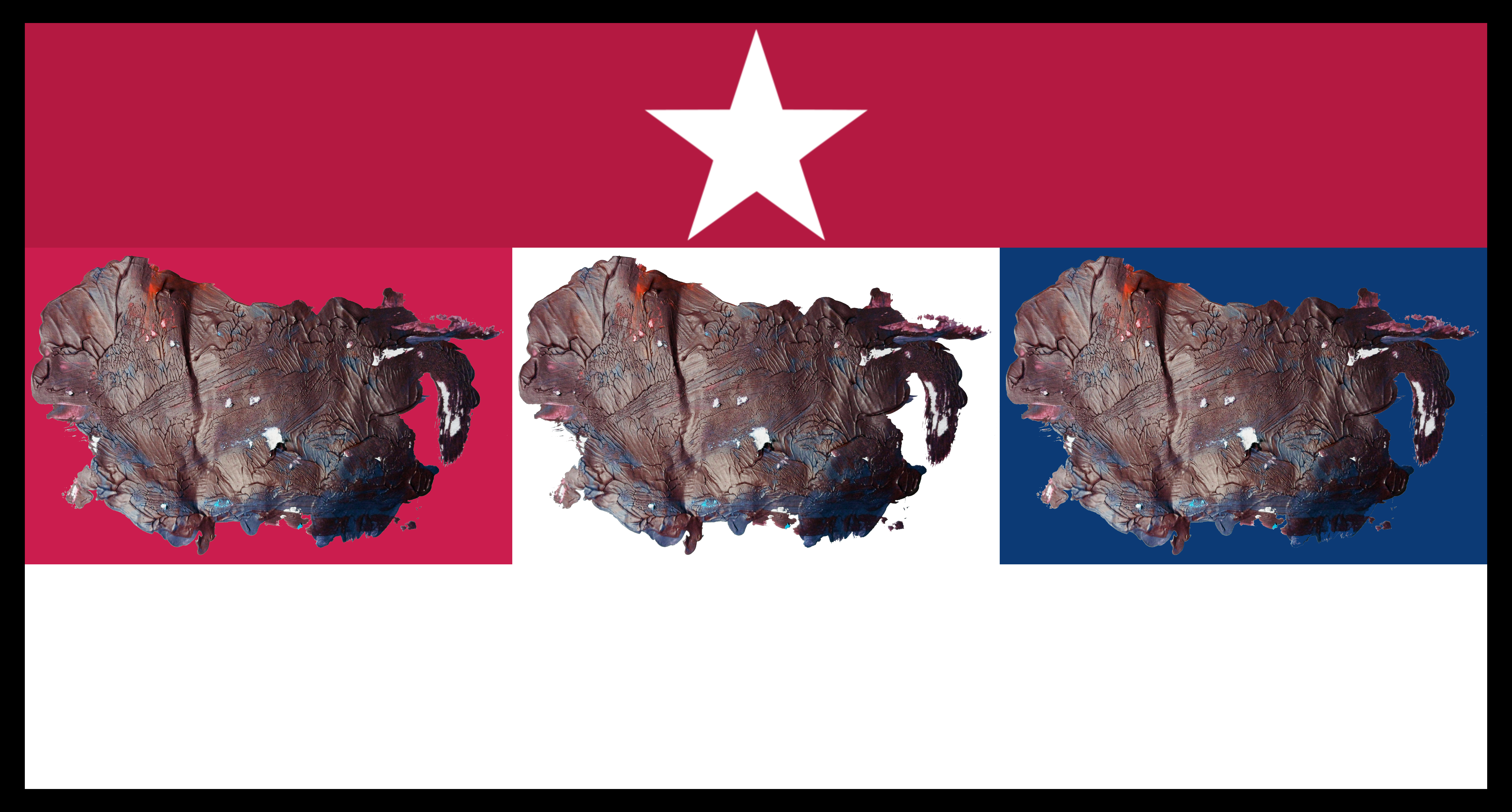
“Red Old Glory Colour North American Bison” [digital artwork, 9th original, 11/12th September 2024 digital] by Matt The Unfathomable Artist, 6000 x 3899 pixels.
I titled this “Red Old Glory Colour North American Bison” today on 24th October 2024.
The red is 179, 25, 66 in the RGB scale.
“White Old Glory Colour North American Bison” [digital artwork, 9th/12th September 2024] by Matt The Unfathomable Artist, 6000 x 3899 pixels.
I titled this “White Old Glory Colour North American Bison” today on 24th October 2024.
The white is 255, 255, 255 in the RGB scale.
“Blue Old Glory Colour North American Bison” [digital artwork, 9th/12th September 2024] by Matt The Unfathomable Artist, 6000 x 3899 pixels.
I titled this “Blue Old Glory Colour North American Bison” today on 24th October 2024.
The blue is 10, 49, 97 in the RGB scale.
“Red, White & Blue Old Glory Colours North American Collage with Border” [digital artwork, 9th/12th September 2024] by Matt The Unfathomable Artist, 6480 x 3396 pixels.
“Red, White & Blue Old Glory Colours North American Collage with Border” is the first collage I made, shown immediately above.
“White Star, Red & White Stripe, Triple Old Glory Colour North American Collage with Border” [digital artwork, 9th/12th September 2024] by Matt The Unfathomable Artist, 6480 x 3396 pixels.
“White Star, Red & White Stripe, Triple Old Glory Colour North American Collage with Border” is the second collage I made (immediately above) to represent North American emblems of Stars, Stripes red and white with the complimenting Old Glory colours of Red, White and Blue.
Quotation on 16th September 2024 at 2150hrs “.. i would LOVE this artwork as four flags if i could. The three colour flags and then the collage with red and white stripe. if it was my choice i would make it into a cool weathervain [weathervane] piece entitled Four Winds of Direction. i would fasten each flag top and side so each flag would ripple nicely in the wind”.
I honestly felt I needed to dignify the whole random notepad work particularly as North America decided to present itself.
Randomly.
I would like to mention that despite the strange randomness of my work an art commentator did mention Jasper Johns to me afterwards. Jasper Johns famous for his intricate flag artworks.
The art commentator wrote “.. The Jasper Johns directive, ‘take an object, do something to it, do something else to it’. – anonymous, 19th September 2024, 1222hrs.
To this I replied:
“I had researched Jasper Johns work some weeks ago. This is why Upper is so very strange to me, randomly so ‘perfect’. I’m the only person who knows I just focused on mixing red and blue paint. Very odd.” – Matt The Unfathomable Artist, 1322hrs same day.
It should be noted I read, view or think about different visual artists most every day. Including the days and weeks prior to “Upper – Original” and “Unfathomable Apocalypse Rider”.
Let’s see some screenshots of newspaper articles whilst thinking of the ‘tail of Florida’in my random brushwork of “Upper – Original”:
‘Map of Tropical Storm Helene’s path’ courtesy of the BBC, 25th September 2024.
As you can see from ‘Map of Tropical Storm Helene’s path’ (immediately above) the ‘tail of Florida’ could be interpreted as a swirling hurricane. There is a striking similarity despite the fact my random brushwork and pressing is done on the 9th September 2024..
.. with pseudo-purple paint whilst working on “UN noise dash dot” [6th to 9th September 2024].
Here is a screenshot report detailing some of the devastating effects of Hurricane Helene:
‘Hurricane Helene tracker, image one’ courtesy of The Telegraph, 27th September 2024 screenshot.
Another highlight from the same report of exponentially destructive manmade climate effects:
‘Hurricane Helene tracker, image two’ courtesy of The Telegraph, 27th September 2024 screenshot.
Anyone appreciating my humanitarian efforts will know I have strongly campaigned for a reversal of manmade climate damages to the Earth, environment, wildlife and global air, land and sea pollution.
I feel my artworks in this article are the subconscious result of humanitarian efforts to appeal to world leaders to better manage Earth’s resources in a more harmonious way.
Thank you.
[#] For reference this is a photograph of the entire brushwork and pressing on the notepad paper as I first viewed same on the 9th September 2024:
Notepad paper with random brushwork and pressing for “Upper” and “Unfathomable Apocalypse Rider” from 9th September 2024.
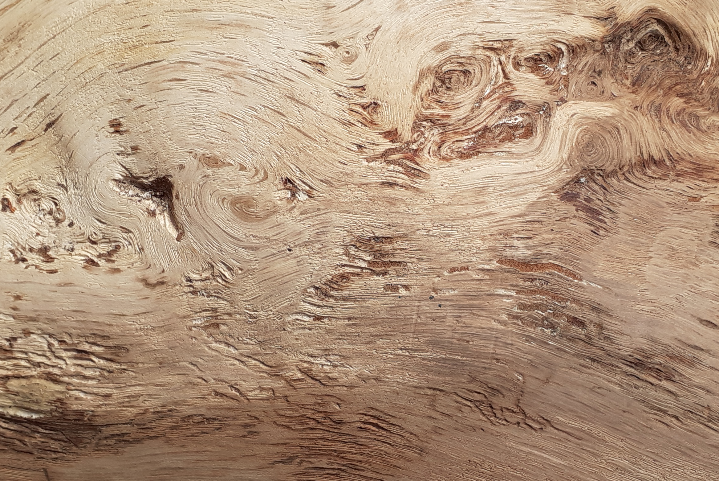
“Golden Sun Bathed in Red” [8th September 2024, dry paint image on the 11th] by Matt The Unfathomable Artist, acrylic paint on premium 115gsm medium textured cotton primed to 240gsm over 12in x 16in (30cm x 40cm) wood-fibre board (4mm), 6000 x 4461 pixels.
From social media in bold and italics:
[ I made “Golden Sun Bathed in Red” very quickly in two drafts. The first draft palette work to cover the canvas with a purple I mixed from red/blue acrylic. Then around half an hour to an hour later I produced the entire work within approximately one hour using brushwork primarily.
Palette work can be seen for the sunray fronds. The paints I used additional to the red/blue purple are gold, cadmium red, iridescent copper, orange and green. ]
Do click on the image above, see for yourself the artistry within the painting.
The photography for the original image (shown immediately below) is a specialised style I developed from my sketch “King James VI & I Oak of 1612 Branches in Sunlight”. Whereas the latter is direct lamp light, for “Golden Sun Bathed in Red” I photographed with indirect lamp light.
“Golden Sun Bathed in Red – wet canvas in indirect light” [8th September 2024] by Matt The Unfathomable Artist, acrylic paint on premium 115gsm medium textured cotton primed to 240gsm over 12in x 16in (30cm x 40cm) wood-fibre board (4mm), 5724 x 4189 pixels.
The point I’m making with my artworks is light makes a difference to the presentation. Often I think how I wish an individual artwork to be displayed in terms of lighting.
For instance I have a specific installation idea for “Gold & Blue Abstract After Rothko” (click link to see artwork). I see “Gold & Blue Abstract After Rothko” in an enclosed booth. Each viewer walks in through the low ceiling doorway entrance, likely bowing as they do so. They reach the painting, sitting down at personable distance to the moonlit-like artwork.
Sat meditating. To contemplate their life and life. To refind peace.
By the way, I saved someone work for much later with “Gold & Blue Abstract After Rothko” to help with any potential restoration work centuries yond.
Here it is as a reference for a dear old lady of the future:
“Ecce Pueri” [4th April 2024] by Matt The Unfathomable Artist, digital image hand drawn on screen over original abstract, 1089 x 1641 pixels.
If Monet can begin with caricatures (please refer to the link here Claude Monet’s Caricatures) to influence modern French cartoons, then it is good in my eyes. Besides, I have an immense humour.
[ Claude Monet Caricatures website link courtesy of Draw Paint Academy ]
Breadcrumbs in tarragon crusted sea bass anyone?
Yesterday evening I was walking around theatrically to myself, waving my hands aloft in the air dramatically exclaiming ‘I see the hands of Calibos!‘.. continuing with ‘oh what eyes you have Grandma‘.. then finishing on chatter about wolves in sheeps clothing of fabled fame.
Fun, fun, fun the intellects of centuries past.
I went on to thinking about “The Allegory of Good and Bad Government“ (please click link to view). Artists of the 1300s understanding the contrary elements of good or nefarious intent.
Essentially “Golden Sun Bathed in Red” is specifically a mix of Van Gogh and Munch for style. Their work is loved for a reason..
.. quality and care.
The search for most every professional artist.
With this in mind I shall share with you a quote courtesy of Daily Rothko:
“…nobody has any conception of how poor we all were then. I remember maybe as late as 1955, you know, after the so-called triumph of Abstract Expressionism Rothko saying to me, ‘If somebody would pay me $500 a month for all my past work, which constituted hundreds of pictures, plus everything I’ll make in the future, I would gladly accept it in order to survive.’ I remember looking him in silence because we knew – and this is in 1955 – that nobody in the world would pay him $6,000 a year for his total output; and he was married with a child in the most expensive city in the world.” – Robert Motherwell
(Interview by Paul Cummings at the Artist’s home in Greenwich, Connecticut November 24, 1971, Smithsonian Archives of American Art).
Appreciating and dignifying the monetary value for his work Rothko was in effect asking for $5,882.48 a month if we adjust $500 in 1955 for inflation.
Today, completely unconnected to adjusted inflation Rothko’s rather modest 1955 commentary-offer easily proved worthwhile with his abstract paintings selling for millions of dollars.. each.
“Untitled Photograph #1“ [30th October 2021] by Matt The Unfathomable Artist, artistically edited photograph in black & white, digital image 5373 x 6248 pixels.
I took this photograph at 1850hrs on 30th October 2021, whilst Jupiter and Saturn watched from afar, above the night skyline. A human-like shadow appears to cast a glow of itself, below the urban lights.
Here are photographs of the celestial sights to the South South East, South that evening:
1848hrs:
Photograph taken at 1848hrs of the bright celestial body by Matt The Unfathomable Artist.
Photographed by me nearer to the urban lights whilst I stood upon the smooth concrete, at a junction. All light objects below the two central celestial bodies (shown in the image just above centre, centre-right) are manmade.
One celestial body is hardly discernible, without zooming for a close-up.
1851hrs:
This was photographed at 1851hrs, whilst I stood upon smooth concrete, further away from the urban lights pictured. Yet, standing near to where my original photograph was taken one minute earlier, entitled “Untitled Photograph #1”, urban lights without colour.
Here is a close-up of 1851hrs, shown immediately above:
To the imagination, this could resemble an alien face.
“Buzzards Wood Hollow” [9th June 2021] by Matt The Unfathomable Artist, sketch with 3H HB 3B pencils signed in black ink on A4 250gsm Artist’s paper.
I photographed a few compositions of the entrance to Buzzards Wood via the central hollow from Meadow Three. This opening is directly opposite to Ridge Willow and Wrens Wood. There are three additional entranceways into Buzzards Wood.
There are four pathways within and immediately surrounding Buzzards Wood. Whenever I’m writing regarding Buzzards Wood I’m usually referring to the Nature Reserve area. However, Buzzards Wood technically also encompasses the wood to the rear (bow, north) beyond the Nature Reserve itself, in my opinion.
Buzzards fly regularly over the meadows, woods, and towards the north, where there is a local fishing pond. The post at the lower right of my sketch actually used to be a wooden bench. I rather hope it is restored as a bench as this is a great sitting place, centrally in Meadow Three.
Further along to this bench is a ‘watervole ground stone’. Rabbits do seem to enjoy using the flat stone surface as a convenient toilet, haha. A ‘rabbit ground stone’ can be viewed inside Buzzards Wood at the pathway crossroads, nicely covered by the shade of trees to enjoy. Rabbits frequent all three meadows, the private land to the west and all around the 29 acre lake to the south.
Another ‘ground stone’ meets with you to the left as one enters Meadow Three from Meadow One, walking up a small number of steps.
My sketch style in this article strongly reminds me of the beautifully artistic childrens animations I used to watch as a boy.
In keeping with that theme I included fanciful eyes and faces, Picasso-esque, to add fun to some of these series of artworks.
‘Triple Seismic Waves with Oscillation #1’ [July 2020] by Matt The Unfathomable Artist, dip nib ink pen on A3 180gsm paper.
Spontaneously sharing my latest dip nib ink pen artwork using iron gall ink entitled ‘Triple Seismic Waves with Oscillation #1’.
Electronic oscillation produces pleasing visual effects. This artwork seeks to replicate the idea in drawing form using my free hand technique for the curved lines. I love scientific art. Curves, electronics, seismographs, oscillators, earthquakes, sound waves, along with the beauty of artistic courses.
For this artwork I use a nib that creates a double ink line due to the noticeably distant ‘tines’ of the metallic nib. The flow of ink is important with dip nibs where one is wishing to produce a continuous line across a ‘decent measure of time’ once upon the paper.
The effect of oscillation can been seen vertically in this artwork.
‘Kinin Valley’ [copyright 7th May 2020] by Matt The Unfathomable Artist, digital photography.
Imagine NASA has just this second received new images from their distantly galactic travelling satellite probe. Kinin Valley, shown above, could have been photographed 100,000 miles from space. Detailing its epic landscape of cavernous valleys and Mars like red rock formations.
‘Nebulaic Cyclones with Wormhole Striations’ [copyright 7th May 2020] by Matt The Unfathomable Artist, digital photography.
As the deep space probe passes over this alien lunar surface we see a huge meteor has struck an immensely dry area to our left in the above image, Nebulaic Cyclones with Wormhole Striations. Upper right we can make out what appears to be storm scars of ancient water erosion.
At the lower mid section of the image we observe heavy sloping, a natural quarry descending downwards towards us. An alien species has perhaps eaten into the landscape in worm-like striations, burrowing strange etches into this now lifeless moon.
‘The Helix Whorls’ [copyright 7th May 2020] by Matt The Unfathomable Artist, digital photography.
NASA gathers together a team of specialist scientists to categorically figure out ‘The Helix Whorls’ phenomenon.
A time traveller probably visited last Wednesday, one million three hundred thousand years ago, at a time when sturdy shell covered creatures roamed this moon’s macro-phasic atmosphere.
‘Robur Canyon’ [copyright 7th May 2020] by Matt The Unfathomable Artist, digital photography.
Mythical legends have spoken of monsters lurking in structures exactly as described in Robur Canyon. Dark matter without discernible mass, form or measurable depth causes disenchanted quietness upon anyone approaching its entrance ways – shown above, to the right and lower right, at two distinctive places.
‘Inescapable Monster Moon’ [copyright 7th May 2020] by Matt The Unfathomable Artist, digital photography.
Similar in idea to our own Man in the Moon, this image conjures a vivid resemblance with the terrestrial deep sea Fangtooth, Anoplogaster cornuta. Actually the pit to the lower left could be 20,000 feet deep!
‘type: The Unfathomable Artist #1’ [19th February 2020] by Matt The Unfathomable Artist, Digital Pop Artwork, MS Shell Dig 2 and Times New Roman fonts, 7016 x 4951 pixels, 600dpi, A4 Landscape format.
Digital Pop Artworks digitally produced to technologically articulate the need for global climate change policies.
Subtle version two shown immediately below, with the future idea to create written words and iconography throughout the blue canvas space:
‘type: The Unfathomable Artist #2’ [20th May 2020] by Matt The Unfathomable Artist, Digital Pop Artwork, MS Shell Dig 2 font, 4412 pixels x 3981 pixels, 600dpi, A4 Landscape format.
Version three with Times New Roman ‘type’ font and ITC Kristen chosen for the main green yellow alternating Unfathomable text shown below:
‘type: The Unfathomable Artist #3’ [24th May 2020] by Matt The Unfathomable Artist, Digital Pop Artwork, Times New Roman and ITC Kristen fonts, 7016 pixels x 4961 pixels, 600dpi, A4 Landscape format.
At the time of editing this page on 24th May 2020 I have started work on two oil paintings for my ‘type: The Unfathomable Artist‘ series of pop artworks. The blue screen backgrounds are already completed. I’m waiting for the refined linseed oil mixed within the oil paints to dry before adding the painted fonts.
I’m likely to choose version #3 as the first oil painting artwork for me to finish. Then version #1, as seen in these Digital Pop Artworks. The blue backgrounds already look delicious.
‘Clay Jug’ [2012] by Matt The Unfathomable Artist, Sketch on A4 card paper.
Photograph taken by bending the card into a three dimensional curved form to emulate the physical properties of the clay.
I prefer that those appreciating my artworks might fully understand my interest in clay works such as this jug pictured. For clarification I’d like to share some of my reasons for loving clay works.
Firstly my hometown is quite literally referenced upon natural red clay itself. The area surrounding my birthplace is also notable for its Middle Ages trade in pottery. The jug dated sometime between the 12th to the 14th Century, sketch pictured, is on display at my local city museum.
It’s delightful to me that my early art classes included much clay making using my middle school’s professional kiln and glazes. Metal, wood, textiles and paper mache classes would all become a regular part of my week to week schooling growing up into high school.
17th July 1986 is the date I completed a pottery piece for my Grandad George. Even though my Grandad George passed away 2007 I still have that very pottery I gave to him in 1986. He kept it proudly on his windowsill for years where the Hills smile gently upon the Plains.
My early pottery piece makes me laugh to this day, particularly describing his exceptional sense of humour.
Love of clay works, to me, is all about an existential sense of Continuity.