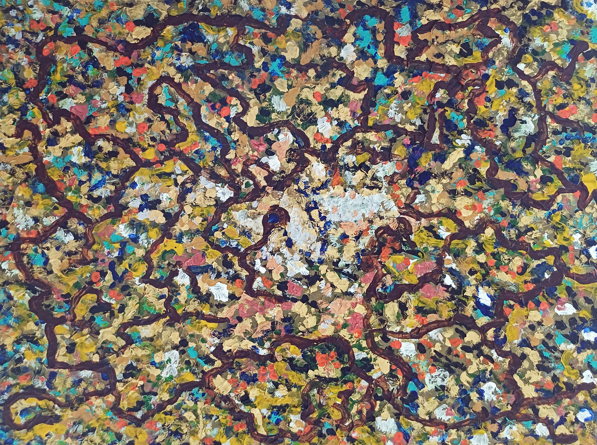
“Easel #1” [2nd to 5th August 2025] by Matt The Unfathomable Artist, acrylic on A3 (12 in x 16 in) gesso primed 5mm wooden board, 2400 x 1789 pixels.
Easel #1 began as a conversation between colours, a raw outpouring of emotion and energy. A multitude of individual dabs of paint — ochre, turquoise, crimson, gold, silver — jostle for position like a crowd of competing thoughts.
Each daub is a distinct texture, a fragment of intuition. This is the foundation: the beautiful, untamed wilderness of the subconscious.
A highly painterly work, crafted with deliberate precision and sought-after intent.
I invite you into its layers. Wander along the meandering paths. What do you see in the noise? A cosmic nebula? A forest floor teeming with life? A satellite city glowing at night?
The work carries the energy of nature seen up close: the shimmer of moss and earth, the shifting tones of autumn leaves, the microscopic geometry of cells branching into unseen directions. Yet it remains entirely abstract — a landscape of the mind, painted directly from impulse.
At first glance, it’s a frenzy of colour and depth. Production, though, is not merely random. A search for pathways. Ideas.
My painting invites multiple readings: a forest after rain, a nebula in spring or the cartography of thought crystallising. Each interpretation is an opinion of self.
Threading across the surface is a network of deep umber lines. Roots, veins, neural circuits — maps of thought itself. A weaving structure through impulse, linking hundreds of discoveries into a unified whole.
At least, this is my interpretation..
For those having missed my Instagram post for this painting, here is the writing I published:
“Five distinct drafts, the last of these the defining idea, a then-realised originating inspiration. Canvas held in hand throughout my fifth draft.
A painting symbolically the notes of your voice, potential, your personal ability, to produce your own harmonic sound of melody in life.
Easel #1 presents a dynamic composition where rich, painterly textures and a profusion of colour evoke a visual topography that shifts between natural and imagined forms.
The painting is structured by a network of interlaced, vein-like umber lines that organically traverse the surface, echoing neural pathways. These darker linear forms separate swathes of vibrant, impasto daubs in cadmium-orange, yellow-ochre, cadmium-yellow, ultramarine, turquoise, gold and titanium-white—each practical dab contributing to a dense, fractal rhythm.
The central area of the canvas suggests a focal illumination or zone of heightened chromatic complexity. Silvery whites-creams emerge from the surrounding matrix. A compositional strategy draws the eye inward while retaining the all-over balance of action painting.
Easel #1 places itself within post-impressionistic abstraction, perhaps informed by Pollock’s non-linear gesturalism, textural buildup and discrete pigment groupings. The work may also be interpreted as poetic cartography—biological and/or terrestrial in implication—suggesting an unfixed terrain of consciousness or memory.”
“Turquoise Green Bronze Waters” [23rd April 2025] by Matt The Unfathomable Artist, acrylic mixed with liquid fixative and clear acrylic medium on A4 250gsm Artist’s mixed media paper mounted onto A3 (42cm x 30cm) primed-bronze painted 5mm wooden board, 5000 x 3725 pixels.
“Turquoise Green Bronze Waters” is made with specific movie inspiration, having rented the film the evening prior on the 22nd April. I painted “Alvis Dede Wimsey III” immediately after “Turquoise Green Bronze Waters” too.
Then on 26th May I produced six variations to create a 3×2 Collage, plus a silver 3D-Movie version. The latter silver version yet to be published.
Turquoise Green Bronze Waters
At first glance, your attention is drawn into an oceanic expanse of turquoise depth, layered with strokes of emerald green, coral pinkish-salmon, burnished bronze, and subtle golden highlights. The textures ripple across the surface like tidal currents, suggesting a convergence of water, mineral and energy.
This piece is alive with impressive swirls:
Fluid yet grounded – The swirling gestures evoke the untamed motion of water, while the underlying turquoise base steadies the composition.
Calm whilst intense – Soft pastel undertones create moments of serenity, balanced against sharper bronze and emerald accents to bring dramatic tension.
Elements interacting with water – A recurring theme in art, bridging natural contrasts through layered abstraction.
Essentially I would like to reveal this painting represents the most joyous scene in the movie, to me. The ebb and flow of emotion carried within each curve-play of..
.. discovery, perfect friendship, adventure, understanding and selfless uncompromising protection.
“Turquoise Green Bronze Waters – 3×2 Collage” [Digital Artwork, 26th May 2025] by Matt The Unfathomable Artist, produced from the original A3 acrylic painting, 5000 x 2483 pixels.
The Colour Transformation: Six Dimensions of the Same Tide
Accompanying the original piece is a six-panel digital collage, a study in chromatic reinterpretation. Each transformation recontextualises the original features into alternate emotional registers, revealing the adaptive soul of abstraction.
1. Violet Surge (Top Left)
A lush, almost botanical transformation, where shades of lavender and green fuse into an ethereal dance. The strokes become vine-like—suggesting organic life entangling beneath the surface.
Have you guessed the movie yet?
2. Graphite Echoes (Top Centre)
Stripped of colour, the monochrome rendition exposes the raw anatomy of movement. Without hues to guide the eye, we are drawn purely to form, discovering unexpected structures hidden within the fluidity.
3. Crimson Drift (Top Right)
A heated translation where deep reds and muted aquas meet. This version feels elemental, as if fire has collided with water—suggesting passion, turbulence and heat.
4. Verdant Flux (Lower Left)
A vivid green inversion that evokes reforestation, renewal and nature’s resurgence. It reimagines the composition as an aerial landscape—a terrain seen from above, multicoloured rivers weaving through new growth.
5. Magenta Pulse (Lower Centre)
Possibly the most vibrant reinterpretation, where magenta dominates in a surge of emotional energy. This palette brings out the artwork’s inner velocity, the textures vibrating with urgency.
6. Yellow Golden Horizon (Lower Right)
Finally, the yellow-golden translation lifts the piece into radiance and warmth. The once-aquatic composition transforms into something sunlit, reminiscent of desert mirages or a chameleon catching the glimmer of daylight.
Here, on 11th September 2025 I see for the first time a face at the centre of the Yellow Golden Horizon!
How did I not see the face in my own artwork before 🙈?
Themes and Intent
Across the primary work and its chromatic studies, recurring motifs emerge:
Fluidity and resistance – The tension between soft washes and defined, almost calligraphic lines mirror nature’s duality.
Transformation through perception – By shifting palette alone, the emotional narrative of the artwork changes entirely.
Time and memory – The layered gestures evoke geological sediment, wave ascensions and the intimations of thought—a sense that the watery surface is the playful act of emotive friendship.
You are invited to spiritually immerse yourself—to discover how colour redefines meaning once reimagined across multiple dimensions.
A Reflection on Process
My original painting, here, reflects textural layering technique, where pigment and medium interweave to create depth you can almost feel under your fingertips. The carefully curated six-panel digital collage demonstrates a digital-meets-physical dialogue, amplifying the tactile qualities of paint through chromatic reinterpretation.
This convergence of traditional artistry with modern experimentation positions the work within a broader conversation: how abstraction evolves in an era where colour appears infinite, yet visual touch remains irreplaceable.
Hope you enjoyed viewing and reading this article.
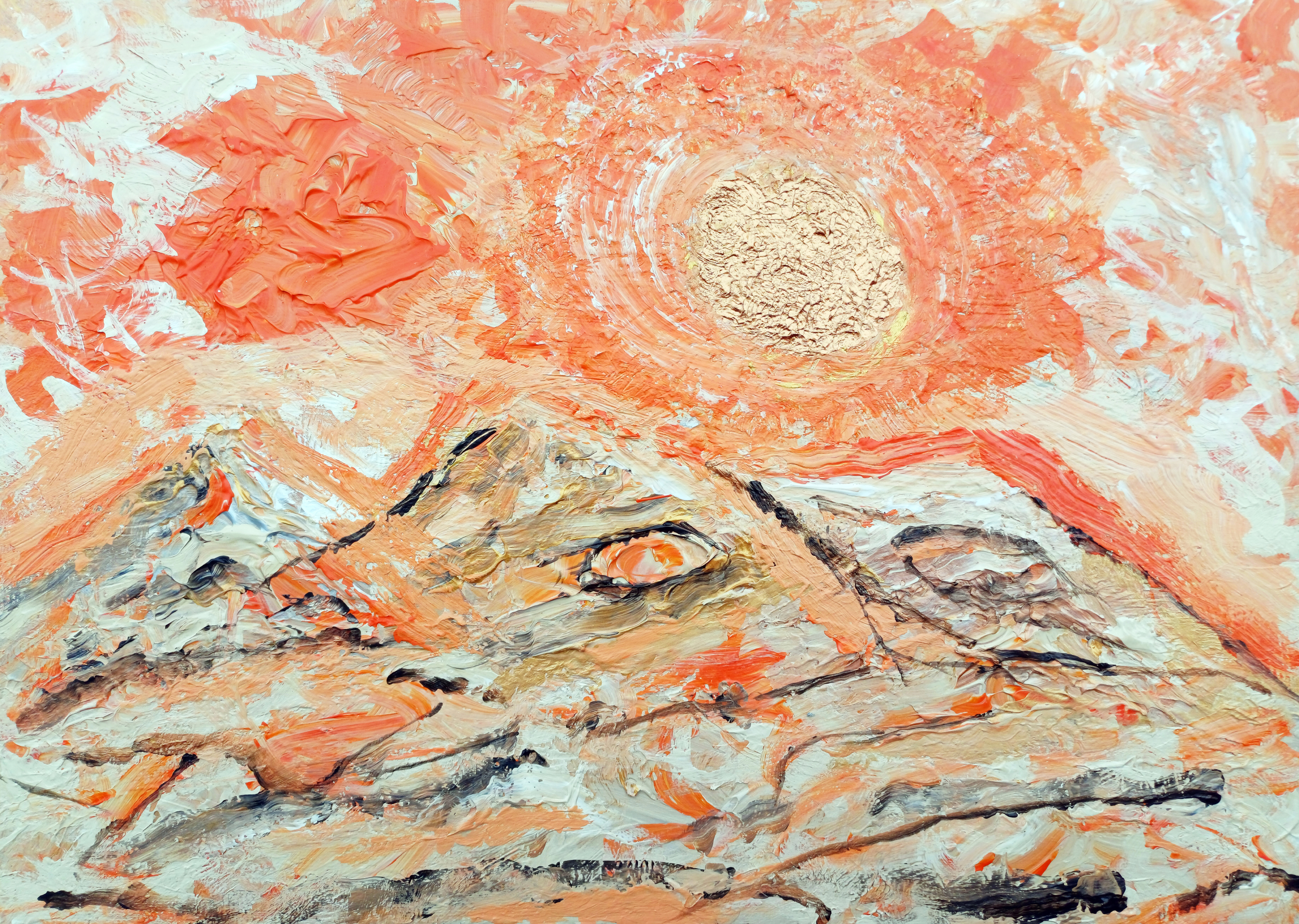
“Orange Sand & Gold #1” [6th April 2025] by Matt The Unfathomable Artist, acrylic on A3 (42cm x 30cm) 2mm wooden board, 5000 x 3574 pixels.
Quote:
Personal quote on 9th April at 1445hrs:
“the Orange Sand Gold.. i used it [the canvas] purely for mixing, then i loved the orangey canvas! im not certain i would want to sell this. however i will do another version with the ideas. the paint plays art immensely useful for producing compositions.”
This version “Orange Sand & Gold #1” is made within an hour approximately.
“Orange Sand & Gold #1” is very much an emotional-feel painting, as Turner-like beautiful as I can make.
Here is the second version of the composition:
“Orange Sand & Gold #2” [10th to 13th April 2025] by Matt The Unfathomable Artist, acrylic on A3 (42cm x 30cm) 2mm primed wooden board, 5000 x 3557 pixels.
Brackets show quotation from pre-published social media (Instagram):
[ I hope you love this second version of an original composition I produced. The Sun-sky area required several drafts to achieve the desired texture and mood I require for fine art pieces.
A distinct movie franchise found its way, twice, into this artwork.
“Orange Sand & Gold #1” and “Orange Sand & Gold #2” share a triple mountain composition, a shine to the gold and bronze Sun-stars with a deep-orange contrast to the sky. ]
In the second version we see a Jabba The Hutt and Yoda-like representation. See the two eyes, one in the middle and one in the right mountain. ‘Jabba The Hutt’ features were partially visible so I had fun accentuating this idea.
I have highlighted a ‘Yoda-like’ character with a screen drawn image, here
Yoda-like screen drawn image in “Orange Sand & Gold #2”
The Yoda-like outline is my interpretation. In fact I kept this strange orange flurry in the painting, unknowing the reason until afterwards. This orangey flurry looks so different than the other sky elements I consciously evaluated same to decide whether to keep it in my painting.
My decision after a few minutes was, ‘I love this, I’m not going to change or overpaint’ it. Very glad I took that decision.
Want to know a subconscious secret to the composition?
Some weeks after both paintings I was sat on my bed. I looked up ahead of me, viewing the October 1997 framed watercolour painting on paper-card my Nan had owned. It was a gift then from my Nan’s artist friend. I met her at my Nan’s funeral in December 2023.
A watercolour painting of the Malvern Hills, UK.
I’d never seen a face in the painting before.
[The Star Wars franchise is owned by The Walt Disney Company. Disney acquired Lucasfilm in 2012]
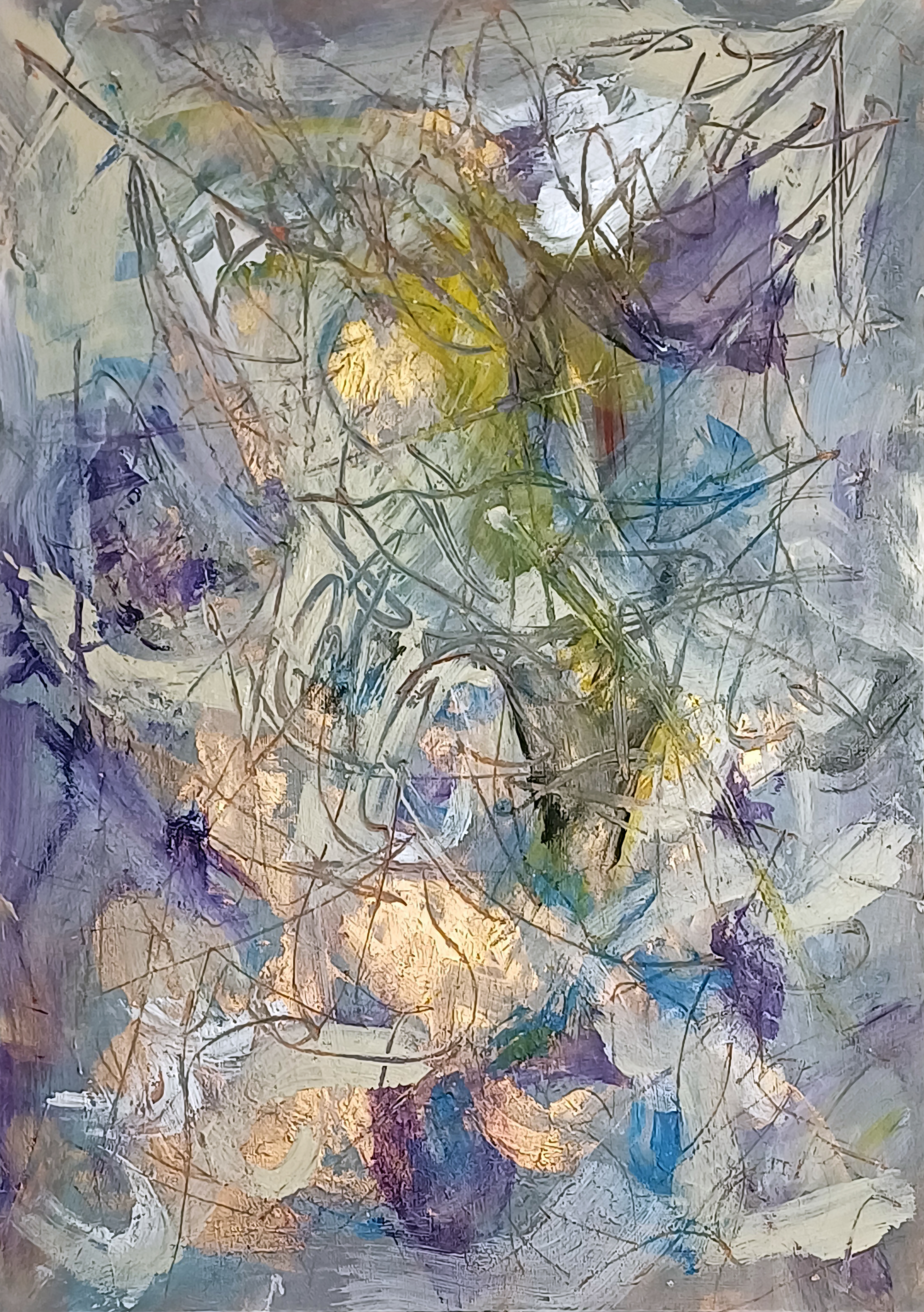
“Surfaces #1” [14th/15th March 2025] by Matt The Unfathomable Artist, acrylic & pastels on A3 (42cm x 30cm) 2mm gesso primed wooden board, 5000 x 7096 pixels.
Social Media Commentary:
[ I made “Surfaces #1” simultaneously with another wooded panel. “Surfaces #1” retained all the necessary requirements I look for in my pieces..
.. quality, balance, originality, artistic expression and personality in style.
“Surfaces #2” I overpainted into “y intersects b”, a Pop Art piece. ] – 17th March 2025.
My abstract composition Surfaces #1 unfolds as a layered field of energy, where colour, texture and line converge into dynamic interplay. Wisps of lavender, azure and deep violet co-operate with creamy whites, orchestrated by flashes of golden light that seem to radiate from within the work.
Sweeping translucent markings weave across the surface, creating a web-like structure reminiscent of organic growth.
There is a sense of depth achieved through the overlay of calligraphic pastel lines atop areas of cloth wiped impasto, with firm textures revealing glimpses of earlier layers. The visual repertoire is one of oscillation—between translucence, opacity, stillness and movement. The atmospheric palette, coupled with the fluid, improvisational paintmaking, imbues the piece with a sense of natural phenomena: light through foliage, reflections in water, or even shifting cloud formations.
In its essence, the work invites contemplative empathy, where the viewing reveals subtle chromatic interaction. It’s a meditation of surface technique—equally a meditation on the hidden strata beneath.
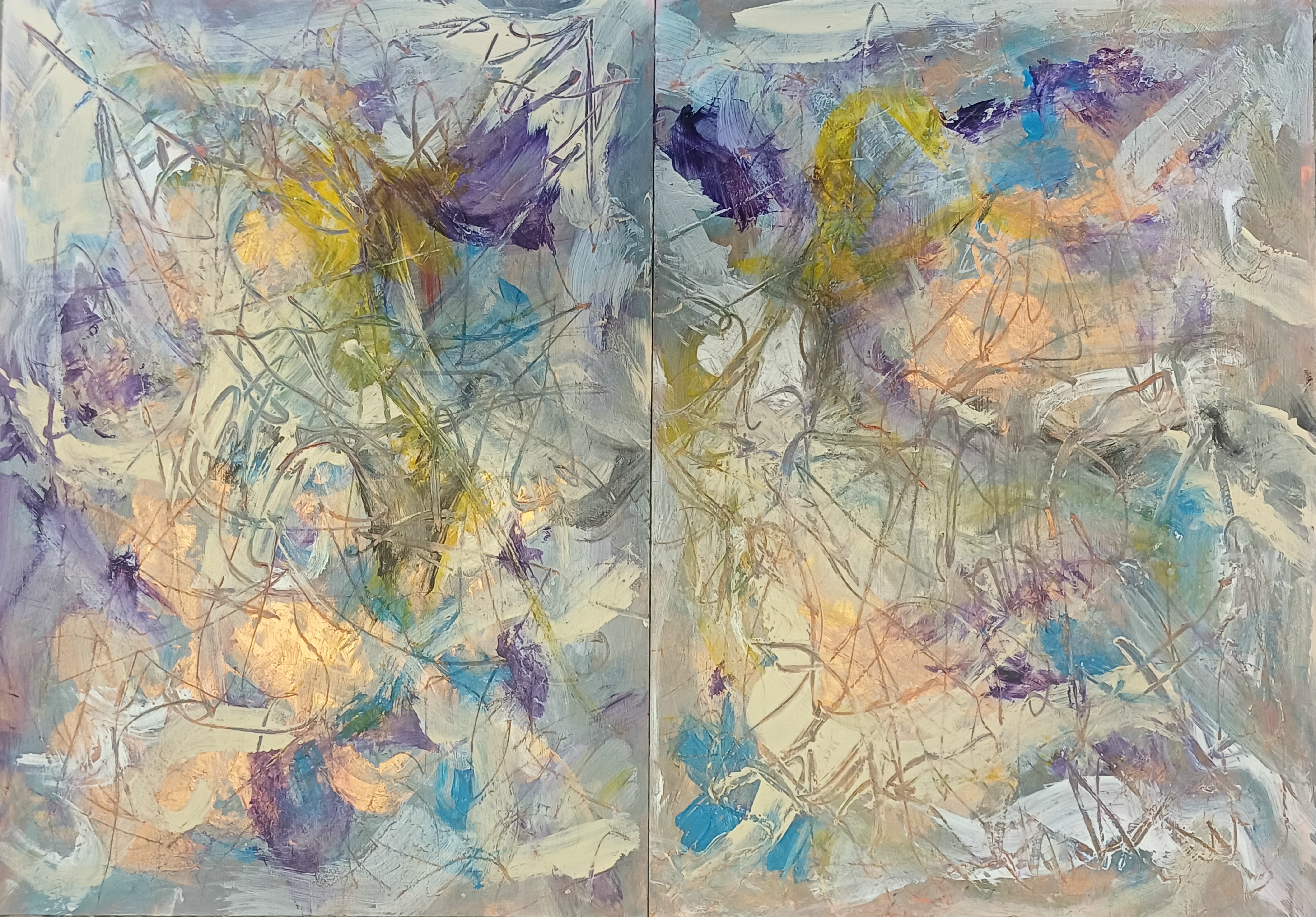
Here is the original diptych:
Diptych of “Surfaces #1 & Surfaces #2”
I retained Surfaces #1 (seen on the left), whereas being unhappy with Surfaces #2 I took the decision to overpaint same to make “y intersects b” [14th – 17th March 2025]:
You can see a small area of the underpainting for Surfaces #2 in the a4LY writing of “y intersects b”.
“Gold Sun Paint Play” [circa 25th April 2025] by Matt The Unfathomable Artist, acrylic on opened cardboard box (approximate 11in x 8in (28cm x 21cm), 5000 x 3882 pixels shown upon cropped gesso canvas for publishing purposes.
Gold Sun Paint Play
“Gold Sun Paint Play” invites the viewer to step outside the strictures of formality to embrace a visual world ruled by spontaneity, flowing movement and bright colour. Painted on a horizontally ‘columned’ piece of torn card, this work speaks not just to the enjoyable act of painting—it appeals to childlike silliness, the process of play as a serious artistic method.
I had immense concentrated fun assembling colour blocks in the form of an abstracted landscape. Crimson-orange embraces violet. Dashes of green and cream separate the palette intensity. All the while metallic gold frames the Sun, a discernible reference point for this vista.
This play is a theatre of chance. Urgent brushstrokes overlap in gestures of compositional resolve and competition. The torn edges of the substrate remain visible, lending a documentary quality to the work—evidence of the surface history and complexity.
A visible ‘tag’ of cardboard remnant at the bottom-right corner grounds the piece in some perceivable mechanical form.
Instantly I’m reminded of words I published to my blog in November 2019:
‘I was greatly interested in Gravity, so I wrote about this. I was greatly interested in soundwaves and the sonic boom, so I wrote about this. Some weeks ago “i saw a buzzard flying overhead, near over my house. It made its call. Eureka. I saw its wingtips and from this i determined soundwaves could be changed by engineering the surface ⚡”.
With “Gold Sun Paint Play” a notable constructive rhythm to the composition: vertical and horizontal divisions allude to maps or symbols, whilst the colour interplay attracts.
I laughed when I made a sort of giraffe face, top-right. The moment a young child tells you an abstract shape, to you, is definitely a giraffe is a wonderful point of self determination.
For those drawn to raw texture, unpredictability, and the visible trace of an artist’s mind, “Gold Sun Paint Play” is my version of how children love to paint.
“Wrens Youngling Oak” [29th/30th May 2025] by Matt The Unfathomable Artist, acrylic on A3 (42cm x 30cm) gesso primed 5mm wooden board, 5000 x 3755 pixels.
Wrens Youngling Oak
First, bracketed commentary from my pre-published social media:
[ I made “Wrens Youngling Oak” in two drafts late evening and then much into the mid-early hours the next day of the 30th.
First draft the entire composition with paint applied direct to the wood panel canvas My second draft clarified structural elements whilst increasing textural quality, light perception and depth.
Without having made a study or pre-drawing I’m very pleased in comparing the painting to my original photograph taken on the 28th May.
An Impressionist-style painting designed with visually abstract shapes to resemble leaves.
I believe my new acrylic painting is the sixth work attained from this very tree, please see:
(4) “Alien Leaves Analysis SolarScape” [20th November 2022] and (5) “Silvery Red Treeline SolarScape” [20th November 2022].
The title for the painting is derived from my works like “Curved Tree at Wren’s Nest Pond – original” [14th March 2022]. The Youngling Oak stands watchfully like an outpost before its natural ecosystem pond. ]
Wrens Youngling Oak is a lush expressive painting of young oak branches in alla prima.
Produced with an accurately layered painting technique from my original photograph, the surface is nicely textured—conveying both the density and vitality of a woodland environment seen in spring or early summer. The swirling greens, radiant in bursts of black, white and bluish brushmarks, evoke a sense of shimmering foliage filtered through fragmented light.
At the compositional core, elongated vertical trunks extend upward and outward, interconnected by branching limbs that disperse through the canvas. These forms, though partially abstracted, suggest a juvenile oak reaching toward maturity. The background finesses into dappled pigment—some smooth, others tumultuous—echoing the living randomness of a wild, managed forest. The white flecks and patches may allude to the presence of blossom, light reflections, or birds mid-flight—wrens perhaps—evoking the title’s poetic imagery.
This work stands in the embrace of impressionism and gestural abstraction, evoking elements of both pointillist texture and spontaneous motion. It neither mimics realism nor entirely distances from same; instead, the painting encompasses the sensation of being immersed—submerged even—within a verdant, living space. The natural concealment of clear figuration draws the viewer closer, encouraging deeper contemplation.
Artistic Notes:
The title Wrens Youngling Oak suggests a personal or ecological narrative. Wrens—modest, energetic songbirds—often symbolize life, resilience, and humbleness, while a “youngling oak” may be a metaphor for strength or growth in both natural and psychological terms. I am inviting you to explore not just the scene, but a moment of becoming, hinting at themes of protection, early life, or memory rooted in place.
The work fits comfortably into contemporary eco-aesthetic practices, which favor direct engagement with nature through materiality and metaphor. It would pair well in curatorial contexts focused on environmental poetics, new materialism, or exhibitions examining landscape beyond the horizon line—where the immersive or internal becomes the sight of painterly attention.
Here is the original photograph:
“Wrens Youngling Oak – photograph” [28th May 2025] by Matt The Unfathomable Artist.
I listen to songbirds all the time. You can hear them exquisitely, whilst walking by this young oak.
For instance, talking of songbirds, the idea of a spectrogram featured in the landscape fauna for “Gold-Bronze King James VI & I Oak of 1612” – recently completed, also in acrylic. This represented my subconscious artworking, since I did not plan to paint the horizontal fauna (behind the tree) in the manner of a spectrogram.
“Chocolate Bronze Rectangle” [30th April/1st May 2025] by Matt The Unfathomable Artist, acrylic on A3 (42cm x 30cm) gesso & paint primed 5mm wooden board, 5000 x 3757 pixels.
As is my custom I shall include pre-published text in colour font:
After making “Alvis Dede Wimsey III” I produced two beautiful ivory-black and bronze canvases with the same 3/8in angular long-tip brush.
“Chocolate Bronze Rectangle” is the first canvas of the two. The photograph here is the best tonal matching of the painting I can provide to you. Varying light creates superb shading values, a wonderful feeling imbued.
Upon completing I sat in the garden on a wooden bench, the painting on a table under a fabric parasol, intently admiring my own work!
The painting’s understated beauty requires a cave.
I have to say myself, “Chocolate Bronze Rectangle” amazes with its tones. For me this artwork is kind of like Basquiat writing a work as ‘Untitled’.
An artist preferring viewers to simply enjoy its qualities.
——-
I have decided to share two of the three paintings which made “Gold-Bronze King James VI & I Oak of 1612”. Merely a bonus to dear Readers waiting for this latest blog article.
This is the final, third painting, after two previous underpaintings:
“Gold-Bronze King James VI & I Oak of 1612” [7th to 13th June 2025] by Matt The Unfathomable Artist, acrylic on A3 (42cm x 30cm) gesso primed 5mm wooden board, 5000 x 3752 pixels.
Gold-Bronze King James VI & I Oak of 1612
“Gold-Bronze King James VI & I Oak of 1612” presents slightly lighter for sharing online.
My vibrant Impressionist painting depicts a large tree with a rich, textured trunk and branches laden with colourful leaves amidst a resplendent abstracted fauna, fore and far-ground.
The 1612 Oak branches appear like two arms of a figure reaching out towards the sky. The trunk is strong and detailed. Leaves and branches are textured with visible brushstrokes creating a sense of depth and volume.
Noticeable layering technique is utilised to create an immersive effect. The palette features various shades of green, umber, black, gold, bronze, copper, white, ultramarine and cerulean to bring a unique dreamy warmth to the treescape.
The sky is a light, hazy blue, adding openness to the expanse. There is a feeling of calm and peacefulness reflecting the quiet beauty of nature, my personality.
“Gold-Bronze King James VI & I Oak of 1612” is kind of three paintings if we include the two underpaintings prior to completion. The first, a prior study-effort of the tree in the same composition. Then a different painting entirely, a beautiful Gold Textured Abstract.
I decided to retry the tree composition from my photograph of 21st May 2025 at 1737hrs. The original photograph faces south towards the mighty Quercus Robur I named the “King James VI & I Oak of 1612”.
Both tree compositions received five distinct drafts each, with the latter including multiple finite changes throughout evaluation.
I took seventeen field photographs around the Nature Reserve and my local Lake on 21st May. The last four photographs at 1737hrs of the 1612 Oak.
The first seven photographs around the adjacent field were taken at.. 1612hrs.. I didn’t know this until writing this very description you read here!
“I love art I do”.
I found myself inspired by Japanese blossom and fields in making this.
The Underpainting
Here is the second underpainting for “Gold-Bronze King James VI & I Oak of 1612”:
“Second Underpainting for Gold-Bronze King James VI & I Oak of 1612” – 8th & 9th June 2025.
If you review the two paintings you can see the top-right tree branch forms from the gold preworking.
If I had not already recently produced “NIIP Fine Gold” I might have considered retaining this gold painting as is. Quite honestly I was annoyed the first (now) underpainted tree (unpublished) didn’t show quite as nicely as I hoped.
I’m a perfectionist with my paintings.
I wanted to paint that tree in that composition on that canvas.
Here is the wonderful composition I photographed:
“King James VI & I Oak of 1612” [21st May 2025, 1737hrs at 50 seconds] by Matt The Unfathomable Artist, 5000 x 3750 pixels.
Perhaps art students or anyone interested for that matter would like to sketch, paint or even sculpture my photographic compositions?
I do hope so.
“King James VI & I Oak of 1612” [21st May 2025, 1737hrs at 45 seconds] by Matt The Unfathomable Artist, 5000 x 3750 pixels.
Four photographs taken of the 1612 Oak at 1737hrs are 45 seconds (pictured here, immediately above), 47, 50 (the painting composition shown in this blog article) and 54 seconds respectively.
Let me share with you a further nature photograph from the day of 21st, the fourth one taken in 1612hrs, precisely:
“Hay Meadow of local lake Nature Reserve” [21st May 2025, 1612hrs at 26 seconds] by Matt The Unfathomable Artist, 5000 x 3750 pixels.
Just as proof of my words earlier..
“The first seven photographs around the adjacent field were taken at.. 1612hrs.. I didn’t know this until writing this very description you read here!”
.. this is the fourth photograph of seven I very quickly composed at 1612hrs. Of those photographic seconds we have 18, 20, 23, (26 pictured here, immediately above), 30, 33 and 36 respectively.
“Alvis Dede Wimsey III” [23rd April 2025] by Matt The Unfathomable Artist, acrylic on opened cardboard box (approximate 12in x 8in (31cm x 21cm), 8000 x 8000 pixels with black border background for social media and online presentation.
Alvis Dede Wimsey III
“Alvis Dede Wimsey III” is a fun paint play with mixed paint in my ‘peghead’ artistic style whereby guitar, violin, viola-like instrument pegs usually compose part of the portrait. With this particular work I feel the ‘pegs’ aptly took the form of piano keys!
You can rotate the painting upside-down 180 degrees to see a second portrait of a different character.
“Alvis Dede Wimsey III” is a subconscious portrait of a definitive jazz musician and composer.
Did I know it subconsciously represented a portrait?
Absolutely not.
I didn’t realise it would become a ‘portrait’. I was having far too much fun doodling to see anything beyond ‘Van Gogh-like crop lines’. I began perceiving an aerial landscape of agricultural fields.
The Garden with Flowers by Vincent van Gogh [1988, Arles, Bouches-du-Rhône, France] is one of my all-time favourite Impressionist works, both visually and technically in terms of composition.
Remember dash dots? Now.. you.. know.. how my art brain works a little better. I’m inspired by past & present Masters whilst adding my own Morse-code blend to the paint-penciled mix.
Van Gogh somewhat composed drawings and paintings through the use of dashes and dots. Pointillism to some extent. In similar manner, “Alvis Dede Wimsey III” hints my personal interest in abstract techniques.
I had viewed social media reels of soul, blues and jazz artists in the week. I’m still enjoying listening, researching and thinking about those notable music genre artists even as I write.
Around the time of making “Alvis Dede Wimsey III” I also made “Gold Sun Paint Play” on another empty opened cardboard paint packaging box.
Raster Man
Proof of historical music culture presenting in my work is found with “Raster Man” pictured here:
“Raster Man” [14th/early hours 15th May 2025] by Matt The Unfathomable Artist, acrylic on A3 (42cm x 30cm) gesso primed 5mm wooden board, 5000 x 6734 pixels.
Completed in three distinct drafts very late evening (finished prior to 2325hrs 14th), then after midnight (inspired to add brushworked Ivory Black surrounds, 15th) and then finally continuing palette the morning of 15th May (finished prior to 1053hrs).
The latter draft new Cadmium Orange texture for the Rastercap. I sang delightedly.
Initially, this composition began as an abstract in landscape until I saw potential for a Pop Art portrait.
At the very last I added eyes, mouth and a nose with Ivory Black surrounds to harmonise colour.
(quote from my published social media)
With the Vatican having elected a new Pope (Pope Leo XIV, Cardinal Robert Prevost) in May 2025 I guess subconscious working occurred here. If you turn the canvas clockwise 90 degrees into landscape, this is how I began the wood panel.
“When I made Raster Man i had no idea the new Pope (Leo XIV) is of Creole (Haitian I believe from newspapers) heritage. I personally view Raster Man as any individual Caribbean man embracing their culture. I do also like any perceived association with a distinct person. Bob Marley, Pope Leo XIV et al..
.. It wasn’t until i realised a portrait potential that the white (cap) became a potentially perceivable structure around a face. Art is our subconscious shaping canvases, sculptures, pottery. Picasso and Basquiat are undoubtedly most influential in these kind of works by me.” – my quote 18th May.
“Raster Man” is visually unique, however, experiencing a physical artwork in person is different to viewing a 2D artwork online.
Ivory Mask
Next is “Ivory Mask” which I originally titled “Insect Mask” before preferring the former name:
“Ivory Mask” [digital artwork, early afternoon 15th May 2025] by Matt The Unfathomable Artist, digital artwork from pressed Ivory Black acrylic, font ‘Destroy’, 5000 x 4000 pixels.
“Ivory Mask” shown immediately above is a digital artwork derived from mixed Ivory Black paint, pressed into Notepad paper, folded at the centre.
I added the mi to create intrigue. The font I chose is called ‘Destroy‘, with individual letters suggesting erosion, damage or decay. The self-destructing words of a cassette tape perhaps?
As to the artwork, what does the mask mean?
Can we fictionalise a purpose to this strange disguise?
A superhero, alien or an ancient artifact with magical properties?
“Ivory Mask – pressed painting” [early hours, 15th May 2025] by Matt The Unfathomable Artist, pressed Ivory Black acrylic on lined Notepad Paper, 5000 x 4000 pixels.
With the Ivory Black paint having already finished the outline to “Raster Man”, I folded the Notepad paper in half, tapped around with my fingers..
.. then opened the paper to produce the very press-painting you see here!
Ivory chosen for the artwork title simply appreciating the beauty to the colour. Natural sunlight showcased the intricate leaf-like structure created whilst unfolding.
Scrollhead Caricature
Finally, we have the very vibrant “Scrollhead Caricature”:
“Scrollhead Caricature” [17th March 2025] by Matt The Unfathomable Artist, acrylic on A4 250gsm mixed media Artist’s paper, 5000 x 3611 pixels.
I produced “Scrollhead Caricature” during and after making “y intersects b” [14th – 17th March 2025] from a paint play with the mixed paint on paper.
(quote from my published social media)
“Scrollhead Caricature” is made quite quickly. I thought of Picasso whilst creating this highly original work. A sense of fun, play and textural contrasts.
There are a few themes to this piece, including Shakespeare.
Courtesy of @Silvia_Davenia Instagram, published 6th June 2021.
Rarely, my artwork here is derived from the model’s online photograph. The pose is person and picture perfect.
I spontaneously produced the drawing that very day! No prior study.
As with my work everything is freehand sketched or drawn visually. With only the exception of “Moonlight in Hay Meadow” [24th January 2022], since that particular drawing required a perfect circle.
“Baby Hippopotamus Constellation” [26th February to 2nd March 2025] by Matt The Unfathomable Artist, acrylic & pastels on A3 (42cm x 30cm) 2mm gesso primed wooden board, 5000 x 3529 pixels.
“Baby Hippopotamus Constellation” is a highly textured Impressionist-Surreal painting with an adorable personality.
Can you see the baby Hippopotamus, the Seahorse, the Guide and three other characters?
Five definitive drafts each with important evaluations whilst I painted “Baby Hippopotamus Constellation”.
“Guides Head Eye” in “Baby Hippopotamus Constellation”
I could publish individual stages of the painting production.
“Seahorse Eye and Gold Whorl” in “Baby Hippopotamus Constellation”
Write about the closeup beauty of the piece.
“Gold Whorls Plume with Space Offering” in “Baby Hippopotamus Constellation”
Explain how I made this.
“Seahorse Gold Tail Plume” in “Baby Hippopotamus Constellation”
Detail my thinking when I first realised a baby hippopotamus looking out from the canvas.
“Guides Head” in “Baby Hippopotamus Constellation”
Give reasons why I named these the “Guides Head Eye”, “Seahorse Eye and Gold Whorl”, “Gold Whorls Plume with Space Offering”, “Seahorse Gold Tail Plume”, “Guides Head” and “Gold Whorls Nebula Plume”.
“Gold Whorls Nebula Plume” in “Baby Hippopotamus Constellation”
Would you like to make your own version of “Baby Hippopotamus Constellation”?
Hanno
Let’s read about the painting’s main character in… the beginning of the “Baby Hippopotamus Constellation” story..
An Enchanting Tale of Celestial Wonders In the calm twilight of a distant realm, where the sky became fireflies of infinite stars, the legend of the “Baby Hippopotamus Constellation” began to gather fruit into the hearts of humans. This magical story, a tradition through generations, resonates in friendship, sentience and the Unimaginable beauty of the Universe.
The Origin of the Constellation Aeons ago, in a fertile, leafy valley, there lived a baby hippopotamus named Hanno.
Hanno was not an ordinary animal; he was gifted with a ravenous thirst for knowledge and a heart brimming with love for the Unknown. Every night, while the human world slumbered, Hanno mudged to the edge of a river, gazing up at the gleaming sky, pondering about the mysteries that lay beyond.
Determination for the Stars One incredibly unusual night, as young Hanno sound-squeaked to the celestial performance, a meteoric star dashed across the sky, leaving a procession of shimmering light. Filled with an ineffable determination, Hanno decided that he must journey to uncover the secrets of the stars. He uttered an emotional goodbye to his family and friends, promising to return with stories of the cosmic heavens.
Hanno’s journey was filled with supremely physical, emotion-rending challenges. He explored immense forests, mind-boggling grasslands, and skip-swam across vast rapid waters to enter Sub-Sea Lake City. Along the way, he found many creatures who were clearly fascinated by his imaginative adventure.
A wise old Nile Crocodile called Mu, an excitable dray of Bush Squirrels, and a gentle Kudu all joined Hanno, eager to learn about the Unknown to support their new friend.
Climb to the Highest Mud Peak Their journey led them to Matope – the highest mud peak in the land, where the sky seemed within touching distance of our lively Hippo’s nostrils. As they climbed, Hanno’s heart brimmed enthusiastically, knowing hippos usually stay near water and avoid the highest of heights.
Well, they reached the summit plateau of Matope just as the sun meandered below the orangey horizon. At this exact time the sky exploded like fireworks into a symphony of stars.
As Hanno and his friends gazed in delight, the stars began to butterfly-beam an awe-inspiring brilliance. The constellations seemed at play, with a lovely soft, melodic hum filling the air.
Could it be the stars themselves were welcoming our adorable Hanno?
Moment of Revelation In that instant, a radiant reddish orb descended from the deep Universe, bathing Hanno in its incomparable glow.
A voice, kindly and prudent, echoed through the fleeting day-lit night:
“Hanno, your love for the Known, the Unknown and your uniquely inquisitive heart have brought you here. You shall be immortalized among all the galaxies, a symbol of enlightenment and honour for all who consider their heartfelt thoughts upon the night sky.”
As the voice quickened to silence, the stars gathered themselves together, forming the shape of a baby hippopotamus!
Hanno’s friends sang raucously contented in their time-honoured quest, and the valley below lit up with a leafy aura of the new constellation. The Baby Hippopotamus Constellation dazzled brightly, a sign of encouragement and inspiration.
Legacy of Hanno Hanno returned to the valley, greeted lovingly as a hero. He shared the story of their journey and the wisdom they had gained. The creatures of the valley looked up at the night sky with renewed amazement, appreciating their friend Hanno was always watching over them.
Generations passed, yet the legend of the Baby Hippopotamus Constellation endured. Parents told their children about the dreamily brave Hanno, who ventured into the deepest expanse to bring back the happiest light of the joyous stars. And every night, as the baby constellation opened its eyes to the sky, it reminded everyone that the spirit of exploration and the search for new knowledge is timely and boundless.
Your New Beginning This is only the beginning of the “Baby Hippopotamus Constellation” story. As ever and ever there are earnest hearts and dreamers who look up at the night sky, the tale of Hanno will continue to inspire. The stars will always hold secrets waiting to be discovered, and the spirit of a little hippopotamus will forever guide those who seek to explore the wonders of the universe.
So, dear reader, the next time you find yourself gazing up at the stars, remember Hanno’s story. Let it remind you that no dream is too big, no journey too troubling. The stars are within reach if you make the effort to seek them. The Baby Hippopotamus Constellation is a symbol of hope, friendship, and the yearning that exists in the heart of every dreamer.
And thus, the legend lives on, shining wonderfully throughout the artwork of our night sky, gleaning promises of new beginnings and endless discoveries.
[the beginning of the “Baby Hippopotamus Constellation” story outline made using AI with story editing, character creation & development by Matt The Unfathomable Artist.]