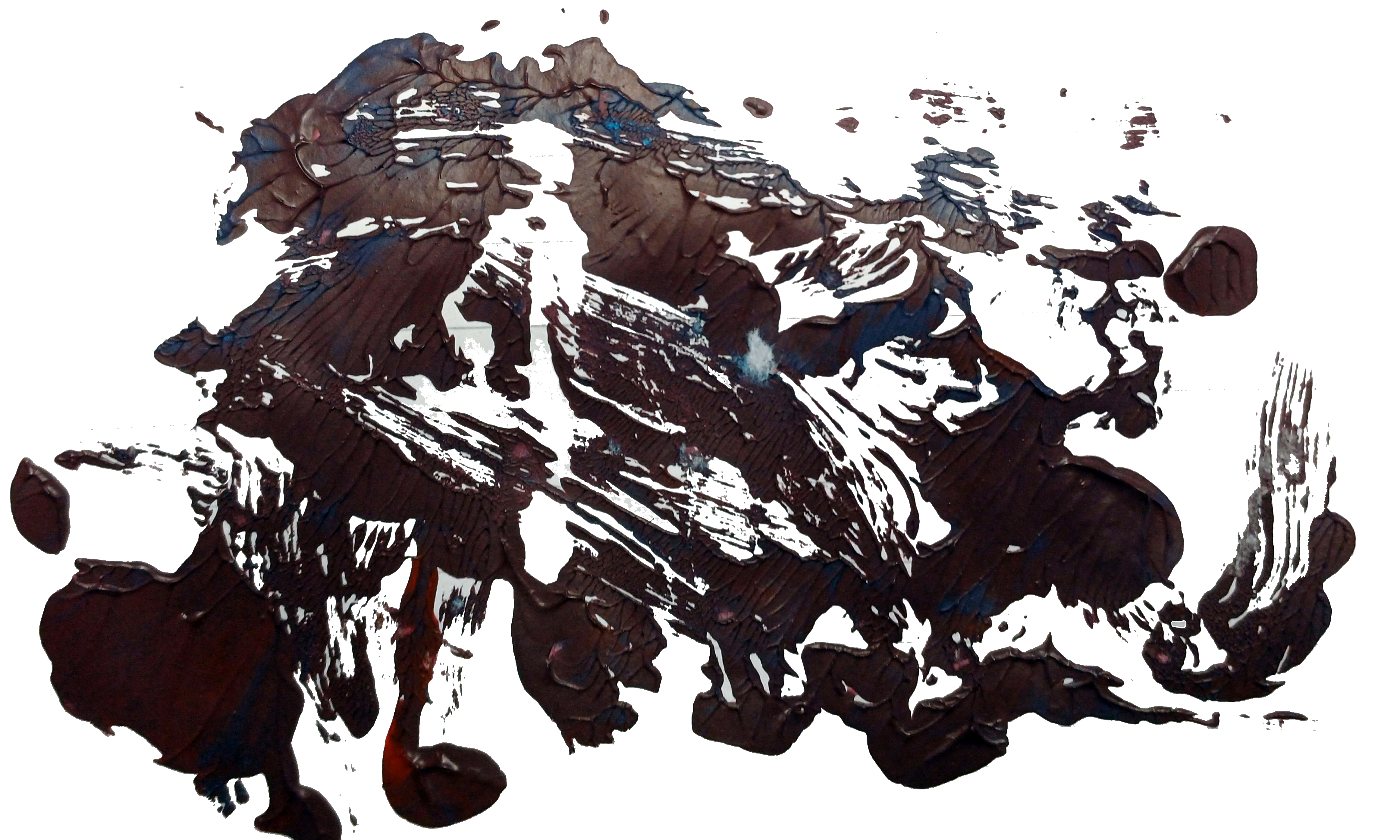
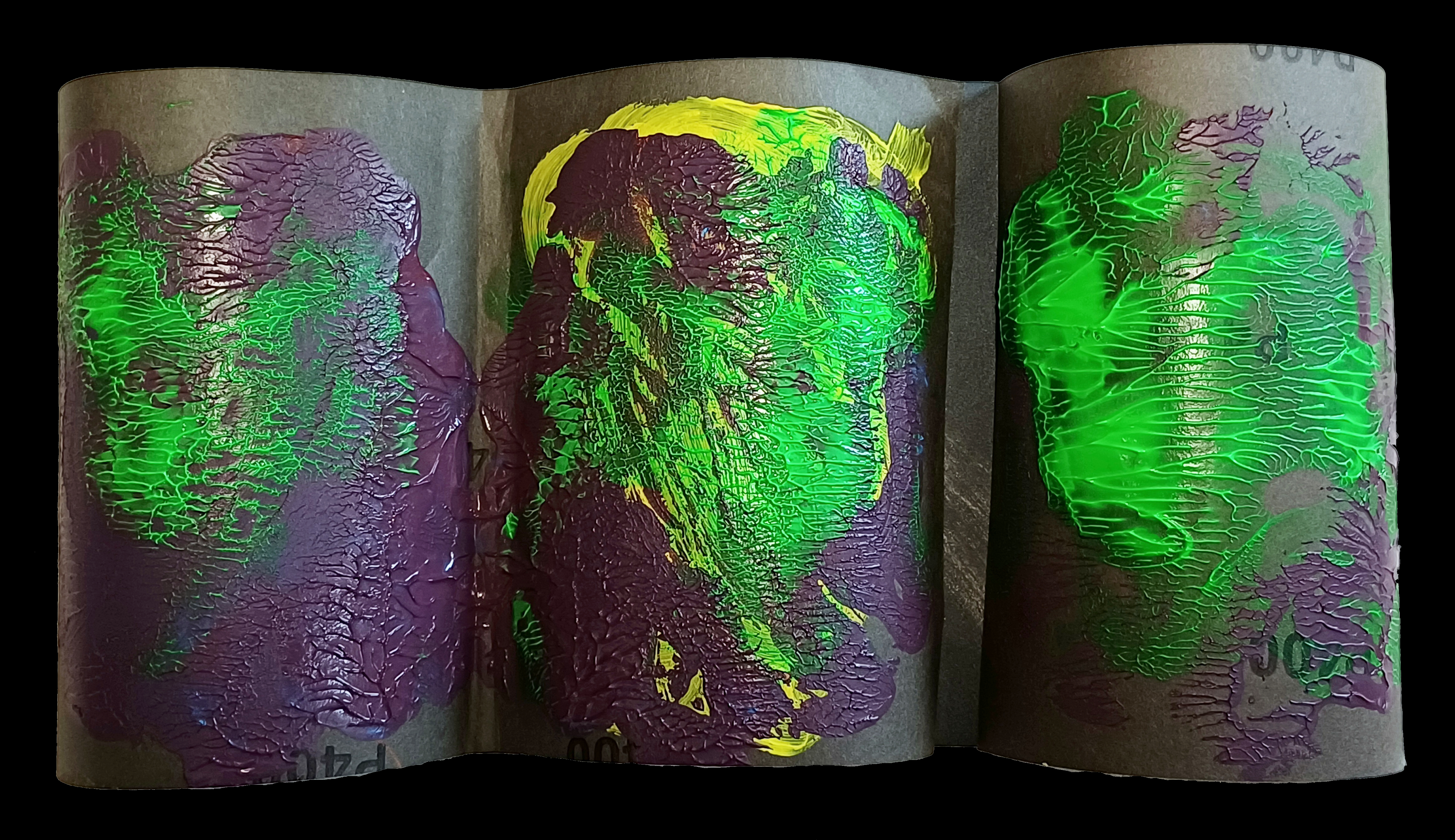
“Comic Book Series [Letter M]” [2nd November 2024, photograph 4th November 2024] by Matt The Unfathomable Artist, acrylic Pop Art painting on 100% pure cotton triple-gesso primed canvas board, 10 in x 12 in (25.4cm x 30.5cm), 6000 x 7261 pixels.
Quotation from social media in bold and italics:
[ I pre-doodled the letter ‘M’ in pencil on card and then set to work on a new painting.
“Comic Book Series [Letter M]” took two drafts each within approximately one hour. The first draft completed prior to 1550hrs, then the latter draft finissimo prior to 2235hrs. In the latter draft I carefully added the Mars Black outline for definition, finely adjusted the gold detailing and made ultra-finite balancing perfections to the lettered area.
Van Gogh-like impasto brushworking, vibrant comic book tones with stylistic fine art emotion in an artistically precise Pop Art piece.
There are six beautiful digital versions to compliment the Original acrylic painting. The six digital versions are individual works along with one six-grid collage in a three-across two-rows configuration. ]
Kind of awesome Pop Art isn’t it.
With my work I’m always requiring professionalism, high quality and artistic value as an artist. I love amazing you! I love amazing myself.
Would you like to know a secret?
The face in the centre is pure chance! True.
I only noticed this the next day (3rd November) after I photographed it academically. That is to say, not a quick draft evaluation photograph.
I made two palette knife scores in the style of the heavy impasto gold surround from “Golden Whale with a Voice”. An artistic decision I made for two reasons. Firstly, I love my palette working in that piece! Secondly, I had made this style of palette work in the prior draft to “Comic Book Series [Letter M]” and wanted to restore something from this in the gold.
The majority of the gold texture in “Comic Book Series [Letter M]” is produced through brushwork ‘fluting’, after careful palette knife placement of the gold.
Let’s take a look at my Collage 3×2 Grid here:
“Comic Book Series [Letter M] Collage 3×2 Grid” [digital artwork, 4th November 2024] by Matt The Unfathomable Artist, 300dpi, 9000 x 7238 pixels.
Be honest, this blows your mind, I hope.
The co-ordination of tones is my compositional choice to wow you✌🏽.
It certainly wows me!
Some time after making my works I often say to myself ‘Did [I] make this!?’ 🤯.
– ‘I did. It was me. I love art I do.’
You can see the individual Digital pieces BLUE, YELLOW, PINK, ORANGE, GREEN & PURPLE (corresponding to the background for each artwork) here:
“Comic Book Series [Letter M] BLUE” [digital artwork, 3rd November 2024] by Matt The Unfathomable Artist, 4798 x 5788 pixels.
BLUE is brightly-dark.
“Comic Book Series [Letter M] YELLOW” [digital artwork, 3rd November 2024] by Matt The Unfathomable Artist, 4798 x 5788 pixels.
YELLOW is cheerily-sombre.
“Comic Book Series [Letter M] PINK” [digital artwork, 3rd November 2024] by Matt The Unfathomable Artist, 4798 x 5788 pixels.
PINK is vibrantly-sad.
“Comic Book Series [Letter M] ORANGE” [digital artwork, 3rd November 2024] by Matt The Unfathomable Artist, 4798 x 5788 pixels.
ORANGE is mellowy-unhappy.
“Comic Book Series [Letter M] GREEN” [digital artwork, 3rd November 2024] by Matt The Unfathomable Artist, 4798 x 5788 pixels.
GREEN is vividly-distressed.
“Comic Book Series [Letter M] PURPLE” [digital artwork, 3rd November 2024] by Matt The Unfathomable Artist, 4798 x 5788 pixels.
PURPLE is interestingly-mooded.
These artworks were made to cheer our day no matter our circumstances. This is how I interpreted my subconscious feelings finding their way onto the canvas.
“Cosmic Mouth” [6th/7th & 10th September 2024] by Matt The Unfathomable Artist, acrylic paint on premium 115gsm medium textured cotton primed to 240gsm over 12in x 16in (30cm x 40cm) wood-fibre board (4mm), 7018 x 5167 pixels.
“Cosmic Mouth” is literally painted over a female mouth acrylic painting (produced 1st & 2nd September with much effort and innumerable drafts). I then worked on the newer Cosmic overpainting you see here for the next two days.
On the 10th September I varnished the centre. I did retain a photograph of the underpainting even though it wasn’t successful to my eyes. You can see hints of the underpainted mouth along the middle of the canvas.
The female mouth I’m determined to paint successfully is physical perfection.
Thankfully the overpainted “Cosmic Mouth” is the perfection I sought for.
Writing of perfection..
“Artist Seduces Artist” [13th September 2024] by Matt The Unfathomable Artist, acrylic paint on premium 115gsm medium textured cotton primed to 240gsm over 12in x 16in (30cm x 40cm) wood-fibre board (4mm), 6000 x 4525 pixels.
..I made “Artist Seduces Artist” in around an hour to an hour and a half, freestyling, in heavy impasto acrylic.
Please do click these images for an even better viewing.
“Artist Seduces Artist” would look incredible hung at the centre of the darkest black large fabric square or rectangular-like tapestry, 6ft by 6ft at the very minimum. it is 100% Picasso inspired 🎨
I made a very finite finishing touch with two paintbrushes to the completed artwork with burnt umber on 17th September due to my perfecting standards.
For the primary working I utilised three painting techniques: palette knife, paintbrush motions using approximately four brushes, and constant-direct tube paint applications onto the canvas for the grass-green and turquoise surrounds.
Originally I intended to use burnt umber, gold, and mid-yellow colour. Prior to canvas working I included silver, copper and bronze into the palette. I have time and again tried to make ‘the beautiful simple style’, yet invariably add complexity!
After thorough happiness with the predetermined colours I then felt the canvas needed the delicious cadmium red, interesting turquoise, balancing titanium white and then finally the defining grass-green to make everything come alive.
It was at this point I added the mid-yellow even though this was an intended colour to use from the outset. I flattened the profile of the turquoise surrounds for visual interest with a flat-paintbrush. The grass-green received an area of purposed flattening due to the paint settling on the canvas.
Please note the inspiration for this canvas derives from the book “Life with Picasso” by Françoise Gilot and Carlton Lake with my own interpreted Picasso style. I was at page 38 to that point prior to making this artwork.
“Artist Seduces Artist” is a mixture of textures, layers, partially recognisable or obscured pictorial elements and humour with a composition intended to please the eyes in visual interest.
The essence of Picasso himself interpreted in an inspired style by myself.
“UN noise dash dot” [6th to 9th September 2024] by Matt The Unfathomable Artist, charcoal, pastels & acrylic paint on premium 115gsm medium textured cotton primed to 240gsm over 12in x 16in (30cm x 40cm) wood-fibre board (4mm), 6936 x 5160 pixels.
Matt The Unfathomable Artist fans please be ready for draft by draft overload.
Having wrote detailed information I thought ‘Fans do need to see these drafts to appreciate how UN noise dash dot progressed’.
“UN noise dash dot” is made in approximately four drafts as follows.
6th September prior to 2111hrs:
First draft: beautiful red canvas coverage and canvas scratches (palette knife) including scratched words. I cannot explain how invigorating this first draft was.
Photograph immediately below.
“UN noise dash dot – first draft”
It’s cool fans get to see early drafts, my artmaking process and developing ideas.
Late 6th into early hours of 7th September prior to 0011hrs:
Second draft:
charcoal lines added
charcoaled SCREEN_. [to read, ‘dash dot’] PLAY, 314, ART LIFE, tree, UN, stylised sigma symbol [ Σ ] left of ART LIFE, M and box shapes
‘claw’ added to the top of a rectangular robot-like or building shape
soft pastels around some boxes for definition
The ‘claw’ could possibly be subconsciously inspired by “The Giant Claw” [movie, 1957] and/or Robby the Robot from “Forbidden Planet” [movie, 1956]. The latter is one of my all-time favourite films. I did enjoy “The Giant Claw” recently, due to the acting performances by the cast.
un in capitals means ‘the opposite of’ or ‘contrary to’ although I’m happy with any reasonable interpretation for this lettering.
I did also think of the un in unfathomable whilst writing this and also the United Nations. I didn’t and haven’t defined an exact meaning for ‘un’. I enjoy viewers deciding for themselves, personally.
Photograph immediately below.
“UN noise dash dot – second draft”
7th September prior to 1445hrs:
Third draft:
yellow paint added around boxes,
yellow highlights around some words,
pseudo-purple paint (first batch) around boxes,
green paint around 314, ART LIFE, UN,
letter [ i ] symbolically added in green to the right of the letter M.
You can see the wet purple and yellow on the UN noise dash dot canvas (image immediately below) that featured in ‘Sandpapered Green..”:
“UN noise dash dot – third draft”
8th September 2024 – artwork drying, photographed once for artistic evaluation:
no drafts, I photographed “UN noise dash dot” now dry from the day before and the still drying heavy impasto canvas of “Cosmic Mouth” – the ‘astronomy‘ art work (not the female mouth canvas working as this was extensively done on the 1st & 2nd September 2024, subsequently overpainted).
9th September early afternoon prior to 1334hrs:
Fourth draft:
green highlights around boxes and dash dot symbols added in green to balance the canvas visuals.
heavier overpaint to the existing UN green box for definition.
second batch of mixed red/blue-to-pseudo-purple paint added around smaller boxes and underneath the overpainted green dash dots below ‘UN‘. I called this latter area ‘the seated dash dots‘ as some days afterwards this is how I myself interpreted this. Please do see “Mapped Random Satellite {Day} #1” as I believe this is my subconscious finding its way into UN noise dash dot. Interestingly the seated shape of these dash dots is pure chance to fill negative canvas space!
see [*2] further below for details of the second batch of pseudo-purple paint I mixed on Notepad paper to randomly become “Upper – Original” with “Unfathomable Apocalypse Rider in Six-Grid Collage”.
“UN noise dash dot – WET PAINT” [6th to 9th September 2024] by Matt The Unfathomable Artist, acrylic paint on premium 115gsm medium textured cotton primed to 240gsm over 12in x 16in (30cm x 40cm) wood-fibre board (4mm), 6624 x 4914 pixels.
In terms of subject matter I feel “UN noise dash dot” is my usual pop art complexity. Not in any order of importance or competing artistic thought:
movies, classical films (produced by studios like RKO Pictures)
spurious Morse Code without any meaning in ‘dash dot’
my digital artworks with bright neon-like highlights as a purely visual reference to the neon-like acrylic highlights within “UN noise dash dot” please see:
Here is further information whilst making “UN noise dash dot” with regards to the two pseudo-purple paint batches I mixed on the 7th and 9th September respectively:
[*1] 7th September prior to 1445hrs:
Whilst mixing the first batch of red/blue paint for the purple I made a (then unknown to me) random artwork on sandpaper that would become “Sandpapered Green with Dark Purple & Yellow”.
I folded one P400 sandpaper piece in the middle from the leftover purple paint to make two paint prints on the same P400 paper piece. I then pressed one of these to a third sandpaper rectangle (folded P400 piece), now making three individual rectangular acrylic ‘prints’ across two pieces of P400 sandpaper.
[*2} 9th September early afternoon prior to 1334hrs.
Whilst mixing a second batch of red/blue paint for the purple I made a (then unknown to me) random artwork on lined Notepad paper. This would become first two acrylic pieces then their digital artwork derivations through “Upper – Original” and “Unfathomable Apocalypse Rider – Original” (both physical pieces and the digital derivations are included in the same blog article and link).
Just a quick thought on ‘then unknown to me‘. To me as an artist, mixed or mixing paint is made purely for the purpose of the canvas I’m working on, nothing more. When working on oils I have art-deco teacup saucers I use to mix the paint. These are cleaned after each oil painting session.
Making art from mixed acrylic paint leftovers is therefore quite new to me. Every now and then I like the look of the random paint I’ve mixed, please see “Pure Chance Portrait #2 in Portrait” for instance. Interestingly, I have some iron gall ink practice works I turned into art pieces some years ago. I’ve not published or formally documented any of those as yet.
“UN noise dash dot” is unusual in that I had two batches of mixed acrylic paint workings I liked and decided to do something with.
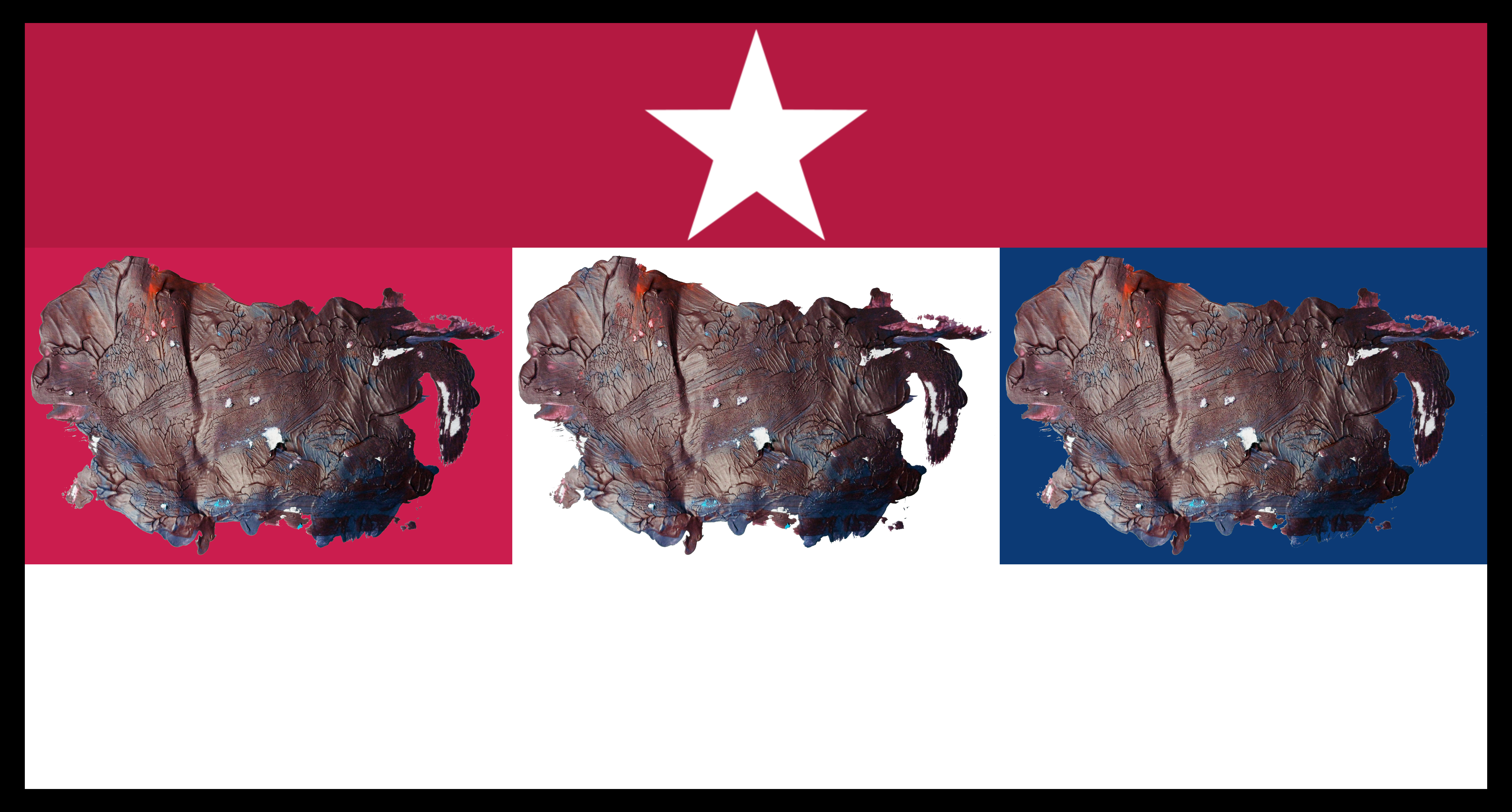
“Unfathomable Apocalypse Rider in Six-Grid Collage” [digital artwork, 9th/10th September 2024] by Matt The Unfathomable Artist, random acrylic red/blue to purple mixed paint on lined notepad into six-grid collage, 6480 x 5853 pixels.
From social media in bold and italics:
Quotation:
“.. I’m very eager for art writers to see a digital artwork I have just made. Having randomly mixed red and blue to make purple for a Pop Art piece [UN noise dash dot] on lined notepad paper yesterday.
It’s quite honestly a most unfathomable coincidence, beyond the planned construction of the six-grid collage itself from the photographed paper in my hand just now this afternoon.
After mixing purple and using the paint on the aforementioned Pop Art piece (yesterday) I viewed the sheet of paper, kind of liking the shapes I had pressed together, yet thinking none more to it..
.. saying to myself, ‘I shall try to make something of it. I would like to show people art can be made from seemingly nothing’. Yesterday I viewed photographic images of the [Indian] Gaur online.
I did this both some day before and after the purple mixing yesterday. Immediately after making the six-grid digital piece I realised inspired thought is somehow finding its way into my work.
The thing is I simply motioned my brush to mix paint, nothing more! When I pressed the wet leftover purple paint paper together at the middle, all I did was touch my finger at one non-painted side a number of times to cause a difference in the paint separation. Without any defined idea or concept.
I really cannot wait for art writers to see this work in its entirety, as I haven’t even photographed the upper-half of the pressed paper to-date. It’s absolutely ridiculous! I’m going to do so this afternoon or later.
It is a most random inspired work in my opinion.” – written by Matt The Unfathomable Artist, 1506hrs on 10th September 2024.
Here is the digital artwork image for the “Unfathomable Apocalypse Rider”:
“Unfathomable Apocalypse Rider – Digital” [digital artwork, 9th/10th September 2024] by Matt The Unfathomable Artist, random acrylic red/blue to purple mixed paint on lined notepad, 4646 x 2788 pixels.
Pictured immediately below is the actual physical random paintbrush pressing on the notepad:
“Unfathomable Apocalypse Rider – Original” [original image held in my hand photographed 10th September 1310hrs, pressing 9th September 2024] by Matt The Unfathomable Artist, random acrylic red/blue to purple mixed paint impressioned-pressed onto lined notepad, 4646 x 2788 pixels.
Imagine the plain paper of the as yet “Unfathomable Apocalypse Rider” folded on top being pressed into the (Upper or bison) random acrylic mixed paint half of the notepad paper.
This is how the Upper bison half of the brushwork pressed together on the 9th September 2024 came to look as you see here:
“Upper – Original” [photographed held in my hand 11th September 2024 at 1414hrs, paint brushwork and pressing 9th September 2024] by Matt The Unfathomable Artist, random acrylic red/blue to purple mixed paint, pressed in half on lined notepad, 4646 x 2788 pixels.
[differences in notepad paper and paint colours due to indoor lighting conditions and the photographic editing between the two images]
Just take a close look at the beautiful striations in “Upper – Original”. Everything the product of complete random pressing from randomly mixed pseudo-purple paint on the 9th September 2024!
I didn’t even realise the randomness of “Upper” represented any visual form or idea until two days later.
– “How Matt could you not see a bison?! Or North America for that matter?!”
‘I was looking at the <random> paint you see in “Upper” upside down at first. When I turned the paper the other way around what would become “Unfathomable Apocalypse Rider – Original” became my initial artistic focus of interest. Primarily since I could quickly see a human-like form in ‘Rider’.
Whereas “Upper” now upside down* as we see it in the image didn’t immediately bring anything to mind visually or in any objective form. Likely since I macro viewed the intricate striations. In fact I was so amazed about the ‘Rider’ for its randomness I even wrote exclusively about this the next day at 1506hrs on the 10th September.Not realising “Upper” would turn out to be as artistically unusual as “Unfathomable Apocalypse Rider – Original”!
*upside down at the top as regards the notepad paper. This is why I called it “Upper” at the time since I didn’t have any other specific title idea for this. In fact, I believe I mixed the (Upper) paint ‘upside down’ at the foot of the paper to how you see it above. Entire notepad image shown at the end of this article for reference [see # below]
Quotation from social media in bold and italics:
“If I told you the perceivable landmass you see is 100% completely random paint mixing would you believe me? The beautiful leaf-like striations occurred through my pressing this Upper half against the folded Notepad paper at the centre.
You can see where I held the paper as I made the pressing in both my hands.
After some days I began to envisage this random paintwork looked like North America. On the 12th September or thereabouts I noticed the unusual placement of ‘Florida’. On the 14th September (five days from its random production) I could then see the entire piece looked like a Bison! ‘Florida’ had therefore became its tail, completely by chance.
Extraordinary.” – personally written quotation published on 18th September 2024 to social media.
From “Upper – Original” I made the following digital artworks:
“Red Old Glory Colour North American Bison” [digital artwork, 9th original, 11/12th September 2024 digital] by Matt The Unfathomable Artist, 6000 x 3899 pixels.
I titled this “Red Old Glory Colour North American Bison” today on 24th October 2024.
The red is 179, 25, 66 in the RGB scale.
“White Old Glory Colour North American Bison” [digital artwork, 9th/12th September 2024] by Matt The Unfathomable Artist, 6000 x 3899 pixels.
I titled this “White Old Glory Colour North American Bison” today on 24th October 2024.
The white is 255, 255, 255 in the RGB scale.
“Blue Old Glory Colour North American Bison” [digital artwork, 9th/12th September 2024] by Matt The Unfathomable Artist, 6000 x 3899 pixels.
I titled this “Blue Old Glory Colour North American Bison” today on 24th October 2024.
The blue is 10, 49, 97 in the RGB scale.
“Red, White & Blue Old Glory Colours North American Collage with Border” [digital artwork, 9th/12th September 2024] by Matt The Unfathomable Artist, 6480 x 3396 pixels.
“Red, White & Blue Old Glory Colours North American Collage with Border” is the first collage I made, shown immediately above.
“White Star, Red & White Stripe, Triple Old Glory Colour North American Collage with Border” [digital artwork, 9th/12th September 2024] by Matt The Unfathomable Artist, 6480 x 3396 pixels.
“White Star, Red & White Stripe, Triple Old Glory Colour North American Collage with Border” is the second collage I made (immediately above) to represent North American emblems of Stars, Stripes red and white with the complimenting Old Glory colours of Red, White and Blue.
Quotation on 16th September 2024 at 2150hrs “.. i would LOVE this artwork as four flags if i could. The three colour flags and then the collage with red and white stripe. if it was my choice i would make it into a cool weathervain [weathervane] piece entitled Four Winds of Direction. i would fasten each flag top and side so each flag would ripple nicely in the wind”.
I honestly felt I needed to dignify the whole random notepad work particularly as North America decided to present itself.
Randomly.
I would like to mention that despite the strange randomness of my work an art commentator did mention Jasper Johns to me afterwards. Jasper Johns famous for his intricate flag artworks.
The art commentator wrote “.. The Jasper Johns directive, ‘take an object, do something to it, do something else to it’. – anonymous, 19th September 2024, 1222hrs.
To this I replied:
“I had researched Jasper Johns work some weeks ago. This is why Upper is so very strange to me, randomly so ‘perfect’. I’m the only person who knows I just focused on mixing red and blue paint. Very odd.” – Matt The Unfathomable Artist, 1322hrs same day.
It should be noted I read, view or think about different visual artists most every day. Including the days and weeks prior to “Upper – Original” and “Unfathomable Apocalypse Rider”.
Let’s see some screenshots of newspaper articles whilst thinking of the ‘tail of Florida’in my random brushwork of “Upper – Original”:
‘Map of Tropical Storm Helene’s path’ courtesy of the BBC, 25th September 2024.
As you can see from ‘Map of Tropical Storm Helene’s path’ (immediately above) the ‘tail of Florida’ could be interpreted as a swirling hurricane. There is a striking similarity despite the fact my random brushwork and pressing is done on the 9th September 2024..
.. with pseudo-purple paint whilst working on “UN noise dash dot” [6th to 9th September 2024].
Here is a screenshot report detailing some of the devastating effects of Hurricane Helene:
‘Hurricane Helene tracker, image one’ courtesy of The Telegraph, 27th September 2024 screenshot.
Another highlight from the same report of exponentially destructive manmade climate effects:
‘Hurricane Helene tracker, image two’ courtesy of The Telegraph, 27th September 2024 screenshot.
Anyone appreciating my humanitarian efforts will know I have strongly campaigned for a reversal of manmade climate damages to the Earth, environment, wildlife and global air, land and sea pollution.
I feel my artworks in this article are the subconscious result of humanitarian efforts to appeal to world leaders to better manage Earth’s resources in a more harmonious way.
Thank you.
[#] For reference this is a photograph of the entire brushwork and pressing on the notepad paper as I first viewed same on the 9th September 2024:
Notepad paper with random brushwork and pressing for “Upper” and “Unfathomable Apocalypse Rider” from 9th September 2024.
“Golden Sun Bathed in Red” [8th September 2024, dry paint image on the 11th] by Matt The Unfathomable Artist, acrylic paint on premium 115gsm medium textured cotton primed to 240gsm over 12in x 16in (30cm x 40cm) wood-fibre board (4mm), 6000 x 4461 pixels.
From social media in bold and italics:
[ I made “Golden Sun Bathed in Red” very quickly in two drafts. The first draft palette work to cover the canvas with a purple I mixed from red/blue acrylic. Then around half an hour to an hour later I produced the entire work within approximately one hour using brushwork primarily.
Palette work can be seen for the sunray fronds. The paints I used additional to the red/blue purple are gold, cadmium red, iridescent copper, orange and green. ]
Do click on the image above, see for yourself the artistry within the painting.
The photography for the original image (shown immediately below) is a specialised style I developed from my sketch “King James VI & I Oak of 1612 Branches in Sunlight”. Whereas the latter is direct lamp light, for “Golden Sun Bathed in Red” I photographed with indirect lamp light.
“Golden Sun Bathed in Red – wet canvas in indirect light” [8th September 2024] by Matt The Unfathomable Artist, acrylic paint on premium 115gsm medium textured cotton primed to 240gsm over 12in x 16in (30cm x 40cm) wood-fibre board (4mm), 5724 x 4189 pixels.
The point I’m making with my artworks is light makes a difference to the presentation. Often I think how I wish an individual artwork to be displayed in terms of lighting.
For instance I have a specific installation idea for “Gold & Blue Abstract After Rothko” (click link to see artwork). I see “Gold & Blue Abstract After Rothko” in an enclosed booth. Each viewer walks in through the low ceiling doorway entrance, likely bowing as they do so. They reach the painting, sitting down at personable distance to the moonlit-like artwork.
Sat meditating. To contemplate their life and life. To refind peace.
By the way, I saved someone work for much later with “Gold & Blue Abstract After Rothko” to help with any potential restoration work centuries yond.
Here it is as a reference for a dear old lady of the future:
“Ecce Pueri” [4th April 2024] by Matt The Unfathomable Artist, digital image hand drawn on screen over original abstract, 1089 x 1641 pixels.
If Monet can begin with caricatures (please refer to the link here Claude Monet’s Caricatures) to influence modern French cartoons, then it is good in my eyes. Besides, I have an immense humour.
[ Claude Monet Caricatures website link courtesy of Draw Paint Academy ]
Breadcrumbs in tarragon crusted sea bass anyone?
Yesterday evening I was walking around theatrically to myself, waving my hands aloft in the air dramatically exclaiming ‘I see the hands of Calibos!‘.. continuing with ‘oh what eyes you have Grandma‘.. then finishing on chatter about wolves in sheeps clothing of fabled fame.
Fun, fun, fun the intellects of centuries past.
I went on to thinking about “The Allegory of Good and Bad Government“ (please click link to view). Artists of the 1300s understanding the contrary elements of good or nefarious intent.
Essentially “Golden Sun Bathed in Red” is specifically a mix of Van Gogh and Munch for style. Their work is loved for a reason..
.. quality and care.
The search for most every professional artist.
With this in mind I shall share with you a quote courtesy of Daily Rothko:
“…nobody has any conception of how poor we all were then. I remember maybe as late as 1955, you know, after the so-called triumph of Abstract Expressionism Rothko saying to me, ‘If somebody would pay me $500 a month for all my past work, which constituted hundreds of pictures, plus everything I’ll make in the future, I would gladly accept it in order to survive.’ I remember looking him in silence because we knew – and this is in 1955 – that nobody in the world would pay him $6,000 a year for his total output; and he was married with a child in the most expensive city in the world.” – Robert Motherwell
(Interview by Paul Cummings at the Artist’s home in Greenwich, Connecticut November 24, 1971, Smithsonian Archives of American Art).
Appreciating and dignifying the monetary value for his work Rothko was in effect asking for $5,882.48 a month if we adjust $500 in 1955 for inflation.
Today, completely unconnected to adjusted inflation Rothko’s rather modest 1955 commentary-offer easily proved worthwhile with his abstract paintings selling for millions of dollars.. each.
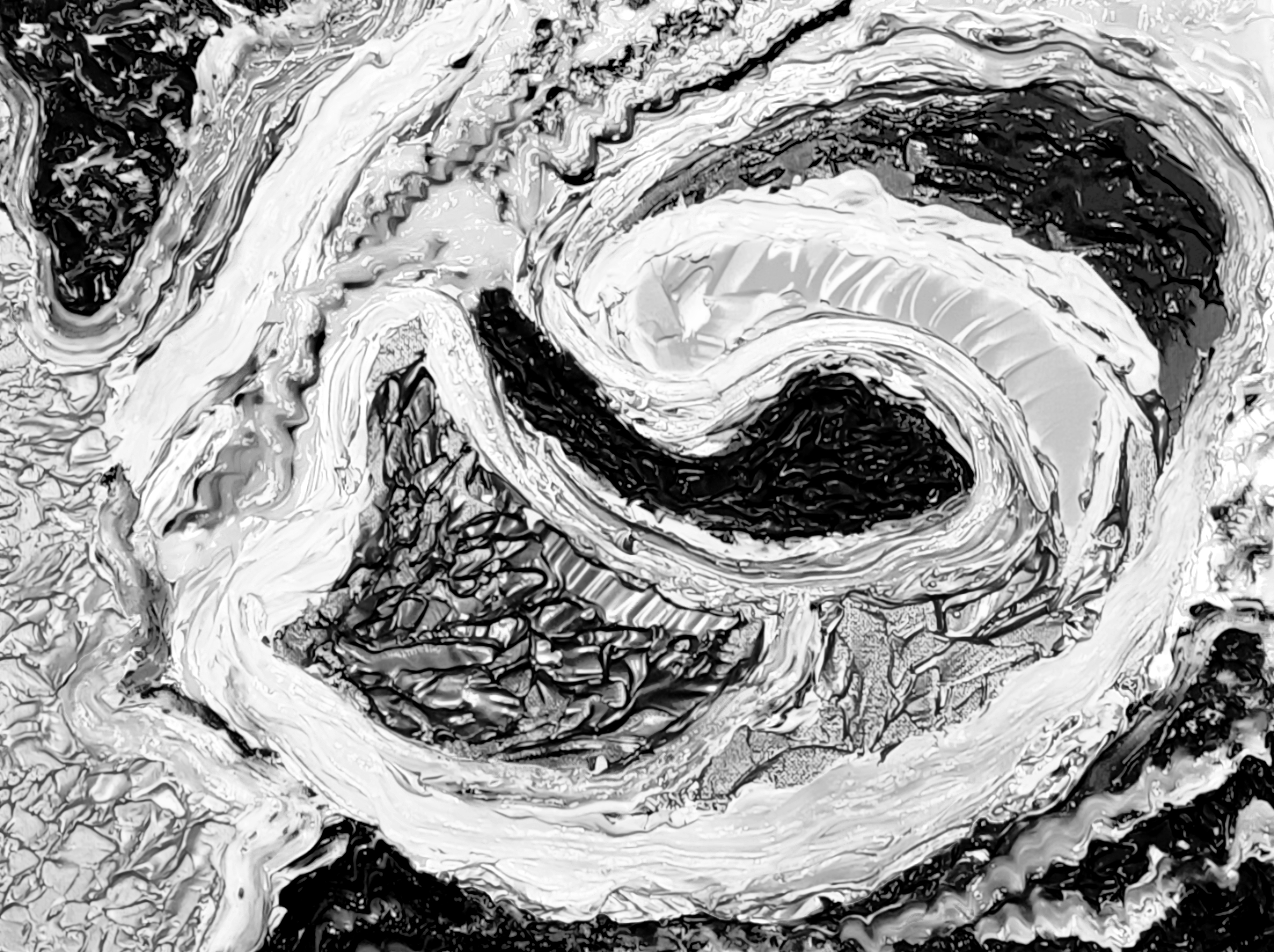
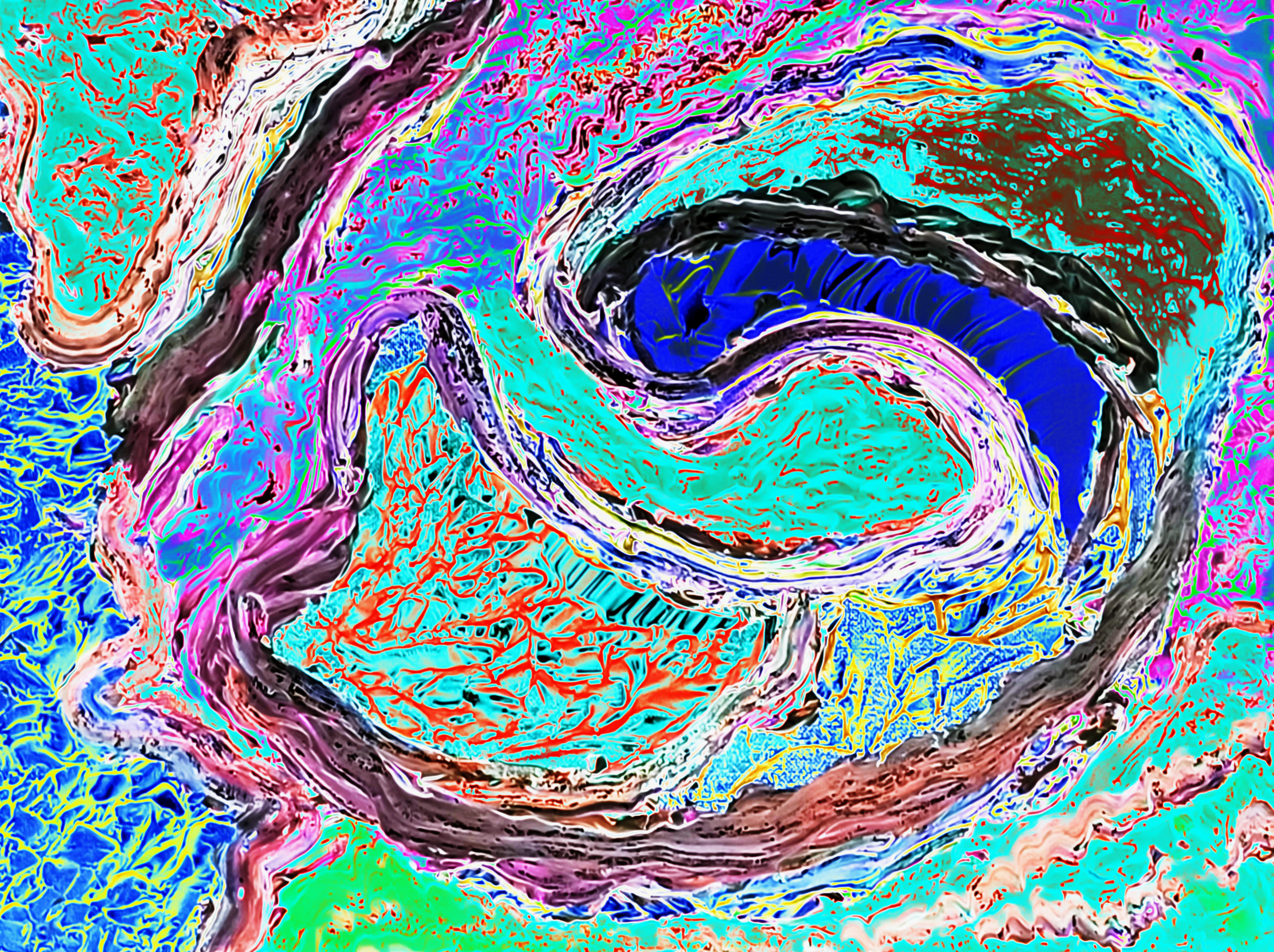
“Sandpapered Green with Dark Purple in Black & White” [digital artwork, 7th/8th September 2024] by Matt The Unfathomable Artist, two fine P400 sandpapers with 100% random paintmixing brushwork, 4691 x 2708 pixels.
“Sandpapered Green with Dark Purple in Black & White” is the image you might know from my social media pages.
Here is the original artistic composition of two sandpaper pieces aligned together in colour:
“Sandpapered Green with Dark Purple & Yellow” [wet paint version with lighting effect, 7th September 2024] by Matt The Unfathomable Artist, two fine P400 sandpapers with 100% random green, purple & yellow acrylic paintmixing brushwork, 4691 x 2708 pixels.
Here is my earlier quotations in bold and brackets:
[ Working on a Pop Art piece through two days of 6th and 7th September I used two pieces of fine sandpaper on the latter day to mix red and blue, making deep purple paint. I made 100% random brush motions whilst mixing the two paints in readiness for my Basquiat style Pop Art piece.
After finishing the Pop Art piece on the 7th September I then pressed the two wet sandpaper pieces together and noted very interesting patternization.
Quickly I arranged these into a curved structure onto cardboard placing a rag canvas underneath.
Photographing this in colour I commented to myself the piece honestly reminded me of Mount Rushmore!
I didn’t realise exactly why until the following day when I made this black and white digital artwork (see foremost image above) without any changes to the random brushwork itself. ]
For clarification the same paper piece was folded against itself to make two prints (shown left and middle). Then for some reason, I don’t know why, I thought I should make a third acrylic image (technically the second print) on another P400 sandpaper piece.
I was amidst making a complex pop art piece “UN noise dash dot” in between this process during its multiple drafts.
Now we get to my own visual interpretation of the completely random mixed paint images..
left: a chimp-ape like those we see in Planet of the Apes! Did you think the same?
[side profile, left eye visible facing to our left, looking rather sullen]
middle: an alien not unlike a creature from Star Wars.
[forward facing front-side profile looking to the right, partially facing towards the viewer, two far placed eyes discernable]
right: Queen Elizabeth II. Clearly this is pure chance, if it does bear any resemblance whatsoever. You decide as the viewer. You could equally say it looks like someones Grandma. Personally I love this image, its beautiful, strong and expressive.
My random mixed paint works are self-interpreted by you. There is no idea for or against in any perceived concept, person or idea. It exists as an artwork devoid of particular reason.
The intellectual artistry is creating something from ‘nothing‘. I literally looked at these green acrylic prints and said to myself ‘I will let these dry and see what I think to them. They do look cool!’
That was it. I was too busy working drafts on the pop art piece to place much thought into any composition at the time. I should say the vivid lime green I used in the pop art piece did settle somewhat darker, both on the pop art canvas and the P400 sandpaper shown in the image above.
Upon producing the black & white digital the following day I could not believe the incredible contrasts! For me as an artist anyway. I fine tuned these in my usual way, as per the digital image you see.
At the time of publishing these two acrylic sandpapers are loose from the other in storage. If anyone wishes to buy the artwork I would make the composition permanent in a deep frame installation. Cast iron molten moulded from a sand furnace then attractively painted would be my high quality choice.
I have further ideas regarding a frame installation for an art collector interested in science-fiction and unusual modern art design imagery.
“Gold Framed Leaf with Red” [20th/21st August 2024] by Matt The Unfathomable Artist, acrylic paint on premium 115gsm medium textured cotton primed to 240gsm over 12in x 16in (30cm x 40cm) wood-fibre board (4mm), 7128 x 5305 pixels.
Quotation from my social media on 22nd August:
“this painting was so difficult! .. i added the leaf to make it beautiful. the gold frame inner was added just before that. last i changed the red tones some more.
then added the silver and chrome frames lines to maximise the optical power. the leaf fell into my garden days ago. i didn’t know what it was seeing it a way off on the grass, curled over.
i realised it was just a leaf in the corner. i varnished it a couple of days ago. it made me think of plastics pollution.” – 20th August at 2213hrs.
After this quotation the following day I decided to overpaint the faded whitish varnished gold to strongly reinvigorate its radiant tones. There is much palette knife work for canvas coverage and most of the rectangles. The red rectangle is all brushwork.
After the difficulties of this painting, then pure joy.
This image is a reasonable likeness of the artwork after two days of drying.
Gold, chrome-like silver and bronze can vary according to the light source whilst photographing. The image above displays some light and some shadow to give you an idea of how those three colours could appear on this canvas.
Whilst everything is complimentary I feel two qualities bring this artwork to life. Firstly, the paintwork in the red rectangle. I need to replicate this style in new pieces. Heart emoji eyes.
Secondly the organic leaf itself. Here we are framing an important part of the recyclable living world. I say we since fans share my experience of loving our planet through this artwork, and your own too of course.
Here is the leaf (edited photograph) the day it was found:
“Leaf found in the corner of my Garden” [found & photographed on 18th August 2024, with editing and neutral background 4th September 2024] by Matt The Unfathomable Artist, 5415 x 6368 pixels.
The leaf changed with the varnishing overnight. I allowed some curling to remain in the final artwork, rather than straightening out the leaf flat to the canvas entirely. It has a hardened, edgy feel quality with the dried varnish. Nicely sensory to the touch. I enjoyed running my finger over the leaf in the artwork, although I have placed the piece into a deep wooden box frame, at least for now.
Plastic pollution saddens us all. It’s something I have journalistically campaigned much regarding.
It’s just one detrimental area of our commercial world, a collective world society I have and am campaigning to help improve, reverse and somehow mitigate.
Let’s make real-world differences we can all be immensely proud to achieve.
“Swirling Winds” [12th August 2024] by Matt The Unfathomable Artist, acrylic paint on premium 115gsm medium textured cotton primed to 240gsm over 12in x 16in (30cm x 40cm) wood-fibre board (4mm), 6000 x 4482 pixels.
Afterwards viewing “Swirling Winds” I realised this had similarities with my clever photographic series of works you can see in my blog article Oak Branch Astronomy. For this very reason I named the artwork Swirling Winds.
“Swirling Winds” itself an acrylic is made from a blank canvas in precisely nineteen minutes ten seconds (19m10.57s).
The canvas is sixteen inches across, therefore this is very quick instinctive art working for an impasto. Please do click on the image for yourself to see the level of detail, complexity and artistic intellect required to make this piece.
Some artworks wow audiences due to their immediate eye-catching beauty. This is one of them.
To produce a strong work within twenty minutes made me very happy. Even more so considering thisinterconnected with an earlier artworking idea.
Those knowing my genuine interest in manmade climate damage problems can appreciate Swirling Winds communicates layers of idea.
“Unification of Colour #2” [21st August 2024] by Matt The Unfathomable Artist, acrylic paint on premium 115gsm medium textured cotton primed to 240gsm over 12in x 16in (30cm x 40cm) wood-fibre board (4mm), 7002 x 5196 pixels.
“Unification of Colour #2” builds upon my Unification series of artworks. The #1 version you can see here in another blog article which includes Unification of Colour #1.
Produced quickly, intuitively and with careful artistic skill in less than half an hour approximately.
I feel my Unification series art very much humanitarian works without political commentary.
I love the harmony of colours.
“Chance Face with Yellow Silver Gold” [26th August 2024] by Matt The Unfathomable Artist, acrylic paint on premium 115gsm medium textured cotton primed to 240gsm over 12in x 16in (30cm x 40cm) wood-fibre board (4mm), 6816 x 5118 pixels.
nb The image for “Chance Face with Yellow Silver Gold” shown immediately above is with minimal editing including natural light upon the canvas. It is a fair likeness, however the silver is represented differently due to the outdoor light.
I made “Chance Face with Yellow Silver Gold” in nineteen minutes and one second. This included a quick pseudo-second draft of one minute ten seconds to palette two present paint-on-canvas applications, one of white, one of silver. I noticed these two paint areas needed paletting after originally stopping the timer at 17m51s.
The following day I could see a central face with eyes, mouth and nose whilst in the evaluation process. Due to this I decided to retain the artwork as we see here, modestly perfect as can be. Pure palette work.
I then changed the working title from ‘Definition #1’ to “Chance Face with Yellow Silver Gold”. I try to create the most memorable artwork titles to describe the visual representation.
Nineteen minutes, one second :]
The digital artwork I produced is nice too, immediately below:
“Chance Face with Blue Red Umber – Solarscape” [digital artwork, 26th August 2024] by Matt The Unfathomable Artist, 6816 x 5118 pixels.
Whilst writing this article I decided “Chance Face with Blue Red Umber” would have a new title, even though this is derived from “Chance Face with Yellow Silver Gold”.
A Solarscape is a computer-generated effect from an original utilising my expertise in fine-tuning the tones, balance, light etc. Therefore we can view this process like photographic editing using a high-quality filter altering my work to produce a contrasting digital version.
For me with AI or computer-aided technology, and this is an opinion, an artist should be involved in the conceptualisation process in some way. Without “Chance Face with Yellow Silver Gold” there is no “Chance Face with Blue Red Umber”.
Conceptualisation is an artistic effort. It’s as simple as that.
Without the ‘Spin Paintings’ by Damien Hirst in 1992 we wouldn’t arrive at a collectors’ interactive AI generated ‘The Beautiful Paintings’ in 2023. Of this creative continuation through Hirst’s career we have a quotation from the internet which reads:
“In 1975, he became transfixed by an episode of the children’s television show Blue Peter, featuring the television host John Noakes creating colorful paintings from a motorized cardboard spinning machine.”
Everytime an artist produces a style there is a driving force behind the intellectual derivation.
For instance, let’s say “Unification of Colour #1” and “Unification of Colour #2” displays a possible rule. One is primarily diagonally produced, whereas the other artwork shows palette verticals and horizontals..
“Unidentified Anomalous Phenomena #1” [3rd August 2024] by Matt The Unfathomable Artist, acrylic paint on premium 115gsm medium textured cotton primed to 240gsm over 12in x 16in (30cm x 40cm) wood-fibre board (4mm), 5797 x 4314 pixels.
Most paint artists think about how beautiful their composition will be. I do.
Sometimes I’m evaluating a work asking myself this very question. The paintings I’ve catalogued in this article challenge the whole concept of traditional aesthetic beauty.
Consciously and subconsciously I decided to paint exactly as I wanted without personal critique.
For those who haven’t read my Instagram social media here is a little commentary I published, in bold and brackets:
[ Four drafts through the afternoon and evening timed at 21m03s, 21m07s, 19m01s and 17m50s, the latter adding in the gold around the UAP and making artistic adjustments. Approximately one hour nineteen minutes with one untimed change consisting of quickly fine tuning the ‘green-sea-space’ effect.
“Unidentified Anomalous Phenomena #1” builds upon my “Cavernous Red Blue Abyss” and ”Propulsion – Original“ artworks. It’s purposely strange/unusual in the manner of this art genre. Details either abstract or definitive for the viewer to decide.
I sought for Willem de Kooning and Frank Auerbach (specifically “Primrose Hill Study – Autumn Evening” [1979]) in style and texture. With any past/present master artists’ inspirations I always seek to create an original composition. Styles like theirs are incredibly difficult technically to produce.
The objective is to blow your mind figuratively speaking through raw creativity. ]
The wet paint in an unedited photograph for “Unidentified Anomalous Phenomena #1” is theatrical to view. I feel the lighting for this artwork is important for an installation. Placing the light source above should suffice very nicely.
My thoughts are two types of viewing experience. Moonlight and Light-source-above. Personally I find the artwork utterly intriguing! Writing this article I needed to see UAP #1 again.
I’m proud of this piece. The textures have such motion.
Some one hour nineteen minutes for an artwork shining like a bright Star. Unusually unique. Different. Confounding. Unexplainable.
Yes please..
.. sorry, gifted.
“iM” [11th August 2024] by Matt The Unfathomable Artist, acrylic paint on premium 115gsm medium textured cotton primed to 240gsm over 12in x 16in (30cm x 40cm) wood-fibre board (4mm), 6000 x 4531 pixels.
Quotation from my Instagram social media, in bold and brackets:
[ “.. the iconography in “iM” is phenomenally fresh, clean and distinct.. i love it!!” – 11th August 2024.
“iM” is pure spontaneity, play with paint really. Symbology, themes and messaging with reference to my past & most recent works.
Please note both “ART LIFE M 314” and “iM” took within one hour seventeen minutes combined to paint from start to finish. ]
What do the symbols and iconography mean in “iM”? This is an area of art where I love art critics and viewers to internalize/externalize the personal commentary.
Let’s include “ART LIFE M 314” too for you to see:
“ART LIFE M 314” [11th August 2024] by Matt The Unfathomable Artist, acrylic paint & charcoal sticks on premium 115gsm medium textured cotton primed to 240gsm over 12in x 16in (30cm x 40cm) wood-fibre board (4mm), 6017 x 4497 pixels.
Quotes for “ART LIFE M 314”:
[ “.. i noticed a ‘gun’ shape in ‘art life’, it is PURE chance 💯%. a piece of charcoal stick broke in my hands (end of gun looks like a bullet!), i didn’t even know this 🙉!! yes i heard some charcoal breaking, just not there. i have straightened the charcoal piece to appear as a bullet leaving the gun. cool huh 🎯. totally chance it became a bullet ^^. not certain how i ensure the charcoal piece is properly adhered to the painting (acrylic holds it there for now). i will look into this tomorrow 🎨 nb interestingly a wipe got totally covered in red making ‘art life’ and the charcoal pieces too. kind of cool i think.”
“i just worked some varnish into and around the charcoal ‘bullet’🏆”.. “.. nb these art after Willem de Kooning, Basquiat inspiration too with overpainted areas. who on Earth is going to believe the charcoal ‘bullet’ placement was pure chance lol 😆. the funniest thing is.. i didn’t even know I’d painted a ‘gun’ haha. then again a yoda in yellow flowered sun abstract, i mean really, how!! ♏️” ]
With “ART LIFE M 314” I just hoped people would ‘get’ the art. Thankfully, they did, including professional artists and writers.
It really is all about the (honestly) chance gun, (honestly) chance bullet and edgy Basquiat style. Ridiculous odds.
Ordinarily, if slowly working, this would seem unlikely. However I made these two artworks very quickly. I purposed for tiny bits of charcoal to be included in this piece along the black lines. Taking imaginative inspiration from Basquiat’s use of oil stick.
Most all black lines were the result of heavy-handedly scrawling charcoal onto the canvas. The sound of charcoal splintering against the canvas was something I can only describe as quite wonderful. Bits of charcoal in the paint, yes, yes, I said to myself! Wanting immediacy, no personal critiquing.
It’s likely the charcoal piece broke in my hands rather than against the canvas, as this happens all the time when I use charcoal sticks.
I don’t know how I didn’t notice the ‘bullet’ piece of charcoal. All I know is whilst reviewing areas on the whole canvas specifically for any significant pieces of charcoal I then realised quite a large piece of charcoal needed initially removing..
.. before quickly deciding this.. was.. absolutely.. perfect!
One hour seventeen minutes for both “ART LIFE M 314” and “iM”.
“Island Anatomy” [wet painting image, 24th/25th August 2024] by Matt The Unfathomable Artist, acrylic paint on premium 115gsm medium textured cotton primed to 240gsm over 12in x 16in (30cm x 40cm) wood-fibre board (4mm), 5978 x 4386 pixels.
Quotation from my Instagram social media, in bold and brackets:
[ The first draft for “Island Anatomy” took 38m46s entirely of palette work.
Reviewing the artwork I wanted to soften the lines. Therefore I made very quick instinctive changes using an angled paintbrush in 5m04s.
I am absolutely delighted with the paintbrush effect throughout the piece.
Did I have anything in mind whilst painting?
“Not specifically, shapes. I began to think of Greek sculpture after making the chrome-like textures. The shapes are <100% pure chance>.”
In the 5m04s second draft [within minutes of the first] I did purpose waves over the textures with the paintbrush. The distinct shapes already painted.
I feel this references my earlier works “Propulsion” and highlights inspired phases visual artists have. For me its rectangles, UFO shapes etc. Kind of like cravings some pregnant women experience.
To be honest I realise there are layers of conscious and intellectual thoughts resonating in this artwork.
In the working process I allowed myself to paint. This is how Andy Warhol also made immensely insightful diary entries. ]
To be clear, the shapes are all palette [knife] work. By pure chance I mean the construction as a whole rather than the individual shapes I made. The individual shapes are pure chance in that they did not represent anything specific at any time. Of course, I did make these shapes of my own freestyle working, by chance, by complete imagination.
I made two digital versions, interesting enough to publish:
“Island Anatomy – Monochrome” [digital artwork, 25th August 2024] by Matt The Unfathomable Artist, 4000 x 2989 pixels.
“Island Anatomy – Monochrome” looks like night time aerial photography.
“Island Anatomy – SolarScape” [digital artwork, 25th August 2024] by Matt The Unfathomable Artist, 4000 x 2989 pixels.
Please do click the image for “Island Anatomy – SolarScape” to see details. As a computer interested person, I find the colour interactions super delicious on this one. It gives a sense of the scientific, electron microscopy, atomic level organisms.
Personally I would love to see this print-painted with textures, then mounted behind the glass of a huge aquarium!
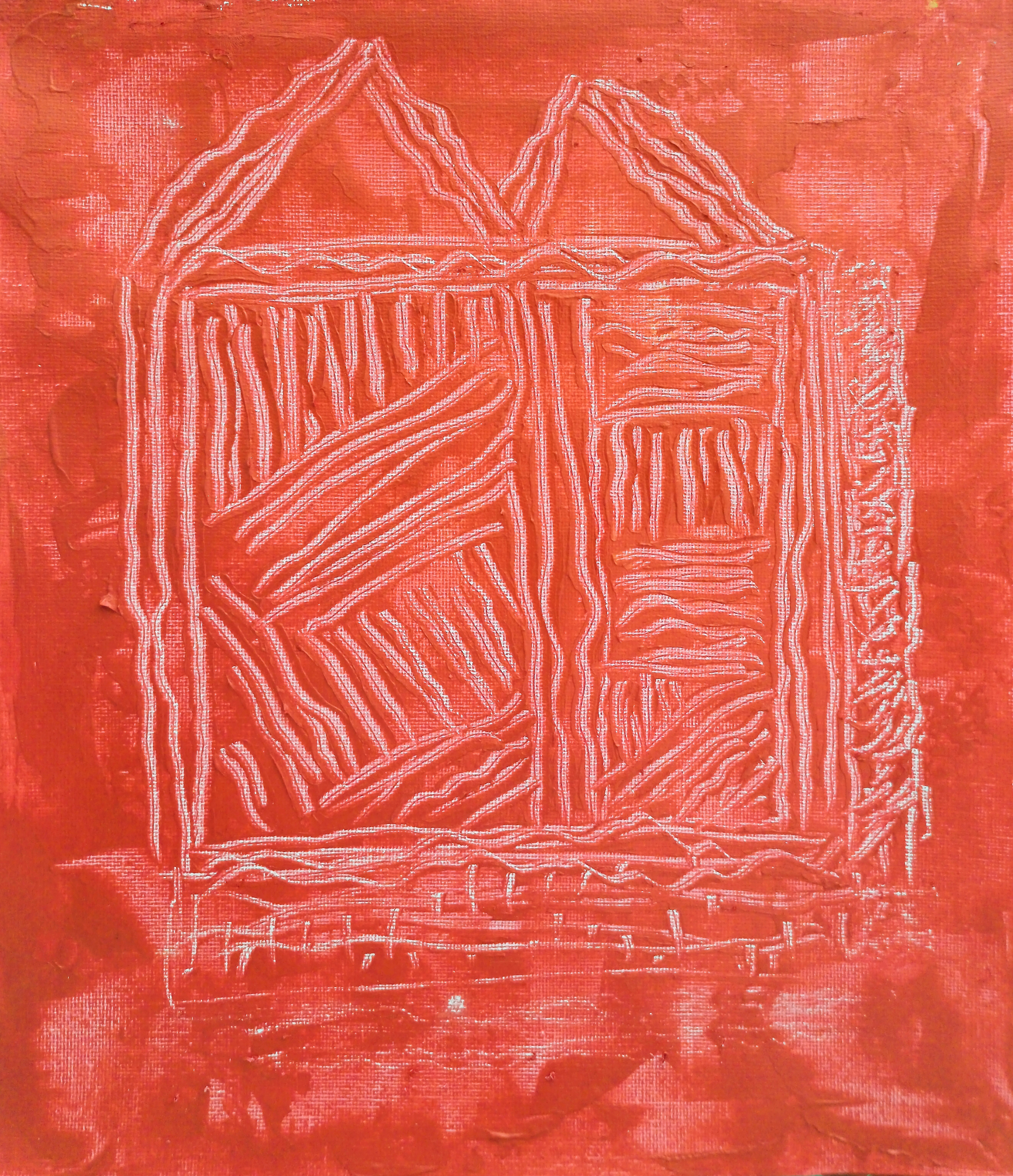
“Red Scratchpad” [23rd/24th April 2024] by Matt The Unfathomable Artist, acrylic fine art painting on 280gsm 10in x 12in gesso primed canvas, 3000 x 3483 pixels.
Quotation from pre-published social media in brackets:
[ “Red Scratchpad” is made with quick palette knife scratches with its own unique pattern.
This artwork exhibits a deep red through mixing cadmium red with gold acrylic paints. I purposely chose to make a scratched ‘beauty highlight’ lower-centre. Another softer scratched highlight is featured mid-left of the ‘M’ at the top of the artwork.
I visually referenced “Green Scratchpad” to begin this second painting of the series. Particularly whilst I am defining visual elements for these pieces.
With the remaining deep red paint I made another quite phenomenal abstract immediately afterwards in the “Pseudo-Purple with Gold Frame” style. ]
You can see “Gold Rectangular Frame with Red” (the second cadmium red with gold acrylic painting I produced on the same days as “Red Scratchpad”) by clicking the link.
It should be noted both “Red Scratchpad” and “Gold Rectangular Frame with Red” were published to my Instagram social media. The latter required new photography prior to publishing to my blog, doing so in June.
In discussing “Red Scratchpad” I can tell you my scratchpad series of works are amongst my favourite. Themes involve movies, creativity, music, thoughts, architecture, self-reflection, abstract ideas. I much prefer viewers to make these series of works their own in terms of meaning.
I have genuinely gifted “Green Scratchpad” although the recipient has yet to receive the artwork as I’m an unbelievably complex person. Some weeks ago I viewed the canvas out from storage.
It’s as astoundingly beautiful as “Red Scratchpad”.
Understated. Classical. First of the Scratchpad series.
There is a great deal of soul-searching to be found within this series, something for me to build upon over the years.
Next we have “Cosmic Scrages” immediately below:
“Cosmic Scrages” [23rd/24th June 2024] by Matt The Unfathomable Artist, acrylic paint on premium 115gsm medium textured cotton primed to 240gsm over 12in x 16in (30cm x 40cm) wood-fibre board (4mm), 6000 x 4497 pixels.
“Cosmic Scrages” is easily the most Jackson Pollock of works I’ve made to-date. Please do click the images for a more detailed viewing digitally.
Quotation from pre-published social media in brackets:
[ The first draft for “Cosmic Scrages” took 55 minutes on the 23rd June. I then worked over another four drafts the next day until I was happy with the result.
Happy equalled me uncontrollably laughing sometime with literal artistic elation. Afterwards I sat in the garden admiring the painting, drinking a cup of tea.
All palette knife and cloth working, no brushes. Immensely difficult to make, goodness gracious. ]
Well, there you have it in a quotation. No way these images even on high-quality flatscreens can possibly convey the paintworking in “Cosmic Scrages”.
I get an immediate sense of joy when I finish a work. The fact I made a successful inspiration from the works of an influential past master American artist meant everything to me.
I guess it did likewise for Basquiat.
Each and every artist painting is different. Not merely through obvious uniqueness from one work to another.
I could do a geometric painting stylelike “Cosmic Scrages” over and over again. The ‘ideas, qualities, application of the paints or materials.. makes all the difference.’
Just to demonstrate the level of skill required, Geometric Lines #1 & #2 are (of several-attempts-following) my very own masterpieces from that series, of two.
One-offs, #1 and #2.
True, I do wish to produce new ink pen geometrics in the future. However for now I’m happy to let those shine brightly as part of my catalogue raisonné of works. Especially since they’re genuinely difficult to make.
Oh gosh, I love them so. I think you can appreciate why it’s soul-wrenching for me to actually send “Green Scratchpad”.. yet.
To me at the very least“Cosmic Scrages” is my geometric painting masterpiece in the Pollock style.
Producing inspiration from very famous artists is an obsession, whilst also creating my own. It would be absurd to write ‘I simply place material to canvas and et voila.. masterpiece’.
Artistic learning is necessary to provide masterful possibilities.
“It took me four years to paint like Raphael, but a lifetime to paint like a child.” – Picasso.
“type: the Unfathomable ARTIST [acrylic version #1]” [9th July 2024] by Matt The Unfathomable Artist, acrylic paint on premium 115gsm medium textured cotton primed to 240gsm over 12in x 16in (30cm x 40cm) wood-fibre board (4mm), 7000 x 5201 pixels.
For those who have not read my pre-published social media (Instagram) for this piece, here is a quotation in brackets to give you some insight into the artwork:
[ “type: the Unfathomable ARTIST [acrylic version #1]” builds upon a genre within art containing either/and/or immediacy, repetition, overwriting, overpainting, confounding wordology, iconography/symbology and interpersonal communication.
This piece is founded from my past works with the same message (‘type: the Unfathomable ARTIST‘) portraying multiple ideas and themes. To date I have made oils, iron gall ink and (now) acrylic works with this title.
In effect this is an invitation for you to get to know me, my person, my personality.
Please note confounding wordology is a repetitive practice amongst Twombly and Basquiat works, where I drew inspiration. Particularly in terms of technique, ideas and motivations I am immensely studious with regards to artists, art and generally everything interesting to me. ]
Now for new information to blog readers about this acrylic shown immediately above..
.. it was a total canvas wrestling match to be honest. Some paintings like Yellow Flowered Sun Abstract just happen. Others like this piece <partway through> you would find me carefully considering the visuals, or a lack of artistic quality or the feeling it’s a work-in-progress I’m not ready to place palette, brush or pencils down with.
I must be delighted with an artwork, professionally.
“type: the Unfathomable ARTIST [acrylic version #1]” is somewhat unique. Understated tones, stylistic paint writing in canvas scratches, a messily-attractive disconcordance.
The idea originates specifically from these digital works; oil paintings; and iron gall ink piece I have linked for you to view (please note clicking on these links you may need to use the back button to return to this article):
[type: The Unfathomable… Artist – Electronic Version]
These works have sentimental meaning to me, even beyond themes.
I personally believe “type: The Unfathomable… Artist – Electronic Version” [18th August 2020] is one of my most valuable artworks. Similar feeling also with “Green Scratchpad” and “Cosmic Scrages” [23rd/24th June 2024].
Friendship is a powerful emotion.
Finally, I would like to share a blog article of an inspired artwork subconsciously featuring a particular woman with whom “type:” series of works derive certain elements.
Purely for those wishing to understand cultural changes my art and humanitarian efforts need to achieve.