Acrylic Portraits

Cadmium Red Mars Black Untitled #1 Matt The Unfathomable Artist
“Cadmium Red & Mars Black Untitled #1” [26th December 2024] by Matt The Unfathomable Artist, acrylic painting on A4 250gsm mixed media paper, 5000 x 6879 pixels.

Acrylic Portraits in Subconscious Working

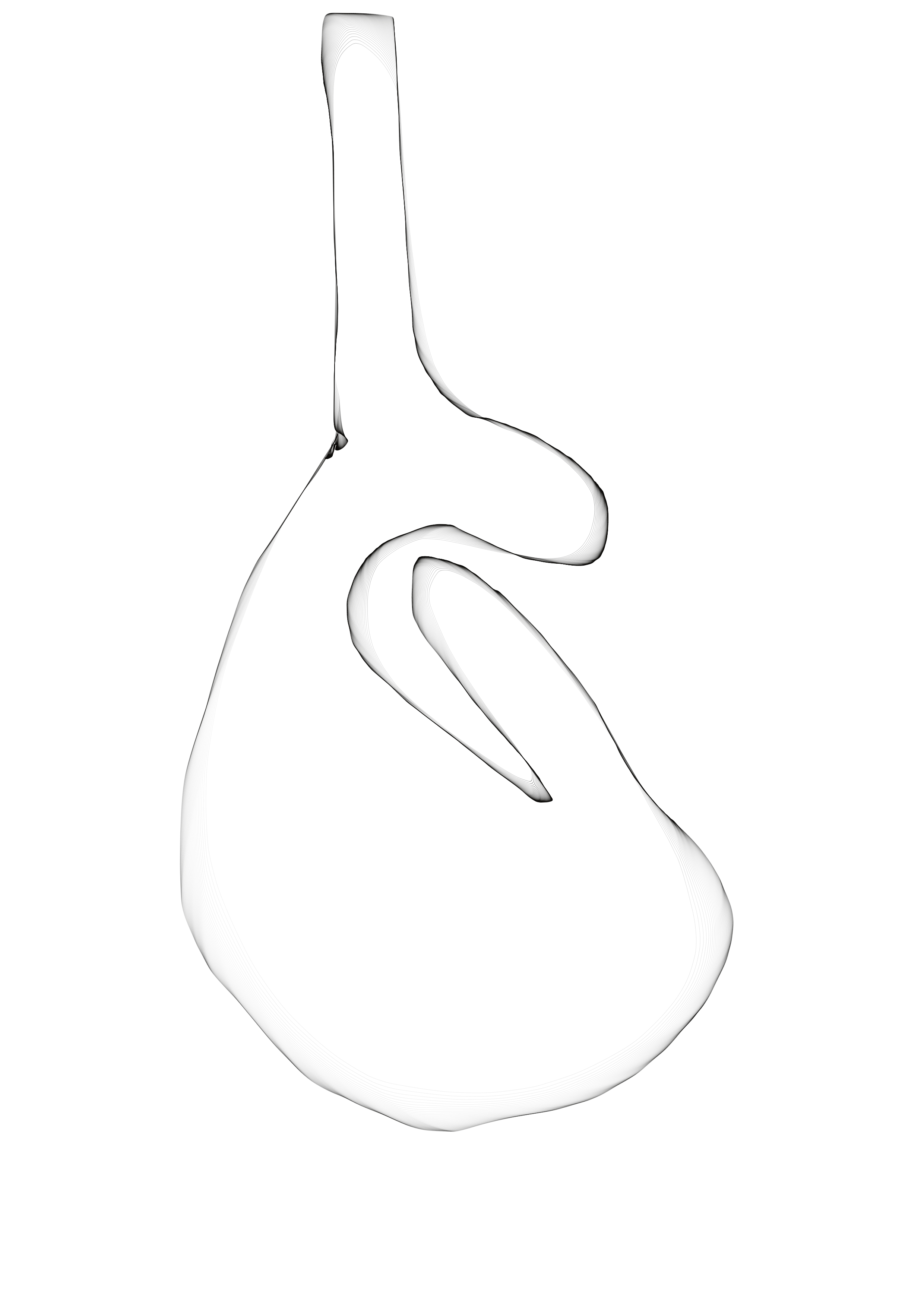
“Cadmium Red & Mars Black Untitled #1” whilst made very quickly in portrait orientation is in fact an abstract. I only noticed the side profile head shape afterwards upon photographing the wet painting. My own focus 100% on making contrasts with the red, black and palette knife textures.

The work is subconsciously inspired of Frank Auerbach.

I photographed this piece on a black cloth vest with light blocking-surrounds excluding camera flash. In effect the piece appears to make its own light since I photographed this completely under shadow.

If you view the work in portrait at 180 degrees you might distinguish a squirrel (in side profile), perhaps a rabbit or some other cute fanciful like-creature facing the viewer.

nb Produced in one draft with my favoured palette tool. One tidying draft millimetres around the edge with brush only. I carefully retained the entire main abstract working seen here from the first draft exactly as spontaneously made.

I do not know how the human portrait formed from an abstract.

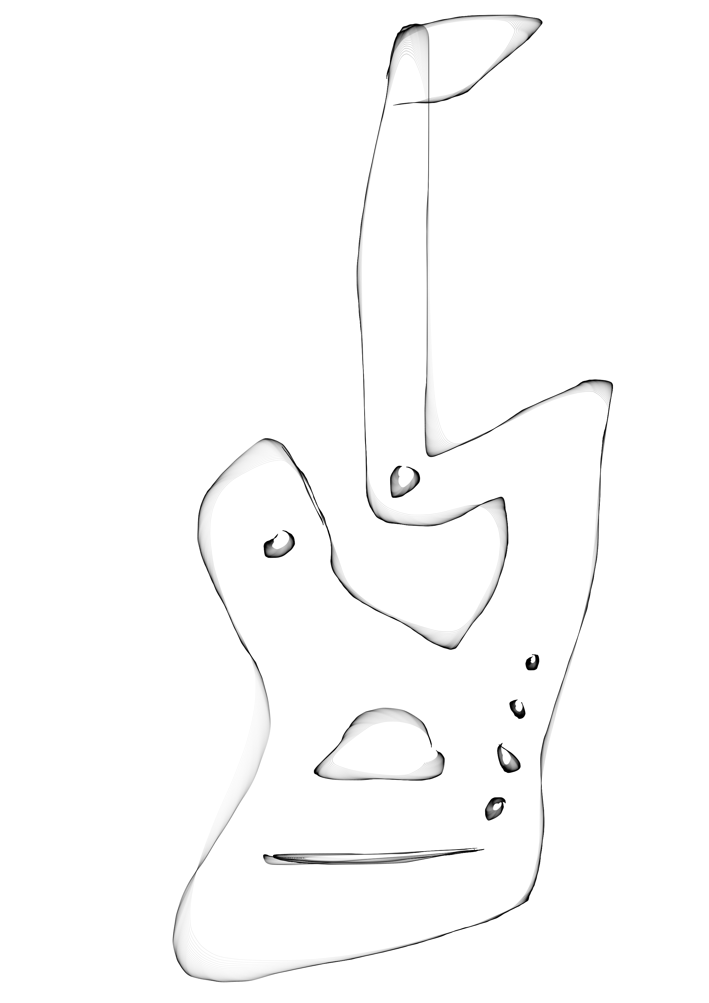
Next we have “Fragments #1”:

Fragments #1 Matt The Unfathomable Artist
“Fragments #1” [19th December 2024] by Matt The Unfathomable Artist, acrylic painting on A4 250gsm mixed media paper, slightly cropped paper, 5566 x 5934 pixels.

Do you see Charlie Chaplin and Buster Keaton?

On 19th December I utilised two A4 papers on the same day with random paint scrages from an as yet unpublished mixed media piece on A3 (“Conker Lots”).

These became “Orange & Violet Untitled” and this work “Fragments #1”.

“Orange & Violet Untitled” featured a predominantly Mars Black ground, inadvertently influenced by the formation of ‘guitar pegs’ around the portrait head. 

“Fragments #1” also features Mars Black, somewhat already preplaced randomly.  To this I added orange with an umber acrylic mix, carefully balancing colours on the canvas paper.

My intuitive brush scrapes of “Fragments #1”in a Cy Twombly style unintentionally collaborating with the Jean-Michel Basquiat style purposed in “Orange & Violet Untitled”.

As an artist I’m immensely intrigued to how viewers respond to “Fragments #1”.

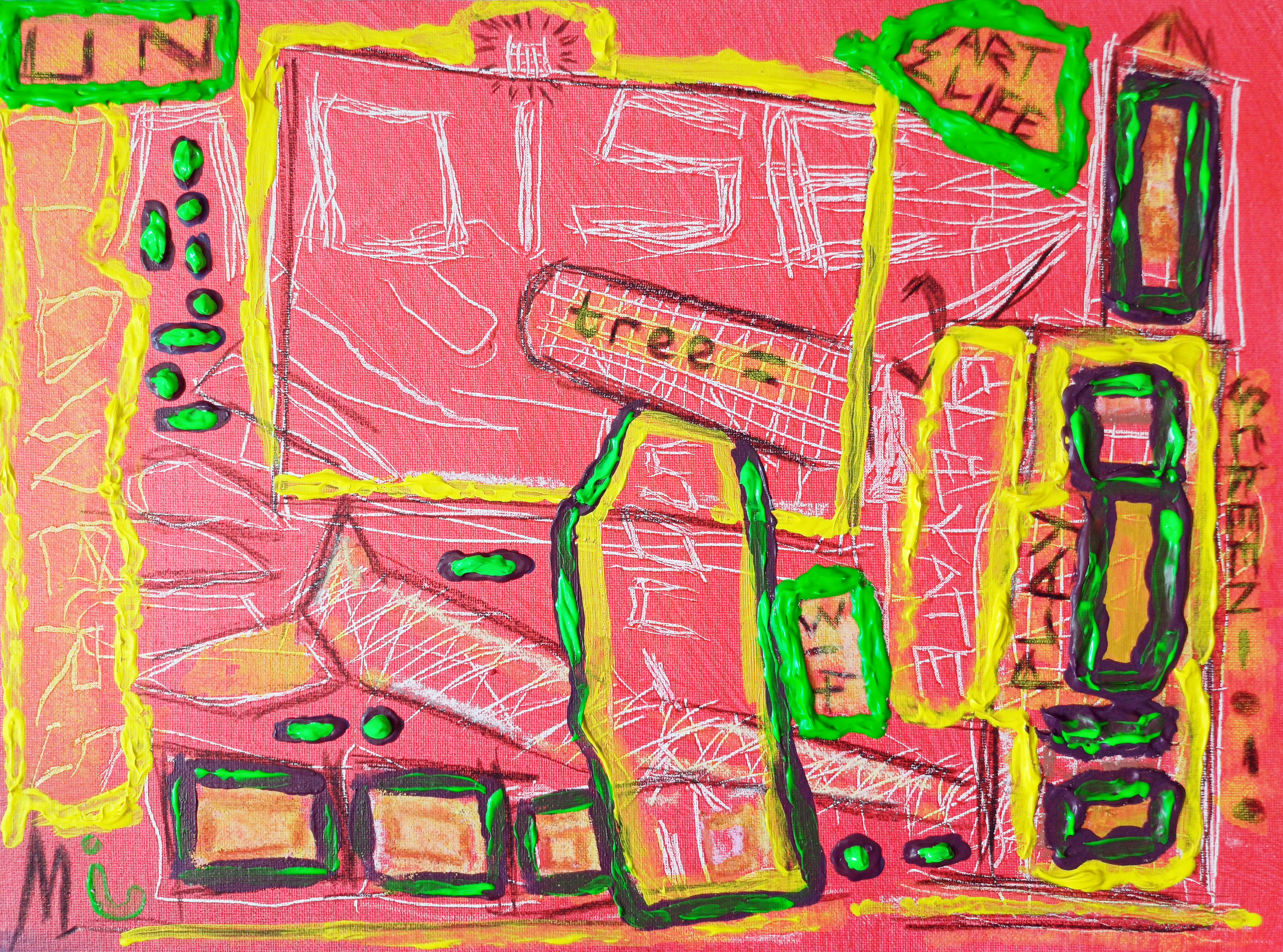
Next is “Pitchfork Hands Man”:

Pitchfork Hands Man Matt The Unfathomable Artist
“Pitchfork Hands Man” [20th January 2025] by Matt The Unfathomable Artist, acrylic Pop Art painting on A3 250gsm mixed media paper with one lined Notepad paper as a painted central collage, 5000 x 7087 pixels.

I made “Pitchfork Hands Man” on 20th January 2025. On 8th February 2025 I read a CNN article (you can click the link to see the article) detailing a man knocking over a 19th Century candelabra at St Peter’s Basilica at the Vatican!

Let’s give more information about the artwork itself.

The lined Notepad paper with lovely textured inner cadmium-red paint looked rather arty. It’s paint scrapes originated from another recent work.

I began to paint play with sap green, cadmium-orange and then cadmium-yellow on the lined Notepad paper ensuring I retained all the beautiful red premarked paint.

Whilst making this I randomly scraped a brush loaded with yellow onto slightly premarked A3. With this separate A3 I began making hair, eyes and a face for fun.

Seeing potential I decided to intuitively place the Notepad piece centrally to produce a Pop Art character. I painted around the Notepad-body in gold to make the lined paper part of the A3 artwork.

Intriguingly if you turn the A3 anticlockwise 90 degrees to the left, the yellow eyes at your lower-left, I perceive a large authoritative head and face from the lined Notepad paper. This new character is not planned, merely a result of my retaining the premarked textured red paint.

Pitchfork hands each with seven prongs were added to complete the piece.

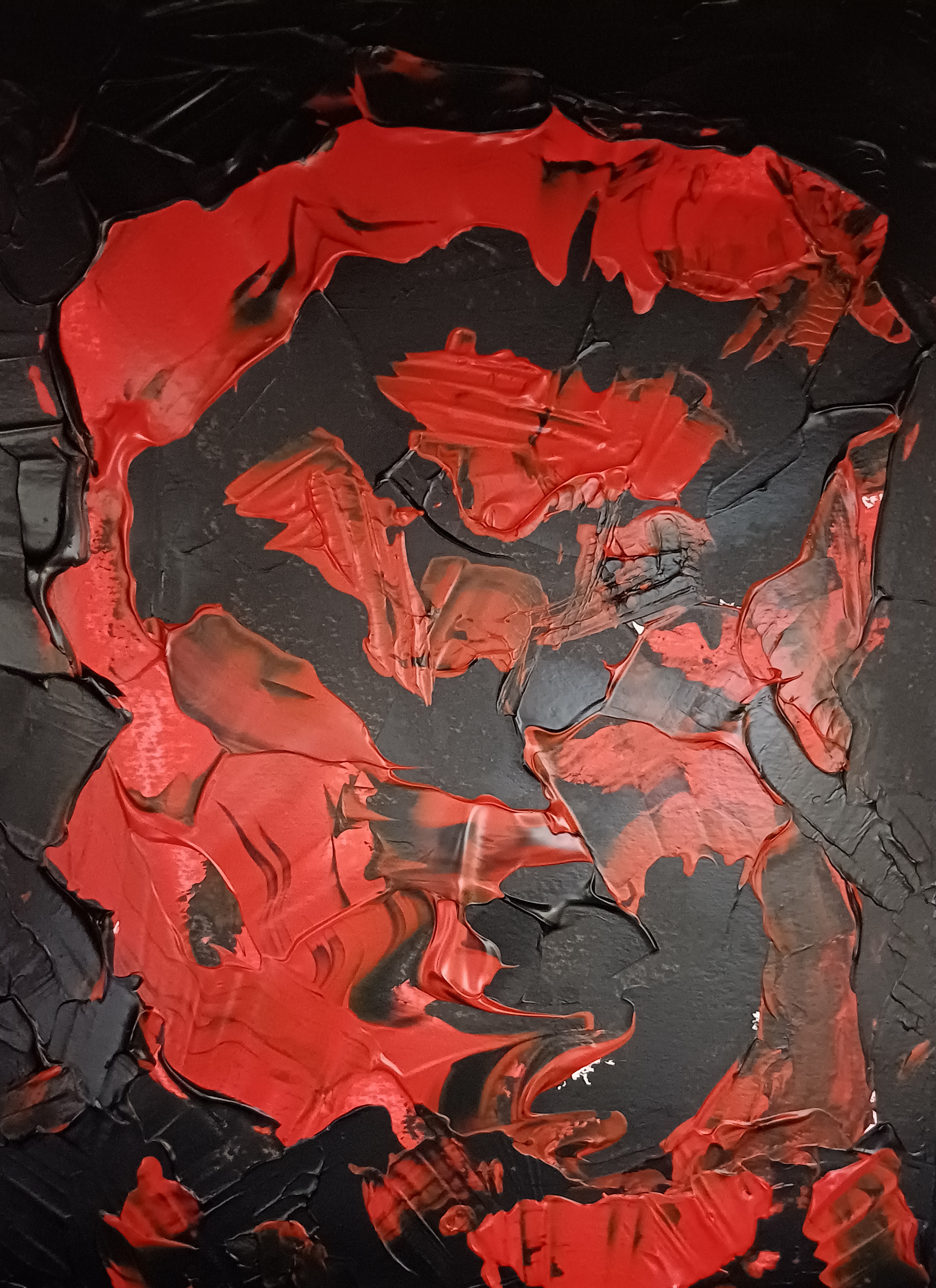
Finally for this blog article we have “Laughing Lion Eye” here:

Laughing Lion Eye Matt The Unfathomable Artist
“Laughing Lion Eye” [6th to 11th February 2025, wet paint photography] by Matt The Unfathomable Artist, acrylic painting on A3 (42cm x 30cm) 2mm white gesso primed wooden board, with border for social media publishing only, 8000 x 8000 pixels.

Personal quote on 11th February 2025:

“i genuinely made this in landscape with what became an eye at the upper mid centre-right. Seeing potential i turned this 90 degrees into portrait, et voila. i mixed red, green, blue (this afternoon) as i am out of pre-mixed black, making the definition outlines you see. this kind of piece is immensely exciting to me for its spontaneity.”

The ‘laughing lion’ in the eye is 100% chance. I didn’t notice this strange animalistic formation until photography again on 11th February.

I had no intention of making a portrait character prior to turning the painting 90 degrees.

Hope you have immensely enjoyed a flurry of portrait publishing to my blog in this article.

Standard

Ye Mud, Ye Mud

“Ye Mud, Ye Mud” 🎧🔉🎭✍️🎨

“through convoluted revolutions of time,

oft gather thine hummings shared-shine,

to divulge inn’ workings fine,

(as all humkinds do in daily grind),

to draw wit’in nutrish,

ye warm mind knead soft dough pined,

thy fellow hums might extra’plate wise,

nurturin’ fanfun vine, health and furrowy yearning finds,

these brabbling ruperted drops..

thay protect ‘gainst foe tailing-toxied kelp upped snipes.

thy Clan hath suff much a’ way ye not, know thee,

from spick nor span,

‘cept crash’ed jib,

or hymneyd march coated,

lamb-goated kid.

oh dear Bard,

what hummied sign shall arch’ed seek,

exceedin’ ye dome cry as muddy wildy beast,

intestine savaged girth in bloodied feast,

seeth ye not spill?

nor spangly hotted manmade well in curse?

when ye mud, ye mud,

i love with all as much,

supered torrents could thine must.”

– poem written and performed by Matt The Unfathomable Artist © 9th/10th March 2025.

Standard

Ospicas Portrait in Blue

“Ospicas Portrait in Blue” [12th to 17th February 2025] by Matt The Unfathomable Artist, acrylic brush & tube painting on A3 (42cm x 30cm) 2mm white gesso primed wooden board, border for social media publishing only, original in 5000 x 6985 pixels.

Personal quotations:

“i am definitely in Picasso inspiration, again. canvases being turned upside down, 90 degrees, strange wonderful art things. Here is (at first) a landscape of white outline with five random green rings i turned into a portrait to figure out some ideas.”

Updated: Approximately six definitive paint workings including three infinitesimal concluding drafts to perfect the visual.

I have strived immensely in my efforts, realising the portrait subject and timeframe during the very latter stages of its production. For me, interpreting my own work, the greatest clue came from the exclamation in the deep blue.

‘Ospicas’ is an anagram, a term of endearment and appreciation by me. I have utilised anagrams earlier with reference to specific artists and/or their works.

Making a portrait from a landscape-oriented abstract has made me very happy with this piece.

Here is the second draft, the first draft involved priming the heavy gesso with the cadmium-red ground you see:

“2nd draft – Ospicas Portrait in Blue” [12th February 2025]

At the time of making the second draft I made structural lines using a tube of titanium white. Additional brush painting in ultramarine/cerulean blue, sand (paint colour around the eyes), gold, copper, silver and burnt umber followed with careful, neat application..

.. only once I had turned the canvas into portrait orientation!

At first you see I envisaged a cute creature, being perfectly honest with you as a dear Reader.

With the yellow I wanted natural creativity to compose a face, enjoying visible brush lines, the interplay between red and yellow. Cloth fabric in use to allow the red ground to shine through, like the Sun.

The wild application of brushed yellow caused the necessity for much tidying work over the white tube lines. Wonderfully this improved the titanium textures. You can view the final draft with the second draft by clicking each image to see these textural differences. I retained smoothness at the centre for contrast.

Burnt umber is synonymous with academic underpainting. It was at this latter draft working I understood the portrait person, including the timeframe in their life.

A person with an intense, insatiable hunger for art.

I would greatly love anyone interested to make a version of this portrait with colours of your own choosing or in emulation of those in the painting.

Please enjoy.

Standard

Guitar designs for Alienalis Mantis

“Guitar Design One A” [Digital Art, 1st December 2024] by Matt The Unfathomable Artist, Digital Artwork, 5000 x 7073 pixels.

Let’s ascend into my process of production for these works. “Guitar Design One A” is made in ten minutes from “Guitar Design One” (foot of this article) using freehand digital drawing software.

The shading you see automatically follows the lines I made, see my blog article and works ‘a4 LY equation [digital sketch #1]’ for academic artistic reference.

Inspired by the beauty within “Guitar Design One A” I decided to make an acrylic replication of sorts on mixed media paper.

Artistic brand signage gave me the idea to produce a visually colourful piece in Alienalis Mantis, shown immediately below:

“Alienalis Mantis” [4th/5th December 2024] by Matt The Unfathomable Artist, acrylic fine art painting on A3 250gsm mixed media paper with four 250gsm backing papers, 5000 x 3617 pixels.

Impressed by the accurate brushwork of signage artists, think shop windows for barbers and barge boats, I thought this would make for an excellent amalgamation of styles.

Abstract and Signage.

My drawing lines in “Guitar Design One A” were so perplexing I found these a maze for my brushwork! Therefore I improvised with certain areas on the paper, quickly finding the landscape orientation the best for the acrylic visual.

I made the gold head for the (unintended) Mantis with textures similar to the preserved outer wrapping of an ancient Egyptian mummy.

It’s exciting for me to appreciate this acrylic is derived from guitar designs. The violet is blueberries to the orange. Everything seems to have motion. Life.

Here is the third computer design, a new work made in eight minutes:

“Guitar Design B” [Digital Art, 1st December 2024] by Matt The Unfathomable Artist, Digital Artwork, 5000 x 7073 pixels.

Haha, isn’t “Guitar Design B” wonderful?

To be a comfortable guitar I might need to round out its seated-position shape.

Finally we have the first design, “Guitar Design One”:

“Guitar Design One” [Digital Art, 1st December 2024] by Matt The Unfathomable Artist, Digital Artwork, 5000 x 7073 pixels.

“Guitar Design One” is more mandolin than guitar. Yet, this design provided the inspiration for guitar Design B.

Here is pre-published social media commentary for the digital pieces and acrylic painting in bold and italics:

[ The three computer drawn guitar designs I made are as follows:

‘Guitar Design One’ prior to 1720hrs on the 1st December 2024, produced in minutes for fun. Seen at the centre of this work.

‘Guitar Design One A’ a professional artwork produced from design one within ten minutes to 1730hrs. The design I incorporate into “Alienalis Mantis”, and the verily design represented here.

Then finally ‘Guitar Design B’, produced within eight minutes to find artistic lines for the possibility of a professional guitar body and neck.

Hope you enjoy these works as much as I do.

Standard

Redeemer

“Redeemer” [21st November 2024] by Matt The Unfathomable Artist, abstract acrylic painting on A3 250gsm mixed media paper, 4000 x 2859 pixels.

From social media, quotation in bracketed bold and italics:

[ “Redeemer” features iridescent bronze, alla prima copper, silver, sap green, mars black and burnt umber applied intuitively in precise motions on a wet, lightly pigmented ground.

The Redeemer element you can see is chance palette application. However, it’s clear to me my subconscious picked out imagery I had seen a day prior.]

Delicate applications of wet copper with heavier palette motions of bronze compliment the canvas. I filled the upper-central space in sap green, definitely in thought of Central Park, New York. To be honest, this delighted.

To canvas-frame the piece I partially added mars black as a surround. Very much a 1950’s art style.

Once again it’s possible climate change is the external narrative here. A sense of saving humanity from industrial pollution in whatever form.

Corruption of duty against the Earth.

On the paper this artwork reveals a gentle, considerate balance. I hope you can see this work one day, physically before your eyes.

As always lighting a work like this is finite, sensitive to its full potential.

Standard

Breathing Manuscript

“Breathing Manuscript” [13th November 2024] by Matt The Unfathomable Artist, abstract acrylic painting on A3 250gsm mixed media paper, 4000 x 2983 pixels.

I have a passion for ancient subjects, cultures, and civilizations. Ancient Egypt particularly intrigues me, for decades.

Presently I’m informally studying the silent movie era with a focus on Hollywood stars of times past. Collating information for depth of understanding and artistic inspiration.

Silent movie levels of acting, directing and production professionalism are truly ingenious. I could talk to you about this subject for hours.

At the top left of “Breathing Manuscript” I perceived a Pharoah-like portrait. I wanted this artwork to look ancient, aged. A lost find, perhaps writings.

In my animation immediately below we can imagine viewing this piece in a cave with a fire-lit torch:

“Breathing Manuscript – Animation” [13th November 2024] by Matt The Unfathomable Artist, abstract acrylic painting in three photographs produced into a 1920 x 1424 pixels GIF animated file.

This artwork is a seed, to grow. An experimentation.

To develop potential further, classical art in new works.

“Breathing Manuscript” is contextual to “Malevolence upon Trees”. Not in theme or idea. In horror, gruesome sentiment to both pieces. Without intention.

My ‘m’ grass (as I called this) in “Malevolence upon Trees” intended to appear like writing, specifically ‘ye olde’ Shakespearean. A work taking much time and effort.

“Breathing Manuscript” is a paint play.

A final piece in this colour scheme will be produced on clay stone, preferably sculpted too. Oh goodness a kiln-fired clay sculpture. I still have the last pottery work I made in 1987.

Sometimes I make art and ask, does this need to be beautiful for people to enjoy? Being ultra-critical if it lacks beauty. Then I ask, why? Answering with.. beautiful art is popular.

Honestly though, this is my first effort in acrylic at emulating antiquity. All I know is that whenever I view this piece it has something.

I don’t know exactly what, just.. something.

Standard

Copper Sunshine Face

“Copper Sunshine Face – RED” [3rd/4th & 9th November 2024] by Matt The Unfathomable Artist, acrylic painting on 100% pure cotton triple-gesso primed canvas board, 10 in x 12 in (25.4cm x 30.5cm), produced into Digital Artwork with a red border, 3000 x 3000 pixels.

From my social media in bold and italics:

[ I made the original acrylic painting freestyle over two days. Tube piping the paint in heavy impasto. The style is a continuance of my exploring the very essence of Picasso.

The artwork questions racism with the use of colour, occupation, history and emotion to challenge prejudice and hatred.

I produced eight digital versions in addition to the acrylic artwork which features in the centre. Originally the real neck ties were secured top and bottom to flatten the canvas board temporarily whilst the heavy paint work is still drying.

To my delight I immediately realised I had inadvertently made installation art from my painting with powerful meaning!

Six digital versions are background colours GREEN, MAGENTA, RED (shown here), ORANGE, UMBER and CYAN. A 3×2 Collage (the eighth version) is produced in the colour order listed here. The seventh MONOCHROME version is included in this blog article.

The title is purely a reference to the copper paint piped to make some of the facial features. The outer area of the face refers to rays of the sun. The artwork canvas began as a beautifully sophisticated abstract in yellow and green.

After evaluation I decided to freestyle the portrait you see here. ]

For reference into a physical mounting of the piece the RED is #fe0000 / rgba 254,0,0,255.

Next we have the beautiful six grid Collage:

“Copper Sunshine Face – 3×2 Collage” [Digital Artwork, 9th November 2024] by Matt The Unfathomable Artist, 9000 x 6000 pixels.

As an Andy Warhol fan my 3×2 Collage provides the opportunity to enjoy colour to its fullest.

“Copper Sunshine Face” is a cultural look at historical society particularly from America, where music converged through classical, jazz, blues, soul, country, rockabilly, rock n’roll, pop, disco, hip-hop, rap and electronic music.

– “Matt, what is your inspiration behind Copper Sunshine Face?”

  • ‘Purity of human being where racial origin has no division. This is why I chose to paint the face yellow, to signify the Sun. The headdress style is 1950’s America following my love of listening to The Collins Kids especially “Shortnin’ Bread Rock” . As described already, the choice of adding ties to the piece is unintended subconcious chance.’

– “The ties are now integral to the piece then?”

  • ‘I like the idea the funeral tie is part of Copper Sunshine Face since this has personal meaning. However I’d like the buyer to add their own personal item as the uppermost headdress for the duration of ownership. Continuing in this manner for any future resale of the piece in keeping with its original purpose.

– “Sounds cool! Why then did you make MONOCHROME if the face is yellow for the Sun?”

  • ‘To me the pieces are founded upon singing in the harvest fields. I felt the subject material needed to appreciate history, hardship and equality for all.

Links courtesy of Wikipedia and Heppest of the Hep YouTube channel. Music publishing owned by any existing label copyrights.

Here is MONOCHROME:

“Copper Sunshine Face – MONOCHROME” [Digital Artwork, 9th November 2024] by Matt The Unfathomable Artist, 3000 x 3000 pixels.

“Copper Sunshine Face – MONOCHROME” reminds me of old black and white movies.

Whilst making the original acrylic painting I thought I’d picked out burnt umber, having bought same in both gouache and acrylic earlier. Halfway through I realised as the wet metallic paint gleamed I’d chosen copper instead. The tones do look similar on the tube packaging. This is the reason I included a BURNT UMBER version in the 3×2 Collage.

The textural detailing of the yellow face is made by softly wiping kitchen tissue paper on “Copper Sunshine Face”.

I wish the artworks to represent progress and oneness for the human race.

Hope you enjoy.

Standard

Comic Book Series [Letter M]

“Comic Book Series [Letter M]” [2nd November 2024, photograph 4th November 2024] by Matt The Unfathomable Artist, acrylic Pop Art painting on 100% pure cotton triple-gesso primed canvas board, 10 in x 12 in (25.4cm x 30.5cm), 6000 x 7261 pixels.

Quotation from social media in bold and italics:

[ I pre-doodled the letter ‘M’ in pencil on card and then set to work on a new painting.

“Comic Book Series [Letter M]” took two drafts each within approximately one hour. The first draft completed prior to 1550hrs, then the latter draft finissimo prior to 2235hrs. In the latter draft I carefully added the Mars Black outline for definition, finely adjusted the gold detailing and made ultra-finite balancing perfections to the lettered area.

Van Gogh-like impasto brushworking, vibrant comic book tones with stylistic fine art emotion in an artistically precise Pop Art piece.

There are six beautiful digital versions to compliment the Original acrylic painting. The six digital versions are individual works along with one six-grid collage in a three-across two-rows configuration. ]

Kind of awesome Pop Art isn’t it.

With my work I’m always requiring professionalism, high quality and artistic value as an artist. I love amazing you! I love amazing myself.

Would you like to know a secret?

The face in the centre is pure chance! True.

I only noticed this the next day (3rd November) after I photographed it academically. That is to say, not a quick draft evaluation photograph.

I made two palette knife scores in the style of the heavy impasto gold surround from “Golden Whale with a Voice”. An artistic decision I made for two reasons. Firstly, I love my palette working in that piece! Secondly, I had made this style of palette work in the prior draft to “Comic Book Series [Letter M]” and wanted to restore something from this in the gold.

The majority of the gold texture in “Comic Book Series [Letter M]” is produced through brushwork ‘fluting’, after careful palette knife placement of the gold.

Let’s take a look at my Collage 3×2 Grid here:

“Comic Book Series [Letter M] Collage 3×2 Grid” [digital artwork, 4th November 2024] by Matt The Unfathomable Artist, 300dpi, 9000 x 7238 pixels.

Be honest, this blows your mind, I hope.

The co-ordination of tones is my compositional choice to wow you✌🏽.

It certainly wows me!

Some time after making my works I often say to myself ‘Did [I] make this!?’ 🤯.

– ‘I did. It was me. I love art I do.’

You can see the individual Digital pieces BLUE, YELLOW, PINK, ORANGE, GREEN & PURPLE (corresponding to the background for each artwork) here:

“Comic Book Series [Letter M] BLUE” [digital artwork, 3rd November 2024] by Matt The Unfathomable Artist, 4798 x 5788 pixels.

BLUE is brightly-dark.

“Comic Book Series [Letter M] YELLOW” [digital artwork, 3rd November 2024] by Matt The Unfathomable Artist, 4798 x 5788 pixels.

YELLOW is cheerily-sombre.

“Comic Book Series [Letter M] PINK” [digital artwork, 3rd November 2024] by Matt The Unfathomable Artist, 4798 x 5788 pixels.

PINK is vibrantly-sad.

“Comic Book Series [Letter M] ORANGE” [digital artwork, 3rd November 2024] by Matt The Unfathomable Artist, 4798 x 5788 pixels.

ORANGE is mellowy-unhappy.

“Comic Book Series [Letter M] GREEN” [digital artwork, 3rd November 2024] by Matt The Unfathomable Artist, 4798 x 5788 pixels.

GREEN is vividly-distressed.

“Comic Book Series [Letter M] PURPLE” [digital artwork, 3rd November 2024] by Matt The Unfathomable Artist, 4798 x 5788 pixels.

PURPLE is interestingly-mooded.

These artworks were made to cheer our day no matter our circumstances. This is how I interpreted my subconscious feelings finding their way onto the canvas.

Standard

of Van Gogh & of Picasso

“Cosmic Mouth” [6th/7th & 10th September 2024] by Matt The Unfathomable Artist, acrylic paint on premium 115gsm medium textured cotton primed to 240gsm over 12in x 16in (30cm x 40cm) wood-fibre board (4mm), 7018 x 5167 pixels.

“Cosmic Mouth” is literally painted over a female mouth acrylic painting (produced 1st & 2nd September with much effort and innumerable drafts). I then worked on the newer Cosmic overpainting you see here for the next two days.

On the 10th September I varnished the centre. I did retain a photograph of the underpainting even though it wasn’t successful to my eyes. You can see hints of the underpainted mouth along the middle of the canvas.

The female mouth I’m determined to paint successfully is physical perfection.

‘Sometimes perfection is immediate and sometimes it takes time.’ – one of my sayings.

Thankfully the overpainted Cosmic Mouth” is the perfection I sought for.

Writing of perfection..

“Artist Seduces Artist” [13th September 2024] by Matt The Unfathomable Artist, acrylic paint on premium 115gsm medium textured cotton primed to 240gsm over 12in x 16in (30cm x 40cm) wood-fibre board (4mm), 6000 x 4525 pixels.

..I made “Artist Seduces Artist” in around an hour to an hour and a half, freestyling, in heavy impasto acrylic.

Please do click these images for an even better viewing.

“Artist Seduces Artist” would look incredible hung at the centre of the darkest black large fabric square or rectangular-like tapestry, 6ft by 6ft at the very minimum. it is 100% Picasso inspired 🎨

I made a very finite finishing touch with two paintbrushes to the completed artwork with burnt umber on 17th September due to my perfecting standards.

For the primary working I utilised three painting techniques: palette knife, paintbrush motions using approximately four brushes, and constant-direct tube paint applications onto the canvas for the grass-green and turquoise surrounds.

Originally I intended to use burnt umber, gold, and mid-yellow colour. Prior to canvas working I included silver, copper and bronze into the palette. I have time and again tried to make ‘the beautiful simple style’, yet invariably add complexity!

After thorough happiness with the predetermined colours I then felt the canvas needed the delicious cadmium red, interesting turquoise, balancing titanium white and then finally the defining grass-green to make everything come alive.

It was at this point I added the mid-yellow even though this was an intended colour to use from the outset. I flattened the profile of the turquoise surrounds for visual interest with a flat-paintbrush. The grass-green received an area of purposed flattening due to the paint settling on the canvas.

Please note the inspiration for this canvas derives from the book “Life with Picasso” by Françoise Gilot and Carlton Lake with my own interpreted Picasso style. I was at page 38 to that point prior to making this artwork.

“Artist Seduces Artist” is a mixture of textures, layers, partially recognisable or obscured pictorial elements and humour with a composition intended to please the eyes in visual interest.

The essence of Picasso himself interpreted in an inspired style by myself.

“Artist Seduces Artist” with.. the beauty of art.

[ nb I am listening to Tobar Mhoire 🔊🎧]

Standard

UN noise dash dot

“UN noise dash dot” [6th to 9th September 2024] by Matt The Unfathomable Artist, charcoal, pastels & acrylic paint on premium 115gsm medium textured cotton primed to 240gsm over 12in x 16in (30cm x 40cm) wood-fibre board (4mm), 6936 x 5160 pixels.

Matt The Unfathomable Artist fans please be ready for draft by draft overload.

Having wrote detailed information I thought ‘Fans do need to see these drafts to appreciate how UN noise dash dot progressed’.

“UN noise dash dot” is made in approximately four drafts as follows.

6th September prior to 2111hrs:

First draft: beautiful red canvas coverage and canvas scratches (palette knife) including scratched words. I cannot explain how invigorating this first draft was.

Photograph immediately below.

“UN noise dash dot – first draft”

It’s cool fans get to see early drafts, my artmaking process and developing ideas.

Late 6th into early hours of 7th September prior to 0011hrs:

Second draft:

  • charcoal lines added
  • charcoaled SCREEN_. [to read, ‘dash dot’] PLAY, 314, ART LIFE, tree, UN, stylised sigma symbol [ Σ ] left of ART LIFE, M and box shapes
  • ‘claw’ added to the top of a rectangular robot-like or building shape
  • soft pastels around some boxes for definition

The ‘claw’ could possibly be subconsciously inspired by “The Giant Claw” [movie, 1957] and/or Robby the Robot from “Forbidden Planet” [movie, 1956]. The latter is one of my all-time favourite films. I did enjoy “The Giant Claw” recently, due to the acting performances by the cast.

un in capitals means ‘the opposite of’ or ‘contrary to’ although I’m happy with any reasonable interpretation for this lettering.

I did also think of the un in unfathomable whilst writing this and also the United Nations. I didn’t and haven’t defined an exact meaning for ‘un’. I enjoy viewers deciding for themselves, personally.

Photograph immediately below.

“UN noise dash dot – second draft”

7th September prior to 1445hrs:

Third draft:

  • yellow paint added around boxes,
  • yellow highlights around some words,
  • pseudo-purple paint (first batch) around boxes,
  • green paint around 314, ART LIFE, UN,
  • letter [ i ] symbolically added in green to the right of the letter M.

see [*1] further below for details of the first batch of pseudo-purple paint I mixed on sandpaper that randomly became “Sandpapered Green with Dark Purple & Yellow”.

You can see the wet purple and yellow on the UN noise dash dot canvas (image immediately below) that featured in ‘Sandpapered Green..”:

“UN noise dash dot – third draft”

8th September 2024 – artwork drying, photographed once for artistic evaluation:

  • no drafts, I photographed “UN noise dash dot” now dry from the day before and the still drying heavy impasto canvas of “Cosmic Mouth” – the ‘astronomy‘ art work (not the female mouth canvas working as this was extensively done on the 1st & 2nd September 2024, subsequently overpainted).

9th September early afternoon prior to 1334hrs:

Fourth draft:

  • green highlights around boxes and dash dot symbols added in green to balance the canvas visuals.
  • heavier overpaint to the existing UN green box for definition.
  • second batch of mixed red/blue-to-pseudo-purple paint added around smaller boxes and underneath the overpainted green dash dots below ‘UN‘. I called this latter area ‘the seated dash dots‘ as some days afterwards this is how I myself interpreted this. Please do see “Mapped Random Satellite {Day} #1” as I believe this is my subconscious finding its way into UN noise dash dot. Interestingly the seated shape of these dash dots is pure chance to fill negative canvas space!

see [*2] further below for details of the second batch of pseudo-purple paint I mixed on Notepad paper to randomly become “Upper – Original” with “Unfathomable Apocalypse Rider in Six-Grid Collage”.

Photograph immediately below, wet paint online version.

“UN noise dash dot – WET PAINT” [6th to 9th September 2024] by Matt The Unfathomable Artist, acrylic paint on premium 115gsm medium textured cotton primed to 240gsm over 12in x 16in (30cm x 40cm) wood-fibre board (4mm), 6624 x 4914 pixels.

In terms of subject matter I feel “UN noise dash dot” is my usual pop art complexity. Not in any order of importance or competing artistic thought:

What did you feel “UN noise dash dot” is about?

Here is further information whilst making “UN noise dash dot” with regards to the two pseudo-purple paint batches I mixed on the 7th and 9th September respectively:

[*1] 7th September prior to 1445hrs:

  • I folded one P400 sandpaper piece in the middle from the leftover purple paint to make two paint prints on the same P400 paper piece. I then pressed one of these to a third sandpaper rectangle (folded P400 piece), now making three individual rectangular acrylic ‘prints’ across two pieces of P400 sandpaper.

[*2} 9th September early afternoon prior to 1334hrs.

  • Whilst mixing a second batch of red/blue paint for the purple I made a (then unknown to me) random artwork on lined Notepad paper. This would become first two acrylic pieces then their digital artwork derivations through “Upper – Original” and “Unfathomable Apocalypse Rider – Original” (both physical pieces and the digital derivations are included in the same blog article and link).

Just a quick thought on ‘then unknown to me‘. To me as an artist, mixed or mixing paint is made purely for the purpose of the canvas I’m working on, nothing more. When working on oils I have art-deco teacup saucers I use to mix the paint. These are cleaned after each oil painting session.

Making art from mixed acrylic paint leftovers is therefore quite new to me. Every now and then I like the look of the random paint I’ve mixed, please see “Pure Chance Portrait #2 in Portrait” for instance. Interestingly, I have some iron gall ink practice works I turned into art pieces some years ago. I’ve not published or formally documented any of those as yet.

“UN noise dash dot” is unusual in that I had two batches of mixed acrylic paint workings I liked and decided to do something with.

Hope you have enjoyed this article.

Standard