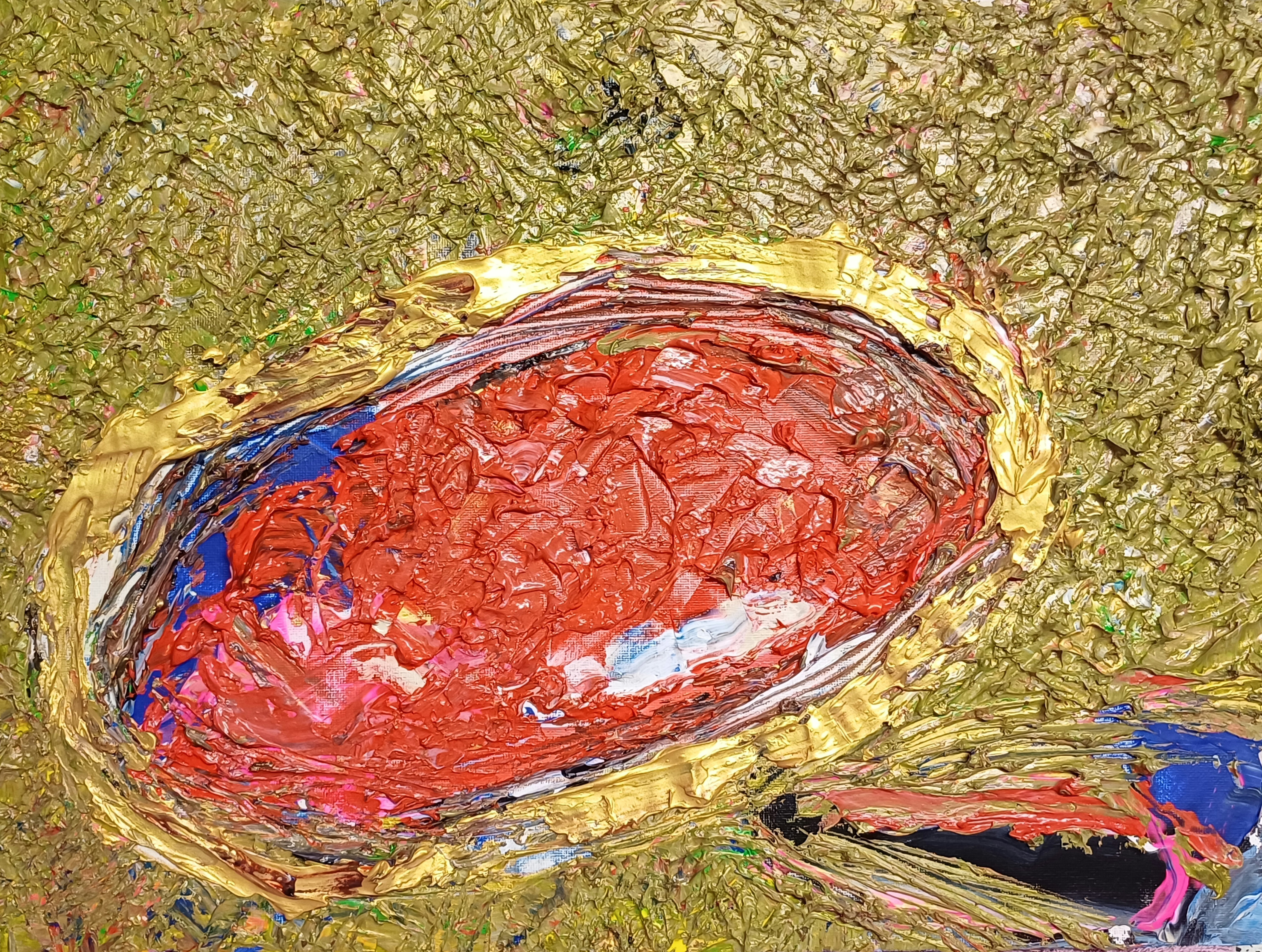
Orange & Violet Untitled
I have chosen to highlight pre-published social media commentary in blue. If you have read my Instagram posts for works in this article you can quickly skip re-reading if you prefer.
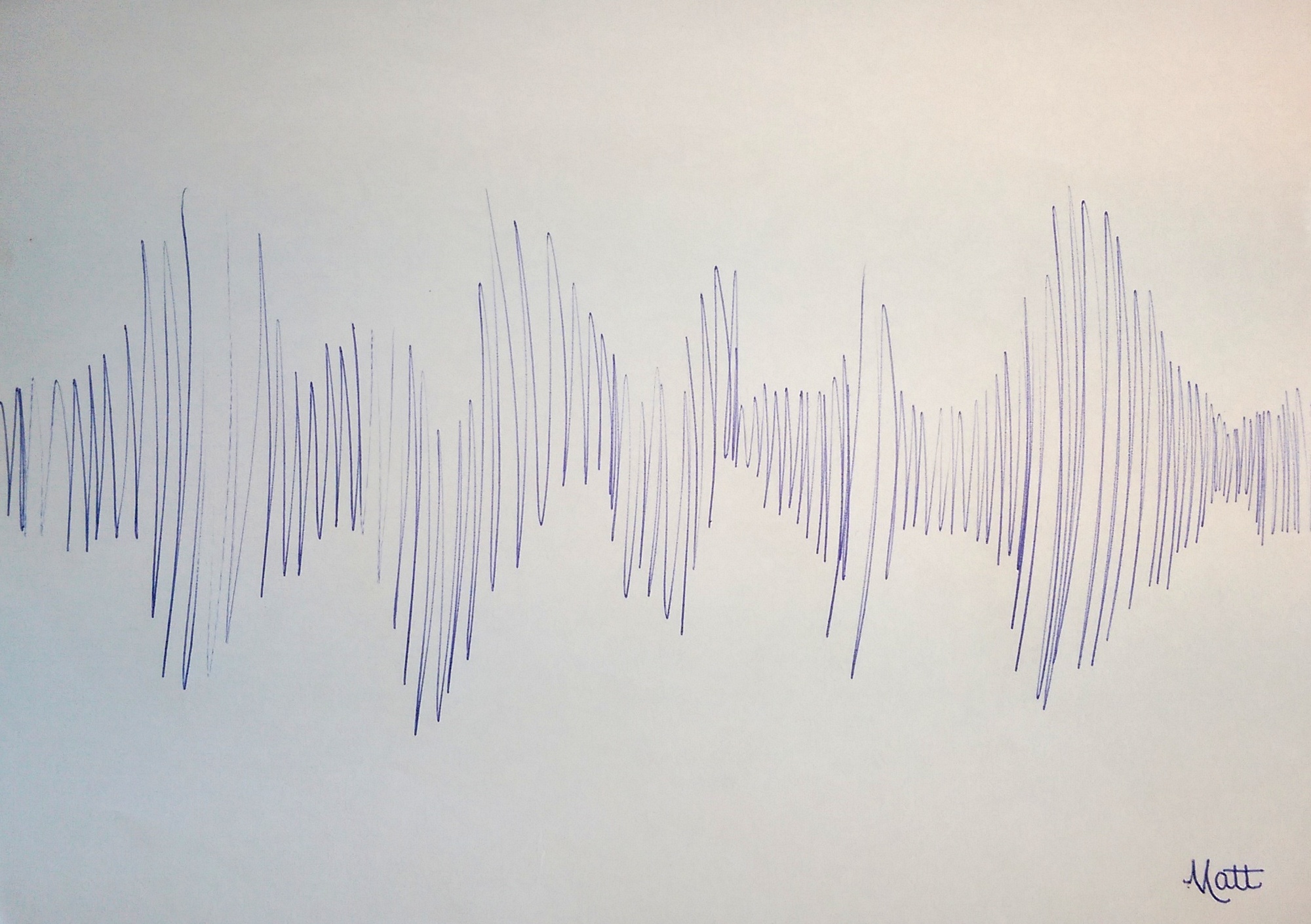
Quote by me for “Orange & Violet Untitled”
“I just photographed this new work, a soaking wet impasto paper in the dark with camera flash.
After making it I brushed varnish on a 250gsm paper underneath to fasten the two papers together for greater rigidity. the purple from the wide brush in between, beautiful.
I used my palette knife underneath the paper doing so. this created unexpected resonance sounds.. something i 100% guarantee i never planned. Satisfied I am with this.” – 1900hrs 29th November 2024.
nb Please note the ‘purple’ colour is actually violet, nearer the blue wavelength. The entire painting work took me less than 30 minutes, timed, in two distinct drafts excluding the photography.
After the primary draft completed a quick second draft etching detail around both eyes during evaluation.
The use of camera flash in the dark simulates a live music concert. Whilst I chose to paint in portrait I did not purpose a face until the very last moment upon adding the violet and gold eyes to the composition. I envisaged an electric guitar throughout.
“Orange & Violet Untitled” [29th November 2024] represents cool guitar designs I made at that time, in an abstract painterly way. You can see Alienalis Mantis for further detail on those guitar designs (please click the link to do so if you wish).
“Orange & Violet Untitled” also represented something earlier in the day on the 29th November..
.. a busker singing in my hometown. An anecdotal story I shall tell anyone who asks me.
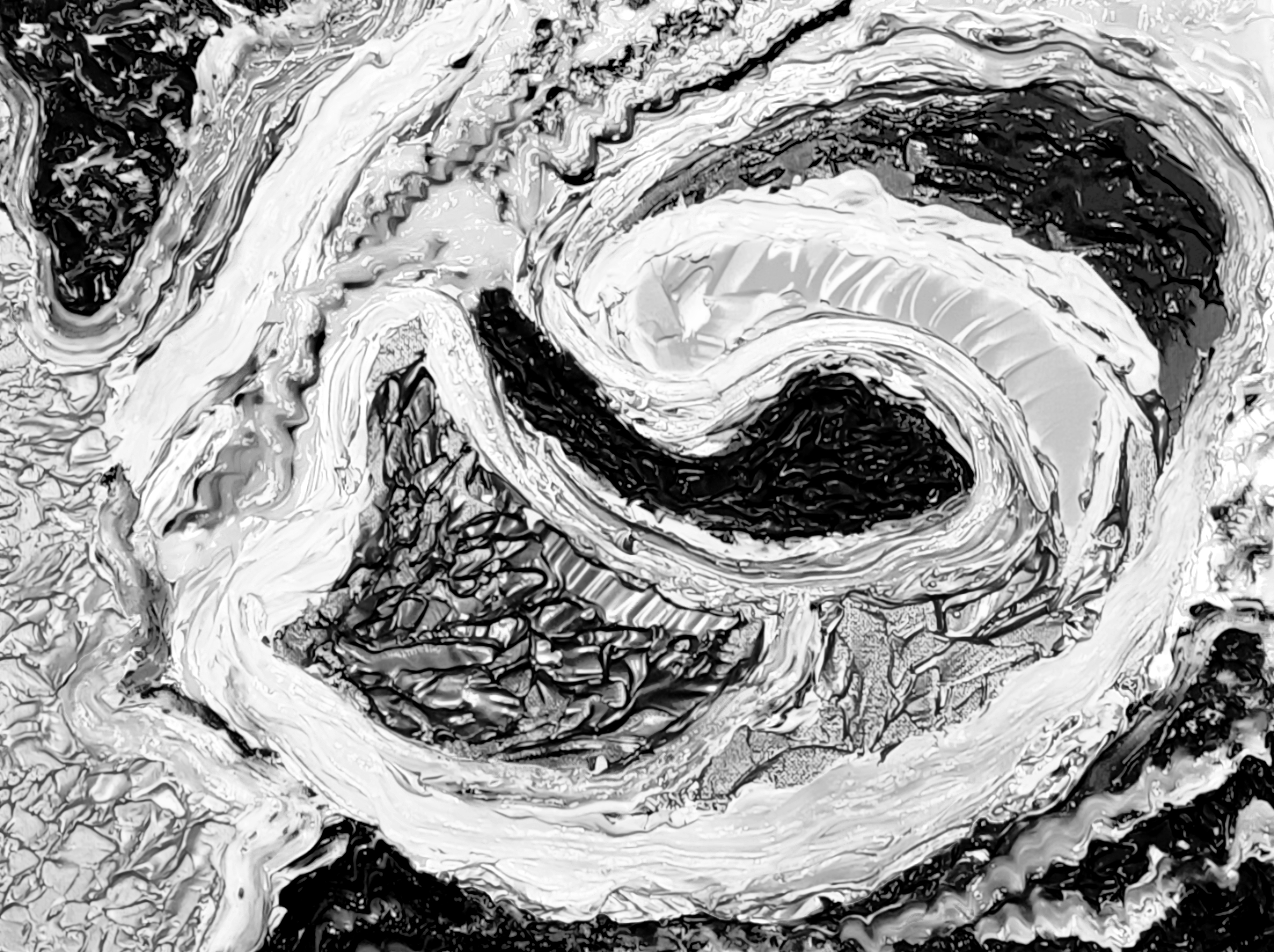
Goggles ROC

I feel “Goggles ROC” is a humorous piece.
“Goggles ROC” is made from a partially torn A4 paper supporting a work from 12th December I have worked upon since then.
The cadmium red acrylic is all from the 12th December draft workings over days of time, 100% unintended. I added copper and orange once removing the paper to make a work. ROC means red, orange and copper with regards to this piece. Building upon my artistic idea that colours such as red, blue, yellow et al do not derive political meanings, to me.
The Mars Black paint is mixed with water, dripped onto the paper then rolled carefully via gravity entirely holding the paper in my hands.
Fans of my work will note a similarity to “The Fathomable Scream” [16th/18th May 2024]. Aside from the ‘goggles’ which I purposed artfully, everything else in Mars Black is void of object or objective construction except to look balanced in composition.
To me this is the oft sought quality of prettiness, attractiveness to you as the viewer.
In artistic terms Picasso is my primary inspiration in brushwork for this piece. Basquiat’s use of any materials available for the function of making art is likely the reason I chose to produce a work in this way.
For clarification I genuinely love Chinese culture.
I love all peoples and cultures.
The title is a play on the word ‘goggles’ as this sounds amusing in English (to me anyway), with the word ‘rock’. I feel this artwork communicated the strength of Chinese manufacturing innovation and range.
By saying the ‘goggles rock’ I’m noting the products are cool, fashionable, well made.
In my opinion I view peoples of the USA, Italy and China as naturally inclined commercially.
The USA since indigenous tribes and settlers eventually co-traded after much civil war. The latter (then-immigrants) being adventurous types to seek out pastures new across the Atlantic/Pacific. Italy through ancient Roman Empire industry routes with a plethora of trades. China via highly disciplined cultures throughout the far-east. Nations like Japan and South Korea too for instance.
We (as in you possibly agreeing with me) could easily include Greek and Jewish culture too, in terms of the inherent working malluability of the people.
Subjective opinion you appreciate, as clearly I note individual/national endeavour around the world from an artistic viewpoint.
Here is a chart from Wikipedia about global working hours to click and read if you’re interested (stats upto 2022 at time of this article, 29th April 2025):
List of countries by average annual labor hours. (does not include all nations).
Of OECD nations the five highest average annual working hours are (2023 stats):
- Mexico: 2,207 hours
- Costa Rica: 2,171 hours
- Chile: 1,953 hours
- Greece: 1,897 hours
- Israel: 1,880 hours
Untitled Orange & Black (Face) #1

“Untitled Orange & Black (Face) #1” is a pure paint play in the Basquiat spirit of artmaking. I believe this was the first time I consciously incorporated the idea of guitar ‘pegs’ into a portrait. That said, after making “Alvis Dede Wimsey III” I re-viewed “Face with Gold Mouth” and realised guitar ‘peg’ shapes at the vocal chords!
I find my paint plays similar to how musicians produce new songs.
Eye Snout with Sand & Silver

“Eye Snout with Sand & Silver” is an instinctive piece where the careful silver/sand framing brought attention to the arty central paint play.
The central A4 is scrap paper having pressed together cadmium-red. Some days later to mix paint I began to use said same scrap paper. Mixing pseudo-black at the top for another painting.
The central paper upside-down to how you see here, throughout.
I brush-scraped out cadmium-red with the pseudo-black impasto on the paper to clean a brush. Incredibly, this became the snout.
Afterwards orange and umber just having fun.
Turning the paper 180 degrees, I liked the artiness.
The paper then affixed to wood panel with thick cadmium-red to obscure the paper edges. A rectangle sand acrylic surround added. Further cadmium-red flourish onto the wood panel beyond the central paper.
Finally the silver rectangle acrylic framing to perfect the visual.
A piece founded upon paint play whilst retaining its originality.
A few straight-from-my-camera raw evaluation photos for you:


Gold Sun Paint Play
Well, having read thus far into my article please let me thank you with a bonus paint play to enjoy:

“Gold Sun Paint Play” is just me having fun on a piece of cardboard packaging.
Likely made on one of the days I worked “Surfaces #n” (working title), a new wood panel piece as yet unpublished.
I love making these delightful paint plays..
.. I love seeing people enjoying life and having fun.


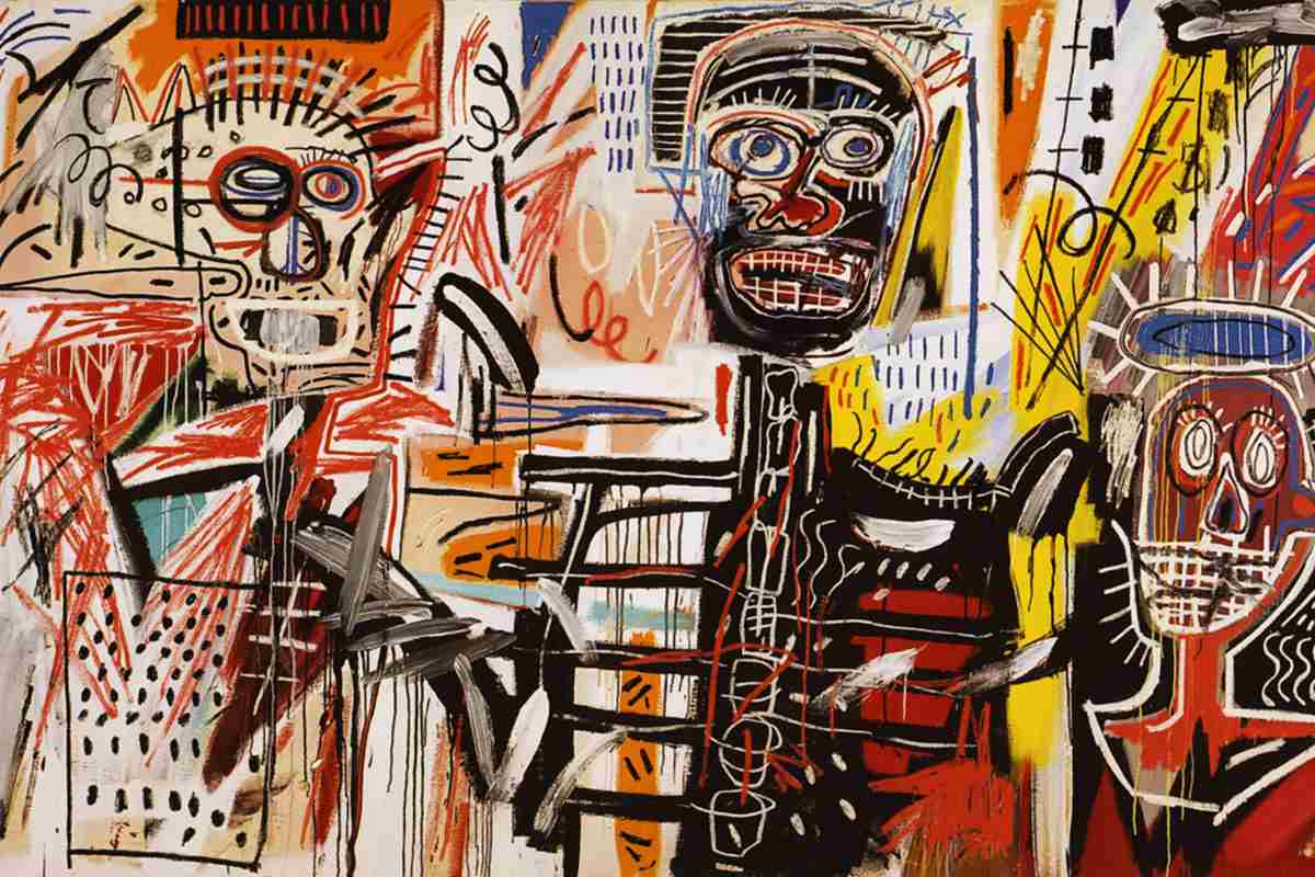
![Untitled known as 'Two Heads on Gold', 1982. Acrylic and oil paintstick on canvas [80 × 125 in 203.2 × 317.5 cm]](https://theunfathomableartist.co.uk/wp-content/uploads/2015/07/jmbtwoheadsongold.png)