If you were to look into Mu the Croc’s eyes—a pastime best described as bold when dealing with a Nile crocodile—you’d find a gaze uncannily reminiscent of the Blinking Planetary Nebula. There’s something quietly mind-boggling in there, ancient and unhurried, paired with an unsettling kind of heavy‑tailed precision.
You might wonder if the spectacles perched on his lengthy snout have something to do with his lack of elegance. However, Mu wears those simply because he likes the “look”. He chooses that look every time he reads, which, since he reads whenever he’s basking, is quite a lot. A scholarly crocodile, with a book resting on a river rock, pages and everything else turned by his breath, is simply part of the local scenery now.
The Paradox of the Straw Hat
Then there’s the brimmed straw sun hat, a choice that confuses anyone with even a casual understanding of crocodilian biology. A Nile crocodile is, after all, a living solar panel built to charge up on celestial rays.
So why the hat? Mu says he likes the “look”. This, of course, has absolutely nothing to do with the little headaches he gets if he’s out in the sun too much. A light‑sensitive, bookish crocodile is an absurdity Mu carries with total confidence.
The Diplomacy of the Tail
Mu keeps his tail mostly still these days. A momentary twitch has been known to accidentally swish his friends across the riverbank—something one can get away with when it involves warthogs or hippos, yet impala are far less receptive to an “Oh, sorry”.
Mu’s personal record is flattening seven at once. They were all uninjured, Mu proudly states. The apology, though, required half a ton of mixed leaves with a decent haul of acacia seed pods, all carried on Mu’s back for two lion‑miles from a local elephant trading post. Elephants, as it turns out, will happily trade half a ton of leaves for a decent watering hole location.
The Measurement of the Plains
Out here, distances are measured in lion‑miles, which are quite different from termite‑miles. Most mammals of the African Plains have worked by this standard for millennia—or so says Babby, the oldest baobab tree, who has seen it all.
A Moment of Mu‑Style Study
In the accompanying Mu animation, we catch a rare glimpse of Mu pausing his studies for a quick, muddy slurp of water. The book is waiting, the sun is shining, and Mu returns almost immediately to the serious business of reading.
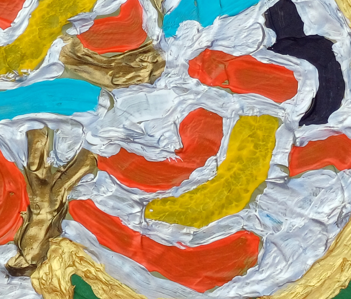
“NAWT” [17th/18th June 2025] by Matt The Unfathomable Artist, acrylic on A3 (42cm x 30cm) gesso primed 5mm wooden board, 5000 x 3803 pixels.
“NAWT”
I view this piece as childlike, a baby suckling his mother.
Five compositional areas organised by raised gold ridges that act as structural boundaries and energy channels.
Left: A stacked, totemic block in reds and olives, pocketed with yellow cells. The perimeter gold line is noticeable, enclosing smaller islands and voids; interior ridges create sub-chambers.
Centre: A vertical plume of warm reds with ripple textures. Gold points punctuate the column, giving a sense of heat or rising material.
Right: A cool turquoise plane meeting a dark indigo/violet corner speckled with gold edging. The m signature contrasts the chroma and scale.
Palette & Surface Warm spectrum (red, ochre, olive) opposed by cool spectrum (turquoise, indigo). Heavy impasto gold forms the highest relief; underlying layers show brush striation and dragged texture that directs the eye vertically and diagonally.
Direction
A diagonal ridge travels from lower centre to the turquoise plane, functioning as a natural partition: it carries the centre visually.
Vertical waves in the red plume interlink to seismic waves works during the Iron Gall Ink flurry period.
Canvas Separation
Perimeter Gold Ridge: Seal forms from the background, preventing colour wash and establishing the object/ground hierarchy.
Left Internal: Multiple small gold lines divide the left block into micro-cells (pockets/voids), creating a chambered topology.
Central–Right Boundary: The raised, slanted gold ridge that delineates the warm centre from the cool right; is both barrier and channel.
Indigo Corner: Ragged gold edge where indigo meets the warm fields; the edge retains discrete gold as floating nodes.
Turquoise Plane: A near-flat field bounded by slight ridges, acting as a pressure release zone.
Compositional Understanding
Rule of thirds tendency: Left mass ≈ one third, central plume ≈ one third, right release ≈ one third.
Figure–ground: The indigo corner behaves as negative space whilst activated by gold; the left behaves as positive mass.
Behaviours
Gold medium used as structural relief and optical highlight.
Visible drag marks suggest slow, deliberate pulls; ripple patterns imply wet-on-wet movement control.
Edge fidelity of ridges indicates masking-free, hand-guided boundaries.
With “NAWT” I didn’t use masking, I rarely ever do. The last time I utilised canvas masking (whatsoever really or at least to any significant degree) is in Two Swans Together sometime ago in 2013. Goodness, the work I made for myself in Conker Lots for my refusal to canvas mask. Conkers affixed first, then highly careful painting, no masking.
Emoji hearts eyes mode activated from a distance.
Visual Meaning Containment vs. expansion; heat to cool; pressure building then venting. The eye experiences compression in the left and cooling/space in the right. The distinct canvas spacing makes this legible by preventing chromatic dissection and choreographing the viewer’s path.
Quadruple intellect angles sought, times ten to the power of one hundred.
Signature Placement Lower right m within the turquoise field—chosen to sit in the calmest zone, preserving legibility while completing the warm–cool dialogue.
No originating concept or preconceived theme(in the actual painting), just painting to enjoy the process. The title is the first word arriving to mind. A painter freestyling, having fun! Although originally I intended this composition:
Original composition for a new painting (NAWT).
Is this a concept or preconceived theme?
No. This is a composition. My painting from the outset was devoid of concept or theme since the original composition ideas didn’t translate into the painting.
I created same (a concept) upon painting, through the working act of subconscious play.
Whereas .. “DANGER: Men at Work with Missiles” had a concept.. symbology, signs, iconography. From here I produced the theme, which became missiles. The ‘signs’ interlinked as a visual concept:
“DANGER: Men at Work with Missiles” [21st to 24th June 2025] by Matt The Unfathomable Artist, acrylic on A3 (42cm x 30cm) gesso primed 5mm wooden board, 5000 x 3725 pixels.
A sign-language visual painting: bold perimeter gold ridges define a two-part emblem that reads as industrial icon + ordnance bracket. Internal strokes (red/orange, turquoise, ochre, black) ride a white ground, all set against a matt green field.
Thirty seconds to comply. Sounds fair.
The palette and edging are engineered to feel like a warning placard lifted into relief.
From Study to Painting (alterations)
One of six study drawings made quickly on lined Notepad paper.
Study drawing (notepad, lined): angular A-like left mass + jigsaw-like leg; arm-bar stretching upwards (highest pencil shape), stylised facial totem nested in the body; linear hatching; a circular peg-coil (the original head with its adjacent arm); missile at this point is the intended triangular head looking up towards ‘m‘!
A3 painting: the facial totem becomes a mosaic of micro-strokes; the arm-bar is retained as a rightward cantilever (or left), softened by curved infill; all outer lines become raised gold fields; hatching converts to channels of colour; the lined-paper constraint dissolves into a continuous awesomely beautiful green plane.
Net effect: the sketch’s diagrammatic figure becomes a sign-object—legible from distance, intricately textured up close.
Hardwork is in the details.
Practice unseen. A life unfathomable.
Different.. communicated for you, by me. Honestly. I love.. places (compute the analogy, derive the connection, distance the meaning).
Use of Canvas Space
Scale shift: notepad lines → A3 board. The jump in size allows thicker ridges and deep impasto, turning flat signage into tactile relief.
Field control: the gold perimeter acts as containment; interior gold seams partition silver ground into cells, preventing chromatic dispersion. Soldering iron is a fusible metal alloy.. interlink NAWT, in wordplay. Please tell me you like my eccentric brain.
Background: uninterrupted green creates a civic-utility register (worksite, military range, municipal warning).
Visual Reading
Left mass: triangular engine/gantry—work zone, man-human-power, structure, a literal symbolic missile.
Arm-bar: launcher lever —missile semantics without literal depiction.
Internal script: curved strokes function as a traffic of signals—command streams, siren paths(?), evacuation arrows(?).. symbology as yet understood.
Black vectors: fault lines(?) / blast trajectories(?).
Turquoise and orange: emergency contrast pairs (sea/sky vs. heat/hazard).
Gold ridges: authority, hardware, state apparatus; also separation-field technology. Perhaps.
Symbology & Signs
This work visualises the Estate’s sign lexicon: simplified shapes that communicate under stress. The artwork pairs with “Ye Mud, Ye Mud” (hummingbird + sign). The hummingbird = life, agility, energy; the missile sign = threat, projection, interruption. Together they outline a grammar: warning vs renewal. The common element is the sign-board frame—public language.
War News & Civilian Anxiety
Headlines about strikes and air defenses have migrated into daily cognition as icon flashes. The brain processes shapes: triangles, bars, chevrons. This painting uses that compression. Acknowledging the worksite metaphor—“men at work”—dissecting work with missile labour: logistics, manufacture, targeting, interception. The result is an ambient alert: the feeling of operating under siren logic while still trying to build.
Micro-signature & Detail
Includes a rare micro “m” (embedded within the paint architecture), consistent with discreet practice. Relief height slightly varies across the perimeter; interior gold seams are intentionally irregular to keep the sign hand-made.
‘m’ detail within “DANGER: Men at Work with Missiles”
“Orange & Violet Untitled” [29th November 2024] by Matt The Unfathomable Artist, acrylic fine art painting on A3 250gsm mixed media paper with 250gsm varnish affixed backing paper, 5000 x 6951 pixels.
Orange & Violet Untitled
I have chosen to highlight pre-published social media commentary in blue. If you have read my Instagram posts for works in this article you can quickly skip re-reading if you prefer.
Quote by me for “Orange & Violet Untitled”
“I just photographed this new work, a soaking wet impasto paper in the dark with camera flash.
After making it I brushed varnish on a 250gsm paper underneath to fasten the two papers together for greater rigidity. the purple from the wide brush in between, beautiful.
I used my palette knife underneath the paper doing so. this created unexpected resonance sounds.. something i 100% guarantee i never planned. Satisfied I am with this.” – 1900hrs 29th November 2024.
nb Please note the ‘purple’ colour is actually violet, nearer the blue wavelength. The entire painting work took me less than 30 minutes, timed, in two distinct drafts excluding the photography.
After the primary draft completed a quick second draft etching detail around both eyes during evaluation.
The use of camera flash in the dark simulates a live music concert. Whilst I chose to paint in portrait I did not purpose a face until the very last moment upon adding the violet and gold eyes to the composition. I envisaged an electric guitar throughout.
“Orange & Violet Untitled” [29th November 2024] represents cool guitar designs I made at that time, in an abstract painterly way. You can see Alienalis Mantis for further detail on those guitar designs (please click the link to do so if you wish).
“Orange & Violet Untitled” also represented something earlier in the day on the 29th November..
.. a busker singing in my hometown. An anecdotal story I shall tell anyone who asks me.
Goggles ROC
“Goggles ROC” [23rd December 2024] by Matt The Unfathomable Artist, acrylic painting on partially torn A4 250gsm mixed media paper, 7000 x 7000 pixels with background for social media.
I feel “Goggles ROC” is a humorous piece.
“Goggles ROC” is made from a partially torn A4 paper supporting a work from 12th December I have worked upon since then.
The cadmium red acrylic is all from the 12th December draft workings over days of time, 100% unintended. I added copper and orange once removing the paper to make a work. ROC means red, orange and copper with regards to this piece. Building upon my artistic idea that colours such as red, blue, yellow et al do not derive political meanings, to me.
The Mars Black paint is mixed with water, dripped onto the paper then rolled carefully via gravity entirely holding the paper in my hands.
Fans of my work will note a similarity to “The Fathomable Scream” [16th/18th May 2024]. Aside from the ‘goggles’ which I purposed artfully, everything else in Mars Black is void of object or objective construction except to look balanced in composition.
To me this is the oft sought quality of prettiness, attractiveness to you as the viewer.
In artistic terms Picasso is my primary inspiration in brushwork for this piece. Basquiat’s use of any materials available for the function of making art is likely the reason I chose to produce a work in this way.
For clarification I genuinely love Chinese culture.
I love all peoples and cultures.
The title is a play on the word ‘goggles’ as this sounds amusing in English (to me anyway), with the word ‘rock’. I feel this artwork communicated the strength of Chinese manufacturing innovation and range.
By saying the ‘goggles rock’ I’m noting the products are cool, fashionable, well made.
In my opinion I view peoples of the USA, Italy and China as naturally inclined commercially.
The USA since indigenous tribes and settlers eventually co-traded after much civil war. The latter (then-immigrants) being adventurous types to seek out pastures new across the Atlantic/Pacific. Italy through ancient Roman Empire industry routes with a plethora of trades. China via highly disciplined cultures throughout the far-east. Nations like Japan and South Korea too for instance.
We (as in you possibly agreeing with me) could easily include Greek and Jewish culture too, in terms of the inherent working malluability of the people.
Subjective opinion you appreciate, as clearly I note individual/national endeavour around the world from an artistic viewpoint.
Here is a chart from Wikipedia about global working hours to click and read if you’re interested (stats upto 2022 at time of this article, 29th April 2025):
Of OECD nations the five highest average annual working hours are (2023 stats):
Mexico: 2,207 hours
Costa Rica: 2,171 hours
Chile: 1,953 hours
Greece: 1,897 hours
Israel: 1,880 hours
Untitled Orange & Black (Face) #1
“Untitled Orange & Black (Face) #1” [19th December 2024] by Matt The Unfathomable Artist, acrylic painting on A4 250gsm mixed media paper, background for social media, 5000 x 7221 pixels.
“Untitled Orange & Black (Face) #1” is a pure paint play in the Basquiat spirit of artmaking. I believe this was the first time I consciously incorporated the idea of guitar ‘pegs’ into a portrait. That said, after making “Alvis Dede Wimsey III” I re-viewed “Face with Gold Mouth” and realised guitar ‘peg’ shapes at the vocal chords!
I find my paint plays similar to how musicians produce new songs.
Eye Snout with Sand & Silver
“Eye Snout with Sand & Silver” [sometime prior to 11th to 23rd February 2025] by Matt The Unfathomable Artist, brush collage & palette acrylic on A3 (42cm x 30cm) 2mm gesso primed wood panel, 5000 x 3577 pixels.
“Eye Snout with Sand & Silver” is an instinctive piece where the careful silver/sand framing brought attention to the arty central paint play.
The central A4 is scrap paper having pressed together cadmium-red. Some days later to mix paint I began to use said same scrap paper. Mixing pseudo-black at the top for another painting.
The central paper upside-down to how you see here, throughout.
I brush-scraped out cadmium-red with the pseudo-black impasto on the paper to clean a brush. Incredibly, this became the snout.
Afterwards orange and umber just having fun.
Turning the paper 180 degrees, I liked the artiness.
The paper then affixed to wood panel with thick cadmium-red to obscure the paper edges. A rectangle sand acrylic surround added. Further cadmium-red flourish onto the wood panel beyond the central paper.
Finally the silver rectangle acrylic framing to perfect the visual.
A piece founded upon paint play whilst retaining its originality.
A few straight-from-my-camera raw evaluation photos for you:
“Eye Snout with Sand & Silver – detail one”“Eye Snout with Sand & Silver – detail two”“Eye Snout with Sand & Silver – detail three”
Gold Sun Paint Play
Well, having read thus far into my article please let me thank you with a bonus paint play to enjoy:
“Gold Sun Paint Play” [circa 25th April 2025] by Matt The Unfathomable Artist, acrylic on opened cardboard box (approximate 11in x 8in (28cm x 21cm), 5000 x 3882 pixels shown upon cropped gesso canvas for publishing purposes.
“Gold Sun Paint Play” is just me having fun on a piece of cardboard packaging.
Likely made on one of the days I worked “Surfaces #n” (working title), a new wood panel piece as yet unpublished.
I love making these delightful paint plays..
.. I love seeing people enjoying life and having fun.
“Brushworks #1 – Original” [21st September 2024] by Matt The Unfathomable Artist, acrylic paint on 250gsm A4 mixed media art paper (upon a 250gsm paper), 6000 x 4271 pixels.
Brushworks and Palette Works
For this article featuring a multitude of paper works, the text shown in italics is replicated from my Instagram social media. I’ve included these words since my earlier Instagram posts give much insight into each work.
“Brushworks #1 – Original” began (unintentionally) as paint markings whilst producing “DELINEATI0N #000000” (artwork shown at the end of this article). Afterwards I started to have fun with brush motions on this paper to (now) intentionally produce random arty brush workings.
Palette knife and brushes each bring different qualities to paintings.
Following the brushwork I used a solid palette knife to press the second sheet of paper underneath this 250gsm piece for structure. This produced pressed leaf, some flattening effects of the paint and virtually imperceptible yet purposed knife edge indentations into the paper.
The brushwork is interesting hence the reason for naming the piece as “Brushworks #1”. There is no palette knife working upon the painting itself.
A beautiful SolarScape from “Brushworks #1 – Original” is shown here:
“Brushworks #1 – SolarScape” [23rd September 2024] by Matt The Unfathomable Artist, digital artwork from original acrylic painting, 6000 x 4271 pixels.
Please do click on the image for “Brushworks #1 – SolarScape”.
Beautiful, expressive brushwork imagery.
“Brushworks #4” [5th December 2024] by Matt The Unfathomable Artist, acrylic painting on A3 250gsm mixed media paper, 5000 x 3621 pixels.
Having worked upon “Alienalis Mantis” I immediately utilised spare paint to make “Brushworks #4”.
There is no object or idea represented merely fun with the paintbrush.
I LOVE the paint colour gold. Oh my goodness, dear gold, how can I not paint your brilliance?
From approximately March 2024 to-date I have found myself in a ‘Gold Phase’.
Like some/most artists I focus on specific working themes or styles through spans of time. The fourth quarter of 2023, for instance, strongly represented 100% digitally produced painting works.
Through 2019 to July 2023 I produced multiple pencil drawings and sketches along with much intellectual poetry workings too.
“Brushworks Ultramarine Gold #1” [10th January 2025] by Matt The Unfathomable Artist, acrylic painting on A4 250gsm mixed media paper, 5000 x 3601 pixels.
Purchasing ultramarine, gold, sap green and sand (cream colour) on the day I made “Brushworks Ultramarine Gold #1” to carefully contrast lights and darks in terms of canvas visualisation.
I feel this is classically abstract.
“Brushworks Ultramarine Green #1” [14th January 2025] by Matt The Unfathomable Artist, acrylic painting on A4 250gsm mixed media paper, 5000 x 3580 pixels.
“Brushworks Ultramarine Green #1” is made intuitively and quickly within approximately fifteen minutes. Sometimes I create works incredibly fast with the high artistry I need to produce.
I painted this with two brushes (wide, flat) with the orange paint orientated to the top right. I perceived a ‘Caesar’ image, canvas reversed 180 degrees, 100% chance.
Here is the image upside-down for you to see the ‘Caesar’, on the left-half of the upside-down photograph in red with a gold crown:
“UPSIDE DOWN Brushworks Ultramarine Green #1” [14th January 2025] by Matt The Unfathomable Artist, acrylic painting on A4 250gsm mixed media paper, 5000 x 3580 pixels.
An arty ‘Caesar’ portrait, random chance, yet very much subconscious thought.
“Brush & Palette Works #1” [6th January 2025] by Matt The Unfathomable Artist, acrylic painting on A4 250gsm mixed media paper, 5000 x 3695 pixels.
The A4 paper for “Brush & Palette Works #1” was utilised with another [fragmentary] piece from the underside of an as yet unfinished mixed materials work (“Conker Lots“).
Earlier overpainted (random underpaint) areas were complimentary-palette-scraged with copper and green. I then added cadmium-red, sand (delightedly) and violet with a brush.
The primary red area to the right is cloth work.
Seeing an abstract opportunity, I made a Rothko style flurry to the lower-left in appreciation.
I make these pieces spontaneously and quickly although I did two definitive drafts to perfect the visual.
“Brush & Palette Works #2” [6th/7th January 2025] by Matt The Unfathomable Artist, acrylic painting on fragmentary A4 250gsm mixed media paper, 6000 x 5232 pixels.
The roughly ¾ A4 paper for “Brush & Palette Works #2” was utilised from the underside of an as yet unfinished mixed materials work (“Conker Lots”).
Underpainted areas were palette-scraged with copper and cadmium-red. I also added violet and sand colour paint with a brush.
I made this piece spontaneously and quickly, evaluating prior to a second draft in a finite area to perfect the visual. The second draft on the 7th.
The background helps to view the piece uniformly due to partial fragmentation of the paper.
I would like “Brush & Palette Works #1″ & “Brush & Palette Works #2” to be sold together. I perceive a three-dimensional element to the display installation.
The partial paper piece was purposely torn from the underside of “Conker Lots” sometime earlier. I needed to mount “Conker Lots” to an A3 wood panel for structural integrity.
This is the otherside of “Brush & Palette Works #2” (taken from some A4 papers stuck to the underside whilst making “Conker Lots”):
“Black White Robot” [7th January 2025] by Matt The Unfathomable Artist, acrylic painting on fragmentary A4 250gsm mixed media paper, 8000 x 8000 pixels with border for social media presentation.
I made “Black White Robot” whilst wiping paint from a brush in vertical and horizontal motions. Produced entirely with the torn part at the top. Afterwards I discovered a ‘robot’ or ‘android’ looking face.
Interested in this unique composition I decided to make a second version the next day:
“White Black Robot” [8th January 2025] by Matt The Unfathomable Artist, acrylic painting on A4 250gsm mixed media paper, 8000 x 8000 pixels with border for social media presentation.
“White Black Robot” differed only in the ground, whereby I painted titanium white to add a level of contrast to this formal piece. Formal in that I planned to make the robot composition, emulating lines from the original brushwork paint play the day prior.
As promised here is “DELINEATI0N #000000” (shown immediately below) from which I utilised to make “Brushworks #1 – Original”.
The colours corresponding precisely between the two works:
“DELINEATI0N #000000” [20th/21st September 2024] by Matt The Unfathomable Artist, charcoal pencil & acrylic paint on 250gsm A4 mixed media art paper, 6000 x 8484 pixels.
“DELINEATI0N #000000” started as a study to develop ideas for a pop or poster art piece. I realised the work becoming exceptionally unique as words arrived to mind in stylistic calligraphy.
As I document this artwork I understand some subconscious specific concepts found their way into “DELINEATI0N #000000”.
National geographic borders, music, opportunity for all and plenty of complex thoughts I am happy for people to enjoy deciphering according to their own interpretation.
“DELINEATI0N #000000” is inspired from Elijah solo, you can listen to their beautiful music by clicking the link.
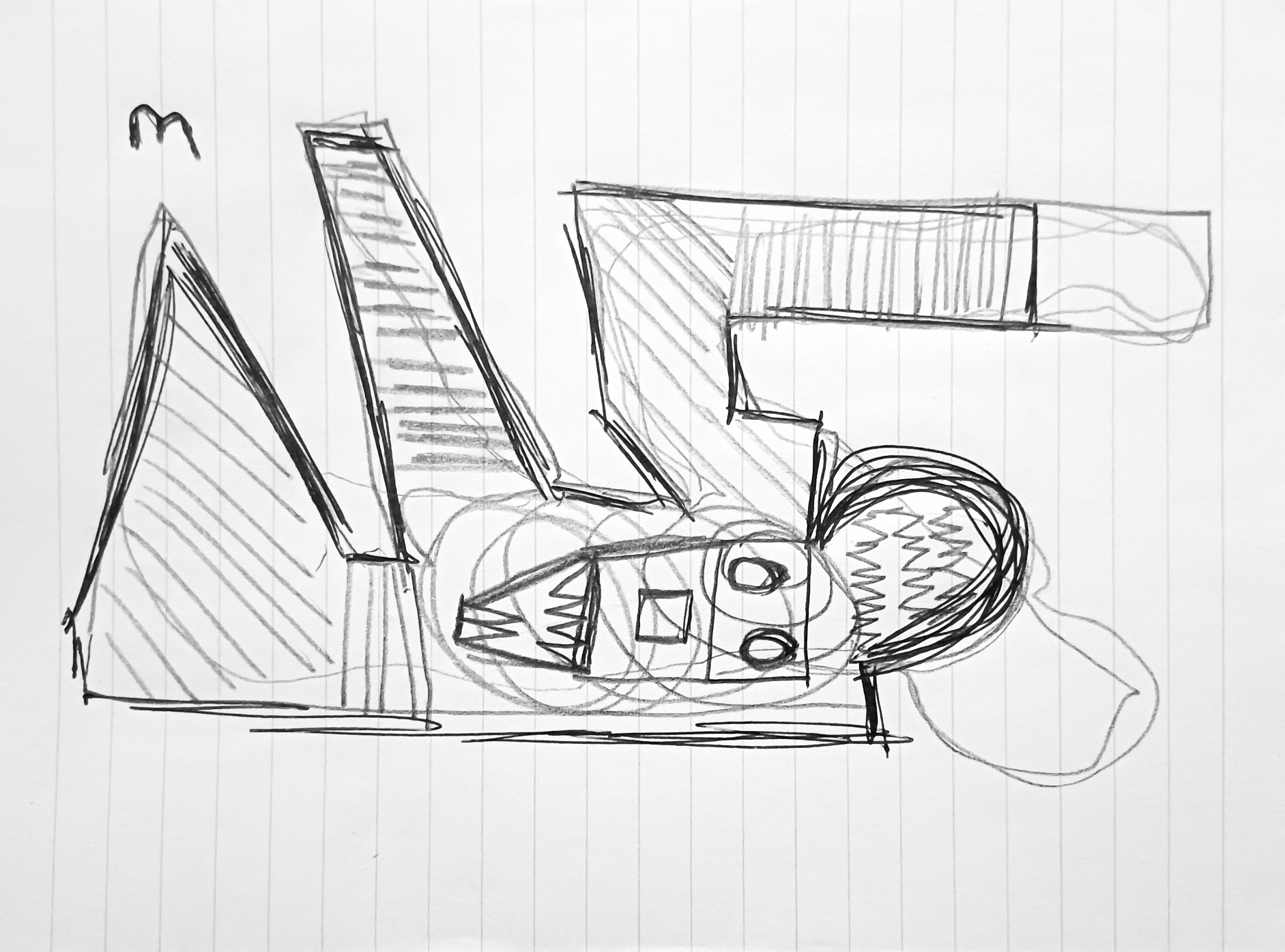
“Buzzards Wood Hollow” [9th June 2021] by Matt The Unfathomable Artist, sketch with 3H HB 3B pencils signed in black ink on A4 250gsm Artist’s paper.
I photographed a few compositions of the entrance to Buzzards Wood via the central hollow from Meadow Three. This opening is directly opposite to Ridge Willow and Wrens Wood. There are three additional entranceways into Buzzards Wood.
There are four pathways within and immediately surrounding Buzzards Wood. Whenever I’m writing regarding Buzzards Wood I’m usually referring to the Nature Reserve area. However, Buzzards Wood technically also encompasses the wood to the rear (bow, north) beyond the Nature Reserve itself, in my opinion.
Buzzards fly regularly over the meadows, woods, and towards the north, where there is a local fishing pond. The post at the lower right of my sketch actually used to be a wooden bench. I rather hope it is restored as a bench as this is a great sitting place, centrally in Meadow Three.
Further along to this bench is a ‘watervole ground stone’. Rabbits do seem to enjoy using the flat stone surface as a convenient toilet, haha. A ‘rabbit ground stone’ can be viewed inside Buzzards Wood at the pathway crossroads, nicely covered by the shade of trees to enjoy. Rabbits frequent all three meadows, the private land to the west and all around the 29 acre lake to the south.
Another ‘ground stone’ meets with you to the left as one enters Meadow Three from Meadow One, walking up a small number of steps.
My sketch style in this article strongly reminds me of the beautifully artistic childrens animations I used to watch as a boy.
In keeping with that theme I included fanciful eyes and faces, Picasso-esque, to add fun to some of these series of artworks.
‘type: The Unfathomable… Artist – Electronic Version’ [18th August 2020] – by Matt The Unfathomable Artist, dip nib pen using original iron gall ink recipe on A3 [180 gsm] Artist’s paper.
‘type: The Unfathomable… Artist – Electronic Version‘ is Basquiat inspired.
I would like to quote my own personal commentary regarding this new iron gall ink piece:
“Intellectually i’m really happy with this artwork. Only after did i think, ‘that’s why i put the jagged lines in‘ This is my first Basquiat style piece and i can honestly write i had no prior notions to make it a Basquiat in style until it happened 🎨❤” [bold italics added for emphasis].
The jagged lines top and bottom were added on the 14th August 2020 after I’d finished the central/vertical calligraphy. Initially without the ‘black block ink and multiple lines’ you can see in the artwork photograph above – completed through impromptu ink work.
I literally didn’t know how to proceed with this artwork from thereon. Actually thinking I might leave it as it was, adrift of any further inspiration or ideas.
After drying the piece for a few days I began spontaneously researching electronic circuit board diagrams with avid interest. I’m familiar, decades past, with circuit diagrams through my Dad’s former occupation as a photocopier engineer and his [second generation] electronics expertise.
Electronic magazines featuring television and Hi-Fi circuitry, repair and assembly scattered all over the house. Diagrams with capacitors, LED’s, transistors, LCD’s, transformers etc. Viewing circuit diagrams is always a memorable and pleasant experience to me. I laughed when I saw a multimeter photograph yesterday. My Dad carried one of those around with him quite often.
For me, this artwork is a connection to the ancient and modern past, encapsulated with new hope for the future.
I’d like to share with you the electronic circuit diagram symbols used in my artwork including their relative placements:
fuse [rectangular box with zigzag lines – begins diagonally underneath the word ‘type’];
Anode/Cathode Solar cell Photodiode [line into circle with inner triangle-vertical-line and two ascending diagonally right-to-left down-pointing arrows – underneath the grammatical colon and letter ‘T’];
battery multi-cell [horizontal line with vertical line, vertical single dash line, vertical single dash line longer, vertical line with horizontal line – underneath the space between the words ‘The’ and ‘Unfathomable’];
dome light [horizontally represented domed light bulb with heart light element – underneath letters ‘n, f, a, t, h’];
tri-phase protective and neutral conductor [single line with ‘triple diagonal line’ ‘diagonal line with T line’ and ‘diagonal line with black dotted circle’ intersections – underneath letters ‘m, a, b, l, e . .];
solder bridge [two adjacent lines above-below with two split circles representing the solders – underneath the word ‘type’];
balanced terminals [two adjacent lines with two open circles – underneath and between the words ‘type’ and ‘The’];
electromagnetic shielding [large rectangle, shaped by line dashes – surrounding the word Artist];
constant current source or generaltransformer or obscured oscillator [line with filled black circle] and also [line with black circle with imperfect unfilled circle overlapping directly below – underneath letters ‘l, e’ ] – please note this latter symbol also has an unknown electronic meaning.
Reasoning is viewer-dependent, wherever conceptual plurality applies to positive and negative space.
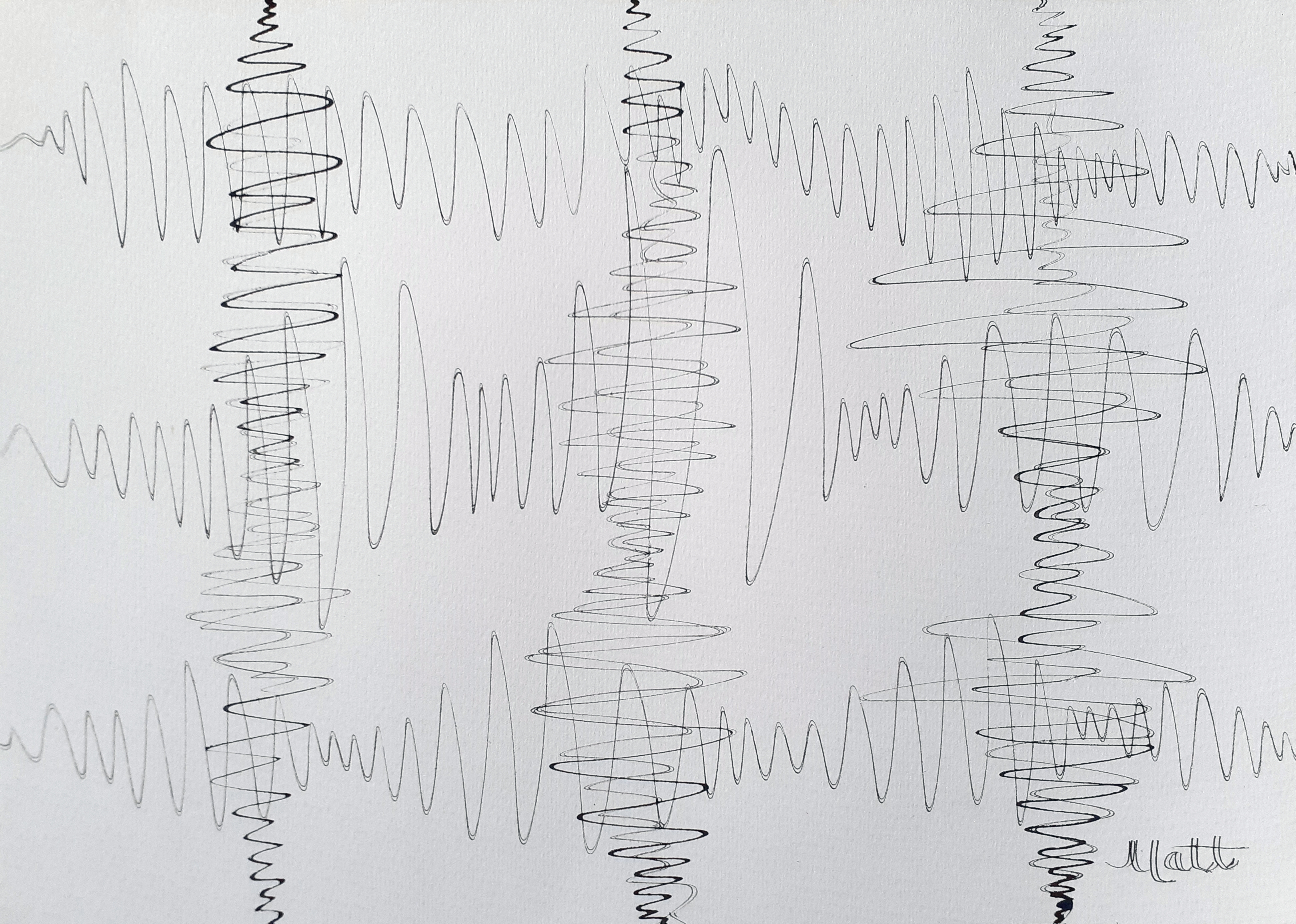
‘Triple Seismic Waves with Oscillation #1’ [July 2020] by Matt The Unfathomable Artist, dip nib ink pen on A3 180gsm paper.
Spontaneously sharing my latest dip nib ink pen artwork using iron gall ink entitled ‘Triple Seismic Waves with Oscillation #1’.
Electronic oscillation produces pleasing visual effects. This artwork seeks to replicate the idea in drawing form using my free hand technique for the curved lines. I love scientific art. Curves, electronics, seismographs, oscillators, earthquakes, sound waves, along with the beauty of artistic courses.
For this artwork I use a nib that creates a double ink line due to the noticeably distant ‘tines’ of the metallic nib. The flow of ink is important with dip nibs where one is wishing to produce a continuous line across a ‘decent measure of time’ once upon the paper.
The effect of oscillation can been seen vertically in this artwork.
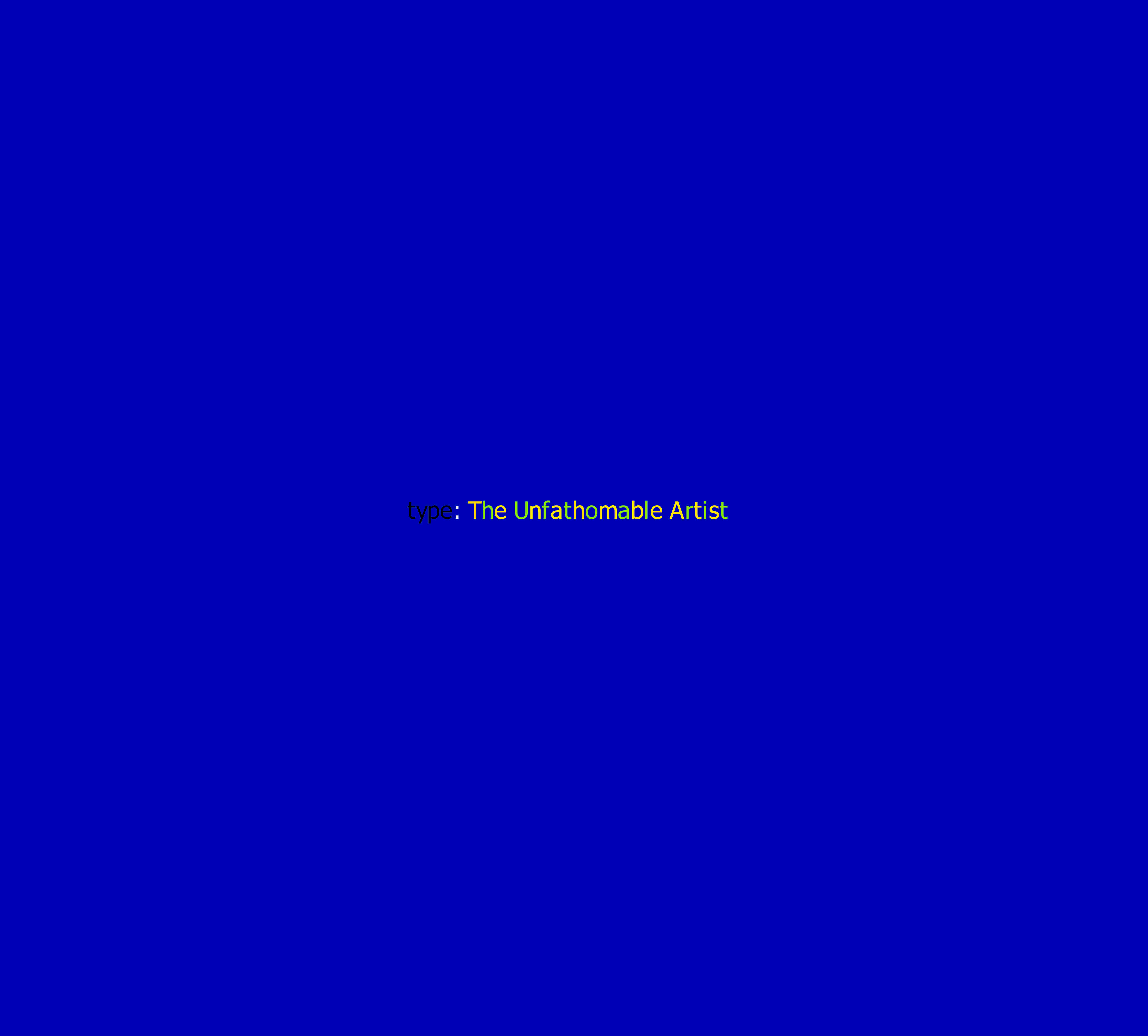
‘type: The Unfathomable Artist #1’ [19th February 2020] by Matt The Unfathomable Artist, Digital Pop Artwork, MS Shell Dig 2 and Times New Roman fonts, 7016 x 4951 pixels, 600dpi, A4 Landscape format.
Digital Pop Artworks digitally produced to technologically articulate the need for global climate change policies.
Subtle version two shown immediately below, with the future idea to create written words and iconography throughout the blue canvas space:
‘type: The Unfathomable Artist #2’ [20th May 2020] by Matt The Unfathomable Artist, Digital Pop Artwork, MS Shell Dig 2 font, 4412 pixels x 3981 pixels, 600dpi, A4 Landscape format.
Version three with Times New Roman ‘type’ font and ITC Kristen chosen for the main green yellow alternating Unfathomable text shown below:
‘type: The Unfathomable Artist #3’ [24th May 2020] by Matt The Unfathomable Artist, Digital Pop Artwork, Times New Roman and ITC Kristen fonts, 7016 pixels x 4961 pixels, 600dpi, A4 Landscape format.
At the time of editing this page on 24th May 2020 I have started work on two oil paintings for my ‘type: The Unfathomable Artist‘ series of pop artworks. The blue screen backgrounds are already completed. I’m waiting for the refined linseed oil mixed within the oil paints to dry before adding the painted fonts.
I’m likely to choose version #3 as the first oil painting artwork for me to finish. Then version #1, as seen in these Digital Pop Artworks. The blue backgrounds already look delicious.