
Personal quote “btw “without” i promise that one word <bolded itself> ! i was just saving the file and was like, ‘what to goodness’, i couldn’t revert it ^^ i realised that is the Emin art happening 🎨 (i was drinking a nice red wine too) 🙊 anyway after that i knew the name for this piece.. “without“.. an artwork that chose its own name.”
True.
Let’s take a look at a fun Collage I made with different colour/stylistic versions:

It is best to view this Collage piece fullscreen [due to the condensed textual size], by clicking the image shown immediately above, whilst viewing on a computer if you can.
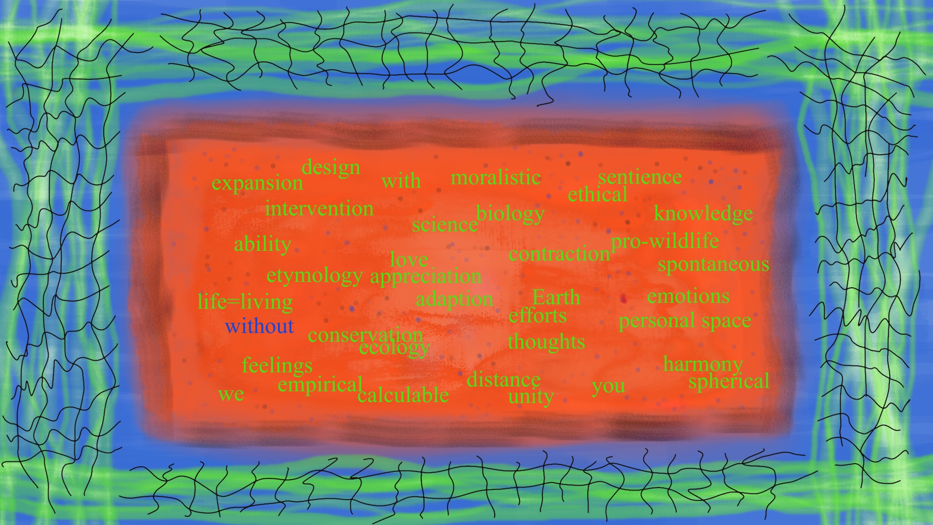
“without – Landscape Collage” features nine unique pieces of the original artwork “without”, an Abstract digitally hand painted and then overlay typed with selected words in Times New Roman. Produced using computer software with a standard mouse and keyboard.
It should be noted the bold typeface differential for the word “without” [visible in most versions in the Collage except for ‘Yellow’ top-right and ‘Antiquity’ mid-lower] is pure 100% chance.
Due to this unintended phenomenon I decided the piece had chosen it’s own title.. “without”. Whereby a bold typeface differential is part of the title itself.
The individual pieces are composed of an original digital abstract Oil painting with a complimentary blend of colours across different hues and style variances. Digital chalk is also hand drawn for the border of the inner-rectangle [the rectangular abstract an appreciation for a 1950’s art style]. Digital ink is used for the outer web-like lines to add interest.
Each artwork is composed of multiple layers using advanced professional painting techniques within a digital environment. Further detail is mostly my spontaneous doodling-a-design for fun.
The words were not carefully contrived in the complexity of thought. I merely wrote those words as I viewed the artwork, including the original words I had spontaneously typed from an earlier draft study for this piece.
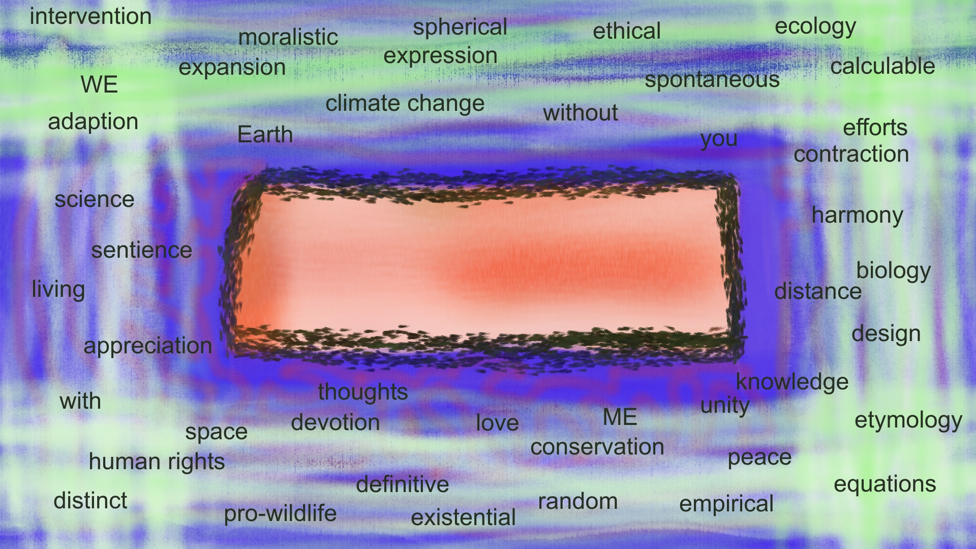
“without – first draft Study” was produced before my second draft finished version, “without – Original” shown at the top of this blog article. You can see from the Study version I incorporated most of the words I spontaneously wrote whilst making the actual final piece.
The colour scheme is also fairly similar, including the green oil lines at the borders and central red rectangular abstract design.
The study had ‘something’ within it I wanted to ‘find’ as an artistic visual. These artworks form part of an idea for a series of Pop Art works I would like to produce with words in a Basquiat style inspiration.
Here are a few of my personal faves, beyond the Original:
Entitled ‘Family Tree’ due to an affinity with a family tree I artistically made in middle school at aged ten or eleven years of age. The family tree I made began in the year 1902.

‘Banknote’ so named due to the mind-bogglingly cool title <laughs head off emoji>.
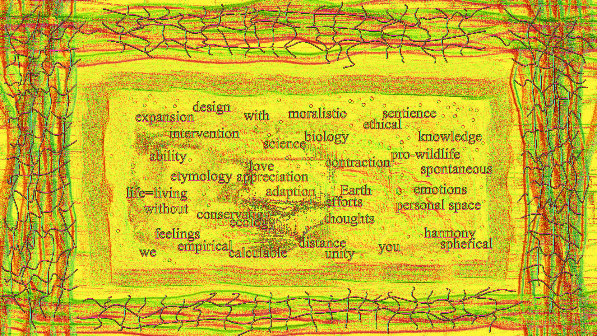
SolarFlare features in the Collage to represent the Original, here:

‘SolarFlare’ had that extra visual wow factor I like. In a conservational/climate change theme I felt the idea made sense to include centrally for the Collage. Bringing light and attention to the words I chose.
I am very happy with each individual digital piece.
Hope you enjoy.
