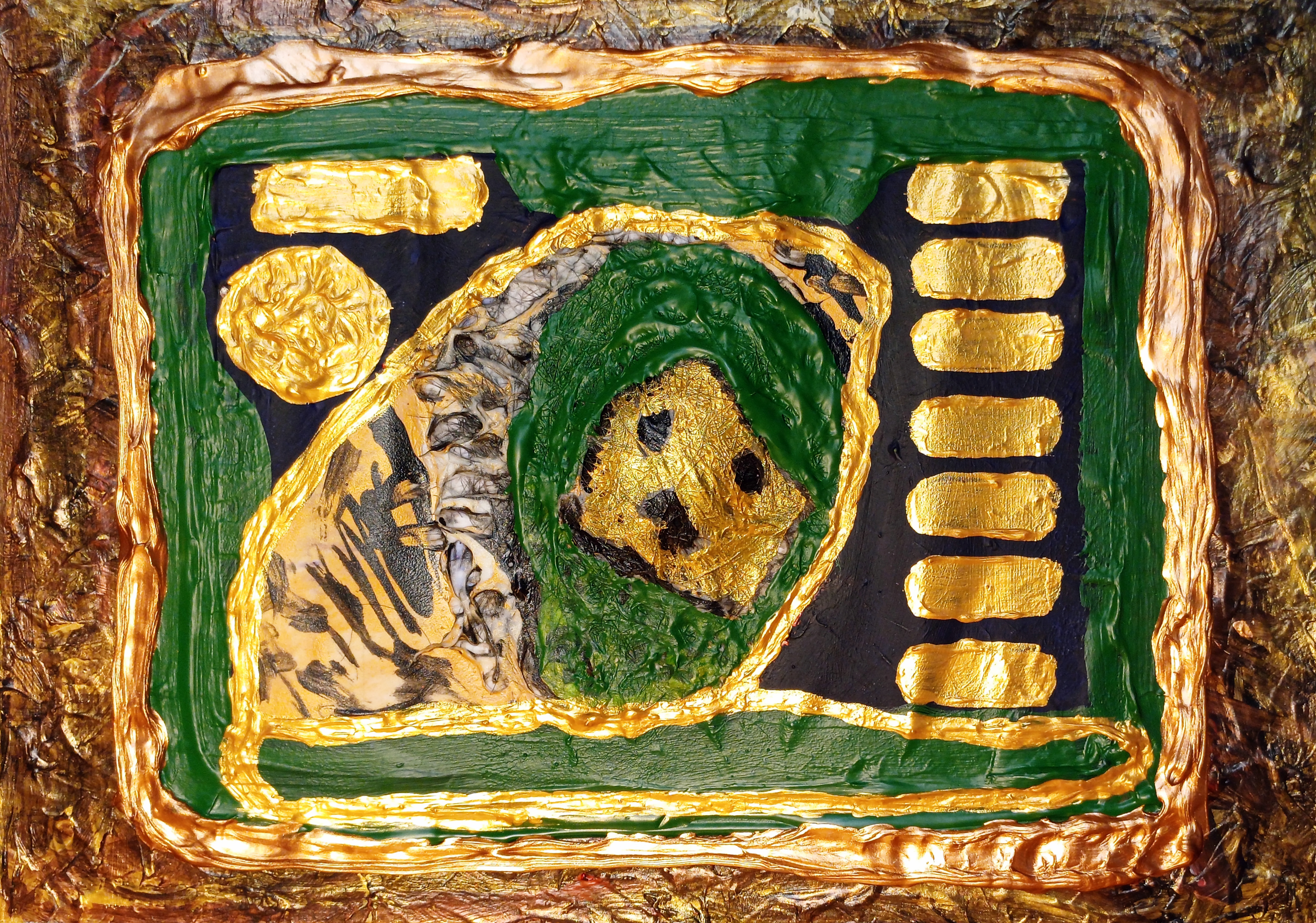
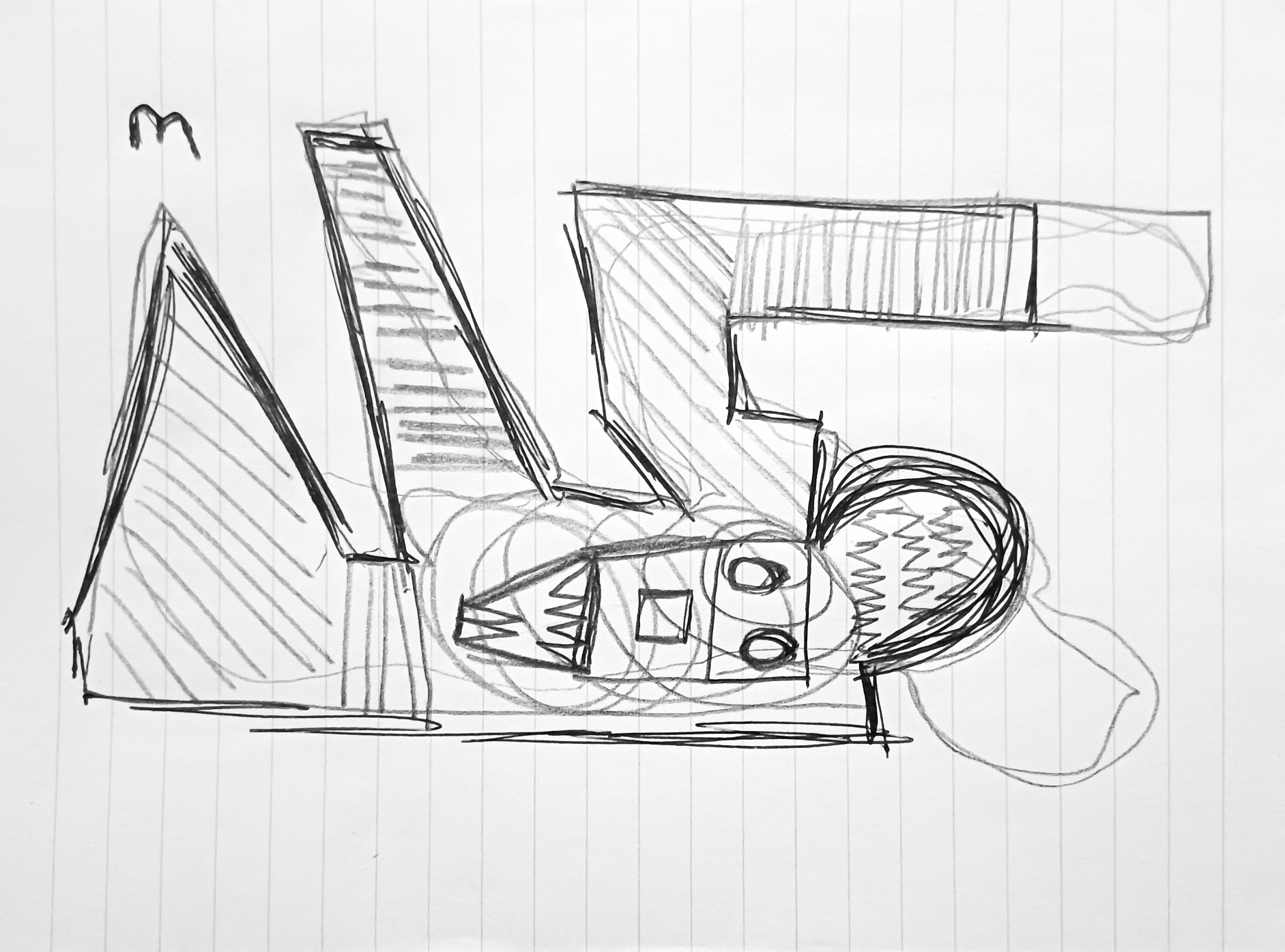
“Tiger Lion Sphinx with Human Hair” [25th January to 4th February 2025, four distinct drafts] by Matt The Unfathomable Artist, acrylic painting with human hair and gesso substrate on A4 250gsm mixed media paper, 5000 x 3506 pixels.
The Tiger-Lion Sphinx: A Sovereignty of Gold, Hair and Bronze
This work nearly didn’t exist.
On 3rd February, I stood before a substrate asserting more energy than form: discordant, insistent, requiring a clearer structure.
Certain elements were already carrying weightiness: the textural-energy, the intricate gravity of mass, and the rectangle waiting to be realigned. The task was not to “save” the work, rather one of shaping its authority.
The Substrate as Evidence
The surface behaves as a living archive. Human hair, integrated with gesso and pressed beneath deep green acrylic impasto, forms a raised terrain that directs the composition from within. The wild creature’s face does not sit on the canvas; it architecturally supports the material, shaped by the biological fibres beneath. The human element becomes structural rather than symbolic: absorbed, and returned to a form that exceeds the human altogether.
Not a crisis of confidence — more of acknowledgment.
Displacing the Human
The classical Sphinx, a human head on a lion’s body, centres human primacy. This work reorders that hierarchy. The human is removed, replaced by the dual sovereignty of Tiger and Lion.
The image gestures toward myth, then holds in modern ecological realism. Childhood iconography sits in its lineage, yet the present era brings a focused realisation: habitats contract, corridors fracture, populations disperse. These animals are no longer allegorical symbols. They stand as living measures enduring pressure, navigating worlds that continue to narrow through fragmentation, depleted resource and prey, with conflict at the margins.
By displacing the human face, the Sphinx returns to the wild: a hybrid of hybrids, a living alien, carrying the contemporary weight of existential survival.
Realigning the Rectangle
The final stages were an act of enforcement in embellishment. “Realigning the rectangle” is compositional discipline: clarifying the outer gated boundaries, fixing the geometry and asserting the relationship between frame and symbolism.
A metallic hierarchy stabilises the form:
Gold acrylic grounds the base, establishes ancient authority.
Bronze carries the highlights, holding age, endurance and uncompromising presence.
The green impasto over the hair substrate centres as living ‘Earth’ – functioning as the connective biology rather than decoration.
Iconographic DNA
The dashes and dots operate as visual DNA. They form a coded field: a numerical pattern over-embedded into the surface. They are designed for symbolic resonance, instructions that remain active even when uninterpreted.
Compositional Gate
The final resolution is one of material thought.
Tiger Lion stripes remain intact in their raw state, while the rectangle functions as a rectified frame: a boundary that highlights the sovereign logic of the creature within. Nothing is softened or diluted. The portrait is permitted its full weight and the form arrives at its intended position.
What results is a compositional gate: a rectified frame displaying a specific creature-logic within. The rectangle is resolved. The hierarchy is established. What remains is a presence: an iconic hybrid of hybrids that reads as portrait, wildlife and civilisation, in its effect upon the environment.
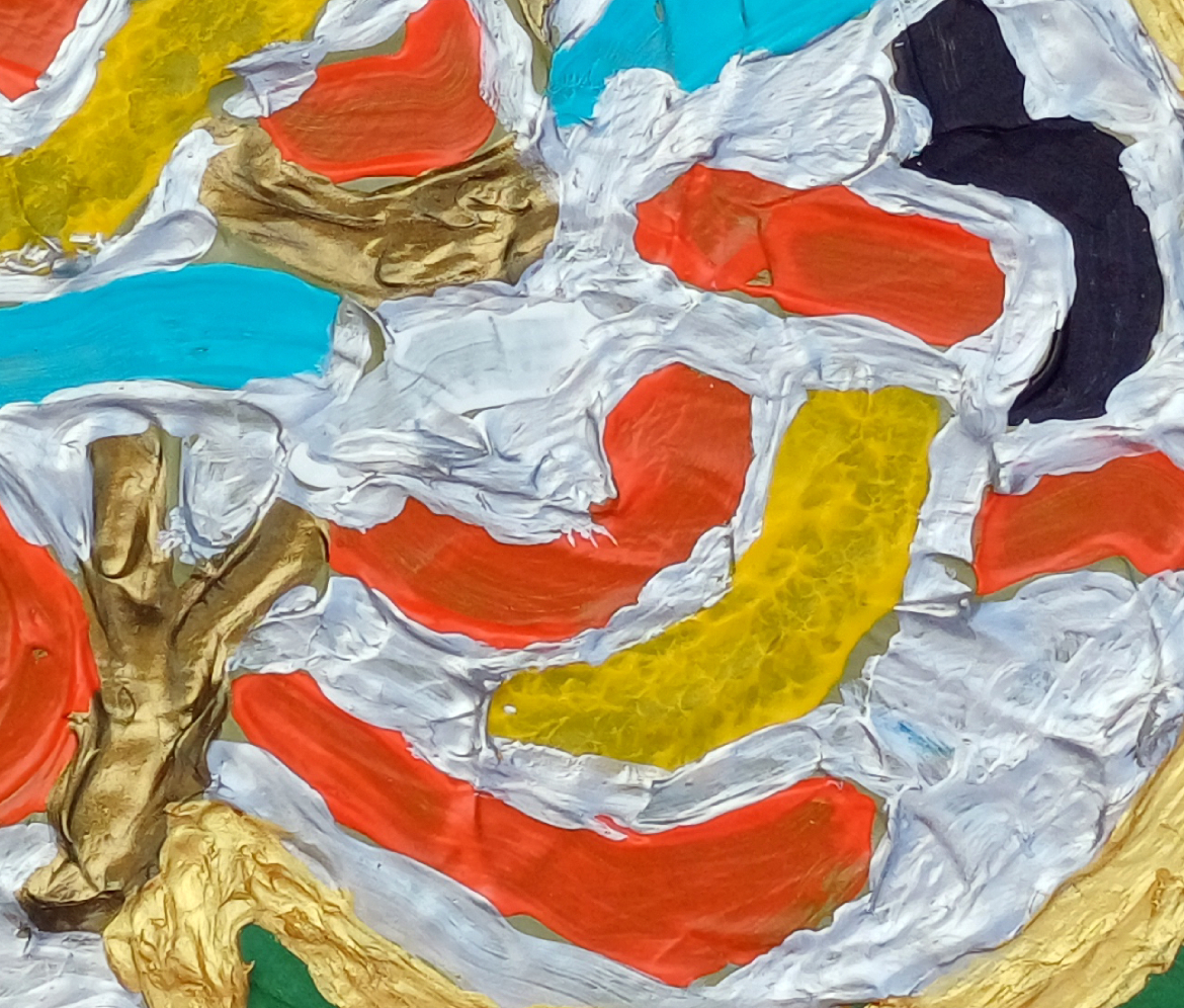
“Equation M Electro Cell” [5th to 8th October 2025] by Matt The Unfathomable Artist, acrylic on A3 (42cm x 30cm) gesso primed 5mm wooden board, 3000 x 2199 pixels
Connecting the Circuits
With Equation M Electro Cell, I wanted to return to the hardware – the physicality of things, rather than how computers operate.
When I look at the finished painting, this feels like a heat-hazed circuit board, a motherboard still holding warmth from the last surge of power. Immediately I recalled my dad’s interest in electronics. I’ve written before about the “type: The Unfathomable… Artist – Electronic Version”. Equation M Electro Cell sits in that lineage of technical references.
My dad worked with soldering irons, resistors and capacitors. I work with pigments, surface and the subconscious. The instruments are different, yet the impulse is recognisable: to make a connection, to get something to come alive, to coax an interconnection between the inanimate and human.
Process
To give the central form its particular presence, the painting needed to be built carefully. I began by painting the surrounding ground in that deep near-black and allowing it to dry completely. The surface became a kind of stable void for the central characterisation to materialise.
Only then, the following day, did I lay in the central block of colour, working the wet paint precisely. This is the intricate part. While the paint was still malleable, I used sandpaper edge to drag, scrape, and meticulously draw through the layers. The method hints at Gerhard Richter’s drag techniques, although here the abrasive surface of the paper takes the place of a squeegee.
The sandpaper pulls the golds, ochres, electric blues and violets sideways across the image. It micro-reduces the physical texture whilst increasing the visual depth, carving out bands and striations that feel close to etched copper tracks on a printed circuit board.
Upon producing the chance ‘double M waveform equation’ at the top right of the colour block, I decided this is the entire piece itself. Further interventions with the sandpaper were measured visually—finite, and inch-by-inch considered in specific colour block areas.
Whenever I note a valuable artistic representation in a piece, I do everything to preserve the uniqueness – purposed or chance.
The Equation
The result is a kind of ‘flat textural’ field. Looking distinct from a classical era painting and more like something printed, pressed or photographic film plate– as if a motion recording in an analogue system had been frozen, glitched and made visible.
I called the work “Equation M Electro Cell” to explain a self-contained apparatus for energy transference. A cell of stored charge, or a fragment of data, suspended in the mainframe. For me, this has the same quiet magic as looking into an old radio and seeing the valves glowing: a mix of warmth and nostalgia with music harmonising softly in the background.
Did I ever tell you about my dad’s valve amp radiograms?
“emi mi” [29th May / 1st June 2025] by Matt The Unfathomable Artist, acrylic on A3 (42cm x 30cm) gesso primed 5mm wooden board, 5000 x 3716 pixels.
The Silent Sentinel
Art reflects a shared conscience and understanding.
In “emi mi” I switch from flowing gesture to firm geometry, using the cool poise of mid-century science fiction as atmosphere rather than subject.
While “The Day the Earth Stood Still” centres on Klaatu—the messenger—my focus is destructive force: Gort, the mute power that enforces the warning. This piece does not depict or reproduce any character or image from that film; the reference is conceptual.
The Abstraction of the Enforcer
An irregular silver monolith commands the field. This is not formal portraiture, rather a distillation: visor, eye, shield. I rarely embrace strict forms, yet to convey a cosmic arbiter the organic yields to rigid structure. The silver plane intrudes with order, dominating the canvas.
Oversight of Human Entropy
Though the style nods to mid-century sci-fi and modern abstraction, the story is present tense. Klaatu arrives to assess; Gort stands ready to act. Here, the silver mass is a celestial oversight of man-made harm. Surrounding bands—oxidised copper, burning gold, bruised violet—signal extraction, scorched habitats, pollution and the dull red of conflict. Hard demarcations: cold corrective logic set against heated disorder.
The Weight of the Ultimatum
Silence is the threat. This presence sees not argument or contention; it measures. Metallic impasto reflects actions. The painting is a study in accountability: by reducing the “enforcer” to a single dominant shape, it asks whether a civilisation can survive its own inventions—or face the consequence of the silent sentinel.
Who or what is the silent sentinel to you?
Is it purpose, chance or cause and effect?
Title Note:
‘emi mi’ fuses EMI (electromagnetic interference) and MI (machine intelligence) with linguistic echo of the self. Succinctly referencing “Mi” iconography as a superscript while the lower-right “M” signature is dually stylised as the human presence to whom the geometric form inclines for direction.
“My Hands” [4th to 10th April 2025] by Matt The Unfathomable Artist, acrylic on A3 (42cm x 30cm) 2mm primed wood board, 7138 x 5000 pixels.
From social media:
“I photographed my hands in the composition you see in the painting at 1454hrs 4th April. By 1525hrs I made the hands first draft consisting of the paint drawing outline and newly filled bronze.
I worked a mars black and egg yolk ground prior to this. Highlighting raw artwork to hint at an aged wooden panel origin.
Each day I meticulously added further sculptural details to attribute elements specifically inspired by da Vinci.
“My Hands” is made in twelve drafts with finite adjustments to finissimo.”
The Iterative Object — “My Hands”
This analysis sets out the work’s core understanding.
Palette & Surface Substrate
A deliberate study in contrast and textural hierarchy:
Ground: Egg tempera. An archival, near-classical substrate that provides a stable, absorbent foundation.
Field: Mars Black. Delivering maximum chromatic counterpoint and visual field bringing the central relief into legibility. The black-umber defines the sculptural presence of the hands.
Positive Form: Bronze and gold acrylics laid in heavy impasto. The texture appears as code. Ridges and channels register the act of making, turning the hands into sculptural form.
Process: The 12-Draft Iteration
The piece is a meticulous, thought-expressive gesture.
Twelve discrete drafts to the final form. A programme of finite, meticulous adjustments. Each draft refining the silhouette, texture, and balancing the gold-bronze relief against the dimensional void.
Composition & Visual Reading
The central form — “My Hands” — reads as a singular sign, almost a sigil.
The joined hands create a stable platform. Gesture suggests warmth, empathy. An aperture between the thumbs form a focal point — a deliberate contemplation within the metallic formation.
Lifelike gold-bronze construction, architectural drawing, sculpture, layers of artistic formulation.
Can you envisage this work as a Bronze sculptural piece?
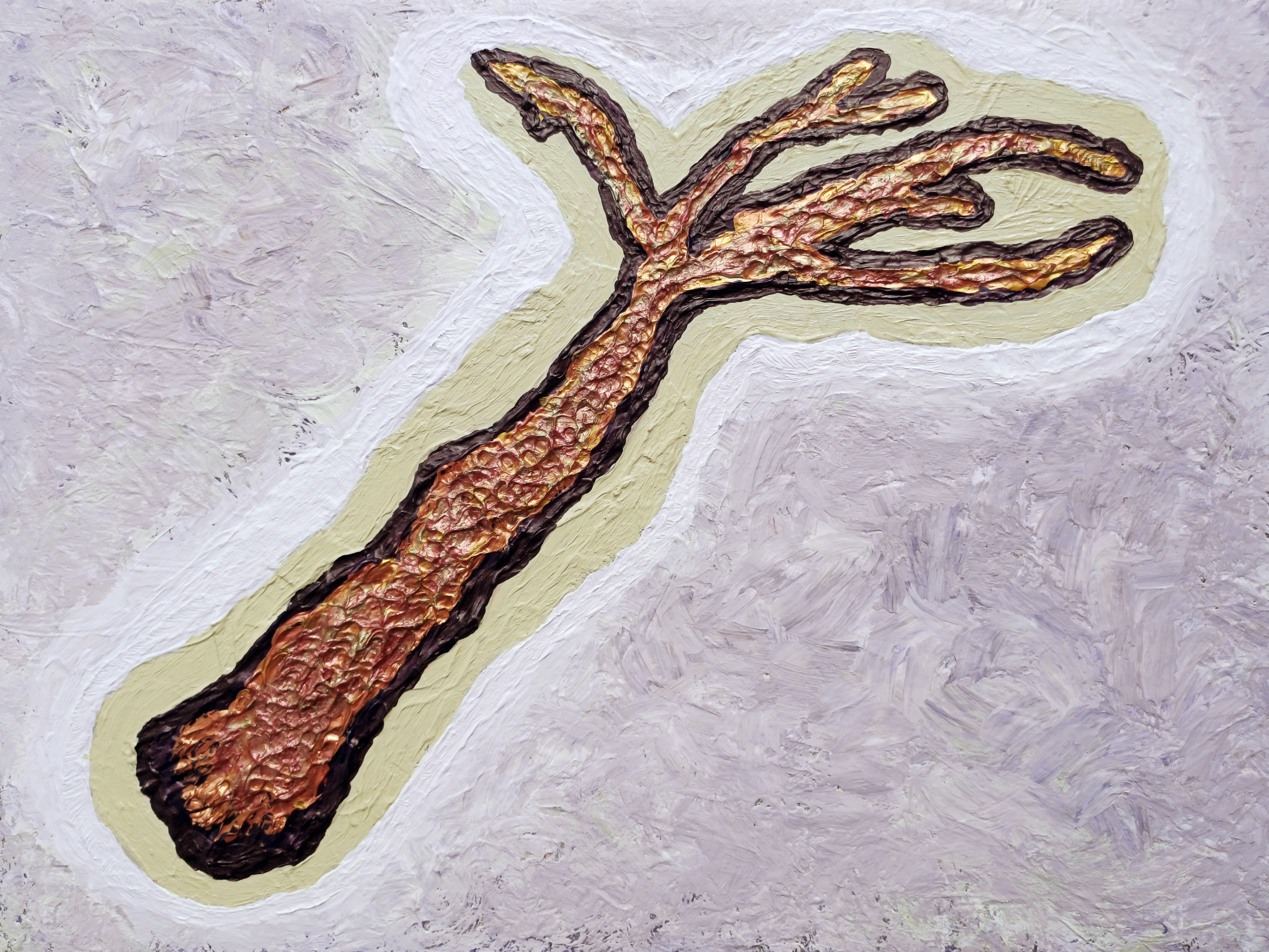
“aš imin” [21st August to 5th September 2025] by Matt The Unfathomable Artist, acrylic on A3 (42cm x 30cm) gesso primed 5mm wood panel, 3000 x 2251 pixels.
My composition “aš imin“ is a deep analysis into universal patterns of life and connection. The central form suggests a branching structure—simultaneously reminiscent of ancient coral, fossils, vascular systems, dendritic neurons or fauna—while deliberately avoiding direct classification. This ambiguity is crucial, allowing the form to function as a multifunctional symbol of growth.
A heavily textured composition of gold and bronze is framed by sand and white pigment. Beneath this is an earlier red–gold ground—essential to the final dialectic. The stratigraphy produces a studied tension: an archaeology of the surface. The form reads as an excavated artifact, granting graphic immediacy and visual resolve.
While my working title “Archaeological Tree” gave meaning, the interpretive process following its completion revealed a more definitive understanding to me, embodied in the final title, “aš imin“, through my use of ancient linguistics.
The work’s ultimate artistic identity emerges for research, intellectual conversation and viewing pleasure.
“the god”
“the god” [30th June to 10th July 2025] by Matt The Unfathomable Artist, acrylic on A3 (42cm x 30cm) gesso primed 5mm wooden board, 5000 x 3735 pixels.
In my work “the god” my intention is to explore the archetypal nature of power and divinity. The piece is built upon a fundamental contrast between the sacred and the primal. I rendered the central figure in heavily textured gold to signify its timeless, iconic status, while the gestural ambiguous form resists simplistic definition.
A being simultaneously monumental and vulnerable, divine and earth-bound.
The surrounding field of expressively textured black is not a passive ground, rather this is an active inference through the body—the source of invention and mystery from which the figure emerges. My technique here is founded in 19th Century brushworking styles; the raw impasto of both the gold and black surfaces is meant to convey a sense of primal energy and ancientness.
This is a deity, a force weathered by millennia.
In its afterlife, the figure resonates with modern mythologies—interlinked with cinematic icons whose alien brilliance and public acclaim embody the uniqueness the work seeks to crystallize.
Love, too, is a force that endures beyond death.
Both “aš imin” and “the god” are foundational works within the Estate of Matt The Unfathomable Artist.
A direct engagement with the symbols that underline human consciousness, created to be a powerful, resonant statement to speak across cultural and temporal boundaries.
These pieces are therefore symbolic portraits of past and modern life, a system—a direct visual language underlying human consciousness; across cultures and epochs.
“NAWT” [17th/18th June 2025] by Matt The Unfathomable Artist, acrylic on A3 (42cm x 30cm) gesso primed 5mm wooden board, 5000 x 3803 pixels.
“NAWT”
I view this piece as childlike, a baby suckling his mother.
Five compositional areas organised by raised gold ridges that act as structural boundaries and energy channels.
Left: A stacked, totemic block in reds and olives, pocketed with yellow cells. The perimeter gold line is noticeable, enclosing smaller islands and voids; interior ridges create sub-chambers.
Centre: A vertical plume of warm reds with ripple textures. Gold points punctuate the column, giving a sense of heat or rising material.
Right: A cool turquoise plane meeting a dark indigo/violet corner speckled with gold edging. The m signature contrasts the chroma and scale.
Palette & Surface Warm spectrum (red, ochre, olive) opposed by cool spectrum (turquoise, indigo). Heavy impasto gold forms the highest relief; underlying layers show brush striation and dragged texture that directs the eye vertically and diagonally.
Direction
A diagonal ridge travels from lower centre to the turquoise plane, functioning as a natural partition: it carries the centre visually.
Vertical waves in the red plume interlink to seismic waves works during the Iron Gall Ink flurry period.
Canvas Separation
Perimeter Gold Ridge: Seal forms from the background, preventing colour wash and establishing the object/ground hierarchy.
Left Internal: Multiple small gold lines divide the left block into micro-cells (pockets/voids), creating a chambered topology.
Central–Right Boundary: The raised, slanted gold ridge that delineates the warm centre from the cool right; is both barrier and channel.
Indigo Corner: Ragged gold edge where indigo meets the warm fields; the edge retains discrete gold as floating nodes.
Turquoise Plane: A near-flat field bounded by slight ridges, acting as a pressure release zone.
Compositional Understanding
Rule of thirds tendency: Left mass ≈ one third, central plume ≈ one third, right release ≈ one third.
Figure–ground: The indigo corner behaves as negative space whilst activated by gold; the left behaves as positive mass.
Behaviours
Gold medium used as structural relief and optical highlight.
Visible drag marks suggest slow, deliberate pulls; ripple patterns imply wet-on-wet movement control.
Edge fidelity of ridges indicates masking-free, hand-guided boundaries.
With “NAWT” I didn’t use masking, I rarely ever do. The last time I utilised canvas masking (whatsoever really or at least to any significant degree) is in Two Swans Together sometime ago in 2013. Goodness, the work I made for myself in Conker Lots for my refusal to canvas mask. Conkers affixed first, then highly careful painting, no masking.
Emoji hearts eyes mode activated from a distance.
Visual Meaning Containment vs. expansion; heat to cool; pressure building then venting. The eye experiences compression in the left and cooling/space in the right. The distinct canvas spacing makes this legible by preventing chromatic dissection and choreographing the viewer’s path.
Quadruple intellect angles sought, times ten to the power of one hundred.
Signature Placement Lower right m within the turquoise field—chosen to sit in the calmest zone, preserving legibility while completing the warm–cool dialogue.
No originating concept or preconceived theme(in the actual painting), just painting to enjoy the process. The title is the first word arriving to mind. A painter freestyling, having fun! Although originally I intended this composition:
Original composition for a new painting (NAWT).
Is this a concept or preconceived theme?
No. This is a composition. My painting from the outset was devoid of concept or theme since the original composition ideas didn’t translate into the painting.
I created same (a concept) upon painting, through the working act of subconscious play.
Whereas .. “DANGER: Men at Work with Missiles” had a concept.. symbology, signs, iconography. From here I produced the theme, which became missiles. The ‘signs’ interlinked as a visual concept:
“DANGER: Men at Work with Missiles” [21st to 24th June 2025] by Matt The Unfathomable Artist, acrylic on A3 (42cm x 30cm) gesso primed 5mm wooden board, 5000 x 3725 pixels.
A sign-language visual painting: bold perimeter gold ridges define a two-part emblem that reads as industrial icon + ordnance bracket. Internal strokes (red/orange, turquoise, ochre, black) ride a white ground, all set against a matt green field.
Thirty seconds to comply. Sounds fair.
The palette and edging are engineered to feel like a warning placard lifted into relief.
From Study to Painting (alterations)
One of six study drawings made quickly on lined Notepad paper.
Study drawing (notepad, lined): angular A-like left mass + jigsaw-like leg; arm-bar stretching upwards (highest pencil shape), stylised facial totem nested in the body; linear hatching; a circular peg-coil (the original head with its adjacent arm); missile at this point is the intended triangular head looking up towards ‘m‘!
A3 painting: the facial totem becomes a mosaic of micro-strokes; the arm-bar is retained as a rightward cantilever (or left), softened by curved infill; all outer lines become raised gold fields; hatching converts to channels of colour; the lined-paper constraint dissolves into a continuous awesomely beautiful green plane.
Net effect: the sketch’s diagrammatic figure becomes a sign-object—legible from distance, intricately textured up close.
Hardwork is in the details.
Practice unseen. A life unfathomable.
Different.. communicated for you, by me. Honestly. I love.. places (compute the analogy, derive the connection, distance the meaning).
Use of Canvas Space
Scale shift: notepad lines → A3 board. The jump in size allows thicker ridges and deep impasto, turning flat signage into tactile relief.
Field control: the gold perimeter acts as containment; interior gold seams partition silver ground into cells, preventing chromatic dispersion. Soldering iron is a fusible metal alloy.. interlink NAWT, in wordplay. Please tell me you like my eccentric brain.
Background: uninterrupted green creates a civic-utility register (worksite, military range, municipal warning).
Visual Reading
Left mass: triangular engine/gantry—work zone, man-human-power, structure, a literal symbolic missile.
Arm-bar: launcher lever —missile semantics without literal depiction.
Internal script: curved strokes function as a traffic of signals—command streams, siren paths(?), evacuation arrows(?).. symbology as yet understood.
Black vectors: fault lines(?) / blast trajectories(?).
Turquoise and orange: emergency contrast pairs (sea/sky vs. heat/hazard).
Gold ridges: authority, hardware, state apparatus; also separation-field technology. Perhaps.
Symbology & Signs
This work visualises the Estate’s sign lexicon: simplified shapes that communicate under stress. The artwork pairs with “Ye Mud, Ye Mud” (hummingbird + sign). The hummingbird = life, agility, energy; the missile sign = threat, projection, interruption. Together they outline a grammar: warning vs renewal. The common element is the sign-board frame—public language.
War News & Civilian Anxiety
Headlines about strikes and air defenses have migrated into daily cognition as icon flashes. The brain processes shapes: triangles, bars, chevrons. This painting uses that compression. Acknowledging the worksite metaphor—“men at work”—dissecting work with missile labour: logistics, manufacture, targeting, interception. The result is an ambient alert: the feeling of operating under siren logic while still trying to build.
Micro-signature & Detail
Includes a rare micro “m” (embedded within the paint architecture), consistent with discreet practice. Relief height slightly varies across the perimeter; interior gold seams are intentionally irregular to keep the sign hand-made.
‘m’ detail within “DANGER: Men at Work with Missiles”
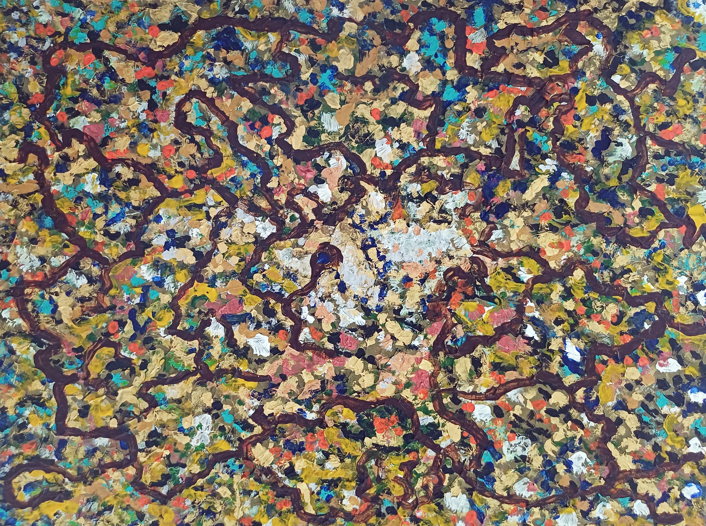
“Easel #1” [2nd to 5th August 2025] by Matt The Unfathomable Artist, acrylic on A3 (12 in x 16 in) gesso primed 5mm wooden board, 2400 x 1789 pixels.
Easel #1 began as a conversation between colours, a raw outpouring of emotion and energy. A multitude of individual dabs of paint — ochre, turquoise, crimson, gold, silver — jostle for position like a crowd of competing thoughts.
Each daub is a distinct texture, a fragment of intuition. This is the foundation: the beautiful, untamed wilderness of the subconscious.
A highly painterly work, crafted with deliberate precision and sought-after intent.
I invite you into its layers. Wander along the meandering paths. What do you see in the noise? A cosmic nebula? A forest floor teeming with life? A satellite city glowing at night?
The work carries the energy of nature seen up close: the shimmer of moss and earth, the shifting tones of autumn leaves, the microscopic geometry of cells branching into unseen directions. Yet it remains entirely abstract — a landscape of the mind, painted directly from impulse.
At first glance, it’s a frenzy of colour and depth. Production, though, is not merely random. A search for pathways. Ideas.
My painting invites multiple readings: a forest after rain, a nebula in spring or the cartography of thought crystallising. Each interpretation is an opinion of self.
Threading across the surface is a network of deep umber lines. Roots, veins, neural circuits — maps of thought itself. A weaving structure through impulse, linking hundreds of discoveries into a unified whole.
At least, this is my interpretation..
For those having missed my Instagram post for this painting, here is the writing I published:
“Five distinct drafts, the last of these the defining idea, a then-realised originating inspiration. Canvas held in hand throughout my fifth draft.
A painting symbolically the notes of your voice, potential, your personal ability, to produce your own harmonic sound of melody in life.
Easel #1 presents a dynamic composition where rich, painterly textures and a profusion of colour evoke a visual topography that shifts between natural and imagined forms.
The painting is structured by a network of interlaced, vein-like umber lines that organically traverse the surface, echoing neural pathways. These darker linear forms separate swathes of vibrant, impasto daubs in cadmium-orange, yellow-ochre, cadmium-yellow, ultramarine, turquoise, gold and titanium-white—each practical dab contributing to a dense, fractal rhythm.
The central area of the canvas suggests a focal illumination or zone of heightened chromatic complexity. Silvery whites-creams emerge from the surrounding matrix. A compositional strategy draws the eye inward while retaining the all-over balance of action painting.
Easel #1 places itself within post-impressionistic abstraction, perhaps informed by Pollock’s non-linear gesturalism, textural buildup and discrete pigment groupings. The work may also be interpreted as poetic cartography—biological and/or terrestrial in implication—suggesting an unfixed terrain of consciousness or memory.”
“Turquoise Green Bronze Waters” [23rd April 2025] by Matt The Unfathomable Artist, acrylic mixed with liquid fixative and clear acrylic medium on A4 250gsm Artist’s mixed media paper mounted onto A3 (42cm x 30cm) primed-bronze painted 5mm wooden board, 5000 x 3725 pixels.
“Turquoise Green Bronze Waters” is made with specific movie inspiration, having rented the film the evening prior on the 22nd April. I painted “Alvis Dede Wimsey III” immediately after “Turquoise Green Bronze Waters” too.
Then on 26th May I produced six variations to create a 3×2 Collage, plus a silver 3D-Movie version. The latter silver version yet to be published.
Turquoise Green Bronze Waters
At first glance, your attention is drawn into an oceanic expanse of turquoise depth, layered with strokes of emerald green, coral pinkish-salmon, burnished bronze, and subtle golden highlights. The textures ripple across the surface like tidal currents, suggesting a convergence of water, mineral and energy.
This piece is alive with impressive swirls:
Fluid yet grounded – The swirling gestures evoke the untamed motion of water, while the underlying turquoise base steadies the composition.
Calm whilst intense – Soft pastel undertones create moments of serenity, balanced against sharper bronze and emerald accents to bring dramatic tension.
Elements interacting with water – A recurring theme in art, bridging natural contrasts through layered abstraction.
Essentially I would like to reveal this painting represents the most joyous scene in the movie, to me. The ebb and flow of emotion carried within each curve-play of..
.. discovery, perfect friendship, adventure, understanding and selfless uncompromising protection.
“Turquoise Green Bronze Waters – 3×2 Collage” [Digital Artwork, 26th May 2025] by Matt The Unfathomable Artist, produced from the original A3 acrylic painting, 5000 x 2483 pixels.
The Colour Transformation: Six Dimensions of the Same Tide
Accompanying the original piece is a six-panel digital collage, a study in chromatic reinterpretation. Each transformation recontextualises the original features into alternate emotional registers, revealing the adaptive soul of abstraction.
1. Violet Surge (Top Left)
A lush, almost botanical transformation, where shades of lavender and green fuse into an ethereal dance. The strokes become vine-like—suggesting organic life entangling beneath the surface.
Have you guessed the movie yet?
2. Graphite Echoes (Top Centre)
Stripped of colour, the monochrome rendition exposes the raw anatomy of movement. Without hues to guide the eye, we are drawn purely to form, discovering unexpected structures hidden within the fluidity.
3. Crimson Drift (Top Right)
A heated translation where deep reds and muted aquas meet. This version feels elemental, as if fire has collided with water—suggesting passion, turbulence and heat.
4. Verdant Flux (Lower Left)
A vivid green inversion that evokes reforestation, renewal and nature’s resurgence. It reimagines the composition as an aerial landscape—a terrain seen from above, multicoloured rivers weaving through new growth.
5. Magenta Pulse (Lower Centre)
Possibly the most vibrant reinterpretation, where magenta dominates in a surge of emotional energy. This palette brings out the artwork’s inner velocity, the textures vibrating with urgency.
6. Yellow Golden Horizon (Lower Right)
Finally, the yellow-golden translation lifts the piece into radiance and warmth. The once-aquatic composition transforms into something sunlit, reminiscent of desert mirages or a chameleon catching the glimmer of daylight.
Here, on 11th September 2025 I see for the first time a face at the centre of the Yellow Golden Horizon!
How did I not see the face in my own artwork before 🙈?
Themes and Intent
Across the primary work and its chromatic studies, recurring motifs emerge:
Fluidity and resistance – The tension between soft washes and defined, almost calligraphic lines mirror nature’s duality.
Transformation through perception – By shifting palette alone, the emotional narrative of the artwork changes entirely.
Time and memory – The layered gestures evoke geological sediment, wave ascensions and the intimations of thought—a sense that the watery surface is the playful act of emotive friendship.
You are invited to spiritually immerse yourself—to discover how colour redefines meaning once reimagined across multiple dimensions.
A Reflection on Process
My original painting, here, reflects textural layering technique, where pigment and medium interweave to create depth you can almost feel under your fingertips. The carefully curated six-panel digital collage demonstrates a digital-meets-physical dialogue, amplifying the tactile qualities of paint through chromatic reinterpretation.
This convergence of traditional artistry with modern experimentation positions the work within a broader conversation: how abstraction evolves in an era where colour appears infinite, yet visual touch remains irreplaceable.
Hope you enjoyed viewing and reading this article.
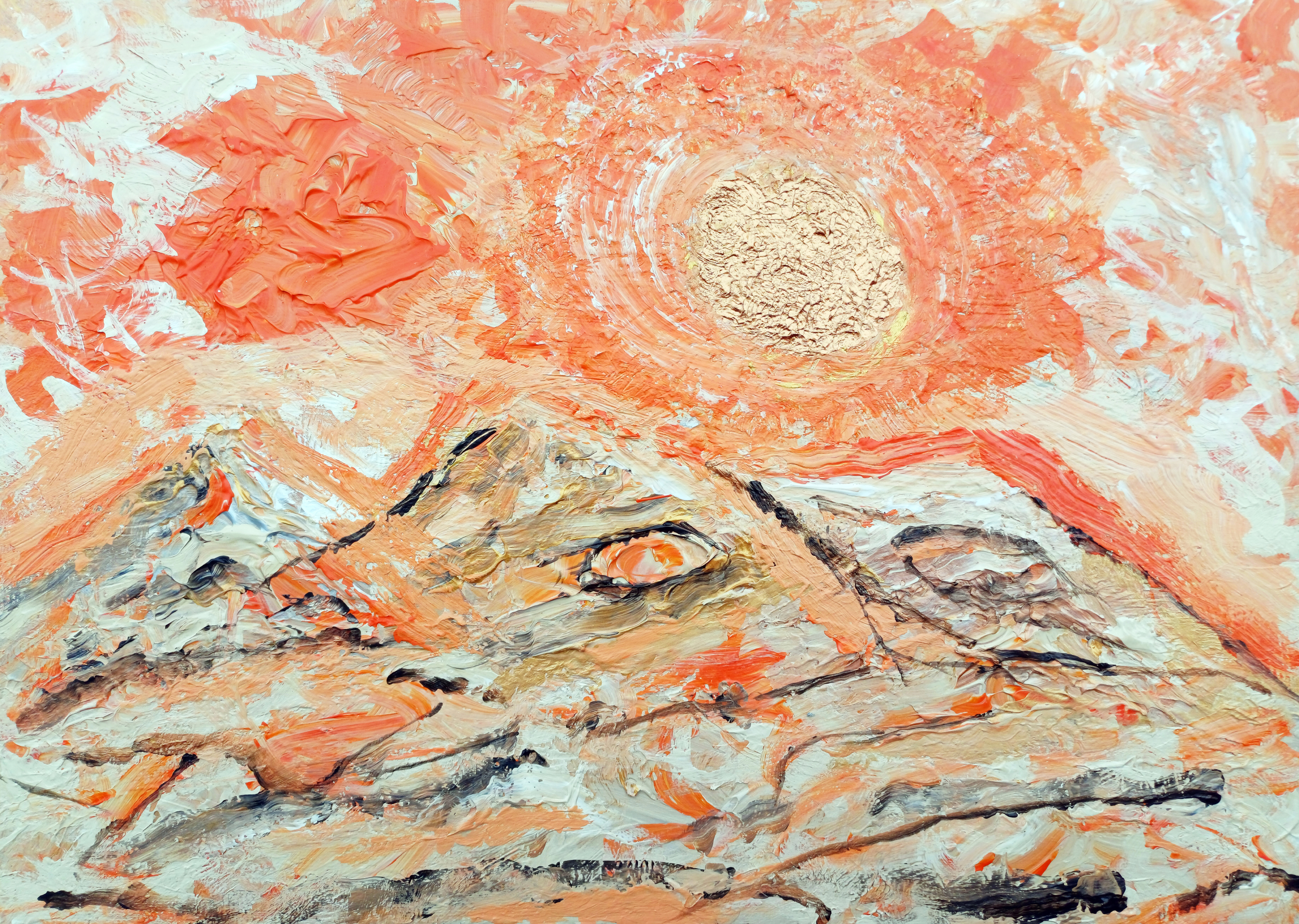
“Orange Sand & Gold #1” [6th April 2025] by Matt The Unfathomable Artist, acrylic on A3 (42cm x 30cm) 2mm wooden board, 5000 x 3574 pixels.
Quote:
Personal quote on 9th April at 1445hrs:
“the Orange Sand Gold.. i used it [the canvas] purely for mixing, then i loved the orangey canvas! im not certain i would want to sell this. however i will do another version with the ideas. the paint plays art immensely useful for producing compositions.”
This version “Orange Sand & Gold #1” is made within an hour approximately.
“Orange Sand & Gold #1” is very much an emotional-feel painting, as Turner-like beautiful as I can make.
Here is the second version of the composition:
“Orange Sand & Gold #2” [10th to 13th April 2025] by Matt The Unfathomable Artist, acrylic on A3 (42cm x 30cm) 2mm primed wooden board, 5000 x 3557 pixels.
Brackets show quotation from pre-published social media (Instagram):
[ I hope you love this second version of an original composition I produced. The Sun-sky area required several drafts to achieve the desired texture and mood I require for fine art pieces.
A distinct movie franchise found its way, twice, into this artwork.
“Orange Sand & Gold #1” and “Orange Sand & Gold #2” share a triple mountain composition, a shine to the gold and bronze Sun-stars with a deep-orange contrast to the sky. ]
In the second version we see a Jabba The Hutt and Yoda-like representation. See the two eyes, one in the middle and one in the right mountain. ‘Jabba The Hutt’ features were partially visible so I had fun accentuating this idea.
I have highlighted a ‘Yoda-like’ character with a screen drawn image, here
Yoda-like screen drawn image in “Orange Sand & Gold #2”
The Yoda-like outline is my interpretation. In fact I kept this strange orange flurry in the painting, unknowing the reason until afterwards. This orangey flurry looks so different than the other sky elements I consciously evaluated same to decide whether to keep it in my painting.
My decision after a few minutes was, ‘I love this, I’m not going to change or overpaint’ it. Very glad I took that decision.
Want to know a subconscious secret to the composition?
Some weeks after both paintings I was sat on my bed. I looked up ahead of me, viewing the October 1997 framed watercolour painting on paper-card my Nan had owned. It was a gift then from my Nan’s artist friend. I met her at my Nan’s funeral in December 2023.
A watercolour painting of the Malvern Hills, UK.
I’d never seen a face in the painting before.
[The Star Wars franchise is owned by The Walt Disney Company. Disney acquired Lucasfilm in 2012]
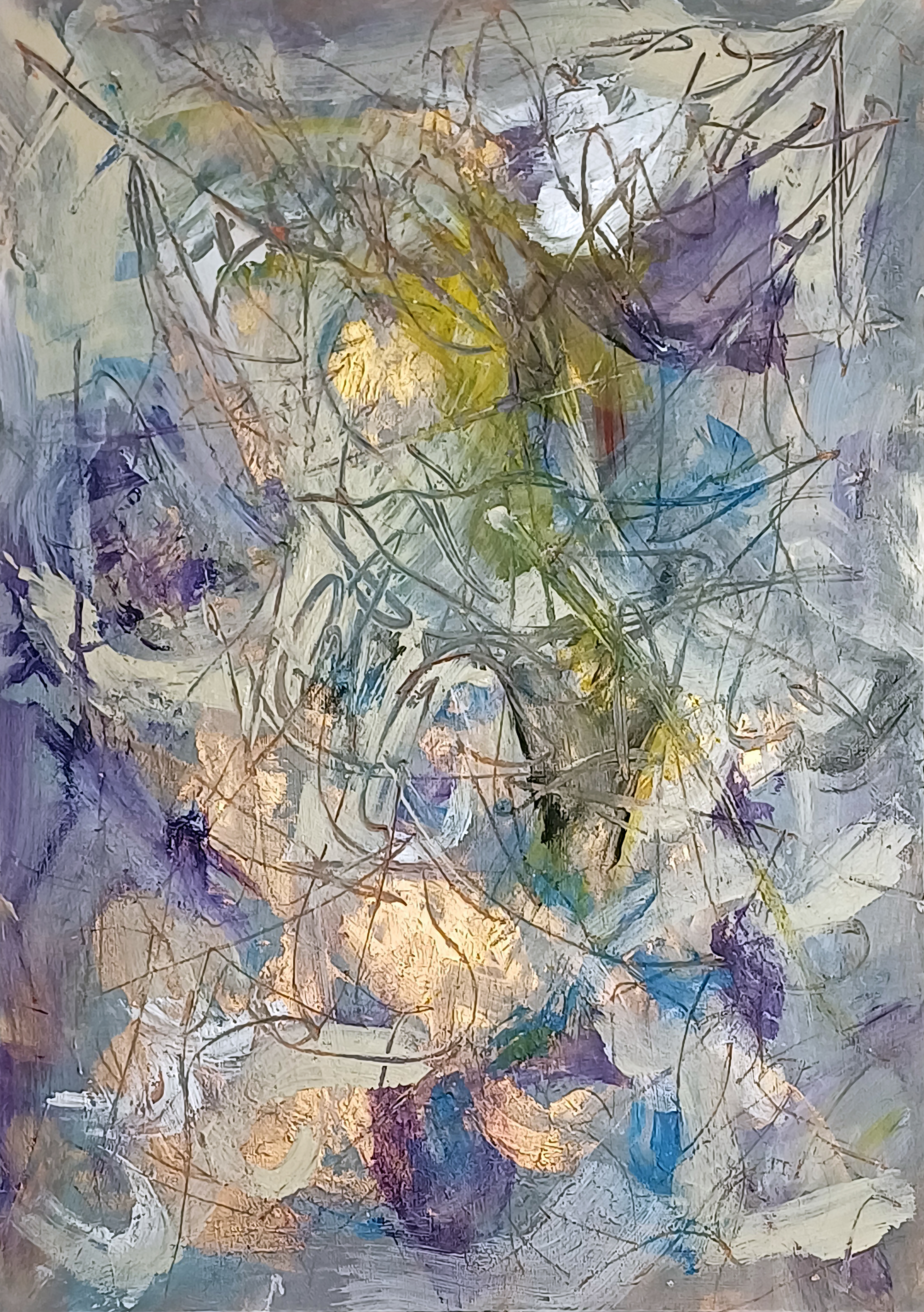
“Surfaces #1” [14th/15th March 2025] by Matt The Unfathomable Artist, acrylic & pastels on A3 (42cm x 30cm) 2mm gesso primed wooden board, 5000 x 7096 pixels.
Social Media Commentary:
[ I made “Surfaces #1” simultaneously with another wooded panel. “Surfaces #1” retained all the necessary requirements I look for in my pieces..
.. quality, balance, originality, artistic expression and personality in style.
“Surfaces #2” I overpainted into “y intersects b”, a Pop Art piece. ] – 17th March 2025.
My abstract composition Surfaces #1 unfolds as a layered field of energy, where colour, texture and line converge into dynamic interplay. Wisps of lavender, azure and deep violet co-operate with creamy whites, orchestrated by flashes of golden light that seem to radiate from within the work.
Sweeping translucent markings weave across the surface, creating a web-like structure reminiscent of organic growth.
There is a sense of depth achieved through the overlay of calligraphic pastel lines atop areas of cloth wiped impasto, with firm textures revealing glimpses of earlier layers. The visual repertoire is one of oscillation—between translucence, opacity, stillness and movement. The atmospheric palette, coupled with the fluid, improvisational paintmaking, imbues the piece with a sense of natural phenomena: light through foliage, reflections in water, or even shifting cloud formations.
In its essence, the work invites contemplative empathy, where the viewing reveals subtle chromatic interaction. It’s a meditation of surface technique—equally a meditation on the hidden strata beneath.
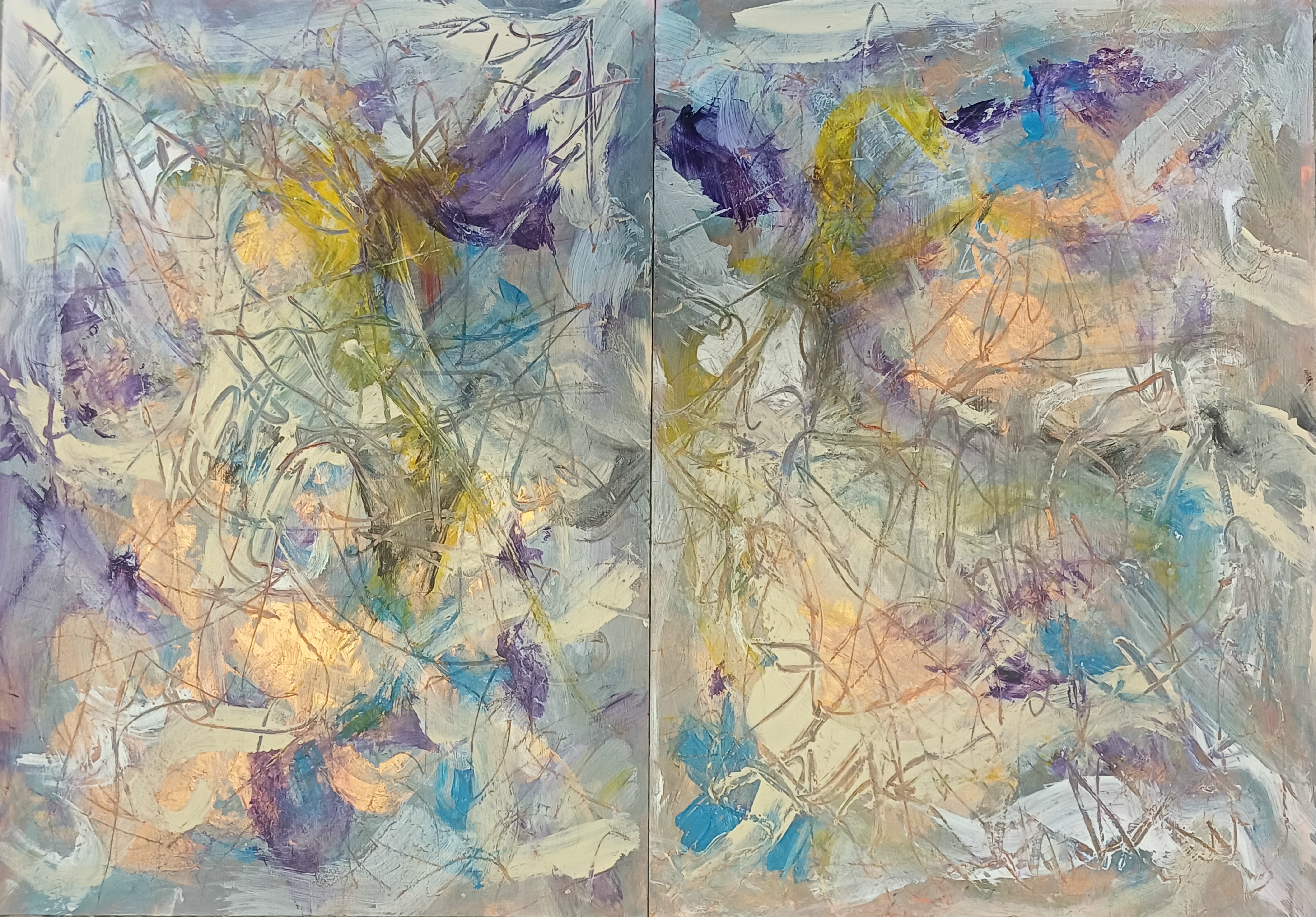
Here is the original diptych:
Diptych of “Surfaces #1 & Surfaces #2”
I retained Surfaces #1 (seen on the left), whereas being unhappy with Surfaces #2 I took the decision to overpaint same to make “y intersects b” [14th – 17th March 2025]:
You can see a small area of the underpainting for Surfaces #2 in the a4LY writing of “y intersects b”.