Innovative Inspirations

“Red Scratchpad” [23rd/24th April 2024] by Matt The Unfathomable Artist, acrylic fine art painting on 280gsm 10in x 12in gesso primed canvas, 3000 x 3483 pixels.

Quotation from pre-published social media in brackets:

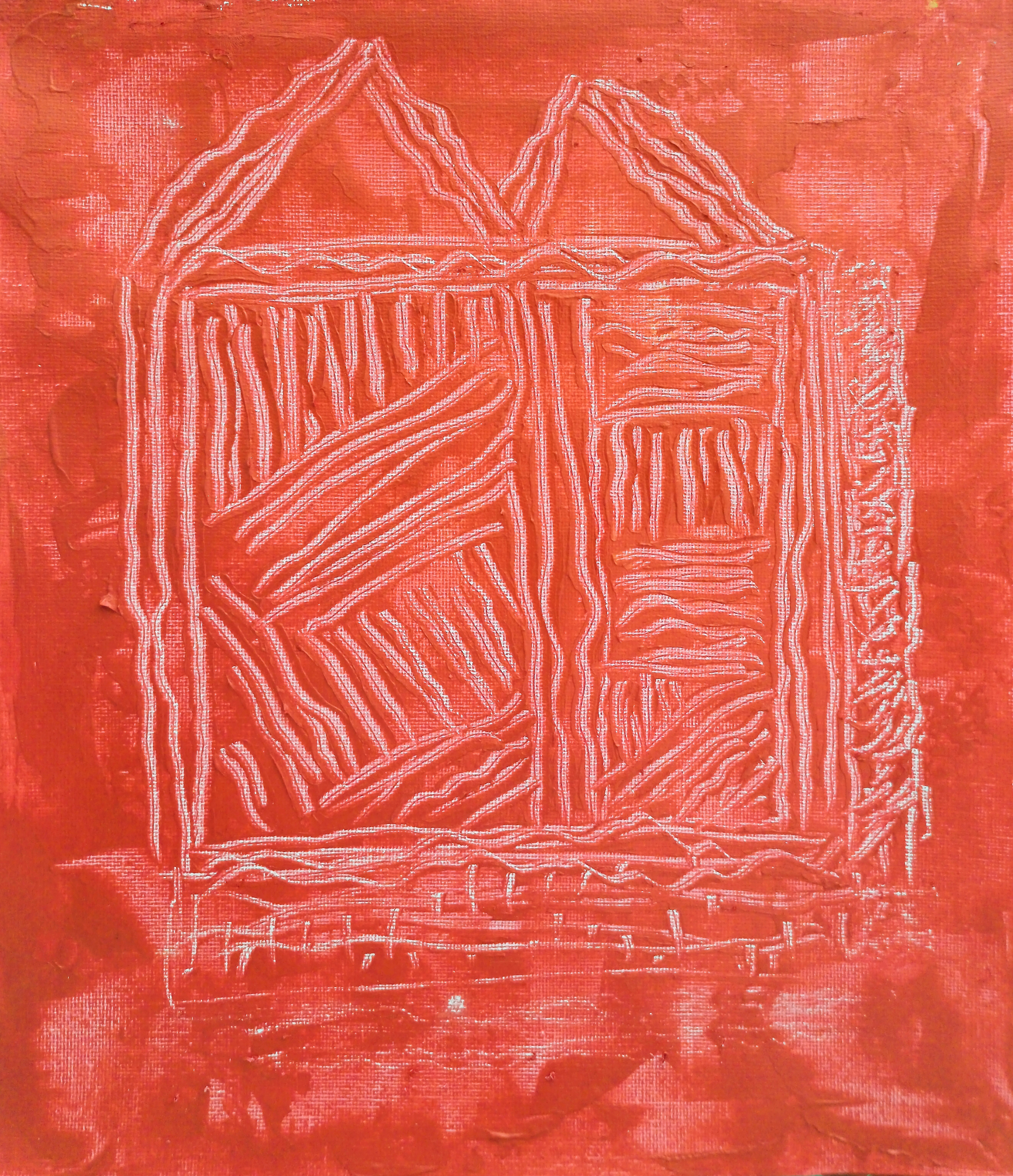
[ “Red Scratchpad” is made with quick palette knife scratches with its own unique pattern.

This artwork exhibits a deep red through mixing cadmium red with gold acrylic paints. I purposely chose to make a scratched ‘beauty highlight’ lower-centre. Another softer scratched highlight is featured mid-left of the ‘M’ at the top of the artwork.

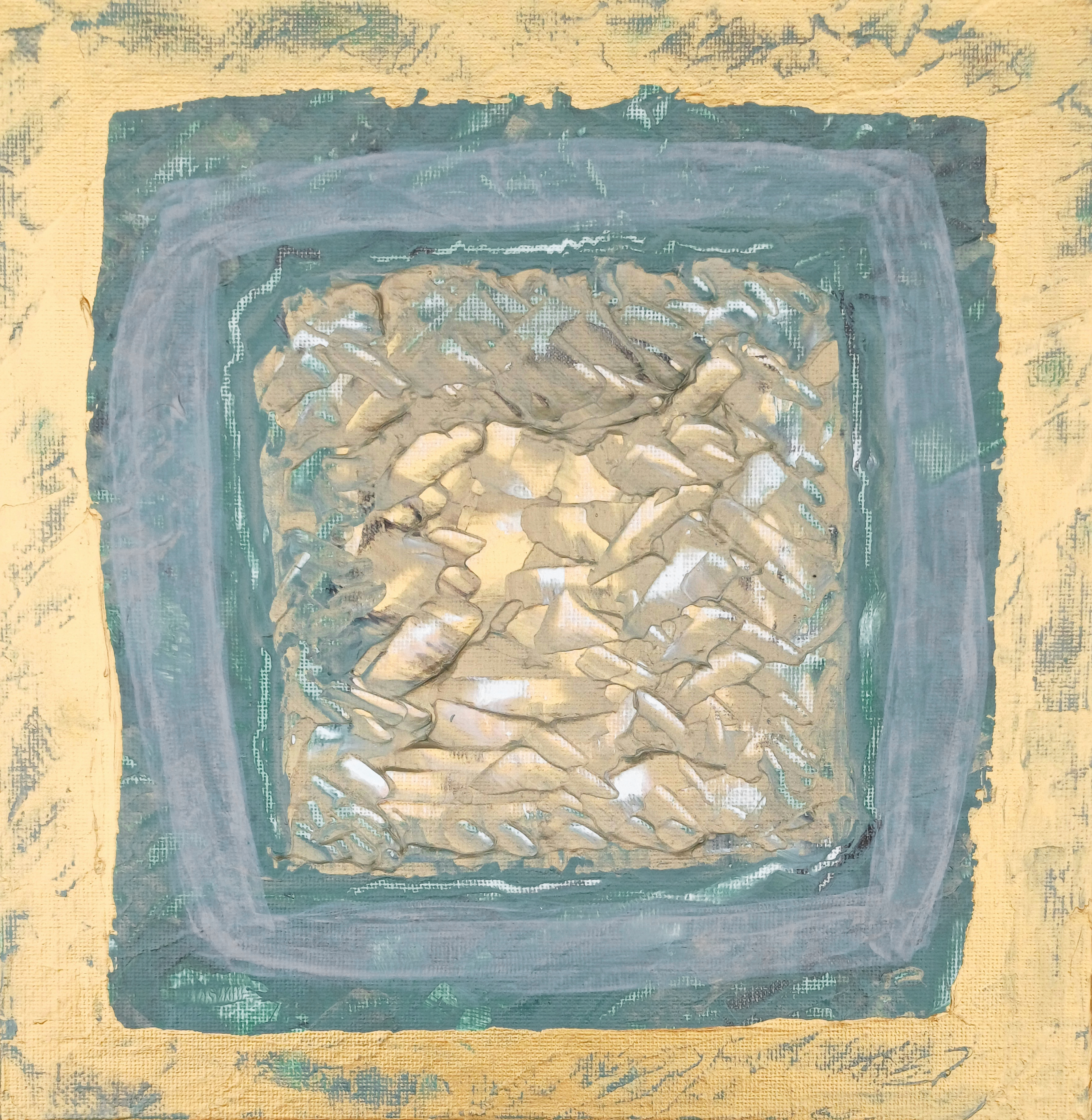
I visually referenced “Green Scratchpad” to begin this second painting of the series. Particularly whilst I am defining visual elements for these pieces.

With the remaining deep red paint I made another quite phenomenal abstract immediately afterwards in the “Pseudo-Purple with Gold Frame” style. ]

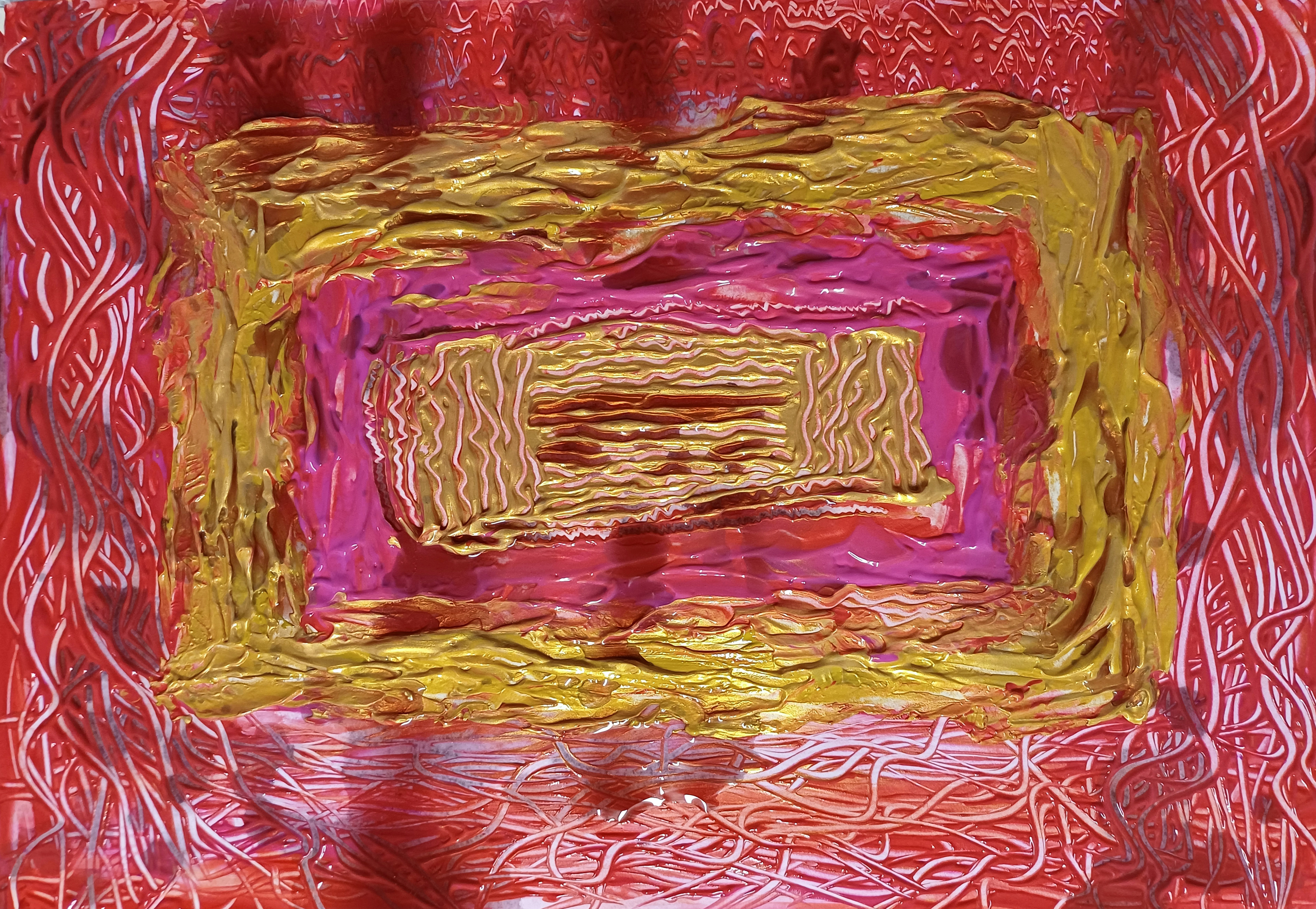
You can see “Gold Rectangular Frame with Red” (the second cadmium red with gold acrylic painting I produced on the same days as “Red Scratchpad”) by clicking the link.

It should be noted both “Red Scratchpad” and “Gold Rectangular Frame with Red” were published to my Instagram social media. The latter required new photography prior to publishing to my blog, doing so in June.

In discussing “Red Scratchpad” I can tell you my scratchpad series of works are amongst my favourite. Themes involve movies, creativity, music, thoughts, architecture, self-reflection, abstract ideas. I much prefer viewers to make these series of works their own in terms of meaning.

I have genuinely gifted “Green Scratchpad” although the recipient has yet to receive the artwork as I’m an unbelievably complex person. Some weeks ago I viewed the canvas out from storage.

It’s as astoundingly beautiful as “Red Scratchpad”.

Understated. Classical. First of the Scratchpad series.

There is a great deal of soul-searching to be found within this series, something for me to build upon over the years.


Next we have “Cosmic Scrages” immediately below:

“Cosmic Scrages” [23rd/24th June 2024] by Matt The Unfathomable Artist, acrylic paint on premium 115gsm medium textured cotton primed to 240gsm over 12in x 16in (30cm x 40cm) wood-fibre board (4mm), 6000 x 4497 pixels.

“Cosmic Scrages” is easily the most Jackson Pollock of works I’ve made to-date. Please do click the images for a more detailed viewing digitally.

Quotation from pre-published social media in brackets:

[ The first draft for “Cosmic Scrages” took 55 minutes on the 23rd June. I then worked over another four drafts the next day until I was happy with the result.

Happy equalled me uncontrollably laughing sometime with literal artistic elation. Afterwards I sat in the garden admiring the painting, drinking a cup of tea.

All palette knife and cloth working, no brushes. Immensely difficult to make, goodness gracious. ]

Well, there you have it in a quotation. No way these images even on high-quality flatscreens can possibly convey the paintworking in “Cosmic Scrages”.

I get an immediate sense of joy when I finish a work. The fact I made a successful inspiration from the works of an influential past master American artist meant everything to me.

I guess it did likewise for Basquiat.

Each and every artist painting is different. Not merely through obvious uniqueness from one work to another.

I could do a geometric painting style like “Cosmic Scrages” over and over again. The ‘ideas, qualities, application of the paints or materials.. makes all the difference.’

Just to demonstrate the level of skill required, Geometric Lines #1 & #2 are (of several-attempts-following) my very own masterpieces from that series, of two.

One-offs, #1 and #2.

True, I do wish to produce new ink pen geometrics in the future. However for now I’m happy to let those shine brightly as part of my catalogue raisonné of works. Especially since they’re genuinely difficult to make.

Oh gosh, I love them so. I think you can appreciate why it’s soul-wrenching for me to actually send “Green Scratchpad”.. yet.

To me at the very least “Cosmic Scrages” is my geometric painting masterpiece in the Pollock style.

Producing inspiration from very famous artists is an obsession, whilst also creating my own. It would be absurd to write ‘I simply place material to canvas and et voila.. masterpiece’.

Artistic learning is necessary to provide masterful possibilities.

“It took me four years to paint like Raphael, but a lifetime to paint like a child.” – Picasso.

“type: the Unfathomable ARTIST [acrylic version #1]” [9th July 2024] by Matt The Unfathomable Artist, acrylic paint on premium 115gsm medium textured cotton primed to 240gsm over 12in x 16in (30cm x 40cm) wood-fibre board (4mm), 7000 x 5201 pixels.

For those who have not read my pre-published social media (Instagram) for this piece, here is a quotation in brackets to give you some insight into the artwork:

[ “type: the Unfathomable ARTIST [acrylic version #1]” builds upon a genre within art containing either/and/or immediacy, repetition, overwriting, overpainting, confounding wordology, iconography/symbology and interpersonal communication.

This piece is founded from my past works with the same message (‘type: the Unfathomable ARTIST‘) portraying multiple ideas and themes. To date I have made oils, iron gall ink and (now) acrylic works with this title.

In effect this is an invitation for you to get to know me, my person, my personality.

Please note confounding wordology is a repetitive practice amongst Twombly and Basquiat works, where I drew inspiration. Particularly in terms of technique, ideas and motivations I am immensely studious with regards to artists, art and generally everything interesting to me. ]

Now for new information to blog readers about this acrylic shown immediately above..

.. it was a total canvas wrestling match to be honest. Some paintings like Yellow Flowered Sun Abstract just happen. Others like this piece <partway through> you would find me carefully considering the visuals, or a lack of artistic quality or the feeling it’s a work-in-progress I’m not ready to place palette, brush or pencils down with.

I must be delighted with an artwork, professionally.

“type: the Unfathomable ARTIST [acrylic version #1]” is somewhat unique. Understated tones, stylistic paint writing in canvas scratches, a messily-attractive disconcordance.

The idea originates specifically from these digital works; oil paintings; and iron gall ink piece I have linked for you to view (please note clicking on these links you may need to use the back button to return to this article):

Digital versions:

[type: The Unfathomable Artist]

next the two developing oil painting English font versions:

[As Yet Unfinished Pop Artwork Studies in Progress]

and also an incredible iron gall ink version using a dip pen:

[type: The Unfathomable… Artist – Electronic Version]

These works have sentimental meaning to me, even beyond themes.

I personally believe “type: The Unfathomable… Artist – Electronic Version” [18th August 2020] is one of my most valuable artworks. Similar feeling also with “Green Scratchpad” and “Cosmic Scrages” [23rd/24th June 2024].

Friendship is a powerful emotion.

Finally, I would like to share a blog article of an inspired artwork subconsciously featuring a particular woman with whom “type:” series of works derive certain elements.

Purely for those wishing to understand cultural changes my art and humanitarian efforts need to achieve.

[Ridge Willow – Spirit of the Trees]

Art Life.

Standard

Green Scratchpad

“Green Scratchpad” [29th March 2024] by Matt The Unfathomable Artist, acrylic fine art painting on 280gsm 10in x 12in gesso primed canvas, 4500 x 5304 pixels.

Here I am catching up documenting works to my WordPress. To my count I have seven unique works to include after “Green Scratchpad”. Five paintings, a sketch and digital art photograph.

For some reason I felt compelled to paint artwork following artwork the evening of 29th.

Gorgeous green paint!

Here is a quote I posted to my Instagram about “Green Scratchpad”:

[ i made three beauties tonight. this is one of them, Green Scratchpad (i scratched two tiny pink spots out the canvas lol) although i called it that before i knew i would! its utterly perfect even if i say myself . Cy Twombly inspired obv. i am hoping to gift this one ]

Interestingly after scratching out two pinkish dots top-right and lower-left I noticed one pinkish dot in the scratchpad itself, mid-right inside the palette knife scratch lines. That one is now happily part of the piece.

The piece exhibits subtle pinkish-red, cyan and yellow flecks. I mixed the green paint from red and blue acrylic originally intended for “Pink Monument Abstract”. “Green Scratchpad” is made very quickly and intuitively.

The paint lines were scratched differently to the two pink dots I removed from the canvas. For clarification if anyone wishes to know, the dots scratched out is (1) the clear white canvas highlight top-right and (2) a less noticeable highlight lower-left.

Pure chance unintended placement since these somehow made their way onto this canvas following work on my first painting of the evening “Pink Monument Abstract”.

At the time of making “Green Scratchpad” I had no preconceived ideas. None. Zero. Not even a title. I generally title works after they’re made anyway. So true since I titled this “Scratchpad” at first upon completion. Changing the title only to reflect the gorgeous green I made.

Furthermore I did have a thought. What if I made different versions of this in a multitude of colours with its own individual scratching design?

Art my friends is a personable production.

That said some people knowing my life will appreciate that again, subconsciously, I am spontaneously drawing upon interconnected conceptual themes. For a clue here is another artwork I made in subconscious thought.. “Conkers of the 2021 Season”.

I was over halfway to etching lines into the green canvas when I realised a possible connection to..

.. numbers.

My favourite part of the canvas is probably the IM you can see at the mid-lower-right. 100% pure chance as the detailing of the right-vertical ‘soundbar‘ is completely random! So random I only just made up the idea to call that a soundbar whilst writing these literal words at 1924hrs.

IM (to me) means I AM. Me. The person of myself.

By the way certain elements in this piece remind me of movies! Movie studios producing specific movies. Why? Black and white action films I watched as a boy.

I can tell you having finished this work very quickly it felt great. An achievement of creativity and quality art making.

During canvas working and afterwards a particularly famous master artist in my thoughts.

Please note this artwork is gifted.

nb I made a Red Scratchpad version in April 2024 [please click link to see].

Standard

“Pink Monument Abstract”+ “Pseudo Purple with Gold Frame”

“Pink Monument Abstract” [29th March 2024 @ 1948hrs] by Matt The Unfathomable Artist, acrylic and red wine abstract art painting on A3 300g mixed media paper, 4197 x 3000 pixels.

I haven’t experimented enough with feminine associated colours. “Pink Monument Abstract” is much palette knife work with a high quality soft-looking (on the canvas) gold paint. I added seismic/sound waves to the top for personal authenticity in my work.

Did it look like a series of ‘M’s also.. yes? Oh goodie.

Wavy palette lines art delicious I think. The central monument idea could be ark-like; burial/archaeological site in reference; haystack/field orientated; trinket box; ancient Egyptian or even alien symbology.

Or something else you personally like. My monument artwork series is all about imagination.

On that evening I made “Pink Monument Abstract” first, “Pseudo Purple with Gold Frame” next and then “Green Scratchpad” lastly with the remaining mixed green paint I produced.

“Pseudo Purple with Gold Frame” [29th March 2024] by Matt The Unfathomable Artist, acrylic abstract art painting on A3 300g mixed media paper, 3000 x 2136 pixels (low-res image only for online publishing)

With “Pseudo Purple with Gold Frame” I repurposed an A3 paint marked paper canvas in true abstract style. You can clearly see my palette knife lines here in the green. Rarely do I show these lines so obviously, as for some it might be considered not quite so sophisticated?

Here I felt they were and are beautiful untouched with a rawness. The high quality gold shines without any further painting or material complications.

To be honest I am delighted with these results including “Green Scratchpad”, the latter to be published to my WordPress in due time.

One of the many things I love about art is the intellectual idea we all pretty much understand when something is arty. Even if you personally prefer realism or impressionist works greater than abstraction.

A big cat playing with its cubs.

The bear cub reaching out to touch falling snow.

I guess art in this way is a playfulness.

As a little bonus for dear Readers I am including two unedited works in progress for you here:

“Gold Squared Green/Gold Tile WIP UNEDITED” [27th March 2024] by Matt The Unfathomable Artist, acrylic painting on 24cm x 24cm canvas board, 3636 x 3605 pixels.

“Gold Squared Green/Gold Tile WIP UNEDITED” is a raw photo for evaluation by me.

Would you have changed the tile into this?

“Gold Squared Green/Gold Tile” [27th March 2024] by Matt The Unfathomable Artist, acrylic fine art painting on 24cm x 24cm canvas board, 3558 x 3649 pixels.

If not perhaps you will change your mind if you see my artwork in orchestrated light rather than a photograph I produced in a homogenous way. The central gold palette work is unchanged between both photographs you see here.

Seeing artworks in gallery or museum settings is a joy for that very reason.

“Pink Monument Abstract WIP UNEDITED with wet red wine”

Prior to “Pink Monument Abstract WIP UNEDITED with wet red wine” (immediately above) the piece looked far too perfect for my liking. All the pink was uniform across the piece.

I ended up tonking this piece as the red wine would take hours to dry into the paper canvas. However the effect is exactly as I envisaged. Interesting. I carefully tablespooned the red wine onto the piece!

I wanted contrast. I wanted light to dark and dark to light.

I want words. Lots of words, beautiful words. Make some noise. Set the stage. Open to hold the attention of the audience from start to finish.

If you look at the original, for me it looks like a stage where a spotlight is shining. This is what I noticed the other day viewing Monument Totem Abstract. For those knowing my intricate themes, the totem idea is interconnected to The Runners Totem.

Oh yes. I do themes. Layers. It fun.

Therefore I was artistically inspired by the totem sculpture at my local lake. Albeit these works are subconsciously produced, spontaneous individual original pieces.

In the manner Basquiat produced pieces at times.

By the things we see around us.

Movies annnnnd Action!

Hope you enjoyed this article :]

Standard