“Picture Houses” [5th February 2026] poem written by Matt The Unfathomable Artist, computerised image render (6th February) for social media publishing only.
Here is my cosmological poem, inline for you to read:
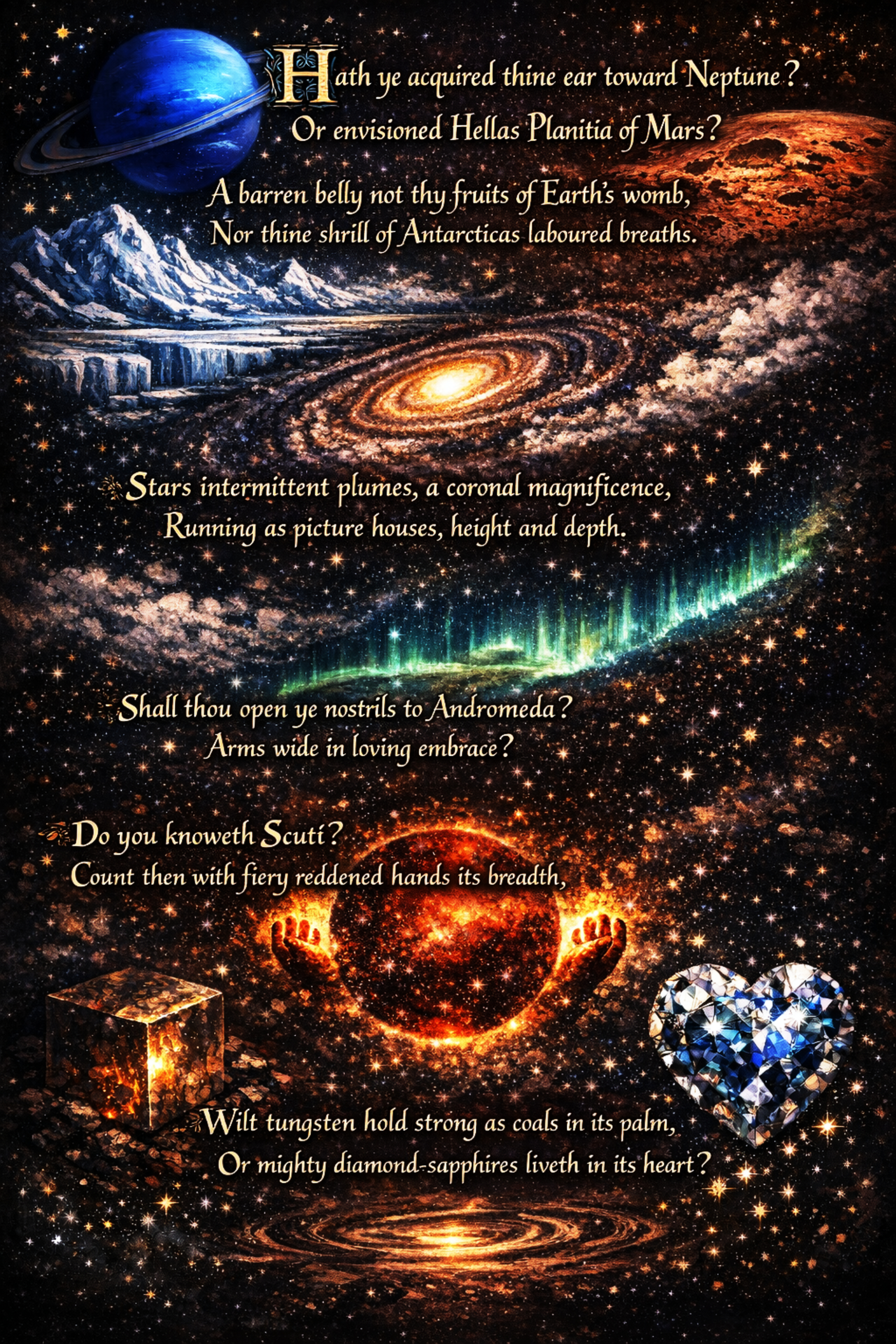
Picture Houses
“Hath ye acquired thine ear toward Neptune?
Or envisioned Hellas Planitia of Mars?
A barren belly not thy fruits of Earth’s womb,
Nor thine shrill of Antarticas laboured breaths.
Stars intermittent plumes, a coronal magnificence,
Running as picture houses, height and depth.
Shall thou open ye nostrils to Andromeda?
Arms wide in loving embrace?
Do you knoweth Scuti?
Count then with fiery reddened hands its breadth,
Wilt tungsten hold strong as coals in its palm,
Or mighty diamond-sapphires liveth in its heart?”
Inspiration..
‘i had listened to recordings of asteroids, planets and solar winds quite some time ago. ..i got to thinking about Universe sounds as melodies.. pure music.’. My inspiration also derived from listening to blues acoustic guitar playing styles.
One of my favourite lines in “Picture Houses” is the image of fiery reddened hands—a way of imagining another star or even our Sun, as the hands measuring Scuti’s immense diameter. Much like establishing a horse’s height with human hands.
Again, my art is often recent ideas, thoughts or subconscious. In the past week I viewed draft horses. Heavy-bodied breeds like Shires, Belgian Draught and Percheron. Horses often feature in my social media reels feed. I went horse trekking up and over Welsh hills and woods when I was between ten to twelve years of age.
At the fish pond near my maternal Nan and Grandad’s, there were horses in a field I used to see as a boy.
My social media feed of horses.. this is why I included nostrils in the poem. The idea interconnects the sense of cosmic smells with the tremendous galloping speed of a galaxy. Racing Andromeda as if with reins.
The choice of Hellas Planitia came purely from my love of H.G. Wells writing. A play on word with depth, literal wells and the seemingly unfathomable facts we learn about the Universe.
If you were to look into Mu the Croc’s eyes—a pastime best described as bold when dealing with a Nile crocodile—you’d find a gaze uncannily reminiscent of the Blinking Planetary Nebula. There’s something quietly mind-boggling in there, ancient and unhurried, paired with an unsettling kind of heavy‑tailed precision.
You might wonder if the spectacles perched on his lengthy snout have something to do with his lack of elegance. However, Mu wears those simply because he likes the “look”. He chooses that look every time he reads, which, since he reads whenever he’s basking, is quite a lot. A scholarly crocodile, with a book resting on a river rock, pages and everything else turned by his breath, is simply part of the local scenery now.
The Paradox of the Straw Hat
Then there’s the brimmed straw sun hat, a choice that confuses anyone with even a casual understanding of crocodilian biology. A Nile crocodile is, after all, a living solar panel built to charge up on celestial rays.
So why the hat? Mu says he likes the “look”. This, of course, has absolutely nothing to do with the little headaches he gets if he’s out in the sun too much. A light‑sensitive, bookish crocodile is an absurdity Mu carries with total confidence.
The Diplomacy of the Tail
Mu keeps his tail mostly still these days. A momentary twitch has been known to accidentally swish his friends across the riverbank—something one can get away with when it involves warthogs or hippos, yet impala are far less receptive to an “Oh, sorry”.
Mu’s personal record is flattening seven at once. They were all uninjured, Mu proudly states. The apology, though, required half a ton of mixed leaves with a decent haul of acacia seed pods, all carried on Mu’s back for two lion‑miles from a local elephant trading post. Elephants, as it turns out, will happily trade half a ton of leaves for a decent watering hole location.
The Measurement of the Plains
Out here, distances are measured in lion‑miles, which are quite different from termite‑miles. Most mammals of the African Plains have worked by this standard for millennia—or so says Babby, the oldest baobab tree, who has seen it all.
A Moment of Mu‑Style Study
In the accompanying Mu animation, we catch a rare glimpse of Mu pausing his studies for a quick, muddy slurp of water. The book is waiting, the sun is shining, and Mu returns almost immediately to the serious business of reading.
The grazers had finally returned to the watering plains after a long day of munching, yet Soffiz the Kudu was still bursting with energy. While the rest of the herd eased into their usual evening calm, she adjusted her ballet skirt — a treasured accessory she insisted improved her balance — and prepared to perform her inimitable routine: the Kudu Prance.
Kudu are famously sociable, happiest in small herds, though they remain shy toward most outsiders. Especially lions.
Soffiz, however, had spent the entire afternoon practising her grace between mouthfuls of grass, keeping one eye on her footwork and the other on the scrub for hyenas. Tonight she intended to finish with a flourish: a brand-new move she called the Manbat Position.
A few days earlier, she had watched a creature leap from a high ravine, plunging into the valley at a speed no sane animal would attempt. In broad daylight, Soffiz was quite certain it was a real “manbat”. Just when it seemed he was about to have a disagreement with the ridge, he unfurled a strange contraption shaped like enormous elephant ears. With a whoosh, he drifted gently to the ground.
“Jumping over dry riverbeds is daring enough for me,” Soffiz muttered as she stretched, “Manbats think they’re vultures soaring through the sky.”
“They are vultures,” Schrodyn piped, her best friend forever.
“Vultures flap..” Soffiz replied, pleased by her own analogy, “..Manbats just stiffen their arm-wings and freefall like boulders. Maddest creatures on the planet — excluding honey badgers, obviously.”
Schrodyn nodded with absolute seriousness, “There can be no disagreement on honey badgers. Ever!”
Like the soft wave that ripples along a caterpillar’s many feet, their voices flow from one to the next. When our fuzzy friend is still, his companion on the highest twig continues the song.
The narrative is all part of Bijibeau the Squirrel‘s story. Along with the story of Hanno the Baby Hippopotamus and his friends, a wise old Nile Crocodile named Mu, an excitable dray of Bush Squirrels and a gentle Kudu.
Developed for a full-length feature animation 🎥.
Studios, actors & voiceover performers, scriptwriters, animators.. I would love to hear from you.
Most of the time I share the finished pieces, the ideas and the process. Today I want to be honest about the practical side: keeping the studio running takes real resources and I can’t do that on inspiration alone.
I’m an independent artist. I work solid hours, I research, do all my own administration, draft, paint and keep going until the piece is ready. That part is the privilege. The really hard part is that every new work has a cost attached to it.
The gold acrylics, heavier surfaces, panels, varnishes, the technology that keeps the workflow stable, even the cost of keeping this site online so I can keep sharing work with you. It all adds up.
So I’m making a straightforward ask.
How You Can Help
A lot of you have followed my work for a long time. People often ask if there’s a way to support the studio beyond buying an original artwork.
If the work brings you something, if you enjoy the fusion of science, nature and subconscious that I share here, please consider contributing to the Studio Fund.
What Your Support Does
This support keeps the studio moving.
It helps me buy the materials that make the work possible
Covers the running costs of sharing the work publicly
Supports me whilst I’m working on drafts or busily researching pieces
If you can only give the price of a coffee, every donation helps. If you can’t give at all, you’re still welcome here. Reading, sharing, commenting, being present: that support is real too.
To Corporate and Science Readers
If you represent a research body, organisation or business and you see value in supporting research-focused art, I’m happy to receive donations or formal sponsorships to aligned projects. If you want to chat, please reach out directly via email.
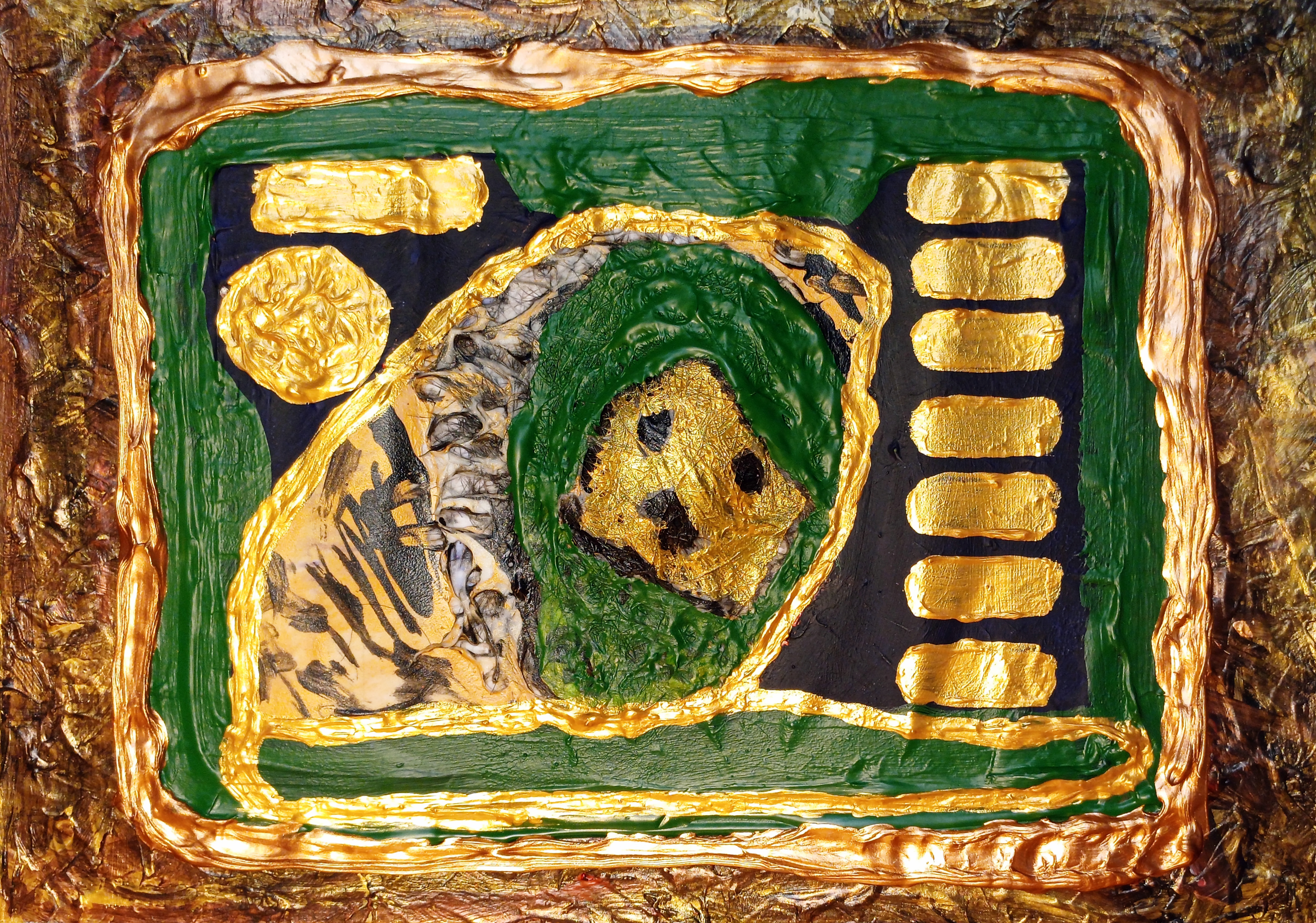
“Tiger Lion Sphinx with Human Hair” [25th January to 4th February 2025, four distinct drafts] by Matt The Unfathomable Artist, acrylic painting with human hair and gesso substrate on A4 250gsm mixed media paper, 5000 x 3506 pixels.
The Tiger-Lion Sphinx: A Sovereignty of Gold, Hair and Bronze
This work nearly didn’t exist.
On 3rd February, I stood before a substrate asserting more energy than form: discordant, insistent, requiring a clearer structure.
Certain elements were already carrying weightiness: the textural-energy, the intricate gravity of mass, and the rectangle waiting to be realigned. The task was not to “save” the work, rather one of shaping its authority.
The Substrate as Evidence
The surface behaves as a living archive. Human hair, integrated with gesso and pressed beneath deep green acrylic impasto, forms a raised terrain that directs the composition from within. The wild creature’s face does not sit on the canvas; it architecturally supports the material, shaped by the biological fibres beneath. The human element becomes structural rather than symbolic: absorbed, and returned to a form that exceeds the human altogether.
Not a crisis of confidence — more of acknowledgment.
Displacing the Human
The classical Sphinx, a human head on a lion’s body, centres human primacy. This work reorders that hierarchy. The human is removed, replaced by the dual sovereignty of Tiger and Lion.
The image gestures toward myth, then holds in modern ecological realism. Childhood iconography sits in its lineage, yet the present era brings a focused realisation: habitats contract, corridors fracture, populations disperse. These animals are no longer allegorical symbols. They stand as living measures enduring pressure, navigating worlds that continue to narrow through fragmentation, depleted resource and prey, with conflict at the margins.
By displacing the human face, the Sphinx returns to the wild: a hybrid of hybrids, a living alien, carrying the contemporary weight of existential survival.
Realigning the Rectangle
The final stages were an act of enforcement in embellishment. “Realigning the rectangle” is compositional discipline: clarifying the outer gated boundaries, fixing the geometry and asserting the relationship between frame and symbolism.
A metallic hierarchy stabilises the form:
Gold acrylic grounds the base, establishes ancient authority.
Bronze carries the highlights, holding age, endurance and uncompromising presence.
The green impasto over the hair substrate centres as living ‘Earth’ – functioning as the connective biology rather than decoration.
Iconographic DNA
The dashes and dots operate as visual DNA. They form a coded field: a numerical pattern over-embedded into the surface. They are designed for symbolic resonance, instructions that remain active even when uninterpreted.
Compositional Gate
The final resolution is one of material thought.
Tiger Lion stripes remain intact in their raw state, while the rectangle functions as a rectified frame: a boundary that highlights the sovereign logic of the creature within. Nothing is softened or diluted. The portrait is permitted its full weight and the form arrives at its intended position.
What results is a compositional gate: a rectified frame displaying a specific creature-logic within. The rectangle is resolved. The hierarchy is established. What remains is a presence: an iconic hybrid of hybrids that reads as portrait, wildlife and civilisation, in its effect upon the environment.
“Golden Whale with a Voice” [21st to 27th September 2024] by Matt The Unfathomable Artist, acrylic paint on 250gsm A4 mixed media art paper, 6960 x 4896 pixels.
The Visual Narrative
In this piece, colour is not just decoration; it is sound.
When the background shifted to this luminous yellow, the entire painting began to sing. Super-complicated, intricate layers build up a history across the surface, a little like sediment gathering quietly on the ocean floor.
You might notice the distinctive textural qualities – complex, organic patterns. The exact method involves a surprising household material; the full process is recorded in my archive for subscribed Patreon‘s.
On the 27th of September, in the final stages of the work, I added the mouth. That single decision completed the image, turning a marine form into a character with something to say.
A Character for the Big Screen?
There is a clear personality here. This is not a formal study of wildlife.. <laughs>; it feels like the first frame of a story.
Golden Whale has that rare, charismatic quality – a presence that seems ready for close-ups and long shots alike. One can imagine him swimming through a feature-length family animation, guiding an adventure with heart, humour and depth. He looks like a star patiently waiting just offstage for wondrous storytellers to call “Action”.
The Unfathomable Connection, Conservation:
Although the palette is bright and jubilant, the inspiration comes from a true oceanic story about conservation and plastic pollution.
We often talk about “giving a voice” to the voiceless. Through layered paint and the glow of gold, this whale found his voice. The image feels joyful, yet it gently asks us to listen to what the sea is trying to say – about care, responsibility and the futures we are shaping.
Process & Drafts
This was one of the most demanding paintings I have created. It moved through multiple drafts and a major shift in colour thinking before arriving at this final golden state. Earlier versions explored different backgrounds, including challenging metallic tones, before the yellow finally unlocked the character’s full presence.
For Patreon patrons and serious collectors who wish to see the unseen layers – the early silver drafts, the secret texturing technique and the long search to find the soul of the piece – I have shared exclusive step-by-step drafts on Patreon.
“Oak Eyes [3×2 Collage]” [28th/29th November 2025] by Matt The Unfathomable Artist, digital artwork, 9000 x 8170 pixels.
I made an entire first draft for “Oak Eyes [3×2 Collage]” within one hour.
The Resonant Land
Does the landscape hold consciousness?
In “Oak Eyes” I have stripped away the expected greens and browns of the English countryside to reveal a heightened chromatic vibrancy, an amalgamation of ideas brought into focus.
This digital piece grew from two realities: the standing, living history of an English Oak and the exposed inner secrets of a large felled branch. By fusing these states through digital collage, I created a synthesis of the living and the repurposed.
Icy blues and blazoned horizon settle into a steady awareness, repeated into a 3×2 grid that beautifully echoes both film frames and pop art history. My subconscious naturally draws upon interconnected themes, like an artisanal builder selecting the finest materials.
For me, the work asks the viewer to sense a quiet guardianship, a calm defiance against habitat destruction.
Process & The Architecture of Sight
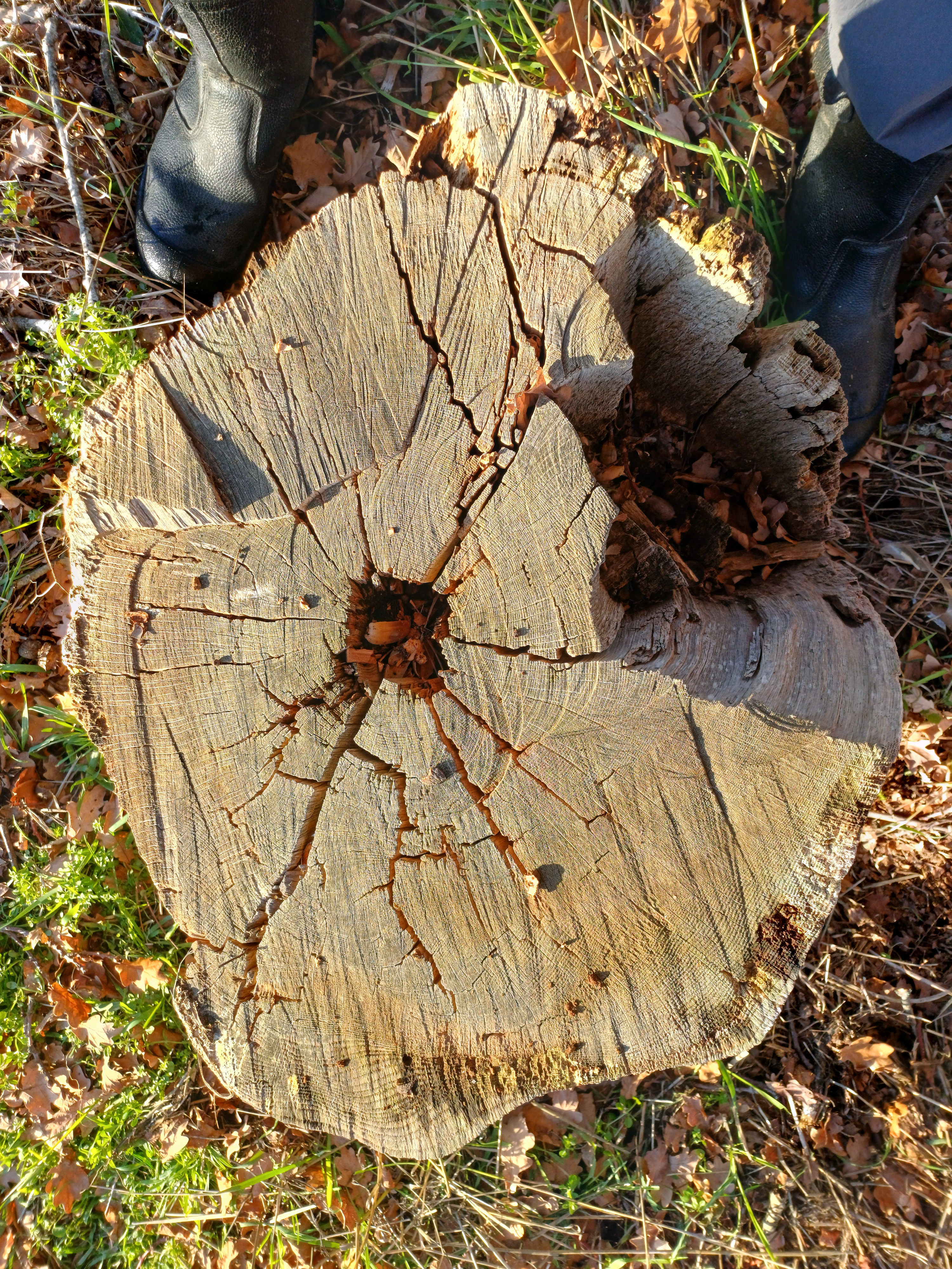
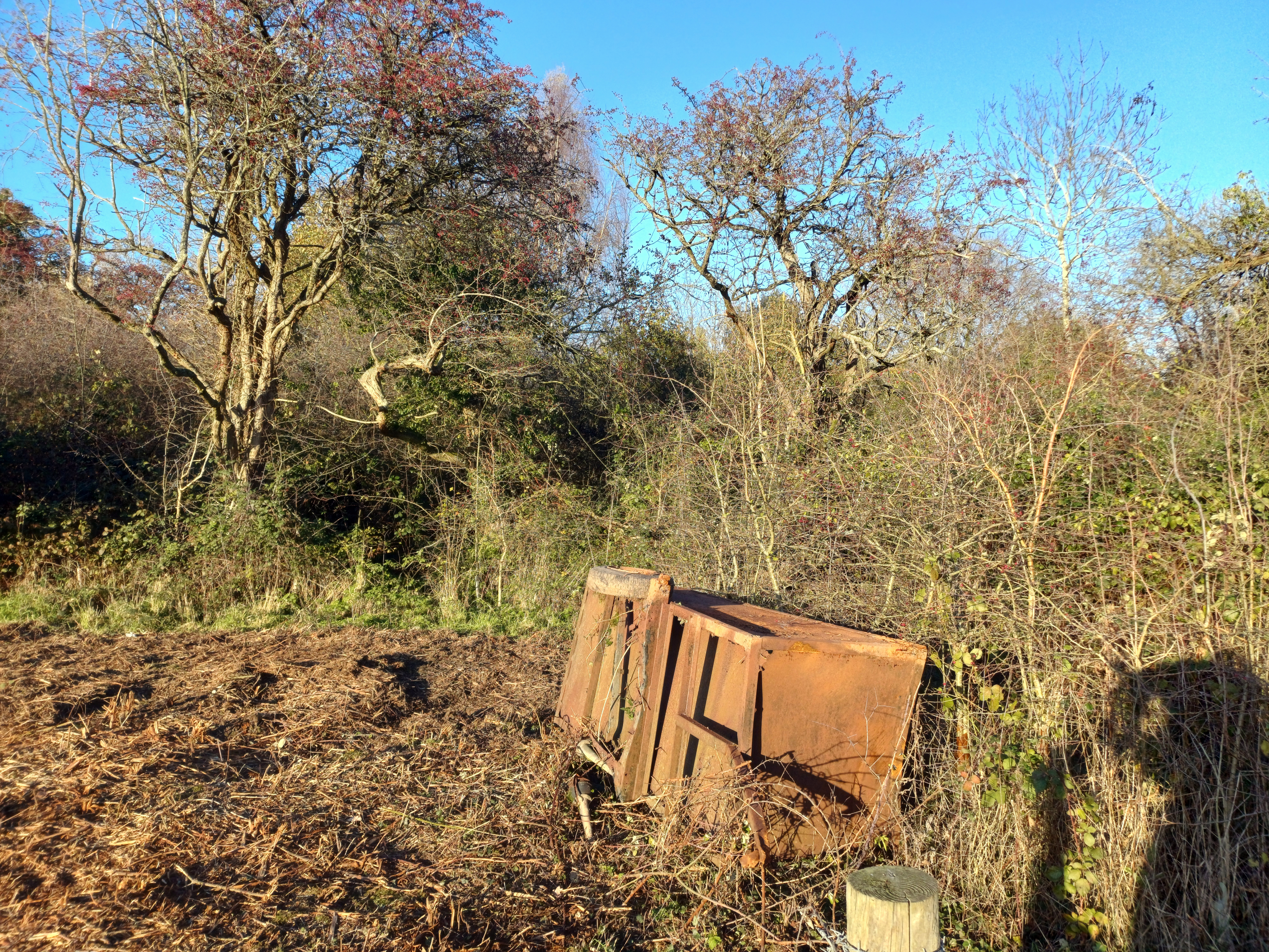
The image began with the immensely pleasurable action of photography in the field on my nature walk of 25th November. Six unique compositions, three of which have already produced artistic output.
Let’s give you wonderful visuals to picture the scene of my nature walk here, shall we:
King James VI & I Oak of 1612 on 25th November 2025.
This tree and nature reserve with all its wildlife has fascinated me as otters to the sculptor.
Cross-section of its fallen branch on 25th November 2025.
Image includes my size 13 UK field boots. Fit for British weather, so they are.
In the meantime, let’s return to the digital artwork of our blog article, “Oak Eyes [3×2 Collage]”..
.. the first input source for my 3×2 Collage is the 1612 Oak in landscape, ancient and gnarled, holding its ground against the weather. Regularly enjoying the oft marshy, water-retaining field I’ve affectionately called King James Meadow (of VI & I fame).
The second input source is the cross-section topology of the manmade cut, fallen branch log, seen above in my photograph. Concentric rings record centuries of growth lines.
This hefty log itself standing exactly where I placed it some years ago, to prop up the wood-and-wire mesh fence; a fence since removed, perhaps for maintenance or to open up the two adjacent fields.
Through digital manipulation, I overlaid the cut timber onto the canopy of the standing tree. The dark central rings duplicated into twin “Eyes” to look out from within the grain. These bring life to the newly formed digital oak work – a human-like quality, a distinguished character.
Colour grading carries the imagination away from literal description. The central canopy shifts into an electric, icy cyan visage while the horizon is ultra-vivid in deep crimson. That reddish horizontal band feels like the passionate heartbeat of the earth. The high blues carry the cold breath of air over ground that seems frost-touched.
It takes the creativity of a painter and the technical precision of digital practice to turn two separate photographs into a multi-layered artistic work.
Visual Reading of “Oak Eyes”
The 3×2 grid transforms a single tree into a coherent, repeating assemblage.
Hollowed Hair: Above the horizon, two forearmed branches reach forward. The ‘Aristolochia gigantea‘s hollowed hair‘ is actually constructed from the upper-right cut infundibulum-like form within the fallen log!
Crimson Orange-Red Eyes: Despite the fiery looking colour of the oak’s eyes, the manner is pleasant and appealing. A warm, inviting nature for a certainty.
Icy Cyan Landscape: The flora and chest area of the trunk provide a sense of coolness — a perfect chromatic foil to the crimson eyes and blazoned horizon.
The Unfathomable Connection
“Oak Eyes” sits within a line of works where I coax an interconnection between the inanimate and human personality.
The work invites the viewer to regard the oak as more warmth than cold — a subtle inversion of colour theory and emotional reading. Eyes also serve as a symbolic oversight: the oak having stood for centuries, holding seasons, weather and human timeframes within its aged circles.
There is a protective quality here too — the sense that the land is watching us through the eyes of the tree, desiring everyone to appreciate its ruddy warmth and attractive gaze.
Assigning human vision brings character. The 1612 Oak is not empty or lifeless; it’s a living organism with a magnanimous, centuries-old storyto tell.
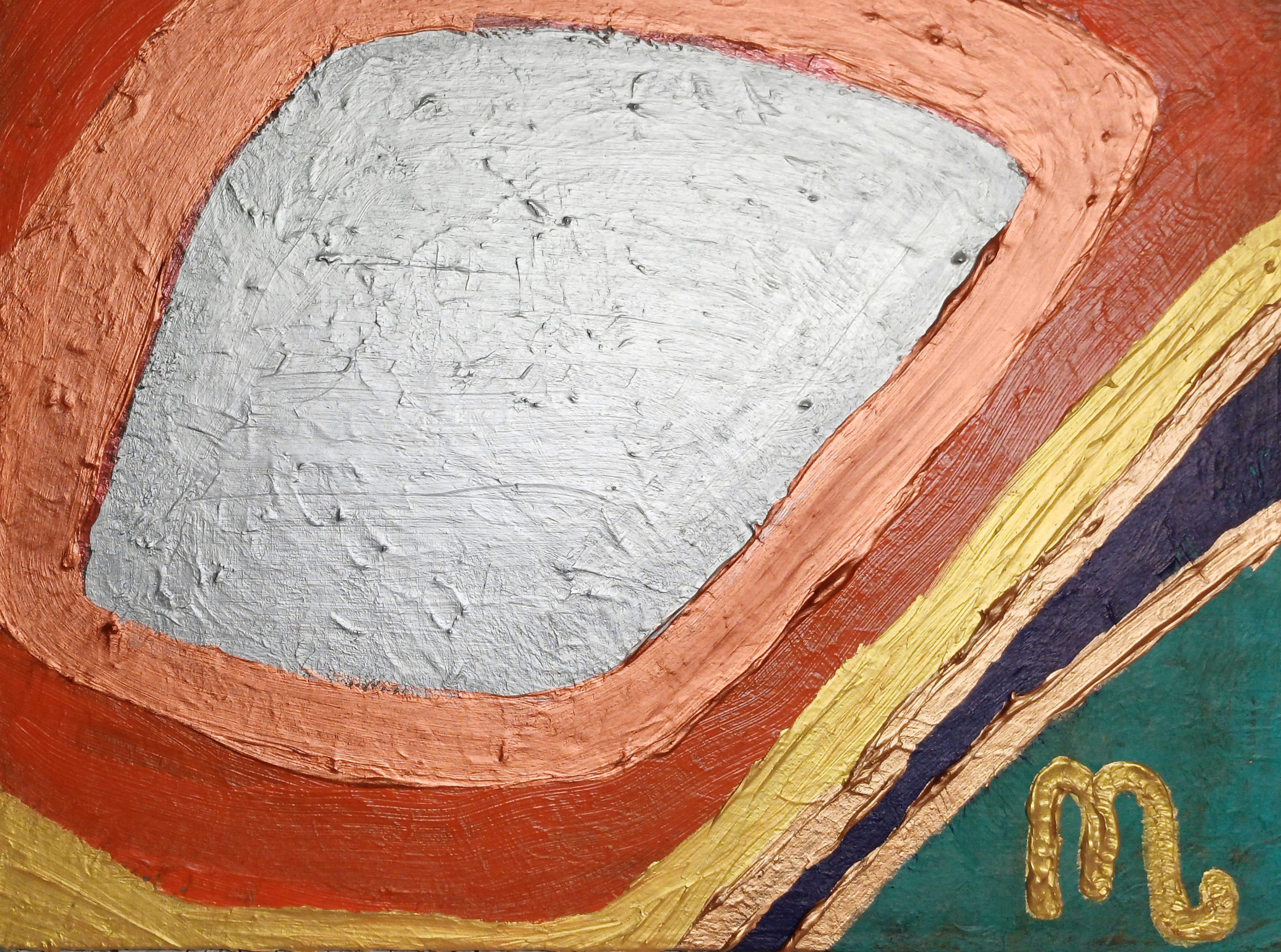
“Equation M Electro Cell” [5th to 8th October 2025] by Matt The Unfathomable Artist, acrylic on A3 (42cm x 30cm) gesso primed 5mm wooden board, 3000 x 2199 pixels
Connecting the Circuits
With Equation M Electro Cell, I wanted to return to the hardware – the physicality of things, rather than how computers operate.
When I look at the finished painting, this feels like a heat-hazed circuit board, a motherboard still holding warmth from the last surge of power. Immediately I recalled my dad’s interest in electronics. I’ve written before about the “type: The Unfathomable… Artist – Electronic Version”. Equation M Electro Cell sits in that lineage of technical references.
My dad worked with soldering irons, resistors and capacitors. I work with pigments, surface and the subconscious. The instruments are different, yet the impulse is recognisable: to make a connection, to get something to come alive, to coax an interconnection between the inanimate and human.
Process
To give the central form its particular presence, the painting needed to be built carefully. I began by painting the surrounding ground in that deep near-black and allowing it to dry completely. The surface became a kind of stable void for the central characterisation to materialise.
Only then, the following day, did I lay in the central block of colour, working the wet paint precisely. This is the intricate part. While the paint was still malleable, I used sandpaper edge to drag, scrape, and meticulously draw through the layers. The method hints at Gerhard Richter’s drag techniques, although here the abrasive surface of the paper takes the place of a squeegee.
The sandpaper pulls the golds, ochres, electric blues and violets sideways across the image. It micro-reduces the physical texture whilst increasing the visual depth, carving out bands and striations that feel close to etched copper tracks on a printed circuit board.
Upon producing the chance ‘double M waveform equation’ at the top right of the colour block, I decided this is the entire piece itself. Further interventions with the sandpaper were measured visually—finite, and inch-by-inch considered in specific colour block areas.
Whenever I note a valuable artistic representation in a piece, I do everything to preserve the uniqueness – purposed or chance.
The Equation
The result is a kind of ‘flat textural’ field. Looking distinct from a classical era painting and more like something printed, pressed or photographic film plate– as if a motion recording in an analogue system had been frozen, glitched and made visible.
I called the work “Equation M Electro Cell” to explain a self-contained apparatus for energy transference. A cell of stored charge, or a fragment of data, suspended in the mainframe. For me, this has the same quiet magic as looking into an old radio and seeing the valves glowing: a mix of warmth and nostalgia with music harmonising softly in the background.
Did I ever tell you about my dad’s valve amp radiograms?
“emi mi” [29th May / 1st June 2025] by Matt The Unfathomable Artist, acrylic on A3 (42cm x 30cm) gesso primed 5mm wooden board, 5000 x 3716 pixels.
The Silent Sentinel
Art reflects a shared conscience and understanding.
In “emi mi” I switch from flowing gesture to firm geometry, using the cool poise of mid-century science fiction as atmosphere rather than subject.
While “The Day the Earth Stood Still” centres on Klaatu—the messenger—my focus is destructive force: Gort, the mute power that enforces the warning. This piece does not depict or reproduce any character or image from that film; the reference is conceptual.
The Abstraction of the Enforcer
An irregular silver monolith commands the field. This is not formal portraiture, rather a distillation: visor, eye, shield. I rarely embrace strict forms, yet to convey a cosmic arbiter the organic yields to rigid structure. The silver plane intrudes with order, dominating the canvas.
Oversight of Human Entropy
Though the style nods to mid-century sci-fi and modern abstraction, the story is present tense. Klaatu arrives to assess; Gort stands ready to act. Here, the silver mass is a celestial oversight of man-made harm. Surrounding bands—oxidised copper, burning gold, bruised violet—signal extraction, scorched habitats, pollution and the dull red of conflict. Hard demarcations: cold corrective logic set against heated disorder.
The Weight of the Ultimatum
Silence is the threat. This presence sees not argument or contention; it measures. Metallic impasto reflects actions. The painting is a study in accountability: by reducing the “enforcer” to a single dominant shape, it asks whether a civilisation can survive its own inventions—or face the consequence of the silent sentinel.
Who or what is the silent sentinel to you?
Is it purpose, chance or cause and effect?
Title Note:
‘emi mi’ fuses EMI (electromagnetic interference) and MI (machine intelligence) with linguistic echo of the self. Succinctly referencing “Mi” iconography as a superscript while the lower-right “M” signature is dually stylised as the human presence to whom the geometric form inclines for direction.

![Golden Whale with a Voice [21st to 27th September 2024] by Matt The Unfathomable Artist, acrylic](https://theunfathomableartist.co.uk/wp-content/uploads/2025/12/golden-whale-with-a-voice-150-jpg-20240927_125619.jpg)
![“Oak Eyes [3x2 Collage]” [28th November 2025] by Matt The Unfathomable Artist, digital artwork](https://theunfathomableartist.co.uk/wp-content/uploads/2025/11/oak-eyes-3x2-300dpi-jpg-28112025.jpg)