‘Butterfly with Seismic Waves’

‘Butterfly with Seismic Waves’ [June 2020] by Matt The Unfathomable Artist, iron gall ink sketch on lined notebook paper [80gsm].

Sketch practice entitled ‘Butterfly with Seismic Waves‘ [June 2020] merely shows my experimentation with a metallic dip nib pen whilst also ensuring a good even flow of the ink in readiness for larger Artist’s-paper seismic works through June of 2020.

Inadvertently the whole butterfly flaps its wings chaos theory has been turned into an unintended conceptual visualization.  On paper at least.  The sound waves intensify the butterfly’s meaning since the seismic ink lines form part of its strongly defined wings.

The butterfly is with us in this artistic message.

Standard

Pop Art Unfathomable

‘Pop Art Unfathomable’ [7th May 2019] by Matt The Unfathomable Artist, digital Pop Art produced for Silkscreen Print Editions. Created through the triple digital blending of ‘If Entirely Fathomable, Wouldn’t Be Unfathomable’ Aquamarine, Red Ochre and Sap Green hand painted versions on Artist’s paper. Original image is 2600 pixels [w] by 2228 pixels [h], 300 DPI.

With silkscreen printing proliferating Pop Art culture I want to create pieces that are my own representation within this art genre.  In fact, wherever any art genre exists, art collectors and fans can be sure I’m looking for new ways to produce works ticking all of those cubist boxes.

Pop Art Unfathomable‘ [7th May 2019] by Matt The Unfathomable Artist is produced using digital images of ‘If Entirely Fathomable, Wouldn’t Be Unfathomable‘, itself originally created in three separate versions – Aquamarine, Red Ochre and Sap Green pigment paint brushed onto Artist’s paper.

The former received the pop art treatment through triple photographic blending, please see above.  Using desktop computer software each image was positionally overlaid with varying degrees of transparency.

Effectively multiplying the words, providing a 3D-like quality and playfully obsfucating the saying in harmony with the original message concept.

How can something unfathomable be made fathomable if there is over-complication?

You will appreciate, as with my work generally, this series of artworks has a profusion of intellectual reasonings.  Combined cognitive abilities in art produces works explaining our world-view absorption and outpouring of communication.

At the heart of this saying is an emphasis on creating solutions to problems we feel are unassailable.

Standard

type: The Unfathomable… Artist – Electronic Version

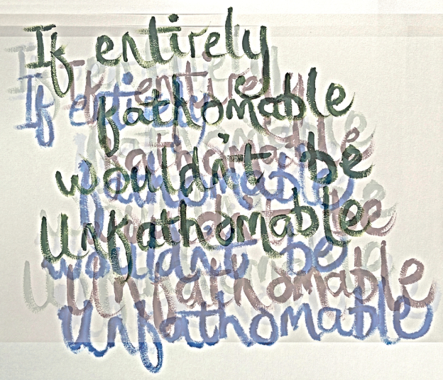
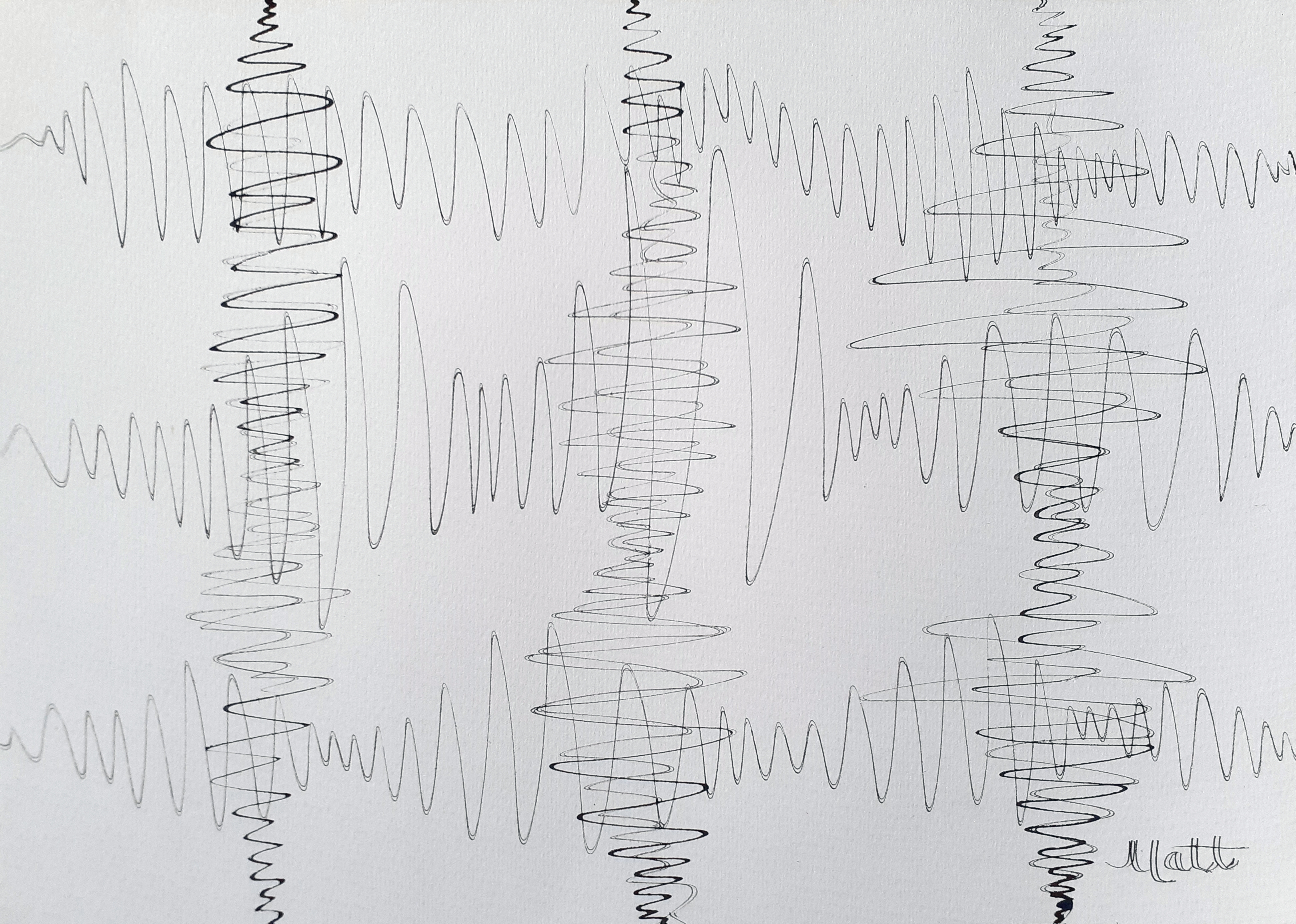
‘type: The Unfathomable… Artist – Electronic Version’ [18th August 2020] – by Matt The Unfathomable Artist, dip nib pen using original iron gall ink recipe on A3 [180 gsm] Artist’s paper.

type: The Unfathomable… Artist – Electronic Version‘ is Basquiat inspired.

I would like to quote my own personal commentary regarding this new iron gall ink piece:

“Intellectually i’m really happy with this artwork. Only after did i think, ‘that’s why i put the jagged lines in‘ This is my first Basquiat style piece and i can honestly write i had no prior notions to make it a Basquiat in style until it happened 🎨❤” [bold italics added for emphasis].

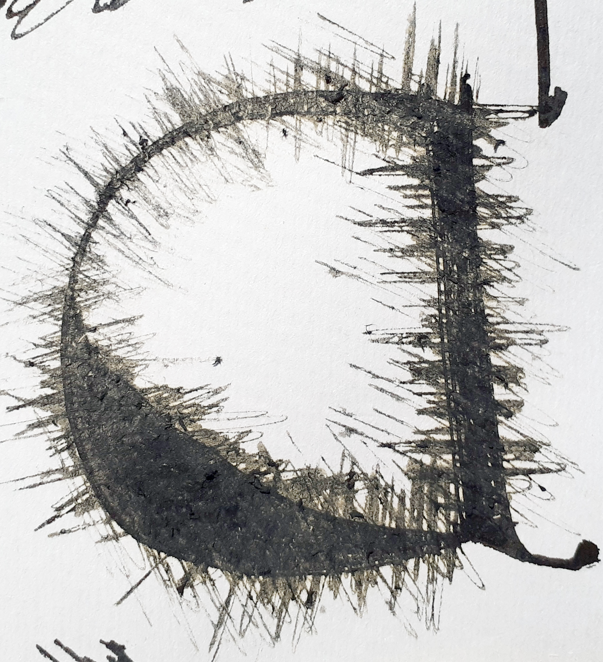
The jagged lines top and bottom were added on the 14th August 2020 after I’d finished the central/vertical calligraphy.  Initially without the ‘black block ink and multiple lines’ you can see in the artwork photograph above – completed through impromptu ink work.

I literally didn’t know how to proceed with this artwork from thereon.  Actually thinking I might leave it as it was, adrift of any further inspiration or ideas.

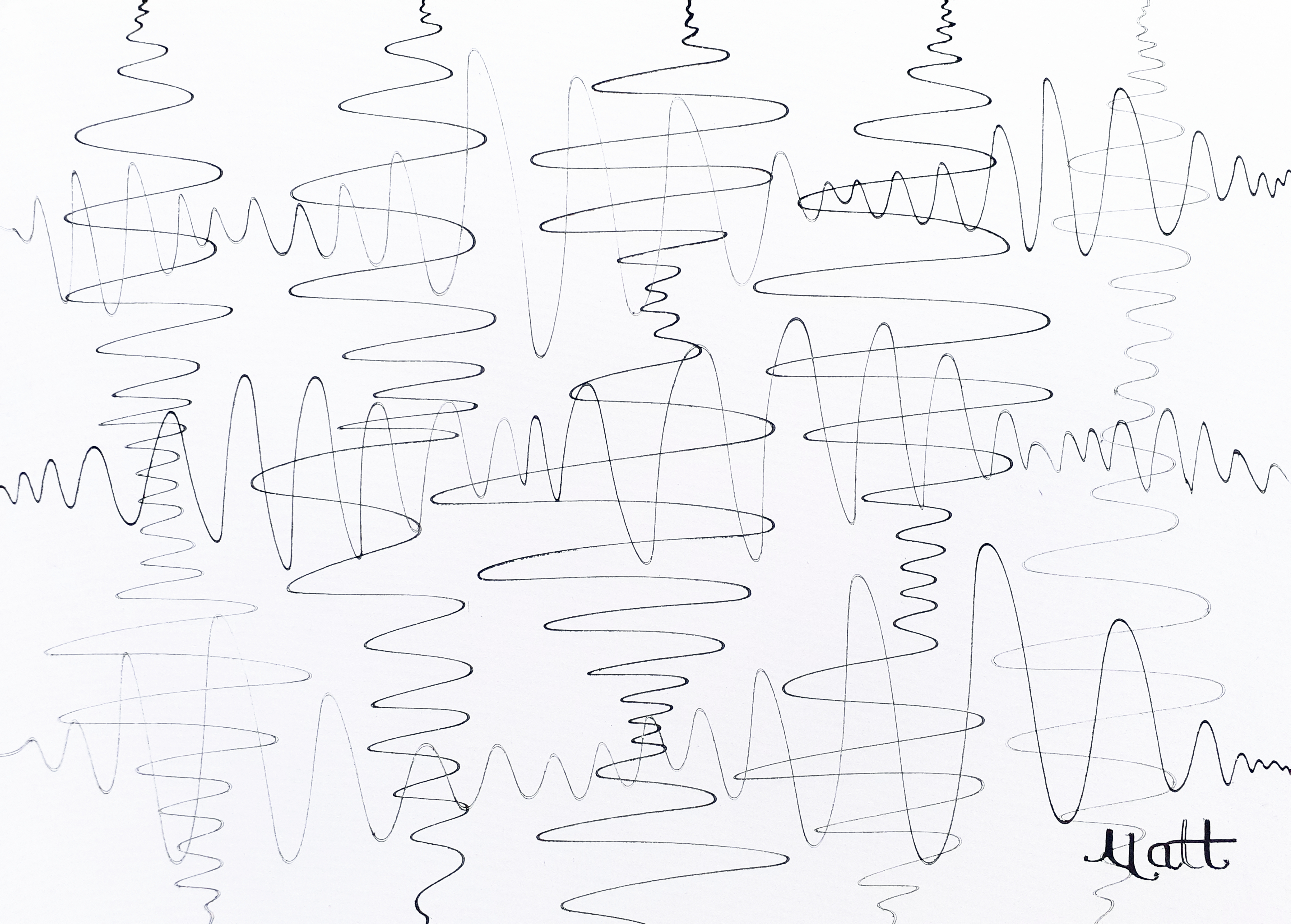
After drying the piece for a few days I began spontaneously researching electronic circuit board diagrams with avid interest.  I’m familiar, decades past, with circuit diagrams through my Dad’s former occupation as a photocopier engineer and his [second generation] electronics expertise.

Electronic magazines featuring television and Hi-Fi circuitry, repair and assembly scattered all over the house.  Diagrams with capacitors, LED’s, transistors, LCD’s, transformers etc.  Viewing circuit diagrams is always a memorable and pleasant experience to me.  I laughed when I saw a multimeter photograph yesterday.  My Dad carried one of those around with him quite often.

For me, this artwork is a connection to the ancient and modern past, encapsulated with new hope for the future.

I’d like to share with you the electronic circuit diagram symbols used in my artwork including their relative placements:

fuse [rectangular box with zigzag lines – begins diagonally underneath the word ‘type’];

Anode/Cathode Solar cell Photodiode [line into circle with inner triangle-vertical-line and two ascending diagonally right-to-left down-pointing arrows – underneath the grammatical colon and letter ‘T’];

battery multi-cell [horizontal line with vertical line, vertical single dash line, vertical single dash line longer, vertical line with horizontal line – underneath the space between the words ‘The’ and ‘Unfathomable’];

dome light [horizontally represented domed light bulb with heart light element – underneath letters ‘n, f, a, t, h’];

tri-phase protective and neutral conductor [single line with ‘triple diagonal line’ ‘diagonal line with T line’ and ‘diagonal line with black dotted circle’ intersections – underneath letters ‘m, a, b, l, e . .];

solder bridge [two adjacent lines above-below with two split circles representing the solders – underneath the word ‘type’];

balanced terminals [two adjacent lines with two open circles – underneath and between the words ‘type’ and ‘The’];

electromagnetic shielding [large rectangle, shaped by line dashes – surrounding the word Artist];

constant current source or general transformer or obscured oscillator [line with filled black circle] and also [line with black circle with imperfect unfilled circle overlapping directly below – underneath letters ‘l, e’ ] – please note this latter symbol also has an unknown electronic meaning.

Reasoning is viewer-dependent, wherever conceptual plurality applies to positive and negative space.

Standard

Seismic Sound Wave Masterpieces

‘Twenty One Particular Seismic Waves’ [12th August 2020] by Matt The Unfathomable Artist, dip nib pen using original iron gall ink recipe on A3 [180 gsm] Artist’s paper.

Without your physically seeing these artworks it’s not easy for me to explain the quality I feel I’ve produced through my iron gall ink pieces.  I’m immensely delighted whenever I view these works myself.

Dip nib pen calligraphy with its magnificent arty fine lines is providing me with pUrE ArT HaPpINeSs.

Twenty One Particular Seismic Waves‘ [12th August 2020] is inspired by Andy Warhol’s iconic screenprinting Pop Art brand works.

Twenty one individual vertical seismic waves each with their own flavour of uniqueness, see above.

‘Five Vertical Three Horizontal Sound Waves #1’ [12th August 2020] by Matt The Unfathomable Artist, dip nib pen using original iron gall ink recipe on A3 [180 gsm] Artist’s paper.

A spirally kind of perfection in ‘Five Vertical Three Horizontal Sound Waves #1’ shown above.  The fifth vertical [from the left] is actually the first, as I worked the paper from right to left.  The lowest placed soundwave is first of the horizontal waves.  Varying pressure regularly upon the paper to create focal points of interest.

Speed of nib pen movement is fairly consistent throughout all eight of these soundwaves.

For this piece I made the lines especially wavy to replicate a green monochrome electronic oscillator display I’d seen my Dad working with decades ago.  He kept this overtly under the stairs for sometime.  I remember thinking many times it was such a cool piece of equipment.

I switched the confounded thing on every now and again purely for the joy of its perplexing display.  There are famous movies, books and television series having fed my incredible boyhood imagination regarding the potential pretend-play of this oscillator.

‘Triple Seismic Waves #5’ [May 2020] by Matt The Unfathomable Artist, dip nib pen using original iron gall ink recipe on A3 [180 gsm] Artist’s paper.

I produced ‘Triple Seismic Waves #5‘ a few months ago in May 2020.  Due to storing this to dry, I didn’t sign it at the time, whilst working on other pieces.  Going through my archive of artworks, upon its rediscovery I promptly signed it for its beauty this day of the 12th August 2020.

I love the noticeably rhythmic changes in seismic wavelengths across this piece.  In reproductive simile of seismographic lines I generally work the ink quite rapidly.  There is a pleasure all of its own for every artist working specific movements.

Standard

Detail part two of my study ‘a4 LY’ equation artwork

‘a4 LY’ equation detail nine.

The thinking behind your first glance visuals with my ‘a4 LY’ equation artwork is to challenge your personal perception of beauty.

‘a4 LY’ is not likely immediately ‘beautiful’ to all viewers.  We could ask the question, ‘Does this really matter with art?’.

The answer, I suppose, depends entirely upon the subject material.

Most people want to see ‘beautiful art’ as this is what we’re naturally attracted to with visuals.  My intention with these two part blog series of visuals is to analyse the ‘beauty’ from within my artwork to find interesting and attractive features.

[For ‘Detail part one’ please click here]

‘a4 LY’ detail seven.

Squiggles above ^^ in detail seven.

‘a4 LY’ detail eight.

With ‘a4 LY’ detail eight, shown immediately above, I found myself enthralled by the majuscule lettering (capitals) found in ancient books.  Majuscule lettering could include the first letter of a new page chapter becoming illuminated with grand artistry.

For this very reason the ‘a4 LY’ detail eight photograph along with the LY within my complete artwork are my own happy scientific replications of the artistic majuscule theme.

‘a4 LY’ detail 5_a close-up.

‘The tree, branches, leaves, bark, wood grain, molecules and atoms’ of Art.

Signed, Matt.

Standard

‘If Entirely Fathomable, Wouldn’t Be Unfathomable’ the a4 LY version

‘If Entirely Fathomable, Wouldn’t Be Unfathomable’ [5th August 2020] by Matt The Unfathomable Artist, dip nib pen using original iron gall ink recipe on A3 [180 gsm] Artist’s paper.

This version of ‘If Entirely Fathomable, Wouldn’t Be Unfathomable‘ has been made using an original iron gall ink recipe dating to c1540 A.D.

The metallic nib of the wooden handled pen required repeated dipping into the bluish-black fluidic iron gall ink to produce legible lines onto the paper.

I have formulated a ‘typeface’ of alphabetical characters within this artwork.  The letters a, E, h, I, m, n, u and w are the most distinctive in style.

Viewing this artwork you will clearly see my equation as follows:

The ‘a4 LYequation [6th August 2020] by Matt The Unfathomable Artist, digital version.

I think this is magnanimously intriguing, do not you?

Study #1 ‘a4 LY’ equation [6th August 2020] by Matt The Unfathomable Artist, dip nib pen using iron gall ink on A3 Artist’s paper.

With this first study of my ‘a4 LY’ equation I’ve incorporated ferrous waves into modern alphabetical lettering with 16th century numerals.

I love my new equation, it’s supercool.

Standard

“I Want To Change The World, Different Same” the higledi-pigledie version

“I Want To Change The World, Different Same” the ‘higledi-pigledie version’ [30th July 2020] – a saying by Matt The Unfathomable Artist, dip nib pen using original iron gall ink on A3 [180 gsm] Artist’s paper.

I want to change the world by making it different and I want to change the world by keeping it the same.” derived from my original saying published on this blog 24th February 2015.  Wrote in an electronic message to my dear Nan some time earlier.

The original blog articles containing my quote-saying in various constructive versions are available to read here:

Twombly and Distant Voices and A Dodecahedron.

Standard

Triple Seismic Waves with Oscillation #1

‘Triple Seismic Waves with Oscillation #1’ [July 2020] by Matt The Unfathomable Artist, dip nib ink pen on A3 180gsm paper.

Spontaneously sharing my latest dip nib ink pen artwork using iron gall ink entitled ‘Triple Seismic Waves with Oscillation #1’.

Electronic oscillation produces pleasing visual effects.  This artwork seeks to replicate the idea in drawing form using my free hand technique for the curved lines.  I love scientific art.  Curves, electronics, seismographs, oscillators, earthquakes, sound waves, along with the beauty of artistic courses.

For this artwork I use a nib that creates a double ink line due to the noticeably distant ‘tines’ of the metallic nib.  The flow of ink is important with dip nibs where one is wishing to produce a continuous line across a ‘decent measure of time’ once upon the paper.

The effect of oscillation can been seen vertically in this artwork.

Standard

World Safari 1987 Illustrations

‘Tiger Portrait 1987’ [30th June 1987] by Matt The Unfathomable Artist aged 13, carbon pencil on A4 paper, 5.0cm [w] x 5.4cm [h].

The illustration above by myself was made in 1987 for my ‘World Safari‘ school project.  This particular drawing featured lower right with a poem by Leslie Norris entitled ‘Tiger’ carefully handwritten onto the A4 page by myself.

Likely I chose this poem to represent the fearsome reputation of wild tigers, perhaps in semblance of my Dad’s favourite poem ‘The Tyger’ by William Blake.

‘The Cougar 1987’ [June 1987] by Matt The Unfathomable Artist aged 13, carbon pencil on A4 paper in landscape. Full signature is shown on my paper illustration.

I think the cougar shown above is standing quite proudly.

‘Wild Cat 1987’ [June 1987] by Matt The Unfathomable Artist aged 13, carbon pencil on A4 paper in landscape.  Full signature is shown on my paper illustration.

I love the defensive feisty nature of this wild cat shown above.  If you look at my online blog signature here…:

Art Blog Infinitum Signature [c2014].

… you should see I’ve fashioned this from my original first signature script style dating back to the mid-to-late 1980’s.  My Grandad George gave me the idea for how to write my signature.  From there I practiced continuously, writing my signature over and over again.

The truth is I only stopped using this scrolly signature in my late teens to early 20’s in exchange for the speed of signing my name.

Please note I’ve added two new work in progress photographs of my ‘type‘ pop artwork series of paintings.  You can view them towards the end of the article, link here: As Yet Unfinished Pop Artwork Studies in Progress.

You will appreciate I’ve much to complete on these two pop art paintings.

Standard

As Yet Unfinished Pop Artwork Studies in Progress

‘type: The Unfathomable Times New Roman’ (work in progress, circa 21st May – 26th June 2020)

For my dearest Readers I thought I would share two artworks in the early stages of progress.  Please appreciate the freehand pencil work is purposely faint, awaiting the oil painted letters.

Photograph above is ‘type: The Unfathomable’ in ITC Kristen font.  The sketched text shown is with HB carbon pencil.  Background oil colours are Aquamarine, Cerulean Blue and Titanium White with a refined linseed oil, mixed together, then applied onto the canvases using one palette knife.  The palette knife was kept low to the canvases in a consistent swishing motion for uniformity.

Work in progress photograph immediately below is ‘type: The Unfathomable Artist’ penciled in Times New Roman font with the word Artist placed vertically.  It should be noted I intend to produce two further pop art oil paintings on Winsor & Newton 36 inch by 28 inch canvases with the ‘type: The Unfathomable Artist’ text displayed completely horizontally on one line.

‘type: The Unfathomable ITC Kristen’ (work in progress, circa 21st May – 26th June 2020)

The text sizing limited my use of fully horizontal typeface for the 25 lettered characters across 20 inches.

‘type: The Unfathomable’ appears on the ITC Kristen font canvas purely for visual impact.  Artist is vertically aligned in the Times New Roman canvas for design experimentation.  Whilst viewing Times New Roman I suddenly thought it would be super to surround the word Artist in a neon-like light glow 🙂

(you can view an impressive iron gall ink version of this work by clicking the link)

I consider these two first edition pieces as study works for my future canvases.

The Times New Roman canvas received a secondary palette knife overworking to sophisticate the blue textural background qualities.  My ITC Kristen blue canvas is raw in palette knife construction to suit the simplicity of the font itself.  Some palette knife lines are partially visible in both canvases.

Concept is to distinguish the two artworks one from the other in the design process.  The pencil work will be overlaid in alternated Yellow and Green oil paints beginning at the word ‘The’ with Titanium White grammatical colon [ : ]details.

The word ‘type’ will be completed in Lamp Black using the Times New Roman font you see here in both canvases.  Times New Roman in Black is used in the original digital Pop artworks I produced (see footnote of this article for the link).

Photograph below shows my ITC Kristen version of the two, first edition, canvases drying.  The Times New Roman blue canvas lay left of ITC Kristen on a workbench also drying in readiness for pencil and oil paintwork.

type: The Unfathomable ITC Kristen’ (work in progress, circa 21st May – 26th June 2020)

Pop arty facts for these pieces: the blue latex gloves were useful in mixing the blue hue I desired for the backgrounds.  I erased some pencil work from time to time using a pencil rubber directly onto the dried blue canvases.  Times New Roman has interesting brushwork at the canvas edge.

I shall certainly experiment with canvas edge brushwork detailing in greater depth with appropriate oil works in the future.

The two oil paintings in progress on this page are based upon my digital Pop Artworks originally pictured in my blog article type: The Unfathomable Artist [click to read].

I’ve decided to include further works in progress for these two pop artworks here on this page.  Two latest art sessions detailing Lamp Black paint work on ‘type’ along with additional palette work for the background of the Times New Roman canvas shown immediately below:

‘type: The Unfathomable Times New Roman’ (work in progress, circa 21st May – 26th June 2020)

Times New Roman font canvas, with Lamp Black added to ‘type’ immediately above.

‘type: The Unfathomable ITC Kristen’ (work in progress, circa 21st May – 26th June 2020)

ITC Kristen font canvas, with Lamp Black added to ‘type’ immediately above.

Standard