“Copper Sunshine Face – RED” [3rd/4th & 9th November 2024] by Matt The Unfathomable Artist, acrylic painting on 100% pure cotton triple-gesso primed canvas board, 10 in x 12 in (25.4cm x 30.5cm), produced into Digital Artwork with a red border, 3000 x 3000 pixels.
From my social media in bold and italics:
[ I made the original acrylic painting freestyle over two days. Tube piping the paint in heavy impasto. The style is a continuance of my exploring the very essence of Picasso.
The artwork questions racism with the use of colour, occupation, history and emotion to challenge prejudice and hatred.
I produced eight digital versions in addition to the acrylic artwork which features in the centre. Originally the real neck ties were secured top and bottom to flatten the canvas board temporarily whilst the heavy paint work is still drying.
To my delight I immediately realised I had inadvertently made installation art from my painting with powerful meaning!
Six digital versions are background colours GREEN, MAGENTA, RED (shown here), ORANGE, UMBER and CYAN. A 3×2 Collage (the eighth version) is produced in the colour order listed here. The seventh MONOCHROME version is included in this blog article.
The title is purely a reference to the copper paint piped to make some of the facial features. The outer area of the face refers to rays of the sun. The artwork canvas began as a beautifully sophisticated abstract in yellow and green.
After evaluation I decided to freestyle the portrait you see here. ]
For reference into a physical mounting of the piece the RED is #fe0000 / rgba 254,0,0,255.
Next we have the beautiful six grid Collage:
“Copper Sunshine Face – 3×2 Collage” [Digital Artwork, 9th November 2024] by Matt The Unfathomable Artist, 9000 x 6000 pixels.
As an Andy Warhol fan my 3×2 Collage provides the opportunity to enjoy colour to its fullest.
“Copper Sunshine Face” is a cultural look at historical society particularly from America, where music converged through classical, jazz, blues, soul, country, rockabilly, rock n’roll, pop, disco, hip-hop, rap and electronic music.
– “Matt, what is your inspiration behind Copper Sunshine Face?”
‘Purity of human being where racial origin has no division. This is why I chose to paint the face yellow, to signify the Sun. The headdress style is 1950’s America following my love of listening to The Collins Kids especially “Shortnin’ Bread Rock” . As described already, the choice of adding ties to the piece is unintended subconcious chance.’
– “The ties are now integral to the piece then?”
‘I like the idea the funeral tie is part of Copper Sunshine Face since this has personal meaning. However I’d like the buyer to add their own personal item as the uppermost headdress for the duration of ownership. Continuing in this manner for any future resale of the piece in keeping with its original purpose.‘
– “Sounds cool! Why then did you make MONOCHROME if the face is yellow for the Sun?”
‘To me the pieces are founded upon singing in the harvest fields. I felt the subject material needed to appreciate history, hardship and equality for all.‘
Links courtesy of Wikipedia and Heppest of the Hep YouTube channel. Music publishing owned by any existing label copyrights.
Here is MONOCHROME:
“Copper Sunshine Face – MONOCHROME” [Digital Artwork, 9th November 2024] by Matt The Unfathomable Artist, 3000 x 3000 pixels.
“Copper Sunshine Face – MONOCHROME” reminds me of old black and white movies.
Whilst making the original acrylic painting I thought I’d picked out burnt umber, having bought same in both gouache and acrylic earlier. Halfway through I realised as the wet metallic paint gleamed I’d chosen copper instead. The tones do look similar on the tube packaging. This is the reason I included a BURNT UMBER version in the 3×2 Collage.
The textural detailing of the yellow face is made by softly wiping kitchen tissue paper on “Copper Sunshine Face”.
I wish the artworks to represent progress and oneness for the human race.
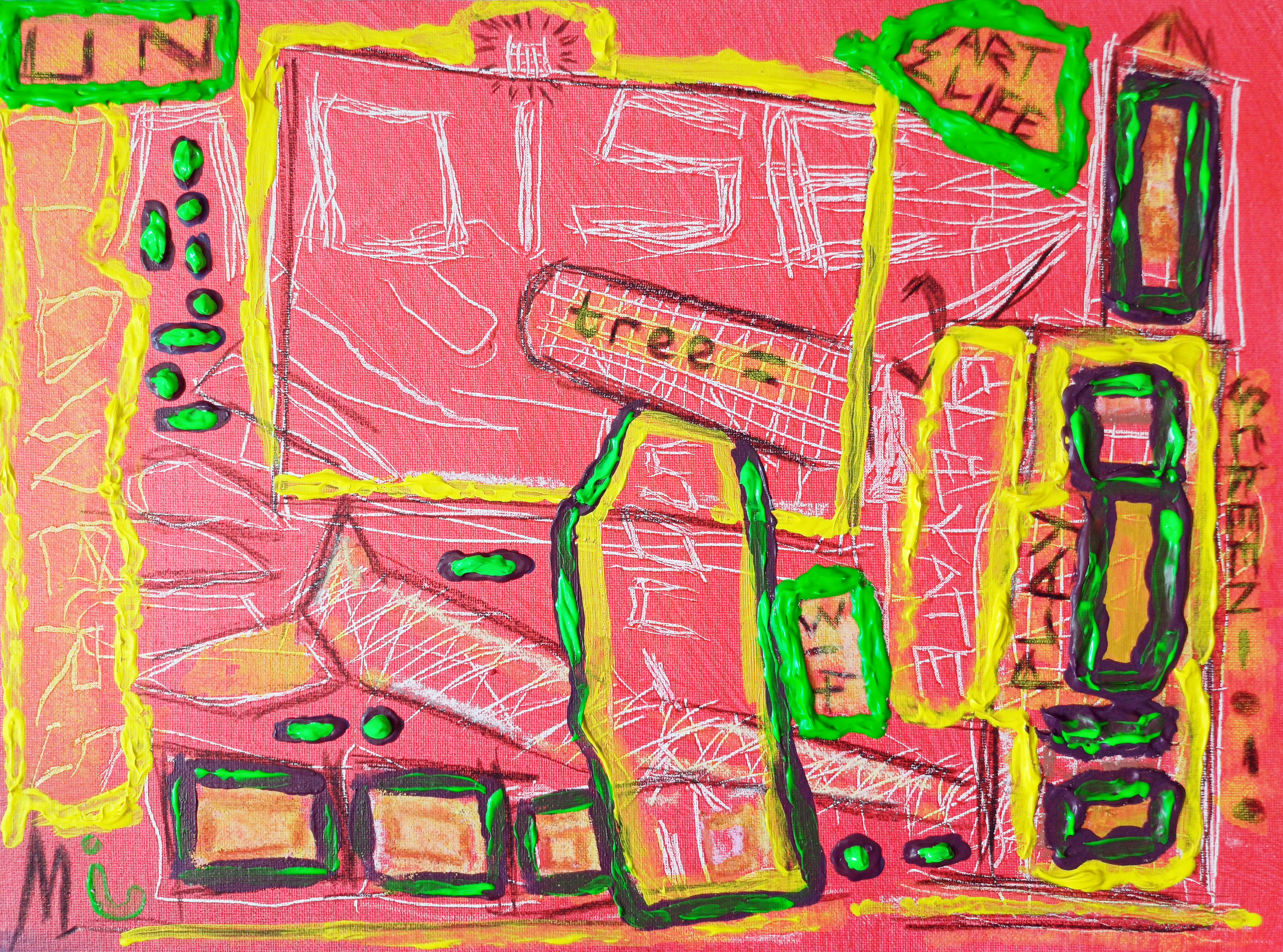
“UN noise dash dot” [6th to 9th September 2024] by Matt The Unfathomable Artist, charcoal, pastels & acrylic paint on premium 115gsm medium textured cotton primed to 240gsm over 12in x 16in (30cm x 40cm) wood-fibre board (4mm), 6936 x 5160 pixels.
Matt The Unfathomable Artist fans please be ready for draft by draft overload.
Having wrote detailed information I thought ‘Fans do need to see these drafts to appreciate how UN noise dash dot progressed’.
“UN noise dash dot” is made in approximately four drafts as follows.
6th September prior to 2111hrs:
First draft: beautiful red canvas coverage and canvas scratches (palette knife) including scratched words. I cannot explain how invigorating this first draft was.
Photograph immediately below.
“UN noise dash dot – first draft”
It’s cool fans get to see early drafts, my artmaking process and developing ideas.
Late 6th into early hours of 7th September prior to 0011hrs:
Second draft:
charcoal lines added
charcoaled SCREEN_. [to read, ‘dash dot’] PLAY, 314, ART LIFE, tree, UN, stylised sigma symbol [ Σ ] left of ART LIFE, M and box shapes
‘claw’ added to the top of a rectangular robot-like or building shape
soft pastels around some boxes for definition
The ‘claw’ could possibly be subconsciously inspired by “The Giant Claw” [movie, 1957] and/or Robby the Robot from “Forbidden Planet” [movie, 1956]. The latter is one of my all-time favourite films. I did enjoy “The Giant Claw” recently, due to the acting performances by the cast.
un in capitals means ‘the opposite of’ or ‘contrary to’ although I’m happy with any reasonable interpretation for this lettering.
I did also think of the un in unfathomable whilst writing this and also the United Nations. I didn’t and haven’t defined an exact meaning for ‘un’. I enjoy viewers deciding for themselves, personally.
Photograph immediately below.
“UN noise dash dot – second draft”
7th September prior to 1445hrs:
Third draft:
yellow paint added around boxes,
yellow highlights around some words,
pseudo-purple paint (first batch) around boxes,
green paint around 314, ART LIFE, UN,
letter [ i ] symbolically added in green to the right of the letter M.
You can see the wet purple and yellow on the UN noise dash dot canvas (image immediately below) that featured in ‘Sandpapered Green..”:
“UN noise dash dot – third draft”
8th September 2024 – artwork drying, photographed once for artistic evaluation:
no drafts, I photographed “UN noise dash dot” now dry from the day before and the still drying heavy impasto canvas of “Cosmic Mouth” – the ‘astronomy‘ art work (not the female mouth canvas working as this was extensively done on the 1st & 2nd September 2024, subsequently overpainted).
9th September early afternoon prior to 1334hrs:
Fourth draft:
green highlights around boxes and dash dot symbols added in green to balance the canvas visuals.
heavier overpaint to the existing UN green box for definition.
second batch of mixed red/blue-to-pseudo-purple paint added around smaller boxes and underneath the overpainted green dash dots below ‘UN‘. I called this latter area ‘the seated dash dots‘ as some days afterwards this is how I myself interpreted this. Please do see “Mapped Random Satellite {Day} #1” as I believe this is my subconscious finding its way into UN noise dash dot. Interestingly the seated shape of these dash dots is pure chance to fill negative canvas space!
see [*2] further below for details of the second batch of pseudo-purple paint I mixed on Notepad paper to randomly become “Upper – Original” with “Unfathomable Apocalypse Rider in Six-Grid Collage”.
“UN noise dash dot – WET PAINT” [6th to 9th September 2024] by Matt The Unfathomable Artist, acrylic paint on premium 115gsm medium textured cotton primed to 240gsm over 12in x 16in (30cm x 40cm) wood-fibre board (4mm), 6624 x 4914 pixels.
In terms of subject matter I feel “UN noise dash dot” is my usual pop art complexity. Not in any order of importance or competing artistic thought:
movies, classical films (produced by studios like RKO Pictures)
spurious Morse Code without any meaning in ‘dash dot’
my digital artworks with bright neon-like highlights as a purely visual reference to the neon-like acrylic highlights within “UN noise dash dot” please see:
Here is further information whilst making “UN noise dash dot” with regards to the two pseudo-purple paint batches I mixed on the 7th and 9th September respectively:
[*1] 7th September prior to 1445hrs:
Whilst mixing the first batch of red/blue paint for the purple I made a (then unknown to me) random artwork on sandpaper that would become “Sandpapered Green with Dark Purple & Yellow”.
I folded one P400 sandpaper piece in the middle from the leftover purple paint to make two paint prints on the same P400 paper piece. I then pressed one of these to a third sandpaper rectangle (folded P400 piece), now making three individual rectangular acrylic ‘prints’ across two pieces of P400 sandpaper.
[*2} 9th September early afternoon prior to 1334hrs.
Whilst mixing a second batch of red/blue paint for the purple I made a (then unknown to me) random artwork on lined Notepad paper. This would become first two acrylic pieces then their digital artwork derivations through “Upper – Original” and “Unfathomable Apocalypse Rider – Original” (both physical pieces and the digital derivations are included in the same blog article and link).
Just a quick thought on ‘then unknown to me‘. To me as an artist, mixed or mixing paint is made purely for the purpose of the canvas I’m working on, nothing more. When working on oils I have art-deco teacup saucers I use to mix the paint. These are cleaned after each oil painting session.
Making art from mixed acrylic paint leftovers is therefore quite new to me. Every now and then I like the look of the random paint I’ve mixed, please see “Pure Chance Portrait #2 in Portrait” for instance. Interestingly, I have some iron gall ink practice works I turned into art pieces some years ago. I’ve not published or formally documented any of those as yet.
“UN noise dash dot” is unusual in that I had two batches of mixed acrylic paint workings I liked and decided to do something with.
“Unfathomable Apocalypse Rider in Six-Grid Collage” [digital artwork, 9th/10th September 2024] by Matt The Unfathomable Artist, random acrylic red/blue to purple mixed paint on lined notepad into six-grid collage, 6480 x 5853 pixels.
From social media in bold and italics:
Quotation:
“.. I’m very eager for art writers to see a digital artwork I have just made. Having randomly mixed red and blue to make purple for a Pop Art piece [UN noise dash dot] on lined notepad paper yesterday.
It’s quite honestly a most unfathomable coincidence, beyond the planned construction of the six-grid collage itself from the photographed paper in my hand just now this afternoon.
After mixing purple and using the paint on the aforementioned Pop Art piece (yesterday) I viewed the sheet of paper, kind of liking the shapes I had pressed together, yet thinking none more to it..
.. saying to myself, ‘I shall try to make something of it. I would like to show people art can be made from seemingly nothing’. Yesterday I viewed photographic images of the [Indian] Gaur online.
I did this both some day before and after the purple mixing yesterday. Immediately after making the six-grid digital piece I realised inspired thought is somehow finding its way into my work.
The thing is I simply motioned my brush to mix paint, nothing more! When I pressed the wet leftover purple paint paper together at the middle, all I did was touch my finger at one non-painted side a number of times to cause a difference in the paint separation. Without any defined idea or concept.
I really cannot wait for art writers to see this work in its entirety, as I haven’t even photographed the upper-half of the pressed paper to-date. It’s absolutely ridiculous! I’m going to do so this afternoon or later.
It is a most random inspired work in my opinion.” – written by Matt The Unfathomable Artist, 1506hrs on 10th September 2024.
Here is the digital artwork image for the “Unfathomable Apocalypse Rider”:
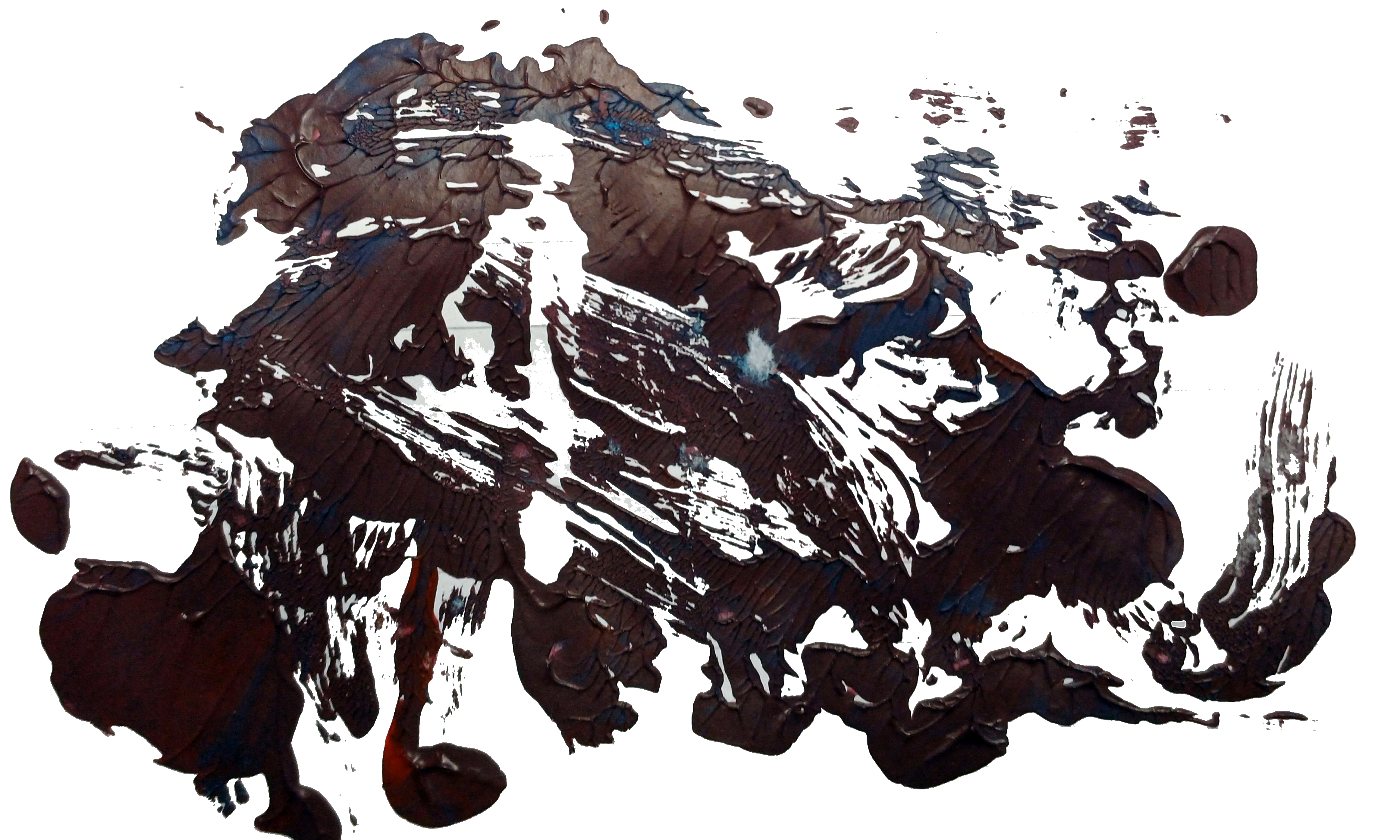
“Unfathomable Apocalypse Rider – Digital” [digital artwork, 9th/10th September 2024] by Matt The Unfathomable Artist, random acrylic red/blue to purple mixed paint on lined notepad, 4646 x 2788 pixels.
Pictured immediately below is the actual physical random paintbrush pressing on the notepad:
“Unfathomable Apocalypse Rider – Original” [original image held in my hand photographed 10th September 1310hrs, pressing 9th September 2024] by Matt The Unfathomable Artist, random acrylic red/blue to purple mixed paint impressioned-pressed onto lined notepad, 4646 x 2788 pixels.
Imagine the plain paper of the as yet “Unfathomable Apocalypse Rider” folded on top being pressed into the (Upper or bison) random acrylic mixed paint half of the notepad paper.
This is how the Upper bison half of the brushwork pressed together on the 9th September 2024 came to look as you see here:
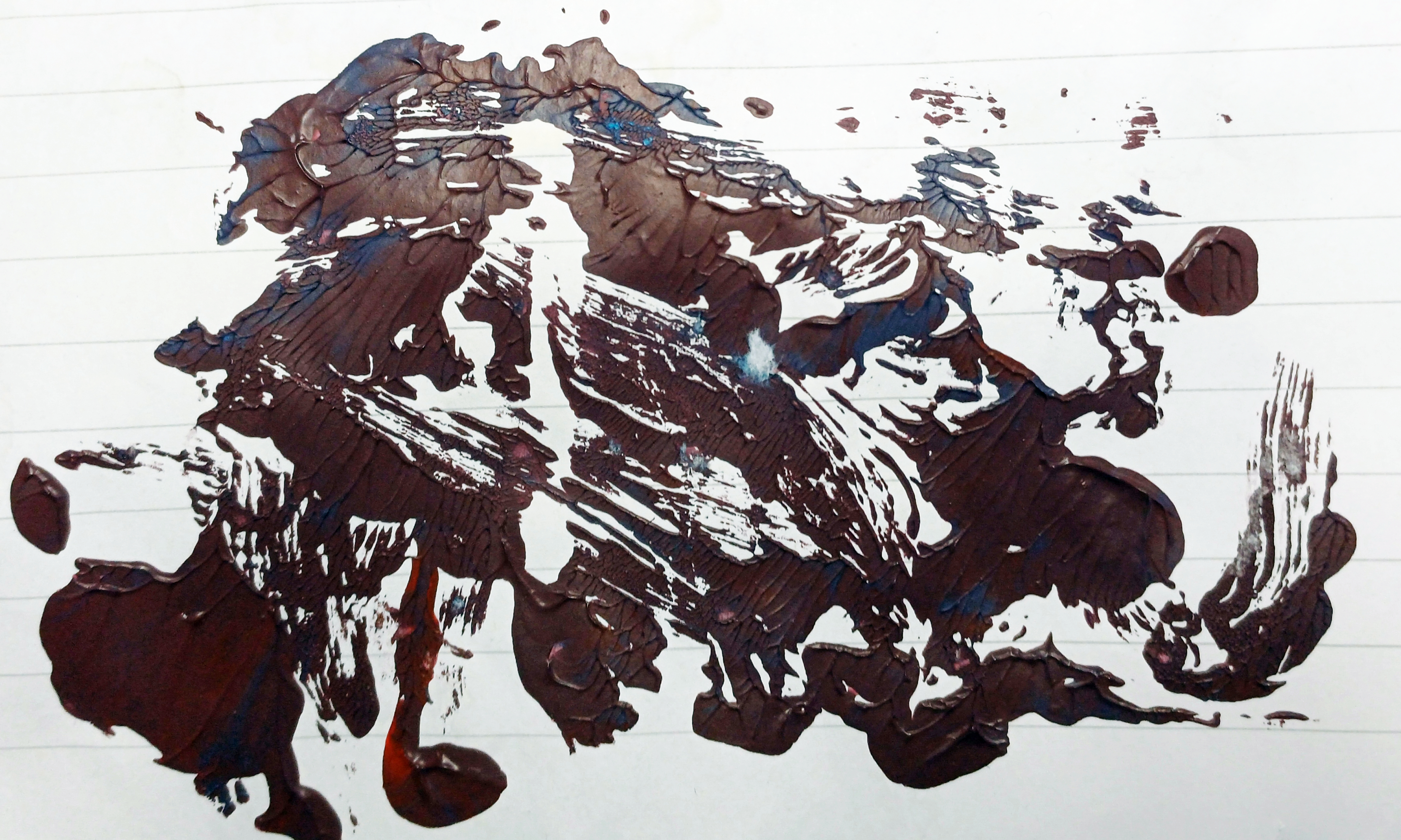
“Upper – Original” [photographed held in my hand 11th September 2024 at 1414hrs, paint brushwork and pressing 9th September 2024] by Matt The Unfathomable Artist, random acrylic red/blue to purple mixed paint, pressed in half on lined notepad, 4646 x 2788 pixels.
[differences in notepad paper and paint colours due to indoor lighting conditions and the photographic editing between the two images]
Just take a close look at the beautiful striations in “Upper – Original”. Everything the product of complete random pressing from randomly mixed pseudo-purple paint on the 9th September 2024!
I didn’t even realise the randomness of “Upper” represented any visual form or idea until two days later.
– “How Matt could you not see a bison?! Or North America for that matter?!”
‘I was looking at the <random> paint you see in “Upper” upside down at first. When I turned the paper the other way around what would become “Unfathomable Apocalypse Rider – Original” became my initial artistic focus of interest. Primarily since I could quickly see a human-like form in ‘Rider’.
Whereas “Upper” now upside down* as we see it in the image didn’t immediately bring anything to mind visually or in any objective form. Likely since I macro viewed the intricate striations. In fact I was so amazed about the ‘Rider’ for its randomness I even wrote exclusively about this the next day at 1506hrs on the 10th September.Not realising “Upper” would turn out to be as artistically unusual as “Unfathomable Apocalypse Rider – Original”!
*upside down at the top as regards the notepad paper. This is why I called it “Upper” at the time since I didn’t have any other specific title idea for this. In fact, I believe I mixed the (Upper) paint ‘upside down’ at the foot of the paper to how you see it above. Entire notepad image shown at the end of this article for reference [see # below]
Quotation from social media in bold and italics:
“If I told you the perceivable landmass you see is 100% completely random paint mixing would you believe me? The beautiful leaf-like striations occurred through my pressing this Upper half against the folded Notepad paper at the centre.
You can see where I held the paper as I made the pressing in both my hands.
After some days I began to envisage this random paintwork looked like North America. On the 12th September or thereabouts I noticed the unusual placement of ‘Florida’. On the 14th September (five days from its random production) I could then see the entire piece looked like a Bison! ‘Florida’ had therefore became its tail, completely by chance.
Extraordinary.” – personally written quotation published on 18th September 2024 to social media.
From “Upper – Original” I made the following digital artworks:
“Red Old Glory Colour North American Bison” [digital artwork, 9th original, 11/12th September 2024 digital] by Matt The Unfathomable Artist, 6000 x 3899 pixels.
I titled this “Red Old Glory Colour North American Bison” today on 24th October 2024.
The red is 179, 25, 66 in the RGB scale.
“White Old Glory Colour North American Bison” [digital artwork, 9th/12th September 2024] by Matt The Unfathomable Artist, 6000 x 3899 pixels.
I titled this “White Old Glory Colour North American Bison” today on 24th October 2024.
The white is 255, 255, 255 in the RGB scale.
“Blue Old Glory Colour North American Bison” [digital artwork, 9th/12th September 2024] by Matt The Unfathomable Artist, 6000 x 3899 pixels.
I titled this “Blue Old Glory Colour North American Bison” today on 24th October 2024.
The blue is 10, 49, 97 in the RGB scale.
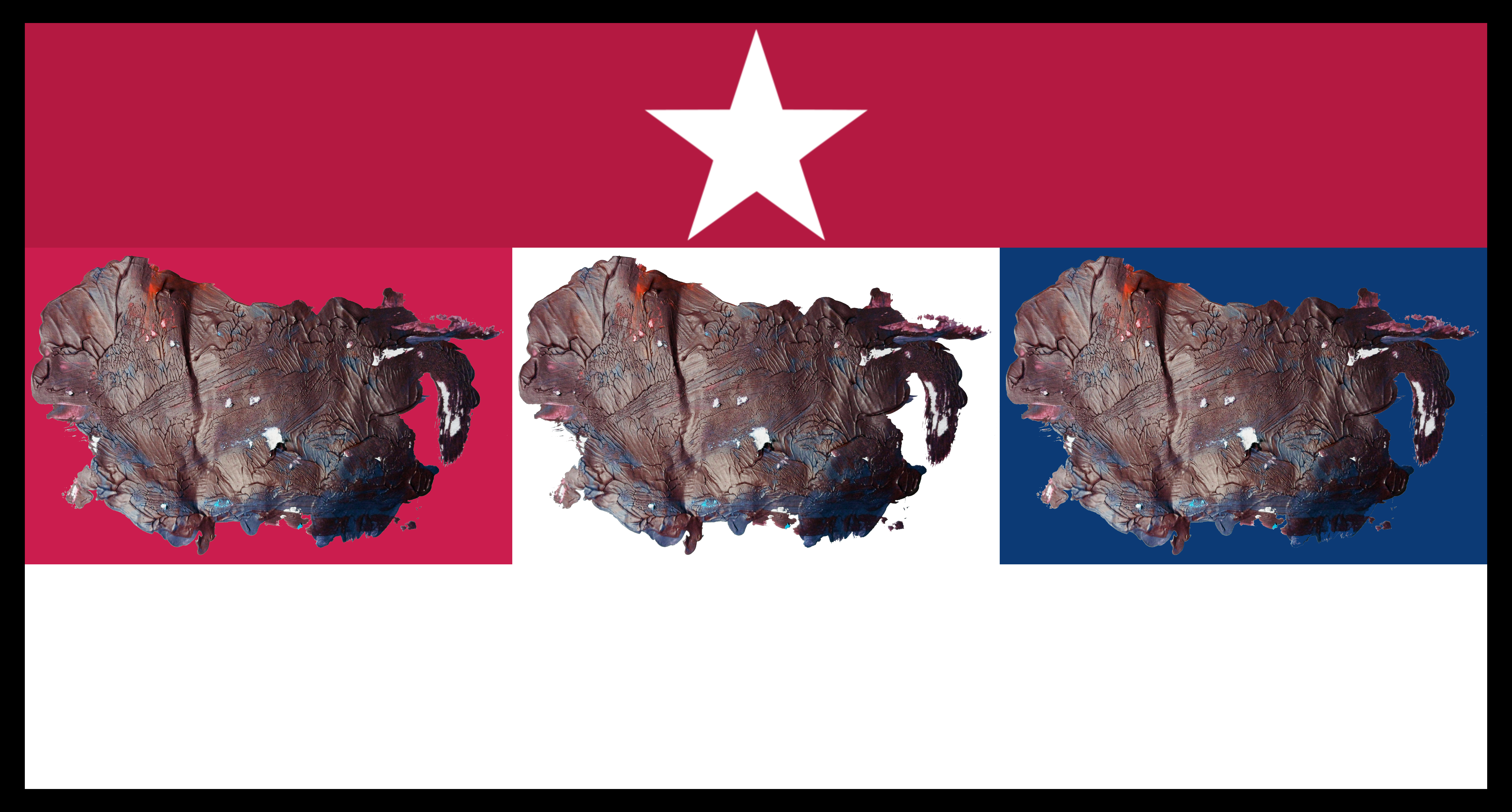
“Red, White & Blue Old Glory Colours North American Collage with Border” [digital artwork, 9th/12th September 2024] by Matt The Unfathomable Artist, 6480 x 3396 pixels.
“Red, White & Blue Old Glory Colours North American Collage with Border” is the first collage I made, shown immediately above.
“White Star, Red & White Stripe, Triple Old Glory Colour North American Collage with Border” [digital artwork, 9th/12th September 2024] by Matt The Unfathomable Artist, 6480 x 3396 pixels.
“White Star, Red & White Stripe, Triple Old Glory Colour North American Collage with Border” is the second collage I made (immediately above) to represent North American emblems of Stars, Stripes red and white with the complimenting Old Glory colours of Red, White and Blue.
Quotation on 16th September 2024 at 2150hrs “.. i would LOVE this artwork as four flags if i could. The three colour flags and then the collage with red and white stripe. if it was my choice i would make it into a cool weathervain [weathervane] piece entitled Four Winds of Direction. i would fasten each flag top and side so each flag would ripple nicely in the wind”.
I honestly felt I needed to dignify the whole random notepad work particularly as North America decided to present itself.
Randomly.
I would like to mention that despite the strange randomness of my work an art commentator did mention Jasper Johns to me afterwards. Jasper Johns famous for his intricate flag artworks.
The art commentator wrote “.. The Jasper Johns directive, ‘take an object, do something to it, do something else to it’. – anonymous, 19th September 2024, 1222hrs.
To this I replied:
“I had researched Jasper Johns work some weeks ago. This is why Upper is so very strange to me, randomly so ‘perfect’. I’m the only person who knows I just focused on mixing red and blue paint. Very odd.” – Matt The Unfathomable Artist, 1322hrs same day.
It should be noted I read, view or think about different visual artists most every day. Including the days and weeks prior to “Upper – Original” and “Unfathomable Apocalypse Rider”.
Let’s see some screenshots of newspaper articles whilst thinking of the ‘tail of Florida’in my random brushwork of “Upper – Original”:
‘Map of Tropical Storm Helene’s path’ courtesy of the BBC, 25th September 2024.
As you can see from ‘Map of Tropical Storm Helene’s path’ (immediately above) the ‘tail of Florida’ could be interpreted as a swirling hurricane. There is a striking similarity despite the fact my random brushwork and pressing is done on the 9th September 2024..
.. with pseudo-purple paint whilst working on “UN noise dash dot” [6th to 9th September 2024].
Here is a screenshot report detailing some of the devastating effects of Hurricane Helene:
‘Hurricane Helene tracker, image one’ courtesy of The Telegraph, 27th September 2024 screenshot.
Another highlight from the same report of exponentially destructive manmade climate effects:
‘Hurricane Helene tracker, image two’ courtesy of The Telegraph, 27th September 2024 screenshot.
Anyone appreciating my humanitarian efforts will know I have strongly campaigned for a reversal of manmade climate damages to the Earth, environment, wildlife and global air, land and sea pollution.
I feel my artworks in this article are the subconscious result of humanitarian efforts to appeal to world leaders to better manage Earth’s resources in a more harmonious way.
Thank you.
[#] For reference this is a photograph of the entire brushwork and pressing on the notepad paper as I first viewed same on the 9th September 2024:
Notepad paper with random brushwork and pressing for “Upper” and “Unfathomable Apocalypse Rider” from 9th September 2024.