of Van Gogh & of Picasso

“Cosmic Mouth” [6th/7th & 10th September 2024] by Matt The Unfathomable Artist, acrylic paint on premium 115gsm medium textured cotton primed to 240gsm over 12in x 16in (30cm x 40cm) wood-fibre board (4mm), 7018 x 5167 pixels.

“Cosmic Mouth” is literally painted over a female mouth acrylic painting (produced 1st & 2nd September with much effort and innumerable drafts). I then worked on the newer Cosmic overpainting you see here for the next two days.

On the 10th September I varnished the centre. I did retain a photograph of the underpainting even though it wasn’t successful to my eyes. You can see hints of the underpainted mouth along the middle of the canvas.

The female mouth I’m determined to paint successfully is physical perfection.

‘Sometimes perfection is immediate and sometimes it takes time.’ – one of my sayings.

Thankfully the overpainted Cosmic Mouth” is the perfection I sought for.

Writing of perfection..

“Artist Seduces Artist” [13th September 2024] by Matt The Unfathomable Artist, acrylic paint on premium 115gsm medium textured cotton primed to 240gsm over 12in x 16in (30cm x 40cm) wood-fibre board (4mm), 6000 x 4525 pixels.

..I made “Artist Seduces Artist” in around an hour to an hour and a half, freestyling, in heavy impasto acrylic.

Please do click these images for an even better viewing.

“Artist Seduces Artist” would look incredible hung at the centre of the darkest black large fabric square or rectangular-like tapestry, 6ft by 6ft at the very minimum. it is 100% Picasso inspired 🎨

I made a very finite finishing touch with two paintbrushes to the completed artwork with burnt umber on 17th September due to my perfecting standards.

For the primary working I utilised three painting techniques: palette knife, paintbrush motions using approximately four brushes, and constant-direct tube paint applications onto the canvas for the grass-green and turquoise surrounds.

Originally I intended to use burnt umber, gold, and mid-yellow colour. Prior to canvas working I included silver, copper and bronze into the palette. I have time and again tried to make ‘the beautiful simple style’, yet invariably add complexity!

After thorough happiness with the predetermined colours I then felt the canvas needed the delicious cadmium red, interesting turquoise, balancing titanium white and then finally the defining grass-green to make everything come alive.

It was at this point I added the mid-yellow even though this was an intended colour to use from the outset. I flattened the profile of the turquoise surrounds for visual interest with a flat-paintbrush. The grass-green received an area of purposed flattening due to the paint settling on the canvas.

Please note the inspiration for this canvas derives from the book “Life with Picasso” by Françoise Gilot and Carlton Lake with my own interpreted Picasso style. I was at page 38 to that point prior to making this artwork.

“Artist Seduces Artist” is a mixture of textures, layers, partially recognisable or obscured pictorial elements and humour with a composition intended to please the eyes in visual interest.

The essence of Picasso himself interpreted in an inspired style by myself.

“Artist Seduces Artist” with.. the beauty of art.

[ nb I am listening to Tobar Mhoire 🔊🎧]

Standard

Yumi Sugai

Angel Abel by Yumi Sugai, Oil painting, 65cm x 53cm

Here in this blog article I am introducing you to the work of Yumi Sugai through four oil paintings by the artist herself.

As you can see her work is immensely skilful, vibrant and visually stunning. Yumi has experience in the art marketplace since the 1990’s with numerous art selections in Japan and France during her career.

A great way for you to know Yumi’s gentle nature is through her own words she wrote to me:

I like drawing since I was a child.
I grew up near the sea in Kyoto Prefecture. I often went to the beach with my dad when I was a child. The beauty of the sea and sky was filled with the great colors of blue created by God.
Studied at Osaka Art University School of Art.
I painted while married and raising my children in Fukui Prefecture. It was around that time that I started drawing pictures of angels. I became a Christian in my time. I think the reason I started painting angels as art was a message from a holy angel. Angels are messengers from God. I draw my art of angels with the desire to spread it to the world.

Regardless of your religious beliefs, non-beliefs, spirituality and/or secular viewpoint, Yumi’s words do resonate a caring personality.

Let me share with you the first tenet of sales I was taught:

People buy from people they like.

I love Yumi’s work. I often have a masculine style to my work, so it is always nice to see how biological differences shape our lives and our artmaking. Even a look at the way I performance read my poems shows distinct differences in how we perceive the world as different creatures from the same kind.

Humankind.

I feel Yumi’s work has the originality I enjoy to showcase on my blog. True collectors pieces. Artists’ know the difficulty of oil paint working. It’s commensurately complex to structure, time and colour mix.

Please just take a look at her Angel at Christmas Dinner artwork immediately below:

Angel at Christmas Dinner by Yumi Sugai, Oil painting, 65cm x 53cm

Can you imagine the work in terms of hours, days and weeks involved in creating this piece?

As with most secular occupations, time in hours equates to cost multiplied by the skill necessary to achieve in addition to popularity.

Popularity might equal niche, rare or unusual in some way. Personally (trying to guess how much art I see over the years) I have not viewed anything stylewise quite like Yumi Sugai’s work.

Classical, pre-Raphaelite, Christianised (think Salvator Mundi by da Vinci) and very pretty.

Yumi’s work is cleverly composed.

Christmas Toy Angel by Yumi Sugai, Oil painting, 65cm x 53cm

Christmas Toy Angel shown above is referencing ancient classical portraiture in a circa Victorian era, in my opinion.

Of course, Yumi is Japanese which makes her subject interest all the more intriguing.

Angel of the Christmas by Yumi Sugai, Oil painting, 65cm x 53cm

Angel of the Christmas continues the traditional posing of Yumi’s imaginative pieces.

Her portraits have influence from different cultures as far as I can perceive. Yumi has explained she has a wish to create illustrations too, particularly in childrens books and magazines.

Therefore any publishers who would like to work with Yumi, do get in contact through her social media. 

I hope you have thoroughly enjoyed seeing Yumi Sugai’s work.

Standard

The Art Career of Denise Wyllie

‘Being Together’ Estandos Juntos Series by Denise Wyllie, Woodcut, 63 x 45cm.

I like to select artists for this blog whom uniquely represent the art world.

‘Being Together’ shown above is a woodcut from the Estandos Juntos Series [the Spanish translation of the artwork] by Denise Wyllie which featured at “The Master’s” exhibition, hosted by the Royal Society of Painter-Printmakers in November 2019 at The Bankside in London.

Denise Wyllie’s artworks appeal to the fine art and interior design markets alike.

Her ‘Estandos Juntos Series’ of gender inspired prints explores the relationship between men and women.  Closeness, disparity, fear, acceptance, race, dominance, reluctance, submission et al.  At least that’s how I see this Series of works.

There is no doubting a feminine style to Denise Wyllie’s floral works.  Her literary commentary is itself ‘a cat among the misogynistic pigeons’.  At this moment I can picture every female reader cheering Denise on.  Men too, as without thorns how does one protect the rose?

Are female artists under-represented in museums?  Is this something you would agree is true?

Primarily through the latter 19th century we see international art establishments readily accepting women into the upper echelon of art.  Often from well-to-do connected backgrounds.

My own past blog articles featuring female artists include: [please click their names to visit the links]

Sonia Mehra Chawla

Tamara de Lempicka

Louisa Beresford, Marchioness of Waterford

Mary Stevenson Cassatt

Élisabeth Louise Vigée Le Brun

Artemisia Gentileschi

Anna Hyatt Huntington

Aelita Andre

Käthe Kollwitz

Berthe Morisot

Thankfully the 21st century is creating new working opportunities for women regardless of class, background, beliefs/non-belief, race or origin.  Technology is the ethical driving force within art, through increased marketing accessibility and popular cultural movements supporting equality.

Let’s take a good look at Denise Wyllie’s floral landscape and treescape works:

‘Into The Renaissance Rose Garden’ by Denise Wyllie, Screenprint, 50 by 70 cm, Edition number 10.

Denise has immersed herself within the David Austin Rose Gardens in Shropshire and blossom trees of Kyoto, Japan over the years.  Artists have an innate desire to draw near to their subject matters to disentangle meaning, grasp new definitions and disseminate thoughts.

‘Into The Renaissance Rose Garden’ by Denise Wyllie is a pretty play on perspectives.  It’s one of those artworks made specifically to bring joy.  Reminding us of springtime blossom whilst fairy flowers wistfully dance the breeze.  Children are probably running around making blissful noises getting caked in mud.

‘Into The Renaissance Rose Garden’ is a stunning composition.

For some years now I’ve recorded birds tweeting at my local nature reserve.  There is a wealth of natural beauty to discover and realise.  Listen as twilight water birds make soft conversational sounds to one another.

Kyoto: Travelling in the snow original Wyllie's screenprint Find Art, Buy Art, Museum Art Gallery, Royal Academy Of Arts, Contemporary Artwork, Abstract Expressionism, Kyoto, Printmaking

‘Kyoto: Travelling in the snow original’ by Denise Wyllie, Screenprint.

If you have ever seen timeless Japanese artworks such as ‘Magpies and Hare’ by Cui Bai [please click the link to view], you will appreciate Denise captures the absolute essence of Japanese silkscreen printing in her works.

‘Kyoto: Travelling in the snow original’ by Denise Wyllie is the apotheosis of the Japanese style.  Sinewy curving branches, hints of delicate leaves, windswept movement.  Bring a colour contrast to the mix and this wintry landscape comes alive with clever outer-edge and far-ground detailing.

A carefully constructed artwork like this cannot be fully visualised without first displaying the piece upon your wall.

‘Tree Spirits 3’ by Denise Wyllie, signed Giclee Fine Art print on Hahnemuhle 310gsm paper.

And then just as you thought there would be no darkness to Denise Wyllie’s work, we have ‘Tree Spirits 3’.

Eerily beautiful isn’t it?

Her career experience, ability and crafted brilliance is magnified throughout her art making.  Complex layers excite our visual senses.. eyes and mind.

Please kindly view the artworks for sale here at: Denise Wyllie & Clare O Hagan to find your own favourite art pieces from their vast inventory.

Standard

Forget Me Nots and The Bee

‘Forget-Me-Nots and The Bee’ [2010] by Matt The Unfathomable Artist, Oil on canvas, 24 ins x 18 ins.

I’ve decided to share ‘Forget-Me-Nots and The Bee’ [2010] by Matt The Unfathomable Artist having, only this year, recently seen Van Gogh’s ‘Roses and Beetle’ [1890] painting here:

‘Roses and Beetle’ [1890] by Vincent van Gogh, Oil on canvas, 33.5 cm x 24.5 cm.

I painted ‘Forget-Me-Nots and The Bee’ using a photograph from 2003.  Here is the photograph I took that day having set my camera onto a tripod, waiting hours for the best photo opportunity:

Photograph dated 2003 from a home garden, inspiration for ‘Forget-Me-Nots and The Bee’.

The bees kept me busy following them around from flower to flower, as they never sat still, haha.

I had not seen ‘Roses and Beetle’ by Van Gogh at the time of producing my artwork.  I love that artists wish to explore nature and produce classical compositions all their own.

Van Gogh’s painting has encouraged me to share my earliest painting experiments.

Interestingly the way I signed this painting has its earliest roots from my high school art class.  That’s the way I used to sign my high school artworks 🙂

My art teacher said she loved the way I’d created my signature.  ‘Creative Mind’ has my full signature, whilst my latest artworks are stylistically signed ‘Matt’.

Thank you Vincent.

Hope you enjoy.

Standard

‘Symbolic Feathers’ completed July 2013

Detailed view 1 of ‘Symbolic Feathers’ [July 2013] by Matt The Unfathomable Artist, Oil on canvas, 36ins x 28ins. (Digitally edited photograph).

Detailed views 1 and 2 shown above and below respectively.

Detailed view 2 of ‘Symbolic Feathers’ [July 2013] by Matt The Unfathomable Artist, Oil on canvas, 36ins x 28ins. (Digitally edited photograph).

Detailed view 3 shown below.

Detailed view 3 of ‘Symbolic Feathers’ [July 2013] by Matt The Unfathomable Artist, Oil on canvas, 36ins x 28ins. (Digitally edited photograph).

The following photograph is the full canvas of ‘Symbolic Feathers’ by Matt The Unfathomable Artist, here:

‘Symbolic Feathers’ [July 2013] by Matt The Unfathomable Artist, Oil on canvas, 36ins x 28ins. (Digitally edited photograph).

Standard

‘Creative Mind’ – oil on canvas

‘Creative Mind’ [completed Summer/Autumn 2012] by Matt The Unfathomable Artist, Oil on canvas, 36ins x 28ins.  Please note the lower right artist’s signature is not shown in this photograph.

Detailed photography [01] of ‘Creative Mind’ [completed Summer/Autumn 2012] by Matt The Unfathomable Artist, Oil on canvas, 36ins x 28ins.

Detailed photography [02] of ‘Creative Mind’ [completed Summer/Autumn 2012] by Matt The Unfathomable Artist, Oil on canvas, 36ins x 28ins.

Detailed photography [03] of ‘Creative Mind’ [completed Summer/Autumn 2012] by Matt The Unfathomable Artist, Oil on canvas, 36ins x 28ins.

Detailed photography [04] of ‘Creative Mind’ [completed Summer/Autumn 2012] by Matt The Unfathomable Artist, Oil on canvas, 36ins x 28ins.

Detailed photography [05] of ‘Creative Mind’ [completed Summer/Autumn 2012] by Matt The Unfathomable Artist, Oil on canvas, 36ins x 28ins.

I hope you love my oil painting artwork ‘Creative Mind’.

Thank you

Matt The Unfathomable Artist

Standard

Cuneiformal Art by J M W Turner

Light and Colour (Goethe’s Theory) – the Morning after the Deluge – Moses Writing the Book of Genesis‘ [1843] by Joseph Mallord William Turner, Oil on canvas, 78.5 cm × 78.5 cm (30.9 in × 30.9 in).

Today I discovered a new work of abstract art, please see the above dated 1843.

Standard

Sir George Clausen on Morality

‘The English People Reading Wycliffe’s Bible’ [1925-27] by Sir George Clausen, Oil on canvas, 304.8 cm x 442 cm

Have a real good think about what’s happening here.

In this painting.

The aforementioned oil on canvas is depicting noble persons and ‘ordinary’ folk huddled in close proximity to one another.  Whilst there is a distinct separation between their social classes, including a cringingly aghast demeanour upon the mid-left lady, we do see a coherence of unity.

Religion can stir up avoidably provocative feelings.  Society always has two classes however which way you look at it.  Food for thought, whichever side of the bench you’re on.

The vivid colouration of this piece and realistic yet stylistic representation harks at pre-Raphaelite construction.  It’s a medieval masterpiece.

Given the influence of French artists upon leading British Impressionists towards the late 19th Century, we do see as with all art painters a yearning to ‘the old ways’.  Sir George Clausen is highly experimental.  His body of work unafraid to grace us with fog, dawn/dusk-haze, Realism, Impressionism, Stylistic and (near) Surrealist master classes.

A melted clock and a Dalian signature are not too far-fetched to envisage amongst a select few Clausen works.  Yes, that’s his ability to influence.

I’ve prided myself on keeping my blog neutral in political, religious and current affairs.  Whilst visual art and music are powerful motivating forces my interest has always been social commentary through art.  I make no PR judgements and steer clear of garnering partial affinity with any reasonable PR view as regards my art writing.

What I do-do (sidenote #1 – I found this highly amusing to attract younger Readers) is present information through art and actuate an empowerment throughout all the ages..

.. by allowing you, the Reader, to continuously develop your own knowledge, opinions and beliefs about what you artfully digest.

For the record (sidenote #2 – total vinyl art fan, Darren Baker smiley) I’m indifferent really to searching for the ‘Juju at the bottom of the sea’.

We’re all uniquely homo sapiens, here and now.

Do, do, do, do, do, do, do, do, do, do, do, do, do, do, do, do.

It’s right here, explained in this article cryptically.

Isn’t life about operating humanely, co-existing as closely to our respective laws as we each can with good intentions by the by.

Art has the very capacity to connect people, share views reasonably and agree to disagree amicably.  Our Children Inherit The Art Around Us.

We are all ‘The Torch Bearers’.

‘The Golden Age’ [1919] by Sir George Clausen, Oil & encaustic on canvas, 305.7 cm x 174 cm.

Ancient Egypt.  Pugilism.  Pompeii.  Dainty flowers.  Breezy air.  Working focus.  Craftspersonship.  Oneness with nature.  His Signatory trademark.  Physical exertion.  Protection from the elements.  Fruitage of the Yellow Sun.  The beauty of nakedness.  Love of clouds.

Those were my immediate thoughts about this iconic looking artwork ‘The Golden Age’ by Sir George Clausen.  Art makes me so happy.

‘William Henry Clegg (1867-1945), Director of the Bank of England (1932-1937)’ by Sir George Clausen, Oil on canvas, 235 cm x 120 cm.

First, musical art – “Fidelity Fiduciary Bank” – https://en.wikipedia.org/wiki/Fidelity_Fiduciary_Bank

This portrait shown above by Sir George Clausen is austere, dignified and slightly awkward about his business to pose.

Business from bisig – care, anxious, occupation.

Work consumes.  I never cease to feel confounded by the working desire of triple-millionaires (£100 millions+) and billionaires.  Business is fun.  Profit is good.  Working can be enjoyable especially from a social perspective.

Would you make it your business to stop people in their efforts to work?

Sounds absurd doesn’t it.  That would be called persecution.

‘Rickyard, Morning’ [1923] by Sir George Clausen, Oil on canvas, 52.50 cm x 60 cm.

I’ve included ‘Rickyard, Morning’ by Sir George Clausen for his application of shade, positioning of the working farmers, unusual composition choice, angle of the clouds and use of negative space.

Having closely observed field workers on a livestock-and-barley farm with all their modern machinery gathering hay in large perfectly round bundles this painting kind of called out to me.

Those farmers I watched working until the minutest aperture of dusk is the very reason why the hint of light in this painting is EVERYTHING.

Never say never to underestimating the ineffable intelligence of a Master at their life’s work.

– Matt The Unfathomable Artist, 15th June 2017.

Standard

Sir John Lavery to Cara Delevingne

‘The Tennis Party’ [1885] by Sir John Lavery, Oil on canvas, 76.2 cm x 183 cm.

Let’s first enjoy additional expert detail about the painting shown above in the following video by the Aberdeen Art Gallery & Museums:

https://vimeo.com/123716025

As explained in the video Lavery’s friends, the Scottish painters Arthur Melville, Edward Arthur Walton and James Guthrie feature in this painting of  ‘The Tennis Party’ (see photo above).

I love tennis.

When I first received a wooden tennis racket as a boy my brother and I would play tennis in my Grandad George’s well-kept garden in Malvern.  Towards the end of the garden was two apple trees we’d climb.

We played makeshift tennis on a rather modest sized rolled lawn adjacent of two wooden tool sheds.  Bees buzzed busily next door for Grandad’s Beekeeper neighbour, harvesting their sweet-solid honey.

Professionally labelled jars given to us every summer.

To practice tennis I would quite often hit balls against the side of our family house on my own prior to and into my mid-teens.  Thankfully, being so young I didn’t serve the ball at the wall too hard.  We know that serves of 137mph are possible on tennis courts these days.

During a very closely contested three sets friendly match, a 27 year old professional full-time tennis coach credited me with the fastest serve he had ever received.  I was 25 years old at the time.

Two sets to one in his favour were quite okay for someone who had never been professionally coached.

Sport is in my blood.  It’s part of my DNA.

‘The Tennis Party’ therefore invokes strong emotional memories for me.  Holidaying in Bude, Devon early 2000’s my ex-girlfriend asked me to play nice and actually rally with her.  Only love could have possibly made me avoid those all too inviting lines and send the ball happily back to her.

It was the most beautiful English day.  Clear blue sky, onward humid heat.

Relationships.  Again, we see a British Impressionist of this era depicting a thoroughly modern view of gender equality within a mixed doubles tennis game.  The gate is open and inviting us to come along and play this wonderful game too.

Young and old.  Social status is irrelevant.

Playful vs Relaxed.  Spectator or eager participant.  A Field of Dreams.

‘Violet Keppel, Mrs Denys Robert Trefusis’ [1919] by Sir John Lavery, Oil on canvas board, 33 cm x 25 cm.

‘Violet Keppel, Mrs Denys Robert Trefusis’ was a must.  Upon viewing this artwork I had to include this in my blog.

It’s precisely the sort of painting I’m looking for.  For instance ‘The Tennis Party’ has unique compositional angles.  What makes the painting ‘Violet Keppel, Mrs Denys Robert Trefusis’ so artistically commendable is her proud, inquiring pose.

The state of her undress is risqué for the time.  Quite in keeping with Violet Keppel as a liberal woman of the early 20th Century.  1920’s extravagance, flair and impassioned art-deco high-society.  I think the 1920’s and 1960’s share artistic freedom to the height of luxury, fashion and mild decadence.

Whereas the 1960’s spread the pursuit of Hieronymus pleasures to the masses, the 1920’s seemed all too intrinsically linked to monetary power and status.  By the 1930’s the masses wanted some of the action.

Moonshine and parties followed.  Mob rule.  Disorder.  Chaos.  Great photography too.  If you love photography and movie art please look up the documentary film of Weegee (born Usher Fellig) entitled:

‘ “I Am Rebel” – Weegee The Famous ‘  [Series 01/Ep02 – 2016, IMDb]

You may even see echoes of Danny DeVito in L.A. Confidential [1997] – if you’re of the appropriate age.

Through this we see the 1920’s morph like clay to become the 1930/1950’s.  Just like Doris Delevingne becomes ‘The Viscountess Castlerosse, Palm Springs [1938]’ by Sir John Lavery.

Yes, Cara Delevingne is her grand-niece.  How cool is that!  Interesting too that Cara is especially creative.  As previously stated in my blog, David Hockney really is a serious art student and a master art working genius.

Value ‘The Viscountess Castlerosse, Palm Springs [1938]’ as a piece of art history entwined.

Living Art, Girls On Film.

The paint application of ‘Violet Keppel, Mrs Denys Robert Trefusis’ is urgent, exquisite and untamed.  Perhaps Violet is portraying herself in a new way for the world to respect her?

“I Am As I Find” a saying by Matt The Unfathomable Artist.

Respect is not necessarily what we do as people.  It’s the inner motivation and intent of what we are.

‘Boating On The Thames’ [1890] by Sir John Lavery,

Anyone wishing to master water painting should check this preposterously life-like painting by Sir John Lavery called ‘Boating On The Thames [1890]’.

We believe the foreground lady is laid-back relaxing in the boat.  We believe the ripples of bluish-green water by wind and movement.  I also thoroughly enjoy those two swans making a quiet appearance.  The sense of reflected light upon the water is carefully considered and astonishingly accurate.

Sir John Lavery shows skilful draughtspersonship.  Detail you can take hold of.  If the nearest boat was at the waters edge we could likely reach out and make it swirl around.  Purely for our amusement.  Maybe they’d fall in?  Oh how that would make us laugh.

What really is man’s work?

‘Mariana, ‘Is this the End? To be Left Alone, To Live Forgotten and Die Forlorn.’ [1880] by Sir John Lavery, Oil on board, 30 cm x 23.5 cm.

Another painting by Sir John Lavery that was a must to include in my blog..

‘Mariana, ‘Is this the End? To be Left Alone, To Live Forgotten and Die Forlorn.’ [1880] is stylistic and colour rich like those glossy hair adverts.  Mariana is voluptuously attractive yet despondent with loss.  Everything about her screams ‘help and comfort, please apply’.

Her most outer garment beckons us to cuddle her to a modicum of happiness once again.  The tone of her buttoned tunic is solemn, guarded, prim and proper.  Background detail is uncheery and perfectly balanced.

Using hues that replicate foreground detail is an excellent way to balance a painting’s composition.  Here Sir John Lavery uses this method cleverly.  The background does not compete for our attention.

Rather this accentuates our selective viewing order of eyes, the portrait expression/feeling, her facial shape, hair and lighting detail contrasts, clothing choice and her bodily structure/positioning.

I love this painting for in this very artwork it is absolutely clear why Lavery was later commissioned to represent Irish banknotes and coins.  This he achieved through his outstanding artwork of Lady Lavery for some 49 years!

Stylistic artworks require great story telling ability.  Throughout his works Sir John Lavery establishes himself amongst Irish folklore, art history and popular culture as a collectors dream.  Lavery portraits are triumphant and his architectural scenes definitive.

Some of my personal favourites by Sir John Lavery – ‘Under The Cherry Tree’, ‘Viscount Morley Addressing the House of Lords’, ‘Loch Katrine’, ‘Edne May in the Belle of New York’ and ‘A Lady In Brown’.

Standard

The La Thangue Angle

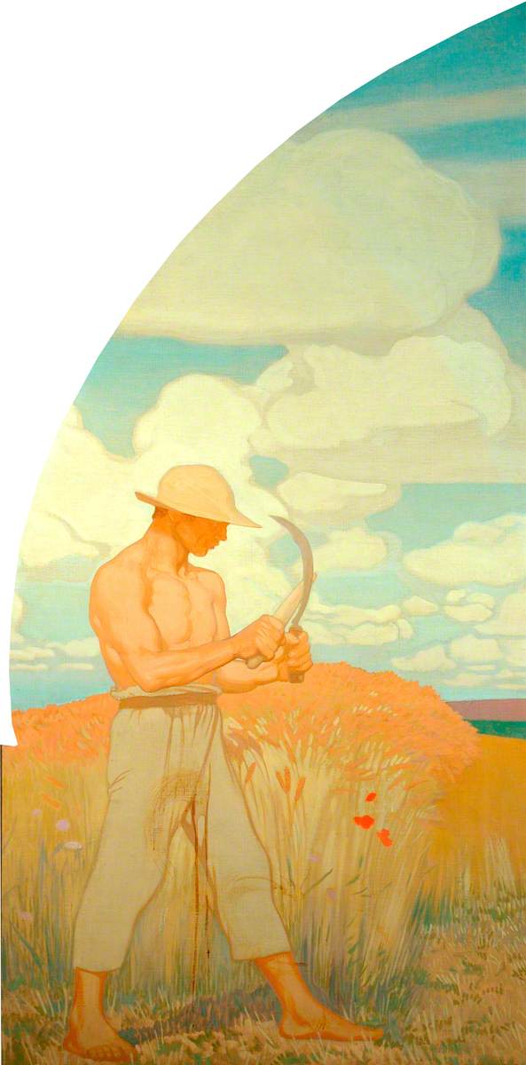
‘An Autumn Morning’ [1897] by Henry Herbert La Thangue, Oil on canvas, 47.5 inches x 37.5 inches.

‘An Autumn Morning’ by Henry Herbert La Thangue features the prettiest young lady exerting herself in forestry work whilst an older male colleague is cryptically obscured in the background vista.

During the late 19th century photography had grown into a fashionable medium for societal sublimation and the cataloguing of everyday events.  Creative painting had already scribed itself into this cultural mechanism for millennia.  For instance, ancient Egyptians crafted pictorial ‘movie’ reliefs to affirm various belief systems to their populace.

The Mummy and her Children.

In ‘An Autumn Morning’ La Thangue’s attractive lady displays a determined working ethic.  We could take the painting at face value as merely a woman bending a stick.  Considering the political mindsets of her generation there is a plethora of social commentary going on within his innovative composition.  Along with an impressionistic focal merging to highlight the foreground.

Both subjects, man and woman, have their heads momentarily cast downwards in an equality of effort.

Let’s call this young lady Kirsty for the purpose of explaining my reasoning.  Kirsty is very strong.  Look at her hands bending the wood.  Her measured grip.  Kirsty is not shy of putting her knee into the work to muscle a stubborn obstacle in her path.

Would you agree that this painting represents an intellectualised struggle?

Dignified.  Independent.  Womanly strength with purpose and vigour.

Henry Herbert La Thangue absorbed modern cultural ideas and inventions to bring forward his unique perspective of art.

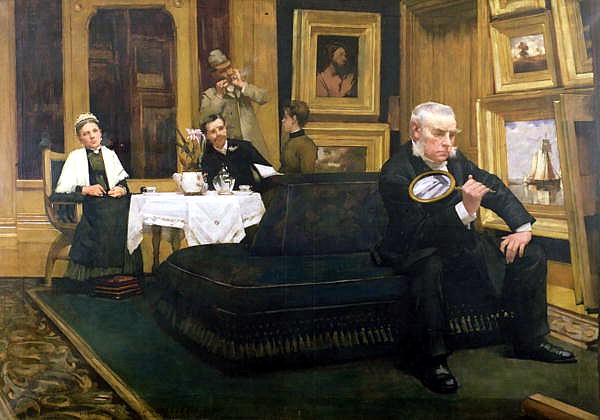
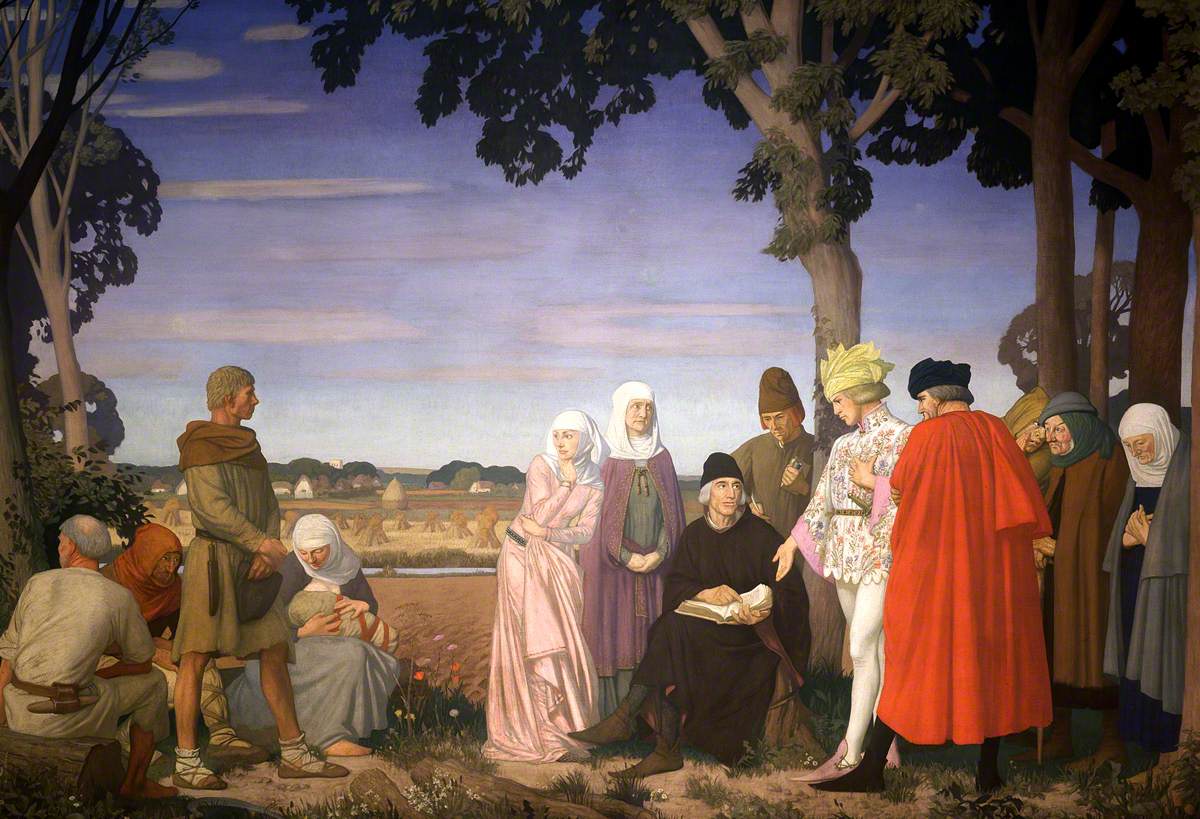
‘The Connoisseur’ [1887] by Henry Herbert La Thangue, Oil on canvas, 44.88 inches x 63 inches.

Abraham Mitchell can be seen, shown above, contrary to his family whilst socialising in this masterful composition entitled ‘The Connoisseur’.  Mitchell is seriously pondering a recently purchased painting, magnifying glass in hand.

‘Dear Mr Holmes, did you notice.. the year is 1887..

‘..and there is a simile of “Boat in an Estuary”‘ on the wall?!’

Here Mitchell’s art collection surrounds everyone present in his gallery area.  Abraham Mitchell is clearly engaged in his endeavours with absolute exclusivity.

La Thangue’s painting suddenly reminded me of the Hen and Chickens in Ludlow.  My dear paternal Gran with all her quality coffee consumptions had numerous footrests available throughout the guest rooms of the Hen & Chickens in Ludlow.  Now three decades past during my early teens.

Freshly caught rainbow trout from the river makes for a marvellous dinner.  Ludlow Castle.  Chocolate truffles.  True stories of her life in Saudi Arabia and Africa.  Visiting the cellar, beer barrels on tap.  Ice cold glass bottled Cola.  Darts.  The Garden.  Postcards.  Nostalgia.  Ye Olde English culture and architecture.

I’d like to mention that Mr R. H. La Thangue, father of the artist, is an extraordinary likeness of my Gran’s second husband.

Great art stirs emotion.

During research about La Thangue I found highly insightful information online about ‘The Connoisseur’ in a direct quotation, shown immediately below in bold.

With the kind courtesy of Dr Grosvenor’s enjoyable art blog: http://www.arthistorynews.com/

“The Connoisseur” by Henry Herbert  La Thangue is actually of Mr Abraham Mitchell, aged 53 at the time, a Bradford textile tycoon and a Methodist of “reserved and retiring nature”.

He and his brother Joseph built neighbouring mansions (called “The Parks”), his with a picture gallery, which is the setting for this work. He was one of La Thangue’s principal patrons.

In the background are his wife and their two sons Tom (standing) and Herbert, and one of his daughters either Edith or Annie. Mitchell had been a local councillor, alderman, JP and refused the mayoralty of the town (see “A Painters Harvest”. Oldham Art Gallery catalogue 4 November -12 December 1978 Page 22 & 23).”

Many thanks also to a contributory reader of the ArtHistoryNews blog.

Artistic Analysis:

Like most exceptional artists La Thangue enjoyed particular focal references and the crafting of new compositional versions within a given theme.  Examples of this can be found in:

‘A Sussex Farm’ and ‘The Watersplash’ – a gathering of birds in a forced perspective, facing the camera.

‘Boy Filling Water Jars at Well’, ‘Ligurian Roses’ and ‘Winter in Liguria’ – a water well positioned right, standing or stooped singular character interacting with the well.

‘Gathering Bracken’ and ‘An Autumn Morning’ – two field forestry workers, one male, one female in complimentary working actions.  Intelligently contrived.

Studying La Thangue paintings further, as if with magnifying glass in hand, I noticed he uses favoured compositional arrangements to great effect.  Two distinct distances in contrast or harmony with each other to draw the eyes naturally to his intended descriptive. 

In ‘From a Ligurian Spring’ La Thangue repeats this structural arrangement of subjects/objects three or four times.  Tree branches, two carefully placed wooden posts, two adjacent stone walls and contrary ’emotional reflections’ of the painted characters foreground to background.

This structural observation can also be seen between the wheels of a cart; the outstretched shoulder-length arms of one person (there are exciting examples amongst his paintings of this inventive idea); two toy boats set to sail by a boy; general foreground to background character placements; person to working animal/s positionings and even two trees carefully framed to unify our attention.

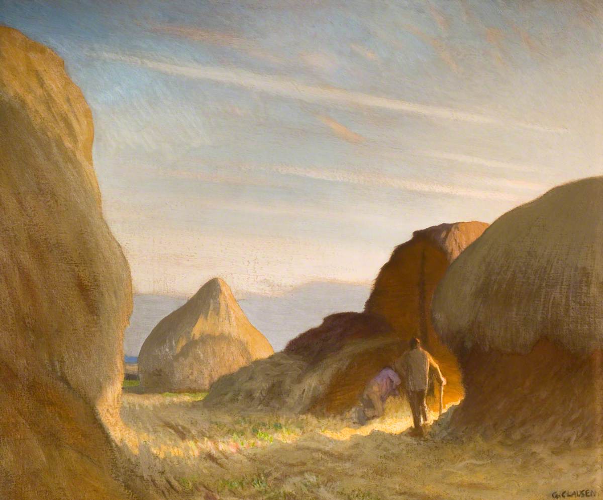
My latter observation is clear to see in his painting ‘A Sussex Hayfield at Graffham’ [1912] shown immediately below:

‘A Sussex Hayfield at Graffham’ [1912] by H. H. La Thangue’, Oil on canvas, 25 ¢ inches x 29 1/4 inches.

From an online reference..: http://www.graffhamparishnews.org.uk/Magazines/GPN2009_11.pdf

..pages 20 to 27 is a treasure trove of art history about La Thangue.  Superlative publications like these are wondrously revealing to read.

La Thangue had residency in Chelsea – London, South Walsham – Norwich, Rye – East Sussex, Horsey Mere – Norfolk Broads and Bosham – West Sussex.  All prior to settling with his actress wife Kate Rietiker in Graffham – West Sussex whom he married in 1885.

Living in Graffham from 1898 to 1926, La Thangue clearly established his artistic influence following his early art apprenticeship with Jean-Leon Gérôme in Paris, France.  As previously stated regarding his admiration of Bastien-Lepage and Léon-Augustin Lhermitte, La Thangue’s connection to French art heavily influenced his work.

The sophisticated art sales platforms of Paris invigorated him into fine tuning British Art institutions and art communities in the UK.  Working on these worthwhile professional endeavours with much assistance from his highly accomplished artist colleagues.

The Graffham Parish News, hyperlink immediately above, specifically mentions The New English Art Club.  La Thangue also became an Associate Member of the Royal Academy of Arts in 1912.

Without question La Thangue is a very important British artist.

Visits to Provence, France follow during the early 1900’s along with Liguria, Italy (paintings aforementioned) and the Balearic Islands.  Reference Wikipedia –https://en.wikipedia.org/wiki/Henry_Herbert_La_Thangue

Let’s take a look at another Henry Herbert La Thangue masterpiece:

‘A Farmyard Scene’ [1905] shown immediately below – oh me, oh my – quite super.  Truly a charming painting par excellence.  La Thangue incorporates an honest application of sunlight in a natural residential setting.

‘Farm Yard Scene’ [1905] by Henry Herbert La Thangue, Oil on canvas, 73cm x 81cm.

Viewing this ‘Farm Yard Scene’ of Italy I’m picturing a past visit to Rhodes, recalling the Old Town chickens roaming freely between garden pathways – wild with their interactive noisy squawking.

With thanks to dear Henry Herbert La Thangue for his time honoured contribution to international art.

Next artist writeup is.. well you shall need to read my blog to find out.

Thank you dear Readers.

Standard