“Orange Sand & Gold #1” [6th April 2025] by Matt The Unfathomable Artist, acrylic on A3 (42cm x 30cm) 2mm wooden board, 5000 x 3574 pixels.
Quote:
Personal quote on 9th April at 1445hrs:
“the Orange Sand Gold.. i used it [the canvas] purely for mixing, then i loved the orangey canvas! im not certain i would want to sell this. however i will do another version with the ideas. the paint plays art immensely useful for producing compositions.”
This version “Orange Sand & Gold #1” is made within an hour approximately.
“Orange Sand & Gold #1” is very much an emotional-feel painting, as Turner-like beautiful as I can make.
Here is the second version of the composition:
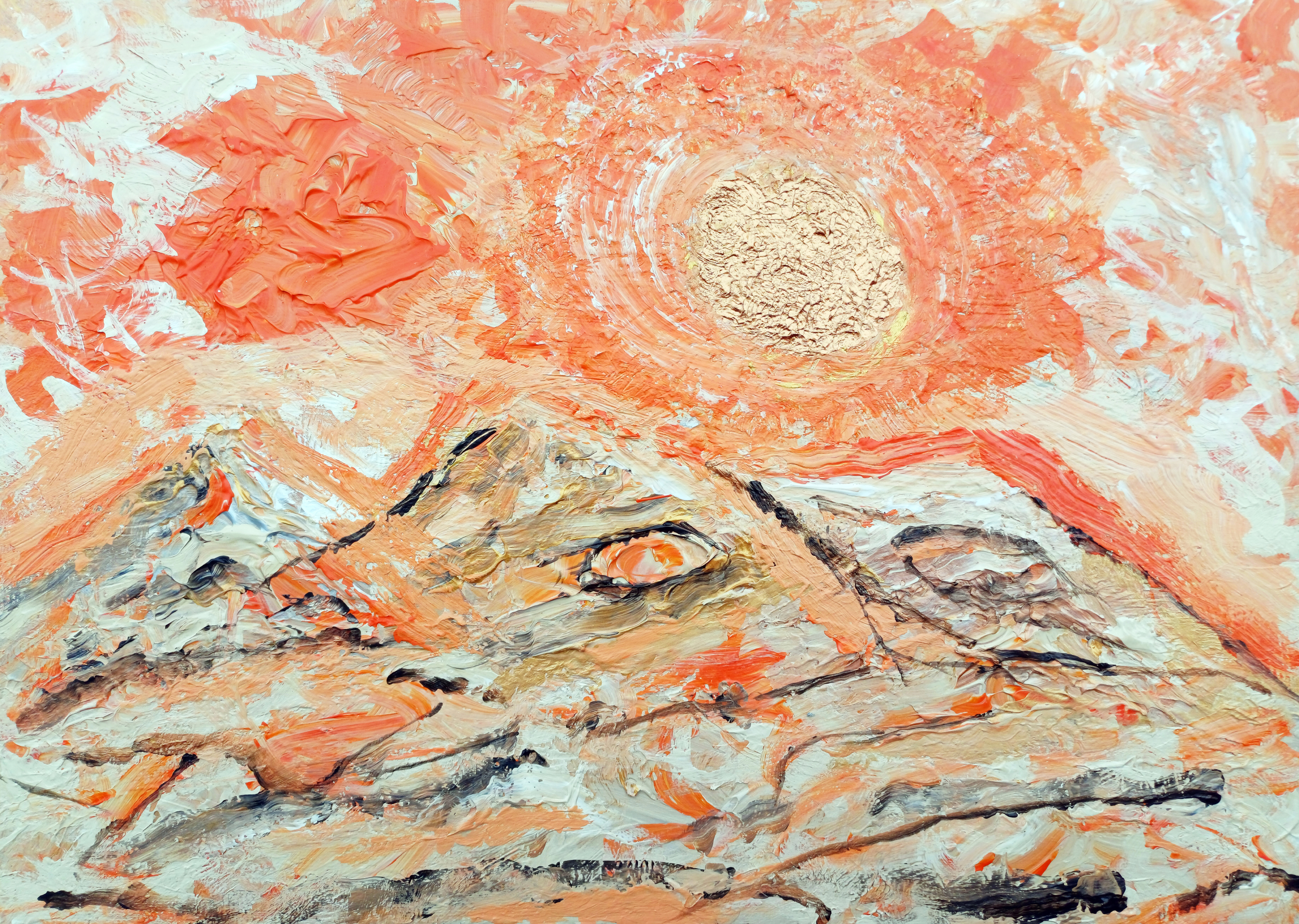
“Orange Sand & Gold #2” [10th to 13th April 2025] by Matt The Unfathomable Artist, acrylic on A3 (42cm x 30cm) 2mm primed wooden board, 5000 x 3557 pixels.
Brackets show quotation from pre-published social media (Instagram):
[ I hope you love this second version of an original composition I produced. The Sun-sky area required several drafts to achieve the desired texture and mood I require for fine art pieces.
A distinct movie franchise found its way, twice, into this artwork.
“Orange Sand & Gold #1” and “Orange Sand & Gold #2” share a triple mountain composition, a shine to the gold and bronze Sun-stars with a deep-orange contrast to the sky. ]
In the second version we see a Jabba The Hutt and Yoda-like representation. See the two eyes, one in the middle and one in the right mountain. ‘Jabba The Hutt’ features were partially visible so I had fun accentuating this idea.
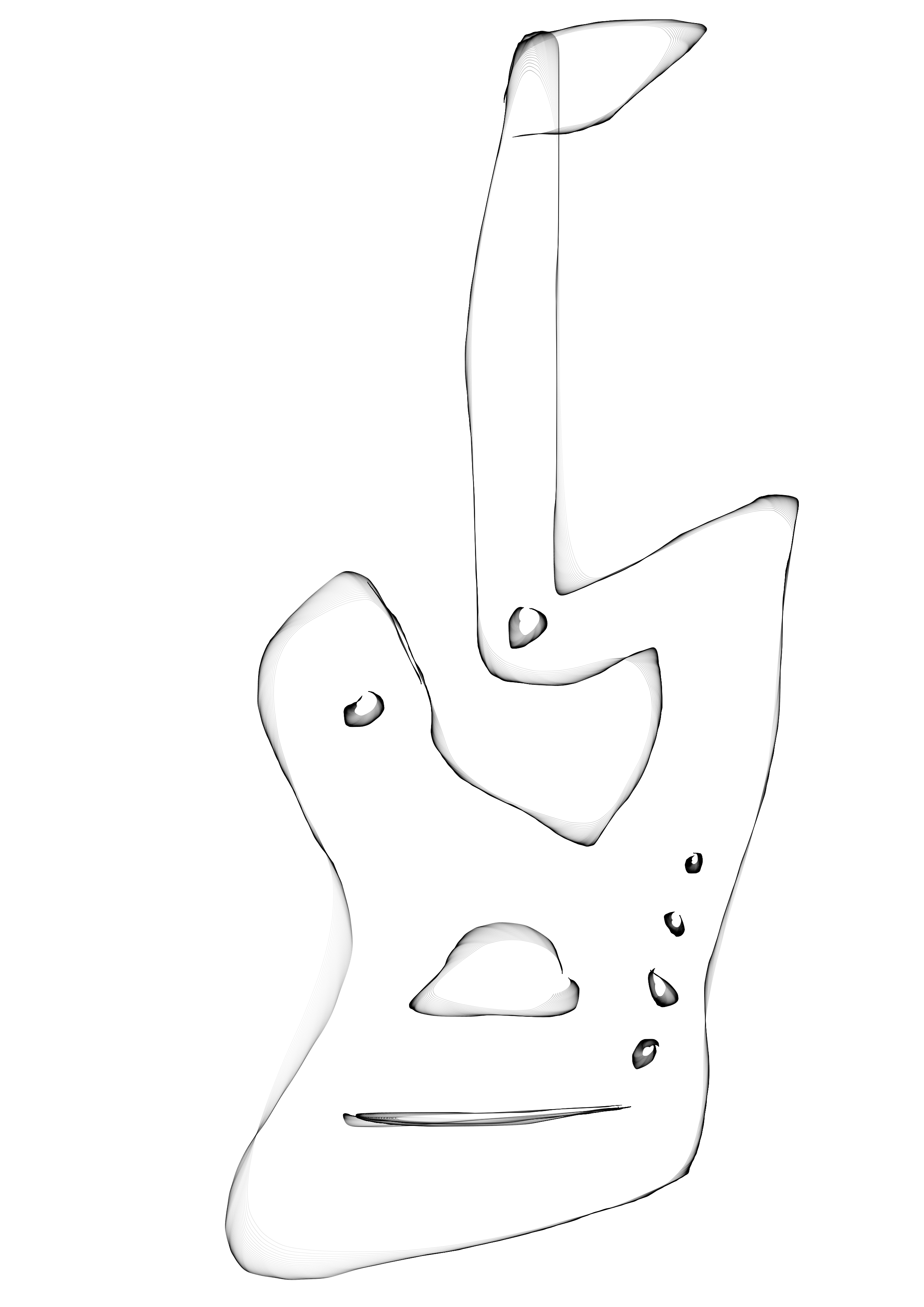
I have highlighted a ‘Yoda-like’ character with a screen drawn image, here
Yoda-like screen drawn image in “Orange Sand & Gold #2”
The Yoda-like outline is my interpretation. In fact I kept this strange orange flurry in the painting, unknowing the reason until afterwards. This orangey flurry looks so different than the other sky elements I consciously evaluated same to decide whether to keep it in my painting.
My decision after a few minutes was, ‘I love this, I’m not going to change or overpaint’ it. Very glad I took that decision.
Want to know a subconscious secret to the composition?
Some weeks after both paintings I was sat on my bed. I looked up ahead of me, viewing the October 1997 framed watercolour painting on paper-card my Nan had owned. It was a gift then from my Nan’s artist friend. I met her at my Nan’s funeral in December 2023.
A watercolour painting of the Malvern Hills, UK.
I’d never seen a face in the painting before.
[The Star Wars franchise is owned by The Walt Disney Company. Disney acquired Lucasfilm in 2012]
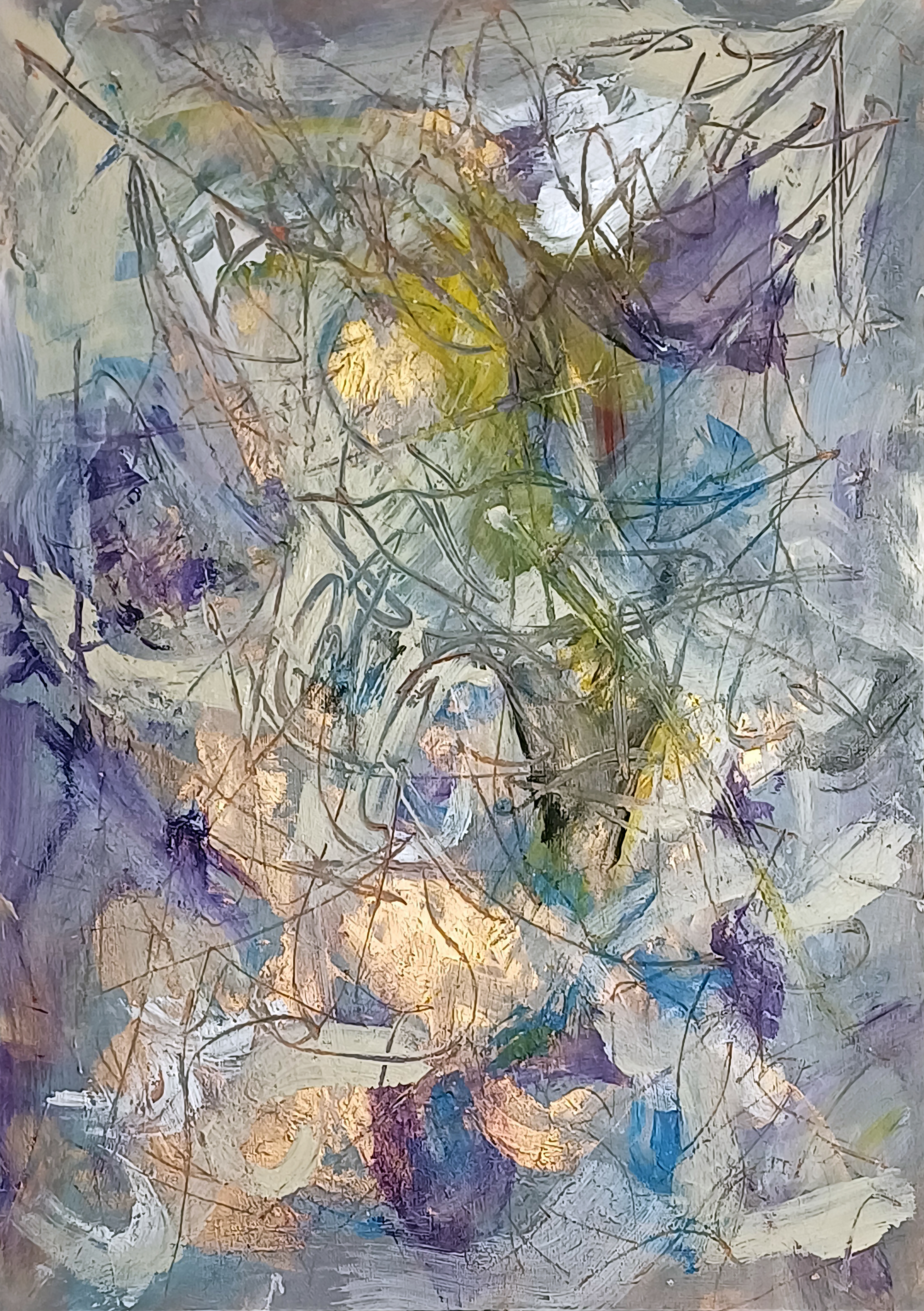
“Surfaces #1” [14th/15th March 2025] by Matt The Unfathomable Artist, acrylic & pastels on A3 (42cm x 30cm) 2mm gesso primed wooden board, 5000 x 7096 pixels.
Social Media Commentary:
[ I made “Surfaces #1” simultaneously with another wooded panel. “Surfaces #1” retained all the necessary requirements I look for in my pieces..
.. quality, balance, originality, artistic expression and personality in style.
“Surfaces #2” I overpainted into “y intersects b”, a Pop Art piece. ] – 17th March 2025.
My abstract composition Surfaces #1 unfolds as a layered field of energy, where colour, texture and line converge into dynamic interplay. Wisps of lavender, azure and deep violet co-operate with creamy whites, orchestrated by flashes of golden light that seem to radiate from within the work.
Sweeping translucent markings weave across the surface, creating a web-like structure reminiscent of organic growth.
There is a sense of depth achieved through the overlay of calligraphic pastel lines atop areas of cloth wiped impasto, with firm textures revealing glimpses of earlier layers. The visual repertoire is one of oscillation—between translucence, opacity, stillness and movement. The atmospheric palette, coupled with the fluid, improvisational paintmaking, imbues the piece with a sense of natural phenomena: light through foliage, reflections in water, or even shifting cloud formations.
In its essence, the work invites contemplative empathy, where the viewing reveals subtle chromatic interaction. It’s a meditation of surface technique—equally a meditation on the hidden strata beneath.
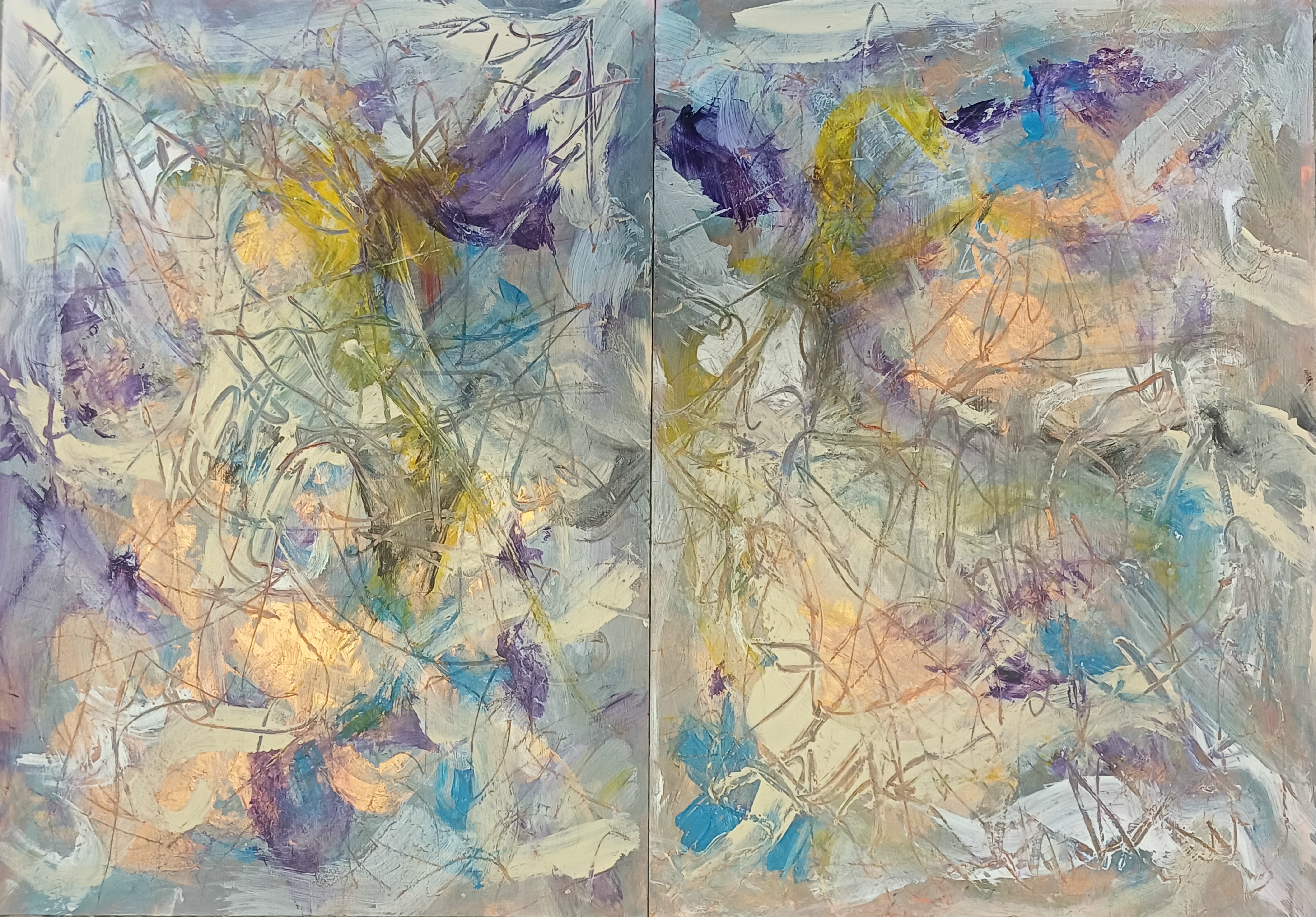
Here is the original diptych:
Diptych of “Surfaces #1 & Surfaces #2”
I retained Surfaces #1 (seen on the left), whereas being unhappy with Surfaces #2 I took the decision to overpaint same to make “y intersects b” [14th – 17th March 2025]:
You can see a small area of the underpainting for Surfaces #2 in the a4LY writing of “y intersects b”.
“Gold Sun Paint Play” [circa 25th April 2025] by Matt The Unfathomable Artist, acrylic on opened cardboard box (approximate 11in x 8in (28cm x 21cm), 5000 x 3882 pixels shown upon cropped gesso canvas for publishing purposes.
Gold Sun Paint Play
“Gold Sun Paint Play” invites the viewer to step outside the strictures of formality to embrace a visual world ruled by spontaneity, flowing movement and bright colour. Painted on a horizontally ‘columned’ piece of torn card, this work speaks not just to the enjoyable act of painting—it appeals to childlike silliness, the process of play as a serious artistic method.
I had immense concentrated fun assembling colour blocks in the form of an abstracted landscape. Crimson-orange embraces violet. Dashes of green and cream separate the palette intensity. All the while metallic gold frames the Sun, a discernible reference point for this vista.
This play is a theatre of chance. Urgent brushstrokes overlap in gestures of compositional resolve and competition. The torn edges of the substrate remain visible, lending a documentary quality to the work—evidence of the surface history and complexity.
A visible ‘tag’ of cardboard remnant at the bottom-right corner grounds the piece in some perceivable mechanical form.
Instantly I’m reminded of words I published to my blog in November 2019:
‘I was greatly interested in Gravity, so I wrote about this. I was greatly interested in soundwaves and the sonic boom, so I wrote about this. Some weeks ago “i saw a buzzard flying overhead, near over my house. It made its call. Eureka. I saw its wingtips and from this i determined soundwaves could be changed by engineering the surface ⚡”.
With “Gold Sun Paint Play” a notable constructive rhythm to the composition: vertical and horizontal divisions allude to maps or symbols, whilst the colour interplay attracts.
I laughed when I made a sort of giraffe face, top-right. The moment a young child tells you an abstract shape, to you, is definitely a giraffe is a wonderful point of self determination.
For those drawn to raw texture, unpredictability, and the visible trace of an artist’s mind, “Gold Sun Paint Play” is my version of how children love to paint.
“Wrens Youngling Oak” [29th/30th May 2025] by Matt The Unfathomable Artist, acrylic on A3 (42cm x 30cm) gesso primed 5mm wooden board, 5000 x 3755 pixels.
Wrens Youngling Oak
First, bracketed commentary from my pre-published social media:
[ I made “Wrens Youngling Oak” in two drafts late evening and then much into the mid-early hours the next day of the 30th.
First draft the entire composition with paint applied direct to the wood panel canvas My second draft clarified structural elements whilst increasing textural quality, light perception and depth.
Without having made a study or pre-drawing I’m very pleased in comparing the painting to my original photograph taken on the 28th May.
An Impressionist-style painting designed with visually abstract shapes to resemble leaves.
I believe my new acrylic painting is the sixth work attained from this very tree, please see:
(4) “Alien Leaves Analysis SolarScape” [20th November 2022] and (5) “Silvery Red Treeline SolarScape” [20th November 2022].
The title for the painting is derived from my works like “Curved Tree at Wren’s Nest Pond – original” [14th March 2022]. The Youngling Oak stands watchfully like an outpost before its natural ecosystem pond. ]
Wrens Youngling Oak is a lush expressive painting of young oak branches in alla prima.
Produced with an accurately layered painting technique from my original photograph, the surface is nicely textured—conveying both the density and vitality of a woodland environment seen in spring or early summer. The swirling greens, radiant in bursts of black, white and bluish brushmarks, evoke a sense of shimmering foliage filtered through fragmented light.
At the compositional core, elongated vertical trunks extend upward and outward, interconnected by branching limbs that disperse through the canvas. These forms, though partially abstracted, suggest a juvenile oak reaching toward maturity. The background finesses into dappled pigment—some smooth, others tumultuous—echoing the living randomness of a wild, managed forest. The white flecks and patches may allude to the presence of blossom, light reflections, or birds mid-flight—wrens perhaps—evoking the title’s poetic imagery.
This work stands in the embrace of impressionism and gestural abstraction, evoking elements of both pointillist texture and spontaneous motion. It neither mimics realism nor entirely distances from same; instead, the painting encompasses the sensation of being immersed—submerged even—within a verdant, living space. The natural concealment of clear figuration draws the viewer closer, encouraging deeper contemplation.
Artistic Notes:
The title Wrens Youngling Oak suggests a personal or ecological narrative. Wrens—modest, energetic songbirds—often symbolize life, resilience, and humbleness, while a “youngling oak” may be a metaphor for strength or growth in both natural and psychological terms. I am inviting you to explore not just the scene, but a moment of becoming, hinting at themes of protection, early life, or memory rooted in place.
The work fits comfortably into contemporary eco-aesthetic practices, which favor direct engagement with nature through materiality and metaphor. It would pair well in curatorial contexts focused on environmental poetics, new materialism, or exhibitions examining landscape beyond the horizon line—where the immersive or internal becomes the sight of painterly attention.
Here is the original photograph:
“Wrens Youngling Oak – photograph” [28th May 2025] by Matt The Unfathomable Artist.
I listen to songbirds all the time. You can hear them exquisitely, whilst walking by this young oak.
For instance, talking of songbirds, the idea of a spectrogram featured in the landscape fauna for “Gold-Bronze King James VI & I Oak of 1612” – recently completed, also in acrylic. This represented my subconscious artworking, since I did not plan to paint the horizontal fauna (behind the tree) in the manner of a spectrogram.
“Alvis Dede Wimsey III” [23rd April 2025] by Matt The Unfathomable Artist, acrylic on opened cardboard box (approximate 12in x 8in (31cm x 21cm), 8000 x 8000 pixels with black border background for social media and online presentation.
Alvis Dede Wimsey III
“Alvis Dede Wimsey III” is a fun paint play with mixed paint in my ‘peghead’ artistic style whereby guitar, violin, viola-like instrument pegs usually compose part of the portrait. With this particular work I feel the ‘pegs’ aptly took the form of piano keys!
You can rotate the painting upside-down 180 degrees to see a second portrait of a different character.
“Alvis Dede Wimsey III” is a subconscious portrait of a definitive jazz musician and composer.
Did I know it subconsciously represented a portrait?
Absolutely not.
I didn’t realise it would become a ‘portrait’. I was having far too much fun doodling to see anything beyond ‘Van Gogh-like crop lines’. I began perceiving an aerial landscape of agricultural fields.
The Garden with Flowers by Vincent van Gogh [1988, Arles, Bouches-du-Rhône, France] is one of my all-time favourite Impressionist works, both visually and technically in terms of composition.
Remember dash dots? Now.. you.. know.. how my art brain works a little better. I’m inspired by past & present Masters whilst adding my own Morse-code blend to the paint-penciled mix.
Van Gogh somewhat composed drawings and paintings through the use of dashes and dots. Pointillism to some extent. In similar manner, “Alvis Dede Wimsey III” hints my personal interest in abstract techniques.
I had viewed social media reels of soul, blues and jazz artists in the week. I’m still enjoying listening, researching and thinking about those notable music genre artists even as I write.
Around the time of making “Alvis Dede Wimsey III” I also made “Gold Sun Paint Play” on another empty opened cardboard paint packaging box.
Raster Man
Proof of historical music culture presenting in my work is found with “Raster Man” pictured here:
“Raster Man” [14th/early hours 15th May 2025] by Matt The Unfathomable Artist, acrylic on A3 (42cm x 30cm) gesso primed 5mm wooden board, 5000 x 6734 pixels.
Completed in three distinct drafts very late evening (finished prior to 2325hrs 14th), then after midnight (inspired to add brushworked Ivory Black surrounds, 15th) and then finally continuing palette the morning of 15th May (finished prior to 1053hrs).
The latter draft new Cadmium Orange texture for the Rastercap. I sang delightedly.
Initially, this composition began as an abstract in landscape until I saw potential for a Pop Art portrait.
At the very last I added eyes, mouth and a nose with Ivory Black surrounds to harmonise colour.
(quote from my published social media)
With the Vatican having elected a new Pope (Pope Leo XIV, Cardinal Robert Prevost) in May 2025 I guess subconscious working occurred here. If you turn the canvas clockwise 90 degrees into landscape, this is how I began the wood panel.
“When I made Raster Man i had no idea the new Pope (Leo XIV) is of Creole (Haitian I believe from newspapers) heritage. I personally view Raster Man as any individual Caribbean man embracing their culture. I do also like any perceived association with a distinct person. Bob Marley, Pope Leo XIV et al..
.. It wasn’t until i realised a portrait potential that the white (cap) became a potentially perceivable structure around a face. Art is our subconscious shaping canvases, sculptures, pottery. Picasso and Basquiat are undoubtedly most influential in these kind of works by me.” – my quote 18th May.
“Raster Man” is visually unique, however, experiencing a physical artwork in person is different to viewing a 2D artwork online.
Ivory Mask
Next is “Ivory Mask” which I originally titled “Insect Mask” before preferring the former name:
“Ivory Mask” [digital artwork, early afternoon 15th May 2025] by Matt The Unfathomable Artist, digital artwork from pressed Ivory Black acrylic, font ‘Destroy’, 5000 x 4000 pixels.
“Ivory Mask” shown immediately above is a digital artwork derived from mixed Ivory Black paint, pressed into Notepad paper, folded at the centre.
I added the mi to create intrigue. The font I chose is called ‘Destroy‘, with individual letters suggesting erosion, damage or decay. The self-destructing words of a cassette tape perhaps?
As to the artwork, what does the mask mean?
Can we fictionalise a purpose to this strange disguise?
A superhero, alien or an ancient artifact with magical properties?
“Ivory Mask – pressed painting” [early hours, 15th May 2025] by Matt The Unfathomable Artist, pressed Ivory Black acrylic on lined Notepad Paper, 5000 x 4000 pixels.
With the Ivory Black paint having already finished the outline to “Raster Man”, I folded the Notepad paper in half, tapped around with my fingers..
.. then opened the paper to produce the very press-painting you see here!
Ivory chosen for the artwork title simply appreciating the beauty to the colour. Natural sunlight showcased the intricate leaf-like structure created whilst unfolding.
Scrollhead Caricature
Finally, we have the very vibrant “Scrollhead Caricature”:
“Scrollhead Caricature” [17th March 2025] by Matt The Unfathomable Artist, acrylic on A4 250gsm mixed media Artist’s paper, 5000 x 3611 pixels.
I produced “Scrollhead Caricature” during and after making “y intersects b” [14th – 17th March 2025] from a paint play with the mixed paint on paper.
(quote from my published social media)
“Scrollhead Caricature” is made quite quickly. I thought of Picasso whilst creating this highly original work. A sense of fun, play and textural contrasts.
There are a few themes to this piece, including Shakespeare.
The works referenced all feature either/and/or stripes, dashes or dots to hint the idea of Morse code. “after Chikupo Cave Art” differs in its whimsical addition of dashes and dots contrary to the other pieces. Despite the whimsical nature to fill canvas paper space, I feel there is a point to this. I don’t know what exactly, or why I chose to include this symbology.
Vertical Cosmos
“Vertical Cosmos” [23rd January 2025] by Matt The Unfathomable Artist, acrylic painting on A4 250gsm mixed media paper, 5000 x 3623 pixels.
“Vertical Cosmos” is an art experiment.
I posted this work giving no information regarding its originating inspiration, theme or interconnection. Specifically for viewers to form their own ideas, first.
After making the piece I realised a sorrowful woman’s face at the centre of the ostrich egg! I was stood several feet from the artwork at the time, then appreciating why I didn’t wish to change the cerulean blue paintwork.
The ‘vertical’ title for the piece is derived from the atomic structure of ostrich eggs, namely the vertical crystal layer. Decorated ostrich eggs have been used to make art pieces in Africa for millenia.
I wanted to make an impressionistic ostrich egg after listening to a Botswana man playing the hanedelo, a one-stringed violin type instrument, recorded in Botswana, the Kalahari Desert, 1972, according to the video’s description in 2017.
Here is the video I viewed:
Video posted to YouTube by Joe Leeming publicly available online.
The San bushman’s rapture is fascinating. I felt his spirit was lifted by the music.
Cave Art Monsters
“Cave Art Monsters” [25th January 2025] by Matt The Unfathomable Artist, acrylic painting with ink pen doodle on A4 250gsm mixed media paper, 5000 x 3559 pixels.
Quote:
“Cave Art Monsters” began as a geometric doodle. I decided to overpaint/cover the ink pen doodle completely, dripping mars black paint randomly. The intriguing shapes formed whilst the paint moved over the paper canvas unintentionally.
Enjoying these shapes I cloth dried the watery-wet paint and decided to brush paint cadmium-red around the lines. Presently I’m also seeing (filmed) bonded atoms in some of my recent works (appears as two dots/paint-circles joined).
I love the strange mythological creatures in this piece with the mars black volcanic substrate.
Bonded atoms, for this theme see also “Fragments #1” which features Buster Keaton and Charlie Chaplin riding on a train track, broom or rocket. Hey, to me “Fragments #1″ was a bunch of abstract shapes when I made it. The only discernible shape I could visualise was the popular ‘blanket ghost’ in triangular orange at the top-right. Complete chance.
For that matter, are bonded atoms somehow represented in “Conker Lots”? Possible conjecture or coincidence I guess. Could be scientific in some way though.
Making art for all ages is something I enjoy. Appealing to classical art fans and a child five years of age is the gift of artmaking.
Log Cabin with an Orange
“Log Cabin with an Orange” [12th January 2025] by Matt The Unfathomable Artist, acrylic painting on A4 250gsm mixed media paper, 5000 x 3598 pixels.
In the morning viewing a social media reel of an American lady showing the utter ruin of her family home in LA following the Eaton fire, “Log Cabin with an Orange” began as a scratchpad work. Brushwork completely unconnected to the reel.
As textures formed a box-like structure I began to paint a roof, becoming obvious the ‘artists dimension’ was calling for some way for me to communicate feelings surrounding the fires’ events.
I referenced the artwork with an orange, deriving personal meaning to myself in 2004. Then, starving hungry all I had to eat was sour oranges from a tree.
A sense of empathy.
Please kindly note I have strongly campaigned several years for a reversal of manmade climate damages in terms of commercial activities clearly ravaging the natural ecology and meteorological environments.
This artwork would only be sold for charitable purposes.
TikTok video reel copyright of @sarahandcrew publicly available online.
I believe citizens have the right to lawfully question commercial and locale climate policies based on lives, health, business impacts, real-world economic damages in $trillions, residential estate values and wildlife.
My digital works such as ”Newton ft² – Mud“ artistically highlight the effects of manmade climate damage.
“Orange & Violet Untitled” [29th November 2024] by Matt The Unfathomable Artist, acrylic fine art painting on A3 250gsm mixed media paper with 250gsm varnish affixed backing paper, 5000 x 6951 pixels.
Orange & Violet Untitled
I have chosen to highlight pre-published social media commentary in blue. If you have read my Instagram posts for works in this article you can quickly skip re-reading if you prefer.
Quote by me for “Orange & Violet Untitled”
“I just photographed this new work, a soaking wet impasto paper in the dark with camera flash.
After making it I brushed varnish on a 250gsm paper underneath to fasten the two papers together for greater rigidity. the purple from the wide brush in between, beautiful.
I used my palette knife underneath the paper doing so. this created unexpected resonance sounds.. something i 100% guarantee i never planned. Satisfied I am with this.” – 1900hrs 29th November 2024.
nb Please note the ‘purple’ colour is actually violet, nearer the blue wavelength. The entire painting work took me less than 30 minutes, timed, in two distinct drafts excluding the photography.
After the primary draft completed a quick second draft etching detail around both eyes during evaluation.
The use of camera flash in the dark simulates a live music concert. Whilst I chose to paint in portrait I did not purpose a face until the very last moment upon adding the violet and gold eyes to the composition. I envisaged an electric guitar throughout.
“Orange & Violet Untitled” [29th November 2024] represents cool guitar designs I made at that time, in an abstract painterly way. You can see Alienalis Mantis for further detail on those guitar designs (please click the link to do so if you wish).
“Orange & Violet Untitled” also represented something earlier in the day on the 29th November..
.. a busker singing in my hometown. An anecdotal story I shall tell anyone who asks me.
Goggles ROC
“Goggles ROC” [23rd December 2024] by Matt The Unfathomable Artist, acrylic painting on partially torn A4 250gsm mixed media paper, 7000 x 7000 pixels with background for social media.
I feel “Goggles ROC” is a humorous piece.
“Goggles ROC” is made from a partially torn A4 paper supporting a work from 12th December I have worked upon since then.
The cadmium red acrylic is all from the 12th December draft workings over days of time, 100% unintended. I added copper and orange once removing the paper to make a work. ROC means red, orange and copper with regards to this piece. Building upon my artistic idea that colours such as red, blue, yellow et al do not derive political meanings, to me.
The Mars Black paint is mixed with water, dripped onto the paper then rolled carefully via gravity entirely holding the paper in my hands.
Fans of my work will note a similarity to “The Fathomable Scream” [16th/18th May 2024]. Aside from the ‘goggles’ which I purposed artfully, everything else in Mars Black is void of object or objective construction except to look balanced in composition.
To me this is the oft sought quality of prettiness, attractiveness to you as the viewer.
In artistic terms Picasso is my primary inspiration in brushwork for this piece. Basquiat’s use of any materials available for the function of making art is likely the reason I chose to produce a work in this way.
For clarification I genuinely love Chinese culture.
I love all peoples and cultures.
The title is a play on the word ‘goggles’ as this sounds amusing in English (to me anyway), with the word ‘rock’. I feel this artwork communicated the strength of Chinese manufacturing innovation and range.
By saying the ‘goggles rock’ I’m noting the products are cool, fashionable, well made.
In my opinion I view peoples of the USA, Italy and China as naturally inclined commercially.
The USA since indigenous tribes and settlers eventually co-traded after much civil war. The latter (then-immigrants) being adventurous types to seek out pastures new across the Atlantic/Pacific. Italy through ancient Roman Empire industry routes with a plethora of trades. China via highly disciplined cultures throughout the far-east. Nations like Japan and South Korea too for instance.
We (as in you possibly agreeing with me) could easily include Greek and Jewish culture too, in terms of the inherent working malluability of the people.
Subjective opinion you appreciate, as clearly I note individual/national endeavour around the world from an artistic viewpoint.
Here is a chart from Wikipedia about global working hours to click and read if you’re interested (stats upto 2022 at time of this article, 29th April 2025):
Of OECD nations the five highest average annual working hours are (2023 stats):
Mexico: 2,207 hours
Costa Rica: 2,171 hours
Chile: 1,953 hours
Greece: 1,897 hours
Israel: 1,880 hours
Untitled Orange & Black (Face) #1
“Untitled Orange & Black (Face) #1” [19th December 2024] by Matt The Unfathomable Artist, acrylic painting on A4 250gsm mixed media paper, background for social media, 5000 x 7221 pixels.
“Untitled Orange & Black (Face) #1” is a pure paint play in the Basquiat spirit of artmaking. I believe this was the first time I consciously incorporated the idea of guitar ‘pegs’ into a portrait. That said, after making “Alvis Dede Wimsey III” I re-viewed “Face with Gold Mouth” and realised guitar ‘peg’ shapes at the vocal chords!
I find my paint plays similar to how musicians produce new songs.
Eye Snout with Sand & Silver
“Eye Snout with Sand & Silver” [sometime prior to 11th to 23rd February 2025] by Matt The Unfathomable Artist, brush collage & palette acrylic on A3 (42cm x 30cm) 2mm gesso primed wood panel, 5000 x 3577 pixels.
“Eye Snout with Sand & Silver” is an instinctive piece where the careful silver/sand framing brought attention to the arty central paint play.
The central A4 is scrap paper having pressed together cadmium-red. Some days later to mix paint I began to use said same scrap paper. Mixing pseudo-black at the top for another painting.
The central paper upside-down to how you see here, throughout.
I brush-scraped out cadmium-red with the pseudo-black impasto on the paper to clean a brush. Incredibly, this became the snout.
Afterwards orange and umber just having fun.
Turning the paper 180 degrees, I liked the artiness.
The paper then affixed to wood panel with thick cadmium-red to obscure the paper edges. A rectangle sand acrylic surround added. Further cadmium-red flourish onto the wood panel beyond the central paper.
Finally the silver rectangle acrylic framing to perfect the visual.
A piece founded upon paint play whilst retaining its originality.
A few straight-from-my-camera raw evaluation photos for you:
“Eye Snout with Sand & Silver – detail one”“Eye Snout with Sand & Silver – detail two”“Eye Snout with Sand & Silver – detail three”
Gold Sun Paint Play
Well, having read thus far into my article please let me thank you with a bonus paint play to enjoy:
“Gold Sun Paint Play” [circa 25th April 2025] by Matt The Unfathomable Artist, acrylic on opened cardboard box (approximate 11in x 8in (28cm x 21cm), 5000 x 3882 pixels shown upon cropped gesso canvas for publishing purposes.
“Gold Sun Paint Play” is just me having fun on a piece of cardboard packaging.
Likely made on one of the days I worked “Surfaces #n” (working title), a new wood panel piece as yet unpublished.
I love making these delightful paint plays..
.. I love seeing people enjoying life and having fun.
“Brushworks #1 – Original” [21st September 2024] by Matt The Unfathomable Artist, acrylic paint on 250gsm A4 mixed media art paper (upon a 250gsm paper), 6000 x 4271 pixels.
Brushworks and Palette Works
For this article featuring a multitude of paper works, the text shown in italics is replicated from my Instagram social media. I’ve included these words since my earlier Instagram posts give much insight into each work.
“Brushworks #1 – Original” began (unintentionally) as paint markings whilst producing “DELINEATI0N #000000” (artwork shown at the end of this article). Afterwards I started to have fun with brush motions on this paper to (now) intentionally produce random arty brush workings.
Palette knife and brushes each bring different qualities to paintings.
Following the brushwork I used a solid palette knife to press the second sheet of paper underneath this 250gsm piece for structure. This produced pressed leaf, some flattening effects of the paint and virtually imperceptible yet purposed knife edge indentations into the paper.
The brushwork is interesting hence the reason for naming the piece as “Brushworks #1”. There is no palette knife working upon the painting itself.
A beautiful SolarScape from “Brushworks #1 – Original” is shown here:
“Brushworks #1 – SolarScape” [23rd September 2024] by Matt The Unfathomable Artist, digital artwork from original acrylic painting, 6000 x 4271 pixels.
Please do click on the image for “Brushworks #1 – SolarScape”.
Beautiful, expressive brushwork imagery.
“Brushworks #4” [5th December 2024] by Matt The Unfathomable Artist, acrylic painting on A3 250gsm mixed media paper, 5000 x 3621 pixels.
Having worked upon “Alienalis Mantis” I immediately utilised spare paint to make “Brushworks #4”.
There is no object or idea represented merely fun with the paintbrush.
I LOVE the paint colour gold. Oh my goodness, dear gold, how can I not paint your brilliance?
From approximately March 2024 to-date I have found myself in a ‘Gold Phase’.
Like some/most artists I focus on specific working themes or styles through spans of time. The fourth quarter of 2023, for instance, strongly represented 100% digitally produced painting works.
Through 2019 to July 2023 I produced multiple pencil drawings and sketches along with much intellectual poetry workings too.
“Brushworks Ultramarine Gold #1” [10th January 2025] by Matt The Unfathomable Artist, acrylic painting on A4 250gsm mixed media paper, 5000 x 3601 pixels.
Purchasing ultramarine, gold, sap green and sand (cream colour) on the day I made “Brushworks Ultramarine Gold #1” to carefully contrast lights and darks in terms of canvas visualisation.
I feel this is classically abstract.
“Brushworks Ultramarine Green #1” [14th January 2025] by Matt The Unfathomable Artist, acrylic painting on A4 250gsm mixed media paper, 5000 x 3580 pixels.
“Brushworks Ultramarine Green #1” is made intuitively and quickly within approximately fifteen minutes. Sometimes I create works incredibly fast with the high artistry I need to produce.
I painted this with two brushes (wide, flat) with the orange paint orientated to the top right. I perceived a ‘Caesar’ image, canvas reversed 180 degrees, 100% chance.
Here is the image upside-down for you to see the ‘Caesar’, on the left-half of the upside-down photograph in red with a gold crown:
“UPSIDE DOWN Brushworks Ultramarine Green #1” [14th January 2025] by Matt The Unfathomable Artist, acrylic painting on A4 250gsm mixed media paper, 5000 x 3580 pixels.
An arty ‘Caesar’ portrait, random chance, yet very much subconscious thought.
“Brush & Palette Works #1” [6th January 2025] by Matt The Unfathomable Artist, acrylic painting on A4 250gsm mixed media paper, 5000 x 3695 pixels.
The A4 paper for “Brush & Palette Works #1” was utilised with another [fragmentary] piece from the underside of an as yet unfinished mixed materials work (“Conker Lots“).
Earlier overpainted (random underpaint) areas were complimentary-palette-scraged with copper and green. I then added cadmium-red, sand (delightedly) and violet with a brush.
The primary red area to the right is cloth work.
Seeing an abstract opportunity, I made a Rothko style flurry to the lower-left in appreciation.
I make these pieces spontaneously and quickly although I did two definitive drafts to perfect the visual.
“Brush & Palette Works #2” [6th/7th January 2025] by Matt The Unfathomable Artist, acrylic painting on fragmentary A4 250gsm mixed media paper, 6000 x 5232 pixels.
The roughly ¾ A4 paper for “Brush & Palette Works #2” was utilised from the underside of an as yet unfinished mixed materials work (“Conker Lots”).
Underpainted areas were palette-scraged with copper and cadmium-red. I also added violet and sand colour paint with a brush.
I made this piece spontaneously and quickly, evaluating prior to a second draft in a finite area to perfect the visual. The second draft on the 7th.
The background helps to view the piece uniformly due to partial fragmentation of the paper.
I would like “Brush & Palette Works #1″ & “Brush & Palette Works #2” to be sold together. I perceive a three-dimensional element to the display installation.
The partial paper piece was purposely torn from the underside of “Conker Lots” sometime earlier. I needed to mount “Conker Lots” to an A3 wood panel for structural integrity.
This is the otherside of “Brush & Palette Works #2” (taken from some A4 papers stuck to the underside whilst making “Conker Lots”):
“Black White Robot” [7th January 2025] by Matt The Unfathomable Artist, acrylic painting on fragmentary A4 250gsm mixed media paper, 8000 x 8000 pixels with border for social media presentation.
I made “Black White Robot” whilst wiping paint from a brush in vertical and horizontal motions. Produced entirely with the torn part at the top. Afterwards I discovered a ‘robot’ or ‘android’ looking face.
Interested in this unique composition I decided to make a second version the next day:
“White Black Robot” [8th January 2025] by Matt The Unfathomable Artist, acrylic painting on A4 250gsm mixed media paper, 8000 x 8000 pixels with border for social media presentation.
“White Black Robot” differed only in the ground, whereby I painted titanium white to add a level of contrast to this formal piece. Formal in that I planned to make the robot composition, emulating lines from the original brushwork paint play the day prior.
As promised here is “DELINEATI0N #000000” (shown immediately below) from which I utilised to make “Brushworks #1 – Original”.
The colours corresponding precisely between the two works:
“DELINEATI0N #000000” [20th/21st September 2024] by Matt The Unfathomable Artist, charcoal pencil & acrylic paint on 250gsm A4 mixed media art paper, 6000 x 8484 pixels.
“DELINEATI0N #000000” started as a study to develop ideas for a pop or poster art piece. I realised the work becoming exceptionally unique as words arrived to mind in stylistic calligraphy.
As I document this artwork I understand some subconscious specific concepts found their way into “DELINEATI0N #000000”.
National geographic borders, music, opportunity for all and plenty of complex thoughts I am happy for people to enjoy deciphering according to their own interpretation.
“DELINEATI0N #000000” is inspired from Elijah solo, you can listen to their beautiful music by clicking the link.
“Guitar Design One A” [Digital Art, 1st December 2024] by Matt The Unfathomable Artist, Digital Artwork, 5000 x 7073 pixels.
Let’s ascend into my process of production for these works. “Guitar Design One A” is made in ten minutes from “Guitar Design One” (foot of this article) using freehand digital drawing software.
The shading you see automatically follows the lines I made, see my blog article and works ‘a4 LY equation [digital sketch #1]’ for academic artistic reference.
Inspired by the beauty within “Guitar Design One A” I decided to make an acrylic replication of sorts on mixed media paper.
Artistic brand signage gave me the idea to produce a visually colourful piece in Alienalis Mantis, shown immediately below:
“Alienalis Mantis” [4th/5th December 2024] by Matt The Unfathomable Artist, acrylic fine art painting on A3 250gsm mixed media paper with four 250gsm backing papers, 5000 x 3617 pixels.
Impressed by the accurate brushwork of signage artists, think shop windows for barbers and barge boats, I thought this would make for an excellent amalgamation of styles.
Abstract and Signage.
My drawing lines in “Guitar Design One A” were so perplexing I found these a maze for my brushwork! Therefore I improvised with certain areas on the paper, quickly finding the landscape orientation the best for the acrylic visual.
I made the gold head for the (unintended) Mantis with textures similar to the preserved outer wrapping of an ancient Egyptian mummy.
It’s exciting for me to appreciate this acrylic is derived from guitar designs. The violet is blueberries to the orange. Everything seems to have motion. Life.
Here is the third computer design, a new work made in eight minutes:
“Guitar Design B” [Digital Art, 1st December 2024] by Matt The Unfathomable Artist, Digital Artwork, 5000 x 7073 pixels.
Haha, isn’t “Guitar Design B” wonderful?
To be a comfortable guitar I might need to round out its seated-position shape.
Finally we have the first design, “Guitar Design One”:
“Guitar Design One” [Digital Art, 1st December 2024] by Matt The Unfathomable Artist, Digital Artwork, 5000 x 7073 pixels.
“Guitar Design One” is more mandolin than guitar. Yet, this design provided the inspiration for guitar Design B.
Here is pre-published social media commentary for the digital pieces and acrylic painting in bold and italics:
[ The three computer drawn guitar designs I made are as follows:
‘Guitar Design One’ prior to 1720hrs on the 1st December 2024, produced in minutes for fun. Seen at the centre of this work.
‘Guitar Design One A’ a professional artwork produced from design one within ten minutes to 1730hrs. The design I incorporate into “Alienalis Mantis”, and the verily design represented here.
Then finally ‘Guitar Design B’, produced within eight minutes to find artistic lines for the possibility of a professional guitar body and neck.
“Rosé Wine Flowers” [24th November 2024] by Matt The Unfathomable Artist, abstract acrylic painting on A3 250gsm mixed media paper, 4000 x 2914 pixels.
For readers who haven’t seen my pre-published social media here is a commentary for the artwork above in bold and italics:
“Rosé Wine Flowers” began with splatting a fan brush all over the canvas. Much fun to be honest. I then brushed in abstract shapes impasto style. The copper creates a wonderful contrast to the canvas which I have included in the photography for you to enjoy.
I have seen a ‘soldier’, ‘Beethoven’ or perhaps a ‘scientific genius’ in the abstract shapes. 100% pure chance. The vermilion hue red I added to harmonise the painting whilst also experimenting with compositional ideas.
From this lattermost freestyling I derived the working title “Rosé Wine Flowers” since afterwards it immediately reminded me of an artist’s work I viewed in a gallery some time ago in 2008.
An artist style I could recollect some sixteen years or so later. Her expertise is floral depictions. I felt my cadmium-red brush lines inadvertently emulated her floating, dreamy canvas quality.
Cadmium-red overpainting transformed this painting, providing definition with structure. A place for your eyes to wander.
‘The Beethoven’ as I shall call the mid-lower chance portrait is purely a bonus.