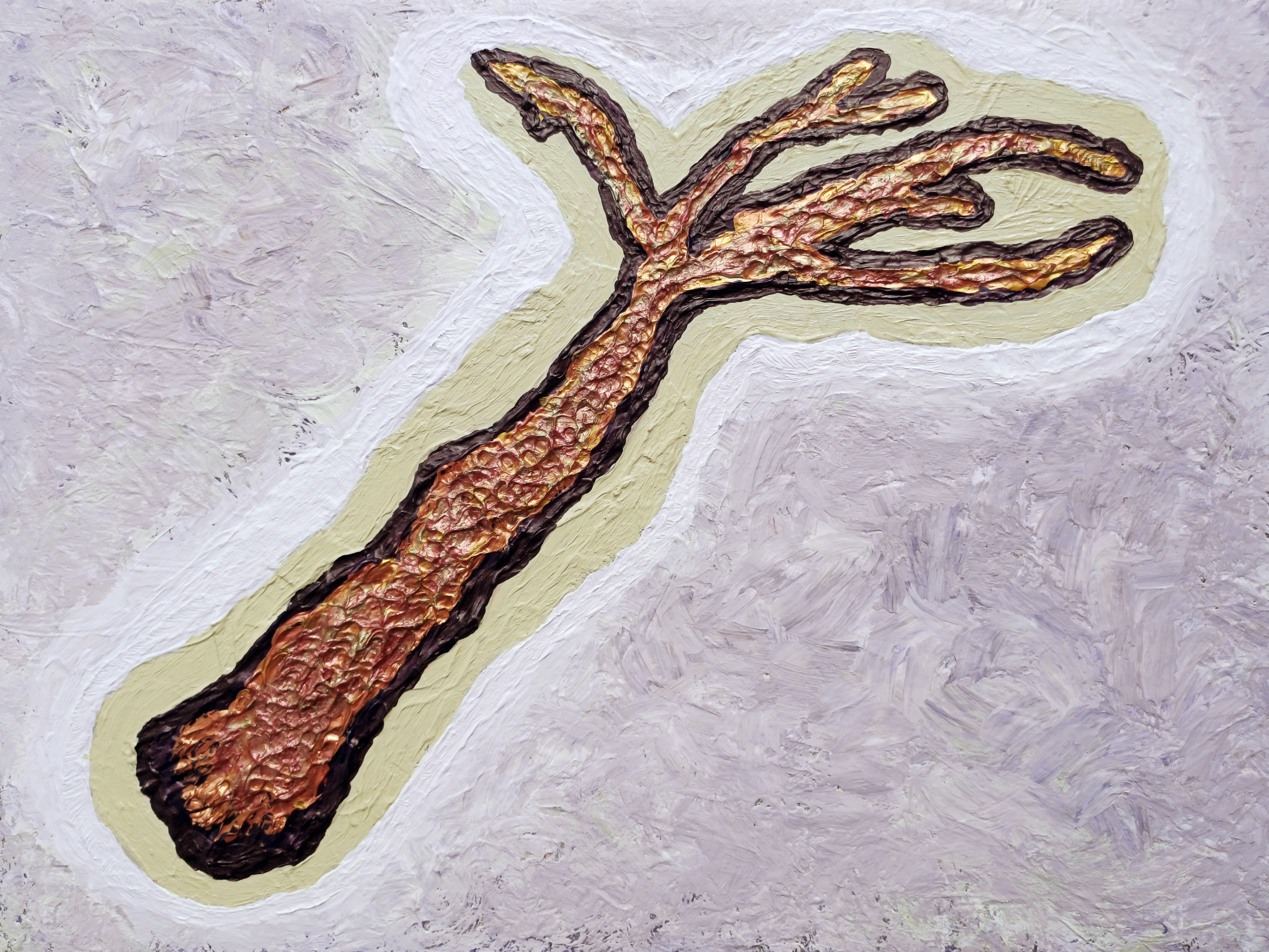
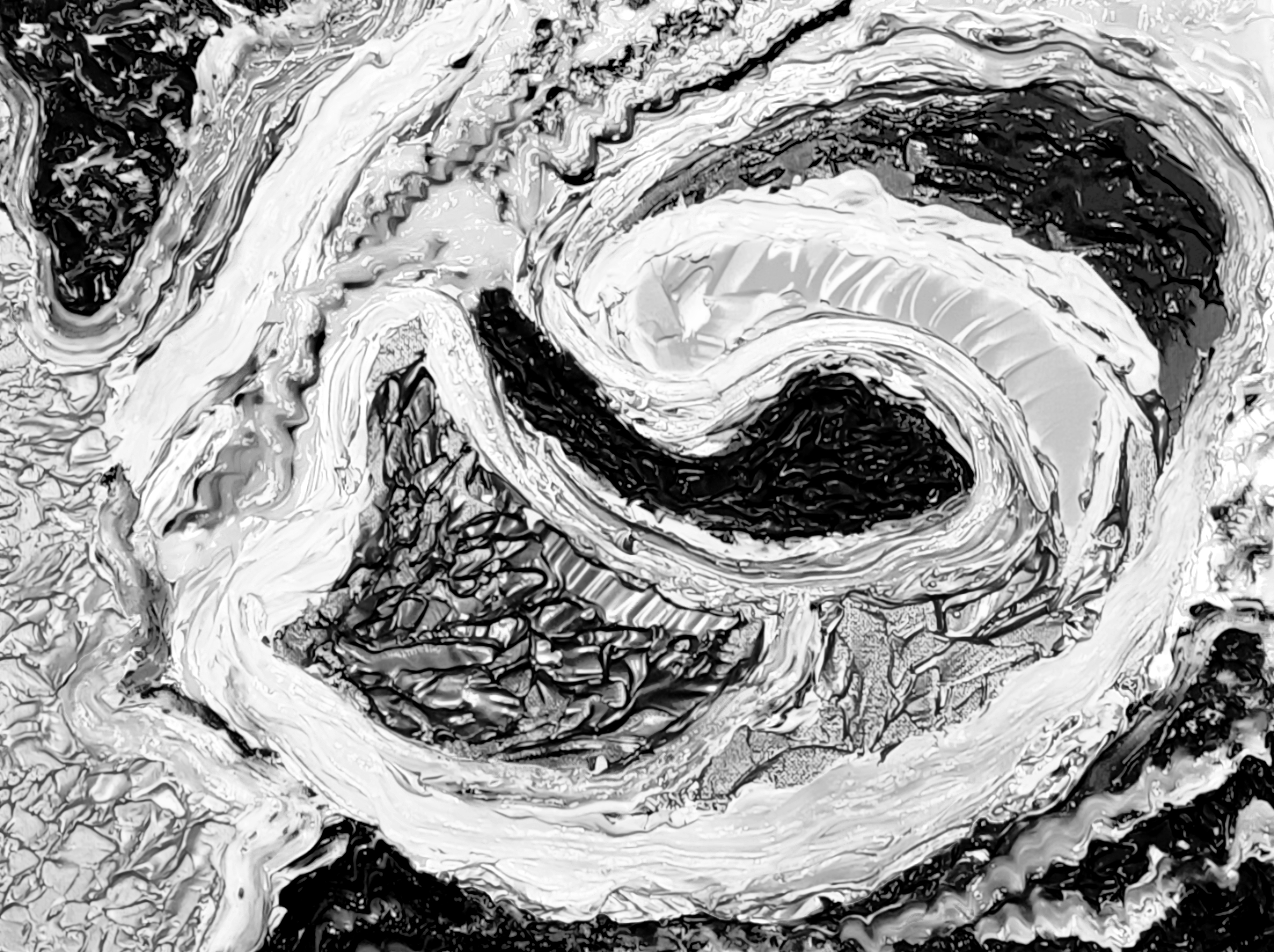
“aš imin” [21st August to 5th September 2025] by Matt The Unfathomable Artist, acrylic on A3 (42cm x 30cm) gesso primed 5mm wood panel, 3000 x 2251 pixels.
My composition “aš imin“ is a deep analysis into universal patterns of life and connection. The central form suggests a branching structure—simultaneously reminiscent of ancient coral, fossils, vascular systems, dendritic neurons or fauna—while deliberately avoiding direct classification. This ambiguity is crucial, allowing the form to function as a multifunctional symbol of growth.
A heavily textured composition of gold and bronze is framed by sand and white pigment. Beneath this is an earlier red–gold ground—essential to the final dialectic. The stratigraphy produces a studied tension: an archaeology of the surface. The form reads as an excavated artifact, granting graphic immediacy and visual resolve.
While my working title “Archaeological Tree” gave meaning, the interpretive process following its completion revealed a more definitive understanding to me, embodied in the final title, “aš imin“, through my use of ancient linguistics.
The work’s ultimate artistic identity emerges for research, intellectual conversation and viewing pleasure.
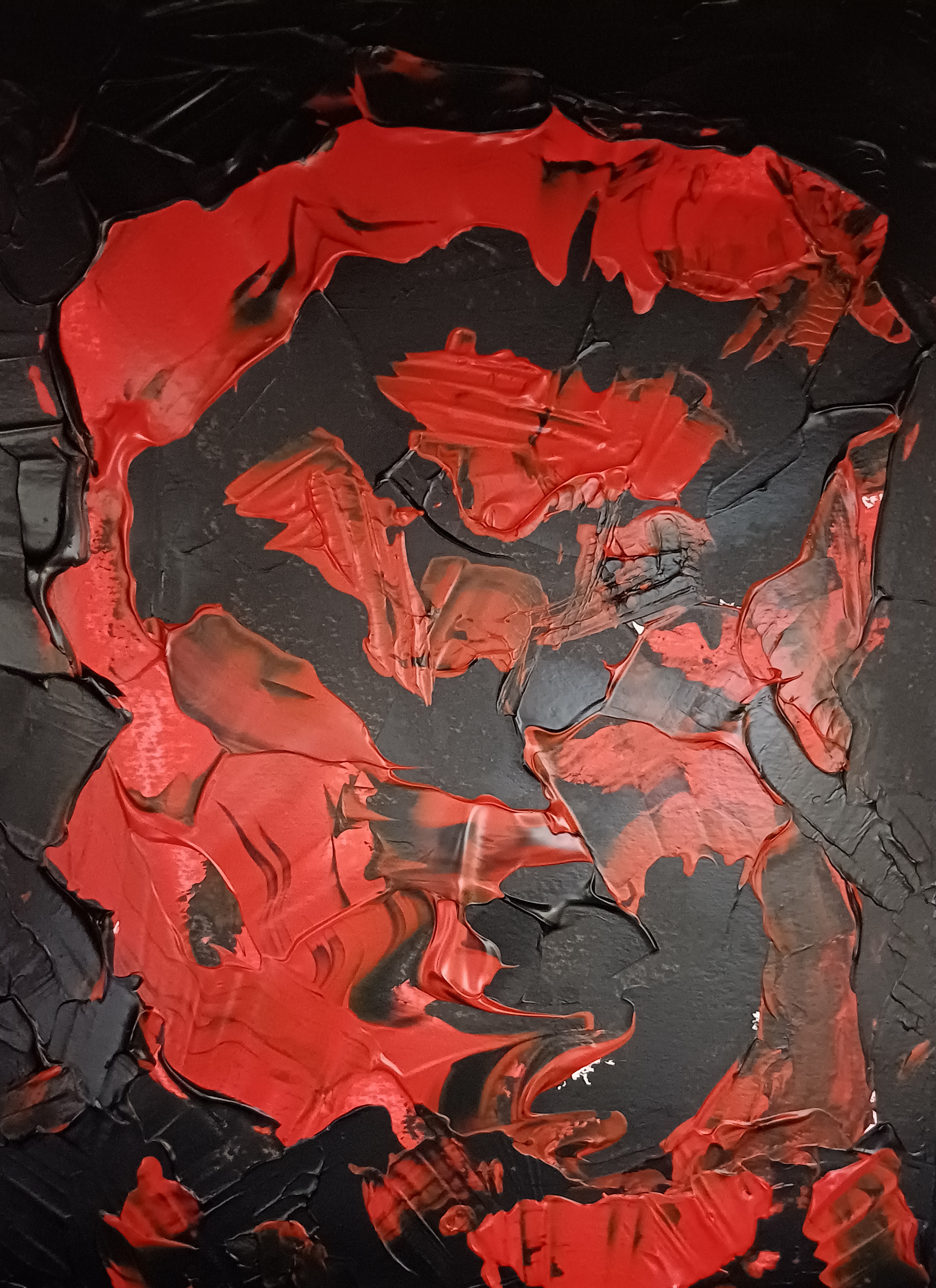
“the god”
“the god” [30th June to 10th July 2025] by Matt The Unfathomable Artist, acrylic on A3 (42cm x 30cm) gesso primed 5mm wooden board, 5000 x 3735 pixels.
In my work “the god” my intention is to explore the archetypal nature of power and divinity. The piece is built upon a fundamental contrast between the sacred and the primal. I rendered the central figure in heavily textured gold to signify its timeless, iconic status, while the gestural ambiguous form resists simplistic definition.
A being simultaneously monumental and vulnerable, divine and earth-bound.
The surrounding field of expressively textured black is not a passive ground, rather this is an active inference through the body—the source of invention and mystery from which the figure emerges. My technique here is founded in 19th Century brushworking styles; the raw impasto of both the gold and black surfaces is meant to convey a sense of primal energy and ancientness.
This is a deity, a force weathered by millennia.
In its afterlife, the figure resonates with modern mythologies—interlinked with cinematic icons whose alien brilliance and public acclaim embody the uniqueness the work seeks to crystallize.
Love, too, is a force that endures beyond death.
Both “aš imin” and “the god” are foundational works within the Estate of Matt The Unfathomable Artist.
A direct engagement with the symbols that underline human consciousness, created to be a powerful, resonant statement to speak across cultural and temporal boundaries.
These pieces are therefore symbolic portraits of past and modern life, a system—a direct visual language underlying human consciousness; across cultures and epochs.
“Gold Sun Paint Play” [circa 25th April 2025] by Matt The Unfathomable Artist, acrylic on opened cardboard box (approximate 11in x 8in (28cm x 21cm), 5000 x 3882 pixels shown upon cropped gesso canvas for publishing purposes.
Gold Sun Paint Play
“Gold Sun Paint Play” invites the viewer to step outside the strictures of formality to embrace a visual world ruled by spontaneity, flowing movement and bright colour. Painted on a horizontally ‘columned’ piece of torn card, this work speaks not just to the enjoyable act of painting—it appeals to childlike silliness, the process of play as a serious artistic method.
I had immense concentrated fun assembling colour blocks in the form of an abstracted landscape. Crimson-orange embraces violet. Dashes of green and cream separate the palette intensity. All the while metallic gold frames the Sun, a discernible reference point for this vista.
This play is a theatre of chance. Urgent brushstrokes overlap in gestures of compositional resolve and competition. The torn edges of the substrate remain visible, lending a documentary quality to the work—evidence of the surface history and complexity.
A visible ‘tag’ of cardboard remnant at the bottom-right corner grounds the piece in some perceivable mechanical form.
Instantly I’m reminded of words I published to my blog in November 2019:
‘I was greatly interested in Gravity, so I wrote about this. I was greatly interested in soundwaves and the sonic boom, so I wrote about this. Some weeks ago “i saw a buzzard flying overhead, near over my house. It made its call. Eureka. I saw its wingtips and from this i determined soundwaves could be changed by engineering the surface ⚡”.
With “Gold Sun Paint Play” a notable constructive rhythm to the composition: vertical and horizontal divisions allude to maps or symbols, whilst the colour interplay attracts.
I laughed when I made a sort of giraffe face, top-right. The moment a young child tells you an abstract shape, to you, is definitely a giraffe is a wonderful point of self determination.
For those drawn to raw texture, unpredictability, and the visible trace of an artist’s mind, “Gold Sun Paint Play” is my version of how children love to paint.
“Alvis Dede Wimsey III” [23rd April 2025] by Matt The Unfathomable Artist, acrylic on opened cardboard box (approximate 12in x 8in (31cm x 21cm), 8000 x 8000 pixels with black border background for social media and online presentation.
Alvis Dede Wimsey III
“Alvis Dede Wimsey III” is a fun paint play with mixed paint in my ‘peghead’ artistic style whereby guitar, violin, viola-like instrument pegs usually compose part of the portrait. With this particular work I feel the ‘pegs’ aptly took the form of piano keys!
You can rotate the painting upside-down 180 degrees to see a second portrait of a different character.
“Alvis Dede Wimsey III” is a subconscious portrait of a definitive jazz musician and composer.
Did I know it subconsciously represented a portrait?
Absolutely not.
I didn’t realise it would become a ‘portrait’. I was having far too much fun doodling to see anything beyond ‘Van Gogh-like crop lines’. I began perceiving an aerial landscape of agricultural fields.
The Garden with Flowers by Vincent van Gogh [1988, Arles, Bouches-du-Rhône, France] is one of my all-time favourite Impressionist works, both visually and technically in terms of composition.
Remember dash dots? Now.. you.. know.. how my art brain works a little better. I’m inspired by past & present Masters whilst adding my own Morse-code blend to the paint-penciled mix.
Van Gogh somewhat composed drawings and paintings through the use of dashes and dots. Pointillism to some extent. In similar manner, “Alvis Dede Wimsey III” hints my personal interest in abstract techniques.
I had viewed social media reels of soul, blues and jazz artists in the week. I’m still enjoying listening, researching and thinking about those notable music genre artists even as I write.
Around the time of making “Alvis Dede Wimsey III” I also made “Gold Sun Paint Play” on another empty opened cardboard paint packaging box.
Raster Man
Proof of historical music culture presenting in my work is found with “Raster Man” pictured here:
“Raster Man” [14th/early hours 15th May 2025] by Matt The Unfathomable Artist, acrylic on A3 (42cm x 30cm) gesso primed 5mm wooden board, 5000 x 6734 pixels.
Completed in three distinct drafts very late evening (finished prior to 2325hrs 14th), then after midnight (inspired to add brushworked Ivory Black surrounds, 15th) and then finally continuing palette the morning of 15th May (finished prior to 1053hrs).
The latter draft new Cadmium Orange texture for the Rastercap. I sang delightedly.
Initially, this composition began as an abstract in landscape until I saw potential for a Pop Art portrait.
At the very last I added eyes, mouth and a nose with Ivory Black surrounds to harmonise colour.
(quote from my published social media)
With the Vatican having elected a new Pope (Pope Leo XIV, Cardinal Robert Prevost) in May 2025 I guess subconscious working occurred here. If you turn the canvas clockwise 90 degrees into landscape, this is how I began the wood panel.
“When I made Raster Man i had no idea the new Pope (Leo XIV) is of Creole (Haitian I believe from newspapers) heritage. I personally view Raster Man as any individual Caribbean man embracing their culture. I do also like any perceived association with a distinct person. Bob Marley, Pope Leo XIV et al..
.. It wasn’t until i realised a portrait potential that the white (cap) became a potentially perceivable structure around a face. Art is our subconscious shaping canvases, sculptures, pottery. Picasso and Basquiat are undoubtedly most influential in these kind of works by me.” – my quote 18th May.
“Raster Man” is visually unique, however, experiencing a physical artwork in person is different to viewing a 2D artwork online.
Ivory Mask
Next is “Ivory Mask” which I originally titled “Insect Mask” before preferring the former name:
“Ivory Mask” [digital artwork, early afternoon 15th May 2025] by Matt The Unfathomable Artist, digital artwork from pressed Ivory Black acrylic, font ‘Destroy’, 5000 x 4000 pixels.
“Ivory Mask” shown immediately above is a digital artwork derived from mixed Ivory Black paint, pressed into Notepad paper, folded at the centre.
I added the mi to create intrigue. The font I chose is called ‘Destroy‘, with individual letters suggesting erosion, damage or decay. The self-destructing words of a cassette tape perhaps?
As to the artwork, what does the mask mean?
Can we fictionalise a purpose to this strange disguise?
A superhero, alien or an ancient artifact with magical properties?
“Ivory Mask – pressed painting” [early hours, 15th May 2025] by Matt The Unfathomable Artist, pressed Ivory Black acrylic on lined Notepad Paper, 5000 x 4000 pixels.
With the Ivory Black paint having already finished the outline to “Raster Man”, I folded the Notepad paper in half, tapped around with my fingers..
.. then opened the paper to produce the very press-painting you see here!
Ivory chosen for the artwork title simply appreciating the beauty to the colour. Natural sunlight showcased the intricate leaf-like structure created whilst unfolding.
Scrollhead Caricature
Finally, we have the very vibrant “Scrollhead Caricature”:
“Scrollhead Caricature” [17th March 2025] by Matt The Unfathomable Artist, acrylic on A4 250gsm mixed media Artist’s paper, 5000 x 3611 pixels.
I produced “Scrollhead Caricature” during and after making “y intersects b” [14th – 17th March 2025] from a paint play with the mixed paint on paper.
(quote from my published social media)
“Scrollhead Caricature” is made quite quickly. I thought of Picasso whilst creating this highly original work. A sense of fun, play and textural contrasts.
There are a few themes to this piece, including Shakespeare.
“Orange & Violet Untitled” [29th November 2024] by Matt The Unfathomable Artist, acrylic fine art painting on A3 250gsm mixed media paper with 250gsm varnish affixed backing paper, 5000 x 6951 pixels.
Orange & Violet Untitled
I have chosen to highlight pre-published social media commentary in blue. If you have read my Instagram posts for works in this article you can quickly skip re-reading if you prefer.
Quote by me for “Orange & Violet Untitled”
“I just photographed this new work, a soaking wet impasto paper in the dark with camera flash.
After making it I brushed varnish on a 250gsm paper underneath to fasten the two papers together for greater rigidity. the purple from the wide brush in between, beautiful.
I used my palette knife underneath the paper doing so. this created unexpected resonance sounds.. something i 100% guarantee i never planned. Satisfied I am with this.” – 1900hrs 29th November 2024.
nb Please note the ‘purple’ colour is actually violet, nearer the blue wavelength. The entire painting work took me less than 30 minutes, timed, in two distinct drafts excluding the photography.
After the primary draft completed a quick second draft etching detail around both eyes during evaluation.
The use of camera flash in the dark simulates a live music concert. Whilst I chose to paint in portrait I did not purpose a face until the very last moment upon adding the violet and gold eyes to the composition. I envisaged an electric guitar throughout.
“Orange & Violet Untitled” [29th November 2024] represents cool guitar designs I made at that time, in an abstract painterly way. You can see Alienalis Mantis for further detail on those guitar designs (please click the link to do so if you wish).
“Orange & Violet Untitled” also represented something earlier in the day on the 29th November..
.. a busker singing in my hometown. An anecdotal story I shall tell anyone who asks me.
Goggles ROC
“Goggles ROC” [23rd December 2024] by Matt The Unfathomable Artist, acrylic painting on partially torn A4 250gsm mixed media paper, 7000 x 7000 pixels with background for social media.
I feel “Goggles ROC” is a humorous piece.
“Goggles ROC” is made from a partially torn A4 paper supporting a work from 12th December I have worked upon since then.
The cadmium red acrylic is all from the 12th December draft workings over days of time, 100% unintended. I added copper and orange once removing the paper to make a work. ROC means red, orange and copper with regards to this piece. Building upon my artistic idea that colours such as red, blue, yellow et al do not derive political meanings, to me.
The Mars Black paint is mixed with water, dripped onto the paper then rolled carefully via gravity entirely holding the paper in my hands.
Fans of my work will note a similarity to “The Fathomable Scream” [16th/18th May 2024]. Aside from the ‘goggles’ which I purposed artfully, everything else in Mars Black is void of object or objective construction except to look balanced in composition.
To me this is the oft sought quality of prettiness, attractiveness to you as the viewer.
In artistic terms Picasso is my primary inspiration in brushwork for this piece. Basquiat’s use of any materials available for the function of making art is likely the reason I chose to produce a work in this way.
For clarification I genuinely love Chinese culture.
I love all peoples and cultures.
The title is a play on the word ‘goggles’ as this sounds amusing in English (to me anyway), with the word ‘rock’. I feel this artwork communicated the strength of Chinese manufacturing innovation and range.
By saying the ‘goggles rock’ I’m noting the products are cool, fashionable, well made.
In my opinion I view peoples of the USA, Italy and China as naturally inclined commercially.
The USA since indigenous tribes and settlers eventually co-traded after much civil war. The latter (then-immigrants) being adventurous types to seek out pastures new across the Atlantic/Pacific. Italy through ancient Roman Empire industry routes with a plethora of trades. China via highly disciplined cultures throughout the far-east. Nations like Japan and South Korea too for instance.
We (as in you possibly agreeing with me) could easily include Greek and Jewish culture too, in terms of the inherent working malluability of the people.
Subjective opinion you appreciate, as clearly I note individual/national endeavour around the world from an artistic viewpoint.
Here is a chart from Wikipedia about global working hours to click and read if you’re interested (stats upto 2022 at time of this article, 29th April 2025):
Of OECD nations the five highest average annual working hours are (2023 stats):
Mexico: 2,207 hours
Costa Rica: 2,171 hours
Chile: 1,953 hours
Greece: 1,897 hours
Israel: 1,880 hours
Untitled Orange & Black (Face) #1
“Untitled Orange & Black (Face) #1” [19th December 2024] by Matt The Unfathomable Artist, acrylic painting on A4 250gsm mixed media paper, background for social media, 5000 x 7221 pixels.
“Untitled Orange & Black (Face) #1” is a pure paint play in the Basquiat spirit of artmaking. I believe this was the first time I consciously incorporated the idea of guitar ‘pegs’ into a portrait. That said, after making “Alvis Dede Wimsey III” I re-viewed “Face with Gold Mouth” and realised guitar ‘peg’ shapes at the vocal chords!
I find my paint plays similar to how musicians produce new songs.
Eye Snout with Sand & Silver
“Eye Snout with Sand & Silver” [sometime prior to 11th to 23rd February 2025] by Matt The Unfathomable Artist, brush collage & palette acrylic on A3 (42cm x 30cm) 2mm gesso primed wood panel, 5000 x 3577 pixels.
“Eye Snout with Sand & Silver” is an instinctive piece where the careful silver/sand framing brought attention to the arty central paint play.
The central A4 is scrap paper having pressed together cadmium-red. Some days later to mix paint I began to use said same scrap paper. Mixing pseudo-black at the top for another painting.
The central paper upside-down to how you see here, throughout.
I brush-scraped out cadmium-red with the pseudo-black impasto on the paper to clean a brush. Incredibly, this became the snout.
Afterwards orange and umber just having fun.
Turning the paper 180 degrees, I liked the artiness.
The paper then affixed to wood panel with thick cadmium-red to obscure the paper edges. A rectangle sand acrylic surround added. Further cadmium-red flourish onto the wood panel beyond the central paper.
Finally the silver rectangle acrylic framing to perfect the visual.
A piece founded upon paint play whilst retaining its originality.
A few straight-from-my-camera raw evaluation photos for you:
“Eye Snout with Sand & Silver – detail one”“Eye Snout with Sand & Silver – detail two”“Eye Snout with Sand & Silver – detail three”
Gold Sun Paint Play
Well, having read thus far into my article please let me thank you with a bonus paint play to enjoy:
“Gold Sun Paint Play” [circa 25th April 2025] by Matt The Unfathomable Artist, acrylic on opened cardboard box (approximate 11in x 8in (28cm x 21cm), 5000 x 3882 pixels shown upon cropped gesso canvas for publishing purposes.
“Gold Sun Paint Play” is just me having fun on a piece of cardboard packaging.
Likely made on one of the days I worked “Surfaces #n” (working title), a new wood panel piece as yet unpublished.
I love making these delightful paint plays..
.. I love seeing people enjoying life and having fun.
“Cadmium Red & Mars Black Untitled #1” [26th December 2024] by Matt The Unfathomable Artist, acrylic painting on A4 250gsm mixed media paper, 5000 x 6879 pixels.
Acrylic Portraits in Subconscious Working
“Cadmium Red & Mars Black Untitled #1” whilst made very quickly in portrait orientation is in fact an abstract. I only noticed the side profile head shape afterwards upon photographing the wet painting. My own focus 100% on making contrasts with the red, black and palette knife textures.
The work is subconsciously inspired of Frank Auerbach.
I photographed this piece on a black cloth vest with light blocking-surrounds excluding camera flash. In effect the piece appears to make its own light since I photographed this completely under shadow.
If you view the work in portrait at 180 degrees you might distinguish a squirrel (in side profile), perhaps a rabbit or some other cute fanciful like-creature facing the viewer.
nb Produced in one draft with my favoured palette tool. One tidying draft millimetres around the edge with brush only. I carefully retained the entire main abstract working seen here from the first draft exactly as spontaneously made.
I do not know how the human portrait formed from an abstract.
Next we have “Fragments #1”:
“Fragments #1” [19th December 2024] by Matt The Unfathomable Artist, acrylic painting on A4 250gsm mixed media paper, slightly cropped paper, 5566 x 5934 pixels.
Do you see Charlie Chaplin and Buster Keaton?
On 19th December I utilised two A4 papers on the same day with random paint scrages from an as yet unpublished mixed media piece on A3 (“Conker Lots”).
“Orange & Violet Untitled” featured a predominantly Mars Black ground, inadvertently influenced by the formation of ‘guitar pegs’ around the portrait head.
“Fragments #1” also features Mars Black, somewhat already preplaced randomly. To this I added orange with an umber acrylic mix, carefully balancing colours on the canvas paper.
My intuitive brush scrapes of “Fragments #1”in a Cy Twombly style unintentionally collaborating with the Jean-Michel Basquiat style purposed in “Orange & Violet Untitled”.
As an artist I’m immensely intrigued to how viewers respond to “Fragments #1”.
Next is “Pitchfork Hands Man”:
“Pitchfork Hands Man” [20th January 2025] by Matt The Unfathomable Artist, acrylic Pop Art painting on A3 250gsm mixed media paper with one lined Notepad paper as a painted central collage, 5000 x 7087 pixels.
I made “Pitchfork Hands Man” on 20th January 2025. On 8th February 2025 I read a CNN article (you can click the link to see the article) detailing a man knocking over a 19th Century candelabra at St Peter’s Basilica at the Vatican!
Let’s give more information about the artwork itself.
The lined Notepad paper with lovely textured inner cadmium-red paint looked rather arty. It’s paint scrapes originated from another recent work.
I began to paint play with sap green, cadmium-orange and then cadmium-yellow on the lined Notepad paper ensuring I retained all the beautiful red premarked paint.
Whilst making this I randomly scraped a brush loaded with yellow onto slightly premarked A3. With this separate A3 I began making hair, eyes and a face for fun.
Seeing potential I decided to intuitively place the Notepad piece centrally to produce a Pop Art character. I painted around the Notepad-body in gold to make the lined paper part of the A3 artwork.
Intriguingly if you turn the A3 anticlockwise 90 degrees to the left, the yellow eyes at your lower-left, I perceive a large authoritative head and face from the lined Notepad paper. This new character is not planned, merely a result of my retaining the premarked textured red paint.
Pitchfork hands each with seven prongs were added to complete the piece.
Finally for this blog article we have “Laughing Lion Eye” here:
“Laughing Lion Eye” [6th to 11th February 2025, wet paint photography] by Matt The Unfathomable Artist, acrylic painting on A3 (42cm x 30cm) 2mm white gesso primed wooden board, with border for social media publishing only, 8000 x 8000 pixels.
Personal quote on 11th February 2025:
“i genuinely made this in landscape with what became an eye at the upper mid centre-right. Seeing potential i turned this 90 degrees into portrait, et voila. i mixed red, green, blue (this afternoon) as i am out of pre-mixed black, making the definition outlines you see. this kind of piece is immensely exciting to me for its spontaneity.”
The ‘laughing lion’ in the eye is 100% chance. I didn’t notice this strange animalistic formation until photography again on 11th February.
I had no intention of making a portrait character prior to turning the painting 90 degrees.
Hope you have immensely enjoyed a flurry of portrait publishing to my blog in this article.
“Cosmic Mouth” [6th/7th & 10th September 2024] by Matt The Unfathomable Artist, acrylic paint on premium 115gsm medium textured cotton primed to 240gsm over 12in x 16in (30cm x 40cm) wood-fibre board (4mm), 7018 x 5167 pixels.
“Cosmic Mouth” is literally painted over a female mouth acrylic painting (produced 1st & 2nd September with much effort and innumerable drafts). I then worked on the newer Cosmic overpainting you see here for the next two days.
On the 10th September I varnished the centre. I did retain a photograph of the underpainting even though it wasn’t successful to my eyes. You can see hints of the underpainted mouth along the middle of the canvas.
The female mouth I’m determined to paint successfully is physical perfection.
Thankfully the overpainted “Cosmic Mouth” is the perfection I sought for.
Writing of perfection..
“Artist Seduces Artist” [13th September 2024] by Matt The Unfathomable Artist, acrylic paint on premium 115gsm medium textured cotton primed to 240gsm over 12in x 16in (30cm x 40cm) wood-fibre board (4mm), 6000 x 4525 pixels.
..I made “Artist Seduces Artist” in around an hour to an hour and a half, freestyling, in heavy impasto acrylic.
Please do click these images for an even better viewing.
“Artist Seduces Artist” would look incredible hung at the centre of the darkest black large fabric square or rectangular-like tapestry, 6ft by 6ft at the very minimum. it is 100% Picasso inspired 🎨
I made a very finite finishing touch with two paintbrushes to the completed artwork with burnt umber on 17th September due to my perfecting standards.
For the primary working I utilised three painting techniques: palette knife, paintbrush motions using approximately four brushes, and constant-direct tube paint applications onto the canvas for the grass-green and turquoise surrounds.
Originally I intended to use burnt umber, gold, and mid-yellow colour. Prior to canvas working I included silver, copper and bronze into the palette. I have time and again tried to make ‘the beautiful simple style’, yet invariably add complexity!
After thorough happiness with the predetermined colours I then felt the canvas needed the delicious cadmium red, interesting turquoise, balancing titanium white and then finally the defining grass-green to make everything come alive.
It was at this point I added the mid-yellow even though this was an intended colour to use from the outset. I flattened the profile of the turquoise surrounds for visual interest with a flat-paintbrush. The grass-green received an area of purposed flattening due to the paint settling on the canvas.
Please note the inspiration for this canvas derives from the book “Life with Picasso” by Françoise Gilot and Carlton Lake with my own interpreted Picasso style. I was at page 38 to that point prior to making this artwork.
“Artist Seduces Artist” is a mixture of textures, layers, partially recognisable or obscured pictorial elements and humour with a composition intended to please the eyes in visual interest.
The essence of Picasso himself interpreted in an inspired style by myself.
“Golden Sun Bathed in Red” [8th September 2024, dry paint image on the 11th] by Matt The Unfathomable Artist, acrylic paint on premium 115gsm medium textured cotton primed to 240gsm over 12in x 16in (30cm x 40cm) wood-fibre board (4mm), 6000 x 4461 pixels.
From social media in bold and italics:
[ I made “Golden Sun Bathed in Red” very quickly in two drafts. The first draft palette work to cover the canvas with a purple I mixed from red/blue acrylic. Then around half an hour to an hour later I produced the entire work within approximately one hour using brushwork primarily.
Palette work can be seen for the sunray fronds. The paints I used additional to the red/blue purple are gold, cadmium red, iridescent copper, orange and green. ]
Do click on the image above, see for yourself the artistry within the painting.
The photography for the original image (shown immediately below) is a specialised style I developed from my sketch “King James VI & I Oak of 1612 Branches in Sunlight”. Whereas the latter is direct lamp light, for “Golden Sun Bathed in Red” I photographed with indirect lamp light.
“Golden Sun Bathed in Red – wet canvas in indirect light” [8th September 2024] by Matt The Unfathomable Artist, acrylic paint on premium 115gsm medium textured cotton primed to 240gsm over 12in x 16in (30cm x 40cm) wood-fibre board (4mm), 5724 x 4189 pixels.
The point I’m making with my artworks is light makes a difference to the presentation. Often I think how I wish an individual artwork to be displayed in terms of lighting.
For instance I have a specific installation idea for “Gold & Blue Abstract After Rothko” (click link to see artwork). I see “Gold & Blue Abstract After Rothko” in an enclosed booth. Each viewer walks in through the low ceiling doorway entrance, likely bowing as they do so. They reach the painting, sitting down at personable distance to the moonlit-like artwork.
Sat meditating. To contemplate their life and life. To refind peace.
By the way, I saved someone work for much later with “Gold & Blue Abstract After Rothko” to help with any potential restoration work centuries yond.
Here it is as a reference for a dear old lady of the future:
“Ecce Pueri” [4th April 2024] by Matt The Unfathomable Artist, digital image hand drawn on screen over original abstract, 1089 x 1641 pixels.
If Monet can begin with caricatures (please refer to the link here Claude Monet’s Caricatures) to influence modern French cartoons, then it is good in my eyes. Besides, I have an immense humour.
[ Claude Monet Caricatures website link courtesy of Draw Paint Academy ]
Breadcrumbs in tarragon crusted sea bass anyone?
Yesterday evening I was walking around theatrically to myself, waving my hands aloft in the air dramatically exclaiming ‘I see the hands of Calibos!‘.. continuing with ‘oh what eyes you have Grandma‘.. then finishing on chatter about wolves in sheeps clothing of fabled fame.
Fun, fun, fun the intellects of centuries past.
I went on to thinking about “The Allegory of Good and Bad Government“ (please click link to view). Artists of the 1300s understanding the contrary elements of good or nefarious intent.
Essentially “Golden Sun Bathed in Red” is specifically a mix of Van Gogh and Munch for style. Their work is loved for a reason..
.. quality and care.
The search for most every professional artist.
With this in mind I shall share with you a quote courtesy of Daily Rothko:
“…nobody has any conception of how poor we all were then. I remember maybe as late as 1955, you know, after the so-called triumph of Abstract Expressionism Rothko saying to me, ‘If somebody would pay me $500 a month for all my past work, which constituted hundreds of pictures, plus everything I’ll make in the future, I would gladly accept it in order to survive.’ I remember looking him in silence because we knew – and this is in 1955 – that nobody in the world would pay him $6,000 a year for his total output; and he was married with a child in the most expensive city in the world.” – Robert Motherwell
(Interview by Paul Cummings at the Artist’s home in Greenwich, Connecticut November 24, 1971, Smithsonian Archives of American Art).
Appreciating and dignifying the monetary value for his work Rothko was in effect asking for $5,882.48 a month if we adjust $500 in 1955 for inflation.
Today, completely unconnected to adjusted inflation Rothko’s rather modest 1955 commentary-offer easily proved worthwhile with his abstract paintings selling for millions of dollars.. each.
“Unidentified Anomalous Phenomena #1” [3rd August 2024] by Matt The Unfathomable Artist, acrylic paint on premium 115gsm medium textured cotton primed to 240gsm over 12in x 16in (30cm x 40cm) wood-fibre board (4mm), 5797 x 4314 pixels.
Most paint artists think about how beautiful their composition will be. I do.
Sometimes I’m evaluating a work asking myself this very question. The paintings I’ve catalogued in this article challenge the whole concept of traditional aesthetic beauty.
Consciously and subconsciously I decided to paint exactly as I wanted without personal critique.
For those who haven’t read my Instagram social media here is a little commentary I published, in bold and brackets:
[ Four drafts through the afternoon and evening timed at 21m03s, 21m07s, 19m01s and 17m50s, the latter adding in the gold around the UAP and making artistic adjustments. Approximately one hour nineteen minutes with one untimed change consisting of quickly fine tuning the ‘green-sea-space’ effect.
“Unidentified Anomalous Phenomena #1” builds upon my “Cavernous Red Blue Abyss” and ”Propulsion – Original“ artworks. It’s purposely strange/unusual in the manner of this art genre. Details either abstract or definitive for the viewer to decide.
I sought for Willem de Kooning and Frank Auerbach (specifically “Primrose Hill Study – Autumn Evening” [1979]) in style and texture. With any past/present master artists’ inspirations I always seek to create an original composition. Styles like theirs are incredibly difficult technically to produce.
The objective is to blow your mind figuratively speaking through raw creativity. ]
The wet paint in an unedited photograph for “Unidentified Anomalous Phenomena #1” is theatrical to view. I feel the lighting for this artwork is important for an installation. Placing the light source above should suffice very nicely.
My thoughts are two types of viewing experience. Moonlight and Light-source-above. Personally I find the artwork utterly intriguing! Writing this article I needed to see UAP #1 again.
I’m proud of this piece. The textures have such motion.
Some one hour nineteen minutes for an artwork shining like a bright Star. Unusually unique. Different. Confounding. Unexplainable.
Yes please..
.. sorry, gifted.
“iM” [11th August 2024] by Matt The Unfathomable Artist, acrylic paint on premium 115gsm medium textured cotton primed to 240gsm over 12in x 16in (30cm x 40cm) wood-fibre board (4mm), 6000 x 4531 pixels.
Quotation from my Instagram social media, in bold and brackets:
[ “.. the iconography in “iM” is phenomenally fresh, clean and distinct.. i love it!!” – 11th August 2024.
“iM” is pure spontaneity, play with paint really. Symbology, themes and messaging with reference to my past & most recent works.
Please note both “ART LIFE M 314” and “iM” took within one hour seventeen minutes combined to paint from start to finish. ]
What do the symbols and iconography mean in “iM”? This is an area of art where I love art critics and viewers to internalize/externalize the personal commentary.
Let’s include “ART LIFE M 314” too for you to see:
“ART LIFE M 314” [11th August 2024] by Matt The Unfathomable Artist, acrylic paint & charcoal sticks on premium 115gsm medium textured cotton primed to 240gsm over 12in x 16in (30cm x 40cm) wood-fibre board (4mm), 6017 x 4497 pixels.
Quotes for “ART LIFE M 314”:
[ “.. i noticed a ‘gun’ shape in ‘art life’, it is PURE chance 💯%. a piece of charcoal stick broke in my hands (end of gun looks like a bullet!), i didn’t even know this 🙉!! yes i heard some charcoal breaking, just not there. i have straightened the charcoal piece to appear as a bullet leaving the gun. cool huh 🎯. totally chance it became a bullet ^^. not certain how i ensure the charcoal piece is properly adhered to the painting (acrylic holds it there for now). i will look into this tomorrow 🎨 nb interestingly a wipe got totally covered in red making ‘art life’ and the charcoal pieces too. kind of cool i think.”
“i just worked some varnish into and around the charcoal ‘bullet’🏆”.. “.. nb these art after Willem de Kooning, Basquiat inspiration too with overpainted areas. who on Earth is going to believe the charcoal ‘bullet’ placement was pure chance lol 😆. the funniest thing is.. i didn’t even know I’d painted a ‘gun’ haha. then again a yoda in yellow flowered sun abstract, i mean really, how!! ♏️” ]
With “ART LIFE M 314” I just hoped people would ‘get’ the art. Thankfully, they did, including professional artists and writers.
It really is all about the (honestly) chance gun, (honestly) chance bullet and edgy Basquiat style. Ridiculous odds.
Ordinarily, if slowly working, this would seem unlikely. However I made these two artworks very quickly. I purposed for tiny bits of charcoal to be included in this piece along the black lines. Taking imaginative inspiration from Basquiat’s use of oil stick.
Most all black lines were the result of heavy-handedly scrawling charcoal onto the canvas. The sound of charcoal splintering against the canvas was something I can only describe as quite wonderful. Bits of charcoal in the paint, yes, yes, I said to myself! Wanting immediacy, no personal critiquing.
It’s likely the charcoal piece broke in my hands rather than against the canvas, as this happens all the time when I use charcoal sticks.
I don’t know how I didn’t notice the ‘bullet’ piece of charcoal. All I know is whilst reviewing areas on the whole canvas specifically for any significant pieces of charcoal I then realised quite a large piece of charcoal needed initially removing..
.. before quickly deciding this.. was.. absolutely.. perfect!
One hour seventeen minutes for both “ART LIFE M 314” and “iM”.
“Island Anatomy” [wet painting image, 24th/25th August 2024] by Matt The Unfathomable Artist, acrylic paint on premium 115gsm medium textured cotton primed to 240gsm over 12in x 16in (30cm x 40cm) wood-fibre board (4mm), 5978 x 4386 pixels.
Quotation from my Instagram social media, in bold and brackets:
[ The first draft for “Island Anatomy” took 38m46s entirely of palette work.
Reviewing the artwork I wanted to soften the lines. Therefore I made very quick instinctive changes using an angled paintbrush in 5m04s.
I am absolutely delighted with the paintbrush effect throughout the piece.
Did I have anything in mind whilst painting?
“Not specifically, shapes. I began to think of Greek sculpture after making the chrome-like textures. The shapes are <100% pure chance>.”
In the 5m04s second draft [within minutes of the first] I did purpose waves over the textures with the paintbrush. The distinct shapes already painted.
I feel this references my earlier works “Propulsion” and highlights inspired phases visual artists have. For me its rectangles, UFO shapes etc. Kind of like cravings some pregnant women experience.
To be honest I realise there are layers of conscious and intellectual thoughts resonating in this artwork.
In the working process I allowed myself to paint. This is how Andy Warhol also made immensely insightful diary entries. ]
To be clear, the shapes are all palette [knife] work. By pure chance I mean the construction as a whole rather than the individual shapes I made. The individual shapes are pure chance in that they did not represent anything specific at any time. Of course, I did make these shapes of my own freestyle working, by chance, by complete imagination.
I made two digital versions, interesting enough to publish:
“Island Anatomy – Monochrome” [digital artwork, 25th August 2024] by Matt The Unfathomable Artist, 4000 x 2989 pixels.
“Island Anatomy – Monochrome” looks like night time aerial photography.
“Island Anatomy – SolarScape” [digital artwork, 25th August 2024] by Matt The Unfathomable Artist, 4000 x 2989 pixels.
Please do click the image for “Island Anatomy – SolarScape” to see details. As a computer interested person, I find the colour interactions super delicious on this one. It gives a sense of the scientific, electron microscopy, atomic level organisms.
Personally I would love to see this print-painted with textures, then mounted behind the glass of a huge aquarium!
“humane slaughter – Original” [6th June 2024], by Matt The Unfathomable Artist, acrylic paint & iron gall ink with dip pen on four individual A4 250g mixed media papers, 5848 x 4505 pixels.
I made “humane slaughter – Original” on four individual A4 papers pretty much in one day. This was very intricate, precise work. I felt it important to envisage a writing font to suit the subject material..
.. livestock humanity.
The care and keep of live domesticated animals in the farming environment.
An online model posted a harrowing scene showing the separation of cow to her calves at the behest of farmers. It was the way this was done which questioned humanity.
The calves were loaded on to a truck and they drove away directly in front of the cow. Appearing to take delight in the process.
I needed to articulate this into an artwork. Doing so with layers of ‘human humanity‘ entwined into the works you see here.
Questions interlinking livestock treatment to humanitarian issues we see commonly in wars around the world. Humanity seems to go out the window as evil driving storms.
With an opportunity to create something in Warhol style I produced this digital 16 grid piece you see here:
“humane slaughter – sixteen grid Collage” [6th June / digital 10th June 2024], digital artwork from four paintings by Matt The Unfathomable Artist, acrylic paint & iron gall ink with dip pen on four individual A4 250g mixed media papers arranged into a sixteen-grid digital Collage, 6000 x 4627 pixels.
“humane slaughter – sixteen grid Collage” highlights the awful conditions some livestock (sentient creatures) are kept.
Quotation:
[ My four original “humane slaughter” paintings are made to interconnect animal livestock commercial ethics/practices with humanitarian sensibilities, especially as regards wars/refugee displacement.
The thought I am making is ‘Are humans and livestock animals being treated fairly according to the relevant Laws in terms of life and sentience?”. ]
As we read, we all know the answer.
“unMatched” [6th/7th June & 17th July 2024] by Matt The Unfathomable Artist, magazine derived collage cutouts with acrylic paint on gesso primed whole international magazine [painted over cover], circa A4 size, 4503 x 5842 pixels.
“unMatched” features layers of ideas whilst creating the artwork early June 2024. Conservation and manmade habitat destruction are the primary themes.
Interestingly, reading the news on the 17th July, the Mashco Piro indigenous tribe inspired my use of green paint.
The use of green paint is further referenced in my earlier poetry and poetry reading performance work “Father of Sci-Fi”. You can see and listen to my reel on Instagram for this here:
[Please note the letter M in “unMatched” is written in the colour GREEN. This may or may not be noted on your social media platform’s visual text]
“unMatched” includes multiple themes – modern popular culture references, symbology, personal iconography with a rough collage style to provide spontaneity.
As you can see by the title dates, this collage piece took some time before finalising. The green paint added last on the 17th July to make the artwork stand out. In terms of “Father of Sci-Fi” there is significant ‘symbiosis‘ occurring between these works.
You could even say the choice of works in this blog article is art itself.
Quotation:
“i wanted to share this work with you “unMatched”. when i made this spontaneously i only realised afterwards the diverse intellectual output.
i am definitely asking in the tribal sense ‘who is greater in intellect, the forest dwelling tribe living in harmony with the land or the modern destructive capitalist culture?’.
i would like to say i’m not against capitalism. as a humanitarian i am for equality, harmony and respect of resources ♏️” – personal words sent on 26th July 2024, 2024hrs.
“Unification of Colour #1” [23rd May 2024] by Matt The Unfathomable Artist, acrylic on A4 250g mixed media paper, 5000 x 3672 pixels.
The artistically placed palette colours onto A4 paper for “Unification of Colour #1” took me approximately twenty minutes.
With the beauty of its construction this reminds me of my earlier works Geometric Lines #1 & #2. Whereas acrylic paint in “Unification of Colour #1” forms the structure instead of ink and pencil in Geometric Lines #1 & #2.
The title for this work derives from the unification of peoples rather than describing political terminology. A unification transcending individual national colours.
Please note the choice of colours is not political, national or with any exact meaning. It merely represents the palette colours I had available at the time of my art working.
“Unification of Colour #1 -SolarScape” [100% digital artwork, 26th May 2024] by Matt The Unfathomable Artist, acrylic on A4 250g mixed media paper, 5000 x 3672 pixels.
I encourage you to click on each image for closer detail. “Unification of Colour #1 -SolarScape” is a digital artwork derived from the original. I balanced the tones, contrast and brightness digitally for this artwork.
Whilst some digital artworks I make are purely experimental, I do feel digital artworks like these are limited edition giclees, lithographs and silkscreens for the future.
Both these works are as perfect as my artmaking gets, to me.
“cetacea” [20th May 2024] by Matt The Unfathomable Artist, acrylic and charcoal on A4 250g mixed media paper, 3890 x 5487 pixels.
I photographed prewritten A4 paper at 2135hrs consisting entirely of charcoal pencil from an earlier working idea.
By 2312hrs on the 20th I had photographed the completed “cetacea” work with acrylic paint. I write this to give you an idea of just how fast I am working sometimes.
Here is the premarked paper:
“cetacea – charcoal work in progress” [2135hrs, 20th May 2024] by Matt The Unfathomable Artist, charcoal on A4 250g mixed media paper, 5121 x 7164 pixels.
Super glad I had the thought to photograph this A4 premarked paper prior to painting, see immediately above.
10101, 10101, 01010 is an ISBN style theme from earlier works in Pop Art Egyptian Rabbit with ISBN & Barcode. Albeit a different numbering code, visibly obscured in the painting.
“cetacea” asks questions with regards to the origination of life, entwined in the idea of secrecy and spiritual liberation.
“Gold Rectangular Frame with Red” [23rd/24th April 2024] by Matt The Unfathomable Artist, acrylic paint on A4 250g mixed media paper, 7894 x 5663 pixels.
“Gold Rectangular Frame with Red” (shown immediately above) is made in the same one-draft-only session with “Red Scratchpad” using a gold and cadmium red 50/50 acrylic paint mix.
The first photographs for both paintings [Gold Rectangular Frame with Red and Red Scratchpad] were taken at 0023hrs upon completion on 24th April including photographs of the two acrylic paint tubes used, for documenting purposes.
Quote ‘With the remaining deep red paint I made another quite phenomenal abstract immediately afterwards in the style of “Pseudo-Purple with Gold Frame” [29th March 2024]’.
I decided on the paint mix for “Red Scratchpad” and continued with this colour scheme for “Gold Rectangular Frame with Red”. The latter has two digital Versions entitled “Pseudo-Gold Monochrome Frame” and “Pseudo-Gold Magenta Frame with Purple”, see immediately below for both these:
“Pseudo-Gold Monochrome Frame” [3rd June 2024] by Matt The Unfathomable Artist, digital artwork, 7894 x 5663 pixels.
Then the Purple version here:
“Pseudo-Gold Monochrome Frame” [3rd June 2024] by Matt The Unfathomable Artist, digital artwork, 7894 x 5663 pixels.
“I kind of like this one, Bob, leave it” – screenplay quote from Batman (1989).
Why reference a popular violent movie?
I don’t know. Heat? Global warming? Manmade climate damage. Art is interpreted the way you perceive it. I didn’t have any specific theme behind “Gold Rectangular Frame with Red”. It does have an urgency within the artwork though.
I feel if we combine the red to be heat, the monochrome to be fossil fuels and the purple to be a psychopathic onslaught against planet Earth.. an intellectual theme is created as I write!
In keeping with themes here is my next work to share with you:
“Mapped Random Satellite {Day} #1” [1st June 2024] by Matt The Unfathomable Artist on 80gsm lined Notepad paper, 6480 x 6480 pixels with border for social media.
Clearly this is Abstract.
“Mapped Random Satellite {Day} #1” is literally a doodle produced by drawing pencil lines around random premarked acrylic paint likely made during my earlier work “Black Rectangle with Blue”. The latter included both silver and black acrylic.
As an electronic gaming enthusiast since my childhood I had just completed a virtual flight using a modern computing simulation of avionics.
Having a pencil at the ready following notation after my gaming I made a quick doodle around the premarked acrylic in the Notepad I was using! No preplanned idea whatsoever.
The title is derived by how I perceived the artwork, afterwards.
Quote – ‘What do you think of looking at this?’ [Asking with no information given regarding the artwork besides drawing around premarked paint]
– “It looks like tools“.
Maps are an integral part of aviation. The artwork is 100% pure chance.
nb I made a second Version as a digital artwork for this entitled “Mapped Random Satellite {Night} #1” here:
“Mapped Random Satellite {Night} #1” [3rd June 2024] by Matt The Unfathomable Artist on 80gsm lined Notepad paper, 5000 x 6946 pixels without border for social media.
I felt “Mapped Random Satellite {Night} #1” had artistic value in context of beauty and symbology.
Incredibly by 100% pure chance the original has two adjacent runways with a ‘person’ sat on a seat as if viewing a computer, perhaps even directing aircraft either for ATC or military purposes?
You’re the viewer, you decide.
For me as an artist the original is one of the most ridiculous artworks I have ever made by chance.
As a bonus to blog Readers I thought I would include a previously unpublished acrylic work:
“10110101” [20th May 2024] by Matt The Unfathomable Artist, acrylic paint on A4 250g mixed media paper, 4262 x 6234 pixels.
I hadn’t published this artwork up until now for no particular reason. It certainly has no gender specific or unspecific connotation.
Those knowing my youth will appreciate I was/am immensely technically interested in computers. Including the ability in my teens to write programs in computer languages to some extent. With (non-machine) code I could understand somewhat its intended purpose.
In my childhood family life and/or directly owned by me personally I had direct access to the ZX81, Atari, ZX Spectrum, Commodore 16, Commodore 64, Commodore Amiga, Playstations 1 & 2 then three desktop PCs (as early as Windows 95) and two laptops.
Binary numbers always represent computing to me.
In this sense “10110101” is created as a cuneiform tablet as a pseudo-set of language rules.
The origination of written language academically, historically, culturally and genetically as a human race.