UN noise dash dot

“UN noise dash dot” [6th to 9th September 2024] by Matt The Unfathomable Artist, charcoal, pastels & acrylic paint on premium 115gsm medium textured cotton primed to 240gsm over 12in x 16in (30cm x 40cm) wood-fibre board (4mm), 6936 x 5160 pixels.

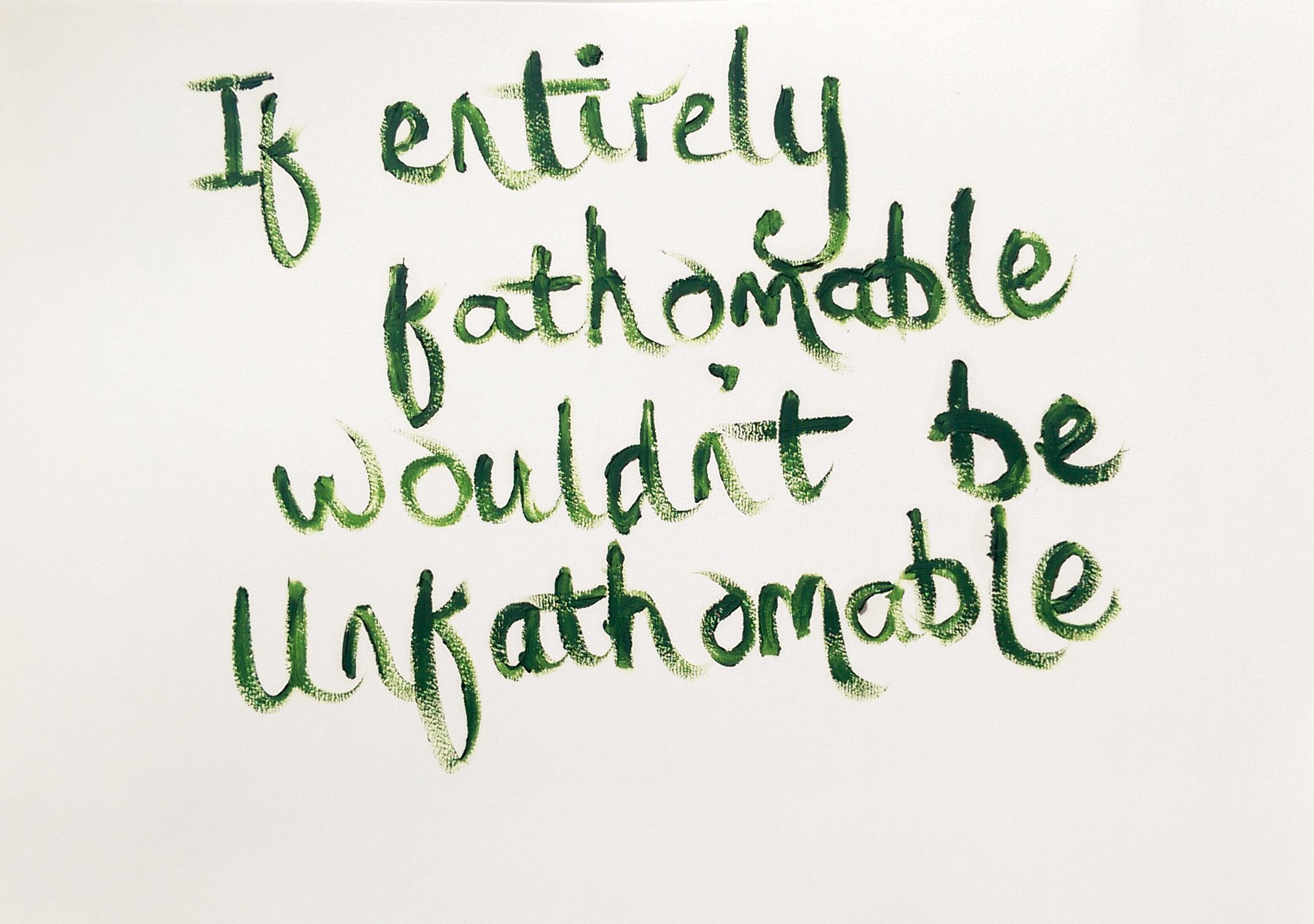
Matt The Unfathomable Artist fans please be ready for draft by draft overload.

Having wrote detailed information I thought ‘Fans do need to see these drafts to appreciate how UN noise dash dot progressed’.

“UN noise dash dot” is made in approximately four drafts as follows.

6th September prior to 2111hrs:

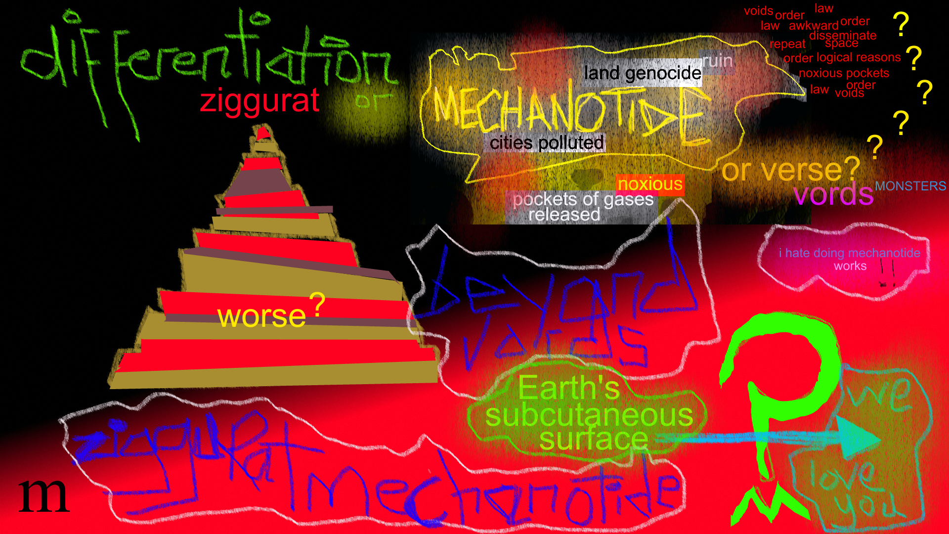
First draft: beautiful red canvas coverage and canvas scratches (palette knife) including scratched words. I cannot explain how invigorating this first draft was.

Photograph immediately below.

“UN noise dash dot – first draft”

It’s cool fans get to see early drafts, my artmaking process and developing ideas.

Late 6th into early hours of 7th September prior to 0011hrs:

Second draft:

  • charcoal lines added
  • charcoaled SCREEN_. [to read, ‘dash dot’] PLAY, 314, ART LIFE, tree, UN, stylised sigma symbol [ Σ ] left of ART LIFE, M and box shapes
  • ‘claw’ added to the top of a rectangular robot-like or building shape
  • soft pastels around some boxes for definition

The ‘claw’ could possibly be subconsciously inspired by “The Giant Claw” [movie, 1957] and/or Robby the Robot from “Forbidden Planet” [movie, 1956]. The latter is one of my all-time favourite films. I did enjoy “The Giant Claw” recently, due to the acting performances by the cast.

un in capitals means ‘the opposite of’ or ‘contrary to’ although I’m happy with any reasonable interpretation for this lettering.

I did also think of the un in unfathomable whilst writing this and also the United Nations. I didn’t and haven’t defined an exact meaning for ‘un’. I enjoy viewers deciding for themselves, personally.

Photograph immediately below.

“UN noise dash dot – second draft”

7th September prior to 1445hrs:

Third draft:

  • yellow paint added around boxes,
  • yellow highlights around some words,
  • pseudo-purple paint (first batch) around boxes,
  • green paint around 314, ART LIFE, UN,
  • letter [ i ] symbolically added in green to the right of the letter M.

see [*1] further below for details of the first batch of pseudo-purple paint I mixed on sandpaper that randomly became “Sandpapered Green with Dark Purple & Yellow”.

You can see the wet purple and yellow on the UN noise dash dot canvas (image immediately below) that featured in ‘Sandpapered Green..”:

“UN noise dash dot – third draft”

8th September 2024 – artwork drying, photographed once for artistic evaluation:

  • no drafts, I photographed “UN noise dash dot” now dry from the day before and the still drying heavy impasto canvas of “Cosmic Mouth” – the ‘astronomy‘ art work (not the female mouth canvas working as this was extensively done on the 1st & 2nd September 2024, subsequently overpainted).

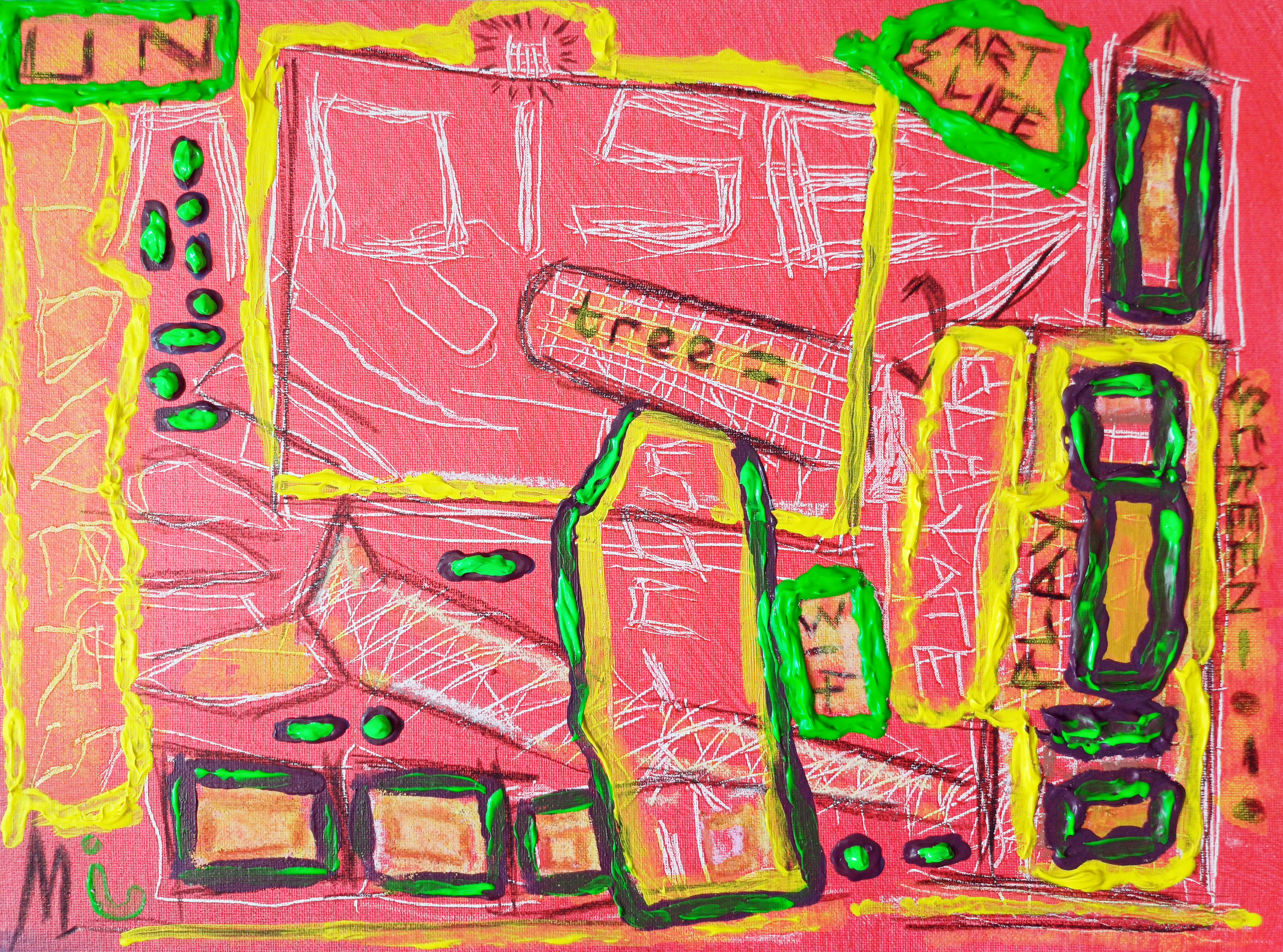
9th September early afternoon prior to 1334hrs:

Fourth draft:

  • green highlights around boxes and dash dot symbols added in green to balance the canvas visuals.
  • heavier overpaint to the existing UN green box for definition.
  • second batch of mixed red/blue-to-pseudo-purple paint added around smaller boxes and underneath the overpainted green dash dots below ‘UN‘. I called this latter area ‘the seated dash dots‘ as some days afterwards this is how I myself interpreted this. Please do see “Mapped Random Satellite {Day} #1” as I believe this is my subconscious finding its way into UN noise dash dot. Interestingly the seated shape of these dash dots is pure chance to fill negative canvas space!

see [*2] further below for details of the second batch of pseudo-purple paint I mixed on Notepad paper to randomly become “Upper – Original” with “Unfathomable Apocalypse Rider in Six-Grid Collage”.

Photograph immediately below, wet paint online version.

“UN noise dash dot – WET PAINT” [6th to 9th September 2024] by Matt The Unfathomable Artist, acrylic paint on premium 115gsm medium textured cotton primed to 240gsm over 12in x 16in (30cm x 40cm) wood-fibre board (4mm), 6624 x 4914 pixels.

In terms of subject matter I feel “UN noise dash dot” is my usual pop art complexity. Not in any order of importance or competing artistic thought:

What did you feel “UN noise dash dot” is about?

Here is further information whilst making “UN noise dash dot” with regards to the two pseudo-purple paint batches I mixed on the 7th and 9th September respectively:

[*1] 7th September prior to 1445hrs:

  • I folded one P400 sandpaper piece in the middle from the leftover purple paint to make two paint prints on the same P400 paper piece. I then pressed one of these to a third sandpaper rectangle (folded P400 piece), now making three individual rectangular acrylic ‘prints’ across two pieces of P400 sandpaper.

[*2} 9th September early afternoon prior to 1334hrs.

  • Whilst mixing a second batch of red/blue paint for the purple I made a (then unknown to me) random artwork on lined Notepad paper. This would become first two acrylic pieces then their digital artwork derivations through “Upper – Original” and “Unfathomable Apocalypse Rider – Original” (both physical pieces and the digital derivations are included in the same blog article and link).

Just a quick thought on ‘then unknown to me‘. To me as an artist, mixed or mixing paint is made purely for the purpose of the canvas I’m working on, nothing more. When working on oils I have art-deco teacup saucers I use to mix the paint. These are cleaned after each oil painting session.

Making art from mixed acrylic paint leftovers is therefore quite new to me. Every now and then I like the look of the random paint I’ve mixed, please see “Pure Chance Portrait #2 in Portrait” for instance. Interestingly, I have some iron gall ink practice works I turned into art pieces some years ago. I’ve not published or formally documented any of those as yet.

“UN noise dash dot” is unusual in that I had two batches of mixed acrylic paint workings I liked and decided to do something with.

Hope you have enjoyed this article.

Standard

subcutaneous differentiation mechanotide

”subcutaneous differentiation mechanotide“ [Original in Red edition, digital Art, 24th November 2023] by Matt The Unfathomable Artist, digital artwork, 1920 x 1080 pixels.

I hadn’t felt inspired in terms of my art for quite some weeks really.

This artwork idea became a mindful thought earlier this morning (24th November). Although to produce a work referencing the word “ziggurat” was actually something I wanted to do months ago.

With my inspiration this morning I began constructing the artwork on a canvas in my mind. Linking ‘ziggurat’ with ‘mechanotide’ and asking a question..

.. Which effect is most damaging to the Earth?

An hour later or so I recorded a few words. Me personally saying [precisely and slowly] “mechanotide ziggurat differention

Here is a computer generated version for you to listen to:

”mechanotide ziggurat differention“ [Vocals by a popular <Text-to-Speech> service, digitally produced using my three original words combined in the title, 24th November 2023], mp3 format.

Now let’s take a look at my B&W Monochrome edition:

”subcutaneous differentiation mechanotide“ [B&W Monochrome edition, digital Art, 24th November 2023] by Matt The Unfathomable Artist, digital artwork, 1920 x 1080 pixels.

B&W Monochrome is best viewed full screen to get a sense of all the words.

Next is my own exact one-take spontaneous vocal recording, no alteration to my vocals. I did not preconceive any idea to produce a vocal artwork with this recording.

Just me formulating artistic ideas ready to produce a [digital] canvas later in the day [best with good headphones or music speakers 🎧🔉]:

[available upon request]

My last edition (of the three) is the SolarScape shown immediately below:

”subcutaneous differentiation mechanotide“ [Solarscape edition, digital Art, 24th November 2023] by Matt The Unfathomable Artist, digital artwork, 1920 x 1080 pixels.

The colours art so cool in this I think, do you? Again, viewing full screen reveals the words much more clearly of course.

Returning to my vocals, I spontaneously say the word ‘differention’, as there is no such word in the English language to my knowledge. I believe I am somehow inspired by the Basquiat use of misspelt linguistics having viewed a (previously unseen) specific work of Jean-Michel online the day before.

Intriguing.

For my digital artwork I chose “differentiation” to create lyrical contrast. I feel “differention” became an artwork of itself in the vocals rather than on my digital canvas. I didn’t try to produce a lyrical performance even though I speak with artistically unintended melancholic verbalisation due entirely to the subject matter [of mechanotide].

My human vocal recording was 100% produced to ensure I formulated good ideas for my canvas artwork.

I digitally inserted ”evil mechanotide #2“ [digital Art, 17th November 2023] into ”subcutaneous differentiation mechanotide“ [24th November 2023] for speed of working, whilst also since I love the mouse written style of ‘MECHANOTIDE’ in that work.

”evil mechanotide #2“ [digital Art, 17th November 2023] is an exact digital inclusion from ”evil mechanotide“ [digital Art, 8th October 2023].

Here is the inserted art in a macro image:

”evil mechanotide #2“ [digital Art, 17th November 2023] by Matt The Unfathomable Artist, digital artwork, 1920 x 1080 pixels.

This is edited in these newer mechanotide versions with corresponding colours and/or textures added using a digital painting package.

The word ‘subcutaneous’ was an instant idea whilst I was digitally drawing.

Here is a Youtube version of my artwork with images and words by a popular Text-to-Speech service:

”mechanotide ziggurat differention“ [Artwork Images with Vocals by a popular service, digitally produced using my three original words combined in the title, 24th November 2023], mp4 video format.

For myself as a person I perceive a vast plethora of content from within my complex layers of ideas, as Basquiat did throughout his incredible artworks.

I am interested to know which of these three digital editions you like the most.

Standard

”human being²”

”human being²” {human being squared} [digital Art, 20th September 2023] by Matt The Unfathomable Artist, digital artwork, 1920 x 1080 pixels.

”human being²” speaks to us in black and white regarding ethnical, ethical, cultural values that are wickedly devalued or twisted in Law and society dependent upon a person’s beliefs.

“The Spiritual Charter is to recognise equal treatment in Law and society wherever unacceptable regard is being taken towards an individual person or group of persons due to their beliefs or non-beliefs.”

The important rapport behind The Spiritual Charter is to tackle obvious spiritual corruption occurring in such instances.

Do we not read [in common Laws] to respect a person’s beliefs, non-beliefs and/or opinions even should thoust disagree?

Throughout the world we see the blight of unfair treatment of peoples.

The Law for All Peoples is clear. It is ancient, past, present and beyond this day.

The title for my artwork represents equal value as a human being, whilst also continuing my idea of fair living space written into Law for every human being.

Here I am considering shanty towns, favelas and those without a home within the message of my artwork.

Standard

“great is our GRETA”

”great is our GRETA – Original” [digital Art, 19th September 2023] by Matt The Unfathomable Artist, digital artwork, 1920 x 1080 pixels.

A personal quote in writing of positive climate change and humanitarian activism:

“Powerhouse art 🌍🌎🌏 the people care, the people are speaking 🌋🌊⚡🌩🌪🌬🌡☀⛽⏰💪🏼💪🏼🎨”

‘Original’ shows fiery red as a colour with neon-like writing for strong emphasis and a somewhat messy order to the canvas structure to extol the harsh reality of these messages.

With a few pre-planned ideas ready for the canvas I worked spontaneously and quickly in style. ‘Original’ was made in one hour. The four complimentary versions took 35 minutes, with a third draft of fifteen minutes for ‘Leaders Version’ to ensure ‘great is our GRETA’ shone even if Leadership over the climate has not.

I made five versions of ”great is our GRETA” – ‘Original’, ‘SolarScape in Green & Blue’, ‘for the Grain’, ‘Lime Green with Pink’ and ‘Leaders Version’ {the latter where all the words are senselessly obscured except ‘great is our GRETA’ still holding steadfast and true.

These artworks boldly, vividly and powerfully highlight global economic disparities linked to demographical inequality and a hierarchical persistence in unethical commercial behaviour.

Here are the four further versions:

”great is our GRETA – SolarScape in Green & Blue” [digital Art, 19th September 2023] by Matt The Unfathomable Artist, digital artwork, 1920 x 1080 pixels.

I feel ‘SolarScape in Green & Blue’ dignifies the beauty of our Earth, the sky, the oceans and fauna as a reminder against manmade global warming.

”great is our GRETA – for the Grain” [digital Art, 19th September 2023] by Matt The Unfathomable Artist, digital artwork, 1920 x 1080 pixels.

‘for the Grain’ represents our international news media bringing information and knowledge throughout important human challenges. Aptly naming this to honour the poor, starving and malnourished peoples around our globe.

”great is our GRETA – Lime Green with Pink” [digital Art, 19th September 2023] by Matt The Unfathomable Artist, digital artwork, 1920 x 1080 pixels.

‘Lime Green with Pink’ represents the fruits of our labours, your valuable human labours in effort, ethics and equality.

”great is our GRETA – Leaders Version” [digital Art, 19th/20th September 2023] by Matt The Unfathomable Artist, digital artwork, 1920 x 1080 pixels.

A reasonable satirical take on the state of greenwashing in the modern commercial, politically corrupted world.

‘Leaders Version’ represents the lack of true, definable advantageous climate action across developed world'(?) Leadership since 1992! Lobbying through the political systems has wrought climatic woes on our shared planet, its natural ecosystems and resources.

We are the people.

Standard

Cellular Circles Candy #2

Cellular Circles Candy #2 – Original in Blue, Red & Yellow” [digital Pop Art, 25th August 2023] by Matt The Unfathomable Artist, 100% digital artwork, 1920 x 1080 pixels.

Cellular Circles Candy #2 is more simplistic than #1, yet reminiscent of school mathematical counters. Of which I have a particular story from first school, one of the earliest obvious connections I had with art!

Here is the Collage version:

Cellular Circles Candy #2 – Nine Grid Collage” [digital Pop Art, 25th August 2023] by Matt The Unfathomable Artist, 100% digital artwork, 3264 x 3264 pixels.

These are super pretty aren’t they? Like those mathematical counters at school. You see, I loved a few of them so much. The beautiful designs on the counters were delicious to my young six or seven year old self.

One of my naughty school classmates pocketed a few. Something I know even a near-decade later from first school was part of his character. He was well known as one of the most pick-pocketing pocketers you ever might know.

Anyway with great rarity, for me, I pocketed a few too! Yes, we got into naughty trouble for that with our very nice teacher who was genuinely perplexed <I> personally had naughtily ‘acquired’ a counter or two myself. She was not perplexed by the other boy’s naughtiness. In fact, she seemed to rather expect it.

I was werry werry embarassed <red-faced emoji>.

I realise now the irresistible desire I had for art. Through my childhood – patterns, natural stones, textures, songs, nature.. anything arty greatly interested me.

Here is the unusual abstracted circles version:

“Cellular Circles Candy #2 – Abstracted” [digital Pop Art, 25th August 2023] by Matt The Unfathomable Artist, 100% digital artwork, 1920 x 1080 pixels.

I do love this piece and all my Cellular Circles works.

Hope you enjoyed this article.

nb You can see the Cellular CIrcles #1 works by clicking the title link.

Standard

“Angry Owl – #2”

“Angry Owl #2 – Original” by Matt The Unfathomable Artist, pastels, charcoal and acrylic on 10in x 12in canvas pad.

“Angry Owl #2 – Original” is probably a selfie on his smartphone.

“Angry Owl #2 – Digitised” [4th July 2023] by Matt The Unfathomable Artist, digital artwork.

“Angry Owl #2 – Digitised” found himself in computer circuitry.

“Angry Owl #2 – Black & White” [4th July 2023] by Matt The Unfathomable Artist, digital artwork.

“Angry Owl #2 – Black & White” walked onto the set of a 1920’s silent movie. Quickly he assumed this cunning mask to conceal his distinctive looks.

“Angry Owl #2 – Pixelated” [4th July 2023] by Matt The Unfathomable Artist, digital artwork.

Caught up by mistaken identity “Angry Owl #2 – Pixelated” found himself in a Police line-up. ‘Pixelated’ was his disguise so you wouldn’t recognise him.

“Angry Owl #2 – Solarised” [4th July 2023] by Matt The Unfathomable Artist, digital artwork.

As you can clearly see “Angry Owl #2 – Solarised” turned his face to the Sun. He wasn’t even on holiday at the time.

“Angry Owl #2 – Tracing Paper” [4th July 2023] by Matt The Unfathomable Artist, digital artwork.

A keen student of H.G. Wells The Invisible Man, “Angry Owl #2 – Tracing Paper” went to art class in high school to perfect blending into any surrounding. I think by now you would all agree he is quite brilliant at camouflage.

“Angry Owl #2 – Montage” [4th July 2023] by Matt The Unfathomable Artist, digital artwork.

“Angry Owl #2 – Montage” was released by secret services in order for the public to formally identify him, amidst all his aliases. We do not know where “Angry Owl #1” is either. Last information we have is that “Angry Owl #1” was placed into a refuse bin for no reason whatsoever.

To help identify “Angry Owl #1” here is the last known photograph:

“Angry Owl #1” [August 2010] by Matt The Unfathomable Artist, pastels on board.

Please do not attempt to approach “Angry Owl #1” or “Angry Owl #2” as they are able to horizontally rotate their necks at extreme angles. Also, they are absolutely lethal to harvest mice.

Special skills: Ability to listen to you under one foot of snow.. whilst hovering airborne!

If you find “Angry Owl #1” please contact Matt The Unfathomable Artist as he is willing to trade one of his best currently available sketches for the safe return of “Angry Owl #1”.

Thank you for your kind assistance.

Standard

Impassioned Kisses – Pop Art Oil Painting

‘Impassioned Kisses’ [completed August 2013] by Matt The Unfathomable Artist,
Oil on canvas, 36 inches x 28 inches.

Pop Art oil painting entitled ‘Impassioned Kisses’ completed August 2013.

‘Beautiful art lines are discovered and re-discovered like sand dunes and swan necks.’

by Matt The Unfathomable Artist

[Digitally edited photograph]

Standard

‘If Entirely Fathomable, Wouldn’t Be Unfathomable’

I have produced a series of Pop Art oil pieces on A3 light textured paper entitled ‘If Entirely Fathomable, Wouldn’t Be Unfathomable’.

Here is the Aquamarine version:

Pop Art ‘If Entirely Fathomable, Wouldn’t Be Unfathomable’ [Aquamarine, 25th April 2019] by Matt The Unfathomable Artist, Aquamarine oil paint writing on A3 light textured paper, signed ‘Matt’ on reverse. Digitally edited photograph. Original Saying created December 2018.

This is the Red Ochre #1 version:

Pop Art ‘If Entirely Fathomable, Wouldn’t Be Unfathomable’ [Red Ochre, 26th April 2019] by Matt The Unfathomable Artist, Red Ochre oil paint writing on A3 light textured paper, signed ‘Matt’ on reverse. Digitally edited photograph. Original Saying created December 2018.

.. and here is the Sap Green version:

Pop Art ‘If Entirely Fathomable, Wouldn’t Be Unfathomable’ [Sap Green, 26th April 2019] by Matt The Unfathomable Artist, Sap Green oil paint writing on A3 light textured paper, signed ‘Matt’ on reverse. Digitally edited photograph. Original Saying created December 2018.

The phantasmagorical concept emanating from this Pop Art ensemble is to mix artistic persona with fluent ecological conservation.  To help inspire the need for cultural, societal, economical and environmental change linked to our beautiful Earth planet.

I like the idea ‘If Entirely Fathomable, Wouldn’t Be Unfathomable’ carries within various layers of meaning.  For instance if someone says, we can’t solve this, it’s too difficult, it cannot be done, then we quizzically reply, ‘If Entirely Fathomable, Wouldn’t Be Unfathomable’.

To drive true change we need new behaviour to accomplish whatever is necessary, environmentally speaking.  Art can motivate, encourage, nurture, grow, develop and achieve unimaginably positive solutions we just didn’t think possible.

‘If Entirely Fathomable, Wouldn’t Be Unfathomable’.

Some have wondered at the random placing of words onto the A3 paper with regards to the use of ‘canvas’ space.  Aquamarine naturally aligned centrally.  Red Ochre (#1 of #2) shifted right, whilst Sap Green ascended higher textually than the preceding colour oil works.

Perhaps this is the result of pure chance, coincidence.  Or possibly preposterously we can read formulaic thinking into the letters.  After I completed the art pieces, super happily viewing them drying late evening, I couldn’t help notice the positioning of certain letters:

Y over O in ‘Aquamarine’,

Y intersects B in ‘Red Ochre #1’,

Y is a constant over MA in ‘Sap Green’.

T required calculation.

Likely astronomers, engineers and mathematicians can help explain the correlation to us.

Thank you for reading.

I hope you enjoy my Pop Art works.


Standard

Warhol and Beautiful Vulgarity

Andy Warhol enjoyed recurring themes.

A fashion, art, celebrity, social, commercial, media and political commentator. Banksy certainly appreciates the power of Andy Warhol’s style of portrayal. Warhol was extremely clever with his use of commercialism and controversy to promote his work.

Would you agree that it is the Artist and their body of work that interests viewers so much so as to make them into a phenomenon?

Maybe it is the Artist, their verbal commentary and personality that people find as fascinating as their art work itself?

Few Artists can be as mind bendingly fascinating as Andy Warhol.

The Good, The Bad and The Ugly. Sometimes ugly is beautiful. I’m talking about the ugliness in the portrayal. Such a strange looking word in English is ugly. It sounds strange. Ugh.

Let me show you some subtle vulgarity that exists.

‘Impassioned Kisses’ below [#1] is my first take on Pop Art. My Warholian efforts if you will.

I spent several weeks creating, practising and perfecting the artwork design. Interestingly this involved the use of computerised art software. Why? Well, it’s more difficult for me to draw that way and assisted me when I eventually came to use wet-on-wet ‘alla prima’ oil technique with brush in hand.

‘Impassioned Kisses’ really is my first attempt with brush and oil at this composition. Completely freehand on 36 inch by 28 inch canvas.

Why not try an oil alla prima artwork for yourself. Go on, please. I’d love to think that a dear Reader readies a 36in by 28in canvas with their own subtle background design and gives it a go. Wonderful fun you know.

Practice with a computer drawing package then emulate and sign your name as I have done, in your own style.

Here’s a delicious challenge – maybe copy ‘Impassioned Kisses’ and then sign your own name.

For reference purposes the use of alla prima with ‘Impassioned Kisses’ separated my unusual choice of background to foreground colour from the simple Titanium White and Vermilion Red palette mix.

Having later studied Matisse I surprised myself at the choice of one of his most important brush strokes.

Beautiful art lines are discovered and re-discovered like sand dunes and swans necks.

Again too with an earlier tree painting Matisse produced. It’s a pity I wrecked my own first version of my ‘Lake and Treescape Serenity’ oil by overworking. The artists nightmare that I’m immensely conscious to avoid and the reason I won’t make too many finishing adjustments to near completed compositions.

Once the gusto and flair for a work is over I can only make small changes. My heart has already given its all to the piece intensively. Super focus gleans my best effort for a canvas.

Below ‘Impassioned Kisses’ you can also see my ‘Lake and Treescape Serenity – Version 1’ [#2] prior to overworking. Version one of the latter is awaiting a bonfire although I do very much love the foreground work so maybe it should rightly remain stored up.

Thankfully I’m ecstatic about ‘Impassioned Kisses’.

‘Impassioned Kisses’ – [#1] (a) – foreground highlighted:

(b) same painting with background detail highlighted in low key:

I loaded the brush with paint and made broad flowing strokes. ‘Impassioned Kisses’ does require framing in my opinion. My hope is that you will see glorious shapes, ideas and a frivolous playful energy. Two bodies entwined. A harmony of sweet music. A promise kept, unchanged.

‘Lake Treescape’ [version one, 2012, unfinished artwork] below – prior to overworking.

This is where I had the clouds as I wanted them:

Lake Treescape

Lake Treescape

Distant trees and landscape unfinished. I need to restore this artwork.

Here is my photograph for the composition:

Onto other artworks with ‘The Boat Is Dark’.

‘The Boat Is Dark [first version]’ below: (unsigned in watercolour, somewhere)

The Boat is Dark

The Boat is Dark

‘The Boat Is Dark’ is purposefully kitsch, garish and ugly. Earth’s ecology, the natural environment and recycling. Further versions must always appear child-like and grotesquely garish until the sea is green again.

You will never forget my paintings.

I love version one with its dreamy Van Gogh-like wooden fishing peg and eerie chromatic sun. Fishing is so serene, so I used photographs taken of local fishing pegs to help explain my concept behind the composition.

Are you wondering why I haven’t posted an Andy Warhol painting.. yet?

Vulgarity and ugliness really can be very beautiful. It has a time honoured place in history, this right now and for all our futures.

Sometimes I wonder how far it will be allowed to go.

My guess is Andy Warhol did too.

Standard