of Van Gogh & of Picasso

“Cosmic Mouth” [6th/7th & 10th September 2024] by Matt The Unfathomable Artist, acrylic paint on premium 115gsm medium textured cotton primed to 240gsm over 12in x 16in (30cm x 40cm) wood-fibre board (4mm), 7018 x 5167 pixels.

“Cosmic Mouth” is literally painted over a female mouth acrylic painting (produced 1st & 2nd September with much effort and innumerable drafts). I then worked on the newer Cosmic overpainting you see here for the next two days.

On the 10th September I varnished the centre. I did retain a photograph of the underpainting even though it wasn’t successful to my eyes. You can see hints of the underpainted mouth along the middle of the canvas.

The female mouth I’m determined to paint successfully is physical perfection.

‘Sometimes perfection is immediate and sometimes it takes time.’ – one of my sayings.

Thankfully the overpainted Cosmic Mouth” is the perfection I sought for.

Writing of perfection..

“Artist Seduces Artist” [13th September 2024] by Matt The Unfathomable Artist, acrylic paint on premium 115gsm medium textured cotton primed to 240gsm over 12in x 16in (30cm x 40cm) wood-fibre board (4mm), 6000 x 4525 pixels.

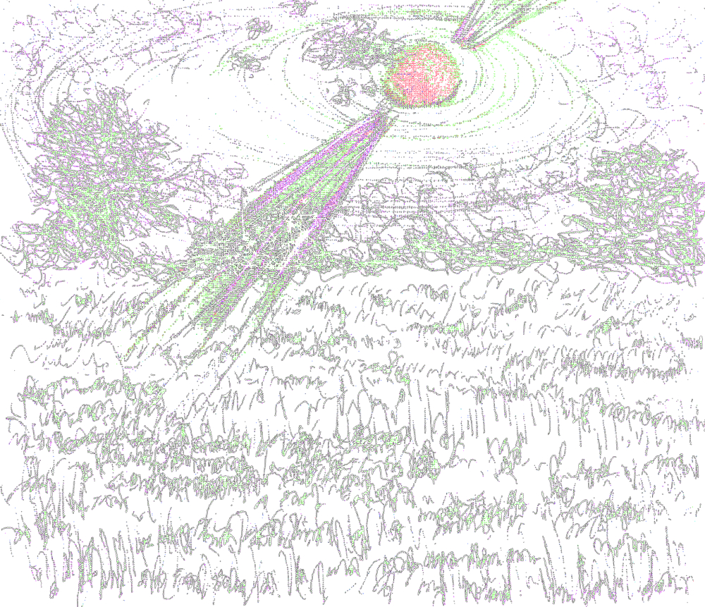
..I made “Artist Seduces Artist” in around an hour to an hour and a half, freestyling, in heavy impasto acrylic.

Please do click these images for an even better viewing.

“Artist Seduces Artist” would look incredible hung at the centre of the darkest black large fabric square or rectangular-like tapestry, 6ft by 6ft at the very minimum. it is 100% Picasso inspired 🎨

I made a very finite finishing touch with two paintbrushes to the completed artwork with burnt umber on 17th September due to my perfecting standards.

For the primary working I utilised three painting techniques: palette knife, paintbrush motions using approximately four brushes, and constant-direct tube paint applications onto the canvas for the grass-green and turquoise surrounds.

Originally I intended to use burnt umber, gold, and mid-yellow colour. Prior to canvas working I included silver, copper and bronze into the palette. I have time and again tried to make ‘the beautiful simple style’, yet invariably add complexity!

After thorough happiness with the predetermined colours I then felt the canvas needed the delicious cadmium red, interesting turquoise, balancing titanium white and then finally the defining grass-green to make everything come alive.

It was at this point I added the mid-yellow even though this was an intended colour to use from the outset. I flattened the profile of the turquoise surrounds for visual interest with a flat-paintbrush. The grass-green received an area of purposed flattening due to the paint settling on the canvas.

Please note the inspiration for this canvas derives from the book “Life with Picasso” by Françoise Gilot and Carlton Lake with my own interpreted Picasso style. I was at page 38 to that point prior to making this artwork.

“Artist Seduces Artist” is a mixture of textures, layers, partially recognisable or obscured pictorial elements and humour with a composition intended to please the eyes in visual interest.

The essence of Picasso himself interpreted in an inspired style by myself.

“Artist Seduces Artist” with.. the beauty of art.

[ nb I am listening to Tobar Mhoire 🔊🎧]

Standard

“Sunrays in Wildflower Meadow”

“Sunrays in Wildflower Meadow – TRACE” [27th May 2023] by Matt The Unfathomable Artist, digital artwork derived from an original sketch in blue ballpoint ink pen and sunlight yellow pencil. 

“Sunrays in Wildflower Meadow – TRACE” finds me thinking about nature, rabbits, animation and music. How about you? What do you think looking at this artwork?

The original sketch (not shown) for these digital artworks in this blog article took me 20 minutes to produce. It was done spontaneously with very quick pen and pencil work to emulate the Van Gogh style for movement.

I am very happy with the artworks and the original, inspired by a Van Gogh drawing. I would like to mention that the artworks are produced from an original sketch and photograph by myself.

The photograph is actually shown at the end of this blog article.

“Sunrays in Wildflower Meadow – Black & White” [27th May 2023] by Matt The Unfathomable Artist, digital artwork derived from an original sketch in blue ballpoint ink pen and sunlight yellow pencil. 

“Sunrays in Wildflower Meadow – Black & White” reminds me of space and science-fiction. What about you? How do you feel looking at this artwork?

“Sunrays in Wildflower Meadow – COMMAND” [27th May 2023] by Matt The Unfathomable Artist, digital artwork derived from an original sketch in blue ballpoint ink pen and sunlight yellow pencil. 

“Sunrays in Wildflower Meadow – COMMAND” is powerful. I am reminded of 3D structures, electricity and the sense of touch. How about you? Do you have any particular feelings or thoughts as you view this artwork?

“Sunrays in Wildflower Meadow – photograph” [4th July 2022, 1935hrs] by Matt The Unfathomable Artist.

Hopefully I have brought the beauty within this landscape into my sketch and digital artworks, inspiring you in some way.

Very best.

Standard

Triple Vertical Horizontal Seismic Waves #1 Sketch

‘Triple Vertical Horizontal Seismic Waves #1’ [11th May 2020] by Matt The Unfathomable Artist, Blue/Black Iron Gall Ink on specially treated A4 Artist’s Gouache Paper 160 gsm.

I’m working on a new art project to highlight preservative conservation.  In doing so I’m exploring further artistic opportunities with my artworks.

Those familiar with my work will appreciate my interest in seismic wave and sound wave depictions.  Myself producing numerous free-hand sketches, as shown above, similar in style to how seismographs record ground motions such as earthquakes.

Having lightly sanded the nib of my dip pen, I subsequently sketched ‘Triple Vertical Horizontal Seismic Waves #1‘ and happily signed this artwork.  Satisfied with its quality and feeling.  I didn’t expect to produce a delightfully enjoyable piece whilst practicing handwriting using my new nib dip pen.

Autoschediastic artworks are as jubilant as carefully planned creations whenever successful.  Van Gogh analysed levels of quality ascending to masterpieces in his own work.  I’m certainly of the opinion that all his artworks are masterpieces through his ingenuity, obsessive practice and artistic genius.

My artwork, shown above in a digitally edited photograph, was wet with ink as I wasted no time taking this image!  Afterwards, whilst writing this article I realize the wonderment of this piece.  I’m not immodestly discussing whether it’s a success or not.

No, rather, I’m viewing my sketch as a curiously spontaneous artwork by reason of my lacking fresh quality art paper.  You see I hastily ran upstairs to use the reverse side of some old practice sketches made on quality paper.  Then immediately, old sketch pad in hand, I returned downstairs to quickly enjoy my smoother sandpapered nib!  Scribbling on plain paper, before producing this completely impromptu seismic waves artwork.

The reverse side of this artwork above is less favourable of quality in my own view of how I judge my works.  The pen work on the reverse, unpublished side, is good – it just didn’t connect with me technically.

Some earlier unpublished sketches I’ve already signed, some not.  Quite laughably without any pre-thought whatsoever ‘I’ve now gone and signed‘ this earlier sketch, albeit upon its newly defined triplet.

I find this genuinely hilarious.

Of course, I’m not the first paint artist or illustrator to do the same thing.  I just think it’s the first time I’ve personally utilized earlier sketch work held on the reverse side for a new signed artwork.  To be perfectly honest I kind of like the economical use of good quality paper, and that’s the whole nib point.

Except it’s not, because I sanded the nib to a ‘seismic’ curve.

Anyway, do you like my triple vertical horizontal seismic waves artwork?

Standard

Forget Me Nots and The Bee

‘Forget-Me-Nots and The Bee’ [2010] by Matt The Unfathomable Artist, Oil on canvas, 24 ins x 18 ins.

I’ve decided to share ‘Forget-Me-Nots and The Bee’ [2010] by Matt The Unfathomable Artist having, only this year, recently seen Van Gogh’s ‘Roses and Beetle’ [1890] painting here:

‘Roses and Beetle’ [1890] by Vincent van Gogh, Oil on canvas, 33.5 cm x 24.5 cm.

I painted ‘Forget-Me-Nots and The Bee’ using a photograph from 2003.  Here is the photograph I took that day having set my camera onto a tripod, waiting hours for the best photo opportunity:

Photograph dated 2003 from a home garden, inspiration for ‘Forget-Me-Nots and The Bee’.

The bees kept me busy following them around from flower to flower, as they never sat still, haha.

I had not seen ‘Roses and Beetle’ by Van Gogh at the time of producing my artwork.  I love that artists wish to explore nature and produce classical compositions all their own.

Van Gogh’s painting has encouraged me to share my earliest painting experiments.

Interestingly the way I signed this painting has its earliest roots from my high school art class.  That’s the way I used to sign my high school artworks 🙂

My art teacher said she loved the way I’d created my signature.  ‘Creative Mind’ has my full signature, whilst my latest artworks are stylistically signed ‘Matt’.

Thank you Vincent.

Hope you enjoy.

Standard

Vincent and his Sunflowers

Having planted sunflowers in my own garden and watching them grow to a very great height like the proverbial beanstalk I can understand the fascination.  The width of the flower itself is quite breathtaking and the yellow mirrors the Sun for its beauty.

Van Gogh – or shall we prefer to call him Vincent as he has invited us to do?  We all probably know that Vincent’s Sunflowers paintings have been amongst the most expensive in history.  He artily studied sunflowers extensively and produced a varied array of styles and compositions.

I would like to talk about version F.454, Van Gogh’s fourth version. Here is a picture:

Vincent depicts these sunflowers with vibrant yellows symmetrically contrasted against a lighter background and darker yellowy-gold floor to offset the vase’ lighter lower-half colour.  This is pleasing to our eyes and allows us to see all the details perfectly.

The sunflowers show strength, positivity and respectful humbleness.  The six flower heads boldly facing us could be a matter-of-fact declaration of facing challenges.  Readers will appreciate that Vincent was a master of composition so naturally he will choose to paint the flower heads artistically.  It is also true that Vincent would use his imagination with some compositional details to better the artistic appeal.

I know personally speaking that paintings are influenced by our moods at the time.  Subconscious feelings will rise to the fore.  As expressive creatures we cannot help translate this into our arts for all to see, hear or feel with our hearts and our minds.

Vincent’s voice is clearly heard within this yellow Sunflowers version by the epitome of joy and happiness we see.  Interestingly, whilst the background is beautifully simple the sunflowers are detailed.  I enjoy the way he has managed the seed heads in the flowers that face us, with the light specks dancing around.

White light bounces off the mid-top of the vase and the artist has chosen to write his name on the vase like a personable gift.

The flair for movement is consistent with his swirling style.  I love this about his artworks, his sense of movement.

Each person sees an artwork differently so I am by no means saying this is so or that is so about this painting.  Sacre bleu with blue lining all around.  I am much happier that you might like my interpretation of this great painting and the things I felt about it.

I can say that like all art lovers I would love to have one of Van Gogh’s paintings adorning my wall.  A visit to a Museum or Gallery graces us with a chance to pretend for a moment that one of his Sunflowers paintings is ours.

If only for a brief moment.

– Matt, The Unfathomable Artist

Standard